The new booking forms are here and with them, a new Customize section!
The design of Amelia’s front-end forms and inputs relies on advanced color and style settings. Through every step, customizing the design of your booking forms will allow you to adjust Amelia to match any corporate branding, color styles, and WordPress themes.
Video version
Accessing the Customize section is done through the WordPress menu – Amelia » Customize.
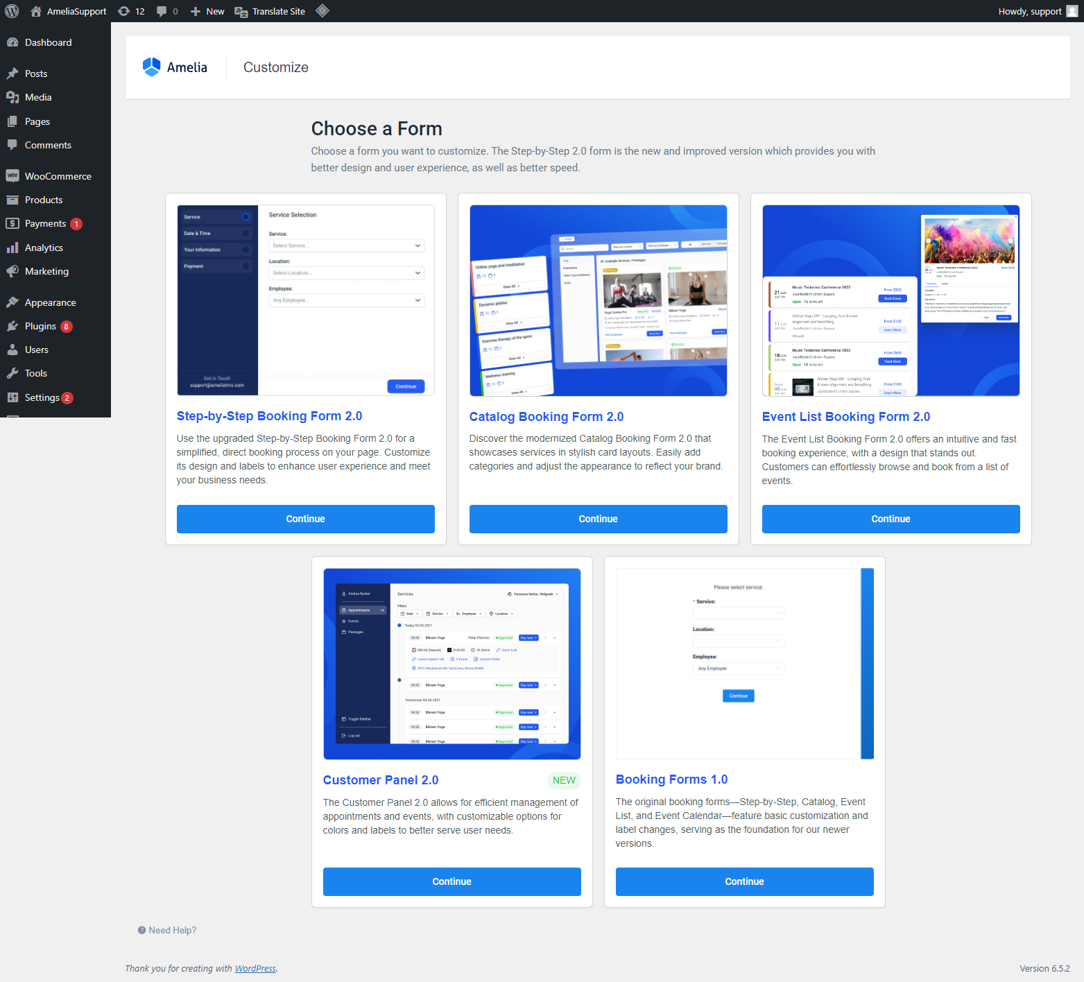
All new forms (Step-by-Step Booking Form 2.0, Customize Booking Form 2.0, Events Booking Form 2.0, and Customer Panel 2.0) are based on the functionalities of the Step-by-Step booking form, so make sure to go through it first.
Step-by-Step Booking Form 2.0
Select the “Step-by-Step Booking Form 2.0” by clicking on the “Continue” button below the name of the form and access the new Customize section. There, you will see a WYSIWYG (What-You-See-Is-What-You-Get) style customizer.
If you have purchased a Pro or Elite license, you will see a selectbox on the left above the form, where you can select whether you’re editing the form for Services or for Packages.
Please note that the Packages feature is not included in the Starter and Standard License plans of Amelia.
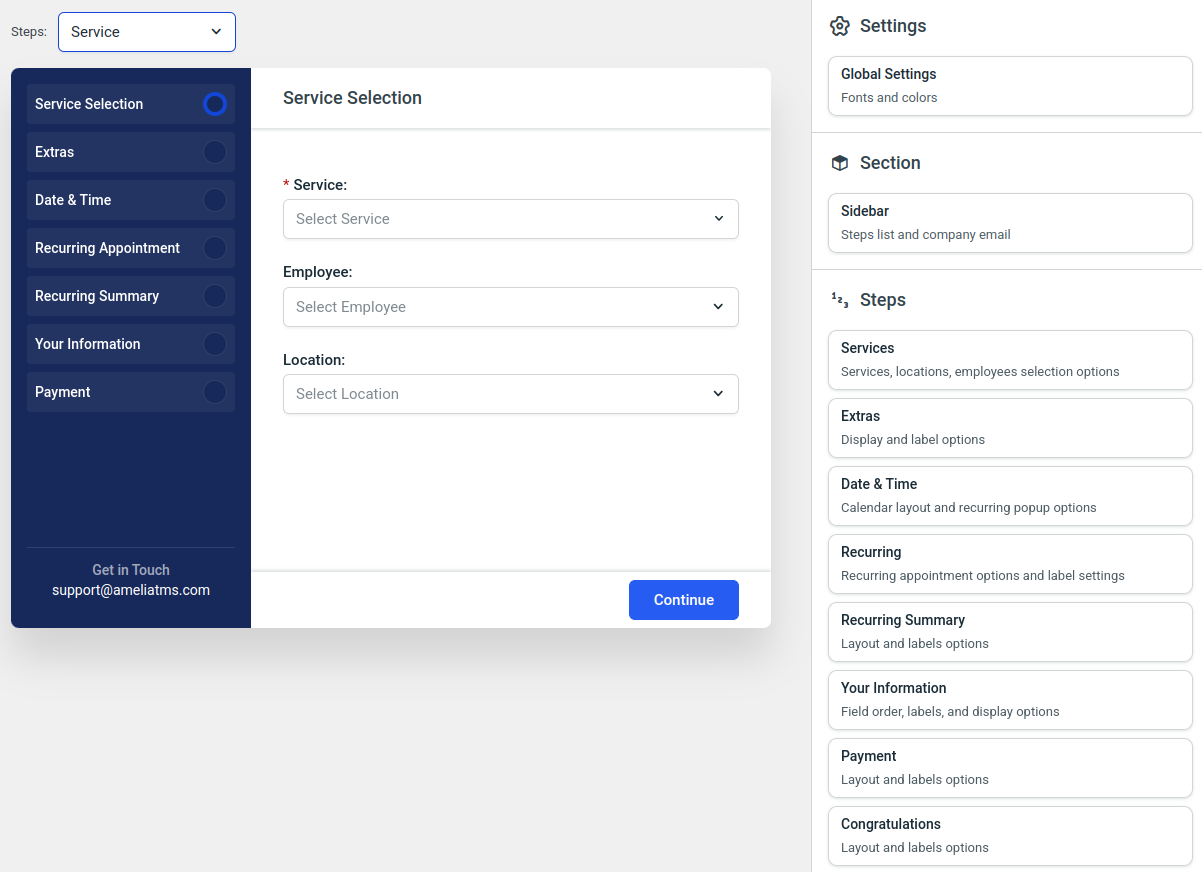
Everything needed to customize the form is located in the right-hand side menu.
The menu is divided into three parts:
- The Settings (where you configure Global Fonts and Colors)
- Section (where, currently, you can only configure the sidebar visibility and its labels)
- The Steps (where you can individually configure the colors, labels, order of fields, translations, and if some fields will be mandatory or not).
For some elements, you can choose whether they will be shown on the front-end or not, and for some selections like Locations or Employees, you can choose whether they will be mandatory in the booking process or not. All changes are visible in real-time, so you will see changes in the preview as soon as they’re made.
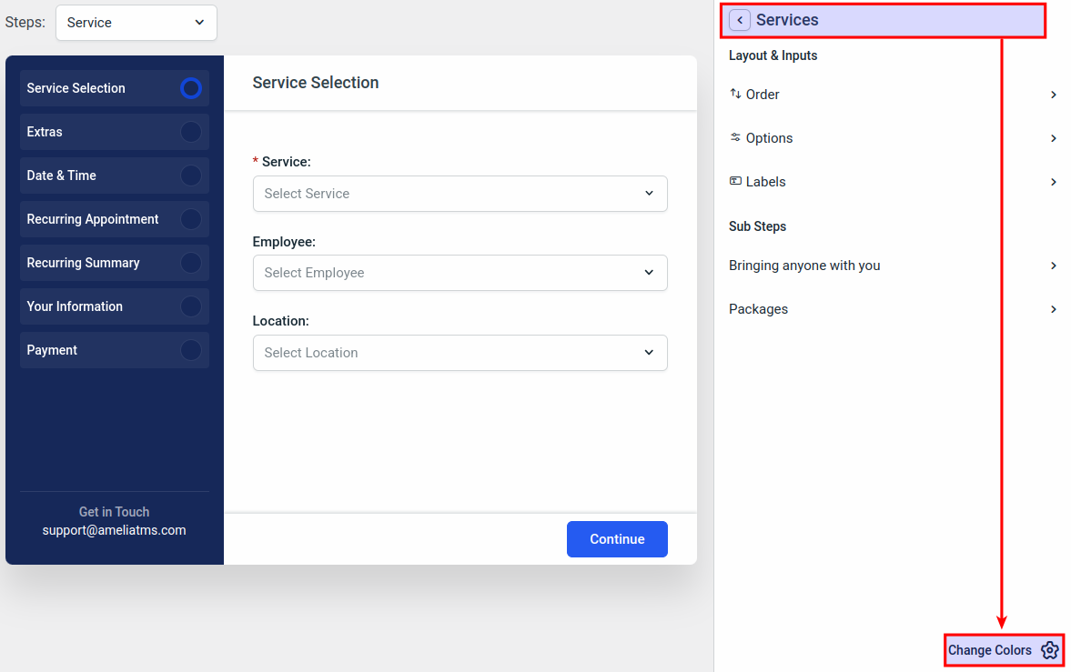
On each step, in the bottom right corner of the side menu, you will be able to access the colors, and see which global colors affect which section of the selected step. For example, in the “Services” step:
Choosing the Step-by-step layout
Above the form preview, you’ll find an option to switch between two layouts for the Step-by-step booking form:
-
List layout (default): Service, Employee, and Location are all selected in one step.
-
Steps layout: The first step is split into three separate screens (Service Selection → Employee Selection → Location Selection).
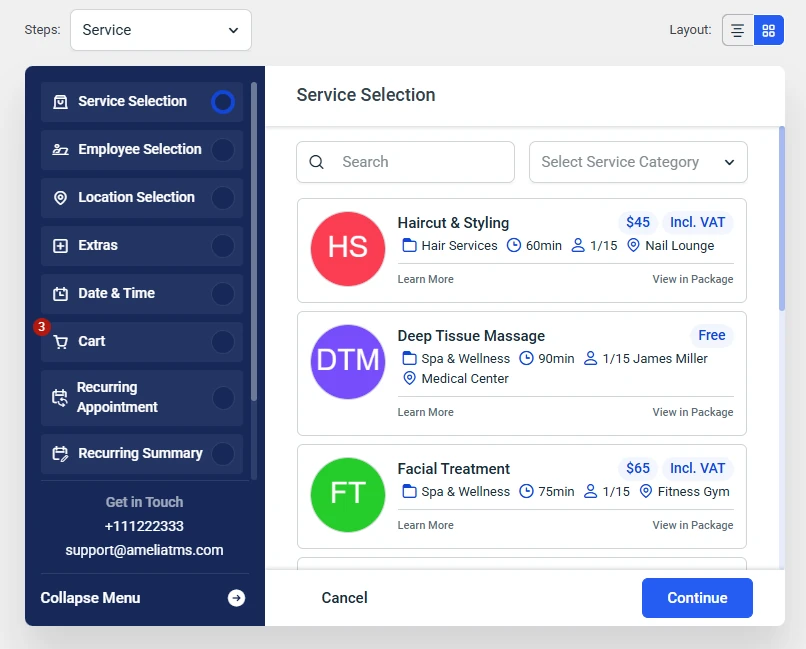
Notes about the steps layout:
-
You can rearrange the order of these three steps depending on your preference (for example, Employee first, then Service, then Location).
-
Services are displayed in categories, exactly as they are organized in the back end.
-
If a service belongs to a package, the View in package button appears, allowing customers to immediately book a package instead of just a single appointment.
-
If a customer selects both Employee and Location, then navigates backward, the previous choice is locked. To change it, they must select Any employee or Any location first.
This gives you more flexibility in how customers move through the booking process.
Global Settings and Form Colors
In the Global Settings of the Customize section, you will be able to choose the font you’ll use on the form (you can select one of the default ones, or use your own custom font) and modify the colors which are applied throughout the form.
Available Fonts:
- Roboto
- Lato
- Merriweather
- Montserrat
- Mulish
- Nunito
- Asap Condensed
- Open Sans
- Barlow
- Oswald
- Bitter
- Poppins
- Carme
Defining Custom Font
As mentioned above, if loading Google Fonts is in conflict with the GDPR policies of your country, you can download fonts and load them locally.
First, find the font you want to use somewhere online. For example, we’ll use Dafont and download the “Freshman” font. The .ttf file needs to be saved locally, so we added it to /wp-content/uploads/fonts/ folder, and pasted the URL to the font:
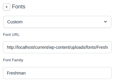
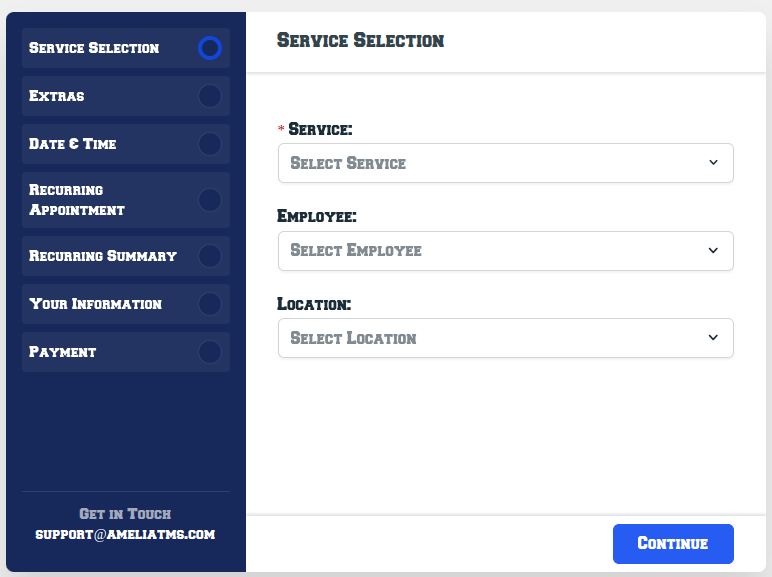
This makes Amelia load the font from your local folder instead of Google’s servers and the form picks up the font correctly and displays this:
Colors
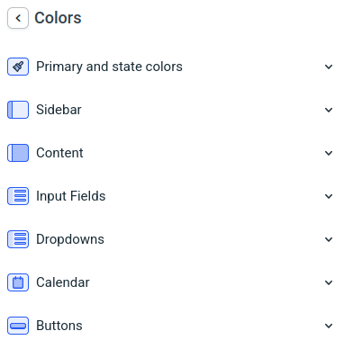
Here, you can define the primary and state colors, the color of the sidebar, the content, input fields, dropdowns, calendar, and buttons within the form.
As mentioned before, if you don’t like some colors when you move through the steps, remember to click on the “Change Colors” button in the bottom right corner of the side menu.
Primary and State Colors
This menu consists of “Primary”, “Success”, “Warning”, and “Error” colors which can be found throughout the form.
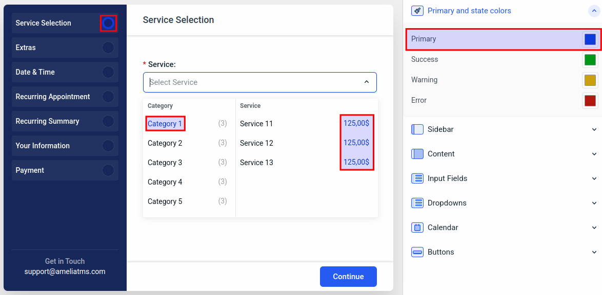
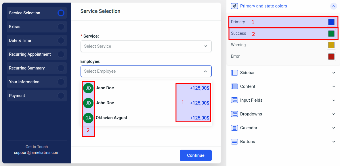
In this step, the “Primary” color defines the current step circle in the sidebar, the category you’re hovering over when you click on the “Service” dropdown, the color of the service’s price, and the color of the price for each employee in the “Employees” dropdown (don’t forget that the price for Services can be different per employee).
The “Success” color defines the employee’s thumbnail color (unless the employee has a profile photo – in that case, the photo will be displayed in the “Employees” dropdown).
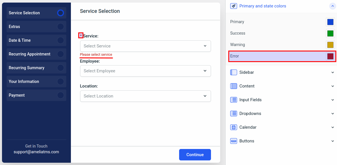
The “Error” color (in this step) is used for the mandatory field’s asterisk ( * ), and for a warning that’s displayed if the customer tries to continue without selecting the mandatory field (Service, in this example).
The “Warning” color can’t be displayed in this step, but it is covered here.
The default colors in the “Primary and state colors” section are:
- Primary: rgba(18, 70, 214, 1)
- Success: rgba(1, 151, 25, 1)
- Warning: rgba(204, 162, 12, 1)
- Error: rgba(180, 25, 15, 1)
Sidebar and Content colors
The “Sidebar” and the “Content” colors are pretty basic. Here you define the background color of the sidebar and the main content, along with text colors within the sidebar, the main content, and the heading text.
Please note that the background colors of the sidebar steps are a shade of the sidebar background color.
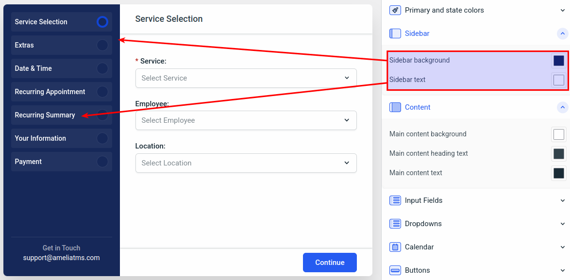
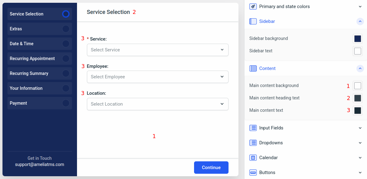
The default colors in the “Sidebar” and the “Content” sections are:
- Sidebar background: rgba(23, 41, 90, 1)
- Sidebar text: rgba(255, 255, 255, 1)
- Main content background: rgba(255, 255, 255, 1)
- Main content heading text: rgba(51, 67, 76, 1)
- Main content text: rgba(26, 44, 55, 1)
Input fields colors
This defines the dropdowns’ colors, their border colors, the placeholder text colors, and the selected input colors.
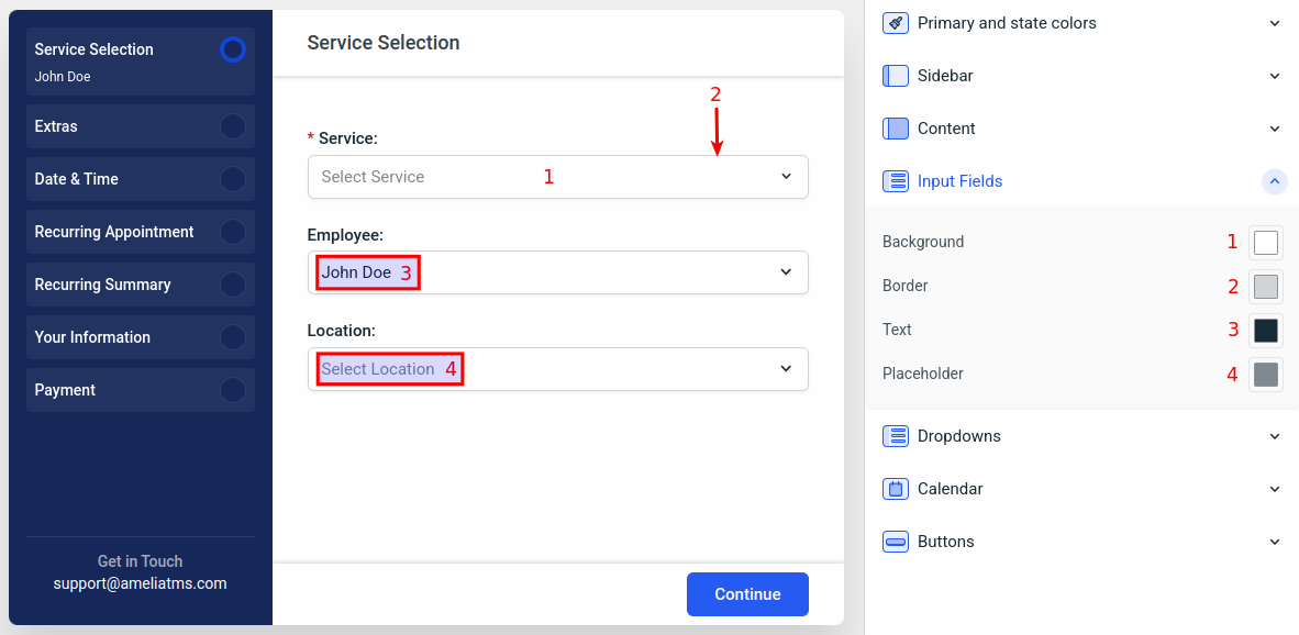
The default colors in the “Input fields“ section are:
- Background: rgba(255, 255, 255, 1)
- Border: rgba(209, 213, 215, 1)
- Text: rgba(26, 44, 55, 1)
- Placeholder: rgba(128, 138, 144, 1)
Dropdowns colors
As simple as it sounds, this section allows you to define the background, border, and text colors of all your dropdown selections.
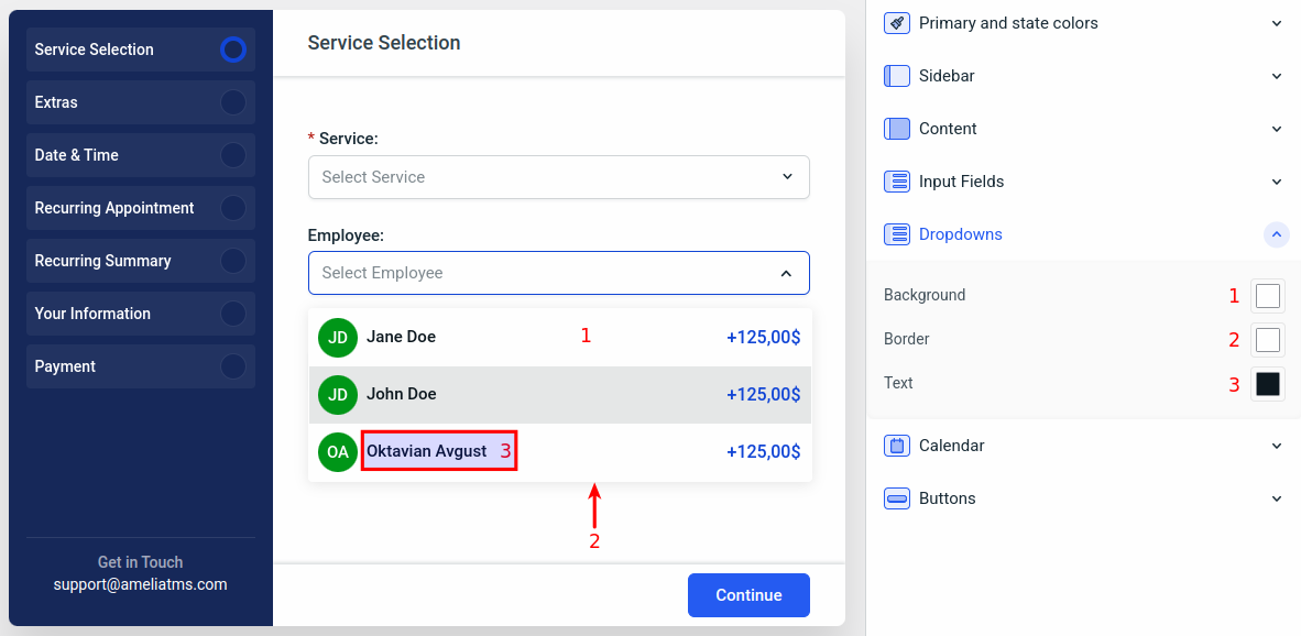
The default colors in the “Input fields“ section are:
- Background: rgba(255, 255, 255, 1)
- Border: rgba(255, 255, 255, 1)
- Text: rgba(14, 25, 32, 1)
Calendar colors
Since the calendar view can’t be displayed in the first step, we’ll back away from the “Colors” section in the “General Settings”, and we’ll move to “Steps” (we’ll access the “Date & Time” step).
Hint: You can navigate back to the right sidebar’s main menu by clicking on the < symbol on top of the sidebar, next to the section’s name.
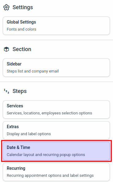
The default view of the “Date & Time” step shows you the calendar and available options for this step. In the screenshot below, you can see that the “Success” color from “Primary and state colors” is applied to the background of the sidebar circle, showing that all selections and inputs of that step have been met.
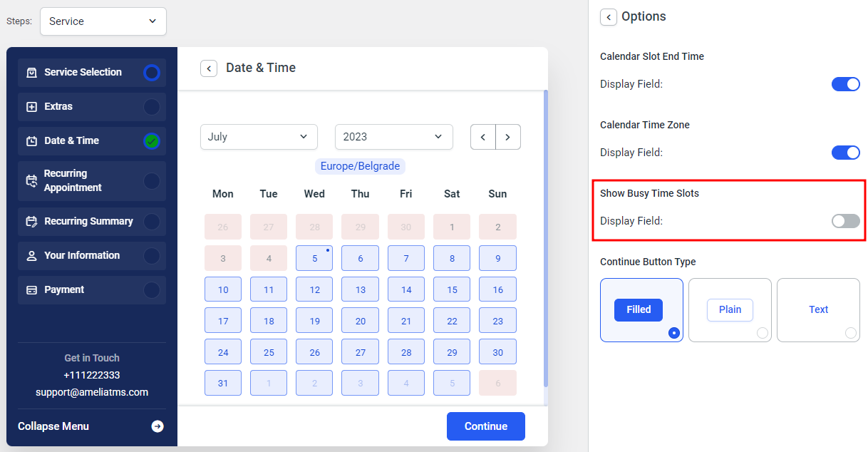
As mentioned before, in the bottom right of the right side menu, you can access the color settings to see the colors that apply to the step you’re on (Date & Time).
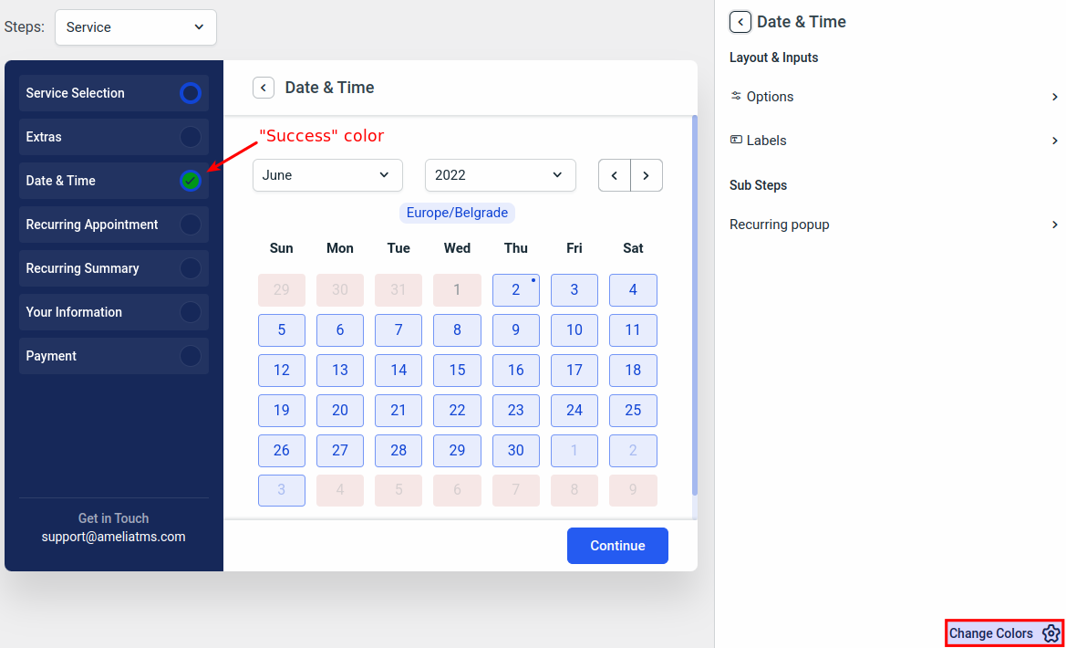
When you click on the “Change colors” button, you’ll notice that the same menu from General Settings is opened. Here, you will be able to navigate to the “Calendar” section, and configure the colors of the calendar.
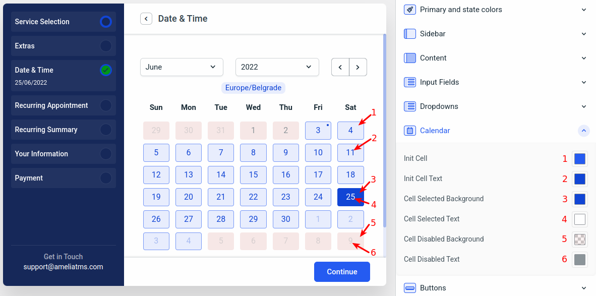
Changing the colors of the “Calendar” step allows you to modify the calendar cell colors (these colors apply both to the calendar and the time slots, and therefore, the available time slots are not visible in the “Customize” section preview).
- Init Cell is the background and the border color of available cells. This color also applies to the “Current time zone” field which is located above the calendar.
- Init Cell Text configures the text color of available dates and the “Current time zone” field.
- Cell Selected Background defines the background of a selected cell.
- Cell Selected Text defines the text color of a selected cell.
- Cell Disabled Background applies to non-available dates (days off, fully booked days).
- Cell Disabled Text configures the text color within disabled cells.
The default colors in the “Calendar“ section are:
- Init Cell: rgba(38, 92, 242, 1)
- Init Cell Text: rgba(18, 70, 214, 1)
- Cell Selected Background: rgba(18, 70, 214, 1)
- Cell Selected Text: rgba(255, 255, 255, 1)
- Cell Disabled Background: rgba(180, 25, 15, 0.05)
- Cell Disabled Text: rgba(140, 149, 154, 1)
Buttons colors
In order to see what “Buttons Colors” do, we’ll again move back to the main menu of the right side menu and access the “Services” step.
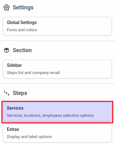
To properly configure button colors, in the “Services” step, select one of the sub-steps. In this example, we’ve chosen the “Bringing anyone with you” sub-step.
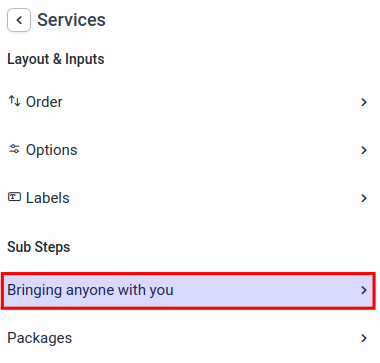
The form preview will automatically expand the “Bringing anyone with you” section where you’ll be able to configure options, labels, and colors. Remember that you can access the colors within each step by clicking on the “Change Colors” button in the bottom right of the right side menu.
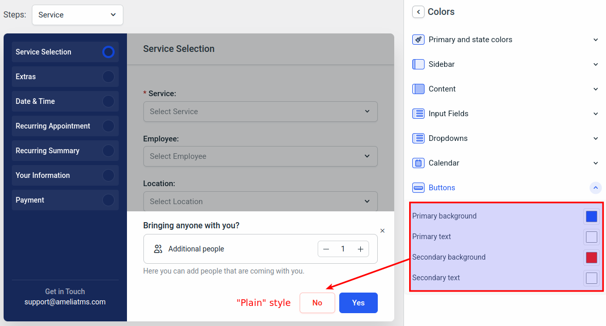
When you access the colors, navigate to the “Buttons” section. In there, you’ll be able to configure the following colors:
- Primary background applies to all primary buttons (“Continue” and “Yes” buttons in all steps).
- Primary text configures the text color within primary buttons.
- Secondary background modifies the background color of all secondary buttons (“No” buttons in all steps).
- Secondary text applies to the text of secondary buttons.
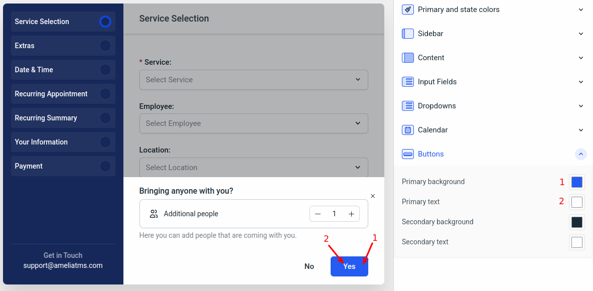
In order to modify the secondary button colors, and to understand why the colors are switching between background and text colors, we’ll need to go back a step.
Remember, we’re configuring the sub-step “Bringing anyone with you” within the “Services” step, so while you’re in the Colors section of the right side menu, just click on the “<” button next to “Colors”, and you’ll be taken back to the “Bringing Anyone With You” customization menu.
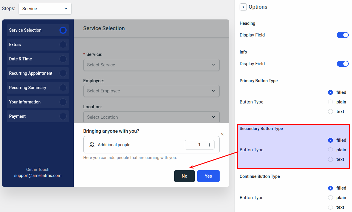
In there, click on “Options”.
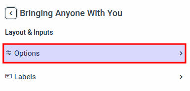
In here, you can see why the colors of the secondary button are reverted. The button’s type is set to “Text” by default.
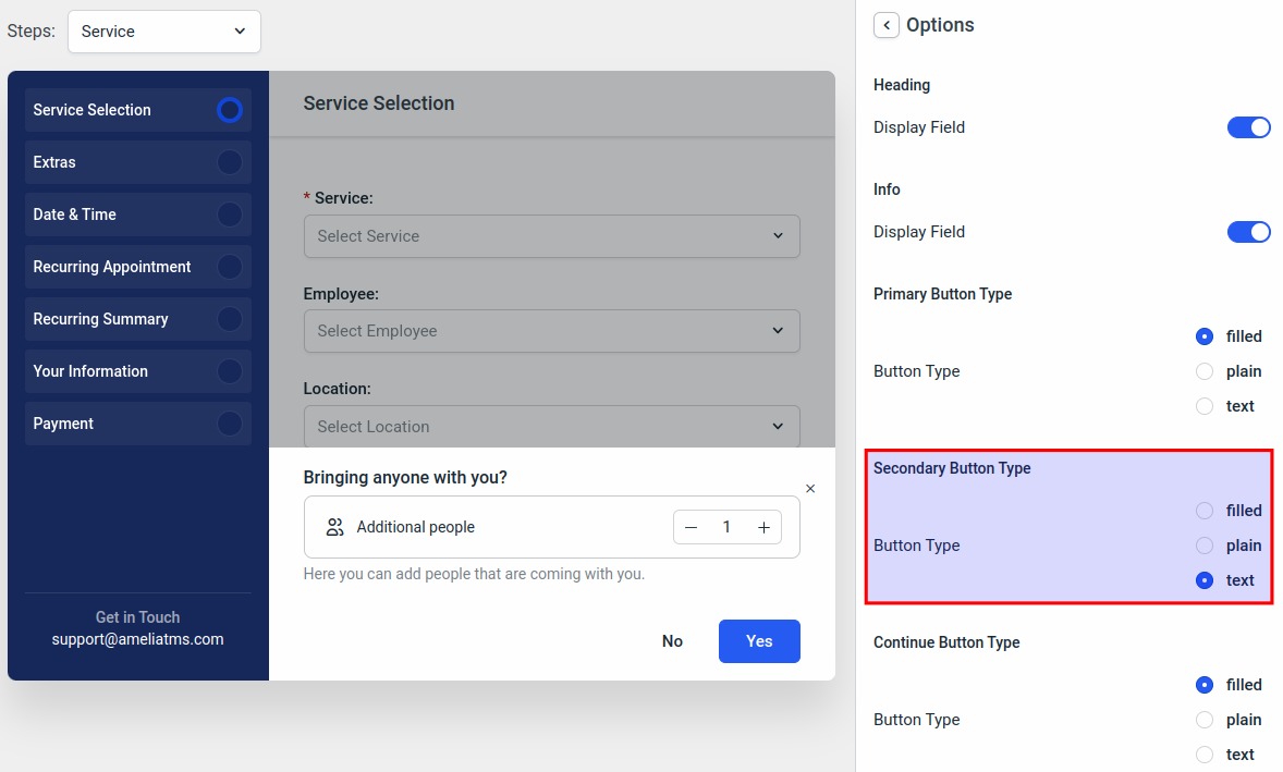
So, in order for the secondary button colors to apply to the background and the text colors from the previous step, change the button’s type to “filled” and you’ll see the colors from the previous step.
The “plain” style of the button will show the button with a transparent background (so the “Main content background” will be the background of the “plain” button, while the “Secondary background” color of the button will be applied to the border, and the text of the secondary button.
The default colors in the “Buttons“ section are:
- Primary background: rgba(38, 92, 242, 1)
- Primary text: rgba(255, 255, 255, 1)
- Secondary background: rgba(26, 44, 55, 1)
- Secondary text: rgba(255, 255, 255, 1)
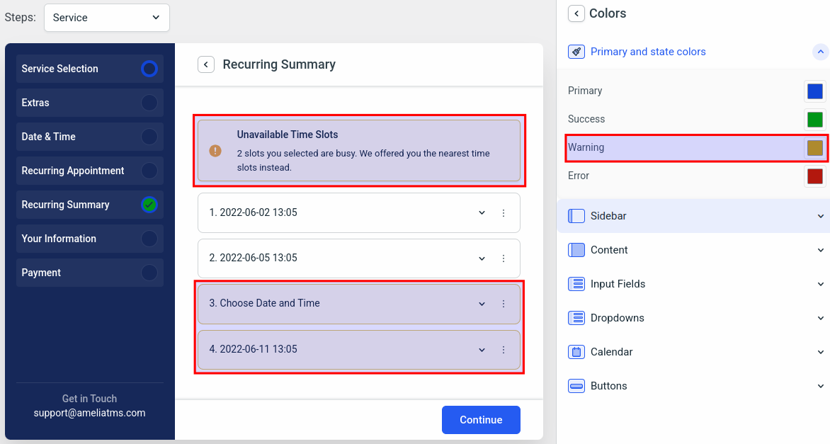
We “owe” you the “Warning” color from the “Primary and state colors” section. In order to see the warning color, access the main screen of the right side menu and access the “Recurring Summary” section.
You’ll be able to access the colors using the “Change colors” button in the bottom right. Here you can see that the warning color applies to the messages that require the customer’s attention.
Click here to go back to the “Primary and State” section.
Section
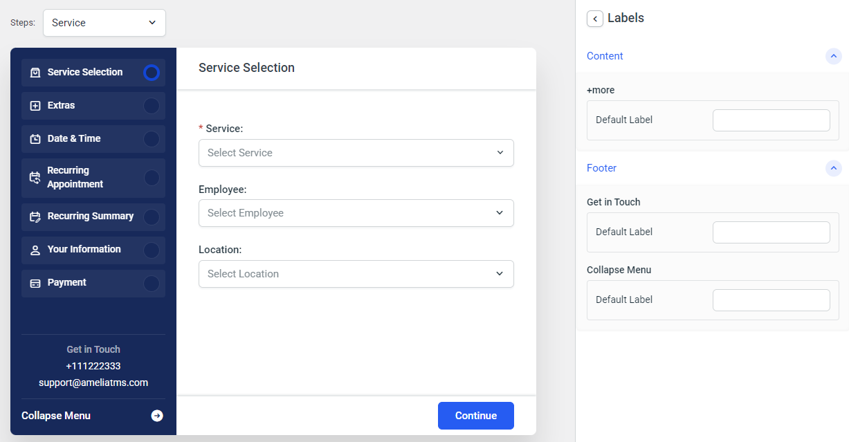
The Section customization setting allows you to hide the booking form’s left-hand sidebar, to hide the heading (“Get in Touch”), to hide the company phone, or to hide the company email (both configured in Settings/Company Settings):
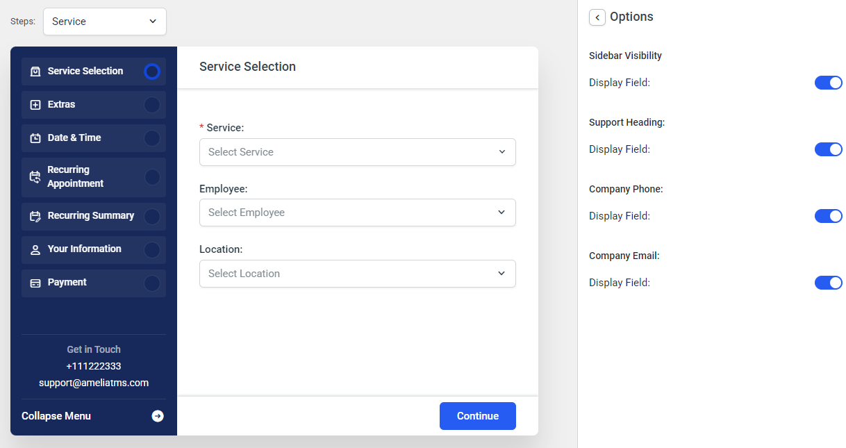
Accessing the Labels section also allows you to change the labels for “+more”, “Get in Touch”, and “Collapse Menu”.
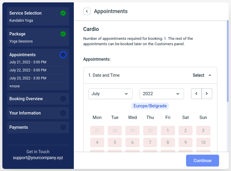
The “+more” string is only shown when a customer purchases a Package after more than 3 appointments have been booked.
Steps and Options
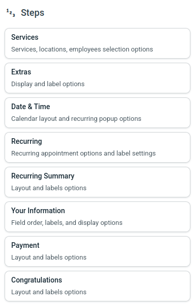
Every step in the Step-By-Step booking form can be individually configured through the Customize section. The options available are:
- Changing the order within the “Services” and “Your Information” steps
- Configuring the fields so they are mandatory or not
- Choosing the button types
- Modifying the default labels for all steps
- Accessing sub-steps and configuring their options and labels (where applicable)
Services Step
When you access the “Services” step, you will see “Order”, “Options”, and “Labels” settings, and below that you’ll be able to access the sub-steps “Bringing anyone with you” and “Packages” (please remember that the Packages feature is not included in the Starter and Standard License plans of Amelia).
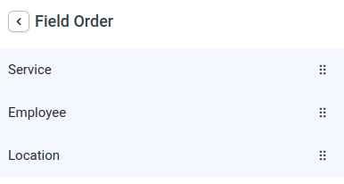
In the “Order” section, you will be able to change the order of fields (by default, the “Service” dropdown is the first field, “Employees” is the second field, and the “Locations” is the third field).
You can reorder the fields with a simple drag-and-drop function.
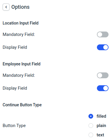
The “Options” section allows you to change the “Continue” button’s style, hide the “Employees” and the “Locations” drop-downs, and make them mandatory.
If a field is set to be mandatory, you will not be able to hide it.
Within the “Labels” settings of each step, you will be able to change all default labels in that step, along with providing translations for those labels for other languages you added to Amelia.
The offered language labels will be pulled from Amelia’s General Settings, so if you only add the German language, only that language will appear when you access each label.
The following screenshot will give you an idea of how editing labels works throughout the new Customize section.
The title of each section is set above the label fields, so in the example below, the “Service Selection” is the title of the label you’re modifying. If the field next to the “Default Label” entry box is empty, the title of the label will be applied as the label (in this case – “Service Selection”).
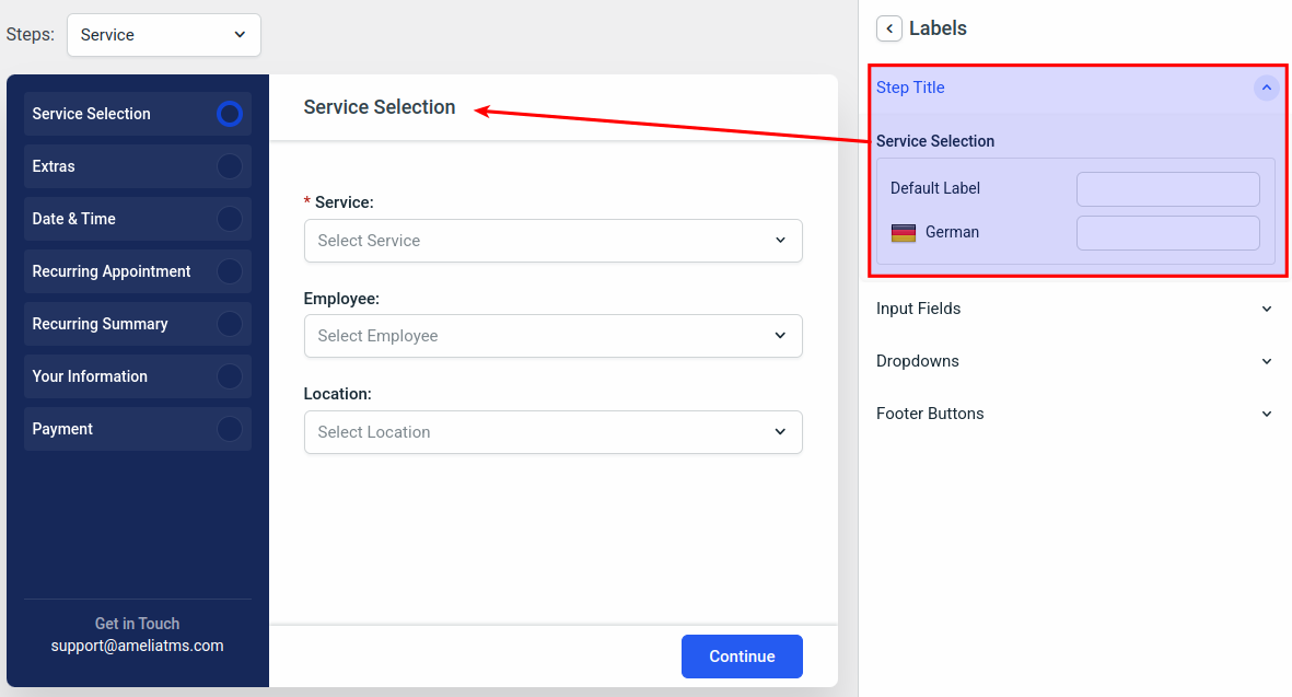
We’ll modify some labels here, so you see how they are applied. Whenever you change a label, you’ll see it being modified in real-time in the preview window on the left.
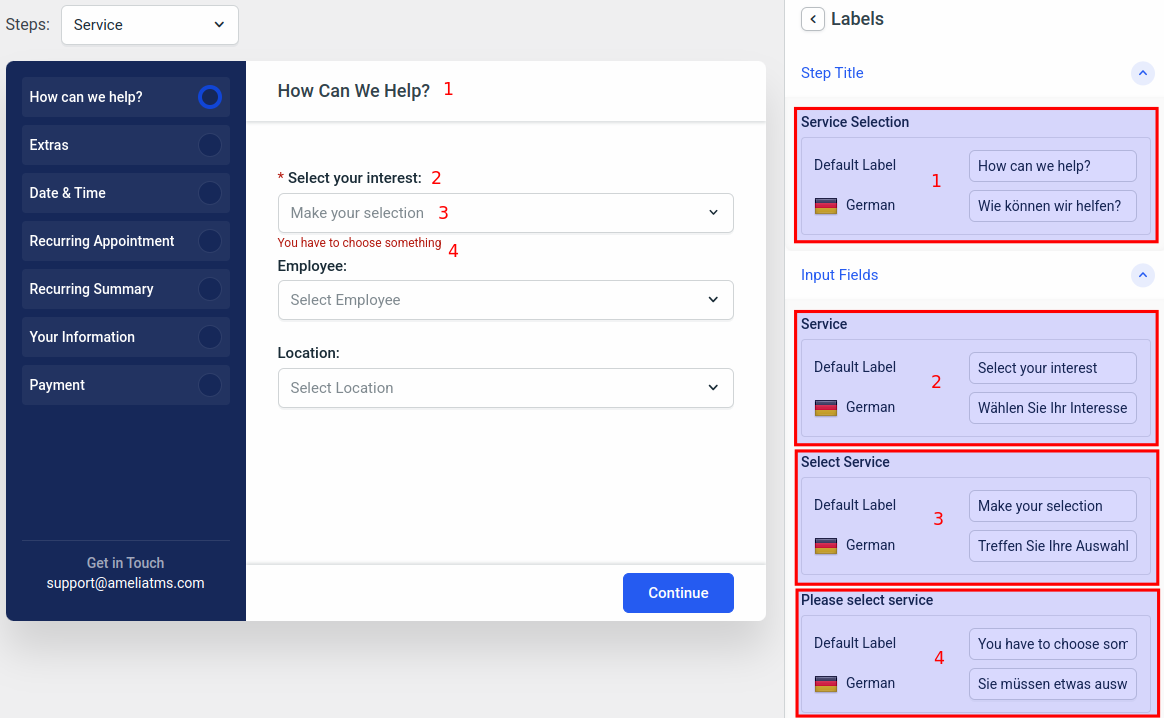
Please remember that the “Default label” applies to the default language of WordPress. Amelia picks up that language if there’s a translation for that language in our plugin (you can read more about languages in Amelia and see the list of translated languages here), so if you want to change the default label, it won’t always be in English, but in your language.
If your language is not translated in Amelia, you can continue changing the strings to your language, so your front-end customers see everything in your language. The same applies to additional languages (German in this case) – since German translation exists in Amelia, if we leave the German labels empty, the default strings will be pulled from the translation file, but you can always override that with the labels in the Customize section.
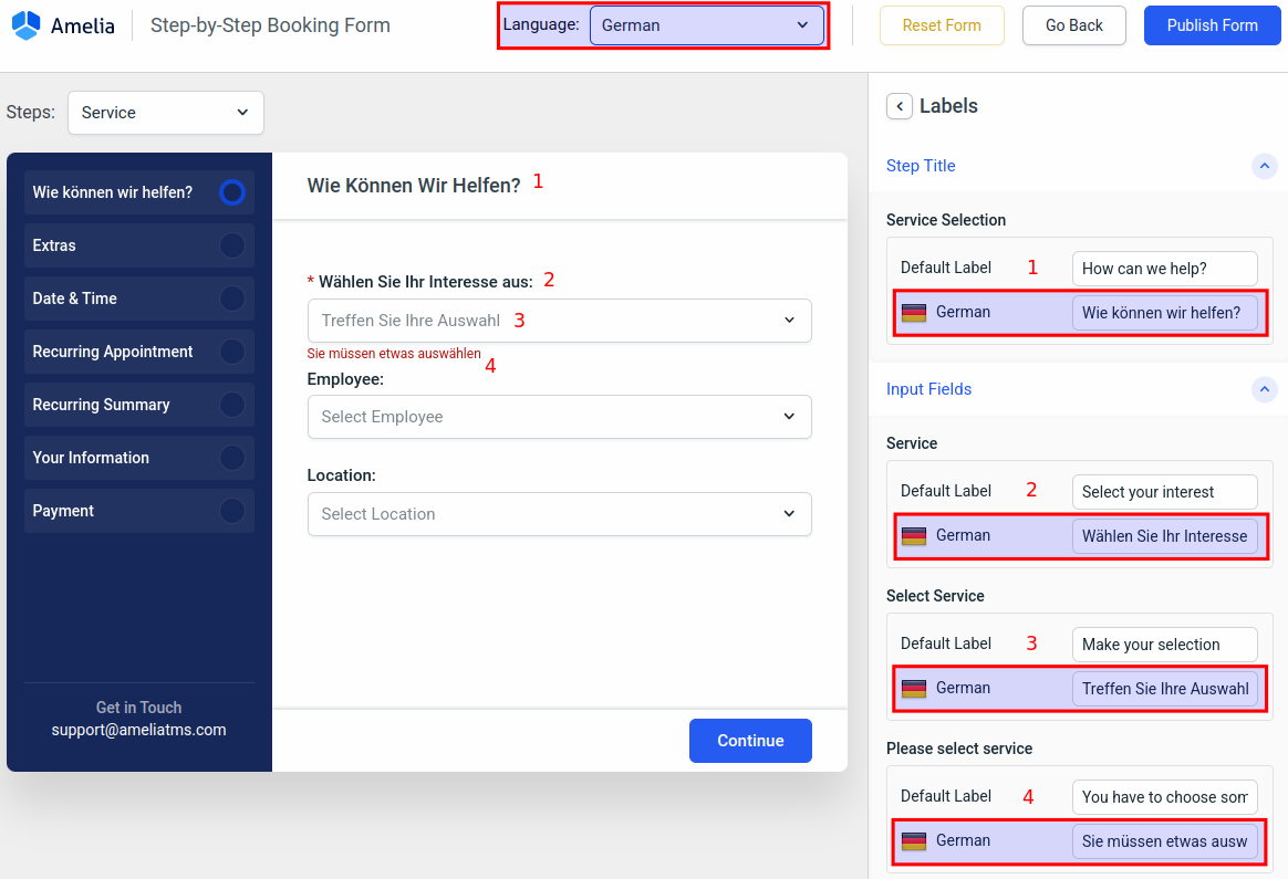
As you can see in the screenshot above, the German strings are currently not being displayed. This is because German is an additional language added to Amelia’s General Settings. If it was set to be the default language, we would’ve added English as the additional language, and the entire form would be in German.
In order to see the modified German labels, we need to change the language in the “Language” dropdown above the form preview.
Every label seen in every step can be changed, you just need to go through the steps and access the “Labels” section in order to do that.
Package Customization
Please note that the Packages feature is not included in the Started and Standard License plans of Amelia.
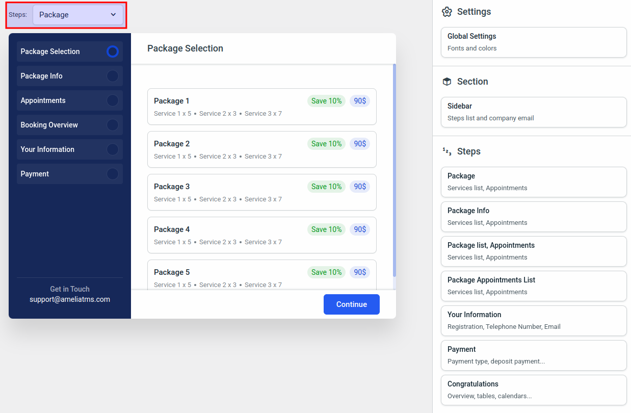
In order to change the appearance, labels, and options for the Packages form, you’ll first need to change the steps from “Service” to “Package” in the top left above the form preview.
On the right side menu, you’ll notice that the steps are a bit different than the steps when you’re customizing the Service steps.
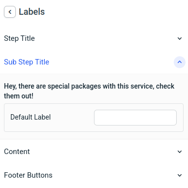
Remember the screenshot from the Step-By-Step Booking Form 2.0 documentation page, where after selecting the service the form mentions there are packages with the selected service included?
In order to change the label of that message, access the “Package” form above the form preview and access the “Package” step / Labels / Sub Step Title.
The flow is exactly the same – you can navigate through the side menu and adjust the colors, options, buttons, and the order of the “Your Information” section.
Simply go through each section and check if the global colors are what you want them to be in the Package purchase form.
Catalog Booking Form 2.0
As mentioned at the beginning of this page, all new forms are based on the Step-by-Step booking form, so in this section, you are able to configure the Catalog Booking form before the date and time selection popup is opened.
Once the date/time (calendar) opens, the Step-by-Step 2.0 customization options will be applied.
Just like with the steps in the Step-by-Step Booking Form 2.0, the Catalog form allows you to edit font and color, and to configure each step before the calendar is displayed.
This is the first screen you land on:
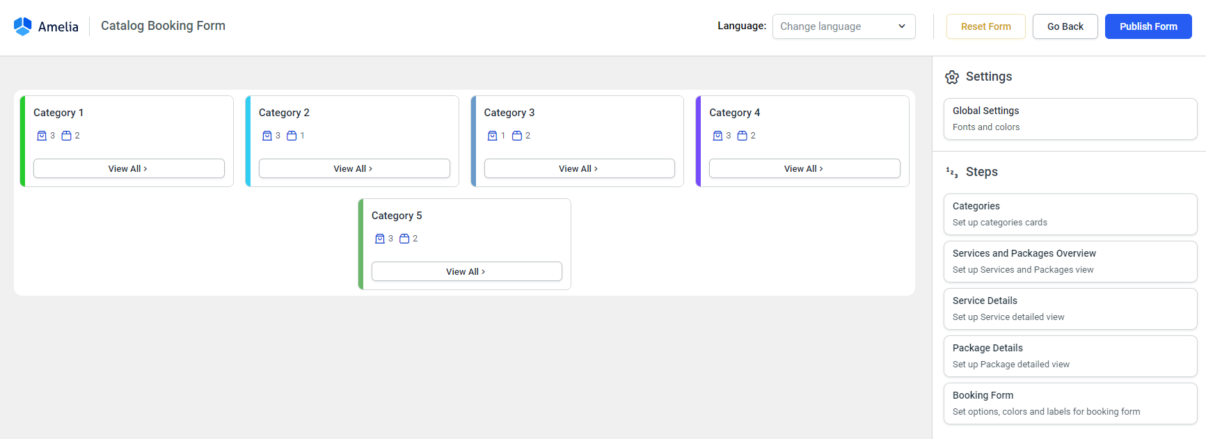
The “Services and Packages Overview” allows you to enable and disable the options that are presented in this window, to choose the button types, and to modify the labels in this step.
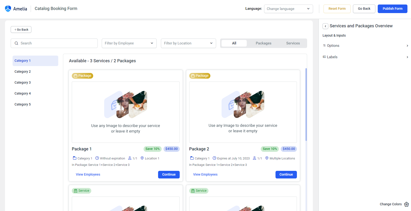
The “Service Details” or the “Package Details” is the window that shows the details of a service once a customer clicks on it. Editing this step will allow you to modify the options (what’s going to be displayed, and what the buttons will look like) and modify the labels of this step.
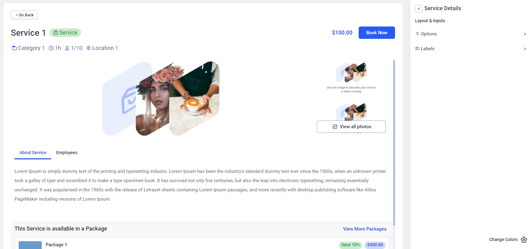
The last step in the Catalog Booking Form 2.0 customize section – “Booking Form” will redirect you back to the Step-by-Step Booking Form 2.0 customize section.
Events List Booking Form 2.0
Similar to previous booking forms, the “Events List Booking Form 2.0” customize section allows you to modify the steps of the Events List.
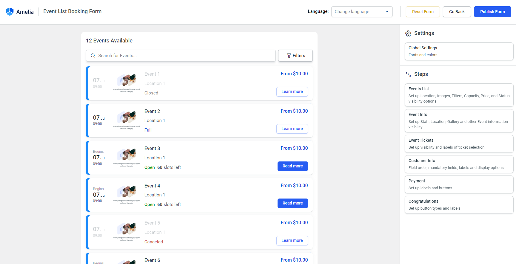
The “Events List” step provides you with Options and Labels that you can adjust for the first view (screenshot above). You can hide filters, the title of the step (how many events are available), the event image, location, capacity, price, and status. Also, you can change the types of all buttons present in this step.
The Labels option allows you to change the default labels displayed in the list.
The “Events Info” is what the “Read More” button opens up in a popup when a customer clicks on it.
In the Options section, you can hide the gallery, location, Slots Capacity, Price, Status, Description, and so on. You can also style the buttons in there.
In the Labels section, you can change the labels displayed in this step.
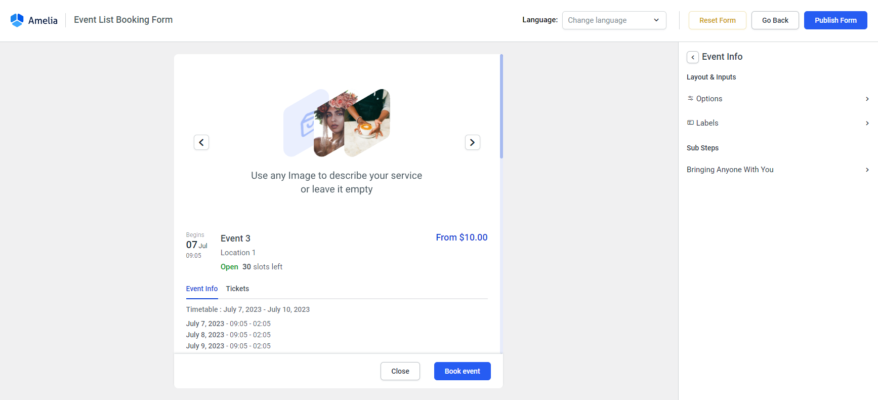
All other steps in the form are similar, so we won’t go through all of them. This article is already quite detailed.
Simply go through all the steps in the Customize section, and configure what you want to hide, change, reorder.
Front-End Customer Panel 2.0
Login
Once the “Customer Panel 2.0” form is accessed, you’ll first be presented with the login screen preview. In the drop-down menu above it, you can switch to the panel preview.
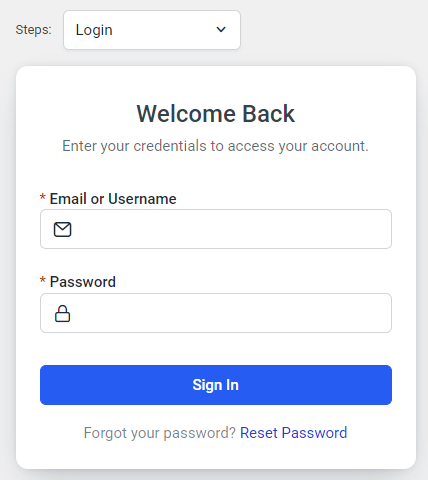
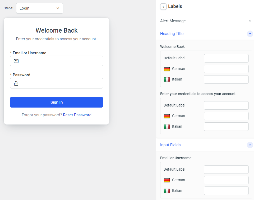
While on the “Login” preview, you’re able to modify the following steps:
- Sign In, where you can modify the “Sign In” button type, and the labels that appear in this step
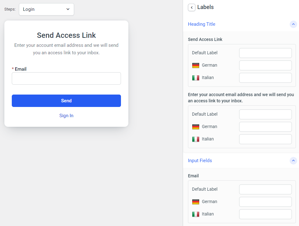
- Access Link, where the “Send” button type can be changed, along with the labels that appear in this step
- Access Link Success allows you to only edit the labels shown on the page when the access link is successfully sent to the customer.
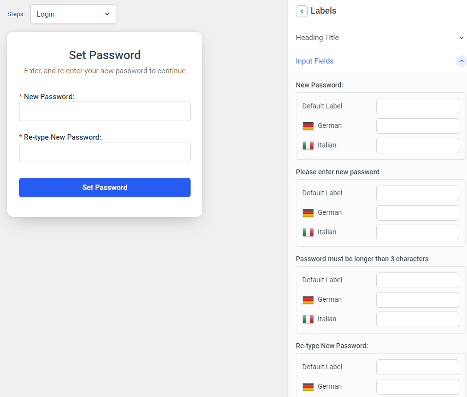
- Set New Password, where you can configure the type for the “Set Password” button, and modify the labels of this step.
Panel
Switching to “Panel” in the drop-down menu above the “Login” preview will bring up the actual Customer Panel for customization.
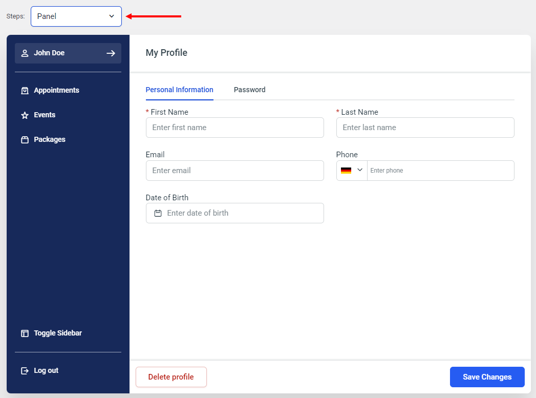
The steps included for the Customer Panel provide you with the following pages within the panel:
- Profile (shown in the screenshot above) – Allows you to change the field order, change labels included in this step, make certain fields mandatory (or hide them if they’re not), and select button types for the “Delete profile”, “Save Changes”, and “Change Password” buttons. Also, there’s a “Delete Profile” popup sub-step that pops up when a customer goes to delete their profile. This sub-step allows you to modify the button types and labels shown in this popup.
- Appointments (screenshot below) – Opens up a separate page within the panel, where your customers preview the appointments they booked. Along with the default “Options” and “Labels” options, the step popups for appointment cancelation and rescheduling provide you with options to modify these popups (change button types and labels, exclude the time zone in the calendar, or the “End Time” in the calendar).
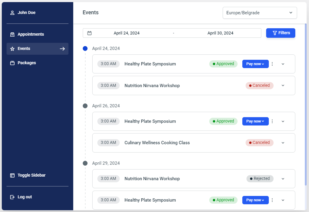
- Events (screenshot below) – Similar to the “Appointments” step, the “Events” page (within the panel) allows your customers to see the events they booked with you. Here, you can modify the options, labels, and the “Cancel Event” popup.
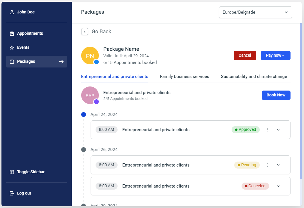
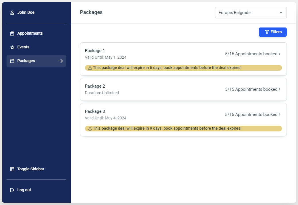
- Packages (screenshot below) – “Options” and “Labels” allow you to hide certain fields from this panel page (Time Zone and specific filters) and to modify the predefined labels of this page.
- Packages Appointments (screenshot below) step provides you with comprehensive customization abilities for the specific package-related appointments that were booked and/or are available for booking through a package. Apart from the “Options” and “Labels” sections where you can change button types, hide the employee and the price, and where you can change the labels of this step, you can also modify the popups for booking additional appointments within the package, and confirming that the package should be canceled.
