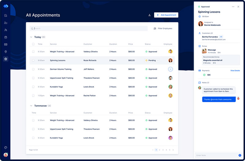
It is advantageous to have a hair salon website. A hair salon website’s job is to attract new clients, showcase work, and manage appointments.
To survive these difficult economic times, many hair salons have added an eCommerce shop. Or they have kept their business popular by providing tutorials on their website.
To have these features, a beauty website needs to be well designed. This article will highlight the aspects necessary for an outstanding hair salon website. It will also discuss inspirational hair salon website designs.
Outstanding Features of Hair Salon Websites
A website that attracts and retains visitors needs to have an uncomplicated and straightforward design. It should also have an appealing appearance that makes it stand out against the competition.
Here are some fundamental features that make a standout hair salon website:
Informative
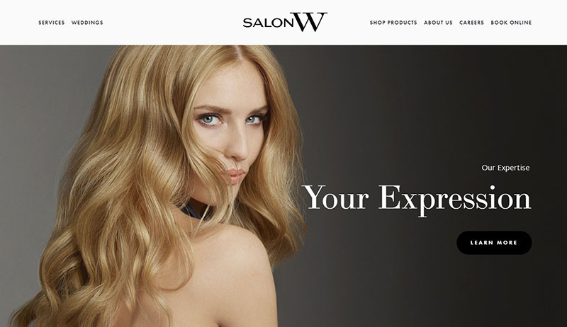
Good websites provide customer service in the form of accessible and organized information. A hair salon website needs to show the services provided, prices, and the location of the business.
To get more traffic, websites strive to be on the first page results of a search engine. The key to maximizing search engine results is to know your target audience and then publish specific desired content on the website.
Appointment booking
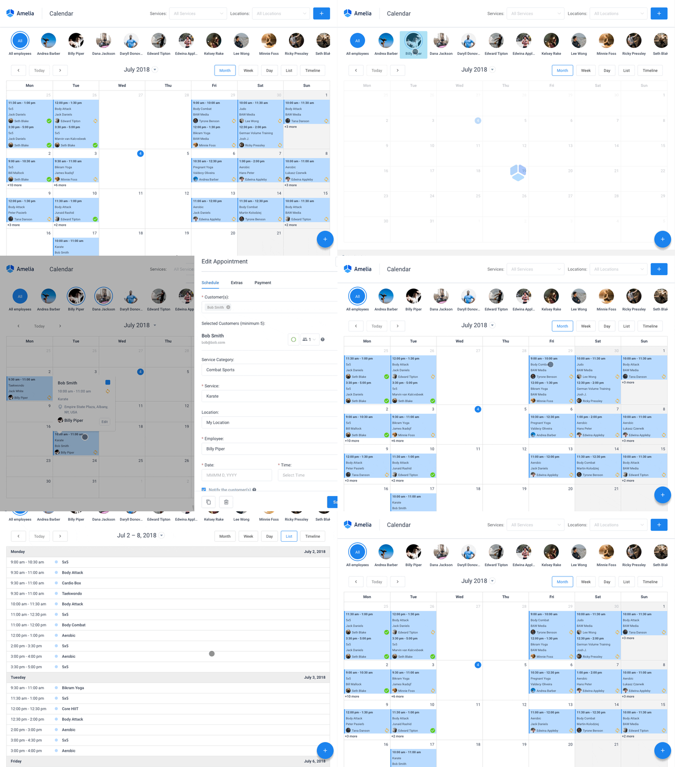
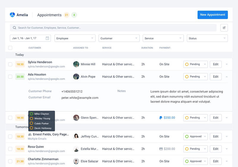
Hair salon websites should include clear options for visitors to schedule appointments. The best strategy is to offer booking options throughout the website but especially on the landing page. A comprehensive booking system will allow visitors to pick which stylist they want to book for a service.
Get more bookings with the right tool for the job
Staying organized has never been easier.
You can now manage your business and grow your brand with a single, powerful WordPress booking plugin that keeps all of your appointments in line, your clients organized and your business booming.
Amelia is perfect for business owners who need to streamline their booking experience both for their staff and their clients.
Amelia handles everything for you, even sending automated email or SMS reminders to your clients. No-shows? Not anymore!
The Amelia WordPress booking plugin adapts to different industries for a blissful online booking experience and employee management.
Want to know more? Check out Amelia’s awesome features to see what you are missing.
Online payment
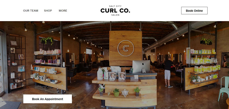
Another crucial feature of hair salon websites is to allow clients to pay online. This is especially helpful to sell products or tutorials online.
Responsive
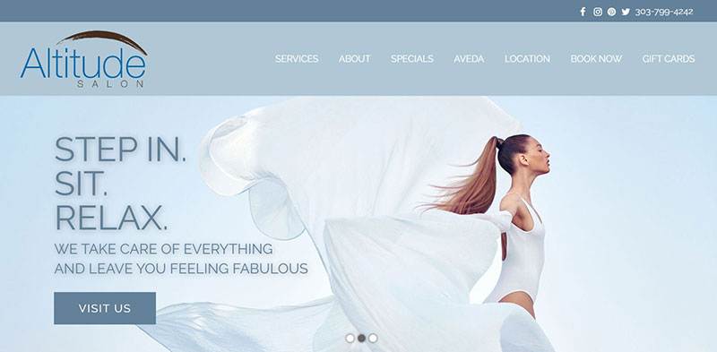
A good website allows customers on any mobile device to enjoy and use the features.
Here are some features that make hair salon websites appealing:
Astra theme: The Ideal Choice for Creating Hair Salon Websites
When it comes to creating a website as trendy and functional as your hair salon, Astra stands out as the go-to choice. Imagine capturing your salon’s ambiance right on the homepage with a full-width header image, much like Fringe Hair Salon’s inviting interior visuals.
Whether you operate a single salon or have multiple locations, Astra gives you the latitude to tailor each page to your specific needs. From detailed maps and operating hours to eye-catching galleries showcasing your services, this WordPress theme delivers a seamless, customizable experience.
But Astra’s versatility doesn’t end there, Astra places special emphasis on intuitive Call-to-Action (CTA) elements. Your visitors won’t just admire your services; they’ll be prompted to make bookings right there and then.
In a market where a compelling online presence can be the difference between a loyal client base and a missed opportunity, Astra offers comprehensive and multiple salon templates that are well-suited to the needs of modern hair salons.
Creative visual layout
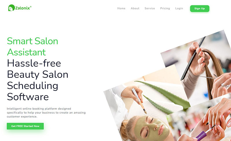
The visual layout of hair salon websites can vary but primarily the website should be beautiful. Some key design concepts include using whitespace, bold typography, and a simple color scheme. Parallax scrolling and animations can add an extra creative effect.
Images and videos
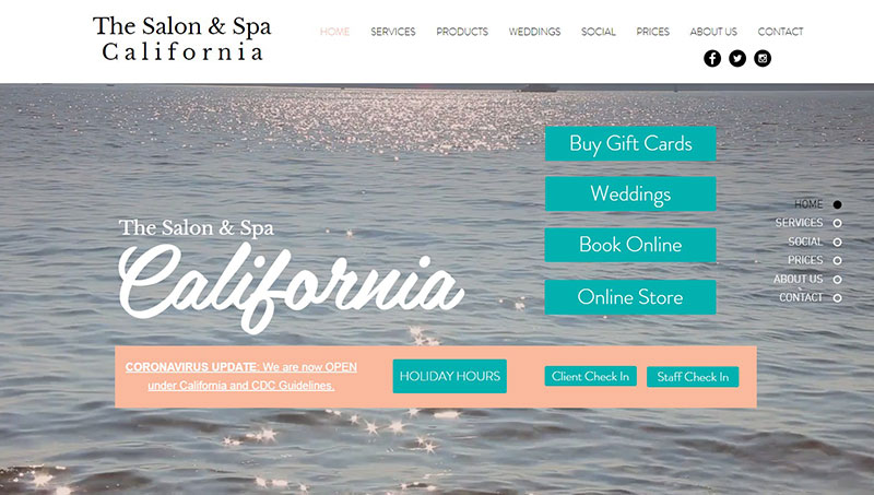
A picture is worth a thousand words, especially in the beauty industry. A good hair salon website showcases its work with a photo gallery. Photographs displaying clients before and after, the salon interior, and equipment pictures impress visitors. Displaying a portfolio for each stylist introduces the team to potential clients. This introduction encourages them to book an appointment.
Stunning Hair Salon Websites
Fringe Hair Salon
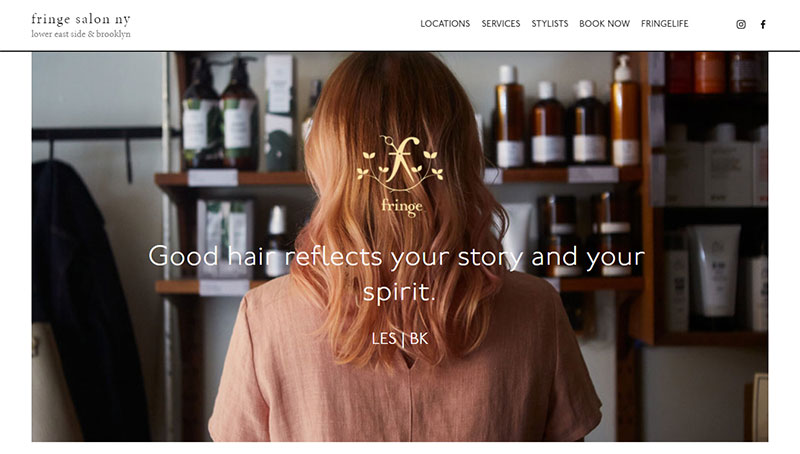
This website introduces the visitor to an interior salon image. Visitors are also greeted by the logo and a catchy tagline that reflects the personality of the salon. The website also identifies the salon’s two locations.
The separate locations each have their own page. The page displays pictures, maps, and the hours of operation for each location.
An outstanding feature of this website is an entire page devoted to the services provided and their prices. Another page introduces visitors to the stylists.
Images appear on different pages to showcase their work and attract new clients. Call-to-action buttons are placed throughout the website to encourage visitors to book an appointment.
The bottom of the landing page showcases the salon’s work with client pictures. The website produces traffic enticing content. The footer allows visitors to navigate, subscribe, and follow social media pages.
Eight Five Zero Salon
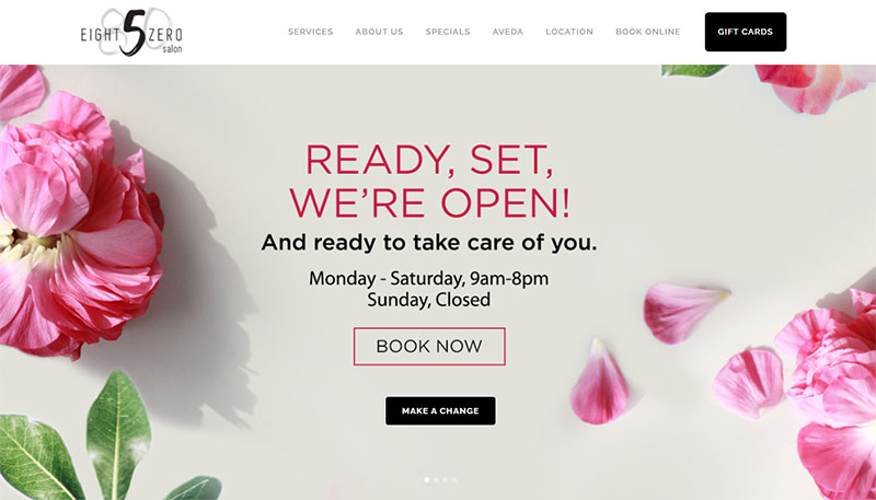
The Eight Five Zero salon has a short, simple yet elegant landing page. It greets visitors with a beautiful hero slider.
The page displays accessible call-to-action buttons. It has a fixed header and a fat footer to make information accessible. It uses slight parallax effects to add to the creative feel of the site.
Drybar
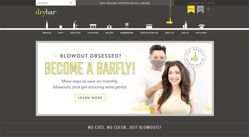
The Drybar expresses its personality and reinforces its brand throughout the website. The designer emphasizes the logo colors by using them throughout the website. The website offers a unique adult perspective by naming the hairstyles offered after trendy alcoholic beverages.
The website also includes an online shop, instructional videos, and a photo gallery. In the website footer, visitors are invited to subscribe with their email increasing potential client contacts.
Crowsnest
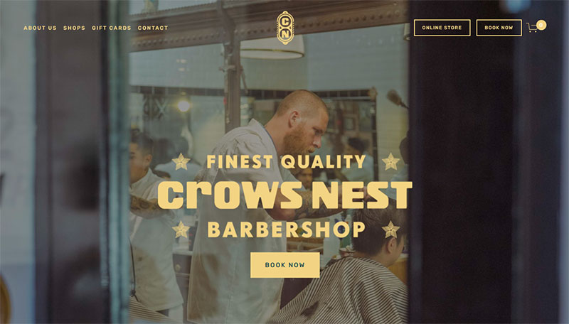
This barbershop website provides a great example of how to impress potential customers. It welcomes visitors with a sharp interior image of the salon and a call-to-action (CTA) button.
The color scheme, typography, and images complement each other. The homepage displays each location of the barbershop and its booking CTA.
The website offers the option to purchase products like barbershop gift cards and shirts to support causes close to the salon. Visitors can watch a video explaining the passion and story behind the salon. The bottom of the homepage encourages visitors to sign up for news and promotion emails.
TONI&GUY
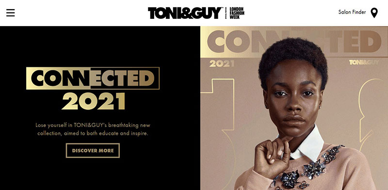
The website for TONI&GUY is full of information. It sells products, books appointments, includes a magazine, and career information.
Call-to-action buttons are effective tools, which appear throughout the website, encouraging visitors to take the step from viewer to client. Visitors can book appointments, sign up for classes, or buy products.
Another effective tool used by the website is the simple fixed header. The header offers visitors the option to navigate the site or find the location of a salon. Social media buttons at the bottom of the webpage invite visitors to share with others.
Groom Service
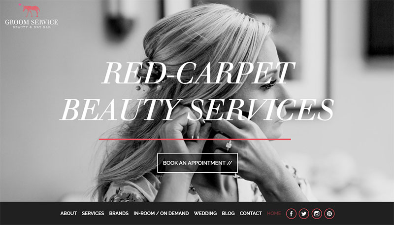
Landing on this salon’s website reveals a clear “book an appointment” CTA. Below that, the website displays a menu that prioritizes services offered and featured content.
The homepage displays featured services and a few short paragraphs explaining the service. The website also includes a blog that discusses all types of beauty tips and features beautiful pictures of the salon’s work.
Salon Safari
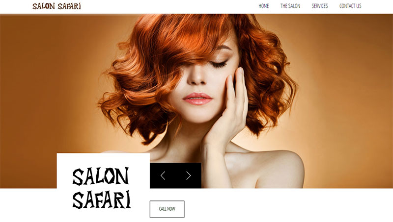
Salon Safari is a one-page website. First, the site opens to beautiful pictures. A visible CTA invites potential customers to call the salon.
Next, the site displays a video and pictures of the salon interior. Further down, testimonials appear on a slider.
Following this is a list of services provided and their prices. Another CTA, a map, and hours of operation are cited at the bottom. Some of the creative aspects of the website include the parallax effects and unique typography.
Overall, this website is uncluttered, practical, and appealing.
Lisa Dinh Hair Studio
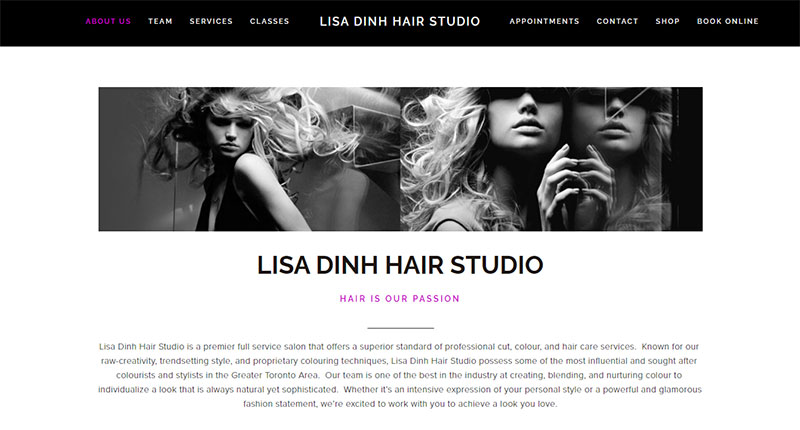
This hair salon website offers plenty of of information, well-organized under the header. From here visitors can navigate the site or book an appointment. The website offers hair appointments, the purchase of hair products, and educational classes.
Another great feature of the site is the way it emphasizes the team of stylists. Staff profiles for each stylist display a picture, a personal message, and a video bio. Some additional features include a behind the scenes video, contact information, and a showcase of the stylists’ creations.
Abel’s On Queen
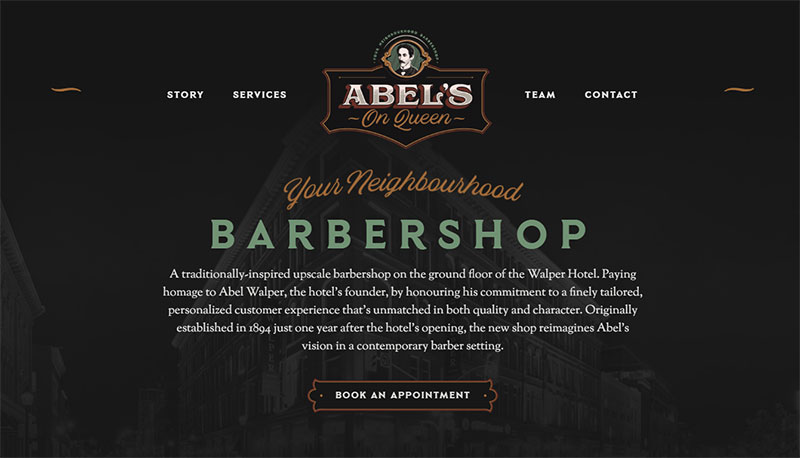
Abel’s On Queen is an example of a simple one-page hair salon website. The soft colors, strong typography, and dark background create an elegant style. The header is strong and simple and allows visitors to navigate the site quickly.
The landing page welcomes visitors with the clear message that it is a barbershop website. A call-to-action button is visible so visitors can book an appointment as soon as they land on the page. The striking images displayed, stand out against the dark background.
Fabio Doti Hairdresser
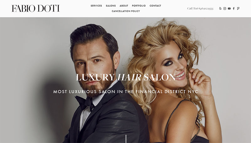
This website is luxurious, yet approachable. The landing page is simple, concise, and contains all the necessary information.
Options to navigate the site appear in the header to maintain a simple layout. The header also includes contact information and social media buttons.
The opening image appeals to both men and women. Below, the services are organized into categories and represented with an attractive image. Call-to-action buttons direct visitors to schedule an appointment at the desired location.
Cleverly, the portfolio features pictures of clients from social media accounts. The footer uses a smart marketing technique of inviting visitors to subscribe to promotional emails.
Ginger Salon
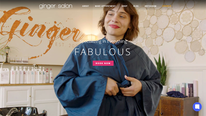
The website for Ginger Salon ensures appointments are easy to book. The home page displays a background video and a booking CTA.
The website has an AI bot to help visitors book appointments. For more information, visitors can travel to other pages. The header contains options for navigating the site.
The pages of the site explain services, prices, salon locations, and more. The website also has a blog that provides beauty information.
A shop offers gift cards and beauty products available for purchase. The header also includes a tab directing visitors to the salon’s Instagram page. There, visitors can check out the salon’s work.
Cuts & Bruises Barbershop
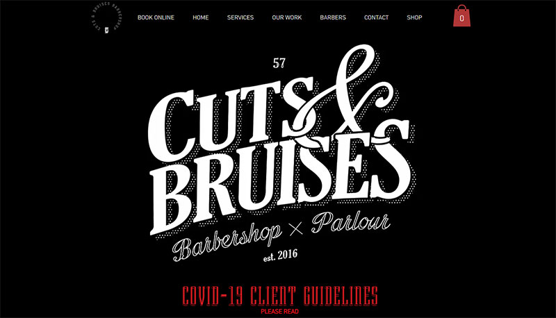
This barbershop website opens to its logo and displays two CTAs, one to shop or another to book an appointment. Some standout elements are the social media buttons found in several places on the site. Trendy, fun videos immerse visitors in the salon’s brand experience.
The floating header includes the option to book an appointment so visitors can easily schedule an appointment. The website showcases the salon’s work with pictures.
A map highlights the salon’s location. A shop makes products and Barbershop branded clothes available for purchase.
Fourteenjay
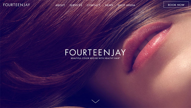
Fourteenjay is a hair salon website with an attractive minimalist style. The homepage is concise and the website contains only a few extra pages. It is a great example of presenting information in a simple layout.
The great use of whitespace helps this website maintain a minimalistic look. Content is spaced appropriately so as not to overwhelm the visitor.
The landing page opens to a closeup, full-screen picture. A “book now” CTA appears in the header so visitors lose no time if they want an appointment. The short homepage directs visitors to the news section of the website where it presents haircare articles.
Bleach London
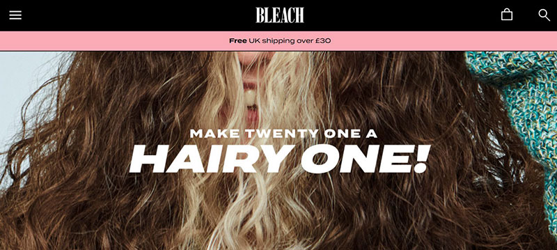
The Bleach London website combines colors and parallax scrolling to create a fun and alluring site. Each section of the homepage has a different color and contains entertaining pictures.
The purpose of the site is to sell hair color products. The website appeals to potential customers by presenting vibrant images of different hair colors.
This website is a good example of providing the information that customers need. The small menu directs visitors to relevant information.
CTA buttons appear in each section of the homepage. Instructional videos are provided for additional help.
FEVERFEW-Stag Hair Parlor
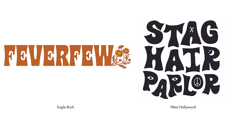
The website for this salon is unique and provides a good example of thinking outside the box. The landing page is designed in a 70s style format.
Visitors have to choose between two salons located in different areas. Once they click on the salon they are directed to the webpage for that salon.
The webpages maintain a simple appearance with few options in the menu bar. Both web pages display a list of services provided and introduce the stylists. Most importantly, both pages allow visitors to book an appointment.
Boardroom Salon
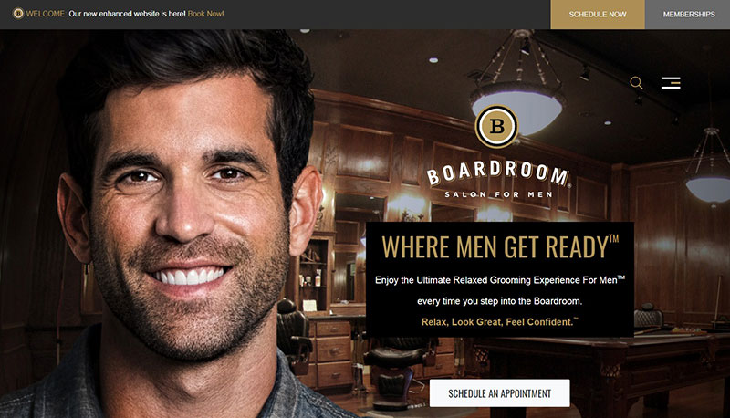
The Boardroom Salon is designed to provide an exceptional grooming experience for men. The website successfully conveys that idea.
The images, font, and layout create a rugged look appealing to their target customers. The layout is simple, uses whitespace appropriately, and keeps the information organized.
The website focuses on making a sale. Throughout the site, CTAs invite visitors to book an appointment, become a member, or buy a gift card.
Useful features include the statistics about how many clients the salon has served. The website includes a section devoted to displaying testimonials from satisfied customers.
Lavish Salon
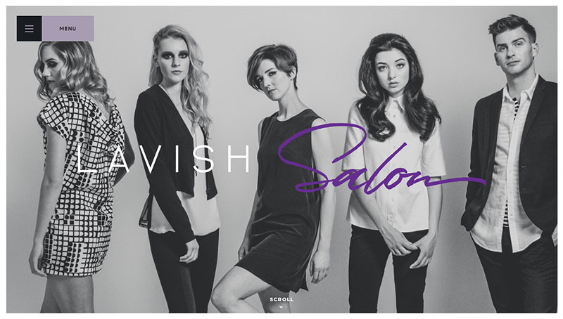
Lavish Salon has created an equally lavish website. Large typography, well-placed content, and soft colors make this website appealing. The homepage is simple and emphasizes the news content.
The footer encourages visitors to sign up for the newsletter. A menu button and book an appointment button appear in the top left and right corners of every page of the website.
The menu displays options to navigate the website and contains location information and hours of operation. A lookbook showcases pictures of the salon’s work. The website also lists services provided and introduces the stylist team.
Ending thoughts about hair salon websites
It can be challenging to design a hair salon website that attracts new clients. The points mentioned in this article can help create a functional and appealing hair salon website. Drawing inspiration from already successful hair salon websites is also helpful.
Organized information and quality images are key aspects of a beautiful website. Another important aspect is a way for visitors to book an appointment online.
Adding a booking feature to a hair salon website generates appointments and thus more income. It allows clients to see available scheduling times for different stylists.
Clients receive confirmation messages and appointment reminders. Ideally, they can also pay for an appointment online.
For a WordPress website, a great booking plugin is Amelia. Amelia provides a simple, step by step booking system for clients. It synchronizes with Google Calendar so stylists can manage their own schedules.
Clients can select the stylist, location, service, date, and time from the booking system. Conveniently, they can pay for the appointment using PayPal or Stripe. Amelia integrates with WooCommerce to provide other payment methods and manage taxes and invoices.
For a website that is not WordPress, Trafft is a schedule managing software compatible with any platform. It simplifies the booking process, helps stylists manage appointments, and enables clients to pay online.
Without a doubt, hair salons thrive with a well-designed website and an online booking system.
If you enjoyed reading this article on hair salon websites, you should check out this one about hair salon names.
We also wrote about a few related subjects like How to upsell salon services, beauty salon names, salon bookers, salon promotion ideas, how to open a hair salon, how to open a spa, salon booking app, salon pricing, salon management, spa website, spa advertisements, spa scheduling software, spa WordPress theme and salon booking system.
