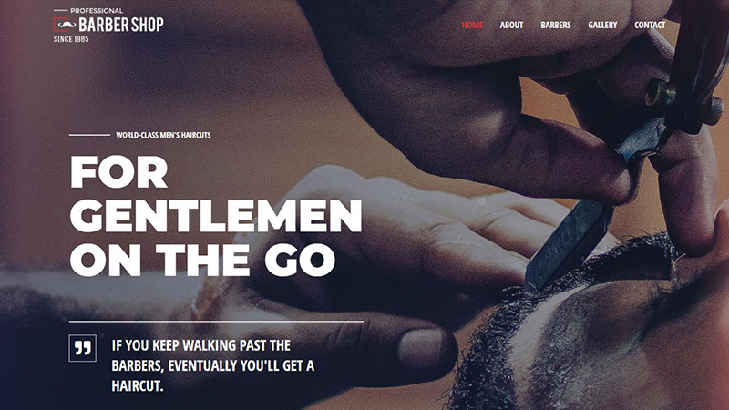
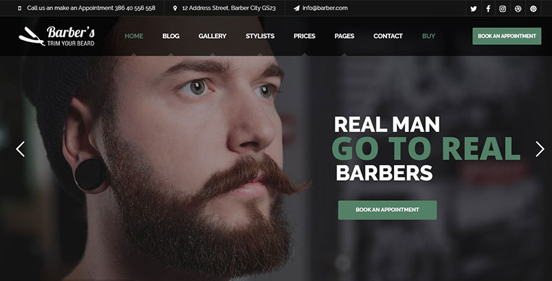
We all know that owning a barbershop business is much more than cutting men’s hair.
Barbering has come a long way from the early 17th century when barbering meant trimming la barbe, which is French for a beard. A contemporary barbershop is a full-service business. Besides taking care of your whiskers, your barber will deliver a package of hair care and hair styling products, topped off by a quick massage.
We can see this diversity in the best barbershop websites. When having a look at the good ones, you can’t help but wish you had a barbershop website like that. The good news is that WordPress themes provide the framework with which you can present your services and your products.
A good barbershop website will help to improve your customer’s experience and promote your business. You want all the relevant information packed into an eye-pleasing presentation, to make it easy for customers to book an appointment with you.
Table of contents
How to Create One of the Best Barbershop Websites
Serious barbershops reflect individuality and professionalism in their barbershop websites. That’s what customers like.
We can do this too by learning from the best barbershop websites we can find online, and by molding our goals into our customized style. WordPress themes help us to replicate and personalize impressive barbershop websites.
Before we get to that, let’s take a look at a few basic rules.
First impressions: the look of our barber website
Your aim should be to reflect the look and feel you have created in your salon or barbershop. A retro barbershop should have a retro-looking website; an ultra-modern salon should go for a similar aesthetic on its barber website.
We create concise content
You must keep your content readable. Big chunks of text, divided into long paragraphs don’t invite your readers to stick with you.
Only say what you have to say and what you think your customers are interested in. Use lists, bullets, numbering, and sparsely highlight your text with bold and italic. Keep it exciting and pleasant for the eye. And as a side note, don‘t go overboard with the adverbs. They rarely help you get to your point.
Let’s use appointment booking forms
Good content leads to action. The call to action you want is customers booking appointments. Why not make the booking process easier and use a booking form?
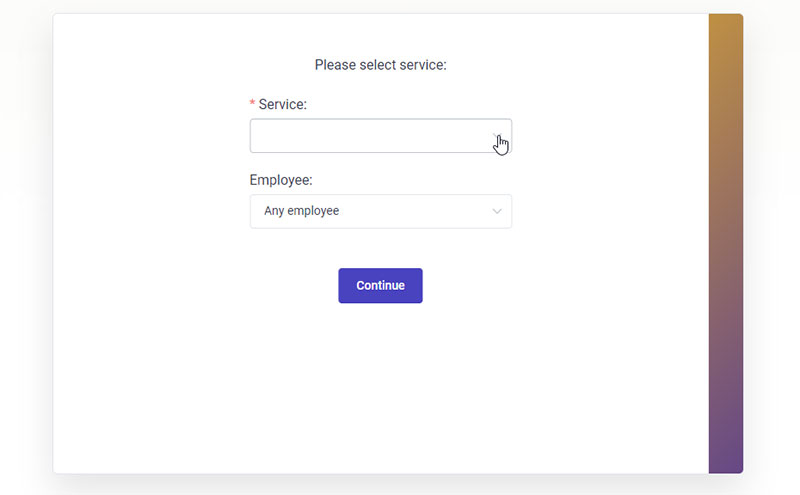
WordPress offers a range of appointment booking plugins. They offer something for everyone, and certainly for the needs of your target market.
We suggest using Amelia, which is in our biased opinion, the best out there. Here’s more info about Amelia and you can see for yourself how it can help you.
If you have a WordPress site and are looking for an online booking system, Amelia could be just what you need. It works efficiently across industries. Whether you own a salon, gym, spa, medical practice, or law office, it’ll work beautifully for you.
Amelia works perfectly with all the latest WordPress themes out there. No matter how complex your demands are, you can easily customize and automate the booking process for your small, medium, or enterprise company, or even for your personal WordPress site.
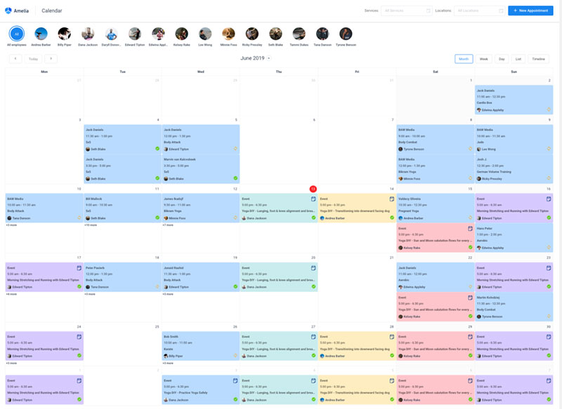
The Amelia booking system has all the tools you would need for managing events and appointments. It won’t require much effort from you at all. Just set up the events and watch this WordPress reservation plugin do its magic.
And on the user side, it’s even better. Its easy-to-use booking form makes it a breeze for users to book an appointment.
Here are some of this booking plugin’s features:
- SMS notifications
- WooCommerce integration
- Google Calendar sync
- Custom fields for your booking forms
- Calendar and list view
- Email notifications
- Payment gateways
- And a lot more which you can check out here.
How to use Amelia with Elementor to create a booking page
You’d be a bit surprised if we told you how easy it is to use Amelia with Elementor.
When using the regular editor, the process would be like this.
When you have created Employees, services, and/or events in Amelia, you can add them on the front-end using our shortcodes, like:
[ameliabooking]
[ameliacatalog]
[ameliasearch]
[ameliaevents]
There are also variations, so you can filter the form to show only a specific category, a specific service, a specific employee, or a combination of all those, like:
[ameliabooking category=1]
[ameliacatalog category=2 service=5]
[ameliacatalog category=3 service=7 employee=2]
You would need to add one of these widgets to the page where you want your booking form to be.
You don’t have to know these by heart, though. You can do this easily with Amelia’s Gutenberg blocks by adding the desired view (booking, catalog, search, or events):
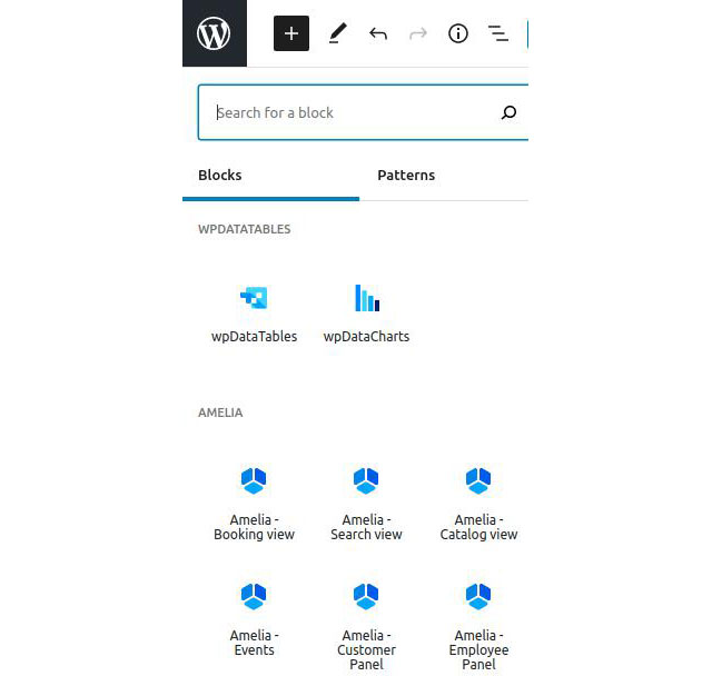
and then selecting the booking parameters on the right-hand side:
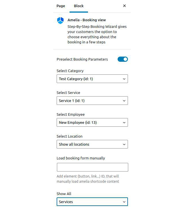
With Elementor, thanks to Amelia’s integration, you can use these widgets easily.
Simply search for “Amelia” in Elementor’s sidebar, and drag the widget onto a page:
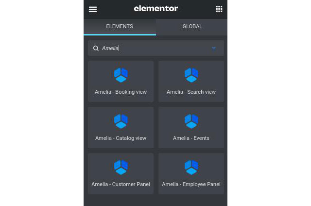
After you drag the widget on the page, you will see the same parameter options as in Gutenberg.
Elementor’s side panel looks like this:
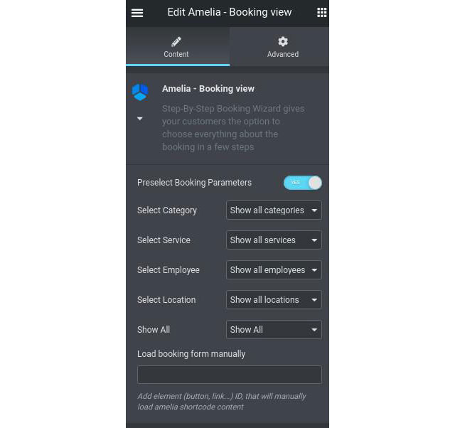
And you have the following options:
- Select Category – allows you to select a specific category you have created in Amelia.
- Select Service – allows you to select a specific service created in Amelia;
- Select Employee – selection which filters the form per selected employee;
- Select Location – if your employees are working on multiple locations, you can choose which location’s bookings will appear in the window.
- Show All refers to “Services” and “Packages”, and is only available in Amelia’s Pro license (since packages are not included in the Basic license). With this option, you can choose if the form will show both services and packages (all), only services or only packages. Delivery packages with your car might be included.
All these can be combined, but please be careful that you’re selecting actual values.
For example, if you select [ameliacatalog category=1 employee=3 location=2] and there’s no Employee #3 working on Category 1, or on Location #2, the booking form will continuously load, and will not display anything.
- Load booking form manually – this is used for popups within Elementor, and that’s what we’re going to explain now.
We added a shortcode for the popup – it needs to have the ID of the button that is calling the popup, so this is how one of the shortcodes should look like in the Elementor pop-up:
[ameliabooking trigger=amelia-button-id]
So if the button ID is 1 it will be:
[ameliabooking trigger=1]
If you create a PopUp and set this shortcode in the popup, you will see the option Load booking form manually when you create the Amelia shortcode This is where you need to provide the button’s ID.
When you create a button on which the popup will be called, you set its Button ID (that you will provide in the shortcode above afterward):
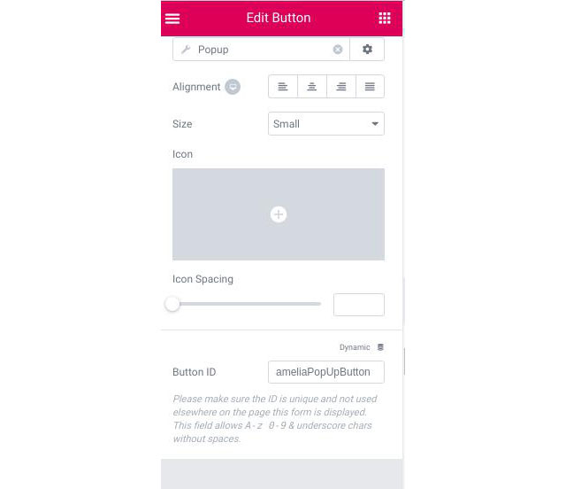
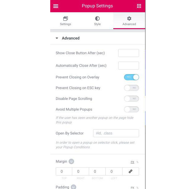
You need to enable the “Prevent Closing on Overlay” option in the popup settings:
And that’s about it.
This is how easy it is to set up the booking form on any of your pages if you use the Classic Editor, Gutenberg, or even Elementor.
Don’t forget about popups
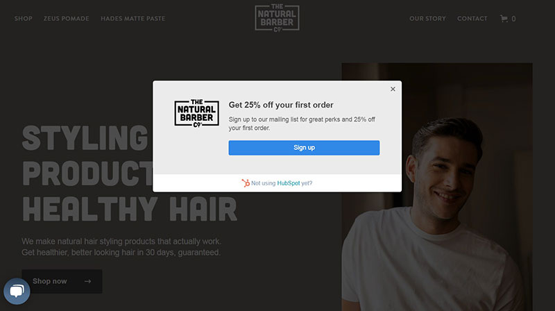
Popups capture attention, and anyone who is in website marketing knows they’re extremely efficient. They can be annoying, sure. So see to it that they carry practical info. Your clients want to book an appointment. So use a popup to direct people to the booking form. This way you connect things and get the best out of your tools. Clients appreciate that.
Make sure your barbershop website design is mobile-friendly
Gracie Mas, an SEO expert at a digital marketing agency in Dallas, recommends using WP Rocket to ensure that your images are compressed and JavaScript files aren’t too large. Since Google now uses mobile-first indexing, checking these boxes for mobile page speed is very important if you want to be seen in search engines.
The attention span of mobile users is short. Realize that you want quick results. Images say more than a thousand words. Put all this together and you will create an attractive, to-the-point layout that can fairly speed up WordPress sites.
Let’s see how some of the best barber websites do this…
Let’s Get Inspired by These Amazing Barbershop Websites
- Barber Blades
- Billy the Barber
- Cuts and Bruises Barbershop Website
- Rust Belt Barbering
- Tweed Barbers
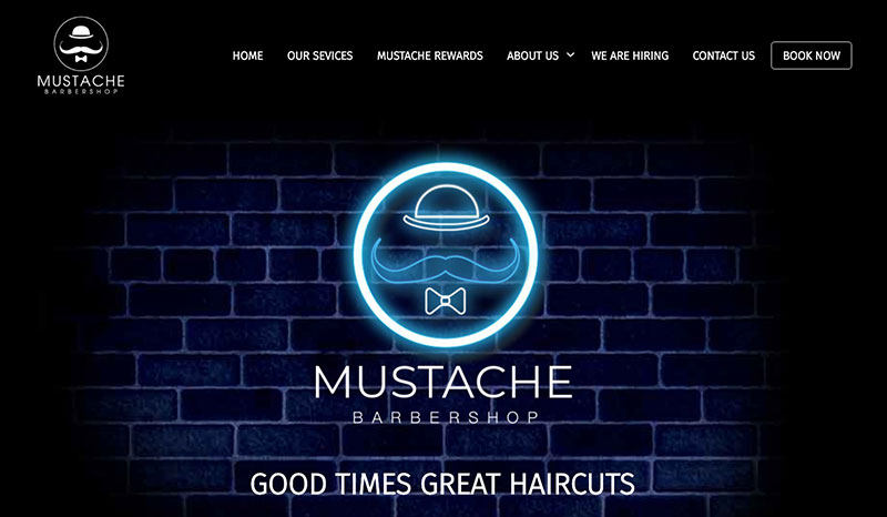
- Mustache Barbershop
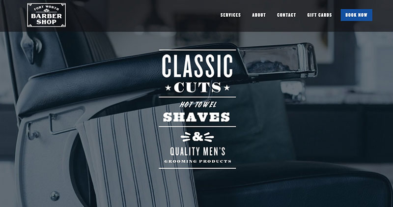
- Forth Worth Barber Shop
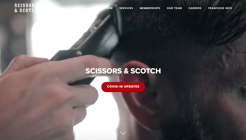
- Scissors & Scotch
You will notice that a barbershop business can mean two things: a shop that sells barber equipment and a place where a barber does the barbering.
So, it is most important that you make it clear to your customers what your business is all about.
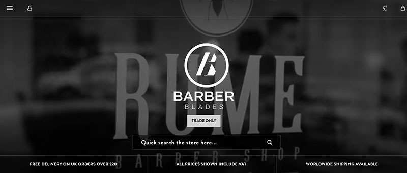
Barber Blades
This great-looking barber website falls under the first category. Don’t be surprised if Barber Blades turns out to be the biggest barber retail shop you will find online. They sell everything your barbershop needs. Plus, they have a mission: “… push the industry as far forward as possible”.
This UK-based company stretches worldwide and influences barbershop websites globally. This barbershop website design oozes craftsmanship. They make presenting their business into an art form.
The Barber Blades premium barbershop website is a fusion of sharp essential knowledge and soft edges. From consistent color usage to the interactive set-up, this website looks equipped to kill it.
Billy the Barber
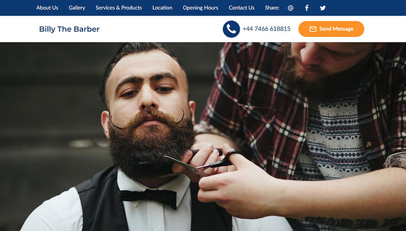
An all-in-one-page solution brought to you in simplicity. It’s perfect if you prefer a landing page instead of a crowded, multilayered website. It works and it looks minimalistic. You won’t lose time finding what you’re after.
The imagery is quality stuff — a touch of class. What you can take away from this barbershop website is that less is more.
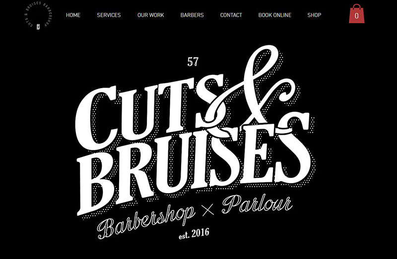
Cuts and Bruises Barbershop Website
Black & white. No gloves on. “Cuts and Bruises” looks like the place to be for tough guys who like to look groomed whilst enjoying their beer. They effortlessly give off the roll up your sleeves, get on your bike and show your tattoos vibe. The website is made up of ‘what you see is what you get.’ It’s atmospheric and down to earth.
The barbershop website design, integration of multimedia, and the definitive unique style hits you in the face. This is a fine example of how a barbershop website can come to life.
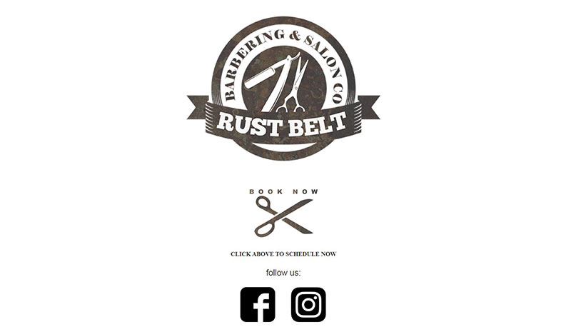
Rust Belt Barbering
A single-page website that gets right to the point. Blink and you’ll miss it.
You can book using the booking plugin, call or drive up there. That’s it. Simple and effective. As for design, the barbershop logo takes it all.
Links to their social media also lead you to set up your appointment. It’s printed in black on white.
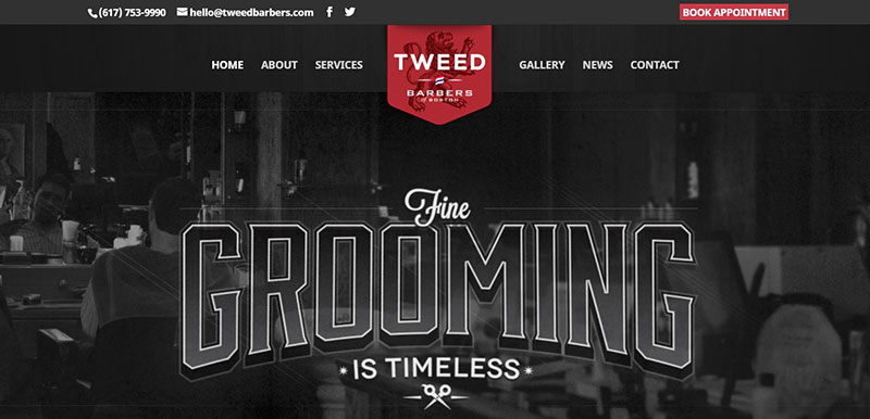
Tweed Barbers
Woven as tweed, the consistent barbershop website design injects some vintage wine-red into their black & white color scheme. Timeless and classic indeed.
When you click the gallery, you’ll see the barbers in action, captured in a sepia-like all-seasons glow. They want to promote tradition and they succeed effortlessly.
You’ll want to spend as much time on their incredible site as you do in their high-end Boston shop. You don’t want to mix them up with a simple haircut business because they’re much more than that. The moment you land on their site, you’ll be wondering what barber website template they used.
Mustache Barbershop
A signature barbershop for gentlemen. If you don’t like constant popups and moving elements, this colorful yet relaxed barber website design is for you. Tab by tab you will get the information you need. Each page gives you something new to discover, including how to find your way in the concrete jungle. Just follow the neon light.
The best barber websites combine classical taste with originality, and this is one of them.
Forth Worth Barber Shop
Talking about individuality, in the space of barbershop websites, Forth Worth Barber Shop is one of a kind. Every styling element adds to a satisfying visual experience. If you want to learn how to combine old and new and still end up with an agile tool, follow their approach.
Scissors & Scotch
Barbershops are the new gentlemen’s clubs. However, this tradition goes way back, from the Roman baths to The Reform Club in Pall Mall, London.
A traditional gentleman’s club, with its bar, library, billiards room, and fitness amenities, is for socializing. It’s a place to feel groomed, both physically and mentally.
How can you translate this into a barbershop website? If you want to find out, visit this barber site. How they reproduce this atmosphere tongue-in-cheek is truly amazing. Their implemented video tops it off. Respect!
Mimicking the Best Barber Designs With WordPress Themes
Luckily, you can build one like the barbershop websites we admire without actually being a web designer. Good WordPress themes make that possible.
A theme shapes your barber website. Font types, sizes, and templates are a part of the theme and give your good barber website its look. WordPress themes give your pages a specific decoration, a layout that sets the mood and tone of your entire site.
WordPress themes comprise of plugins and a template system. This combo is adjustable to what your customers are looking for when they visit your barbershop website.
It’s easier to make a top 10 barbers list than it is to call out the best WordPress themes because there are so many good ones. Choose a ready-made theme that will make you stand out among the world’s best barbershop websites.
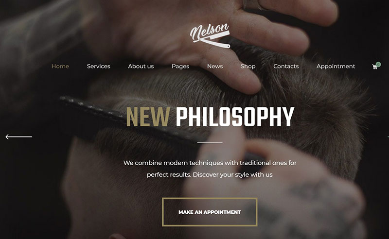
Nelson
As a barbershop website template, the Nelson WordPress theme looks like what every barbershop owner wants. It’s immediately obvious that this theme will allow you to create a website like the sites that inspired us.
Nelson includes all the features you need and requires only minor changes to make it your own. It has one-click installation, pre-built pages, and a customizable, ready-made layout. What more can you ask for?
Astra
Astra is a well-designed WordPress theme designed from the ground up to load fast and be very easy to use. It’s compatible with leading drag and drop page builders and is the most popular WordPress theme of all time!
It works seamlessly with Gutenberg, WooCommerce, and other WordPress plugins install in minutes and provides an exceptional user experience whether you’re an experienced WordPress pro or a complete beginner.
The Astra Barber Shop template is so on-trend it almost hurts. It is one of over 150 templates you can use with the theme and is rich, luxurious, and paints the perfect picture of a lifestyle a good barber website needs to attract customers.
Revolver
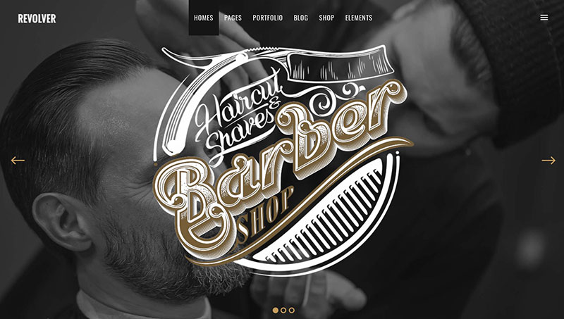
The urban lifestyle look is far from passé and the Revolver theme flourishes on that. Its earthly color pallet helps to augment the down to earth zeal.
The theme is all out adaptability. Over 800 font styles, easy color switch, and customizable headers and footers tune in on that. What’s more, the theme is furnished with sections for your shop, blog, portfolio, pricing, and team introduction. Plus, it comes with the Slider Revolution Responsive plugin for even more options.
Front-page marketing news: the theme is mobile ready and SEO friendly.
Woly
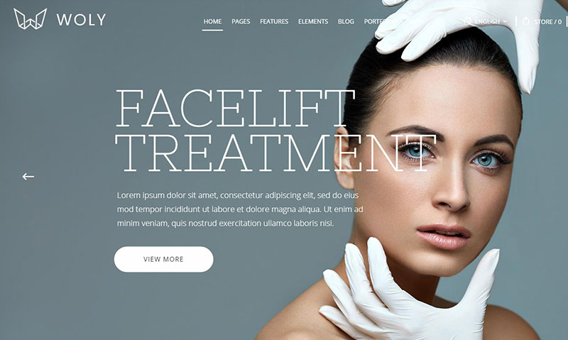
Let’s say you want to stay away from leveled paths and want to be groundbreaking. Well, Woly is here to ensure that you are different from most barbershop websites. A multipurpose theme guarantees more originality.
Standing out is duck soup when singling out one of the 32 prolific homepage formats.
Trueman
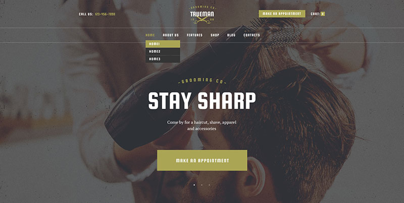
Back to the fashionable classic barbershop website look. Many barbershop website templates emulate the aesthetics of the top barbershop websites. But not one template does it better than Trueman. You can easily imagine that many of those sites made good use of this theme.
Trueman’s theme is congruent with the Revolution Slider. So are Essential Grid, Booked Appointments, and WPBakery Page Builder. There will be no problem in getting creative with its outset homepage templates.
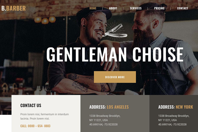
Barber
This Themeforest auxiliary is another exemplar for all premium barber websites. It emerges as the perfect symbiosis of a venerable, yet refreshingly new display. This theme looks timeless.
Get to work with virtually unlimited possibilities to tailor the theme to your preferences. Change colors, drag & drop to customize the slider, embed your videos, and create your effects.
Because it’s retina-ready, it’ll look vivid on your customer’s mobile devices.
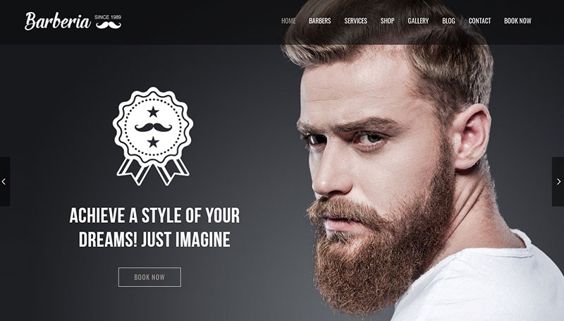
Barberia
Barberia is a similar Themeforest tool with comparable looks and features. It’s extremely user-friendly, too. It will take no time at all to get ready to promote your barbershop online. Existing customers will be impressed with your stylish and graceful arrangement.
You can choose between full width and a boxed layout. Whatever you fancy, visitors will enjoy every minute.
Next to looking great, Barberia offers you real value. Their features list seems endless. Slider Revolution and Visual Composer plugins are included. You get the Contact Form 7 plugin, can watch Video Tutorials, and enjoy Full Support. They give you everything you need to start you off on the right foot.
Bridge
This theme bridges the gap between different tastes. Whether you like what most barbershop websites are doing or want to stand out a bit more, this multi-purpose theme is what you are looking for.
With Bridge, you get more freedom, more room for imagination and creativity. Needless to say, no feature is missing.
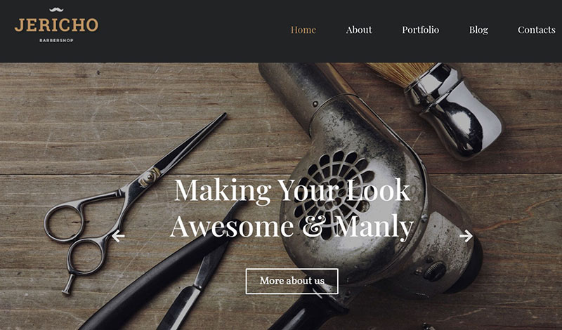
Jericho
Clicking Jericho’s live demo will surprise you. When it begins, a template opens that makes you want a barber website just like it. This incredible demo look is no coincidence. Backstage Jet plugins and the Elementor builder do the hard work. Further features are sliders, photo galleries, testimonials, and a contact form.
What’s more, customers can follow-up with their bookings, discounts, and active subscriptions. There are no walls to break down here, everything goes smooth as shaving cream.
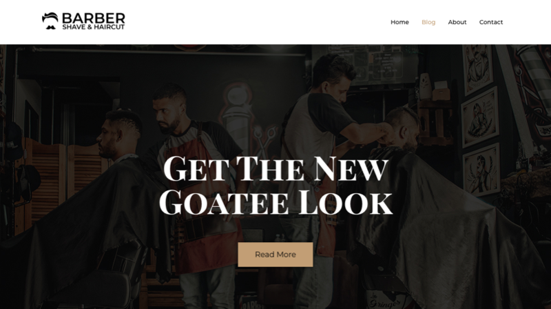
Barber
This is a ready-to-use WordPress theme for Salon and Barber Websites. Using this Barber WordPress theme, one can set pricing, services offered, and about us pages. It comes with pre-designed home, contact, about, and blog Pages.
The only thing one needs to do is add all the information and create a beautiful website for your Salon or Barbershop. You don’t even have to be a web designer.
This is a FREE template that comes with CyberChimps Responsive WordPress Theme. It is SEO- optimized, Fast Loading, Fully Customizable, Well Designed, Mobile friendly, and has many more features.
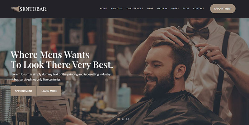
Sentobar
The Sentobar theme completes the old school, ready-to-use WordPress themes. With Sentobar, you can stick to your trade, as there isn’t any coding involved in pulling a great barber website out of this magical hat.
Features include Elementor, Contact Form 7, WP MailChimp, Breadcrumb NavXT, and Categories Images.
The responsive layout looks cool on any device. If you wish for a hip, trendy, and classy instant package, look no further.
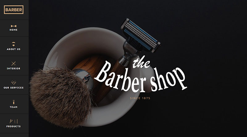
The Barber Shop
It’s appropriate to finish off with the theme that represents our topic the most. Their name says it all — they keep things simple. One page for all your customer’s needs, and it still looks tremendous.
This theme is a dream to create exactly the barber website you have in mind in no time.
Very quickly, clients will navigate through what you have on offer, and pick the treatment they want and when they want it. That’s what we call good business.
In short, with WordPress themes, you will soon own an amazing barbershop website!
Due to the renewed popularity of barbershops, it’s clever to make sure your website puts you on the map. Men like to look good and they want to visit a good-looking barbershop website.
You can use a WordPress theme or a barbershop website template to cut to the chase. They don’t only give your site an aesthetic advantage, but foremost aim to please your customers with a stunning user experience!
If you enjoyed reading this article on barbershop websites, you should check out this one with lawyer WordPress themes.
We also wrote about a few related subjects like alternatives to Easy Appointments, alternatives to the Acuity scheduling WordPress plugin, how to create a WordPress booking system, WP booking plugins, WordPress calendar plugins, WordPress schedule plugin, and blog name generators.
