Everyone knows that a website is now vital for your business. A dental clinic can use a website to convey important information like their services, prices, and more. Dental websites are also beneficial because they can be used to calm the nerves of anxious people. Most people have dental anxiety but dental practices can use their website to encourage them to come for an appointment.
Many dental websites have a cluttered design, use stock photography, and are not mobile-friendly. This can repel potential clients instead of attracting them. To design an efficient website, dental clinics should follow the best site design practices.
Website Principles For Dental Practices
Different elements appeal to different people and it is hard to define a beautiful website. However, there are some standard website design practices that do attract new clients.
Aesthetics
A website should have a clean color scheme, be organized, use whitespace, and have simple navigation.
Functionality
The most important aspect of a website is its functionality. If a website does not function properly then it is useless. The function should be a primary goal. Aesthetics should enhance functionality.
User-friendly
User-friendly means that users are able to navigate the website with ease. It also means that they are able to find all the information they are looking for. A dental website should provide answers to questions that potential clients ask.
Redesign Your Dental Website
If you already have a dental website, you might want to consider redesigning it to make it more appealing. Redesign your website if it has glitches, is not clear, or if it is not attracting new clients.
Here are reasons why you might consider redesigning a website:
- Increase conversions
- Create a positive impression on viewers
- Decrease dental anxiety
- Track interest
- Promote new services
- Promote events
- Provide relevant data
- Rank higher in search engines
- Provide a way for clients to book an appointment
Inspiring Dental Websites
The dental industry is large and there is a wide range of techniques to attract new customers. The following websites showcase efficient designs of dental websites.
Some attract new customers by displaying their experience. Others attract clients by displaying their personalities. Look to these examples to help you design a great dental website that attracts more clients.
Tend
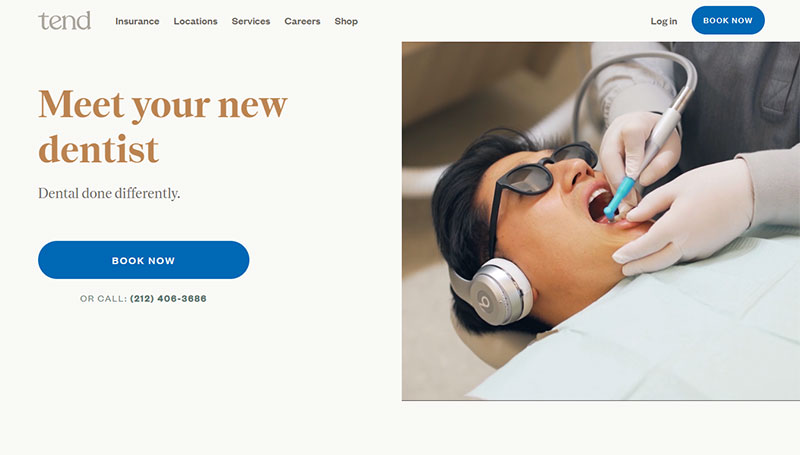
Being one of the many dental offices in New York City is not easy. But this dentist practice is up to the challenge with its amazing site design. Tend uses a clean and minimal website style. It presents bright and colorful images that instantly appeal to the visitor. It also has a video that shows how Tend is different from other dental practices.
Dental Care Seattle
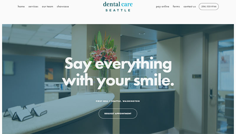
Dental Care Seattle presents another efficient website. The elements that make it work so well include the large images, large font, and parallax effects.
Hobart Family Dental
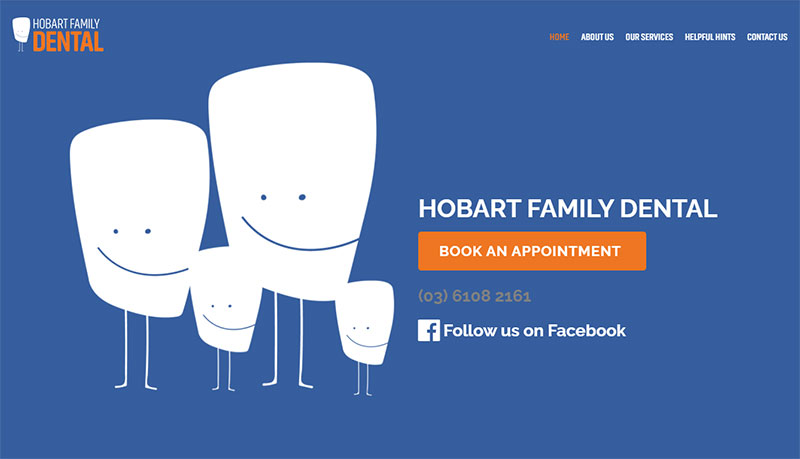
The Hobart Family Dental website can only be described as cute. It presents an animation of large teeth on the landing page. The rest of the website is divided into grid sections. Bright colors make this great dental website stand out.
Grand Street Dental
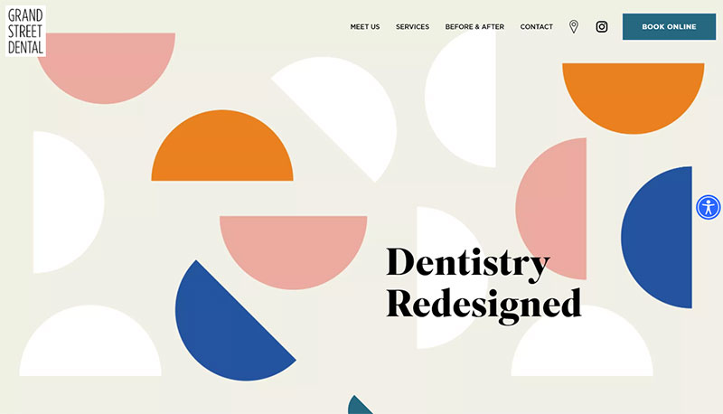
Grand Street Dental uses a modern website to attract attention. It has a mostly white color palette emphasizing the sanitary condition of their offices. It also uses a few splashes of color. The best part is that it has an intuitive design.
Atlanta Dental Spa
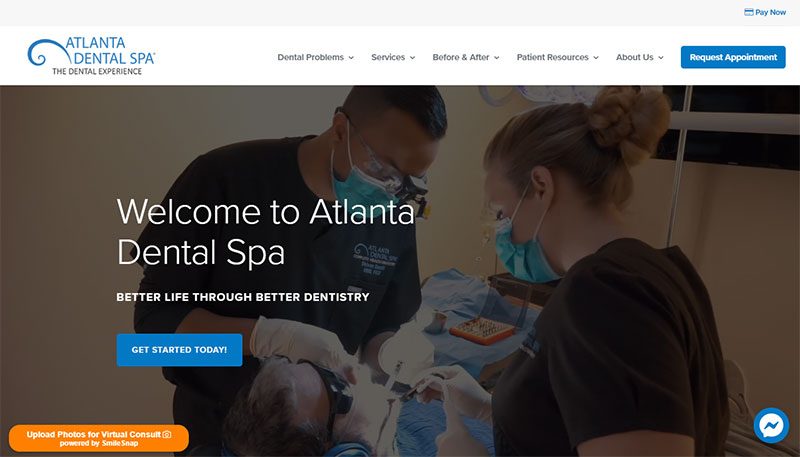
Atlanta Dental Spa is a great dental website that achieves its goals. It has a lot of information but organizes it in such a way that everything is easy to find. It has a clean layout, patient reviews, and videos. Its best feature is that visitors can book appointments within the first few seconds of the page loading. They can also message the office on Facebook Messenger directly from the website.
Get more bookings with the right tool for a dental clinic
Staying organized has never been easier.
You can now manage your business and grow your brand with a single, powerful WordPress booking plugin that keeps all of your appointments in line, your clients organized and your business booming.
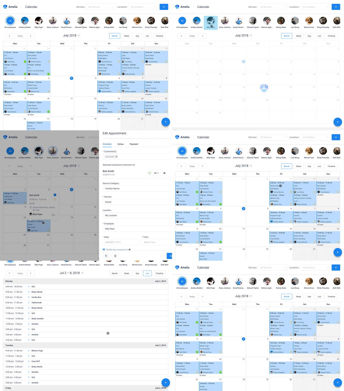
Amelia is a powerful WordPress booking plugin that works flawlessly with WordPress sites of all kinds. It has a minimal, yet powerful appointment booking interface designed to ease your workflow, automate repetitive tasks, avoid double booking, and make appointment booking a breeze for your customers.
You can even have email notifications and SMS notifications so that nobody forgets about their appointment bookings.
In order to book an appointment, the complete user interaction takes a few clicks with this WordPress plugin. Moreover, with it you can accept payments via PayPal and Stripe, perfect for those who want to pay in advance to book appointments.
As a business owner, you can monitor KPIs in the WordPress dashboard and analyze other important data to keep a pulse on your business. Amelia is a straightforward, no-nonsense booking calendar plugin and an amazing option for those who want an around-the-clock solution for their WordPress site.
Want to know more? Check out Amelia’s awesome features to see what you are missing.
Digital Smile Academy
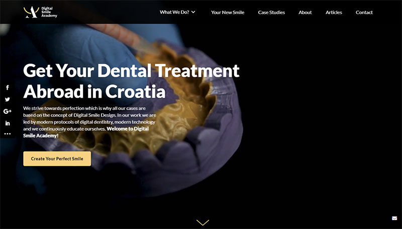
Digital Smile Academy offers some of the highest standards in the dental practice industry and the website shows it.
The dental website makes good use of whitespace, images, and a video in the hero section. The CTAs are captivating and the site offers all the information a visitor would want. It also has sticky headers and a sticky contact button so that visitors can book an appointment with ease.
Dentistry Doug Lewis
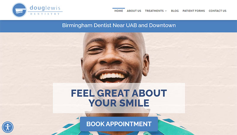
Dentistry Doug Lewis welcomes people with full-screen images, an engaging headline, and a large CTA. The homepage is very simple where visitors can look up the operating hours, see some patient reviews, and book or contact the office. The whole dental website looks good due to its simple design.
Health Inspired Dentistry
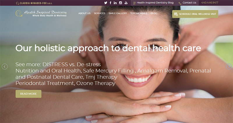
The Health Inspired Dentistry website takes a different approach to selling its services. When a visitor first lands on this website, a feeling of calmness overtakes them. Usually, people feel anxious when they think of the dentist. This website strives to change that feeling and create a positive atmosphere.
Enamel Dentistry
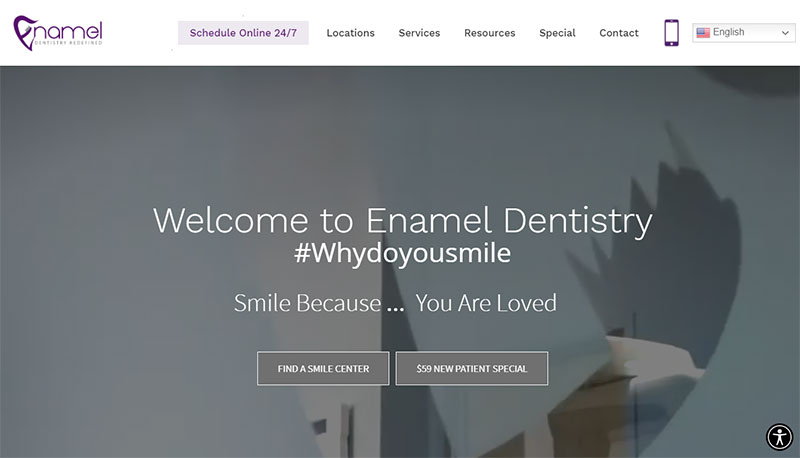
Not only does this website design look great but it also offers great features, including a 24/7 appointment online booking service. The online booking service makes scheduling convenient and keeps the revenue rolling in. It also offers virtual consults which are perfect for older people, emergency cases, and during the pandemic.
Riaz Dental
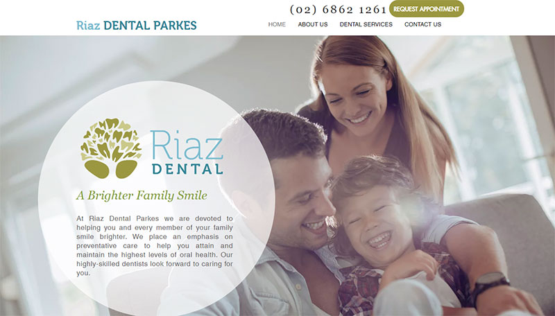
Riaz Dental gets high marks for its color palette and professional images. The homepage is short and simple so that it does not overwhelm visitors. It gives some information about the dental practice, locations, and a booking button. It also has a section dedicated to providing information to new patients.
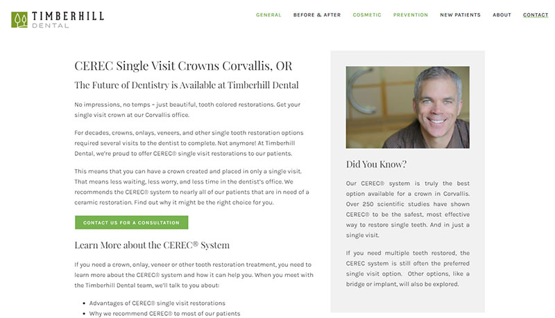
Timberhill Dental
Timberhill Dental boasts a high-tech, high-touch approach to dentistry. On his website, Doctor Kurt Black explains in detail the dental services he offers. He also displays images and patient reviews to emphasize his experience.
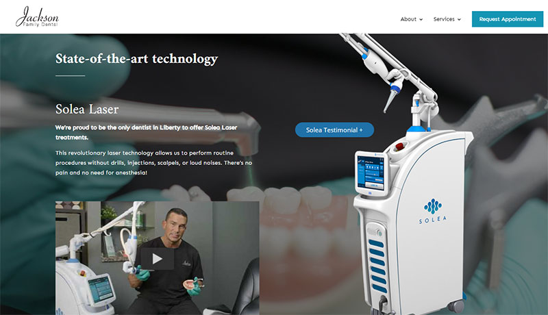
Jackson Family Dental
This is the website of Jackson Family Dental located in Liberty Missouri. The website hits two important notes. The first is a warm and welcoming feel with a personal touch. The second note is the state-of-the-art technology that they use in their dental practice. Engaging images and beautiful videos make this an exceptional website and attract new patients.
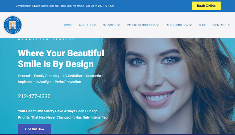
Arch Dental Associates
When a visitor enters the website of Arch Dental Associates, they can find all necessary information above the fold. It displays a nice image, the services provided, a book CTA, and a contact number. Below the fold, the website displays more information. It displays the services, general dentistry information, and a map to their location.
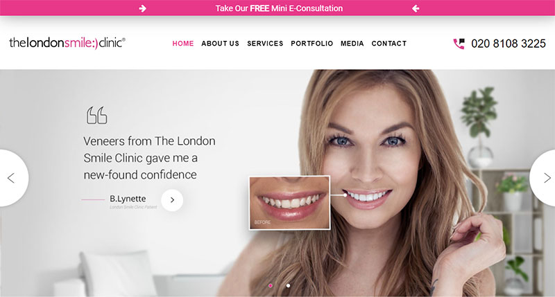
London Smile
The most notable feature of this website is its use of sliders. The hero section has images on a slider that advertise this dental office’s two biggest services. Scrolling down, a slider offers patient testimonials and expert advice. Further down a slider displays before and after pictures. All this information displays the experience this dental office has acquired and gives patients a reason to trust in them.
Caitlin Batchelor Dentistry
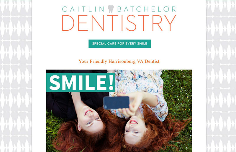
This dental website has a different but impactful layout. Its design resembles an informational brochure. It is clean, simple, and easy to navigate. It uses striking images to appeal to visitors. It also makes it easy to book an appointment.
Glo Modern Dentistry
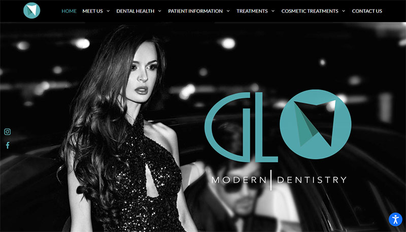
At first glance, Glo Modern Dentistry does not look like a dental website. The website design suits the name well as it has a modern layout. The menu presents all the content in an organized way. Another reason why this is one of the best dental websites out there is that it includes a lot of information about dental health.
St. Lawrence Dental
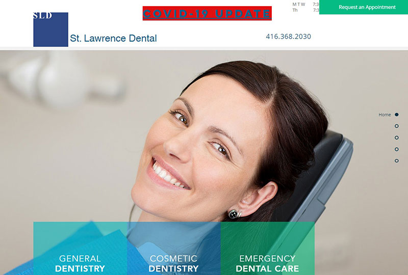
St. Lawrence Dental keeps logistical information in the same section and in clear view. The operating hours, book an appointment button, phone number, and covid-19 updates are all in the right-hand corner. This prevents visitors from having to search around the site for that vital information. This website also uses an appealing full-screen image and different color hues to create an attractive website.
Advanced Family Dentistry
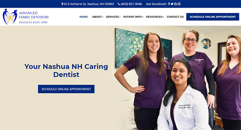
Blue is a common color for dental websites. The Advanced Family Dentistry uses dark blue as their accent color. It provides quality information about their services and team. It also displays before and after pictures. It includes vital information such as contact info, location info, and operating hours.
Mansfield Orthodontics
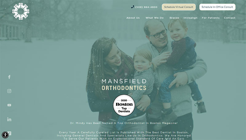
Mansfield Orthodontics uses a gallery of images to appeal to new patients. The images also make it clear that it offers child, teen, and adult dental services. Something that makes this website great is the hero section. It presents all the information that visitors want to know. That includes social media buttons, contact info, and CTAs. This dental office provides free online dental consultations, perfect for those who cannot leave the house. The CTA in the header clearly displays that offer.
Clinica Dental Escariz
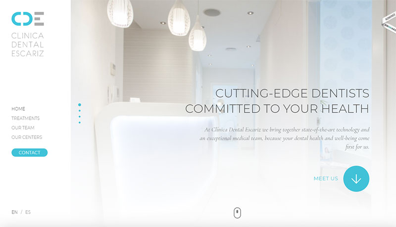
There are many key features that make this a great dental website. First, the logo is clearly visible and the color palette is consistent with the logo colors. Second, the page is designed with a menu on the left side instead of on the top of the page. Third, it uses large images to convey most of the information. Fourth, it offers a language choice between English and Spanish.
Josh Berds, DDS & Associates
This site also makes the list of the best dental websites. It presents a beautiful and clean layout. The homepage opens to a full-screen image with a CTA. The menu directs visitors to the information they want to know.
Each section opens with a full-screen image and a headline. The menu bar is on a sticky header so that visitors do not have to scroll back to the top to search for additional information.
Bethesda Family Dentistry
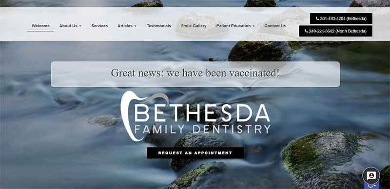
Here is another dental website. It opens to a beautiful picture and to the important notice that the staff has been vaccinated for Covid-19. The homepage is short and explains the services offered, allows patients to make a payment, and has a booking CTA. Another nice element of this site is the chat box that they’ve incorporated using live chat software so users can get the attention they need. It also includes accessibility tools for those who are disabled in some way.
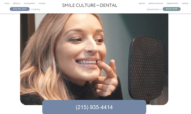
Smile Culture Dental
Smile Culture Dental designed its website to appeal to its patients. Customers can find everything they need with a quick glance at the website. The phone number, booking CTA, and more are easily accessible. It also presents a background video to show customers what their dental practice is about.
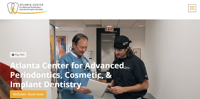
Atlanta Center for Advanced Periodontist
This dental office is a leader in periodontal surgery. The website reflects the practice well and strives to attract high-end clients. The site uses a clean layout with muted colors and great use of whitespace. It also displays quality images and videos that present a welcoming atmosphere. The images imply that this dental practice team explains in detail their procedures. This website includes video testimonials to give new patients extra confidence in this practice.
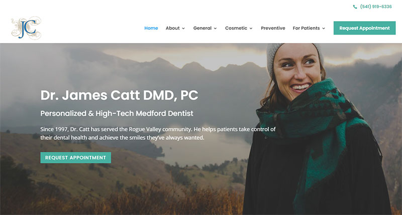
James Catt, DMD, PC
The website for James Catt sets him apart from the pack. It focuses on his experience, education, certificates, and awards. The website has a section for new patients. It also explains the options for patients who do not have insurance. This website provides comforting information so that people can overcome their anxiety. This helps the office get more clients.
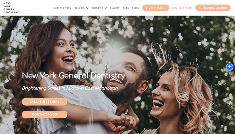
New York General Dentistry
The website for this dental office in New York is a must-see. It has a light color palette that comforts and soothes. The CTAs on the header direct visitors to the prices of the services and to the online booking form. The images are striking and appealing. This website also has a fairly large font. It uses whitespace for a clean layout which makes it comprehensive and reinforces its credibility.
Simply Dental Chatswood
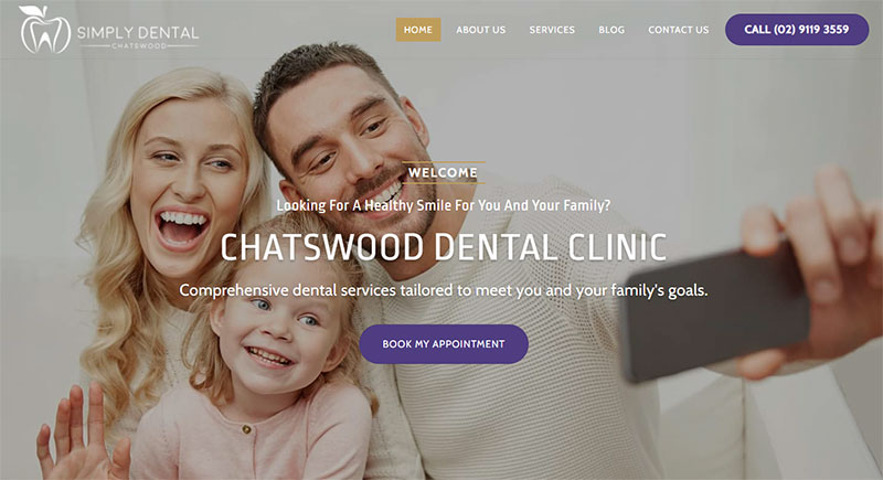
This website connects with all audiences. It uses the gold color in the logo throughout the entire site. It also makes it easy for patients to book or contact the office right from the landing page. They present patient reviews and their eight-point promise to attract customers. It also includes a blog that gives updated information on dental health. It eases the minds of clients by discussing payment plans to take the pressure off of having a huge bill.
Smile & Co.
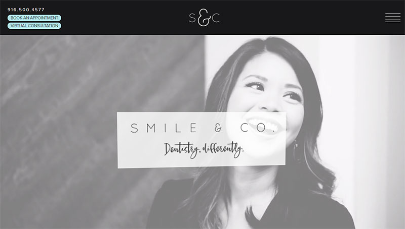
Smile & Co is a dental office in Folsom, California. Its website blends content and design for an effective style. The design is warm and welcoming. The content is written in a conversational style. It provides information about the doctor, the services, and the office. It even has a virtual tour of the office. The colors, the layout, and the content of this website are unique to any other dental website.
Bates Dental
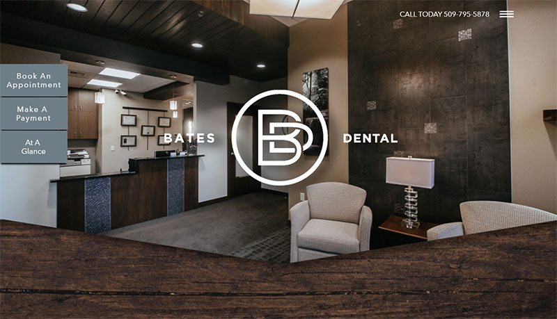
The name of this dental office might conjure up thoughts of the Bates Motel. However, if that was your first thought, this website design will dismiss it immediately.
After opening this modern dental website, it is clear that this dental office defines itself with elegance.
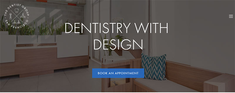
The images of the office, the layout, and the color scheme all say elegant. Some cool features of this site are the simple header with a hamburger menu and the sidebar that gives clients different options.
St. Paul Dental Center
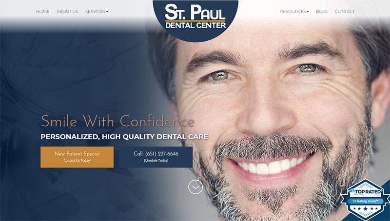
The St. Paul Dental Center website gets straight to the point. It does not add anything unnecessary, but directs visitors to a new client special or to a contact page. It is a good example of keeping a dental website clean with a minimalist layout. The best way to attract new patients is to not overwhelm them with unnecessary information.
Zen Dental Studio
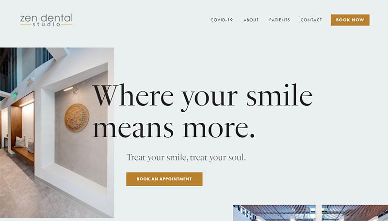
Here is another clean and modern dental website. This one lets images do the talking. There is a great balance between the whitespace, images, and amount of text. Other great elements of this website are the neutral color pallet, simple navigation, and clear CTAs.
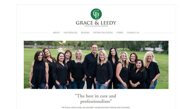
Grace & Leedy
Grace and Leedy present a simple and straightforward dental website design. It has a black and white color scheme and uses whitespace effectively. The first thing viewers see is the navigation tab and the picture of the dental team. Below that the website displays patient testimonials and a comprehensive list of services.
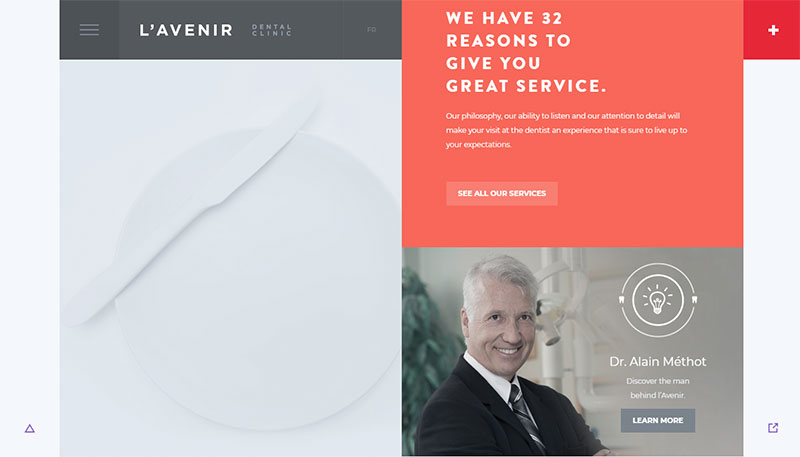
L’Avenir Clinic
L’Avenir Clinic understands the power of a great website. They have a short homepage but they fill it with parallax effects, CTAs, and navigation buttons. This dental website design impresses viewers, increases brand awareness and reaches new clients. Some other outstanding features include the sliders, typography, and social media links.
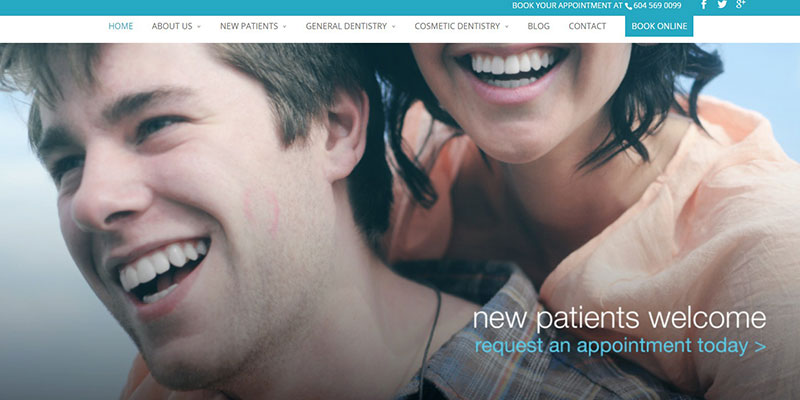
Bay Dental
Bay Dental is a content full website. It uses a large font to appeal to viewers and at the same time give the content a clean layout. It uses bullet points, headings, and good use of color to organize the information. It also displays images, a map, and a contact form.
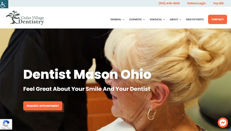
Cedar Village Dentistry
Cedar Village Dentistry is another dental website. It works because it has bright colors and a nice background video. Other effective elements include a live chat box, CTAs, and beautiful photography It gives simple explanations of complex procedures and video testimonials. It also directly addresses those with dental anxiety and offers solutions to this problem.
Ending thoughts on the best dental websites
It may seem like a dental website has limited options. However, as the above dental websites show, dental practices have a variety of website design possibilities. Designing a website properly can help increase brand awareness, attract new clients, and promote the business.
To accomplish those objectives a dental website needs to follow basic design principles. The first design principle is to be functional. A website that functions poorly will repel clients. The second design principle is to provide a website that is easy to navigate. This means having a clean layout and using navigational buttons. The third design principle involves the appearance of the website. The color scheme, effects, logo, and more should be aesthetically appealing. The fourth design principle is to display all the information that a potential client is looking for.
Following these design principles and looking to the above best dental websites for inspiration will help you to create a great dental website.
If you enjoyed reading this article on the best dental websites examples, you should check out this one about barbershop websites.
We also wrote about a few related subjects like the best dentist WordPress themes, photography booking apps, medical scheduling software, yoga websites, appointment makers, salon and spa WordPress themes, photography marketing ideas and hair salon websites.
