Landing pages are an excellent way to build excitement for future events. They are one of the best ways to spread the word and attract attendees.
Event landing pages need to have a striking balance between the design, the message, and a CTA. When someone views the page it should spark an interest in them and create a desire to attend the event.
For events that require registration, the registration page should be a landing page. The purpose of event registration pages is to get visitors to sign up or purchase tickets for the event.
How can one design an attractive event registration landing page? This article will provide helpful suggestions.
The Nitty Gritty of Event Registration Landing Pages
Many people wonder what a landing page is. A landing page is a standalone web page that is distinct from a main website.
It is designed for a single objective.
An event landing page has the single objective of spreading the word about a future event. Whatever the event may be, the goal of an event landing page is to raise awareness about the event.
The purpose of an event registration landing page is to get viewers to sign up or purchase tickets for an event. It is a way to spread the word to increase attendance and ticketing revenue.
When designing an event registration landing page it is important to focus on conversion rate optimization.
Conversion rate is the percentage of users that sign up or purchase tickets. Conversion rate optimization is a system that helps increase that percentage.
So, an event registration page needs to highlight the value of the event. It should showcase its activities and generate excitement.
Conversion rate optimization tools assist in analyzing the target audience to complete these objectives.
Here is a list of efficient event registration landing pages. Learn from these examples to create event landing pages that will get the job done.
eTail
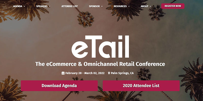
This event landing page is the perfect example of keeping the information above the fold. Above the fold is an expression that refers to the content that is visible before a visitor scrolls down.
This event landing page provides all the key details above the fold. It shows the dates, the location, the purpose, and the CTA right when the visitor enters the page.
The information above the fold is also well-organized. It is not overcrowded, displays a welcoming picture, and is easy to read.
The information below the fold expands on the purpose of the event. It shows the speakers and includes a video.
The key takeaway of this event landing page design is to keep the most vital event details in plain view.
Moz
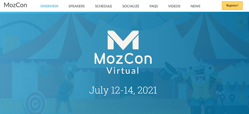
This next event landing page does an excellent job of focusing on the value of the event. Event landing pages work best when they focus on the benefits attendees will receive.
This event registration landing page design displays essential information in the top header. It includes an overview of the event, the speakers, and the schedule.
Additionally, it explains what attendees will learn at the event. It also provides information on how the attendees can connect with industry leaders.
It organizes all of this information with headers, summaries, and bulleted lists. Learn from this landing page how to keep a site organized.
Creative Cruise
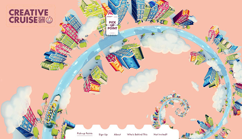
This is one of the most creative event landing pages on the internet.
The event website displays a spiral drawing of the city of Amsterdam. When users scroll, the website “spins”.
A little boat in the bottom left corner represents the cruise boat. As users scroll, they see different pickup points for the cruise.
The menu is at the bottom of the website and provides more information. The menu is in the shape of the boarding ticket.
When users click on a pickup point, the popup also has the design of a ticket.
The takeaway from this event landing page is to think outside the box. Whatever the event, try to design something fun that well represents it.
B2B Marketing
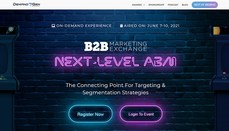
Next is the event registration landing page from B2B Marketing Exchange Experience. It uses animations of neon signs to showcase its personality.
It includes essential landing page features like event registration CTAs.
The best way to design a landing page is to have the most important information above the fold. This landing page does that and takes it one step further.
It positions its CTAs in a way that two-thirds of them are above the fold, but the last third is below. This urges users to scroll down and view the rest of the webpage.
The webpage divides into sections, each focusing on different aspects of the event. It also includes testimonials to make the event more valuable in the eyes of the visitors.
There are two main takeaways from this landing page example.
The first is to showcase your personality. The second is to design the page in a way that encourages viewers to stay.
Get more bookings with the right tool for the job
Staying organized has never been easier.
You can now manage your business and grow your brand with a single, powerful WordPress booking plugin that keeps all of your appointments in line, your clients organized and your business booming.
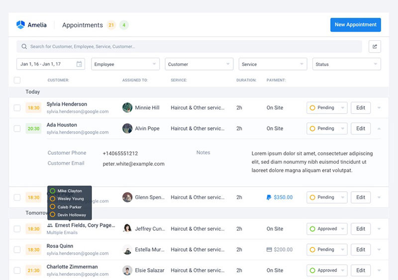
Amelia is a WordPress events plugin that is perfect for business owners who need to streamline their booking experience both for their staff and their clients.
Amelia handles everything for you, even sending automated email or SMS reminders to your clients. No-shows? Not anymore!
The Amelia WordPress booking plugin adapts to different industries for a blissful online booking experience and employee management.
Want to know more? Check out Amelia’s awesome features to see what you are missing.
Traffic Think Tank
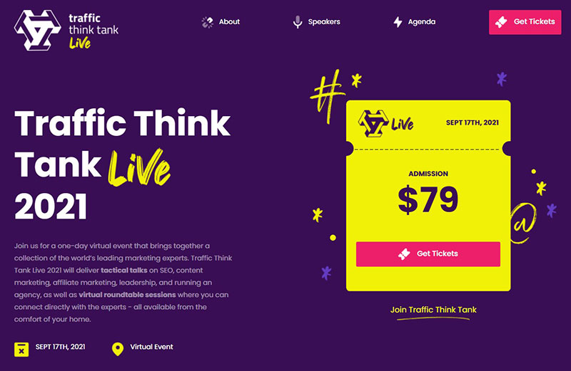
This efficient Traffic Think Tank landing page displays vital information above the fold. It also has a nice design and appearance.
It also displays one of the biggest selling points of an event: expertise. Viewers sign up for events that provide accurate and practical information.
This landing page assures its visitors that this is the case.
It lists which speakers will be at the event. It also lists their profession and allows users to look into their credentials.
The takeaway from this landing page is to display the credentials of the speakers. This assures viewers that they’ll hear the best information available and learn useful solutions.
Adobe
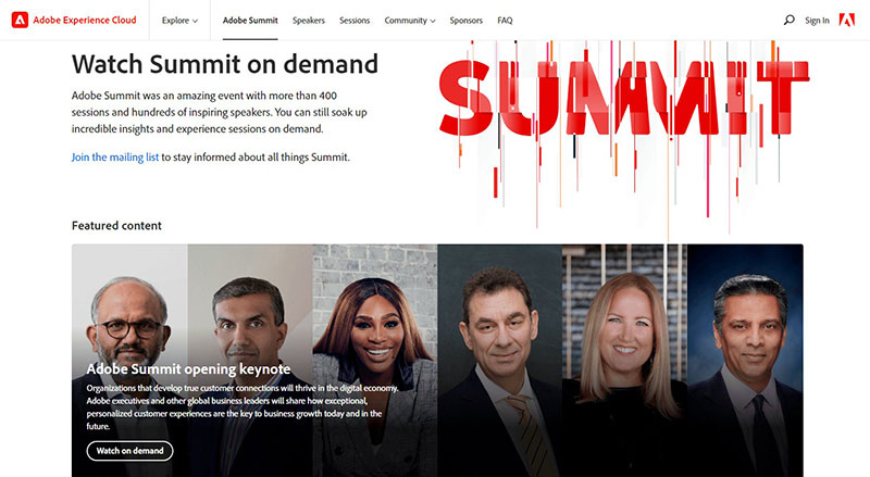
Event registration landing pages must cater to the target audience. The Adobe Summit landing page does that.
To address specific needs, a company needs an intimate knowledge of prospective attendees. If they understand the needs of the viewers, they can present relevant information.
They can also successfully explain why the event will be beneficial.
To design an event landing page that appeals to the target audience, companies can consult an expert. Or they can do A/B testing or surveys to see what design viewers like the most.
Search Engine Journal
The most effective event landing pages answer the question “what is in it for me?” They craft a clear and compelling offer that users find hard to decline.
The Search Engine Journal eSummit virtual conference is a good example of this.
The event page is fun, compelling, and appealing. Everything about the website urges visitors to watch the virtual conference.
The lesson to take away from this example is to craft a compelling offer. Use a color scheme, font, and page design that inspires visitors to register for the event.
Kikk Festival
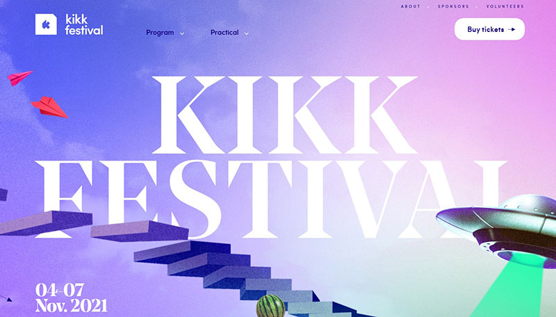
There are several imitation-worthy elements of this website. Here’s a quick look at a few of them.
The first thing that viewers notice on this event page is the background. It is welcoming and appealing but it does not take attention away from the content.
The second noteworthy thing is the minimal header. It displays two basic items with drop-down menus for more information.
The header also contains the CTA.
The third and most noteworthy element is the animated effects. A staircase urges viewers to scroll down where they see several other animations.
They also find information about the event and the speakers.
There is no doubt that this is a unique landing page that is appealing. But there might be one cautionary example to take away from it.
The animation draws so much attention that many people miss the CTA that is in the header. Placing the CTA somewhere down the staircase may have been the wiser course.
Superweek
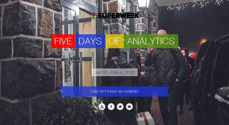
At the moment viewers land on this event page, it is clear what the event is about. The page is simple, eye-catching, and packed with information.
This page also embeds social media buttons.
Social media buttons add credibility to the event. They also connect viewers with an active community.
Including videos on the page adds another level of appeal.
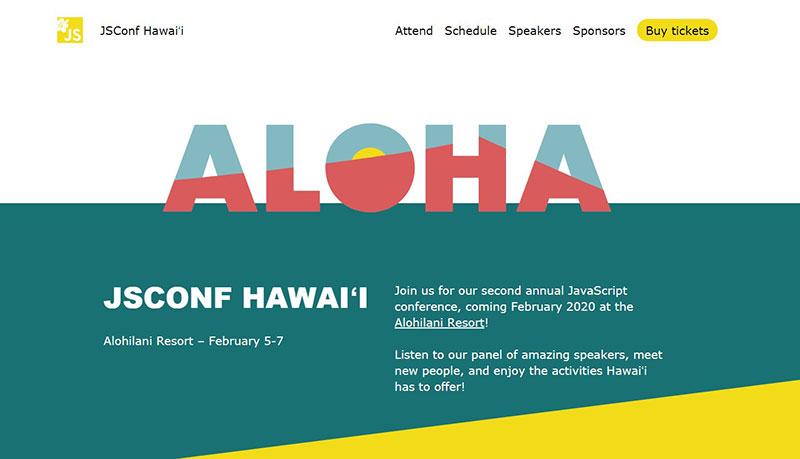
JavaScript Conference
This landing page is a great example of making the whole webpage a reflection of the event itself. When at all possible, add elements to the landing page that exhibit what the event will be like.
This is also a great example of keeping things simple. It is a short landing page that divulges the necessary details in a simple and summarized way.
The menu header offers more information and a bright and noticeable CTA.
It is often recommended that designers put another CTA somewhere else on the page. But in this case, having only one CTA works because the page is so simple.
Zoomtopia
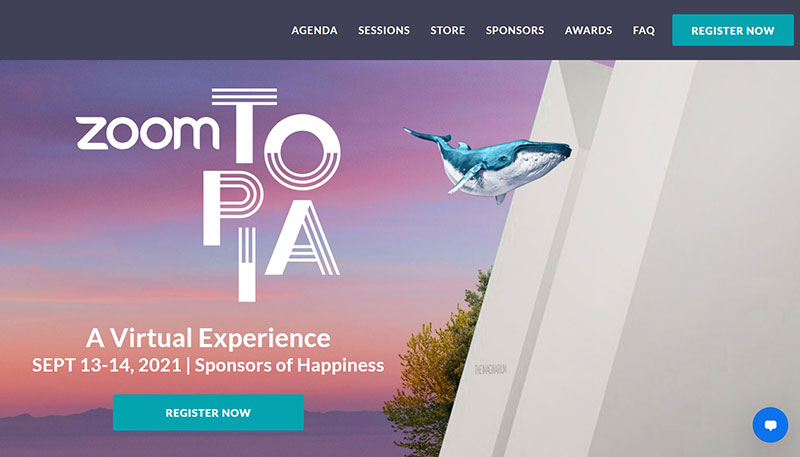
The Zoomtopia event registration landing page stirs the imagination.
Since the COVID-19 pandemic, most have had to host events and meetings in the virtual world. Zoom has been a huge help in that regard.
However, many still long for the return to in-person meetings. The Zoomtopia event landing page closes the gap between in-person and virtual events.
It has an imaginary map of a fake event location. Website visitors can navigate the map as if they were walking from location to location.
The landing page design is very imaginative. It beckons all to think that this event will help them create a better virtual experience.
MicroConf
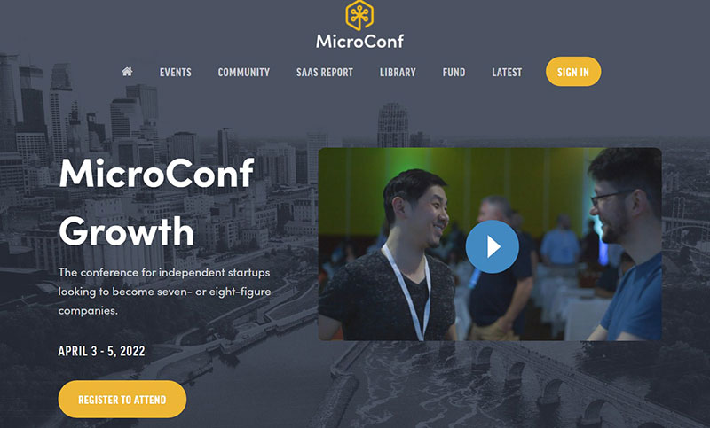
The simple description of this event makes it clear what it is for and who should attend. Also, unlike other event landing pages, this one has a video above the fold to give more details to visitors.
This page also uses Tweets from influential past attendees to show the benefits of the event. It also showcases the powerful companies that are sponsoring it.
It provides options for where to stay while attending the event. Its sign-up form is straightforward so users can purchase tickets with ease.
There are several lessons to take away from this example. First, build landing pages that clearly identify the event.
Second, make sure the landing page has a simple registration form. Third, use video to provide information.
Twinwoods Adventure
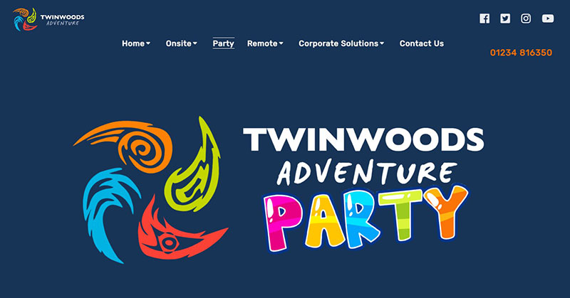
Twinwoods Adventure is different from the other event landing page examples listed here. It uses a landing page to drive bookings.
Twinwoods is an indoor party house perfect for kid’s parties. It uses a high amount of images to show what it offers.
It also uses video to showcase activities, set expectations, and create excitement.
Collision
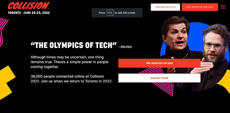
The event landing page for this conference is eye-catching. It is easy to navigate, and on-brand.
It includes testimonials, quotes, and more that give it credibility. Also, the speakers of the conference are featured prominently.
It is an excellent event landing page example to look at when designing the foundation of an event page.
Social Media Examiner
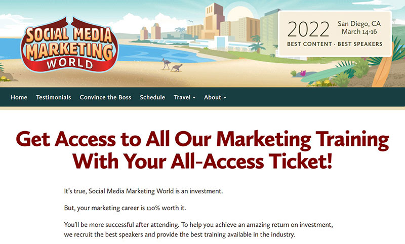
The first thing that catches the eye is the animation header. A banner in the header describes when and where the event will be.
The page uses a lot of text but uses the right font and spacing to be appealing.
This event landing page does not beat around the bush. It shows a chart with ticketing options right as viewers scroll down.
It also includes reviews from past attendees, videos, and frequently asked questions.
One major selling point of this event is the email template it provides. Employees can use it to convince their bosses to let them attend the event.
Visitors can return a ticket within 24 hours of purchase for a full refund if their boss says no.
Slack
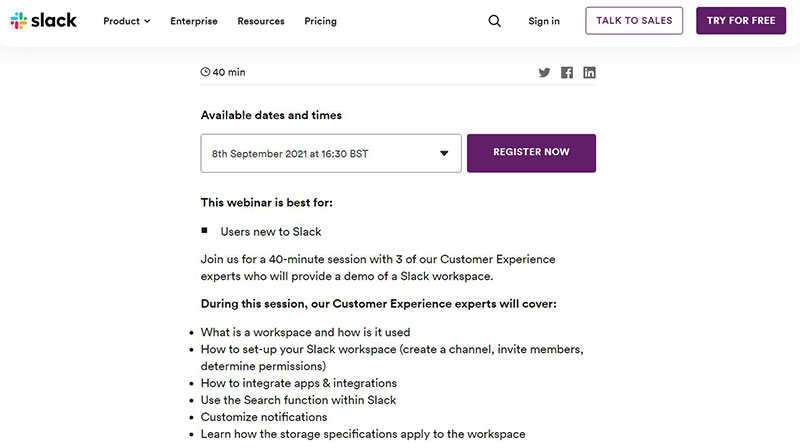
The Slack 101 event landing page is simple and clear. It only has about 18 sentences and yet it explains all the necessary event details.
It explains who would benefit from this webinar, how long it will last, and what viewers will learn. It also lists the speakers at the event.
There are two key points to take away from this event landing page example. Keep things simple and clear while also providing vital information.
PCMA Convening Leaders
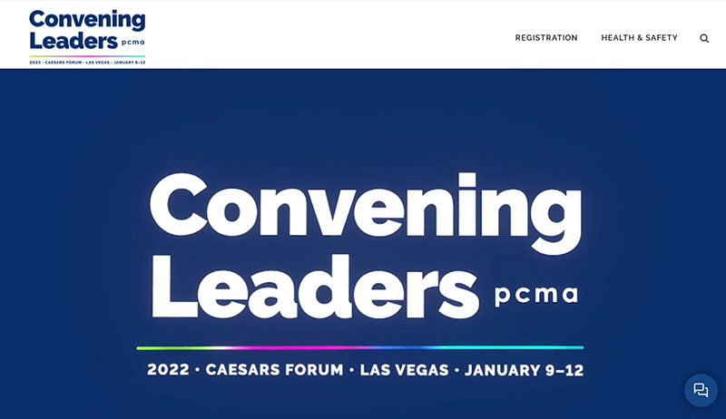
The header on this event landing page is very notable. It plays an animated video that catches the viewer’s attention.
Right below the header is a large and bright call to action.
Then, as viewers scroll down, they see reasons why they should attend the event. A schedule for the event and testimonials are also displayed.
The design of this event page is very compelling. The color scheme, layout, and font choice all come together in a way that emphasizes the CTAs.
It also includes fascinating elements like a countdown timer, videos, and more.
Digital Marketing Summit Asia
A well-designed event registration landing page leaves visitors with a positive impression. It will also encourage them to sign up for the event.
One of the biggest mistakes website designers make is overcrowding the page.
The Digital Marketing Summit Asia event page is a great example of how to avoid overcrowding. Although it presents a lot of information, everything is well-spaced.
It makes use of sections and accent colors to keep information in categories. These categories make the site easy to navigate.
This event page also makes good use of the current dark mode design trend. Another smart design feature is the timeline that highlights the event’s schedule.
CES
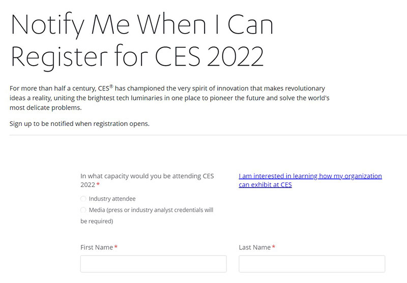
The goal of a registration page is not only to increase event awareness. It also strives to obtain event registrations.
Long registration forms are poison to conversion rates. Registration forms should only ask for the most essential information.
The fewer fields visitors have to fill out, the more likely they are to register. The entire process should take less than three minutes.
Keep the form concentrated on the bare essentials. Users appreciate it when you respect their time.
For those struggling to design an event registration form, look to the CES form as an example. It has a total of seven fields and it is quick and painless to complete.
MAU
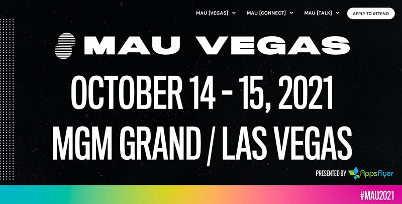
Most event marketers try to get as many attendees as possible. But the event by MAU is very different in that they make viewers apply to attend.
They target a specific audience and allow those who meet the requirements to attend.
This strategy does not work for every event but it does offer a few advantages. One advantage is that it adds value to the community.
Since the host can control who is attending, they can create a community that has the same principles.
WPEngine
As soon as viewers visit this page, they can see its purpose based on the well-designed heading. Scrolling through the page provides information about the event and the speakers.
It also includes a video reel of highlights from past events. It features several CTAs to allow users to sign up for and access the conference.
One thing to learn from this example is to design a creative header that is an accurate reflection of the event.
Place several CTAs throughout the webpage. Also, make good use of video to increase excitement in event attendees.
Dreamforce
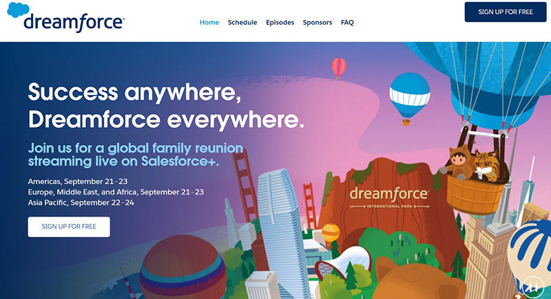
Dreamforce does not disappoint with this dreamy and imaginative event landing page. It is full of animations that attract visitors.
It uses the animation theme to present information about the event.
The page discusses frequently asked questions as well as what to expect from the event. It places CTAs throughout the webpage so that visitors do not have to scroll all the way to the top to sign up.
The key takeaway from this event landing page is to not be afraid of being creative.
Users find the same old website layouts boring. Try something new to impress them.
Landing on an event registration landing page design
An event registration landing page is a powerful marketing tool. It is a great way for event organizers to encourage visitors to attend an upcoming event.
It is important to create a good first impression with an event registration page. But, as the above examples show, there is no one right way to design a landing page.
Designing an event registration page depends on the event’s set of goals. But there are some basic design principles to use on every event registration page.
These include:
- Keep it simple
- Have clear CTAs
- Be creative
- Keep vital information in plain view
- Make it easy for people to attend
- Use images and videos
- Build credibility
Use the examples in this article as event landing page inspiration. You’re sure to find the ideal design for your event registration landing page.
If you enjoyed reading this article with event registration landing page designs, you should check out this one with event WordPress themes.
We also wrote about a few related subjects like event registration software, event websites, event booking systems, fitness event ideas, and event planning resources.
Not only that, but we also created articles with event scheduling software, using PayPal for event registration, and how to make money hosting events.
