A good-looking website offers a pleasant visiting experience and makes people more likely to return. All companies with a corporate website should have a well-designed website to attract viewers. However, the aim of its use is going to be different from one company to the next.
Corporate website designs need to be done well, and according to the needs of the organization. In the end, the website is an online representation of the brand and needs to have a consistent message to its customers.
Today, bold and clean web designs come in different formats, sometimes including videos, graphics, or full-page photo backgrounds. Therefore, it is essential to understand the variety of options, and which ones to use for specific projects.
When we look at the corporate website design, we need to understand what elements make it unique. By following this, we will be able to bring our ideas to life.
This article created by our team at Amelia (the best WordPress booking calendar plugin) will examine some of the best corporate website design examples and explain why we chose them. Let’s start exploring and see what a business web design should look like.
Corporate website design examples
Journey Group, Inc
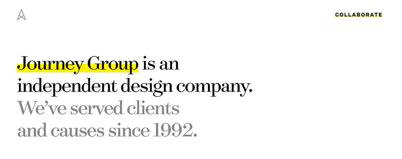
This corporate website design presents the story behind the startup and where it is now. It is a simple design, but the content is well structured. The design elements look attractive as well.
PIXAR
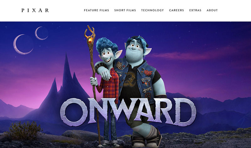
Anyone wanting to create a corporate website design needs to first have an inspiration. The minimalist approach coming from Pixar is an example to follow. We are talking about a massive tech company that rose from the ideas of Steve Jobs. His persistence in creating the best possible product created his legacy.
Montage
Montage has a next-level corporate website that clearly outlines what its products are and how they work. The testimonial section gives all the information that people need to see regarding other people’s experiences. So, it is going to be easier for them to make a choice after they see this section of the website.
The advantage of having such a clean, precise service business website design is that the user has all the information at their disposal. Its navigation allows users to navigate with no problems around all the pages they are searching for.
Pelli Clark Pelli Architects
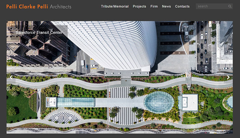
This business website is an excellent example of how showcasing projects should be done. It is a great way of showing users about what the business is about. The black background and the crisp images make it indeed a fresh corporate website design. We also liked the website hierarchy and how simple it is to navigate between menus.
Harry’s
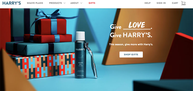
Simple corporate website design that has high-quality stock images together with great fonts. Each section has a description related to the products the brand sells. This helps any user see all the details they need in order to make a decision.
Lexus
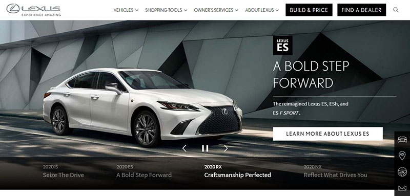
A well-known company, most people have heard of Lexus. Their corporate website design is stunning, and the use of good photography shows off what they have built.
They know how to get people interested in their cars, and their inspirational videos are also something they showcase as well. Lexus has a brisk business website, and people for sure appreciate it.
Apple
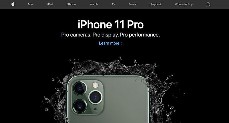
Apple’s website is also a fantastic example of how a corporate website design should be done. It has a minimalist vibe, yet at the same time, it stays elegant and catchy. When you enter the site, you see pictures of their latest products.
This draws the viewer’s attention quickly, and chances are quite big that they become interested in the product. Knowing this can be useful when projects that are similar need to be done.
Boundary Breaks
By focusing on their website animation, we can see how the interactive aspect is used to garner the viewer’s attention.
Susa Ventures
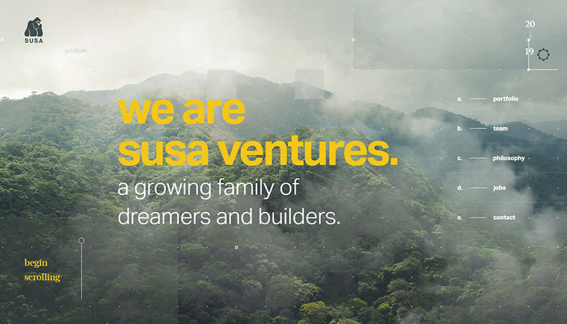
This may not be what you were expecting from an investment group website, but the bold, natural, and adventurous looks surely grab the viewer’s attention. The entire layout is nicely done and works as intended.
Zillow
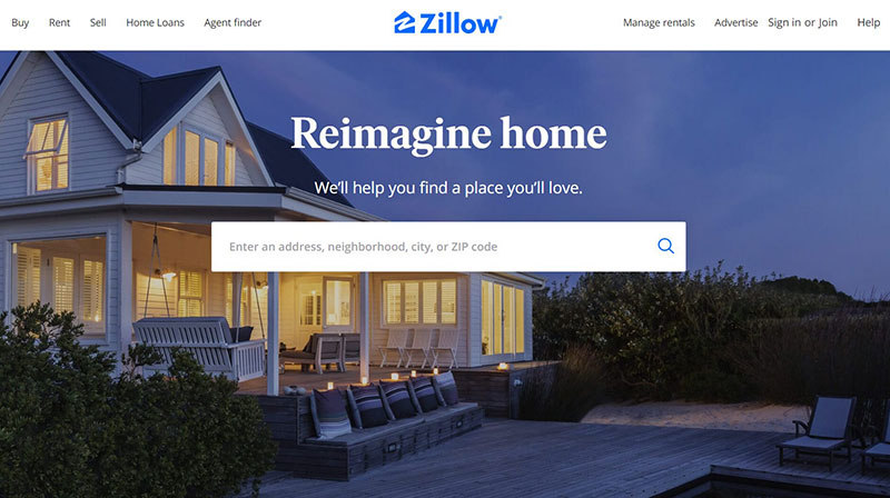
Zillow managed to do a great job with its corporate website design, and we appreciate the ingenuity. The search area is done in a smart way, and it helps new users to select their favorite listings without the need to search for any kind of hidden page.
Brooklyn Soap Company
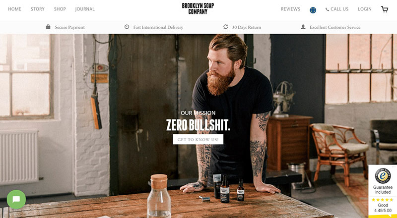
The look of this corporate website design is funny, inviting, and reflects the products and the brand quite well. There is nothing overtly flashy about it, and they seem to be confident about the fact that they do quality products without the need to dazzle you with any kind of graphics and animations.
Wootten
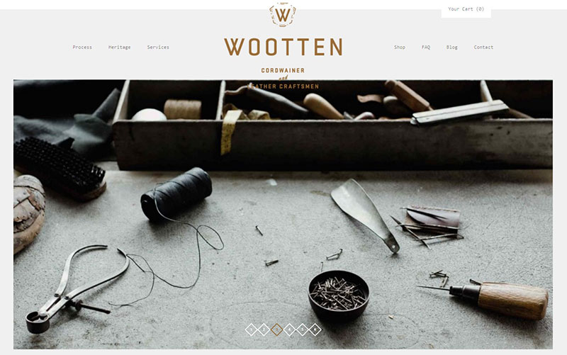
You can see the creativity throughout this minimal website. The different items that are in the store have been presented using a broad web page, and details of all services together with manufacturing have been mentioned boldly.
ETQ
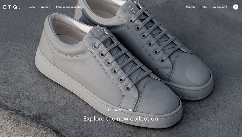
This brand is known for producing footwear and accessories. Similar to other good corporate website design ideas, the focus of the brand was on a minimalist approach.
It has cool images and a nice background that makes the viewer enjoy a nice experience. There are also a lot of the products are shown on the homepage, and this means that users do not need to navigate to another part of the website to find what they need.
Rollpark
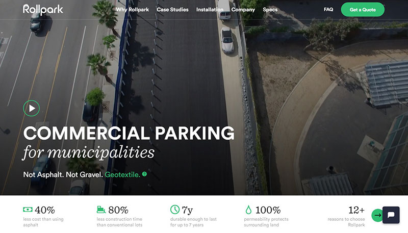
Anybody interested in having a unique corporate website design should check this one from Rollpark. Due to its simple visuals and dynamic navigation, users enjoy a good looking online presence.
Bienville Capital Management
A lot of attention should also be also given to the mobile side in today’s world. This corporate website design looks good in responsive as well as desktop. No website should feel crowded with text or designs. Viewers need to discover the information on the site easily and simply. And this example shows how to do that from a designer’s point of view.
Exponent PR
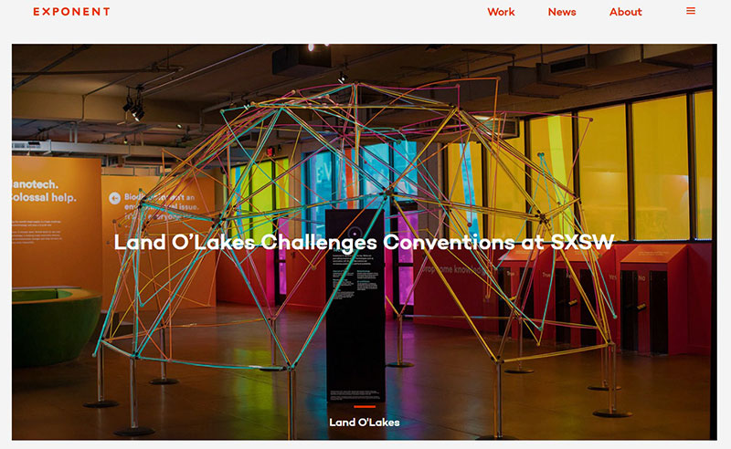
To bring attention to their video montage, the team that built the Exponent PR site used simple colors and fonts to make everything pop up.
Jack Daniels
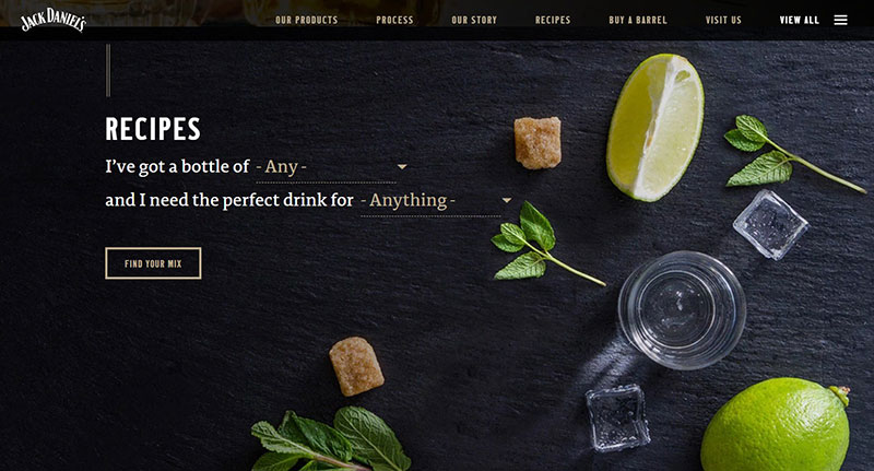
One of the most classic, simple corporate website design is the one from Jack Daniels. The black and white colors look nice on the home page, and soon you will be able to explore the different varieties of whiskey.
Revols
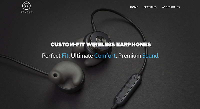
Revols brings a bold approach to its website by having imagery of their headphones, along with other uses of video and photography, from the start. The photography, together with the video, make the site product-focused, so this means users can become more and more immersed in the experience that the headphones can offer.
Clarks
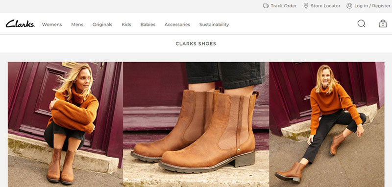
Clarks created a beautiful corporate website that brings the vintage design in touch with modern updates. It reflects the brand, and it combines elegant pictures with their latest shoes with a high fashion approach. A photo banner shows the alternating promotions to advertise the various new shoe collections and promotions that they have.
Emblem
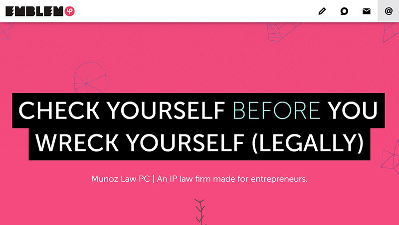
Another great website that we enjoy is this one from Emblem. It has cool imagery together with bright colors that get the attention of any user.
Bark PR
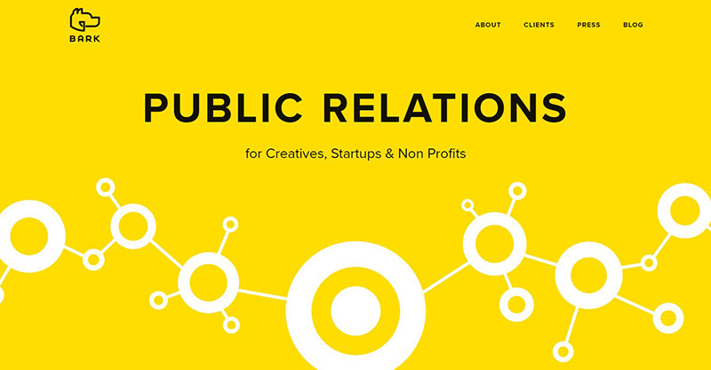
This corporate website design focuses on a flat UI together with bold colors that stand out and help inspire.
Holm Marcher & Co
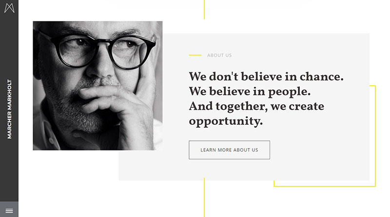
This example of corporate website design is unique and shows how modern trends look very good. It is simple and nicely structured, with all the important information displayed to be easily accessed by any user.
FAQs about corporate website design
1. What is the purpose of a corporate website?
A corporate website’s main goals are to give a company an online presence and to inform visitors of the company’s mission and goals. It functions as a digital storefront where potential customers can learn about the available goods and services, the company’s background and core principles, and contact details. A company website can also be utilized to generate leads, increase brand recognition, and create trust in the market.
2. How important is responsive design for corporate websites?
For corporate websites to display properly across a variety of platforms, such as computers, tablets, and smartphones, responsive design is essential. Lack of mobile friendliness on a website can result in a bad user experience, high bounce rates, and lower search engine ranks. Corporate websites must be created with a responsive layout that adjusts to various screen sizes because the majority of people access websites through mobile devices.
3. What design elements should be included in a corporate website?
A business website need to have a polished, expert appearance that complements the branding of the company. It needs to have crucial components such a simple navigation menu, interesting pictures and videos, strong calls to action, and contact details. White space, a color scheme that is consistent, and easily readable typography should also be used.
4. How do you ensure that a corporate website is visually appealing and engaging to users?
Designers should think about using high-quality photographs, videos, and graphics to make sure a corporate website is aesthetically pleasing. These components must be used in a way that supports the content and adheres to the organization’s brand rules. The use of a legible typeface, a unified color palette, and appropriate usage of whitespace are also crucial. By developing interactive elements like forms, quizzes, or animations, you may engage users.
5. What are the best practices for designing a corporate website that is easy to navigate?
Organization of the information into logical categories and the use of a clear and concise navigation menu are the first steps in creating a corporate website that is simple to explore. Well labeled pages will help consumers understand what to expect when they click on them. Also, adding search capabilities and a breadcrumb trail can help users discover the data they require fast.
6. What role does branding play in corporate website design?
Designing a corporate website with branding in mind is important since it promotes a unified image and message for the company. To increase brand awareness and credibility, designers should constantly use the company’s logo, color scheme, font, and other brand aspects across the website.
7. How do you optimize a corporate website for search engines?
Designers should concentrate on a number of aspects, such as the website’s content, structure, and technical components, in order to optimize a corporate website for search engines. This entails carrying out keyword research to find pertinent terms to target and inserting them into the content, meta descriptions, and header tags of the website. Moreover, search engine rankings may be impacted by a website’s speed, mobile friendliness, and site architecture.
8. What are some common mistakes to avoid when designing a corporate website?
While creating a corporate website, common errors include poor readability, cluttered navigation, slow loading times, and an absence of mobile friendliness. Designers should also refrain from employing unnecessary images, unclear calls to action, and convoluted forms.
9. What is the ideal structure for a corporate website?
A business website should have logical categories for the material to be arranged into for easy navigation. Linking to the website’s primary pages from the homepage should provide visitors with a clear overview of the company. A website for services or products, an about us page, and a page for contacts are also necessary. Including case studies, case studies, or a blog can also provide value and increase the reputation of the company.
10. How do you ensure that a corporate website is accessible to users with disabilities?
The Web Content Accessibility Guidelines (WCAG) 2.1 should be followed by designers to guarantee that a corporate website is accessible to persons with impairments. These guidelines offer suggestions on how to make websites accessible to users with disabilities, such as those who have physical, mental, visual, or hearing impairments. To do this, you should caption movies, use contrasting colors, and make sure the keyboard is accessible in addition to supplying alt text for photos. To make sure it satisfies the needs of all users, it’s also crucial to test the website’s usability with assistive technology.
Ending thoughts on corporate website design
In conclusion, good corporate website designs are accomplished by using the brand features and putting them in the center of attention. More and more designs are done using styles that help the brand stand out and communicate its mission, not the other way around.
To create a good corporate website design, you can use corporate website templates, one of the best WordPress themes for small businesses or you can design the website from scratch.
We hope you liked the corporate landing page inspiration from this article.
If you enjoyed reading this article on corporate website design, you should check out this one about coaching websites.
We also wrote about a few related subjects like meet the team pages, single-page websites, digital agency websites, web development companies, creative websites, artists’ websites, black websites, website backgrounds, simple website design, and portfolio websites.
