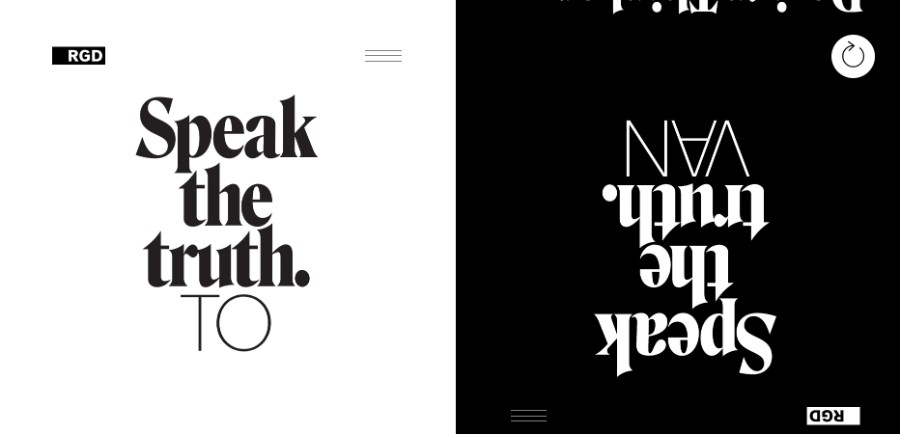
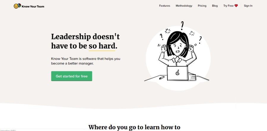
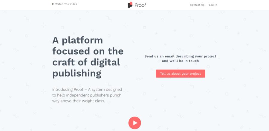
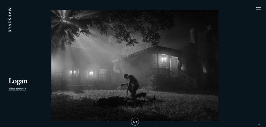
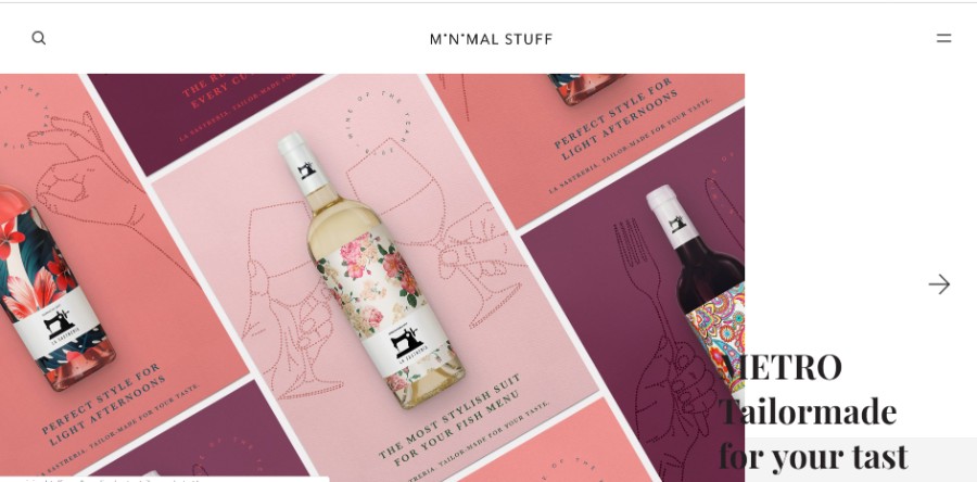
Minimalism is appreciated all the time. As the saying goes, less is more. Minimalism is very popular in modern design approaches. Simple website design will always generate the wanted reactions and exploring the principles of minimalism is a condition for building good websites. We noticed this ourselves when we tested several landing pages for Amelia, the best appointment scheduling plugin for WordPress.
Minimalism involves experimenting with color schemes, scrolling, transitions, buttons, and so on. There are several elements that should always be present in minimal design, regardless of the rest of its composition. In this article, you are going to learn what does it take to come up with a simple website design that suits the needs of all visitors.
Table of contents
- The minimalism principles in web design
- The benefits of keeping website design simple
- Tips for building an efficient minimalist website
The minimalism principles in web design
There are several principles that should always be present in simple website design:
- Making the interface user-friendly
- Navigation should be hidden
- The color scheme should be composed of a maximum of three colors
- Negative space is a condition in minimal design
- Using multiple, different fonts is recommended
- No excess details should be included
- The buttons shouldn’t be too numerous
The benefits of keeping website design simple
The number of conversions
After thorough analysis, it has been proven that websites that have a simpler design bring more conversions to the table than websites that are excessively decorated.
For instance, when an eCommerce store adopts a more minimalist look for their website, the increases in sales are visible in a short period of time. Basic websites seem to be overall more efficient than complex ones.
Minimal design doesn’t get outdated
Sleek websites seem to be timeless, even though minimal web design is constantly changing, and new web design trends emerge every month. This is why some websites tend to become outdated very fast. Adopting a trend that recently appeared on the Internet is not the best option if your goal is to design a website that will last a few years from now on.
Simple website design allows you to avoid applying updates to it very often. A minimal website will always keep your visitors from getting distracted, offering them the exact information they need.
People who visit websites looking for products or services won’t be very interested in the way it looks, but in how easy it can be used. These are a few key points in simple website design that you should keep in mind next time you put together a project:
- Minimalism won’t get outdated because it became a style rather than a trend
- Minimalist websites are the most responsive ones
- Minimalist websites have the best loading times because of their simplicity
- A clean website design allows visitors to focus on the products and services you sell
- Navigation is very intuitive on simpler websites, reducing the bounce rate
Tips for building an efficient minimalist website
Simple website design is based on making everything easy to access and to notice. The reason why that happens is that aesthetic websites contain fewer elements, which allow users to focus on what they are really looking for. The level of usability in simple websites must be better, as the interface is intuitive and less crowded.
Aesthetics should – of course – balance with functionality, which is usually difficult to handle in more complex websites. Minimalism contains all these elements and combines them into one great result – clean websites. Here are the principles that make a minimalist website easy to use:
Good navigation
When looking for simple website examples, you will see they have one thing in common – good navigation. In order to offer the users a chance to find whatever he is looking for fast and easy, you need to put together intuitive navigation. You need to use just a few buttons that are visible to the visitors of the website and that are very responsive at the same time.
The menu button should always be present on a website, but the other buttons that send users to other parts of your website should be encapsulated into the menu button. This way, you keep the menu very minimal, but easy to navigate and highly responsive. Make sure to highlight the buttons so that visitors know they can use them to find what they need.
Using negative space (white space)
Negative space is a term used in design which has to do with the space that is left empty in a composition. This is also called white space and it is paramount in minimalist website design. Using white space has many benefits, among which improving the UX and focusing the visitors’ attention on what truly matters on the website.
White space is also used as a balancing tool in simple website design. If the main content blocks you have designed seem to be too crowded, adding white space will solve the issue and will make the website look much better. The minimalist style in website design is perhaps entirely based on the use of negative space and making all elements intuitive to use and very responsive.
Studying typography
Because there are a few elements on simple sites, you need to focus on typography. Capturing attention can be done only by selecting the proper fonts.
Today, simple web design makes great use of typefaces, which can express a specific message or add a nice touch to the entire design. Here are some of the most used fonts this year:
There are many unique WordPress themes that have great typography and you can try them.
Bold fonts
Bold fonts are very appreciated in minimal design and not only. Fonts started to be more and more creative and the only rule to respect when choosing one is to be easy to read. A font that catches attention quickly and it’s also easy to read is more than enough.
Sans Serif fonts
Don’t forget that you can combine multiple typefaces on a minimal website, but they need to match. Sans Serif fonts have a very crisp look that works best with bolder, creative fonts. Choosing two fonts that match can be tricky, which means you should try multiple combinations until you find the one that looks best.
Combing text blocks
Once you put together the content you will include on the website, divide it into blocks and choose the appropriate font for each. By doing so, you give visitors the chance to rapidly scan the content and find the exact information they need.
Using less content
Talking about content, it’s important to keep it to a minimum. As you may already know, minimalism is all about reductionism. Minimizing the number of elements on a website also includes less content, but more quality content. Simplify the structure of your text, use plain language or professional vocabulary and only include information that would be relevant for the user in one way or another.
Hierarchy
In simple website designs, you need to focus on visual harmony. Creating a simple website is all about putting things in order and achieving that visual balance that people often seek when navigating on a site. Aligning elements beautifully, following a grid or a previously-created layout are two details that will turn the website into a well-built one. Bulking all the content in one single place is not an option.
Smart color palettes
Minimal web design is based on using just a few colors. These colors don’t necessarily have to be black and white. In minimal design, using an accent color is a good practice that creates a focal point. Simple website design requires well-thought color palettes that suit the brand of the client. These should be selected according to the preference of the client and the features of the website.
Images
The images you include on the website also have to be minimal. Beautiful visuals represent the only way to get closer to the users and transmitting a message in a more emotional manner. Images are not only decorations but ways to sustain the written content.
Showcase of minimalist websites
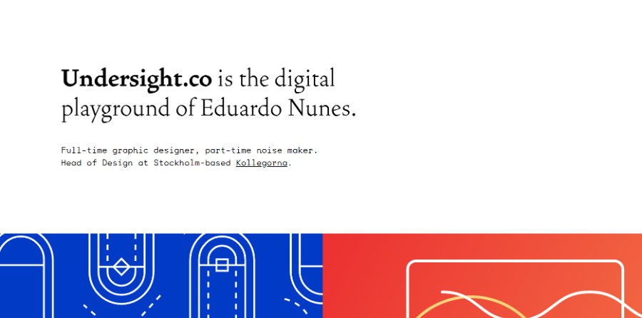
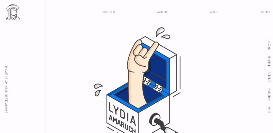
Lydia Amaruch has always been passionate to create, illustrate and photograph everything around her. She is now a graphic designer, UX/UI designer, and motion graphic designer.
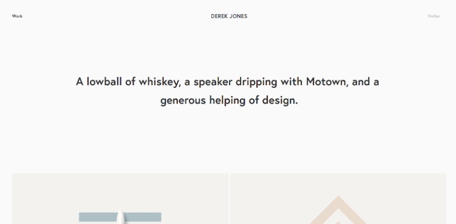
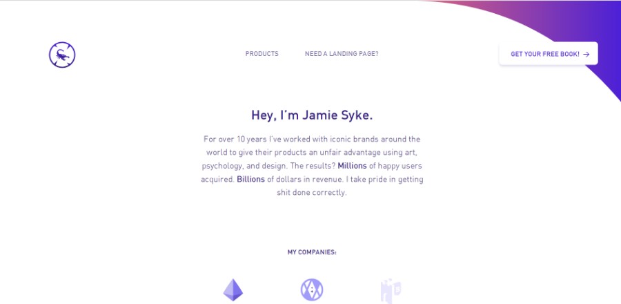
For over 10 years he’s worked with iconic brands around the world to give their products an unfair advantage using art, psychology, and design. The results? Millions of happy users acquired. Billions of dollars in revenue.
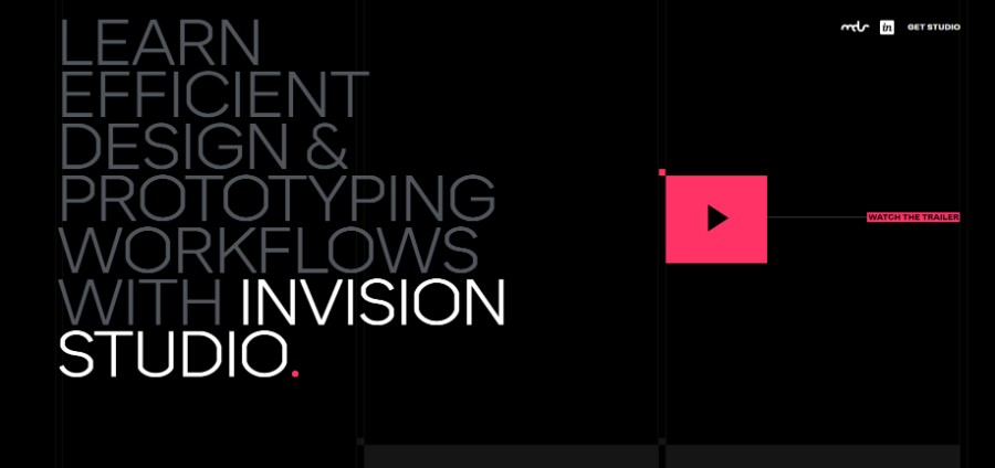
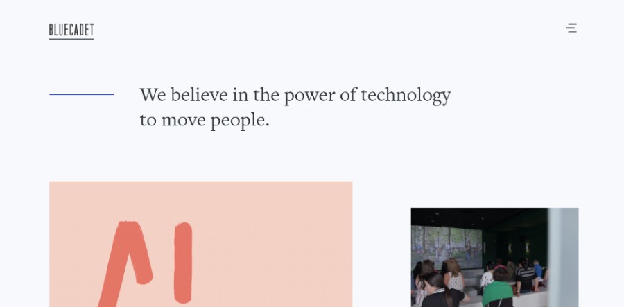
They believe in the power of technology to move people.
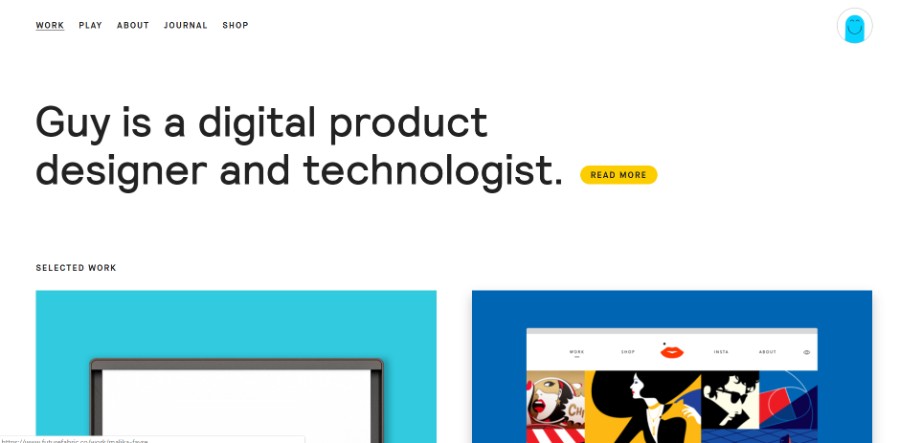
Guy is a digital product designer and technologist.
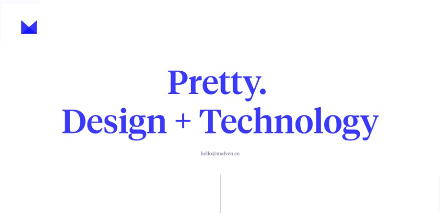
Malven Co. is the web/digital/interactive design and development studio of Chris Malven, based in Des Moines, Iowa.
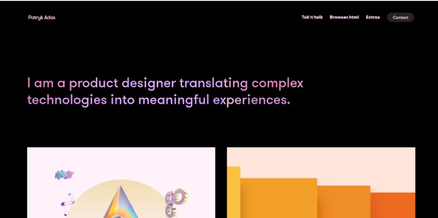
He is a product designer translating complex technologies into meaningful experiences.
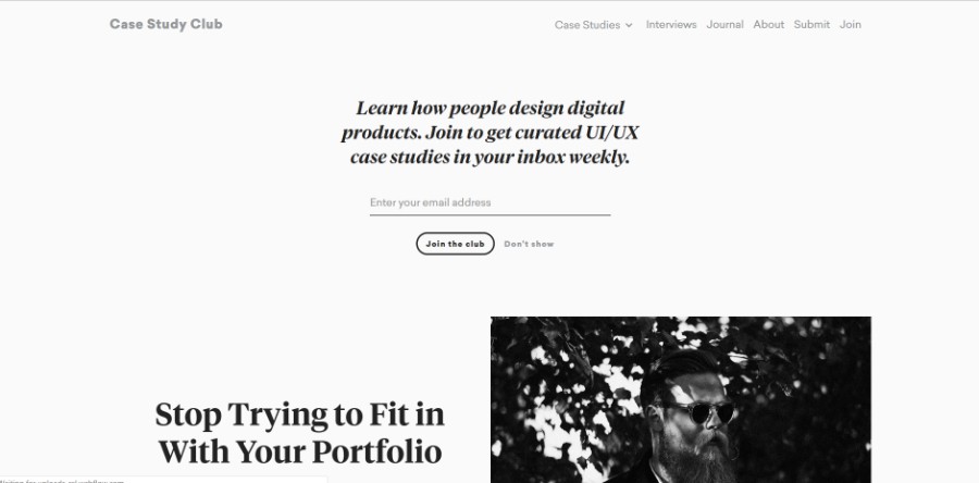
This site started as a side project back in 2015. Collecting only the latest and greatest case studies about digital product design.
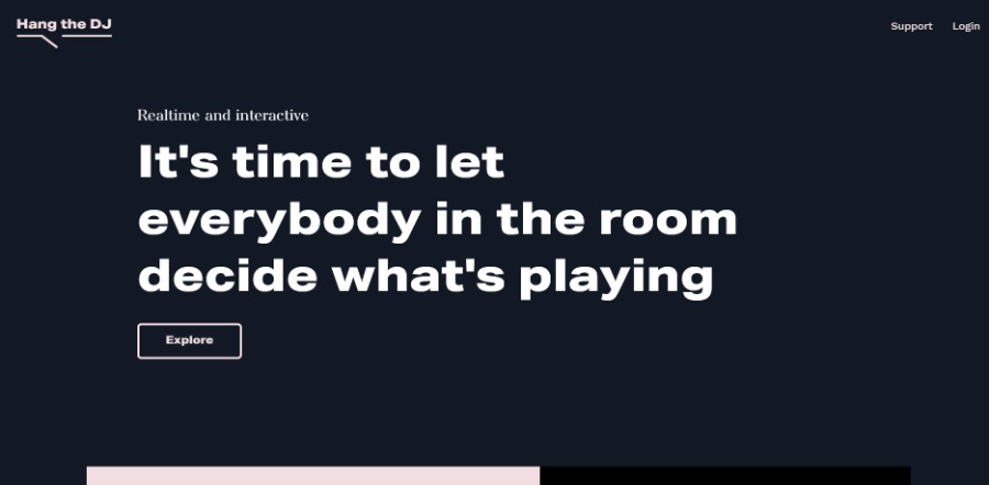
Hang The DJ is the democratic playlist for the upvote era. Set up a playlist, invite your friends to join, and kick off the battle of the tunes.
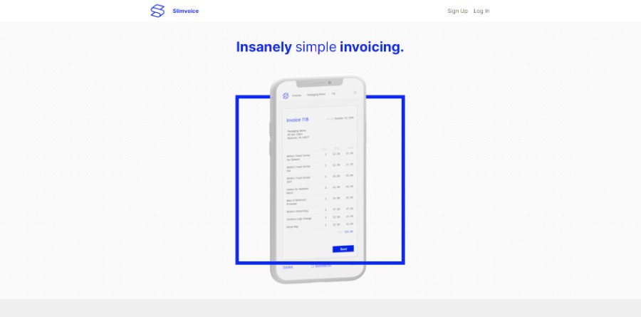
Slimvoice redefines the lightweight app – from the engineering to the design – so that you can spend less time sending and more time receiving.
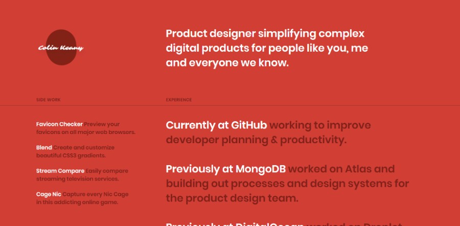
Product designer simplifying complex digital products for people like you, me and everyone we know.
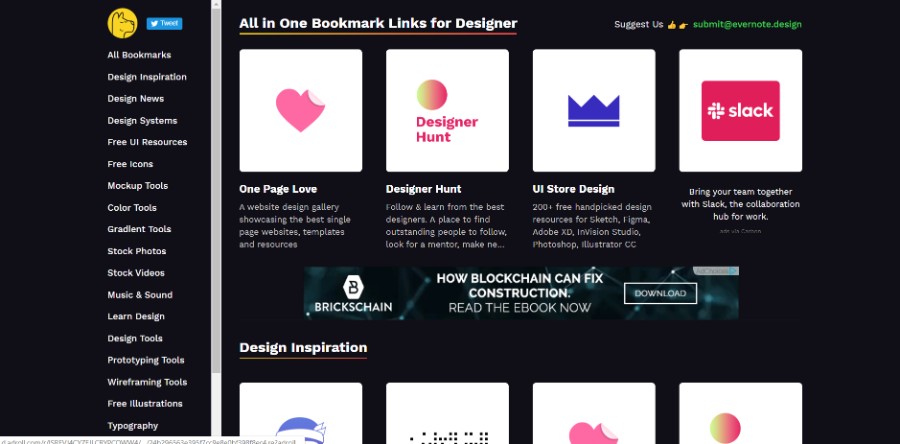
All in One Bookmark Links for Designer.
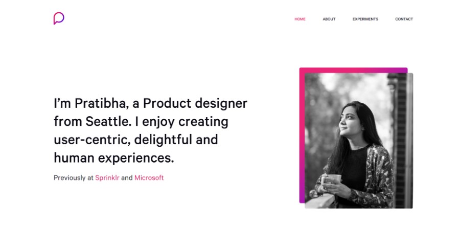
Pratibha is a Product designer from Seattle. She enjoys creating user-centric, delightful and human experiences.
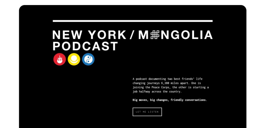
A podcast documenting two best friends’ life-changing journeys 6,380 miles apart. One is joining the Peace Corps, the other is starting a job halfway across the country. Big moves, big changes, friendly conversations.
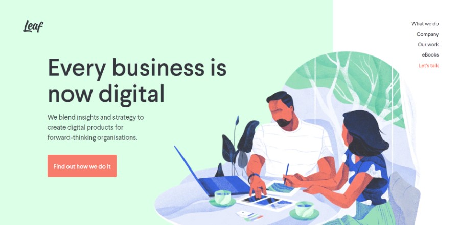
They blend insights and strategy to create digital products for forward-thinking organisations.
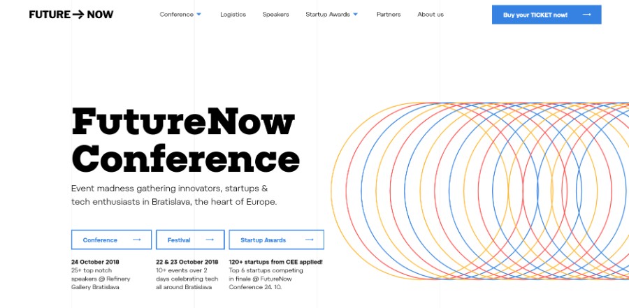
Event madness gathering innovators, startups & tech enthusiasts in Bratislava, the heart of Europe.
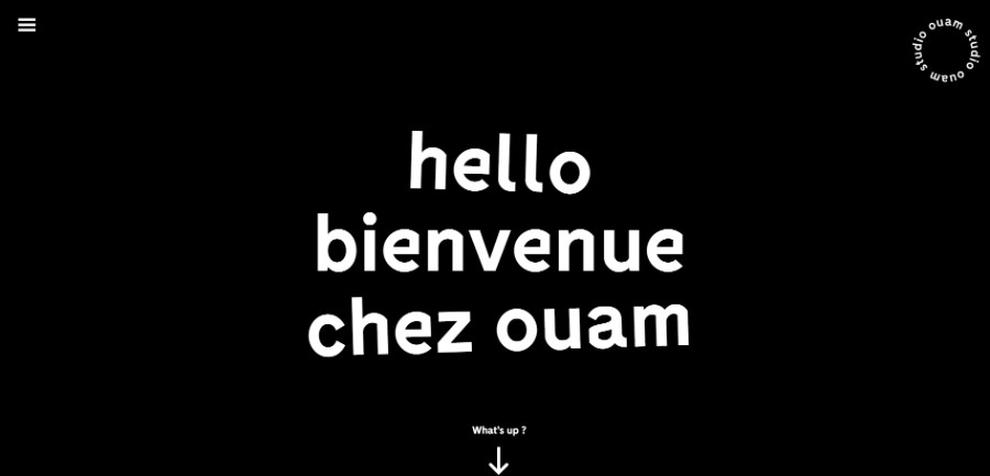
Studio OUAM is a creative agency based in Paris and Bordeaux in France. They specialize in visual identity and brand creation.
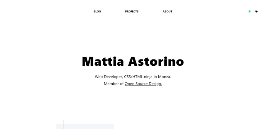
CSS/HTML architect in Monza and member of Open Source Design.
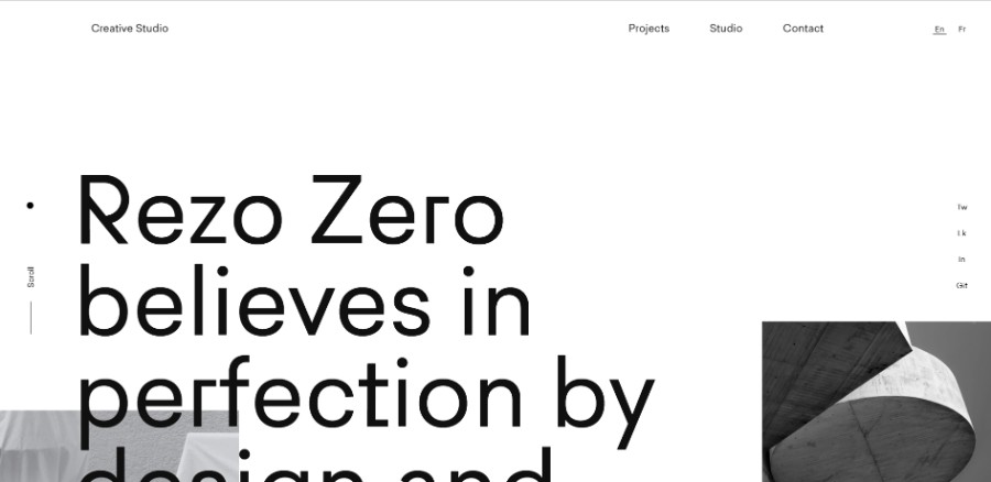
Rezo Zero is a graphic and digital studio that designs and develops unique brand identities and tailor-made digital solutions. Rezo Zero believes in perfection by design and performance by default.
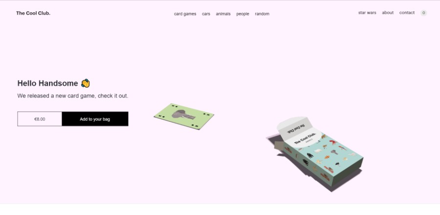
The Cool Club is a collection of the most famous, visionary men and women from around the world. Ante up, it’s time to claim your fame.
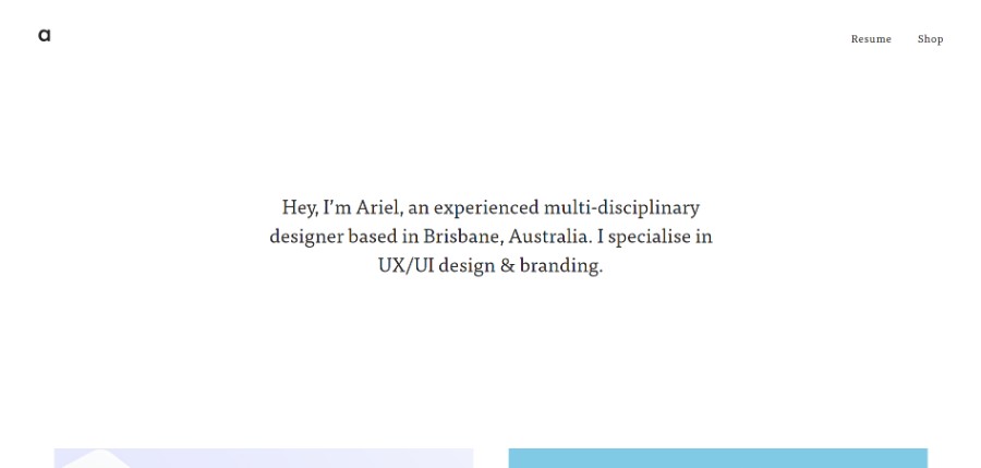
Ariel is an experienced multi-disciplinary designer based in Brisbane, Australia. She specialises in UX/UI design & branding.
Flat for Education is designed for your music classroom. You can use it on any device to access and create your musical compositions or music education activities.
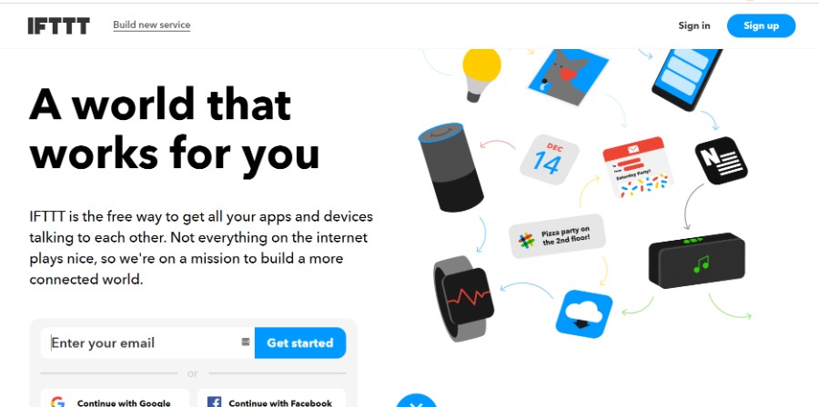
IFTTT is the free way to get all your apps and devices talking to each other. Not everything on the internet plays nice, so we’re on a mission to build a more connected world.
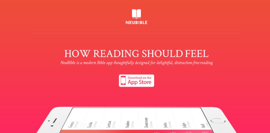
NeuBible is a modern Bible app thoughtfully designed for delightful, distraction-free reading.
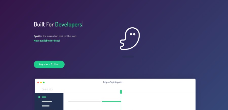
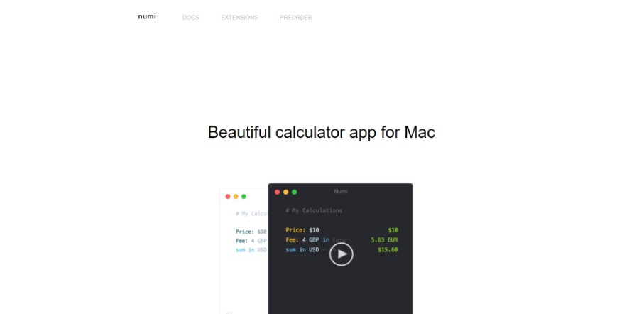
Numi is a beautiful calculator app for Mac.
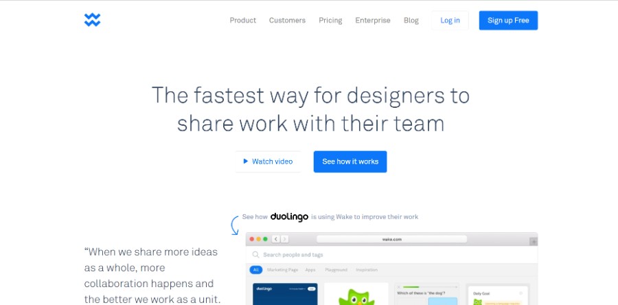
Wake makes it super easy for designers to share work and collect feedback from their team.
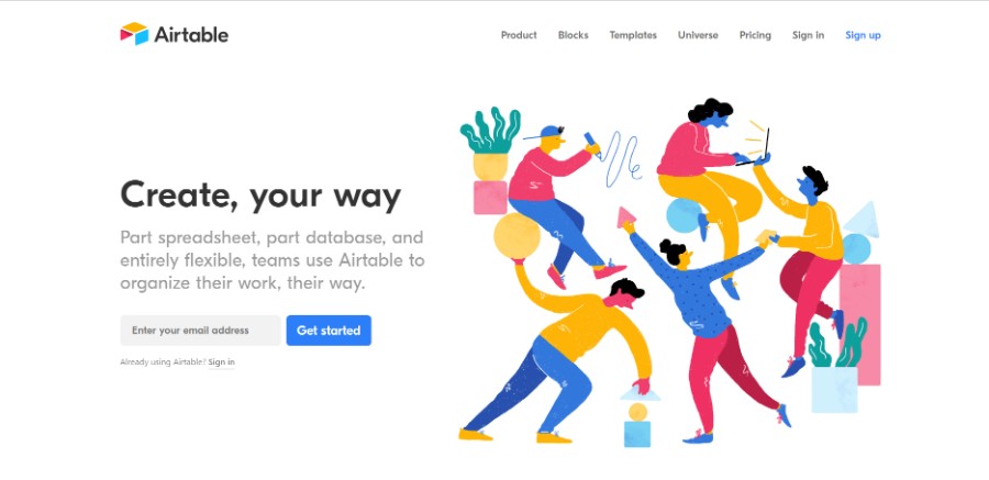
Part spreadsheet, part database, and entirely flexible, teams use Airtable to organize their work, their way.
Finest selection of branding, website & product designs for those who believes in simplicity, beauty and high-quality in design.
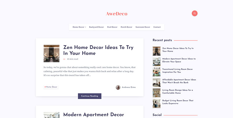
AweDeco is a home decor blog with a minimalist design, brimming with ingenious design inspiration. Readers enjoy a curated selection of chic interior styles, innovative DIY projects, and sustainable living ideas, all communicated through a clean, simple, and user-friendly website interface that champions aesthetic appeal and easy navigation.
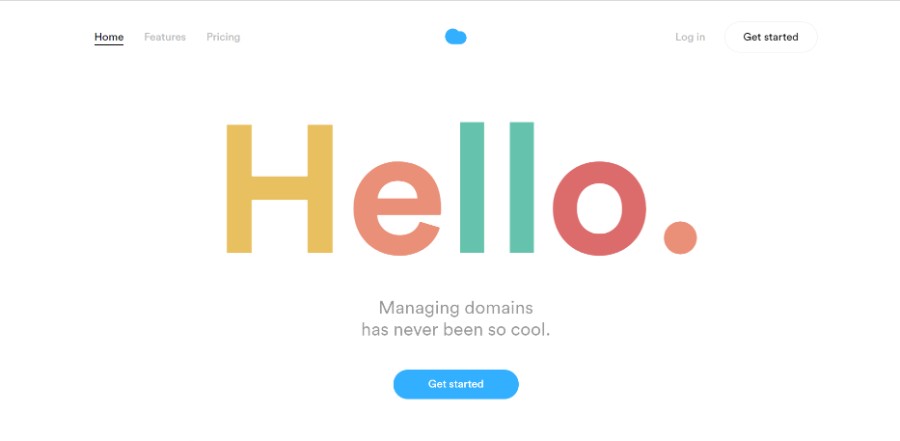
Nuage connects to your registrars’ APIs, allowing you to manage all your domains in the same place. No need to transfer your domains. No worries, we don’t change the infrastructure. Everything remains secure, exactly where it should be.
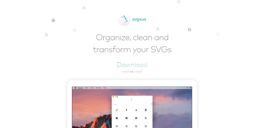
With Svgsus, you find the icons you’re looking for. Search and drag or paste the icons to whatever software you prefer.
Ending thoughts on these simple website design examples
Simple website design is not that simple to create. As you have probably seen in this article, there are many principles to follow to obtain a good result. Most designers prefer a minimalist design because content overload is never beneficial. Thinking about each element of minimal website design and investing more time in usability and responsiveness will help you come up with the best minimal website.
If you enjoyed reading this article on simple website design, you should check out this one on portfolio websites.
We also wrote about a few related subjects like meet the team, single-page website, corporate website design, coaching websites, digital agencies, web development companies, creative websites, artists websites, black websites, and website backgrounds.
