It may seem insignificant, but a section that is often overlooked on company web pages is the “Meet the Team” page. This tab is a small place where we dedicate recognition to the individuals who make it possible for our site or company to prosper, and although it does not seem so important, the truth is that it helps a lot to create a positive image of your work.
The “Meet the Team” tab of a web page is essentially the work credits. But beyond presenting the faces of workers, this tab teaches us much more about the company itself. Whether we only put pictures of the faces or a large panorama of the entire group, team pages are there to show the quality and commitment we have with others.
Not only do these pages give our clients and visitors a way of knowing who is responsible for completing their orders or bringing them daily news, but it also allows those who work with us will feel flattered that their efforts are being recognized, which will motivate them to continue working, and may even attract new employees.
If you do not have one of these pages, in this article created by our team at Amelia (the best WordPress booking calendar plugin), we highly recommend you see the following examples of some fantastic pages.
Awesome meet the team pages
Lateral – The power of imagination
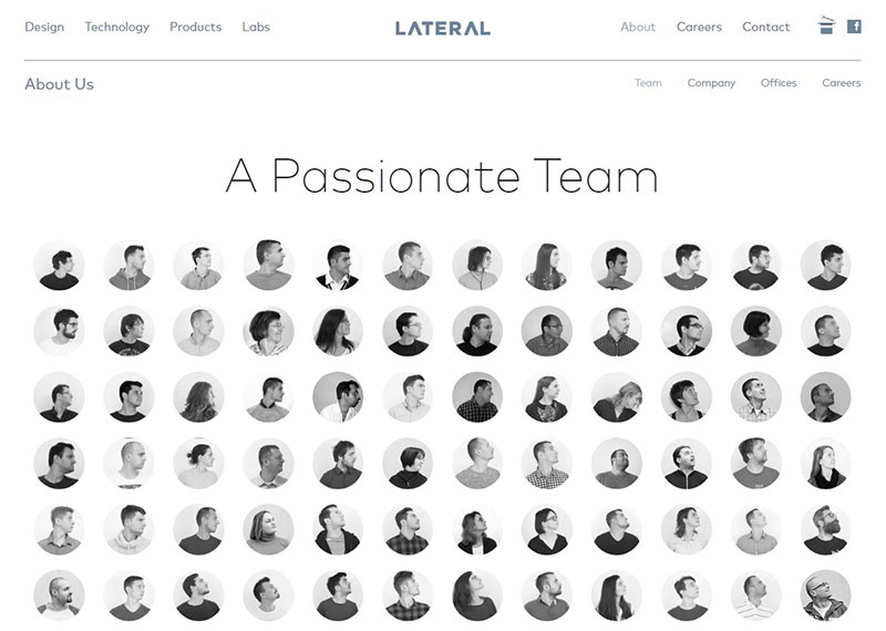
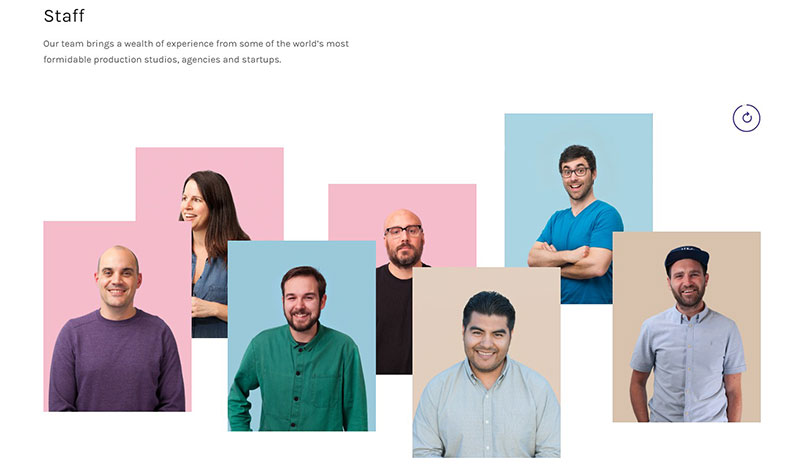
Being a design studio may have had a significant influence on the way Lateral organized its website. Whatever the cause, this is a style that undoubtedly gives importance to each worker, since everyone has a personal photo.
If you visit their meet the team page, you will see something very curious, as each headshot will look where your mouse is. Additionally, when highlighting an individual’s photo, the others will all look at it. These interactive employee profiles make us smile when we see them.
Kickstarter – Personal approach
The Kickstarter meet the team page shows its employee biographies alongside a small summary where you can see the commitment that each one has with the website. This also allows us to see their tastes in terms of projects, and how many they have personally endorsed.
Rethink – That people don’t get bored
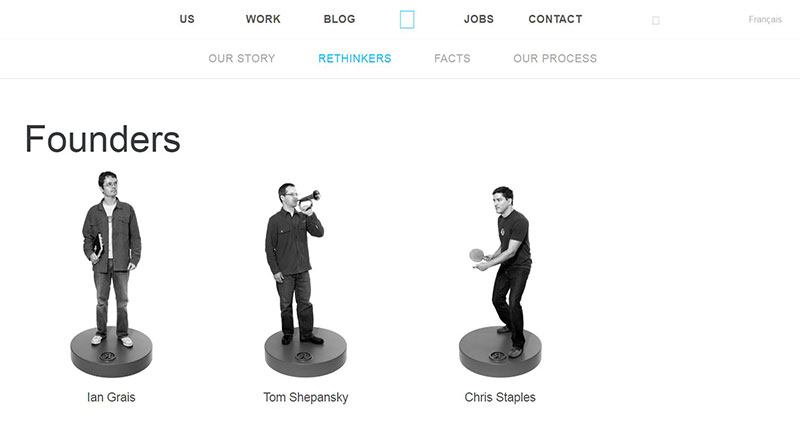
There are many ways to make a website interactive and enjoyable for the user. Rethink, honoring its namesake, created a meet the team page where each person from their team looks like a plastic figurine doing crazy poses.
Mimosa Agency – A brilliant design
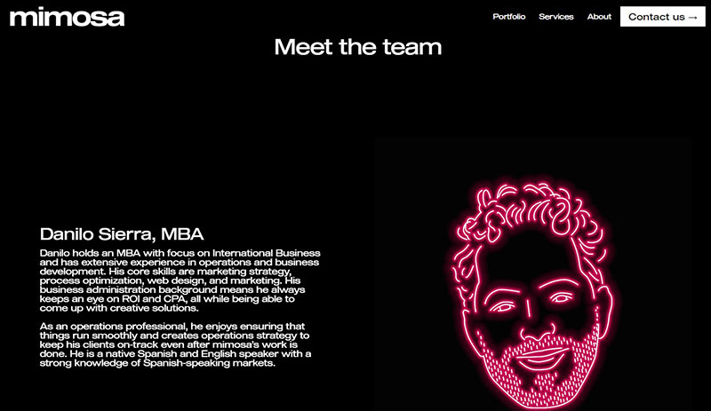
This agency from Berlin focused all their creativity on the faces of their team members. The meet the team page of this creative consulting agency is not excessively striking at the top, but brings a surprise pop of neon upon reaching the biographies of the employees.
Amazee Labs – Betting on the traditional
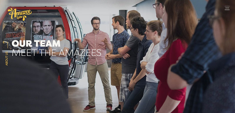
This collection of photos, as if it were an academic album, is an effective way to present each team member. The secret of the Amazee Labs meet the team page is in the order that they manage to locate their elements and how they quickly make clear what position each worker occupies.
Salted Stone – Spontaneity is the key
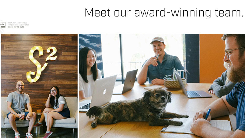
Salted Stone’s company’s website maintains a design according to what they offer; however, this has not prevented to place many high-resolution images where you see the team working as they enjoy what they do.
In each photo, we can see smiles and a desire to continue enjoying the work environment; even pets have a place in the workplace!
Etsy – A great meet the team page
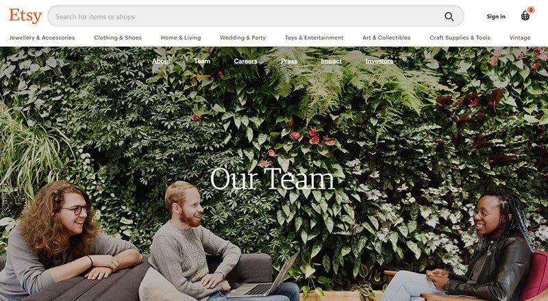
Fans of vintage products know that Etsy has one of the best pages to acquire what they. Not only is its catalog diverse, but it also has a huge team. Although they are many, this has not prevented everyone from having a space where they are recognized.
The page begins with great photos of the leaders, but a little below we realize that they represent less than 5% of the group. If you look closely, you will even find distinctively odd pictures.
Khan Academy – Meeting the teachers
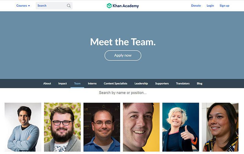
There is nothing more important for a student than to feel comfortable with their teachers. This is the intention of having a “Meet the Team” page at the Khan Academy. To get closer to the students, each employee has a brief introduction.
Additionally, the page also has some information about other skills and certifications,as well as how they can be personally contacted.
Bolden – Don’t overdo it
Bolden’s meet the team page is much more conventional, and at first glance, we may not see its true potential.
However, as soon as we select one of the team members, we can see a transition that gives it the only design touch it needs. A design that maintains the fundamentals so as not to distract the user.
Rock Kitchen Harris – A cartoon representation
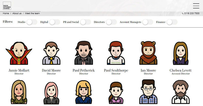
If you are looking for great team members’ bios you cannot miss the unique take that this English team applied. A standard profile image pose but replaced by a personalized cartoon of simple strokes and colors, which gives the brand a special, but very business-like, appearance.
Advantix Digital – The domain of the animated
Another example where cartoons stand out is how the Advantix Digital team seeks to promote its digital marketing brand through a striking presentation with strong colors, with facial drawings using flat colors but rich detailing.
On top of this artistic feature, each team member has a profile where we will also find some personal and work information. A cool feat here would be to use website animation too.
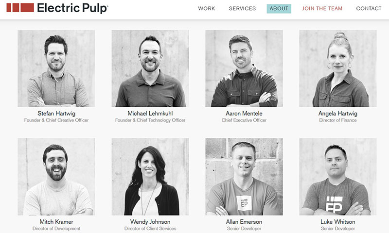
Electric Pulp – Showing their programming experience
Do not be fooled by the simple appearance and pale color palette of this page. The reality is that the Electric Pulp team really shows how much they love their work when we hover over each image. They know how to draw attention to the creative solutions they offer for digital projects.
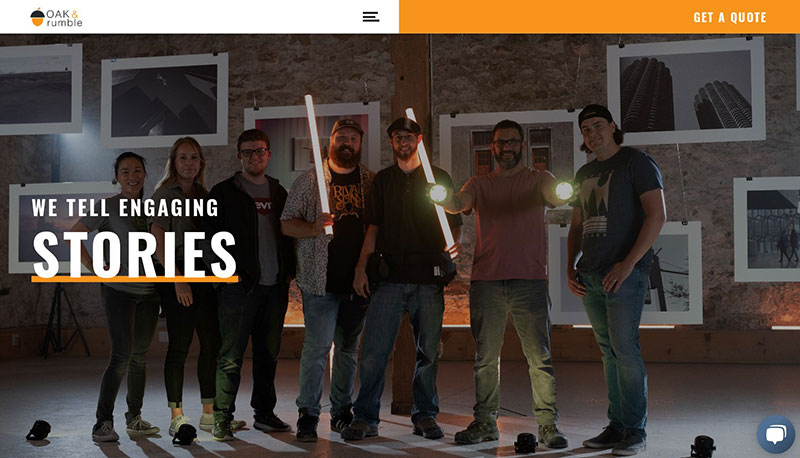
Oak & Rumble – Work and laughs
Coming from a company that specializes in video content, it is expected that the quality of the photos and the attention to details of this page to meet the staff is sublime. However, not everything is stoic and serious, as some funny faces are mixed into the tasks of this team.
Wistia – Let the movement invade you
From a distance, everything about this page seems normal. A group of frontal photos of the team, made up of 109 individuals (and a dog), is displayed. However, if we continue to scroll and move the mouse, the portraits come to life.
However, this is not even the page’s main attraction. At the top, we can select a “Drum Machine Mode”, which will turn this “Meet the Team” page into a musical instrument.
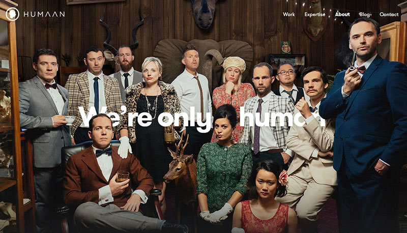
Humaan – No matter what, they are still human
It is very important to remember that aside from being employees and clients, we are all human. That is what Humaan’s team aimed to show by breathing life to each of the portraits of its team members.
In this case, not only a gif accompanies us to give this “Meet the Team” tab a dynamic feature, but also a personalized description of each team member, some more serious than others, along with links to their social networks.
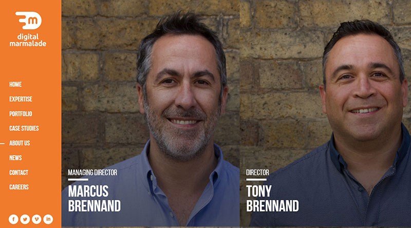
Digital Marmalade – Indicating their power level
The creativity of Digital Marmalade team is on full display through bar graphs and photographs on their page. They have added different data related to each one’s professional career, such as years of experience or in the company, as well as some personal information such as favorite food or favorite soccer team.
In addition, they also have a tab called “Superhero” where we can see nice montages with what we assume is that individual’s favorite hero. Who knew that the ability to fly would be comparable to the ability to program?
FCINQ – Breaking the mold
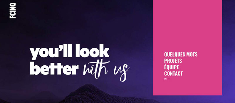
Thanks to the fun, irregular distribution of bubbles on this page, it breaks the traditional scheme of keeping everything uniform and tidy. When we click on one of the bubbles, an enlarged image of each worker’s profile appears, adopting a more common appearance.
Stink Studios – Everything is related
Stink Studios has made sure to create a page that keeps users busy with an abundance of information and related content. Each piece is integrated with some external link that leads to another site.
Search & Gather – A natural design
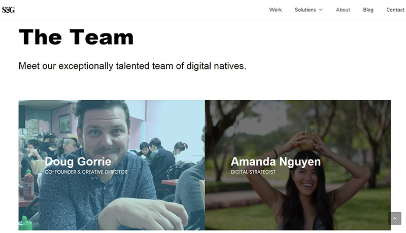
The Search & Gather site has an elegant and minimalist design, which displays some more traditional profile photos and information about the employees. This page proves that it is not necessary to have eccentric designs or long descriptions since the natural appearance of the photographs is more than enough for this site to work.
FAQs about designing a meet the team page
1. What should be included in a “Meet the Team” page?
A corporation or organization’s “Meet the Team” website ought to provide details about the people that make up its team. This can include the individuals’ names, titles, positions, and an overview of their duties. It may also contain specifics about their upbringing, schooling, and professional background. To assist users to put a face to a name, some pages might also feature images or videos of the team members.
2. How many team members should be showcased on the page?
Depending on the size of the company or organization, a “Meet the Team” page may have fewer or more team members. Yet, it is typically advised to keep the quantity modest so that visitors can quickly learn about each individual. A good rule of thumb is to highlight the main team members who are accountable for the success of the business or organization.
3. Should each team member have their own individual profile or should they be grouped together?
Depending on the size of the team and the amount of information being exchanged, it is decided whether to build unique profiles for each team member or to put them all together. Individual profiles might make sense if there are only a few team members. If the team has a large number of people, it could be better to put them together and give a quick overview of each person’s duties.
4. What kind of information should be included in each team member’s profile?
Each team member should have a profile that includes their name, title, and an overview of their duties. A picture or video, along with details about their training, experience, and history, can also be helpful. To encourage visitors to engage with team members on a more personal level, some businesses may also decide to add personal interests or hobbies.
5. How should team members be presented visually on the page?
Depending on the company’s or organization’s brand and style, the way team members are presented on a “Meet the Team” page may differ. But, it’s crucial to make sure that team members are represented consistently and visually appealingly. This can involve the use of top-notch images or videos, a clear and uncomplicated layout, and a unified color palette or style.
6. Should team members be arranged in any particular order?
Depending on the choice of the firm or organization, team members may not always be listed in the same sequence on a “Meet the Team” page. Others might decide to arrange them by department or seniority, while some would opt to arrange them alphabetically. To make it simple for visitors to locate team members according to their roles or area of expertise, it can also be useful to include a search or filter tool.
7. Should the page be updated regularly?
A “Meet the Team” page needs to be accurate and up-to-date. Team members’ profiles should be updated when they join or depart the business or organization. Also, regular updates can maintain the page interesting and appealing to visitors.
8. How can we make the page engaging and interesting for visitors?
It’s crucial to highlight the distinctive personalities and abilities of each team member on the “Meet the Team” page in order to make it engaging and entertaining. This may entail giving each profile a personal touch by including interests or interesting facts. Provide team member remarks or recommendations regarding their experiences working with the business or organization.
9. Should we include the personal hobbies or interests of team members in their profiles?
Team members’ profiles can connect with visitors more personally if they include their personal interests or hobbies. This can foster a sense of belonging and humanize the business or organization. Yet, it’s crucial to confirm that the interests or pastimes are appropriate and consistent with the culture and values of the business or organization.
10. How can we ensure that the page reflects our company culture and values?
It’s critical to highlight the diversity of the team members and their backgrounds in order to make sure that the “Meet the Team” page accurately reflects the culture and values of a firm or organization.
Also, the language and tone used on the page should be in line with the brand and values of the business. It might also be beneficial to highlight the company’s culture and principles by including team member testimonials or quotations about their experiences working there.
The page should also be updated frequently in order to reflect any modifications or changes to the organization’s culture and values.
Tips to make functional and unique meet the team pages
If you have finally decided that it is time to update your organization or company’s employee page, we have some additional tips to help you know how to start and what direction to take your design in.
- Keep the contact page as an individual site. A mistake some make is eliminating the human factor from biographies simply because they are business descriptions. If you want both page visitors and your teammates to feel at ease, consider adding fun anecdotes or facts about each individual. An important part of getting in touch with a company is knowing its staff.
- If you can make a presentation video or a group photo, then do so. It is not called “Meet the Team” for nothing. The idea is to see some teamwork.
- Do not be afraid to stray away from typical profile pictures. Consider adding extra photographs with scenes from day-to-day work, or even photos of the team having fun at work.
If you enjoyed reading this article about awesome meet the team pages, you should check out this one on single page websites.
We also wrote about a few related subjects like corporate website design, coaching websites, digital agency, web development company, creative websites, artists websites, black websites, website backgrounds, simple website design and portfolio websites.

