The traditional artist portfolio has nowadays mostly been replaced by artist websites. These art websites offer many benefits. Anyone with Internet access is able to visit your art website whenever they want. An artist website enables you to seamlessly combine endless amounts of images, texts, and videos.
Artist websites can add a whole other depth to your creativity, allowing others to see your worldview and your work methods. The best artist websites will give you a visual experience that simply cannot be achieved through checklists and slides. One might even say that the websites themselves are a form of art. Our team at Amelia (probably the best WordPress scheduler plugin) created this article to help you to learn more about artist websites and also look at these great examples.
Why is it important to have a website?
It’s vital to keep in mind that viewers will first glimpse your work by visiting your artist webpage. You wouldn’t hold an exhibition consisting of thoughtlessly slapped together art, so why should your artist homepage look like you’ve put zero consideration into it?
Regardless of whether you’re a fan of technology or not, you’ll be at a major loss if you completely disregard the importance of the Internet and social media. No matter whether you hack up old furniture with a chainsaw or you use glitter and macaroni to express yourself, and you steer clear of computers – a website art portfolio is absolutely necessary.
A checklist of what you should do
- Brand yourself.
- Utilize all media.
- Be your own PR firm or biographer.
- Be mysterious and generate curiosity by not displaying your work.
- Reflect your practice through the images you display.
- Don’t limit yourself to showing just your artwork.
- Address your audience.
- Provide your audience with a theatrical experience.
- Large work needs to be shown as
Without further ado, let’s take a look at these websites.
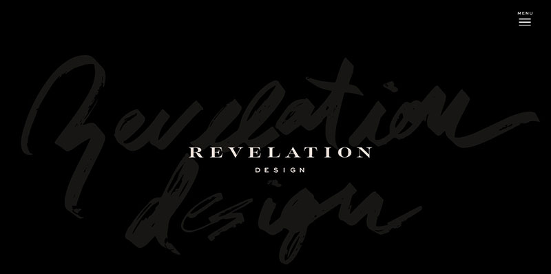
Revelation Design
Revelation Design is an Island-based floral and event design studio led by industry legend, Brooke Raulerson. This web experience entails subtle animation and all things floral.
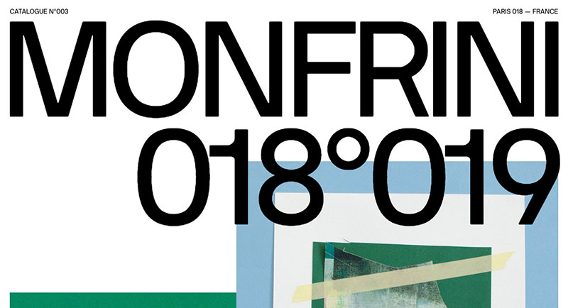
Florian Monfrini N°003
Florian Monfrini, a French painter based in Paris.
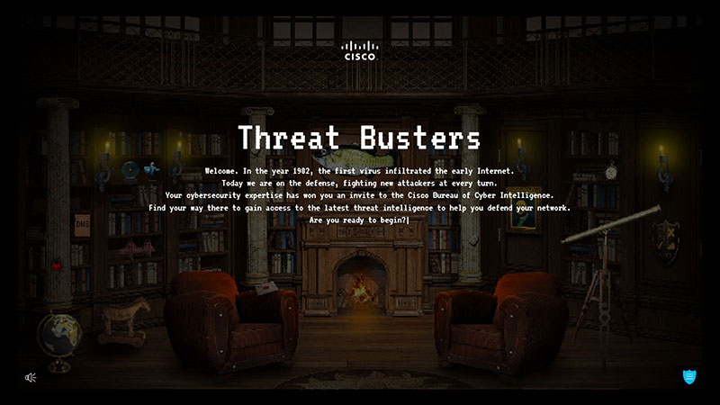
Cisco Threat Busters
A vintage game-style experience for the users to explore and find secret meeting rooms and make their way to the headquarters of the Bureau of Cyber Intelligence to gather malware info.
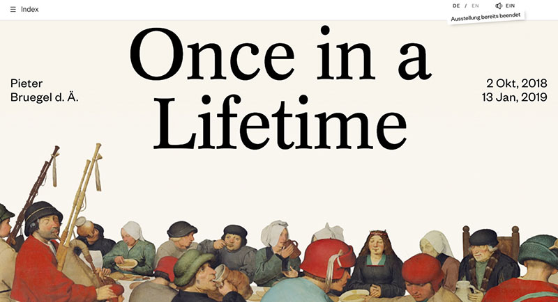
Bruegel – Once in a Lifetime
An interactive info site for the once in a lifetime exhibition about Pieter Bruegel the Elder, initiated by the Art History Museum in Vienna.
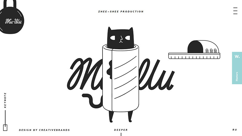
ZHEESHEE PRODUCTION website
The objective for the site was to mirror the company’s values and image while emotionally engaging its users: friends, colleagues, and partners.
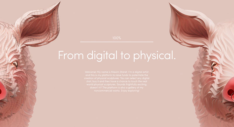
Max Shkret artist portfolio
From digital to physical: This is a digital artist’s platform to raise funds to enable the creation of physical sculptures. It also showcases a gallery of author’s noncommercial works.
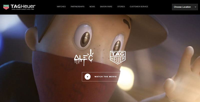
TAG Heuer – Alec Monopoly
In order to communicate on the limited edition with Alec Monopoly, TAG Heuer asks Bonhomme to create the visuals of the campaign and the design of their website.
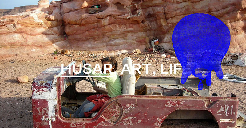
Barbara Anna Husar
HUSAR.SOLAR is a digital display and a liquid art experience.
Superrb
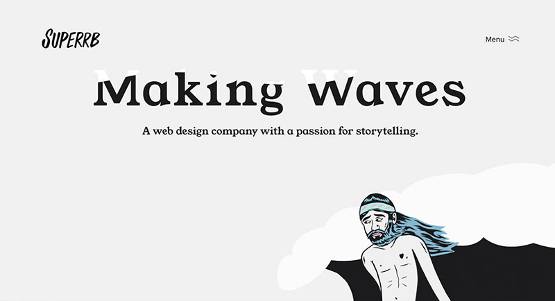 A web design company with a passion for storytelling.
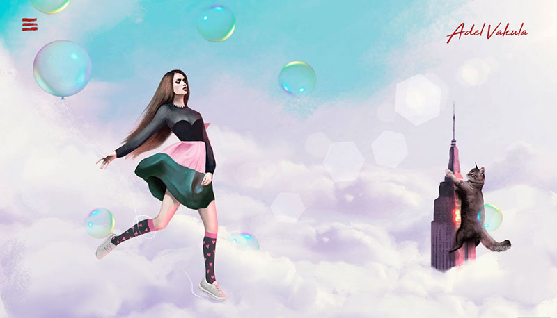
Adel Vakula
The world-famous model, charismatic and intriguing personality. The website designed and illustrated by them emphasizes its uniqueness and its creative nature.
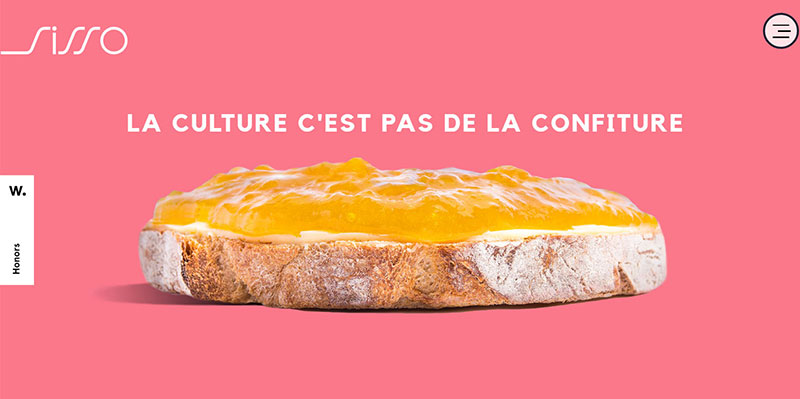
Agence Sisso
A leading agency in culture and luxury, SISSO helps its clients define bespoke strategies and create innovative content to enhance their brand identity and deliver the right message.
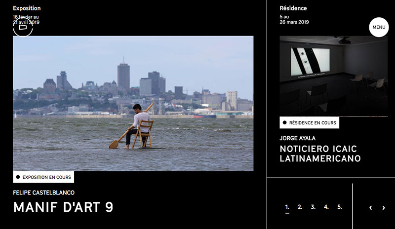
La Bande Vidéo
La Bande Vidéo is a center for media arts that contribute to the emergence of contemporary video culture.
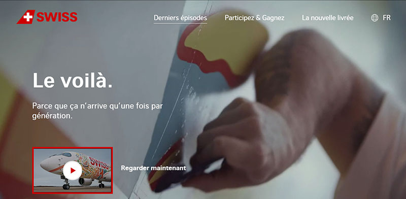
A new special SWISS livery
As colorful as the new SWISS Int. Air Lines livery designed by Fichtre, the website is the core of a campaign based on a short movies series where the audience influences the story.
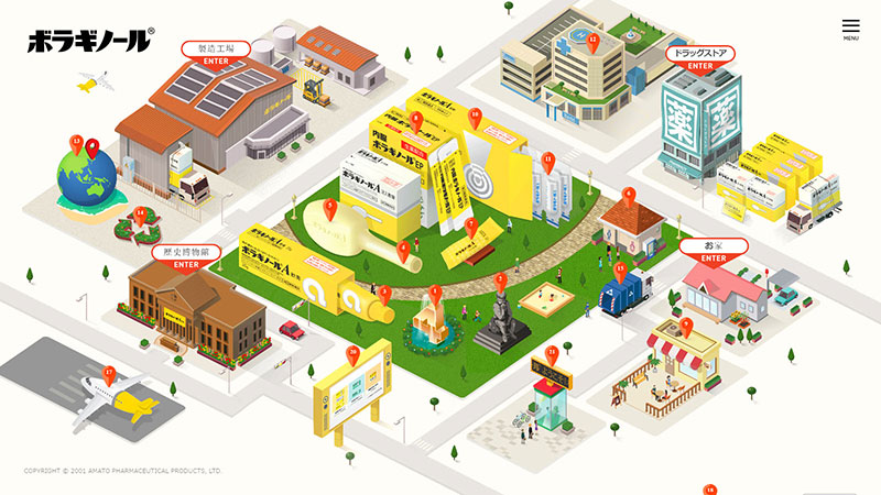
Borraginol Town
Explore Borraginol Town and discover Borraginol a Japanese pharmaceutical company and its history.
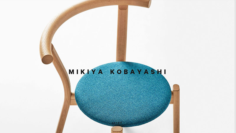
Mikiya Kobayashi
Mikiya is a Product Designer who uses his minimalistic website artist portfolio to showcase his work by using subtle animation and strong photography. His full artist website was first of all created in Japanese and then later on translated into English, thus demonstrating the international expandability of this artist website design.
The Japanese spirit of Mikiya’s home and kitchen products is wonderfully captured through the serenity of this visual artist website.
Visitors can easily consume the art pages content thanks to user-friendly navigation and slick layovers.
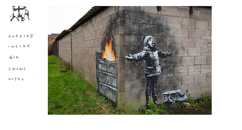
Banksy
Banksy is a well-known street artist whose identity has yet to be revealed. He uses his fine artist website to showcase his graffiti as well as his installation/performance work. His artist web site is as mysterious as he is, with little information available, and the design being Spartan.
Using the Internet’s potential for almost-instant distribution, this free artist website is almost in the form of a blog, always being relevant and current. An example of a recent update is simply a blank frame with ‘today’s art has been canceled due to police activity’ written inside of it.
Banksy’s website is one of the more popular art websites due to his satirical take on the politics of the world.
As Banksy slowly reveals himself to the public, his artist web page is a representation of his statements and the artwork attributed to him.
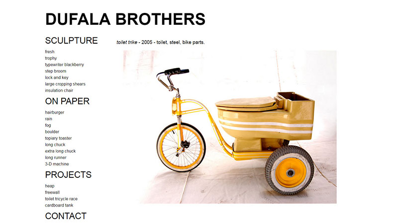
The Dufala brothers
This is one of those artist websites that are simple and cut to the chase, but they still manage to get across the post-consumer cynicism and the sense of humor that these artists have.
This website for art boasts easy-to-use navigation, which is a good way to showcase various artwork in numerous mediums. You always know your position on the site as well as which part you want to next visit.
James Turrell
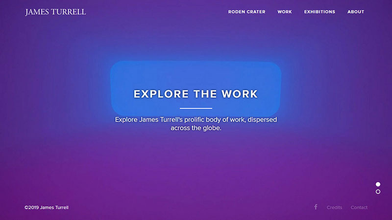
Turell’s website is one of the best artist websites examples thanks to its successful translation of transitory artwork onto the computer by using plenty of information to display a lifetime of artwork.
This is one of the best art websites thanks to its clever use of a cartographic timeline, allowing visitors to search through his artwork by geographical location, medium, and date.
Brad Albright
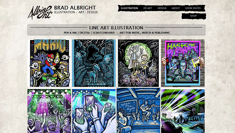
Brad Albright is one of those really good artists who can create anything they put their mind to – toys, print art, album covers, commercial designs, you name it, Brad Albright’s done it. His multi-faceted artwork draws from psychedelic and abstract art as well as comics.
While this one might differ from other artists websites, apart from the dark artwork and harsh colors, this is a good artist website for driving home the visual work at a fast pace.
This graphic designer knew how to fully use his simple portfolio that have a strong illustration touch. Looking on portfolio themes for artists you can get inspired to come up with unique design fo your own.
Mister Lapin
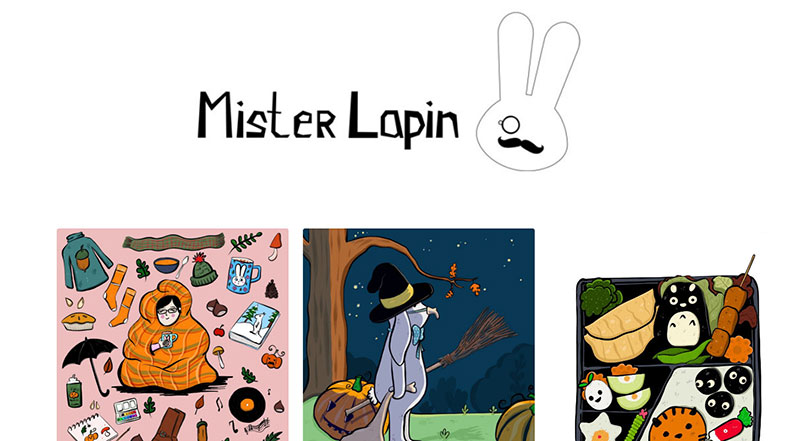
Cinzia’s work as a graphic designer and children’s illustrator is wonderfully showcased through the simple artist website that is also playful.
This is one of those artists websites that cut right to the chase and doesn’t resort to information overload: all information is of use, and there’s a colorful yet simple contact form if you have any additional questions.
Mister Lapin’s art comes in many forms thanks to his combination of computer graphics with watercolors – there are children’s books, logos, greeting cards, stickers etc. All in all, we’re talking about a beautiful combination of childhood playfulness and pop culture.
WimDelvoye
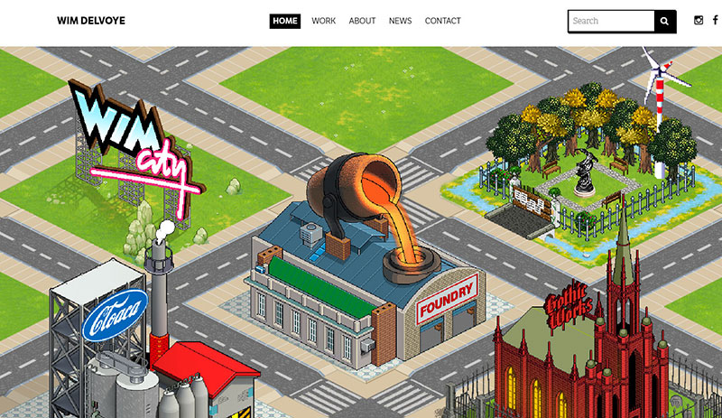
Wim’s website is a fine art website with strong ties to web design.
This is one of those fine artists websites that is the embodiment of an amazing first impression. You can navigate through his work thanks to its 2D-like graphic.
By clicking on particular buildings of the frequently seen carpet town, the visitor is taken to the correlating artwork.
The artist homepage takes this term literally. WimDelvoye’s portfolio comes in the form of a pixelated city, with each building leading to a different artwork gallery in the isometric drawing. There are also some adorable animations, such as the building in the shape of a camera. Delvoye’s recent exhibitions are listed in the form of a billboard.
TaubaAuerbach
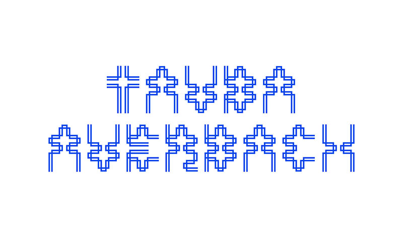 TaubaAuerbach’s painter website may resemble alien hieroglyphics, but no worries – if you’re on the website, then you most likely know where you are. Starting out with a funky intro that changes colors, you then transition to a directory written out in a different kind of squiggly type. You then finally reach the books, paintings, and prints.
John Baldessari
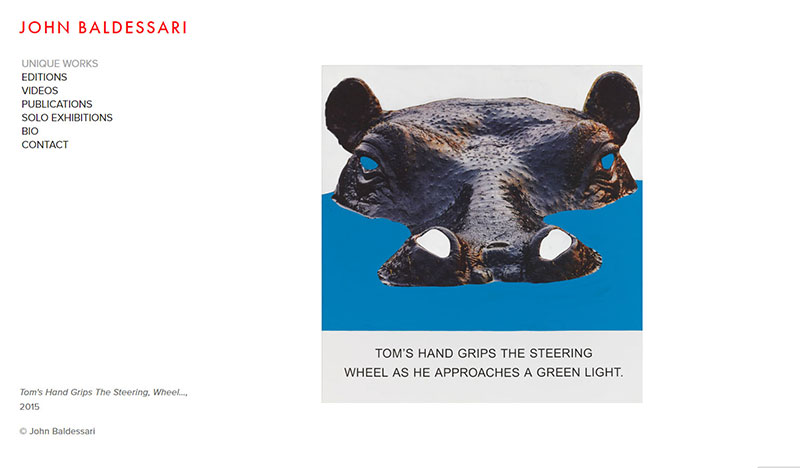
This painter site doesn’t speckle the Internet with colored dots, but instead creates an interactive menu with the help of information trees, allowing users to discover more about veteran painter John Baldessari. You’ll do a lot of exploring to discover all the branches.
The most important factor of best website design for artists is for the right message to be conveyed through the alignment of the site’s purpose, content, and style, and this is the case here. You don’t need to have a perfect website to be a great artist.
If you enjoyed reading this article on artists websites, you should check out this one about creative websites.
We also wrote about a few related subjects like meet the team , single page website, corporate website design, coaching websites, digital agency, web development company, black websites, website backgrounds, simple website design and portfolio websites.
