Choosing a color scheme for a yoga studio involves more than deciding what color to put on the wall. The color scheme of a business creates a certain feeling for its customers.
Finding the right color scheme for a yoga studio is of the utmost importance.
Yoga is not only a form of exercise but is also a meditative practice. Its goal is to boost a person’s sense of calm and to improve the flexibility of both mind and body.
The atmosphere should help clients enter a tranquil state of mind. This, in turn, will help to create a memorable experience for them.
The color palette of a yoga studio does much to set the proper yoga atmosphere. Other details like lighting and candles also assist in creating the proper atmosphere.
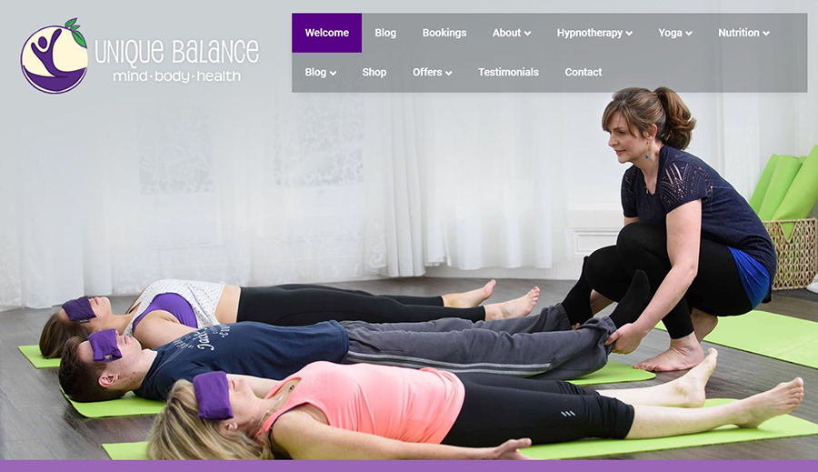
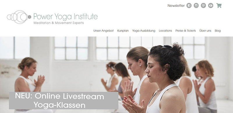
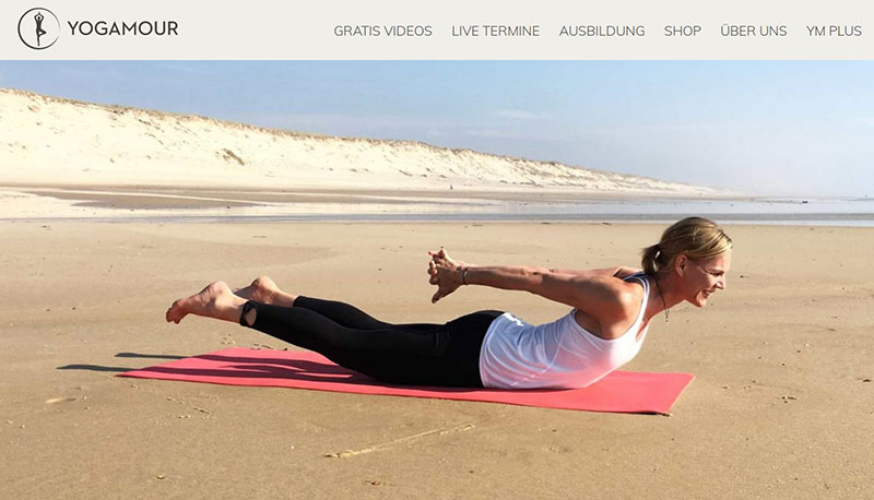
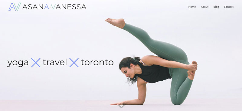
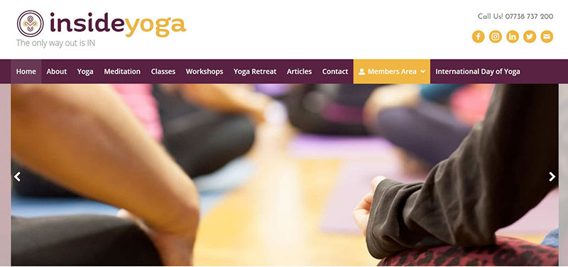
The color palette of a yoga website, too, is important.
Visitors should feel calm and soothed when browsing a yoga studio’s website. They will equate the studio with those feelings and will be more likely to attend classes there.
What color palette should be used in a yoga studio or on a yoga studio’s website? This article will discuss how to choose a color palette and what the best yoga colors are.
How to Choose a Color Palette for a Yoga Practice
A color palette is an important aspect of a yoga studio and yoga website. Yoga studio owners need to keep the following in mind while deciding on a color palette:
Colors Impact Humans
Colors evoke emotions and moods. They can change a person’s physical, emotional, and mental states.
Some colors can increase blood pressure, hunger levels, and body temperature. For example, the color red is an intense color.
Most fast-food restaurants use the color red. It encourages workers to work fast and clients to eat fast, thus improving turnover.
Red is not on the list of good yoga colors.
On the contrary, a yoga studio wants a color that slows the pace of normal life down. For example, different shades of blue create a soothing environment.
Yoga studios should avoid colors that enhance physical senses and cause anxiety. Instead, they should use colors that induce a feeling of calm.
Color Combinations
Colors not only evoke emotions but also change the look of a room or a website. A single color throughout a room or website is boring.
Accent colors make a room look more interesting. They also help highlight important sections of a website.
For example, quotes, subtitles, and buttons should be in an accent color to help them stand out. It improves visitor navigation and makes the site more appealing.
In general, color palettes consist of three colors. A dominant color, a secondary color, and an accent color.
To find colors that complement each other, look at the color wheel.
Complementary colors include hues that are next to each other on the color wheel. Or they are colors that stand opposite each other on the wheel.
The Ratio Rule
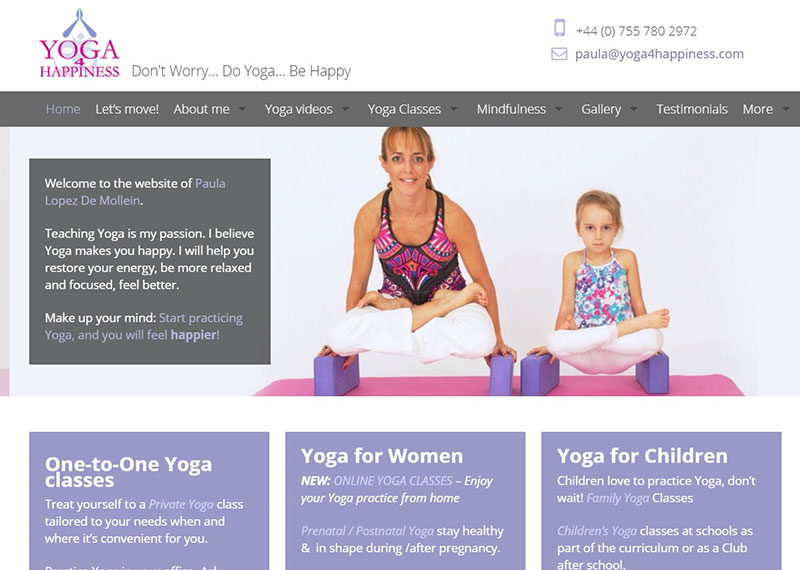
After choosing a soothing color palette, studio owners need to decide how much of each color to use. The ratio rule is a suggested color ratio for rooms and web pages.
The ratio suggested for colors is 60:30:10. So, 60% of a room or website should be in the primary color, 30% in a secondary color, and 10% in the accent color.
Yoga Studio Light
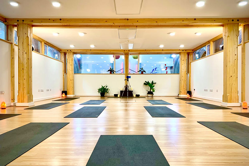
Colors are a reflection of light, so the type of lighting in a yoga studio will affect how colors look on a wall.
Lighting will also have an impact on the mood of customers. Low lighting is the best choice for a meditation room.
A yoga studio should be well ventilated, so there will most likely be a lot of natural light.
That means the studio, especially the meditation room, will not need bright light bulbs. Low-intensity light bulbs or candles will suffice.
Best Yoga Colors for a Studio or Website
Many colors are known for their calming qualities. Here are a few color palette ideas to consider when designing a yoga studio:
White
Most yoga studio color palettes include the color white. White corresponds to the crown chakra, which is the final step of meditation.
White is a neutral, peaceful color. It is often associated with oneness and unconditional love.
Fill white rooms with colorful accessories to provide a pop of color. Mattresses, pillows, mats, plants, and wooden artifacts serve as good yoga accessories.
White can also give proper illumination and incentive to complete the fitness aspect of yoga. It well represents the yoga practice itself while also inspiring ones to exercise.
Pale Yellow
Next on the list of color palette ideas is pale yellow. Yellow radiates warmth, inspiration, and a welcoming feeling.
It represents sunlight, which has an important role in yoga. To harness the power of this natural energy source, yoga studios use shades of yellow or orange.
Yellow helps create a friendly space.
It increases mental activity, energy, and awareness levels. It also brings feelings of ease, power, and grace.
Any shade of yellow or orange works well in a yoga studio.
If a studio has a lot of natural light, then a lighter shade is best. Darker shades create a more intimate atmosphere.
Blushing Pink
Pink is an energizing color. Hot pink supplies a lot of energy.
Fuschia creates a romantic environment. Blushing pink, however, is more calming and is the preferred shade for a yoga practice.
This light and bubbly color encourages a cheerful energy. That energy helps customers dive into their workouts with happy thoughts.
A blushing pink color palette is perfect for Kundalini, Vinyasa, and other types of yoga that feature more active poses. Many places do not use the color pink for their walls, so using this color will help the studio stand out.
Greens
Green is a color of harmony, balance, and stability, all of which are goals of yoga.
Green helps humans to feel grounded. It also lessens anxiety and creates an honest environment.
The color green aids yogis in their path to harmony and enlightenment.
Light Purple and Violet
A light purple or violet color scheme evokes emotions of healing. It accomplishes the following for those who practice yoga:
- creates unity between creative, physical, and intellectual realities
- deepens insight
- overcomes feelings of anxiety
- creates a compassionate environment
- restores spiritual values
- integrates mind, body, and spirit
Dark Purple
Dark purple is also a common color for yoga studios. It is a cool color, so it lulls humans into a calm state.
Similar to blushing pink, a bright, popping purple invokes notions of innocence. However, purple does not need to include those elements to be a good yoga studio color choice.
Dark Blue
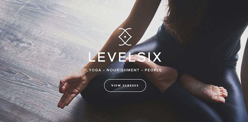
Blue is a cooler color so it immediately invokes calming feelings. Blue helps overcome anxieties, insomnia, and stress.
It contributes to better communication, more patience, and getting a more peaceful sleep.
A lighter shade of blue creates a youthful feel. Darker hues of blue create a more grounded and settled feeling.
Be careful when choosing a darker hue of blue because some shades can induce sadness.
Get more bookings with the right tool for the job
Staying organized has never been easier.
You can now manage your business and grow your brand with a single, powerful WordPress booking plugin that keeps all of your appointments in line, your clients organized and your business booming.
Amelia is perfect for business owners who need to streamline their booking experience both for their staff and their clients.
Amelia handles everything for you, even sending automated email or SMS reminders to your clients. No-shows? Not anymore!
The Amelia WordPress booking plugin adapts to different industries for a blissful online booking experience and employee management.
Want to know more? Check out Amelia’s awesome features to see what you are missing.
FAQs about yoga colors
1. What is the significance of the color white in yoga?
In yoga, the color white stands for innocence, clarity, and a fresh start. It represents the desire to begin again and uphold a pure condition of mind and body and is frequently worn by yogis and yoginis. In addition to reflecting light, white is a symbol of enlightenment and the higher awareness that yoga seeks to achieve.
2. What is the meaning of the color red in yoga?
The root chakra, which is found at the base of the spine, is connected to the color red in yoga. It stands for security, a sense of connection to the land, and stability. In yoga, the color red is employed to energize the body’s energy flow, especially in the legs and feet. It is a well-liked hue for yoga apparel and accessories because it is also connected to passion and vitality.
3. Why is blue a popular color in yoga clothing and accessories?
Because it stands for serenity, calm, and mental clarity, blue is a common hue in yoga. It is frequently linked to the throat chakra, which controls expression, communication, and self-expression. In order to achieve a meditative state during yoga practice, blue is a calming color that can aid in mind-calming and relaxation.
4. What does the color green represent in yoga?
In yoga, the color green stands for peace, balance, and healing. It is frequently linked to the heart chakra, which controls compassion, empathy, and love. During yoga practice, the relaxing hue of green can help to reestablish equilibrium and foster emotions of serenity and tranquillity. It also serves as a reminder of the connection of all living things by being connected to nature and the environment.
5. How does the color yellow relate to the practice of yoga?
The solar plexus chakra, which is found in the abdomen, is commonly connected with the bright and vibrant color yellow. This chakra is in charge of transformation, personal power, and self-assurance. Yellow is a well-liked hue for yoga apparel and accessories since it is thought to stimulate the mind and increase energy.
6. What is the symbolism behind the color purple in yoga?
Purple is a regal hue that stands for spirituality, clairvoyance, and the union of the mind and body. The third eye chakra, which controls perception, intuition, and spiritual awareness, is frequently linked to it. Purple is a well-liked color for meditation and yoga since it is thought to improve spiritual and psychic awareness.
7. Can the colors used in yoga clothing and accessories affect my practice?
Yoga practitioners’ moods and states of mind during practice can be affected psychologically by the colors used in yoga attire and accessories.
Cool hues like blue and green can encourage calm and tranquility, while vibrant colors like yellow and orange can be invigorating and uplifting. The practitioner’s overall yoga experience can be improved by selecting hues that are in alignment with their intention and energy.
8. Why do some yoga studios use warm colors like orange and red in their decor?
Yoga studio decorations frequently feature warm hues like orange and red because they encourage vigor, vitality, and enthusiasm. These hues can contribute to the creation of a cozy and welcoming environment that motivates practitioners to completely engage in their practice.
Additionally, they can encourage the body’s energy flow, which can aid to enliven and revitalize both the body and the mind.
9. What is the significance of the color black in yoga?
Black is a calming and safeguarding color that stands for power, steadiness, and a bond with the earth. It can aid practitioners in feeling safe and grounded during practice, which is why it is frequently utilized in yoga apparel and accessories.
In addition to helping to focus the mind and foster a sense of inner quiet, black can also symbolize the absence of distraction.
10. How do chakras relate to the colors used in yoga?
Different energy centers in the body are said to coincide with the colors associated with the chakras. Chakra balance through yoga practice can aid in promoting physical, emotional, and spiritual well-being because each chakra is linked to a particular hue.
As an illustration, wearing or focusing on the color green while meditation can help to balance the heart chakra, fostering emotions of love, compassion, and harmony.
The Final Coat of Yoga Colors
Selecting a color palette for a yoga studio’s walls or website is an important process. Colors affect the emotions of humans.
A yoga studio’s color palette can convince a client to give you their business.
Decide what emotions you would like to evoke in your customers. Is the yoga studio going to evoke soothing and relaxing feelings?
Or should clients feel a little more energized so that they can reach their fitness goals?
Great yoga colors include blue, purple, green, yellow, pink, and white.
Blue, purple, and green prompt calming and soothing feelings. Yellow, blushing pink, and white create a peaceful environment while also infusing energy into a room.
The goal of a yoga studio color palette should be to help clients achieve their fitness goals. At the same time, it should help to maintain a relaxing and balanced atmosphere.
This guide can help yoga studio owners to choose the right colors for their yoga studio and website.
If you enjoyed reading this article on yoga colors to use for a website or studio, you should check out this one with yoga business names.
We also wrote about other yoga-related subjects like starting a career in yoga, yoga franchises, teaching yoga without certification, yoga studio software, yoga studio owner salary (curious?), and yoga marketing ideas you could use
We also have articles on yoga websites, yoga WordPress themes, creating a yoga studio business plan, and how to start a yoga business.
