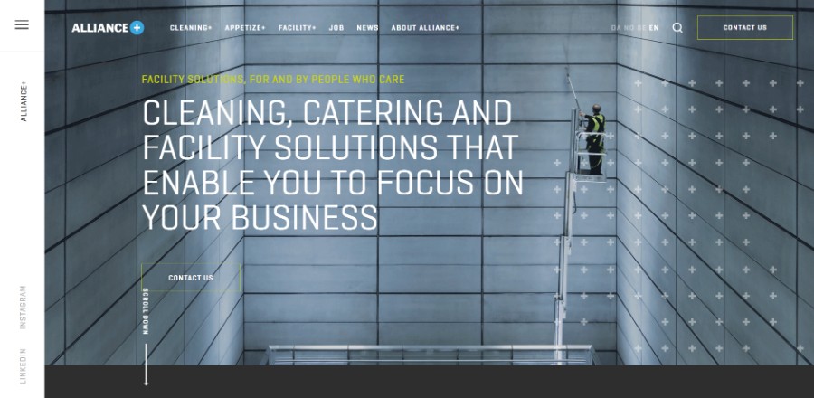
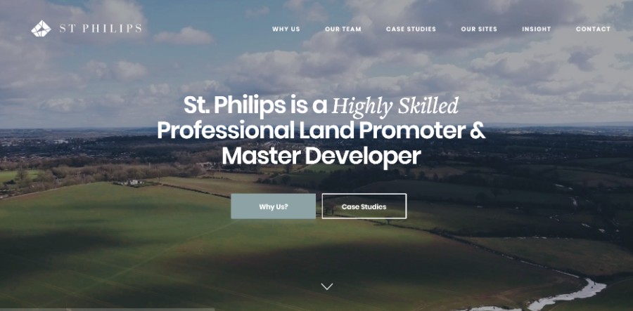
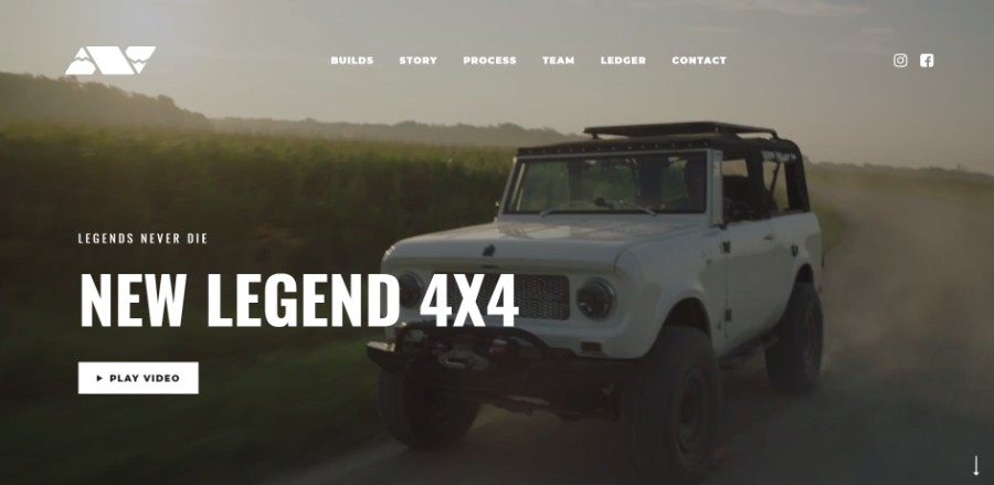
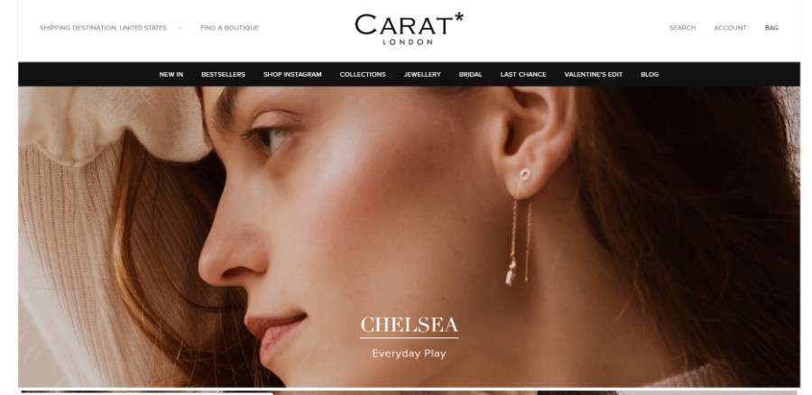
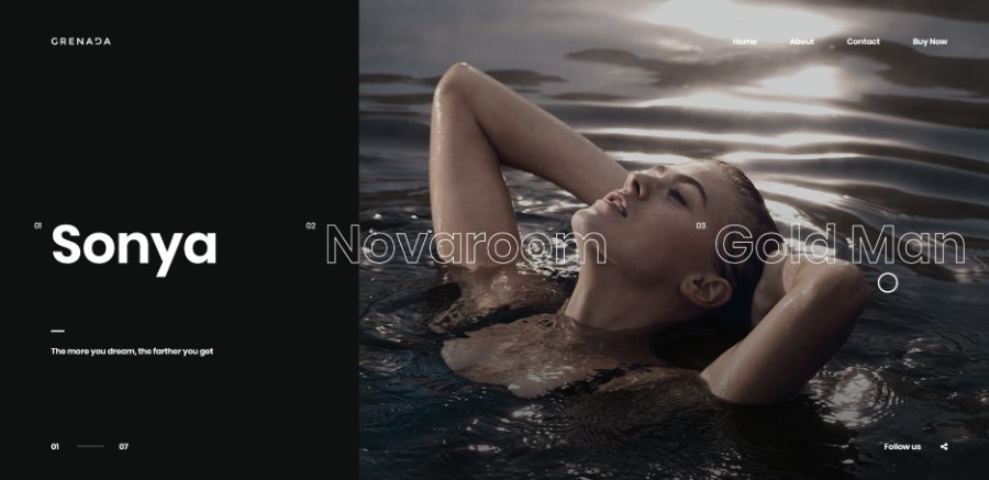
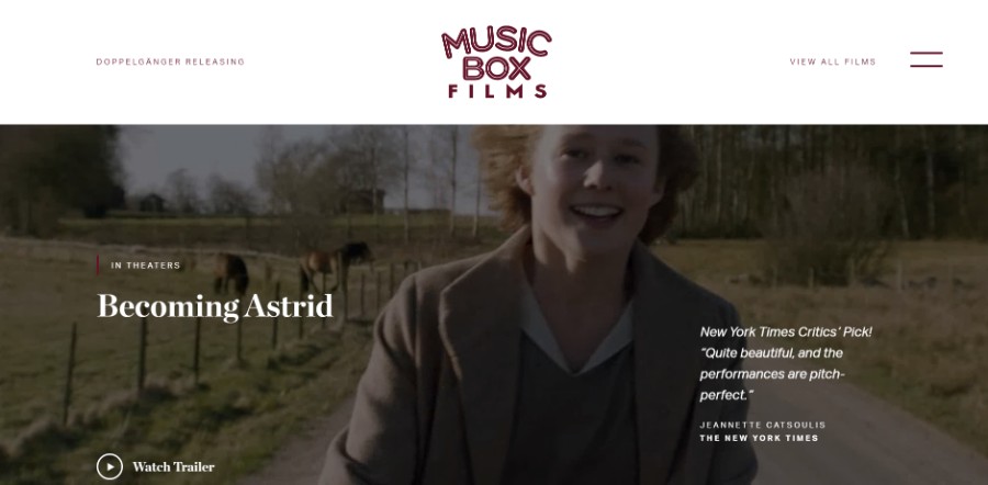
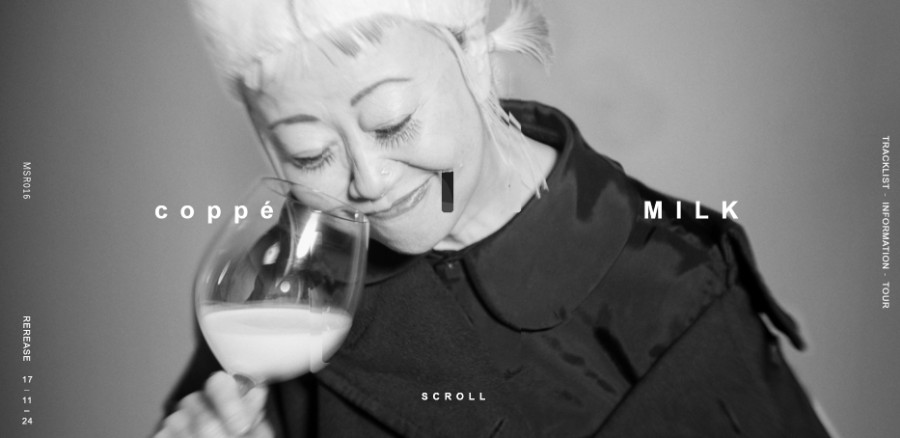
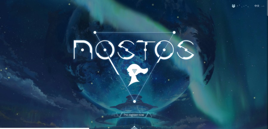
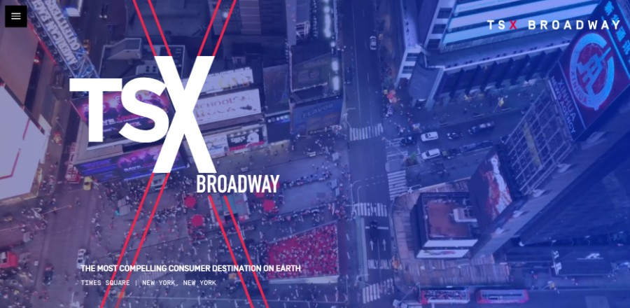
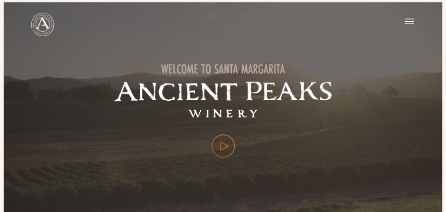
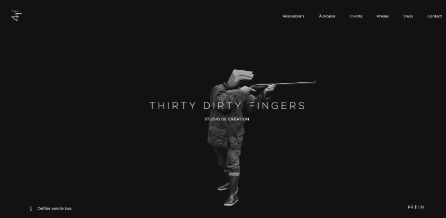
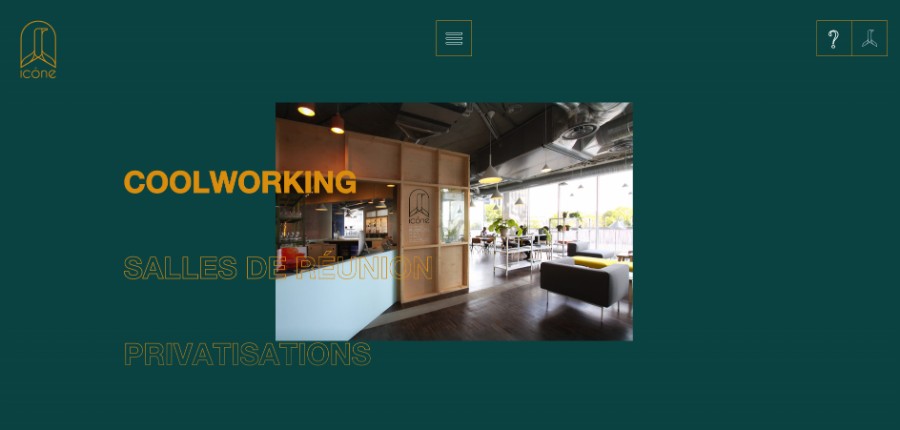
The website background you select is the first element that your visitors are going to notice when they access it. For instance, when you visit Amelia (which is probably the best appointment scheduling plugin for WordPress, btw), you see a lot of white space, which gives you an impression of a clean and organized website. Website backgrounds can make the difference between a user that remains on the website and one that chooses to leave it in an instant.
Finding the right image to use as a web background is paramount, and this article is going to give you some tips on how to do it effectively in just a few steps.
Setting up website backgrounds
Choose website backgrounds that are accessibility-friendly
You should keep in mind that the background images you select must be appropriate for the type of content you include on the website. Would the website background interfere with the readability of the content? Is the effect of that background image positive or negative? Make sure that you analyze all the factors that may affect the accessibility factor on your website.
Use variations
If you found a theme that you enjoy, and you want to stick to it, you can use your creativity to come up with a pattern based on one single image. Selecting one image and playing with it until you create a good-looking pattern is a unique way to build a website’s layout.
Transmitting a message to your audience
When building a website design, the one purpose you have is to transmit a message to your audience and set up an emotional connection with it. Emotional branding is the concept that summarizes the way you can convey a message through the use of background images and other graphic elements.
The user must rapidly associate your brand with something positive and beneficial for their being. Use images that transmit emotions through their content to create perspective for your audience. For instance, if you own websites for realtors, try to use landmarks that may inspire people or build their trust in your company.
You can do it yourself
Another way to move your audience emotionally is by creating the website background yourself, using the many available tools you can find online. If you have drawing skills, putting together some sketches, scanning them and manipulating them digitally might to the work just fine. Original content tends to be much more effective than the one you find online.
Always choose relevant content
Don’t include generic web page backgrounds on your website. You need to transmit an idea that has something to do with the website you own.
Consider taking professional photos of the products you are selling, the physical location of the company or even of yourself. Audiences love familiarity, as this characteristic offers them a sense of trust. Look for images that are relevant to the content you publish on your website.
Choose high-resolution background images
Besides the fact that you should use royalty free images for backgrounds, make sure to choose only the ones that have a high-resolution. Low-budget websites can look good as well as they respect one principle – quality.
Using fewer quality items instead of a lot of bad ones is the best choice you can make to attract visitors.
Spending some of your money on paying wallpaper websites that offer great resolution wallpapers is a must if you want to achieve that crisp look. Simple images you find on Google might be protected by copyright and aren’t that high-quality either.
Other tips to keep in mind
Keep things symmetrical
Visitors will always find beauty in a symmetrical design. Even though asymmetry is one of the trends these years, you should first try to come up with a symmetrical pattern in your website’s design. Do that by using symmetrical, minimal background images.
Check the size of the image
Pay tremendous attention when choosing the size of the image. Crop it if necessary, but not too much, to avoid losing the quality of the image. Read more about optimizing images for a website as well, to keep the loading times fast.
Create a focal point
Focal points help visitors reach the content that you consider important on your website. Use a hierarchy to guide people towards something. The background images you choose should align with the focal point created and point to it.
Choose the right color palette
Simple color palettes are the ones that work great at all times. Regardless of the branding elements present on the website, a nude color palette will definitely do the job. Don’t forget to select an accent color too.
Stay creative
If you notice an idea that is a little more unconventional than the rest of the website design ideas you saw on the Internet, don’t be afraid to use it. Uniqueness is something that people always appreciate and you have the chance to manifest it. For example, animated website backgrounds can do quite an impression on your visitors.
Create a dynamic design
Avoid creating designs that are too static. If you decide to use background images, choose layouts that guide the visitors through your website. Interactive elements are paramount if you feel like your website is not dynamic enough. Don’t exaggerate either.
Consider video backgrounds
Video backgrounds represent a trend in web design today, so you should get informed on how to include one on your own site. They are impressive, but they can slow down the loading times of your website if you don’t optimize it correctly. If you are not much of a tech addict, you can simply include a slideshow instead of a background video. This way, you can use the background images you have selected without having to pick just one.
Create an interactive UI
Transforming your website in an interactive one can be done by adding such elements on your website. Parallax scrolling is one of the effects that works great with websites that have a full-page image background. On selection or hover, the elements can perform an action which gives the user that sense of interactivity that you want to achieve.
Use solid colors as background images
If you feel like no image fits your website’s design, you can use solid colors as background images. You just have to pick the nuance that seems to work well with the other branding details you have incorporated on the website and everything will look as smooth as ever. This way, you can invest more attention to other elements, such as light background music.
Examples of websites with great looking backgrounds
Tengelmann Ventures is a reliable and trusted partner for early growth stage companies that aim to change people’s lives.
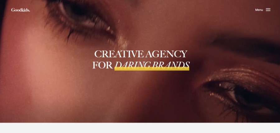
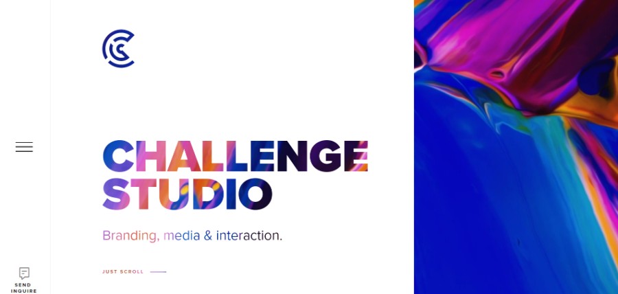
Boutique agency that loves and strives to be challenged. We focus on high-quality branding, media and & interaction (digital products).
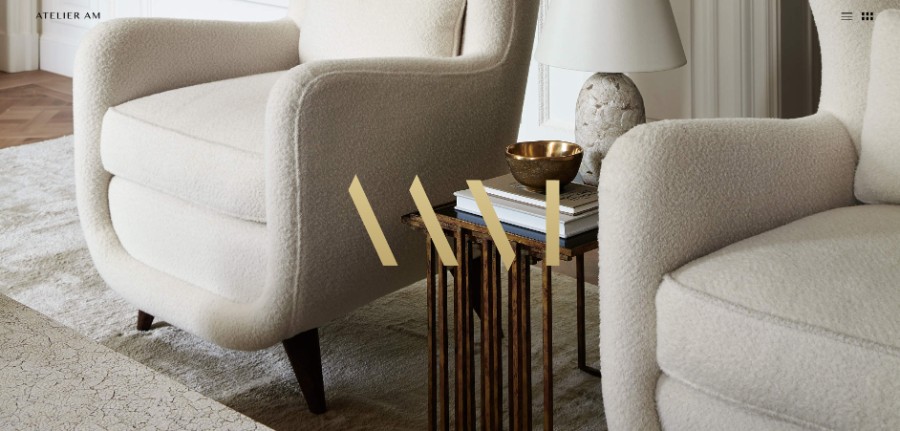
Atelier AM is an interior design firm.
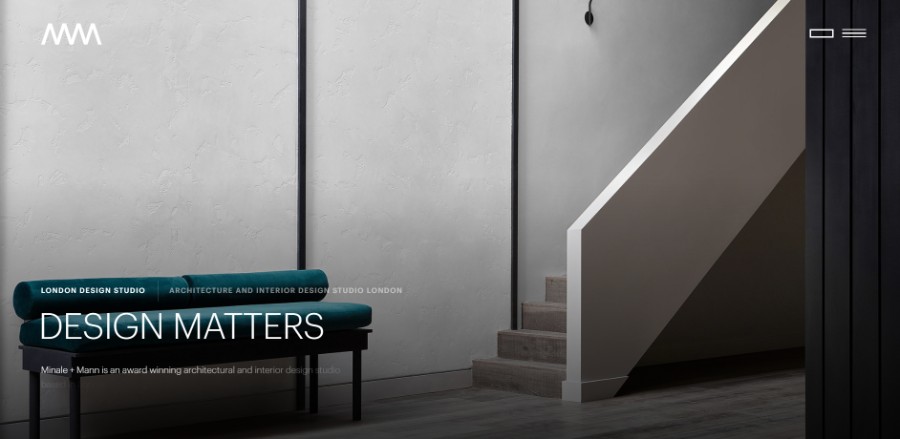
A new website for Minale + Mann an award-winning architectural and interior design studio based in London, by acclaimed architect and designer, Sebastian Mann.
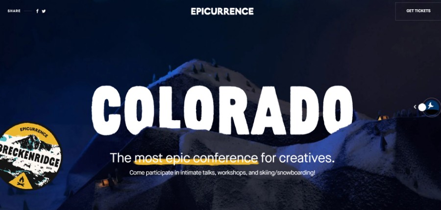
The latest Epicurrence event website, featuring a timezone controlled header with WebGL image transitions, hand crafted paper illustrations and plenty of quirky elements to play with.
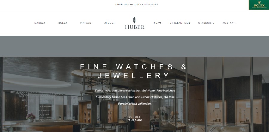
Originally established in 1900 in Switzerland, Huber Fine Watches & Jewellery has one of the richest Traditions in the Luxury Watch and Jewellery segment in Europe.
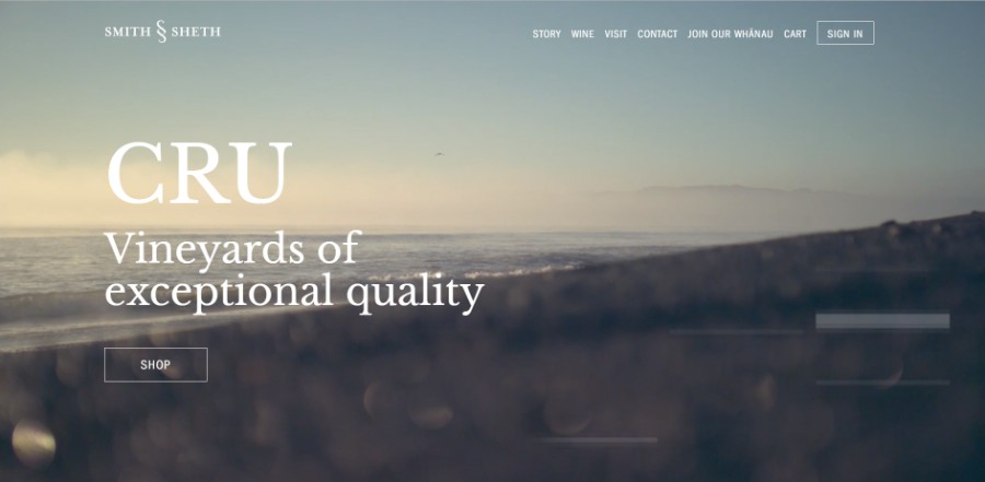
Seeking out the exceptional. Hand selecting the best grapes from the finest vineyards. Establishing steadfast relationships with land, growers and makers who form the DNA of our CRU.
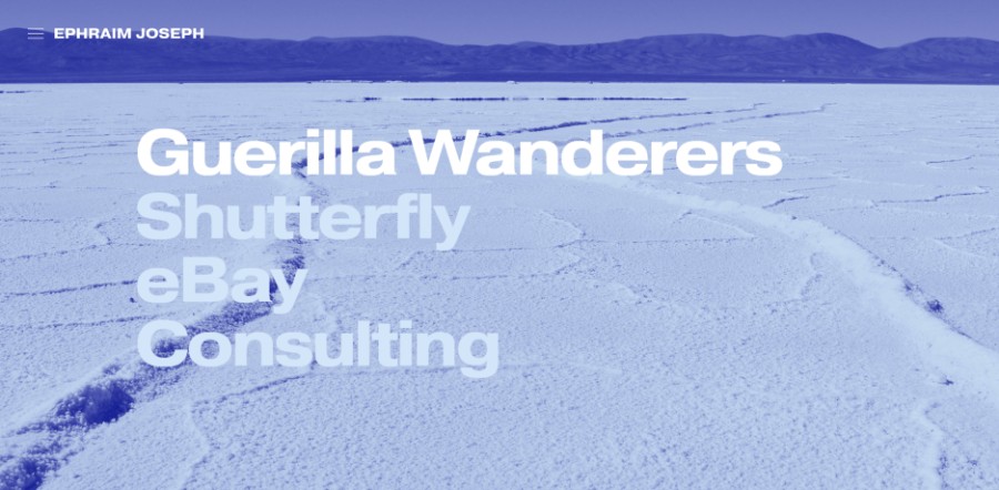
Welcome to the portfolio of Ephraim Joseph. Ephraim is a Creative Director + Designer who elevates brands through clean design and clever words.
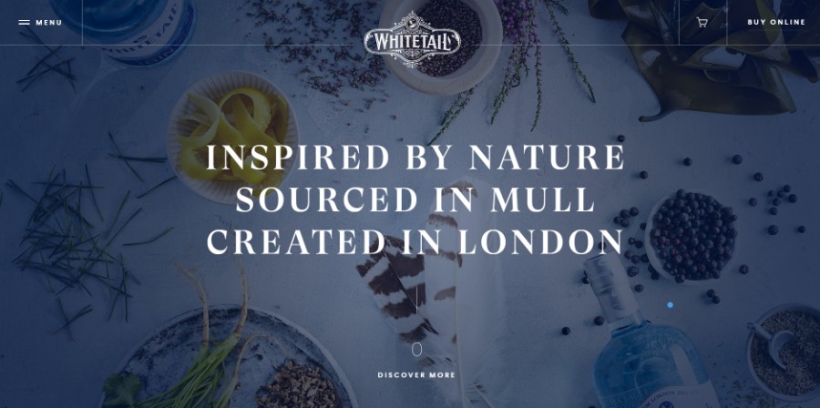
Inspired by Nature. Soured in Mull. Created in London. Whitetail Gin is named after Europe’s largest bird of prey. This fine spirit is noted for its smoothness and strength.
Greyston’s mission is to create thriving communities through the practice and promotion of Open Hiring™.
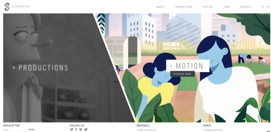
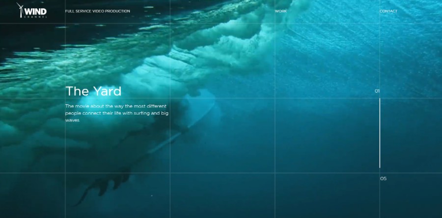
Website for full service video production.
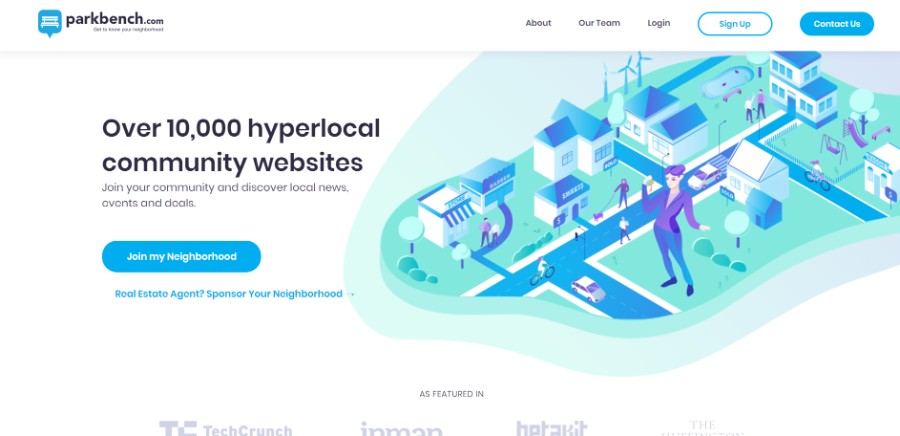
This awesome project which connects business owners, locals and real estate professionals with a local community.
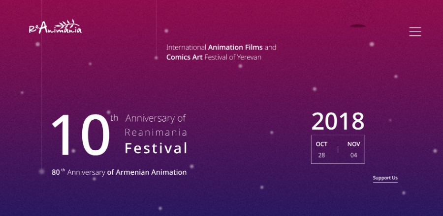
ReAnimania is an annual International Animation Film Festival in Yerevan, Armenia. For one week a year, audiences enjoy creative animated films in a variety of genres.
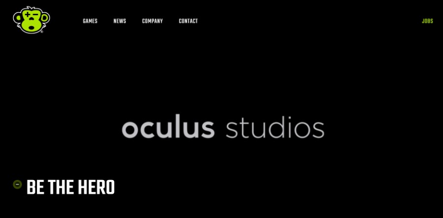
Sanzaru is an independent video game development studio, pushing the boundaries of interactive entertainment and technology on all fronts.
An agency website for Output, communicating a new proposition: ‘Adapt & Thrive’.
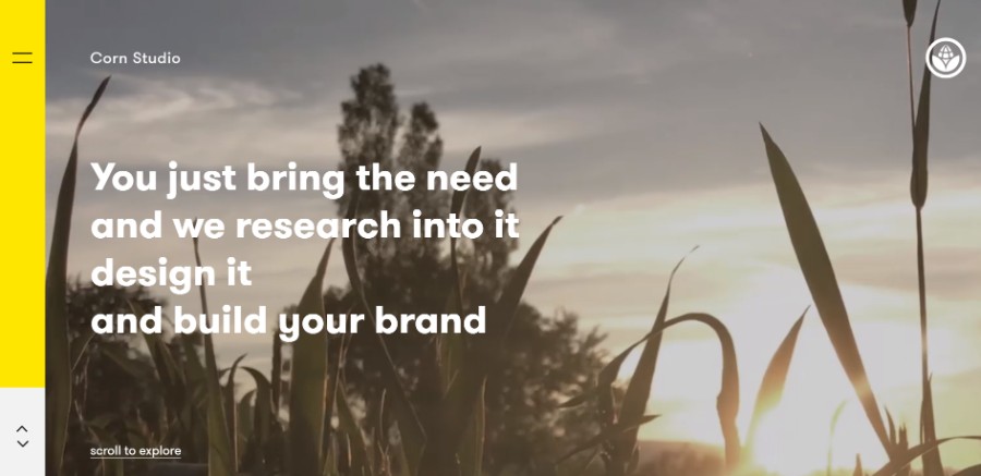
Corn Studio is an Athens-based independent design studio that offers a wide range of custom design solutions, tailor-made for visionary brands, no matter how big or small.
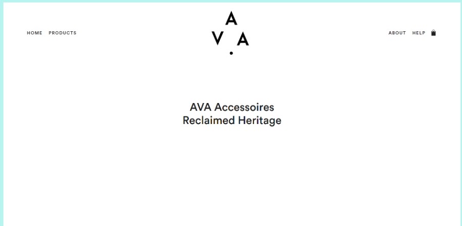
The contemporary and classy women. Timeless accessories and lasting pleasure. Inspiring heritage and unique interpretations.
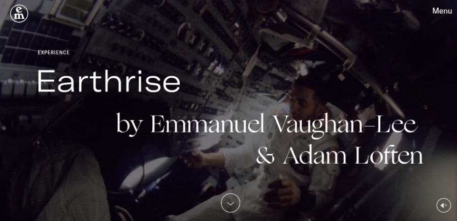
Earthrise Multimedia Experience
A storytelling experience about the Apollo 8 mission and the first image taken from the earth.
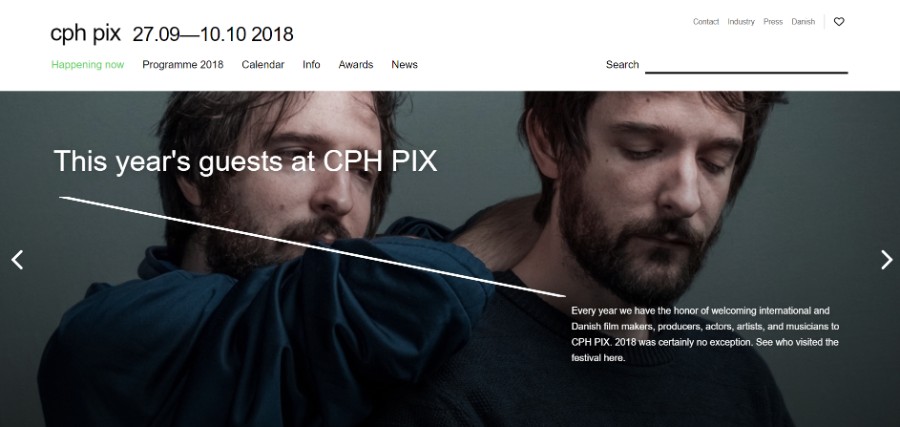
The website for Denmarks biggest film festival.
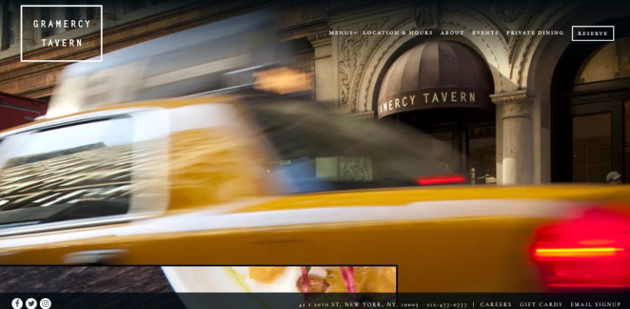
Danny Meyer’s Flatiron District tavern with a fixed-price-only dining room & a bustling bar area.
Ending thoughts on using background images
The power of background images should not be underestimated. The background you choose can transmit a message and leave the first impression in seconds, and it can be the element that makes a person come back to your website or not. Take your time to find the image that works best with your website.
If you enjoyed reading this article on website backgrounds, you should check out this one about black websites.
We also wrote about a few related subjects like meet the team , single page website, corporate website design, coaching websites, digital agency, web development company, creative websites, artists websites, simple website design and portfolio websites.
