We spent many busy months figuring out how to provide your clients with a better booking experience – aligned with their needs and in tune with your business’ preferences. We were thinking in terms of user experience that will boost your business to an utterly new degree. And we think we succeeded!
However, none of this would be possible if there weren’t for you. We were guided by your suggestions. After we considered every opinion of yours, we committed a lot of our time to bring goals to the table. And the intention is achieved – the improved and modernized design of your favorite booking plugin is finally born!
So what are the improvements we managed to integrate into Amelia 5.0 Booking Form? Take a closer look.

Amelia 5.0 booking form improvements
One of the focal points of Amelia 5.0 is the new, modern, fully revamped booking form that pushes what can you do with it further. A brand new booking form comes with the following:
Modern design
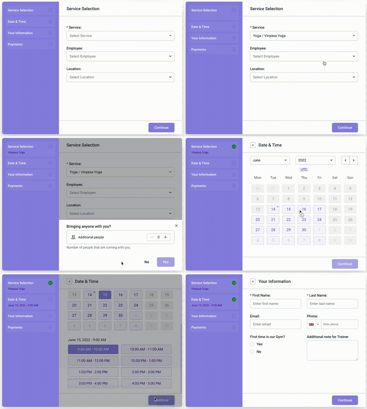
We have designed a new form with a modern, fresh, eye-appealing look, containing crucial booking-related information. We organized the entire booking process in several intuitive and easy-to-navigate steps. Each of the steps your client needs during the booking process is visibly disposable, and just a click away. New design skyrockets the UX improvement to a point where it’s hard to be ignored. Your clients will love it.

Category selection
Navigation through a list of your services is easier. During the appointment preselection process, your clients can click through all service categories with no extra effort. All services are organized within dropdown menus, grouped by categories and locations. This type of preview gives them a detailed insight into all services you offer, consequently making their current and future appointment decisions a lot easier.
Smooth and animated step-to-step transition
A step-to-step transition process is accelerated with a help of smooth, modern loaders working from behind. Transitional animations appearing when moving from one step to another modernize the entire process, making the scheduling experience a breeze.
Contact us option
Clickable email is positioned in a visible place, so your clients can contact you if have any questions or concerns. This feature is optional – whether this option will be enabled or disabled, depends solely on your preferences. We encourage you to enable this option If you want to add a hint of professionalism to your business.
Sidebar for easier tracking of the booking process
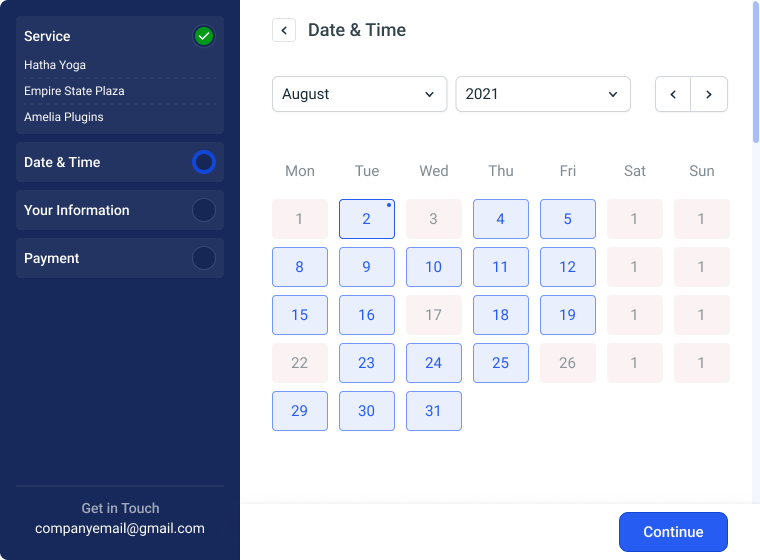
We have implemented the sidebar displaying the booking process in real-time. This feature differentiates finished from non-finished steps. Before the definite scheduling confirmation, your clients can edit every process by clicking on the step back arrow on the top. This option allows them to navigate the booking process much easier.
Improved UX for the booking packages
We have already mentioned that the user experience of the new form is pushed to a high level. But the user experience of the booking packages is another great thing to mention. It is noticeably easier to navigate through thanks to its intuitive design. We are sure your customers will highly appreciate this characteristic.
Larger calendar with available and unavailable time slots
The calendar within the new form consists of a larger surface, meaning each customer can easily see the difference between available and unavailable days. This feature follows accessibility guidelines recommended for modern UIs and makes the new form straightforward and more informational.
A better summary of the finished booking
Insights into former bookings are beneficial for future planning, and the improved form offers easy tracking of all past bookings recapitulation out of the client dashboard.
Simple customization page
The new customization possibilities are vast. You can effortlessly customize the form to extend where the look and feel match your brand needs. Designs you can achieve with new options are outstanding. We believe that the form will appear to your users as more attractive and more interesting to use.
Improved loading speed
By adding more up-to-date technology and logic, we’ve managed to consequently speed up the loading process of the booking form by a significant amount of time. This is one of the crucial benefits. Your customer booking experience will become faster and smoother, which will increase the number of finished bookings.
Improved conversion rate
The intuitive, simple, informative, and fast-loading form will give your customers the joy of smooth and effortless usage. Moreover, this feature will impact the customers’ retention rate increment – meaning they will continue coming back to your services.
Comparison to the old form
To sum everything up, compared to the old form, the new form is faster to load, more modern, more insightful, more intuitive, easier to navigate, and comes with more setting options. You can create and adjust it easier, and you will enjoy using it thanks to its smooth work, modern look, and amusing step-to-step transitions. And finally, yet importantly, it is inviting and conversion-optimized.
What’s important to know?
The old form will be available until the total switch to the new form happens. Time-frame is approximately several months, but we will inform you upfront so you can transition in a timely manner. In the meantime, we encourage you to try the upgraded form and let us know your thoughts. We are looking forward to getting your positive feedback, so we can determine our effort wasn’t in vain.
That’s it for now! However, we are not wrapping it here. There are plenty of new, useful features to come into existence in the upcoming months. Upgrade possibilities on this cleverly projected architecture are nearly immense, as we’ve developed this form having a plethora of future steps in mind. Try Amelia 5.0, and let us know your thoughts. We are looking forward to hearing how it improved your business.

