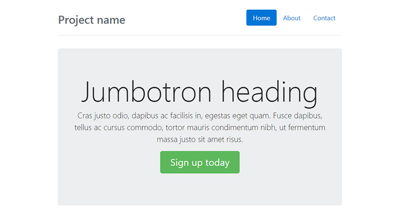
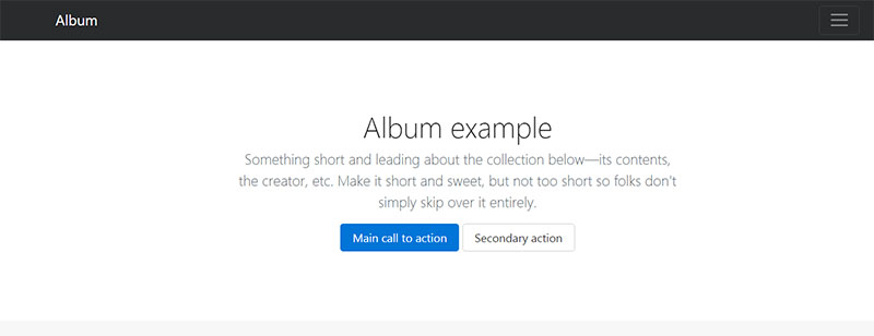
So, what is Bootstrap? For those who work in web development, Bootstrap is not a new term. Bootstrap is one of the most popular web development frameworks out there, and it is used for developing highly-responsive projects in HTML, CSS, and JavaScript. Essentially, what Bootstrap does is reduce the time needed to get a modern website up and running.
You get to use design templates for every aspect of a site, from typography to buttons or image carousels. Of course, in order to make your job easier, you need to learn how to use it in the first place. Keep reading to discover the magic of Bootstrap in this article created by our team at Amelia (the best booking plugin for WordPress).
A Primer on Bootstrap
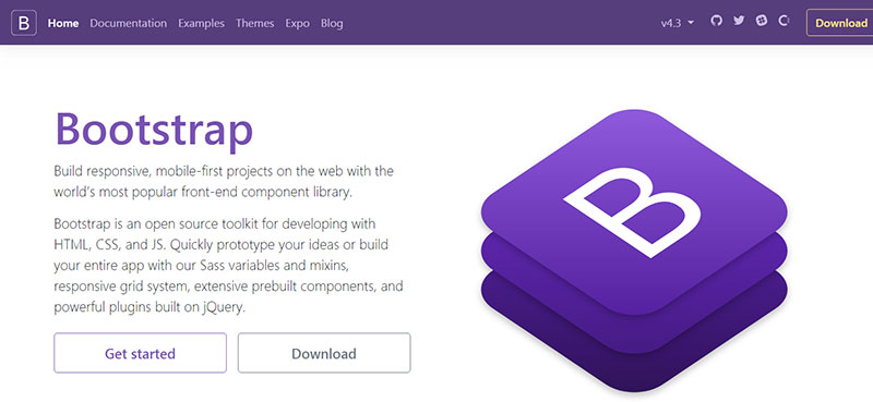
Before anything else, you need to master the basics of using Bootstrap. If you take a look at the official Bootstrap website you will see that Bootstrap is described as an HTML, CSS, and JS framework that is used to develop mobile-first, responsive projects. It’s important to add that Bootstrap is an open-source tool that helps thousands of people create prototypes of their projects or build apps from start to finish using design time-savers like Sass variables included in Bootstrap’s built-in tools. It comes equipped with a grid system, pre-built components, and plugins that are built with jQuery to fit any project.
Simply put, Bootstrap is a wide array of tools that rely on reusable code so that you don’t have to develop the building blocks of a website from scratch. To build websites that are as responsible as possible, Bootstrap makes the process easier by letting users utilize it as a front-end development framework. Even if you just want to create a simple layout, Bootstrap can help. By using a framework like Bootstrap, you will know for sure that your design is consistent, and that no cross-browser issues will be encountered.
To begin with, the files you should know about include:
![]()
bootstrap.css – CSS framework
bootstrap.js –JavaScript/jQuery framework
glyphicons –Icon font set
What Bootstrap does differently compared to other frameworks is that it uses jQuery extensively. Without jQuery, cross-browser compatibility wouldn’t be possible, and JavaScript would be overly complicated. The Bootstrap package contains all the tools that a developer would need to build a regular user interface following the latest trends and requirements in terms of responsivity and versatility. If you’re tired of writing dozens of long code strings, including CSS, Bootstrap will help you by simplifying the process tremendously.
The Importance of a Framework
Developers know that deploying a project was not always as simple as it is today. It used to require hours and hours of work and the programming skills needed were intense. One single mistake could ruin an entire project, so the amount of stress and pressure that was put on the developer’s shoulders was enormous. As a framework, what Bootstrap does isto simplify the process of development, by keeping the code consistent and of high quality. Human mistakes are normal and having a well-tested and proven framework to build on is extremely convenient.
Writing code entirely by yourself remains an option, but it’s the more complicated path to follow.
With a framework, you can:
- Prevent useless repetition
- Adapt to different requirements without making drastic changes
- Be consistent with your code
- Prototype new designs quicker and easier than ever
- Make use of cross-browser compatibility
Why Bootstrap?
So, frameworks are cool, but what makes Bootstrap a good choice? Well, since its appearance in 2011, Bootstrap instantly gained the recognition of web designers and developers for how flexible Bootstrap is and how easy it is to work with. If this doesn’t convince you to give Bootstrap a try, take into account that it has generous browser compatibility, you can re-use components quickly, and it has built-in support for jQuery. Bootstrap can be used with an IDE or editor of your choice, and it can be used alongside server-side languages ranging from ASP.NET to PHP or even Ruby.
But why do software engineers choose Bootstrap over other frameworks? The reasons are diverse. The main one is that it’s easier to master Bootstrap because of its intuitive design. The grid system does make a difference, while the numerous re-usable components make everything more convenient and flexible for a developer. The support for plugins extends the capabilities of this framework even more. Here is a more in-depth look at the benefits of Bootstrap:
It is a time-saver
Using Bootstrap is convenient because it can save a lot of time. It speeds up the development process hugely, while still maintaining the level of quality and consistency that every programmer strives for. When Bootstrap is used, developers don’t need to re-design specific elements to fit the needs across browsers, devices, or platforms or spend hours and hours trying to figure out where a mistake is present. Most of the hard work isn’t handled by developers anymore, but by Bootstrap itself.
By using Bootstrap, even back-end developers can come up with responsive front-ends, without investing time in understanding HTML and CSS. Bootstrap can be applied to a static site, a PHP site, a CMS – anything. Its flexibility is the feature that helps with saving time and avoiding making too many modifications. Moreover, you can download it from GitHub in a few minutes and start working right away.
Bootstrap has a responsive grid

Instead of spending hours coding your own grid, Bootstrap comes with one included. Say goodbye to wasted time by using the predefined grid system and start filling the containers with content of your choice. With Bootstrap, you can also define your custom breakpoints for each column and determine how big they want to be or stick to the default settings. Either way, it’s simpler and faster with a grid.
Image resizing
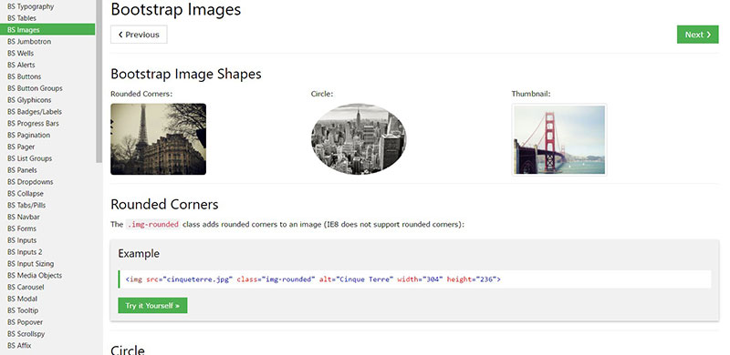
One of the time-consuming processes that a Bootstrap developer is confronted with when working on a project is resizing images. To make a site responsive, you need to reduce the load times, and images are the main cause of slow load times. Luckily, Bootstrap comes with its own code for resizing images automatically, using predefined CSS rules and adding a new class to the images. This makes it easier for a Bootstrap developer to efficiently address this aspect of web development.
Browser friendliness

In today’s world, people use all sorts of devices, platforms, and browsers, depending on their preferences. This is another aspect that makes Bootstrap convenient. It is compatible with most browsers and it helps with building scalable websites and apps that work everywhere.
A high degree of customization
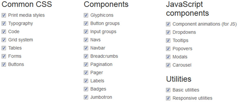
Bootstrap is also highly customizable. Web developers can make choices regarding the aspects they want to include in a project and modify them further to suit their needs, from the Bootstrap customizing page. By simply ticking a box, you get to turn features on and off.
Some of these features include CSS aspects like modifying typefaces or print media styles, component aspects such as changing input groups, labels, or pagination, or even utilities that make the website more responsive.
This is why you get great snippets like Bootstrap tables which you can use in your projects easily.
Bootstrap is consistent
Bootstrap makes use of interior tools that always remain the same.
The concept behind Bootstrap relies on pairing designers with developers and making the job easier for everyone, while keeping the code consistent and error-free, as stated by the co-founder of Bootstrap, Mark Otto.
It can be integrated easily
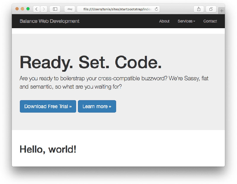
Bootstrap can be quickly integrated with other platforms or even different frameworks. You can use it on sites that are already existent or sites that will be published in the future. Some particular elements of Bootstrap can be utilized in the CSS you already have on one of these platforms and the integration will be done smoothly.
Some components are pre-styled
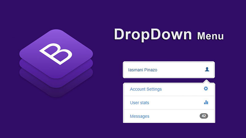
One of the most convenient approaches to styling a project is by using pre-styled components. Bootstrap includes pre-styled components such as dropdown menus, alerts, or navigation bars that you can use when developing a project. These pre-styled components help with creating a feature-rich project and they represent one of the biggest advantages of this framework. Pre-styled components are the big, open secret that sits behind impressive web designs.
The community is huge
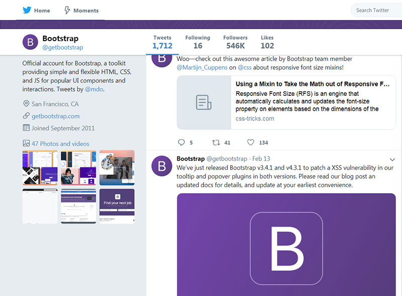
The Bootstrap community is there to help you when you need it. The fact that Bootstrap is one of the most popular – if not the most popular – frameworks based on CSS means there is a large community to answer any question you may have or fix an issue that you are struggling with. The Bootstrap project is hosted and maintained using GitHub, and there are more than 500 contributors and almost 10,000 commits present on the platform. You should:
- Find and follow @getbootstrap on Twitter.
- Keep an eye on The Official Bootstrap Blog.
- Try to join the official Slack room.
- Discuss with otherBootstrapperson IRC: connect to the irc.freenode.net server, and join the #bootstrap channel.
- Ask for implementation help on Stack Overflow (tagged bootstrap-4).
- Stay updated with what people are doing lately with Bootstrap at the Bootstrap Expo.
When you face problems, don’t forget to take a look at these resources too:
Bootstrap General Facts
Bootstrap comes in two variants: one that is precompiled and one that is based on a source code version.
The latter variant is the one that uses Less CSS, but for those who are more inclined to Sass, they should access the official Sass port of Bootstrap. With Bootstrap, developers can also make use of the Autoprefixer to avoid wasting time with CSS vendor prefixes.
Below you will find some general facts about Bootstrap that should help you use it immediately after downloading it.
How files are structured
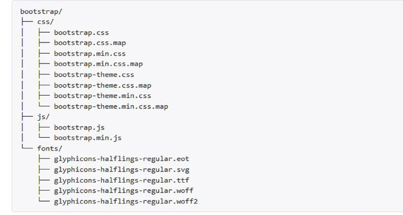
Before moving further, you need to understand how Bootstrap files are structured. The structure is very simple and self-explanatory, compared to how it is presented in the case of other frameworks. The files are precompiled so that developers can use them immediately without delay. The CSS and JavaScript files are also minified and include fonts from Glyphicons. See how the basic form of the Bootstrap file structure looks:
All JavaScript plugins will work only when jQuery is included.
How does the HTML template look?
Next, you should familiarize with how a basic Bootstrap HTML template looks like. After understanding how the looks, it won’t be difficult to figure out this template:
<!DOCTYPE html>
<html lang="en">
<head>
<meta charset="utf-8">
<meta http-equiv="X-UA-Compatible" content="IE=edge">
<meta name="viewport" content="width=device-width, initial-scale=1">
<title>Bootstrap Template</title>
<link href="css/bootstrap.min.css" rel="stylesheet">
</head>
<body>
<h1>Hello, world!</h1>
<script src="https://ajax.googleapis.com/ajax/libs/jquery/1.11.2/jquery.min.js"></script>
<script src="js/bootstrap.min.js"></script>
</body>
</html>
What components does it include?
Starting with simple buttons, dropdown menus, and alert boxes, Bootstrap has a comprehensive list of components for all types of scenarios. You can search for the class you are interested in and a list of all the components will pop up on your screen.
Reading further about the included components should be useful, considering how numerous they are and how different they are in function. The design template is uniform, which means you won’t lose your project’s consistency. The visual design effort is thus minimized.
Consistent documentation
Bootstrap has very consistent and comprehensive documentation. All the blocks and bits of code used in Bootstrap are carefully explained. While reading the explanations, users will also be able to notice examples from within the code and figure out where it belongs.
Most of the lines of code are used for implementing basic elements, but understanding the basics from the beginning saves a lot of time. Bootstrap is an ideal option for beginner developers because it allows people to select the exact components they want to include in a project and they don’t need to write the code from scratch.
Most of the time, all it takes is a bit of copy-pasting. Integrating Bootstrap can significantly streamline the website development process, making it more efficient and user-friendly.
The grid system
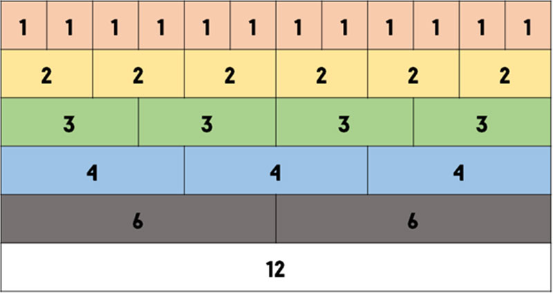
The grid system is useful for responsive, scalable web design. By using it, you can create a project that fits all screen sizes. In Bootstrap, you should know that:
- The rows are placed in a fixed-width or full-width container to support correct alignment.
- The rows are generated in horizontal groups.
- When more than 12 columns are placed within one row, if another column is added it will be wrapped onto a new line, resulting in one unit.
- You can use grid classes when the screen width is equal or greater than the breakpoint sizes.
- For smaller devices, the grid classes are overridden.
- Classes are pre-defined, but designers can make their own layouts based on them.
- The Bootstrap grid system has 4 classes – lg, md, sm, xs – based on how many pixels the screen size has.
To understand the grid system easier, take a look at this image:
Layout examples
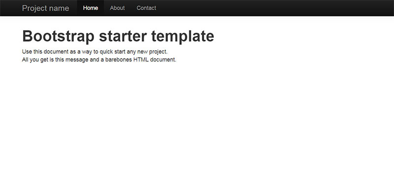
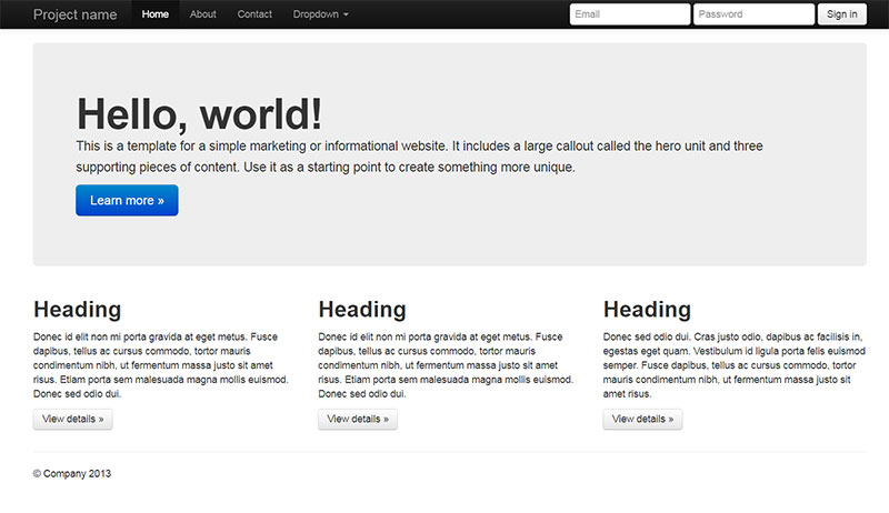
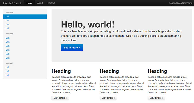
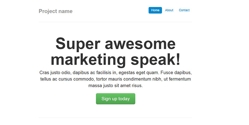
Finally, here are some layout examples you should analyze:
Starter template
Basic marketing site
Fluid layout
Narrow marketing
Narrow jumbotron
Album
FAQs about Bootstrap
1. What is Bootstrap, and what are its key features?
A well-liked front-end framework for creating responsive, mobile-first websites is called Bootstrap. The grid layout, pre-made UI elements (such as buttons, forms, and navigation menus), and integrated support for well-liked CSS and JavaScript plugins are some of its standout features.
2. How do you use Bootstrap in your web development project?
You must include Bootstrap’s CSS and JavaScript files in your HTML code in order to use it in a web development project. Afterward, you may style your web pages and include interactive elements using its classes and components. In addition, Bootstrap offers examples and documentation to aid in your early start.
3. What is the difference between Bootstrap 3 and Bootstrap 4?
The most recent version of the framework, Bootstrap 4, has a number of enhancements and new capabilities over Bootstrap 3. They comprise additional CSS variables, an enhanced typography system, and a new grid system with more breakpoints.
4. What is the difference between Bootstrap 4 and Bootstrap 5?
This framework has been updated multiple times, with major differences between versions 4 and 5.
- Size: Bootstrap 5 is smaller in size than Bootstrap 4. It has removed some of the unused CSS, streamlined the JavaScript code, and improved the documentation.
- Default Font: Bootstrap 4 uses the font-family “Helvetica Neue” while Bootstrap 5 uses the system font stack. This means that Bootstrap 5 will inherit the font of the device or browser it’s being viewed on, resulting in faster load times.
- Changes to Grid System: The grid system in Bootstrap 5 has been simplified and improved. It uses fewer classes and introduces a new concept called “gap” for adding spacing between columns.
- Improved Customization: Bootstrap 5 offers more customization options than Bootstrap 4, allowing developers to choose which components and utilities to include in their projects.
- JavaScript Plugins: Bootstrap 5 has dropped some of the older JavaScript plugins like jQuery and has moved to Vanilla JavaScript for better performance.
- New Components: Bootstrap 5 introduces new components like the off-canvas component, floating labels, and accordion component.
Generally, Bootstrap 5 is superior to Bootstrap 4 in terms of speed, flexibility, and additional features. But, if you’re still using Bootstrap 4, upgrading to the latest version of the framework could be a time-consuming procedure.
5. How do you customize Bootstrap to fit your design needs?
By changing Bootstrap’s variables and mixins, which regulate elements like colors, font, and spacing, you can make it your own. Also, you can make your own CSS classes to replace or supplement Bootstrap’s built-in styles. But it’s crucial to adhere to recommended practices and stay away from directly altering Bootstrap’s core files.
6. What are some of the advantages of using Bootstrap?
Bootstrap has a number of benefits, including its simplicity, widespread community support, and capacity to reduce development time. Moreover, it offers a responsive and constant design across all browsers and devices.
7. What are some of the disadvantages of using Bootstrap?
Using Bootstrap has some drawbacks, such as its big file size (which can increase page load times), generic design (which can make websites look identical), and potential for encouraging poor design techniques (such as relying too heavily on pre-designed components).
8. What are some best practices for using Bootstrap?
Using Bootstrap’s grid structure for layout, using its pre-built classes and components when appropriate, and changing the framework only when necessary are all considered best practices for using it. Also, it’s critical to thoroughly test your website across a variety of platforms and browsers.
9. How do you incorporate Bootstrap into a content management system (CMS)?
You can utilize a pre-made theme or make your own by altering the Bootstrap files to meet the structure and specifications of your CMS to integrate Bootstrap into a CMS. The widely used CMSs Joomla, Drupal, and WordPress all support Bootstrap.
10. What are the most common CSS classes used in Bootstrap?
“container” and “row” for layout, “btn” for buttons, “form-control” for form inputs, and “navbar” for navigation menus are some of the most popular CSS classes used in Bootstrap. For styling typography, pictures, and other elements, Bootstrap also provides a large number of additional classes.
11. How does Bootstrap help with responsive design?
Bootstrap is a flexible and adaptive grid framework that enables you to develop layouts that adapt to various screen sizes, which aids with responsive design. In order to create responsive navigation menus, carousels, modals, and other UI components, it also provides CSS classes and JavaScript plugins.
Ending thoughts on what is Bootstrap
As you may have noticed, Bootstrap is a strong tool that makes the job of developers easier and more efficient. With Bootstrap, you can now painlessly create projects without worrying about integration issues or errors. The fact that Bootstrap is also free makes it one of the top choices among developers, regardless of their level of experience. Both front end and back end developers can use it effortlessly.
The framework is flexible and contains all the tools and documentation a developer would need to come up with responsive projects. Bootstrap can accommodate any need that a developer may have. And, if you ever get stuck, the community is always there to help.
If you enjoyed reading this article on what is Bootstrap, you should check out this one about markup languages.
We also wrote about a few related subjects like dynamic website, web designer vs web developer, the best WordPress plugins for developers, The Best Local WordPress Development Environments, and JavaScript IDE.

