Why are website color schemes so important?
Everything, every little detail that is a part of your website design is important and impacts the user experience in some way. One of the things that easily gets overlooked is the color scheme because people often underestimate it.
Choosing the right website color schemes might not seem like much, but it can get you a long way. Cool color schemes will make the user feel more welcome and comfortable on your website while enhancing the overall user experience.
For Amelia, our WordPress booking plugin, we chose the calm and neutral blue color scheme with bright accents. Later, you will find out why.
The Importance of using the proper website color scheme
The best website color palette is the one that will help you:
- Catch the user’s attention;
- Engage your target audience;
- Turn visitors into customers;
- Spread word of mouth;
- Make the visitors interested in your brand
In today’s competitive market, there are many businesses out there and the key is to stand out from the pack in some way if you want to turn the visitors into customers.
With that in mind, you have to know that all elements on the website affect the visitor’s final decision. If you want to help them cross the line between visitors and customers, you have to think about everything, especially about the website color scheme.
Website color scheme tips
Determine the Product / Service You Are Selling
It always comes down to the product or service that you are selling and you have to choose beautiful colors that pair well with the product.
For instance, if you are selling environmental products, the logical way to go would be by choosing a green color scheme rather than, for example, a red color palette. The website color scheme has to be inspired by the product or service.
Know your Target Audience
A good website color scheme is one that your target audience wants to see. A modern color palette will do great with a younger audience while a more neutral color palette might be better for older folk.
Another thing to keep in mind is that a bright website color scheme full of vibrant colors can cause eye fatigue and drive visitors away.
Choosing a Background Color
When choosing a website color scheme, keep in mind that the background color’s purpose is to punch the body of the page forward and keep the focus on the content.
Make Your Text Black
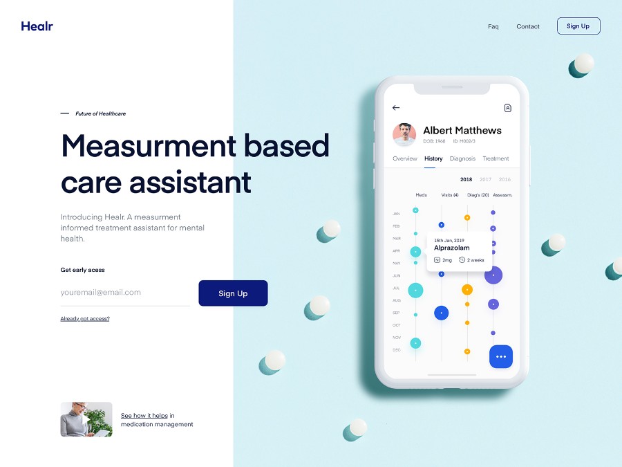
Reading black text is easy on the eye and it is something people are used to seeing. You can get a little creative and play around that, but there is no need to stray too much from what we all know that works.
What Does Each Color Tell Us?
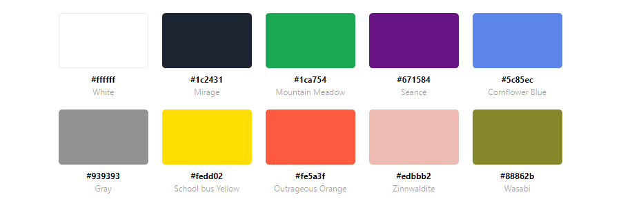
Different colors have different meanings are we are used to seeing them in specific contexts. Here are some of the most popular colors and the stories behind them:
- Red is a color that invokes a strong emotion. It is a powerful color often used with a call to action elements such as “Buy now”, “Reserve now”, and similar. It is easily noticeable but it should be used cautiously because it can be a little overwhelming if you have fully red websites.
- Orange is often used in websites that promote or sell food products. It is a warm color palette associated with increasing creativity and positive thinking, and it is particularly popular among the younger generation.
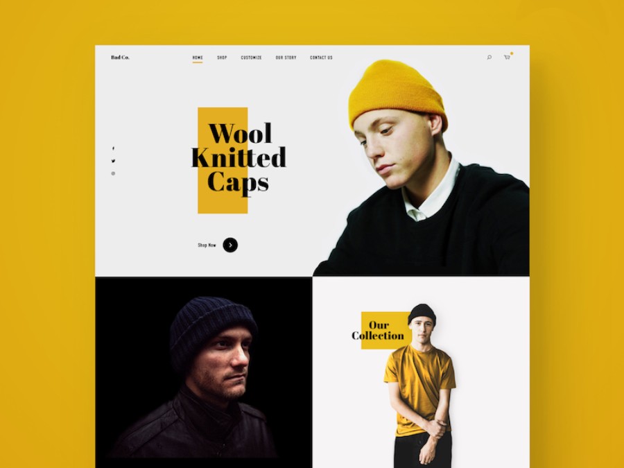
- Yellow is often a part of modern color schemes and while it can be incorporated into almost any website, it is particularly appealing to children. However, keep in mind that it shouldn’t be the dominant color as it can get exhausting for the eyes. Instead, it should be used as an accent color to highlight certain elements and to add some personality to the website design.
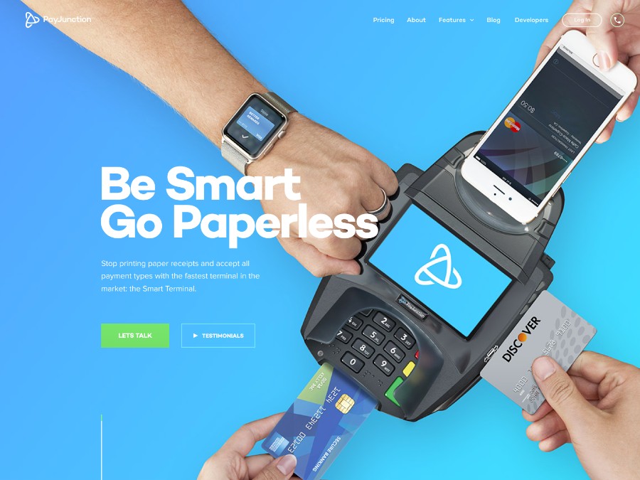
- Green is often associated with nature, tourism, environmental “green” products, etc. But the story of the color green goes beyond that. Green is often a part of the best color schemes because it is pleasing to the human eye, it symbolizes wealth and prosperity, and it is one of the most trendy colors.
- Blue is a conservative color known to relax the nervous system while it also invokes trust. It can be easily incorporated on almost any website. One thing to keep in mind though is that it shouldn’t be used for text as it is not the standard color for the human eye to read with.
- Black is one of the most useful colors in website design, especially when it comes to text. It is also associated with art and photography. It works great especially when you have a vivid accent color with it.
- Purple is used in religious and vacation sites.
Capture a Feeling with the Right Website Color Schemes
Website Color Palettes that Excite an Audience
Triggering an emotional response with the audience can lead to many things – one of which is completing the purchase. The best example of how this works is the way children’s brands use color choices to excite their target audience. Long story short, if you can get the potential customer excited about your product or service, there is a much better chance you will sell it.
To create excitement, modern colors, and bright shades are often used as a part of the web design. For example, red color schemes are more likely to trigger an emotional response than a simple grey color palette or a black and white website. Keep that in mind when choosing the colors for your web design project.
A Website Color Scheme That Increases Brand Sentiment
We talked before about keeping the target audience in mind when choosing the best colors for a website. However, there are some colors that can be easily incorporated into any website color scheme as they are universally liked across the board.
A green color scheme, teal color scheme, light blue color palette, and navy blue color palette are some of the examples of colors that are appealing to all generations and audiences.
Website Color Schemes that Add Credibility
If your goal is to create a more professional, business website, you should stay away from too vibrant and bright colors. Using a website color scheme that adds credibility is a better option in cases like that.
Think about using vintage colors as a part of the retro color palette, a soft color palette with gentle tones, or an earth tone color palette as a part of a warm color scheme.
If you are going with a dark color palette in web design, make sure to add a soft touch with a lighter color to make the website seem less cold and to add some personality.
Website Color Schemes that Increase Trust
While there are many great color combinations that are appropriate to use, if your first goal is to be viewed as a trustworthy and stable brand, use the color blue.
Blue, as a part of a website color scheme, is known to increase feelings of trust. It is no coincidence that around 53% of corporate brands in America use blue as a part of their logo.
Think about Your Industry
You can use a lot of website color scheme options but always keep in mind your industry and the colors associated with it.
Green for eco-friendly brands
This one might seem obvious, but we have to mention it anyway. If you are developing an eco-friendly brand, there is no better website color scheme for you to use than a green color scheme.
Blue for water
Even though water isn’t technically blue, everybody’s first association when it comes to the ocean is the color blue. If your brand has anything to do with water, use different tones of blue in your color scheme to create that wave effect that everyone is expecting to see.
Blue for Finance
When it comes to finance, you want your brand to be viewed as stable and trustworthy – which is why you should use blue in your website color scheme.
Red for retail
Using red in a brand’s and website color scheme is very popular among retailers; 59% of retailers have red in their logo. The reason behind it is the fact that this color easily generates excitement and makes the customers want to complete the purchase.
Awesome Website Color Schemes
BAUNFIRE
![]()
BAUNFIRE is a top digital web design agency in San Jose, California. Their creative team of web designers, interactive developers, and marketing strategists provide branding, graphic design, and corporate website services for leading technology companies, brands, and startups. They have quite the website color scheme which can be easily replicated.
Matter


Matter is a feedback platform for professionals who want to reach their career aspirations.
Kaiten
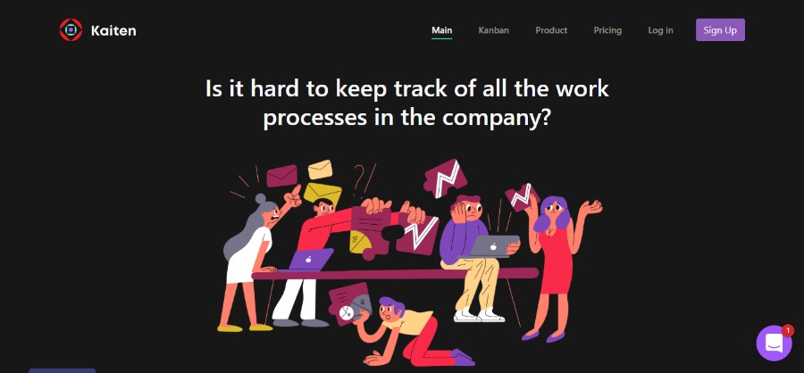
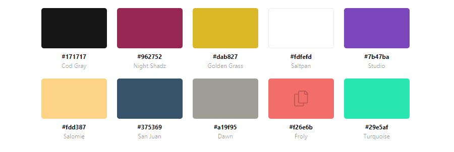
Kaiten helps people to visualize their process using multiple boards, monitor effectiveness and make informed decisions.
Zendesk

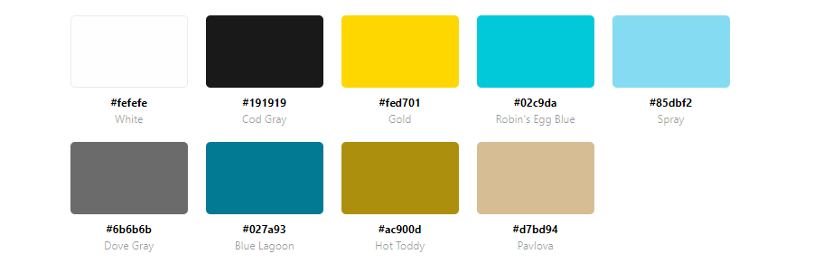
Introducing Zendesk Sunshine, the open, flexible CRM platform. Sunshine is built on AWS and lets you seamlessly connect and understand all your customer data—wherever it lives.
Crazybaby

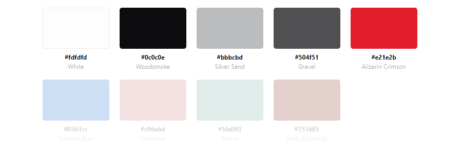
Crazybaby Air 1S are true wireless headphones designed for sports, offering uncompromising Hi-Fi sound quality to keep you pumped while you break a sweat.
TakeShape

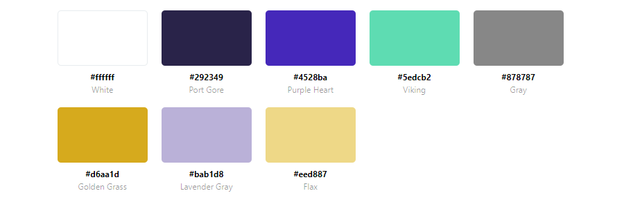
A stress-free Headless CMS, GraphQL API, and Static Site Generator with a great website color scheme to help you get your projects done.
Couple
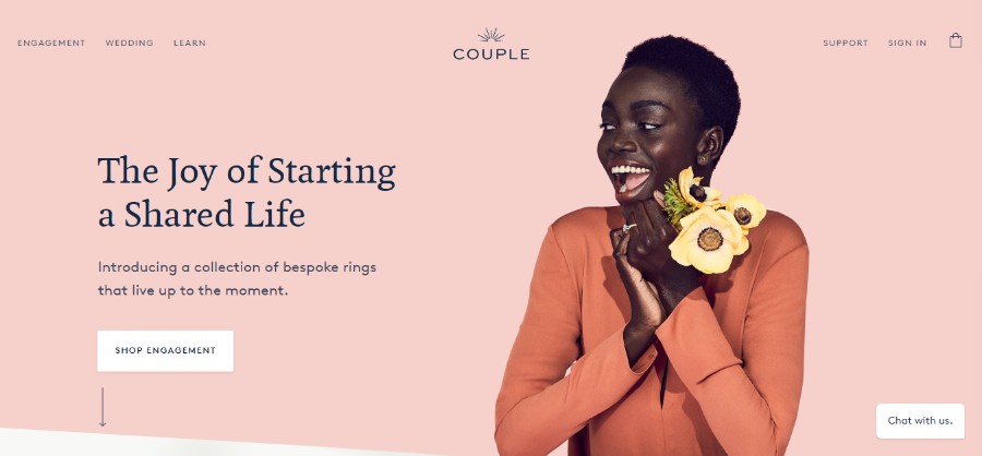

Introducing a collection of bespoke rings that live up to the moment. But that doesn’t matter much for you. Its website color scheme is lovely to say the least.
Motion Design School

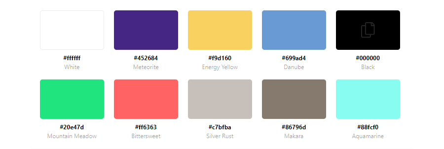
No bullshit course on animation and motion design in After Effects. Its website color scheme is full of vivid colors.
ark

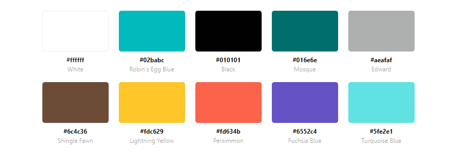
Their debut ARK project this December is to share happiness with as many people as we can. They believe Happiness is only real when shared.
Lustone
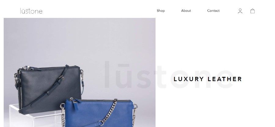

From a love of minimal shapes and edgy details, the lūstone brand was born with a mission to create stylish leather bags and accessories for the Australian market.
Setter

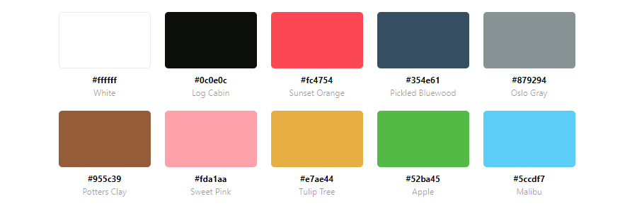
Setter manages all of your home maintenance and projects so that you can get back to living.
Agens
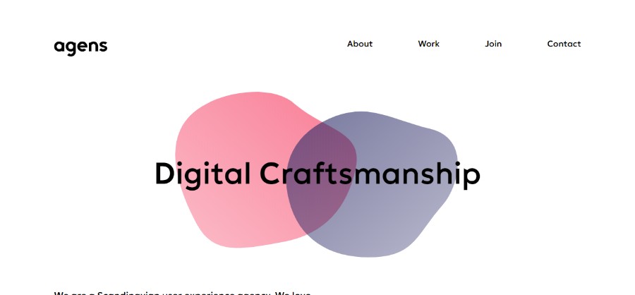
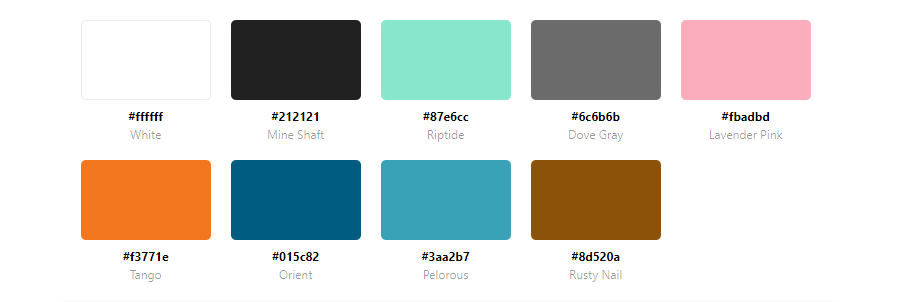
They are 45 designers, developers, and creatives. They turn ideas into products and experiences that people enjoy.
five/four
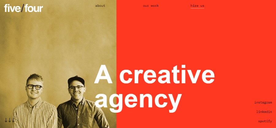
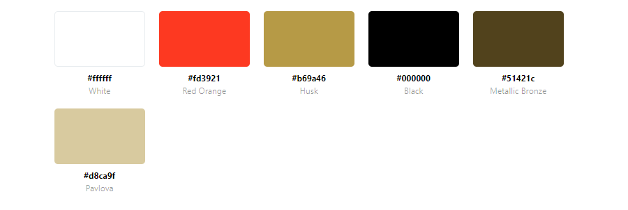
Entrepreneurs, business owners, non-profit leaders. They all love to innovate and challenge the status quo.
Mistretta

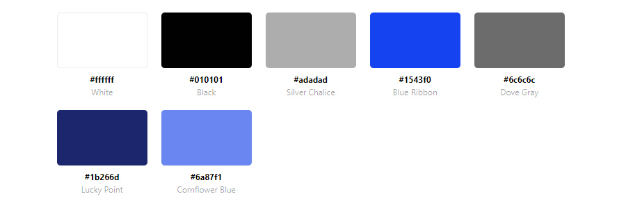
Identifying that unique and individual spark that illuminates the beauty of each and every woman. This is the key to our creativity at Mistretta Coiffure, a refined and exclusive ‘trend laboratory’ where shapes and colours blend to create a unique and personal esthetic experience.
Collect by WeTransfer
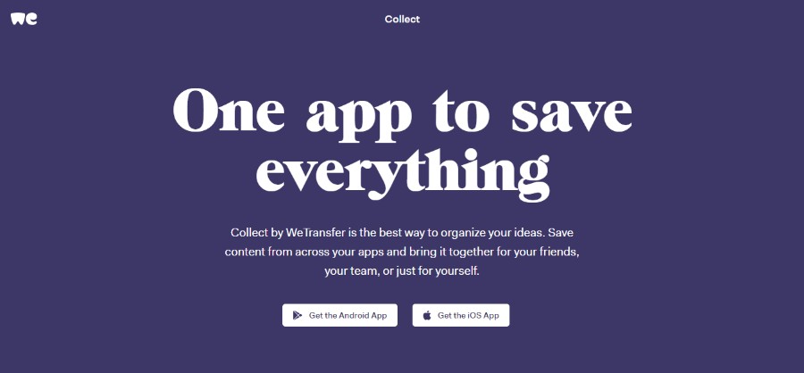
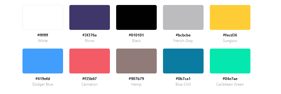
Collect by WeTransfer is the best way to organize your ideas. Save content from across your apps and bring it together for your friends, your team, or just for yourself.
ICO Syndicate
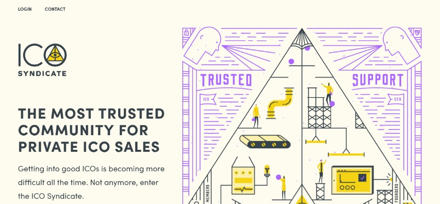
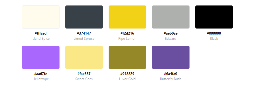
Getting into good ICOs is becoming more difficult all the time. Not anymore, enter the ICO Syndicate.
Tonik Mantra

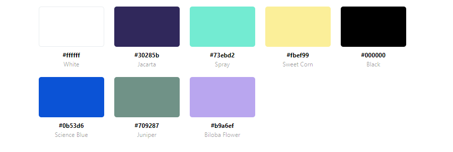
TONIK+ infuses potent *I AM* declarations (Mantras) with a soothing ambiance. Each Mantra is delivered as a small repetitive dose (microdosing).
Ipification

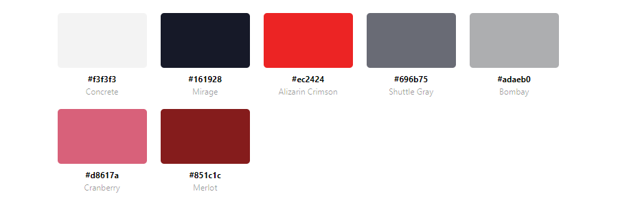
Benefit Vantage Limited – Your trusted Mobile Technology Partner. As technology continuously disrupts the norms, especially in the mobile world, we are here to guide you through your successful digital transformation and mobile business success.
fixate
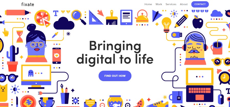
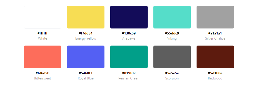
They are a multidisciplinary team with a proven track record. They love to join forces with fellow strategists, design thinkers, and innovators to create apps that delight users and exceed expectations.
Fishfinger

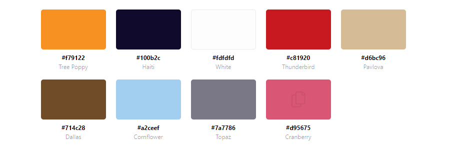
They’re a team of creatives that love nothing more than creating incredible stories. They specialize in branding, animation, and web; uniquely combining our skills to produce magical digital experiences.
BarkBox

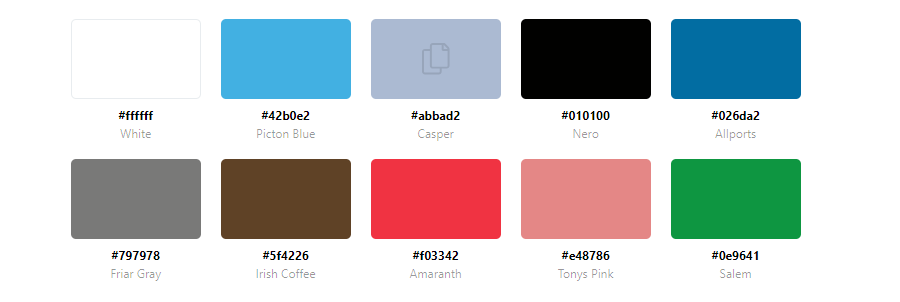
BarkBox is a great example of a site using a cute website color palette that makes the visitors feel welcome and comfortable. The soothing shades of pink are repeated throughout the page as they contrast beautifully with the shades of blue used both in the website design as well as in the brand’s logo.
Red is the best choice when it comes to choosing the color for your call to action elements. It naturally triggers excitement and compels the visitors to make a purchase. You will often find it as a part of retail websites, especially when it comes to the elements that are supposed to draw the visitor’s attention immediately.
Nordic Ruby


Nordic Ruby, a conference in Stockholm, uses a beautiful blue and orange website color scheme that adds a certain elegance and sophistication to the overall design.
LemonStand
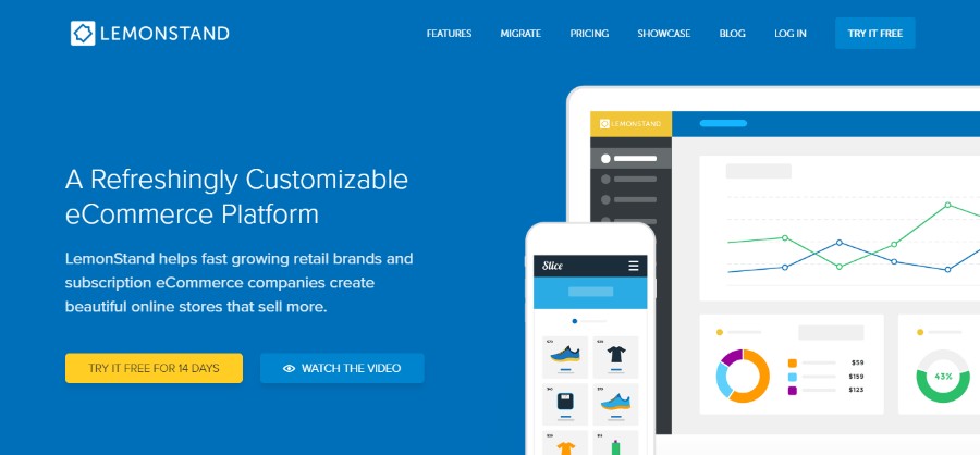

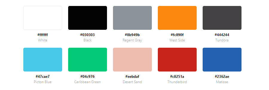
If there is a website that could benefit from using a blue-yellow website color scheme, it is a website called LemonStand. However, they managed to incorporate this vibrant color into the palette beautifully, without making it too overwhelming and disruptive.
Unfortunately, LemonStand has shut down as of June 5th, 2019. by following this link you can learn more about LemonStand alternatives that might be a good fit for you.
Mint

Since Mint is a website dedicated to finance, it is no surprise that we can see lots of blues and greens here. However, by adding soft touches of brown into the mix, they created a lovely earthy website color palette that is both soothing and conveys trust.
Odopod
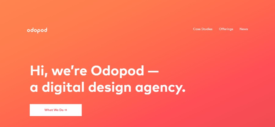

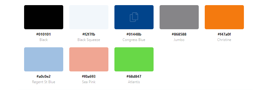
Odopod decided to go with simple color templates but they added a dose of personality by incorporating gradient on the homepage, as well as large typography.
Fiverr


One of the good practices in website design is reserving a specific color for CTAs – and not using them anywhere else on the website. Fiverr did it too and in their case, it is the color green that appears only on the call to action elements.
Ahrefs

Ahrefs created what could be called a liberal color palette that is creative and interesting, yet still easy to look at.
Millo.co

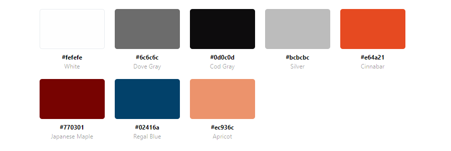
Millo.co uses their website color palette to make you look exactly where you are supposed to. It is a simple color palette and the design is very intuitive.
Loom

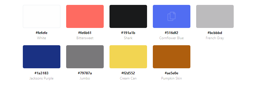
Best color palettes are often the palettes that put the visitor at ease. Loom did it beautifully by using baby blue combined with a touch of salmon. It also uses different color blues for CTAs which makes the design even more interesting and intuitive.
Online Color Palette Generators
Coolors
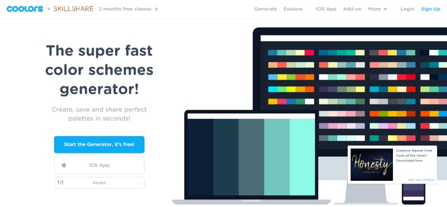
Coolors is a super fast color generator that is free of charge and will surely help you the right color scheme. The key features include:
- Fast and simple – it takes nothing more but pressing a spacebar to create beautiful color schemes that work together perfectly
- Export and share – Export your schemes in multiple handy formats like PNG, PDF, SCSS, SVG, or copy the permanent URLs
- Image to colors – pick up starting colors from your images and get the perfect combination automatically
- Palettes collection – Create your profile and keep all your color schemes well organized with name and tags
- Adjust and refine – Customize your colors precisely by adjusting temperature, hue, saturation, brightness, etc.
- Colors in the cloud – login to your account and access your creations everywhere
Mudcube color sphere

Mudcube is a palette generator that takes the color wheel to 3D where you can rotate a sphere around to get the perfect colors. It comes with 10 harmony presets, 9 vision presets, and 3 quantize presets. It also has a selection of themes from a drop-down menu to choose from if you don’t feel like creating one from the scratch. You can download your palettes in .AI or .ACO files
Color picker
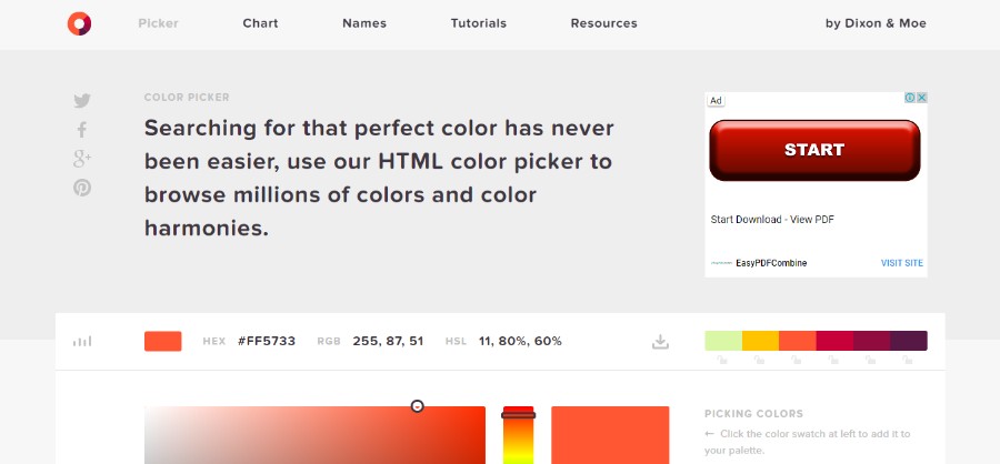
This color scheme picker is for those who don’t feel like spending too much time playing around with the color wheel and adjusting the colors to perfection manually. This tool lets you select the color of your choice from the selector while the app does the rest for you.
You can experiment with different harmonies such as full HEX, HSL, and RGB info. These values CMYK, RGB, etc. will help you to find a particular color from the swatch and when you click the swatch. it will be added in your palette.
Design Your Way’s Color Palette Generator
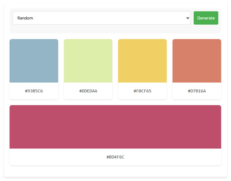
Elevate your design game with Design Your Way’s color palette generator. Ideal for designers, it effortlessly creates cohesive color schemes. Suitable for web design, branding, and digital art, this tool uses color theory to generate harmonious palettes, streamlining your creative workflow and enhancing efficiency.
SpyColor.com
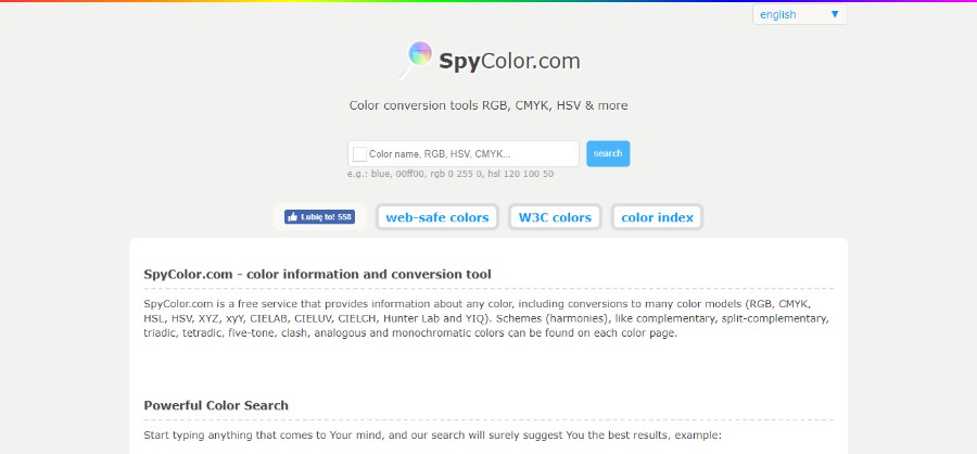
SpyColor.com is a very useful color information and color conversion tool. All you have to do is type whatever comes to mind and the search results will suggest you the best results.
You can type in a color name, for example, Amaranth Purple and you will get a beautiful selection of purple color schemes for you to choose from.
ColorZilla
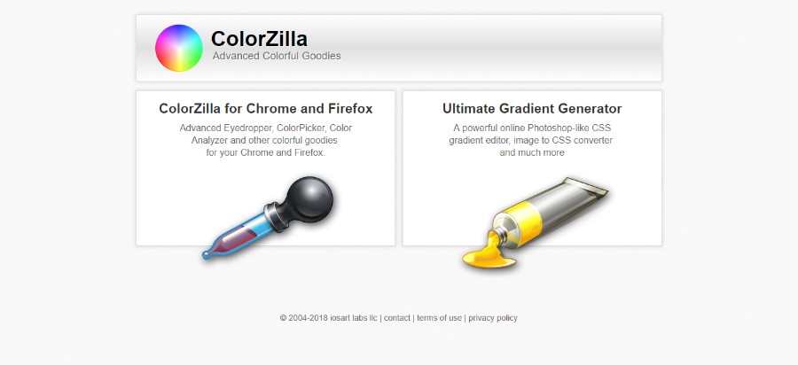
ColorZilla is a wonderful advanced tool for creating an amazing CSS color palette. The advanced features include:
- Eyedropper – get the color of any pixel on the page
- Advanced Color Picker (similar to Photoshop’s)
- Ultimate CSS Gradient Generator
- Webpage Color Analyzer – get a color palette for any site
- Palette Viewer with 7 pre-installed palettes
- Color History of recently picked colors
Colormind
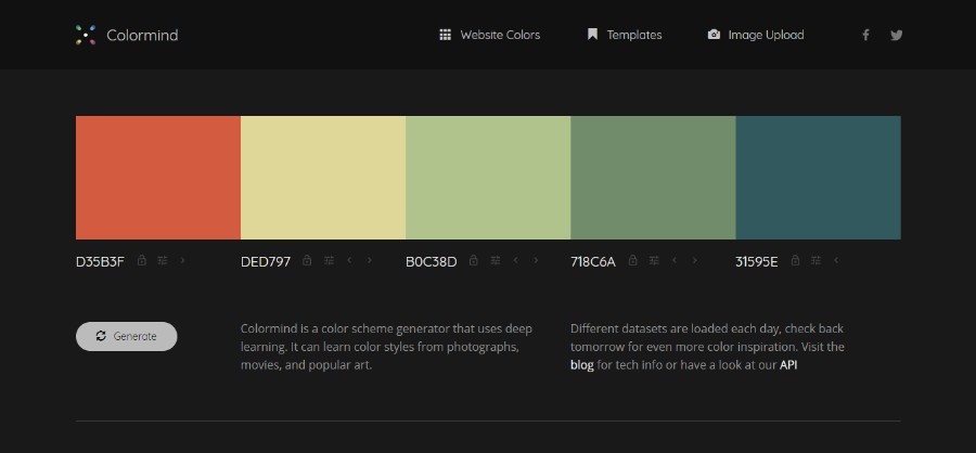
Colormind is a unique tool that uses color styles from films, art, and photos in order to create a color palette. If no colors are locked, it creates random website color schemes. If, on the other hand, you have a particular starting color in mind, all you have to do is lock that color and let the generator do the rest of the job.
ColorHexa
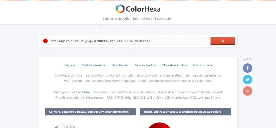
ColorHexa is a great tool for designers that allows you to put a color value into the search bar and it will then display the information related to color schemes, alternatives, tints, tones, etc.
Palettable
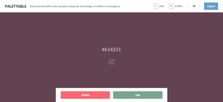
Palettable is an amazing color combination generator that creates a palette using the knowledge of thousands of designers. It has a full-screen display that helps you better see how the colors of your choice complement each other. In addition to that, it offers you suggestions for various colors that can be customized to your liking.
Canvas Colors
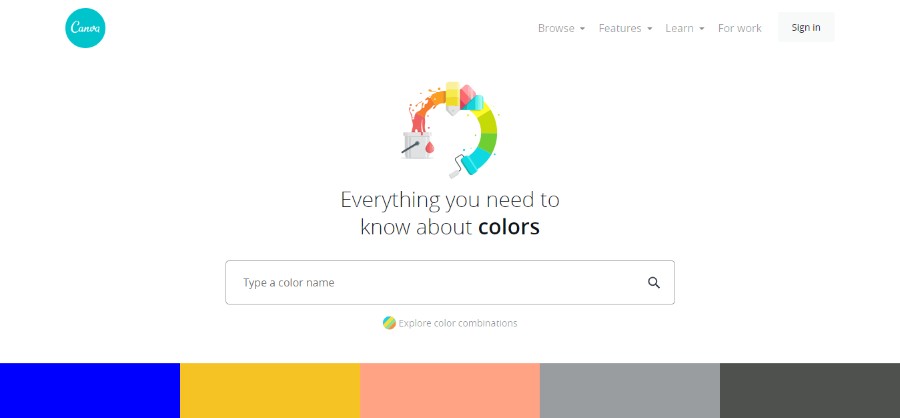
Canvas colors is an amazing color information tool that will let you know everything from the meaning of the colors of your choice to the best color combinations. It comes with hundreds of pre-made color combinations that include the descriptions of each color and the colors it pairs well with.
Colordot

When you open Colordot, your entire screen will be colored in a color of your choice that you can easily adjust or change simply by moving your cursor. Once you find the color you like best, you can save it simply by clicking on it. This tool also comes in the form of an iPhone app.
Material Palette
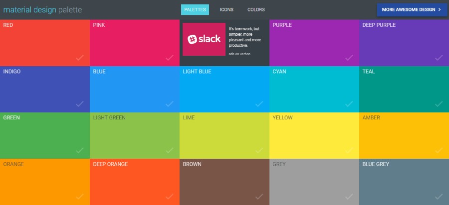
In Material Palette, you have to pick any two colors from the given tiles and the app will then create a color palette for you. These website color schemes can be easily downloaded or tweeted.
COLOURlovers
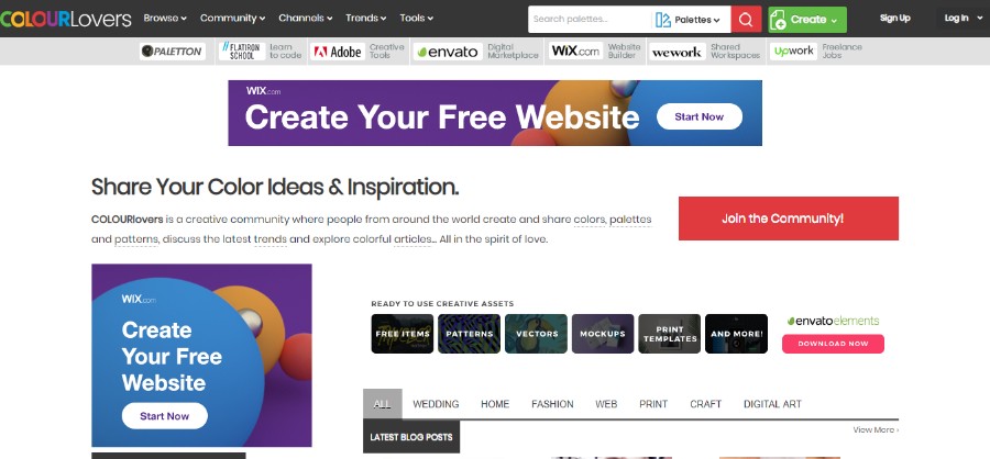
COLOURlovers is a creative community where people from around the world create and share colors, palettes, patterns, and discuss the latest trends in the world of colors. You can easily join the community and share your own designs and enjoy all the other user-generated content. The membership is free and everything here is done in the spirit of love.
Pictaculous
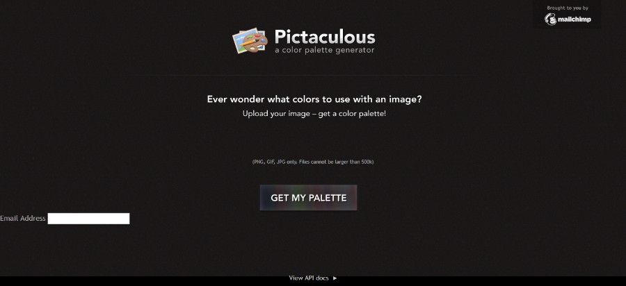
Pictaculous is a color palette generator courtesy of MailChimp that lets you generate a color palette from PNG, JPG or GIF image or photo. Basically, all it takes is to upload a picture of your choice and let the app do the rest. Then, the app creates an Adobe swatch file for you to help you download the color palette quickly and easily.
Colorexplorer
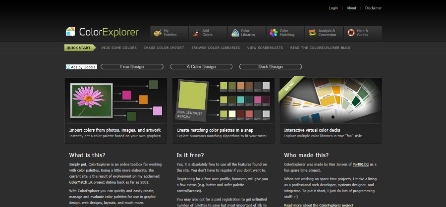
Colorexplorer was created by Kim Jensen as a fun little side project and it turned out to be quite useful and popular. It is all about exploring colors and different combinations to create the most unique and beautiful website color schemes.
It comes with a variety of useful tools such as those for uploading CSS and HTML files, evaluating and working with colors from an existing website, matching tools with a large number of matching algorithms, advanced picker tool, color conversion tools, and many more.
Colors on the web
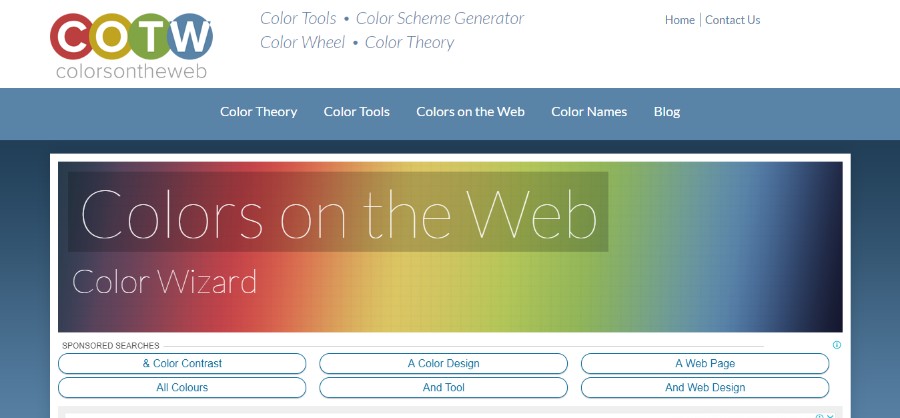
Colors on the Web – The Color Wizard is a color matching application for anyone who wants to create new designs with beautiful website color schemes. All you have to do is enter the hex value of your color or select a color from the drop-down and the app will then process it and return a range of matching colors.
This tool also comes with a unique tool called the Contrast Analyzer that lets you know whether two colors meet the accessibility guidelines defined by the W3 consortium.
Color combos
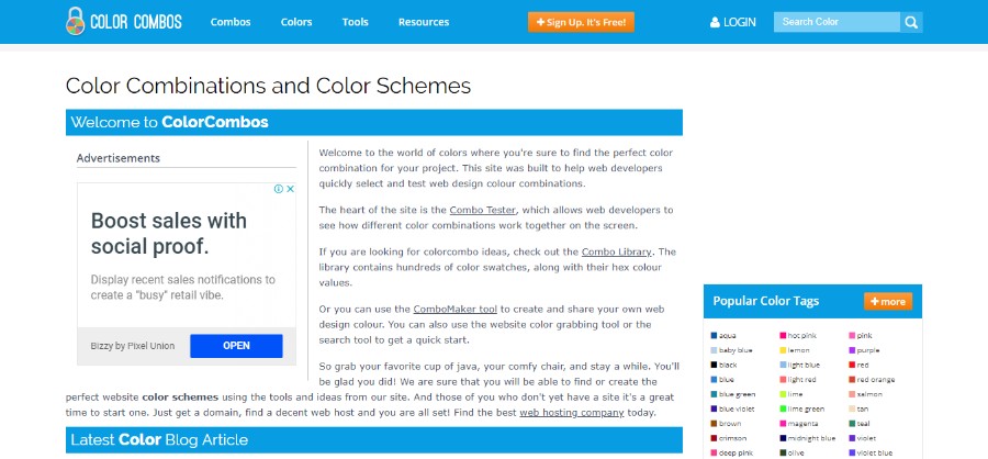
Color Combos is all about creating the perfect color combinations for your new website color schemes. It was designed specifically for web developers to help them quickly pick and test various color combinations and palettes. This tool includes the combo library, combo tester, combo maker and font color tester.
COPASO
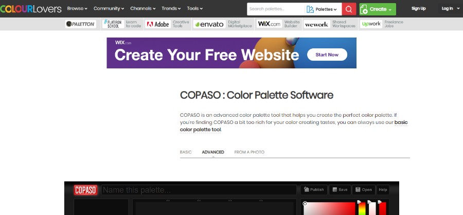
COPASO by COLOURlovers is an advanced tool that will help you create the desired website color schemes quickly and easily. However, keep in mind that you have to be logged in in order to save the palette of your choice. This tool comes with many options for creating color palettes in the form of preset triadic, tetradic, complementary, and split-complementary colors.
Color blender
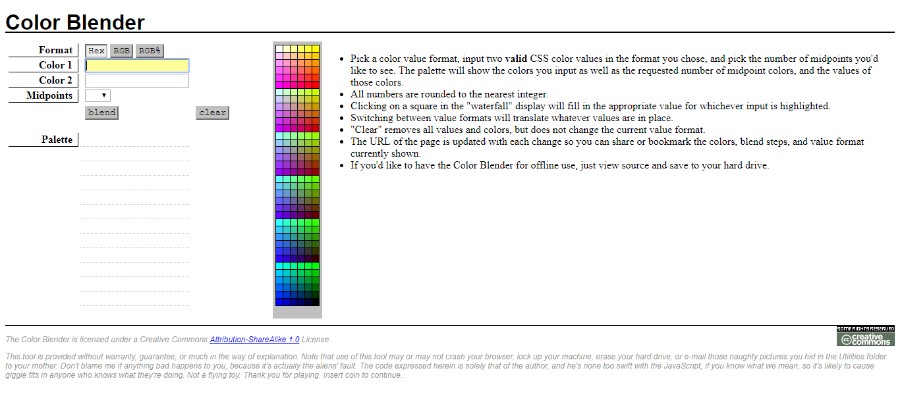
Working with Color Blender includes several simple steps:
- Pick a color value format, input two valid CSS color values in the format you chose, and pick the number of midpoints you’d like to see. The palette will show the colors you input as well as the requested number of midpoint colors, and the values of those colors.
- Clicking on a square in the “waterfall” display will fill in the appropriate value for whichever input is highlighted.
- Switching between value formats will translate whatever values are in place.
- “Clear” removes all values and colors, but does not change the current value format.
- The URL of the page is updated with each change so you can share or bookmark the colors, blend steps, and value format currently shown.
- If you’d like to have the Color Blender for offline use, just view the source and save it to your hard drive.
Colllor color palette generator
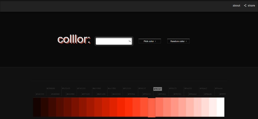
Colllor is a useful generator for creating nice-looking website color schemes and pretty color palettes with just a few simple clicks. A feature that stands out is the tool that helps you find the exact value of the darker shades of any color which is very useful for creating a professional color palette for a website.
Check my Colours
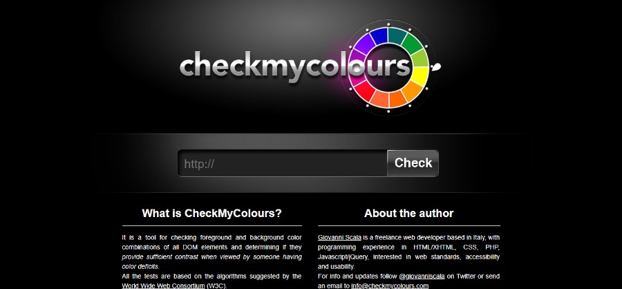
Giovanni Scala created Check my Colours with one simple idea in mind – to see the foreground and background color blend of all DOM elements and to decide if they provide sufficient contrast when viewed by someone suffering from a color deficiency.
Colr.org
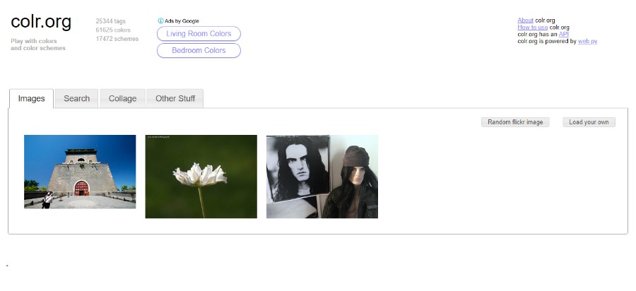
Colr.org is a great tool for creative professionals who enjoy playing around with their colors and testing all possible combinations. One of the cool features of this tool is that it enables you to see the range of colors available within a picture of your choice.
COLRD
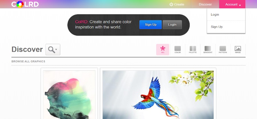
COLRD is a great tool that not only allows you to create cool color backgrounds, app color schemes, and beautiful color palettes, but it also lets you share your inspiration with the world. This tool shares tons of beautiful patterns, gradients, and images that will help you create the most unique designs.
DeGraeve Palette Generator
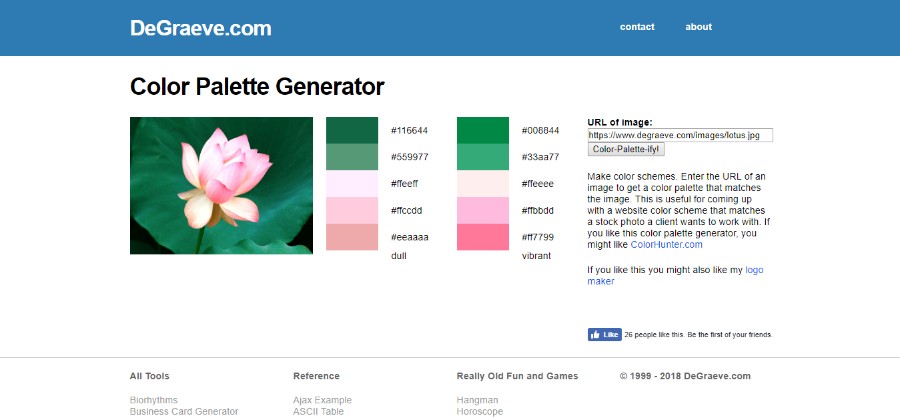
Another great tool for generating website color schemes – DeGraeve Palette Generator. It is a web-based tool that is not only very useful, but it is also completely free of charge. All you have to do is paste the URL of an online image of your choice and the generator will then create a color combination related to the image in question.
PHOTOCOPA
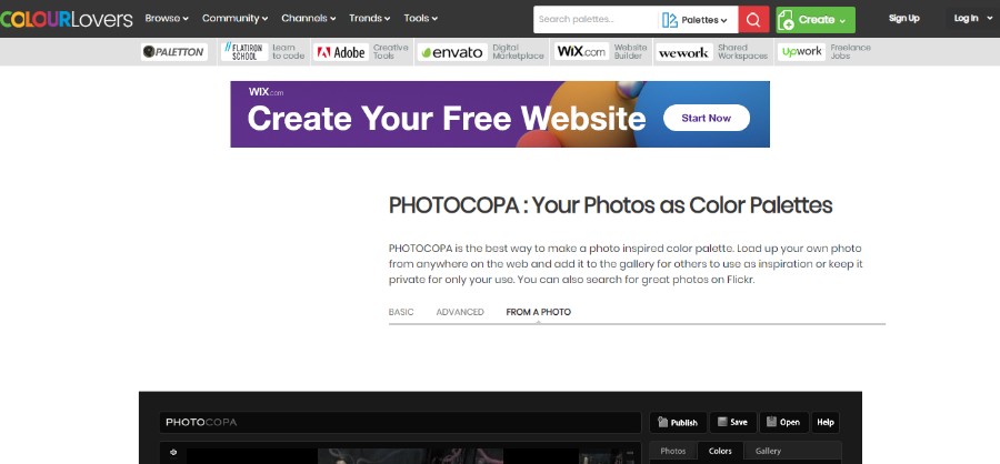
PHOTOCOPA is another great tool by COLOURlovers that will help you create lovely color palettes for websites that are image-inspired. In order to create the best website color schemes with this tool, you will have to upload a photo from the web and then keep it in the gallery as an inspiration for other users.
Colorion
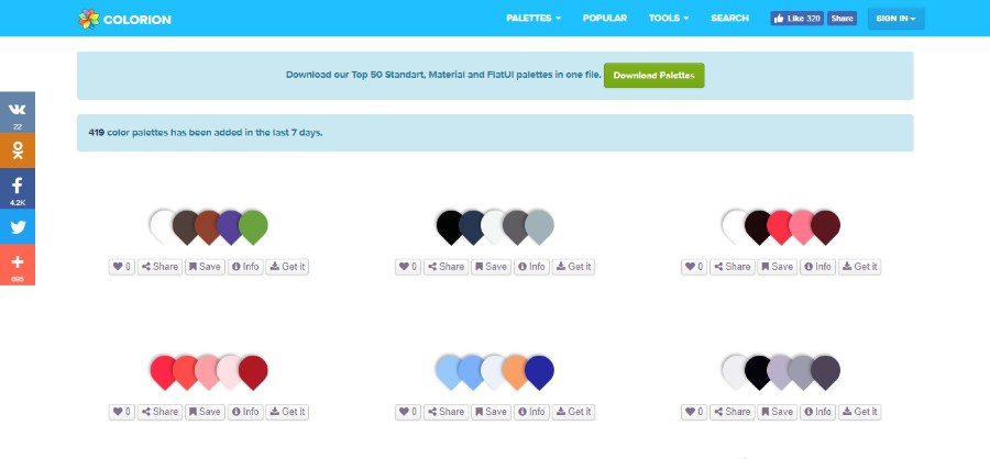
Colorion is a tool with 3 main options: base colors, gradient buttons, and image to the material palette. It will help you create wonderful color palettes for professional websites in just a few simple steps.
FAQs about website color schemes
1. How do I choose the right color scheme for my website?
Considerations for selecting the ideal color scheme for your website include your target market, brand identification, and the site’s intended use. Take into account the associations between the various hues and the messages associated with your brand. To make sure that your website stands out, you might also want to look at the color schemes of your rivals. Try out various color schemes until you discover one that suits your website best.
2. What are the most important factors to consider when selecting a color scheme for my website?
Your brand identity, target demographic, and the goal of your website should all be taken into account when choosing a color scheme. Also, you should make sure that your color scheme doesn’t conflict with the information on your website and that it is readable by users with color vision issues. The psychological effects of various colors and how they could affect visitors to your website should also be taken into account.
3. How many colors should I use in my website’s color scheme?
Your website’s purpose and brand identity will determine how many colors you utilize in the color scheme. In order to prevent confusing your visitors, it’s generally preferable to limit the number of colors in your scheme to three to five. Start with a primary color if you’re unclear about where to go from there, then add accent colors as necessary.
4. What are some popular color combinations for websites?
Websites frequently use monochromatic color schemes, complementary color schemes (like blue and orange), analogous color schemes (like green and yellow), and mixes of these (using different shades of the same color). Some websites also make a statement and draw users’ attention by using strong, high-contrast color schemes.
5. How can I ensure that my website’s color scheme is accessible to users with color vision deficiencies?
Avoid using colors that are hard to identify, such as red and green, and make sure your website’s color scheme has enough contrast to be accessible to individuals with color vision problems. Also, you can evaluate your color scheme using color-blind simulation tools and make any necessary adjustments.
6. What emotions or feelings do different colors evoke, and how can I use this information to inform my website’s color scheme?
People’s reactions and feelings to various hues vary. For instance, red is frequently connected with passion and excitement whereas blue is frequently associated with trust and professionalism. By being aware of these associations, you can utilize color to enhance your brand identification and elicit a particular emotion from visitors to your website.
7. Should I use bright or muted colors in my website’s color scheme?
Your business identification and the goal of your website will determine whether you should employ vibrant or subdued colors in your color scheme. Muted hues might be more peaceful and professional, while bright colors can be attention-grabbing and lively.
8. How can I create a cohesive color scheme that reflects my brand’s identity?
Choose a primary color that best symbolizes your brand in order to build a color palette that flows together and reflects your brand’s identity. Next, pick one or two accent colors that go well with your primary hue and convey the character of your brand. To create a unified and recognizable look for your website, use these colors consistently throughout.
9. How often should I update my website’s color scheme?
The requirements of your brand and the goal of your website will determine how frequently you refresh the color scheme. It might be time to adjust your color scheme if your brand identification changes or if you wish to change the messaging on your website. Similarly to this, it might be time for a refresh if your website starts to look outdated or doesn’t follow modern design trends.
10. What are some common mistakes to avoid when selecting a website color scheme?
When choosing a color scheme for your website, you should try to avoid making certain common mistakes like utilizing too many colors, picking colors that are hard to see or identify, or picking colors that contrast with the background or content of your website. Moreover, make sure that your color scheme fits with your brand identity and messaging and is accessible to all consumers. In order to give your website a polished appearance, it’s crucial to maintain consistency with your color palette.
Ending thoughts on website color schemes
Colors and their different shades have a very important part in web design. Not only will the right website color schemes help you keep the visitors around longer, but they can also influence their actions and turn the visitors into customers.
Choose your color palettes wisely while keeping in mind the industry you work in as well as the target audience. Play around with the color tools and see which one of the website color schemes best fits your design.
If you enjoyed reading this article on website color schemes, you should check out this article about the pastel color palette.
We also wrote about a few related subjects like blue websites and yellow color palette examples. But also an interesting piece with WordPress table plugins.

