Everyone has a favorite color or a color palette that they prefer, and it tends to affect the choices made in their daily lives. Web designers know this, and as a result, work to evaluate a color scheme at the start of a project.
Color is a powerful tool in web design, capable of evoking emotions, setting the tone, and creating memorable experiences. Among the vast spectrum of colors, yellow stands out as a vibrant and energetic hue that instantly catches the eye. From sunny warmth to energetic excitement, websites with a yellow color palette exude a unique charm that captivates and engages visitors.
In this article, we embark on a visual journey through the digital realm to explore websites that embrace the captivating allure of yellow. Whether it’s the primary color or a supporting shade, yellow brings a sense of cheerfulness, positivity, and optimism to the online landscape.
So, join us on this vibrant journey as we immerse ourselves in the world of websites adorned with a yellow color palette. Prepare to be inspired, uplifted, and captivated by the creativity and ingenuity of designers who have harnessed the power of yellow to create stunning digital experiences.
Why Choose a Yellow Color Palette?
Yellow, as a color, embodies a wide range of emotions and meanings. It represents happiness, joy, and enlightenment, evoking images of sunshine, warmth, and blooming fields. It can also symbolize creativity, innovation, and curiosity, igniting the spark of inspiration in both designers and visitors alike.
With its inherent ability to command attention and create a lasting impact, yellow proves to be an exceptional choice for those seeking to make a bold statement and leave a lasting impression.
Throughout this article, we will showcase a variety of websites that expertly incorporate yellow into their design, each with its own unique style and purpose. From minimalist portfolios to dynamic e-commerce platforms, these examples will highlight the versatility and adaptability of yellow in various contexts.
We’ll also explore the interplay between yellow and other colors, uncovering the harmonious palettes that enhance the overall visual experience and ensure a seamless user journey.
Yellow Color Palette Website Examples
Lordz

The best color palette to go with for this website was definitely yellow. As we are talking about the Swiss Urban Dance Academy Lordz, we kind of expect it to have a great, vivid, and expressive design.
The yellow color schemes keep viewers energized, and the animations that are in it also do a great job of engaging them.
Our Wildlife Garden
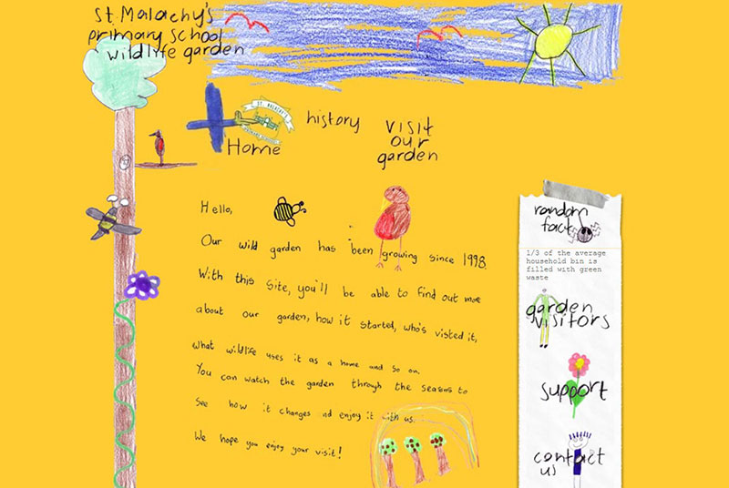
Yellow is known for being a color that is especially loved by children, who seem to be the inspiration behind this website.
No wonder, though. Bright colors attract children, and you can’t go brighter than yellow.
Pittori di Cinema
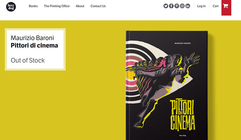
Who said minimalism could not use strong colors as well?
The yellow color palette on this website looks great and blends in perfectly with the design part.
Brio
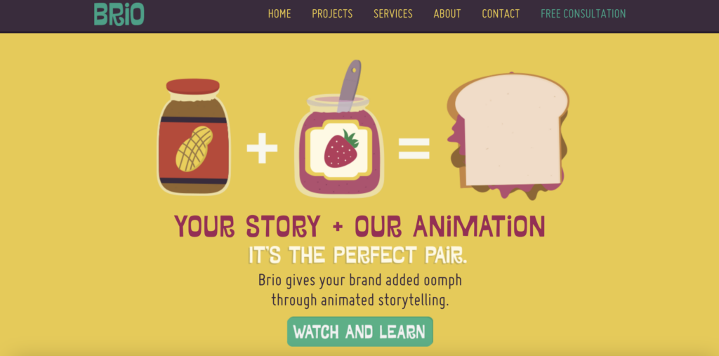
Brio is a great example of a website that managed to tell a brand story by using just design.
This yellow background website uses colors, images, and associations to paint a picture. And what a joyful picture that is!
Mooze Design
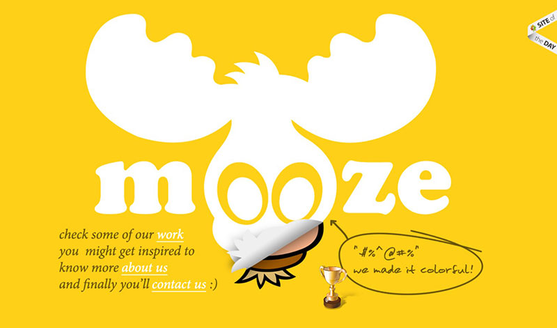
This site is very bright and utilizes both a golden tone and a grey one. It manages to create a nice contrast that visitors can really appreciate.
Unusual
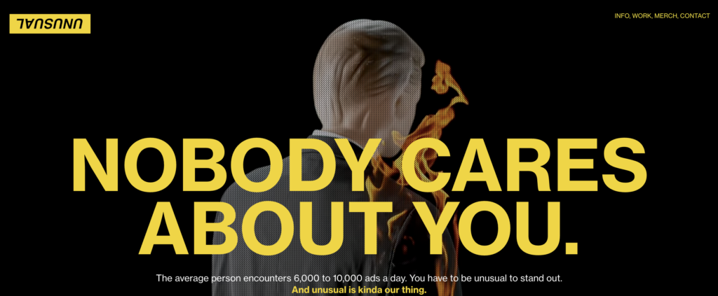
Unusual brand agency truly has an unusual website. Stark contrasts on a black background. Bright yellow, coupled with certain shades of orange and intensified with fiery yellow.
There’s no doubt here – this website definitely stands out.
SocialBee

The chromatic of the SocialBee website brings a whole new sense of joy to the viewer and reflects the unicity of their business by bringing bees into the discussion.
The combination of black and yellow goes hand in hand with beehive-like insertions, which make the website stand out even more. SocialBee took the yellow shades to a whole new level.
Impero
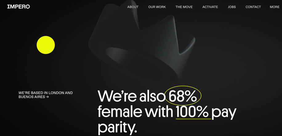
This website uses a yellow color palette on a black background to achieve a bold and attractive design. Yellow details and illustrations only accentuate the brand’s message.
The Robin Collective
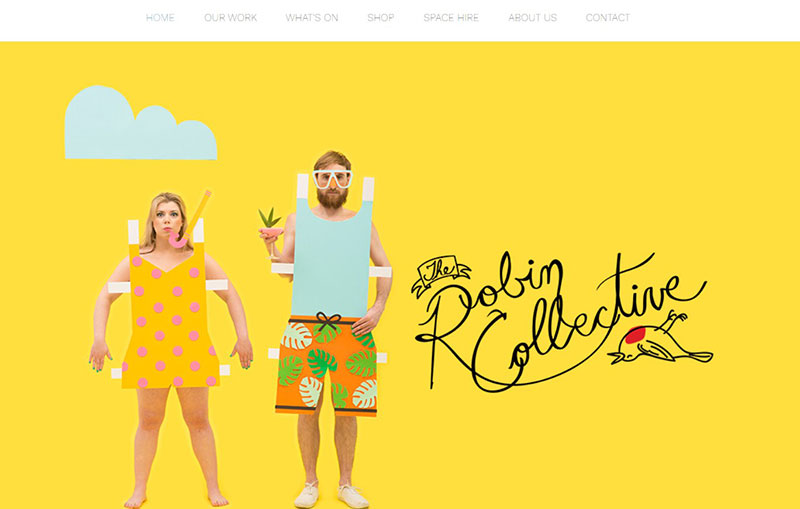
This creative mix gives a magical view of color when entering the website. The yellow palette brings positivity and sunshine to the viewers. The additional shades of blue and orange go hand in hand with the rest of the elements.
A good web designer, when dealing with highly saturated colors such as yellow, knows to add some neutral tones that balance the entire effect.
Yellow Pony
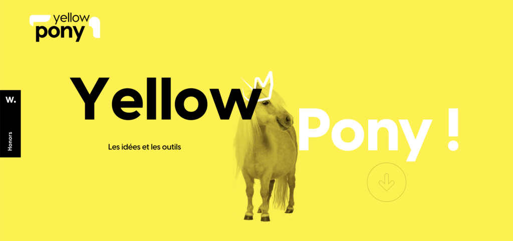
What is your first thought when you see Yellow Pony’s homepage? It’s brimming with energy, warmth, and playfulness.
And that’s the impression that the best yellow color for a website should leave on a visitor.
Sennep
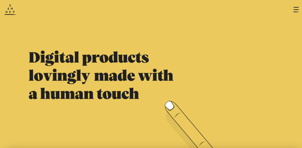
As opposed to the previous yellow color palette website, Sennep uses a different shade of yellow to tell a story. This yellow is more mellow, evoking the feeling of coziness, joy, and positivity.
Excellent use of color to build the brand’s touch and feel.
Hlvticons
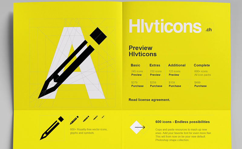
This color palette from Hlvticons has a combination of three colors – yellow, white, and black. Not only do they look stunning, but they are also great for inspiration purposes.
Sonder & Tell
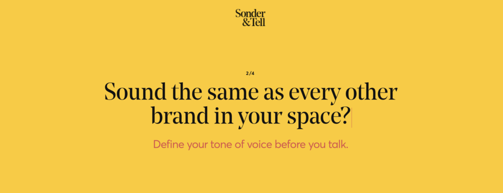
Another website that makes good use of the yellow color palette is Sonder & Tell. This marketing agency uses warm yellow to emphasize a friendly and trustworthy brand identity. Combined with details in both pastel and birth colors, this web design creates an engaging and joyful atmosphere.
Almanac
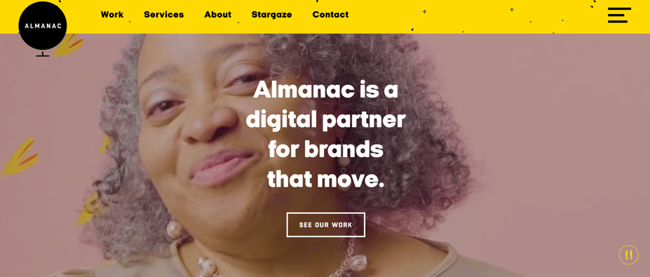
The first glance at Almanac does not reveal your typical yellow website. But once you take a closer look you’ll notice how it uses yellow to create accents. And it does that wonderfully.
Siteleaf

The eye-catching, yellow color palette dominates the Siteleaf website. Combining a natural, white background and dynamic, dominant color is a great choice if you are aiming for a subtle contrast.
It looks great, and the different grades of color result in a pleasant design.
Rohundblutig

The design uses the black and yellow website color scheme to captivate visitors and entice them to explore the website further. And the web designer behind it did a pretty good job. What a smart way to showcase your skillset right from the start.
Assiko
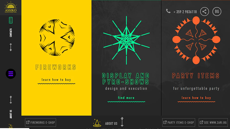
This is a simple combination of a yellow color palette mixed with orange and dark gray.
This particular palette does a great job of grabbing your attention, and it shows that smart color combinations can make your brand stand out. It’s a good example of how colors that go well with yellow can do a great job of featuring a brand online.
MA True Cannabis
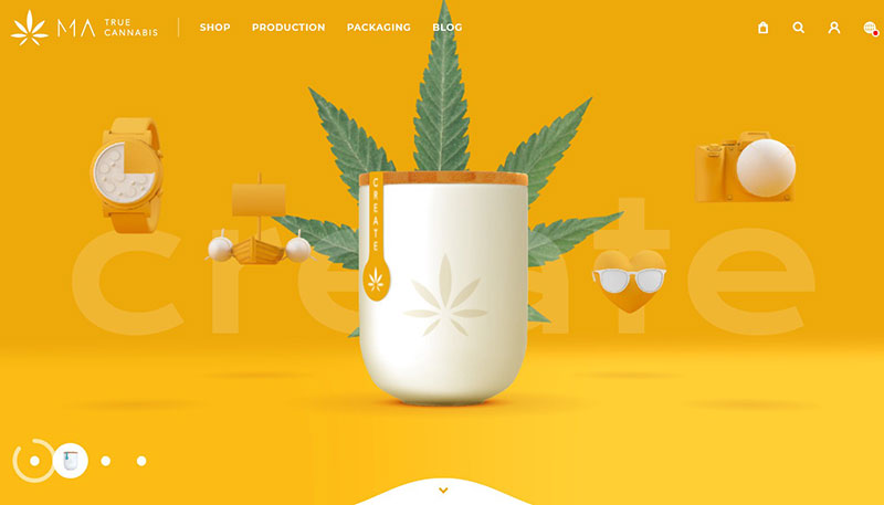
This website has a vibrant color palette that creates a powerful combination.
Together with its design elements, the website brings a nice, long-lasting impression and evokes a feeling of warmth that only a sunny Sunday afternoon can get.
Up 4 Change
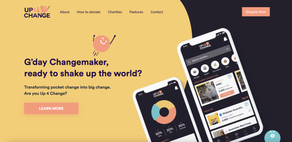
This colorful website definitely uses more than one color to present the brand. However, the most dominant one is yellow. Such a color combination featuring yellow makes the website fun, engaging, friendly, and cheerful.
This is an excellent example for those looking to use a yellow-based palette to create a positive atmosphere.
Adam Hartwig

Another website that takes advantage of the yellow color palette is this online portfolio. It belongs to a designer and developer that lives in the UK and specializes in interactive experiences for tablets, desktops, and mobile devices. Created by Adam Hartwig, this website showcases his creativity and illustrates all the amazing things he can do.
The website starts with a simple slideshow of unique hand-drawn elements that displays information about Adam. We can see that more than one color is being used, but the main one remains yellow. Also, yellow is the first color you see when you enter the website.
Snipcart

This website uses yellow accents that contrast the black background color. The result? It immediately grabs your attention and sparks curiosity.
Moreover, such web design and the intricate use of the yellow color scheme encourage the user to explore the website further. A great way of using colors to make users check out what your website has to offer.
Malu
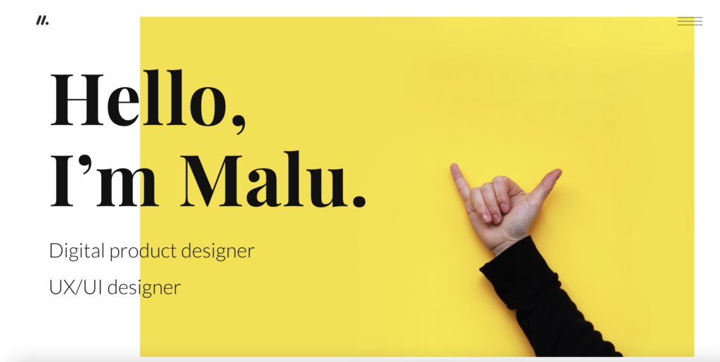
This digital designer chose the yellow color palette as an attention grabber. Everyone who lands on the website’s homepage will be greeted with a sunny, energizing yellow box featuring a friendly gesture. The result? You’ll want to scroll down and see what’s next.
12 Dishes
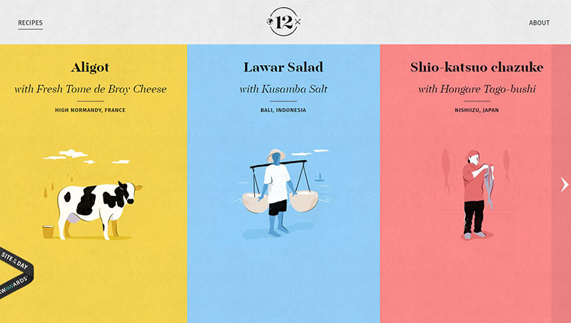
The simple color combinations on this site make it look elegant and engaging at the same time. Take a look at how the yellow color palette has been intricately woven into the website.
Loic Sciampagna Portfolio

The combination of blue, black, and yellow looks interesting on this site. The contrasting hues are simple, elegant, and eye-catching. By using this yellow pattern, the web designer managed to give the website an interesting vibe.
Pennzoil

The last on our list is Pennzoil. A black background that uses the yellow color palette to accentuate the most important information on the page.
See what they did here and how the elements balance each other? It only goes to show that bright colors go perfectly with dark ones.
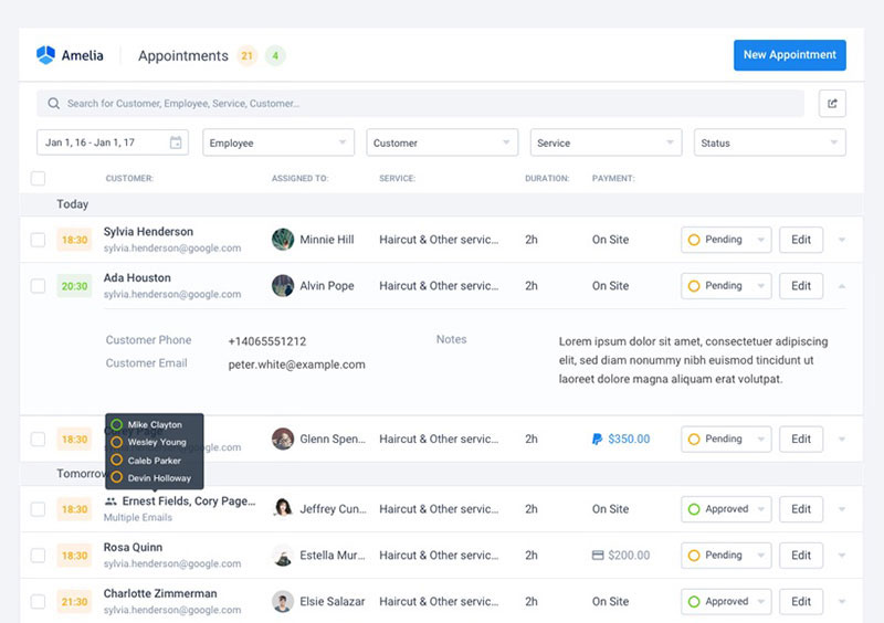
Looking to Add a Booking Plugin to Your Stunning Website?
Look no more – Amelia is here. Amelia is a WordPress booking plugin designed with the end user in mind. Easy to set up, configure, and run, this plugin works seamlessly with every WordPress-based website.
Amelia is an intuitive, hassle-free, and feature-packed booking solution that streamlines your scheduling processes.
Wish to automate your appointment or event bookings? Looking for a simple, easy-to-track calendar to make your operations more efficient? Need help to manage your staff and their schedules? Want to offer an impeccable, round-the-clock booking experience to your customers?
With Amelia, you get all of this and more!
- Send automated notifications and reminders and say goodbye to no-shows;
- Enable customers to schedule recurring appointments with ease and increase your profits;
- Configure and sync individual employee calendars;
- Manage multiple locations;
- Allow group bookings;
- Organize virtual events;
- Handle payments;
- Connect Amelia with other business tools you use every day.
And you get all this with just one license – no additional expenses.
Impressed?
Give Amelia a try and join more than 50.0000 users worldwide.
FAQs about websites with yellow color palettes
1. Why do websites with yellow color palettes seem more playful or upbeat than other colors?
Yellow is a happy, upbeat hue that frequently inspires feelings of joy and optimism. Yellow color schemes for websites can evoke a sense of playfulness and optimism, which can contribute to a warm and engaging user experience.
2. What types of businesses or industries typically use yellow in their website design?
Websites for businesses like fashion, cuisine, and entertainment frequently employ the color yellow. Also, it is frequently employed on websites that sell children’s products and those that want to foster a cheerful, enjoyable environment.
3. How can a website designer effectively use shades of yellow without making the site too overwhelming or hard to read?
To produce a balanced and pleasing color scheme, use hues of yellow that are easy on the eyes, such as pastel yellows or muted golds. In order to make the material easier to read, designers need also to make sure that there is adequate contrast between the yellow elements and other colors, such as black or white.
Additionally, implementing responsive web design ensures that the use of yellow adapts well across various devices and screen sizes, maintaining readability and aesthetic appeal.
4. Are there any cultural or psychological associations with the color yellow that should be considered when designing a website?
In various cultures, the color yellow is frequently linked to coziness, happiness, and sunshine. In other instances, nevertheless, it can also imply caution or a warning. To properly portray the website’s intended message, designers should take into account the psychological and cultural connotations of the color yellow.
5. How can the use of yellow in a website design influence a user’s emotional response or engagement with the site?
Positive feelings like joy, pleasure, and enthusiasm can be evoked by the color yellow, which can contribute to a satisfying user experience. Yet, if the color yellow is utilized excessively or conspicuously, certain individuals may experience anxiety or overload as a result.
6. What are some complementary colors that can be used with yellow to create an effective color scheme for a website?
Yellow pairs effectively with the complementary hues of blue, purple, and green. These hues can work together to produce a pleasing color scheme and counteract the brightness of the yellow.
7. How does the choice of font and typography affect the overall aesthetic of a yellow-themed website?
The choice of font and typography can significantly influence a website’s overall look and can either support or contradict the yellow color scheme. While more ornate serif fonts can lend a sense of elegance and class, sans-serif fonts with clear lines and straightforward designs can help to create a modern and minimalist style.
8. Are there any common mistakes to avoid when using yellow in website design, such as using too many shades or not enough contrast?
Using too many different shades of yellow can result in a disorienting and overwhelming color scheme, which is a common error to avoid when using yellow in website design. Also, the material may be challenging to read if there is not enough contrast between the yellow elements and other colors on the website.
9. What are some examples of well-designed websites that use yellow in their color palettes?
Dropbox, Snapchat, and IKEA are a few examples of well-designed websites that employ yellow as one of their primary color schemes. These websites successfully employ yellow to foster a friendly and enjoyable user experience while retaining a polished and aesthetically pleasing layout.
10. How can the use of yellow in a website design be adapted for mobile devices or other screen sizes?
When creating a website with a yellow theme for mobile devices, designers should take into account the smaller screen size and make sure the color scheme is still aesthetically pleasing and simple to use. On smaller displays, the material may be easier to read if there is a strong contrast between the yellow parts and other colors. Yellow might seem different in different lighting circumstances, thus designers should also take that into account when designing websites.
If you enjoyed reading this article on websites with a yellow color palette, you might enjoy reading about:

Explore topics
Google Calendar Vs Apple Calendar: Which One to Use
Acuity Scheduling vs Square Appointments: The Best of the Two
Introducing Amelia and IvyForms: A New Way to Collect Details Before Booking
Calendly vs. Doodle: Why One Is Better Than the Other
Per-Person Pricing vs Flat Rate Pricing: Which One Fits Your Service?

Read Inspiring Customer Stories
Check out how our user set Amelia for his business