Single page website ideas are becoming more and more commonplace because of their simplicity and conciseness. Structuring a website to make sure content and navigation are on the same page can be challenging, but done right, it will look great, and website users are going to experience a flawless and efficient user experience.
Website and app designers know very well what difficulties can be found in single-page website projects. However, they need to be done correctly in order to ensure that you get the attention of customers quickly.
This is probably one of the biggest reasons why single page websites are starting to appear more commonly throughout the internet. Single page websites are easy to use, and all the information can be seen quickly. This means that users that discover the information will be more encouraged to perform an action depending on the goal of the site.
In this article created by our team at Amelia (the best WordPress booking calendar plugin), lists single-page website options that can be used as an inspiration source.
Single Page Website, Definition
Before checking the websites mentioned above, we will first explain a bit more what a single-page website is and how it can help with the projects you are working on.
Simply put, a single-page website is a website that uses only one HTML page to show all information. This helps users find the information they need by using simple actions such as scrolls and clicks.
The content on a single page website is already loaded on the initial page. This makes the experience quick and fluid for the user. When navigating to different destinations of the site, any user can click navigation links that allow them to jump to specific parts on the page. Another thing they can do is to scroll down and go to the sections they want to go to.
Many creatives started to use the one-page website recently. We can also see page designs similar to this being adopted by larger companies. This is proof that single page website designs are becoming popular indeed.
When should we use a single-page website?
A lot of websites have a lot of information that needs to be displayed. Even simple businesses can have a site with different pages showcasing their contact information, services, and more. Indeed, the multi-page design is also useful and fits certain cases. However, often enough, there are projects where the single-page website is going to work better.
Single-page websites can be the entire website, and for a user, this makes a lot of sense. There is no need to have several pages when the whole content can fit so easily into one.
The challenge here is to know when to use each design. For example, this kind of site works great for portfolios but is not that good for online stores. So, understanding where it makes sense to use a single-page website is going to save time and help you create better websites.
One of the advantages of using a single-page website is that it brings focus on one thing. This helps the visitor to make a quick decision and prevents them from being sent to bloated websites with an overwhelming amount of options and information. They are also used many times to represent a landing page. The goal here is to make the user act downloading, joining a newsletter, or more. These actions are known as Conversions.
Other details regarding the single page website and their characteristics are the following:
- Sections are clear and defined
- Header elements are big
- Custom scrolling effects
- Actionable Goals
- Strong CTA
- Easy navigation buttons
Great single page website designs
Have a look at this single page website ideas that can inspire you. There are many website types shown from restaurants, online portfolios, apps, and more. Investigating further into them is going to show the modern trends and what should be considered for the projects that you might do. Here they are:
Superlative

The typography of Superlative, together with their new product, makes this new website look sharp and attractive.
Playground Digital Agency
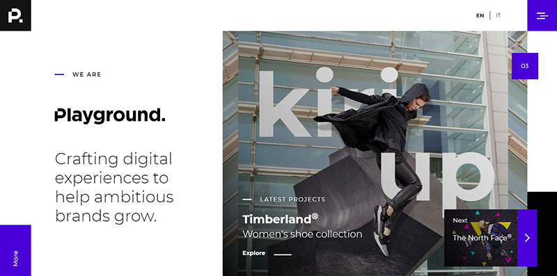
This excellent, single-page website shows how to bring a portfolio on a single page. We love the transitions; they look great and make the site feel like an online comic.
With this single page website, we can find more about the services that the agency is offering, who are the team members, what clients they had before together with contact information. The site also has a simple, fun chatbot that you can use to get in touch when you do not want to send an email. This is a great addon, as it makes the single page design more interactive.
Balsoy
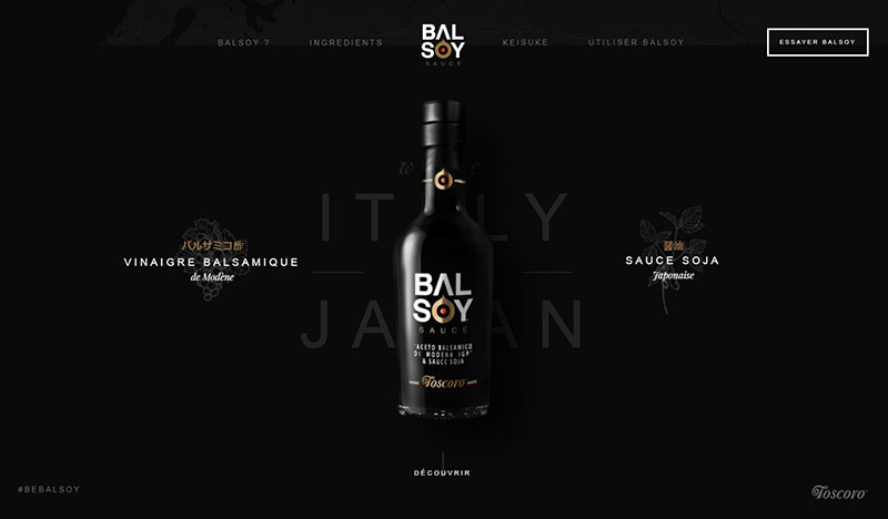
On Balsoy’s website, we see a quick menu at the top that helps users navigate more accessible through the single-page layout. When users scroll down, they will see different sections that give information about the product. Each chapter is marked with an animation transition that brings a fun vibe. This is one of those product pages that does its job well.
A Digital Volcano
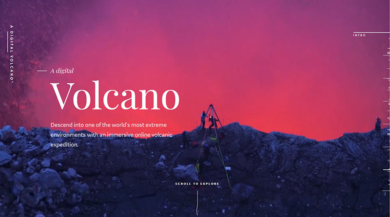
This digital platform was done by a collaboration between Gin Lane and General Electric, together with Qwake Technologies. This single-page website aims to tell the story of GE’s effort to research our planet, starting with the active volcano in Masaya called Nicaragua.
Jon Phillips

This website is a good definition of primary, and what you see here is the whole of it. Even though there can be more info showing work samples or social media profiles, it is still an excellent example of how a cool single page website should look. This is a great example that shows how you can get up quickly and work on something more robust.
Ackee

Check this simple landing page design that features a dark color scheme together with some great analytics tools. Very simple and professional.
Cisco DNA Mobility Graphic
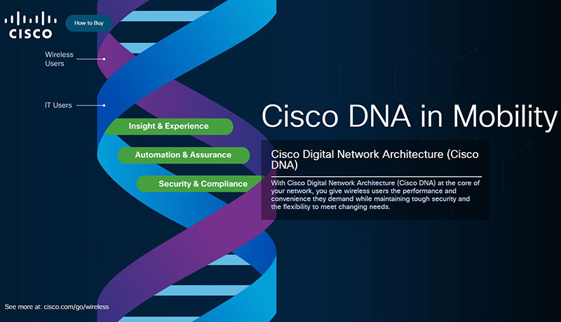
As single page websites have limited space to show any products or services, they are most often designed using a precise navigation bar or system that improves the UX. In this web page example, we see an excellent design concept together with an active menu that attracts users.
Flying Piñata
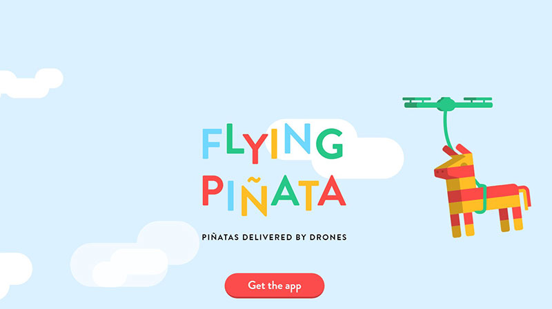
Who does not love pinatas? Now you can get this item delivered at your home brought by drones. It is a great idea when you want to spice up a birthday party. This is the aim of the single-page website featured here. It is a great way of showcasing a product and what it is meant for.
Le Moulin de Ponceau
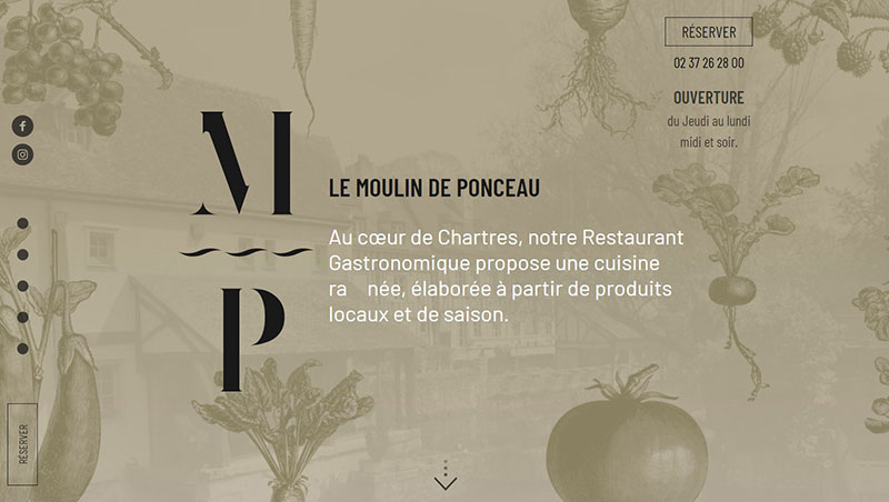
Even food-related businesses can take advantage of single-page websites. A parallax scrolling effect does wonders for the Moulin de Ponceau restaurant. Illustrations that feature food together with a beautiful slider make the content flow naturally.
Ubiq 34
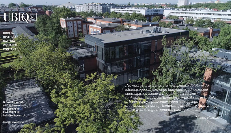
This simple, clean website was done for UBIQ 34 Business Complex. It shows available offices for rent in the space.
Dance Tonite

Simple single page website that features a cool VR project. It is done using user-generated VR recordings that show what you should expect.
Fishing the Feed
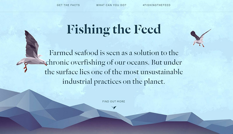
The aim of this website is quite noble. The story shown makes people aware of the crisis and puts pressure on the industry that can bring positive changes.
Sonikpass
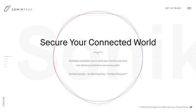
This two-factor authentication device looks futuristic, and the website gives the same impression. We can consider it a landing page that was made to promote the product. The goal of it is to explain how the device works while users scroll down.
We can see a simple design used for this single-page website. However, Sonikpass also has some beautiful animations to bring some diversity. We consider it an excellent example of how to tell a story using a single page.
Make Your Money Matter
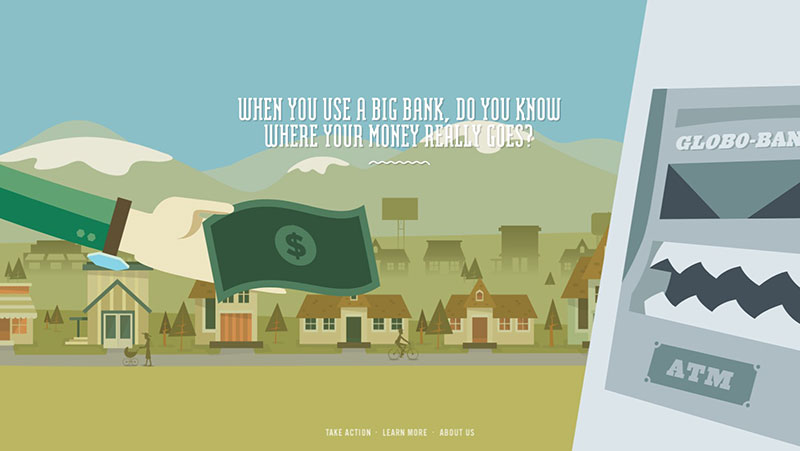
Have a look at how to make your money matter used colorful illustrations on their single-page website. They did to so make it more engaging and adequately exposed what happens to the money when they go in banks. It is a beautiful and informative site that has a great visual design.
Epic
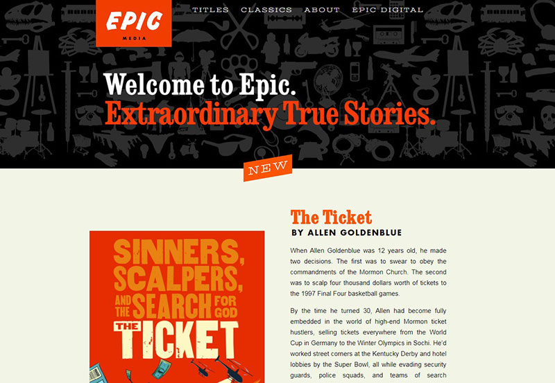
Epic is another example of how a story can be told better when using a single-page website. Anchor links have been added at the top of the page so users can find exactly what they need when they click individual buttons or scroll down.
Each section contains a vivid graphic concept and a short explainer. The layout, therefore, is simple and allows the user to be able to scroll through and have their pick of stories like a digital library.
Built Things
This is a beautiful single-page website that we thought to add on our list. The storyline is done nicely, and it can make sense for all people. It is a great way to find out more details about the company.
RealView
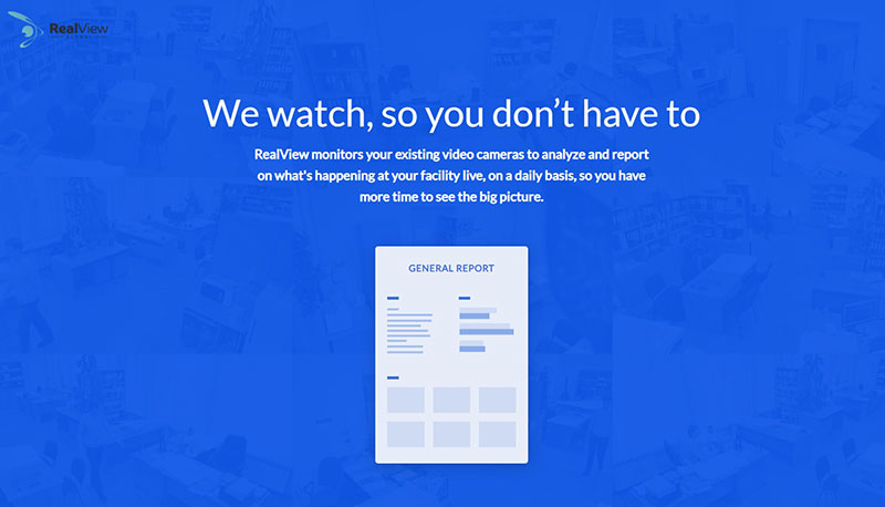
If you check this single-page website, you will understand how a presentation should be done. It offers insights on a relevant topic regarding effective and ineffective employees. But the more significant thing is that the site is itself an excellent example of how to show specific details.
Hyperfocus

Hyperfocus brings a minimal style to the center of attention. It looks beautiful, and the designer behind it did an excellent job.
Live to Change
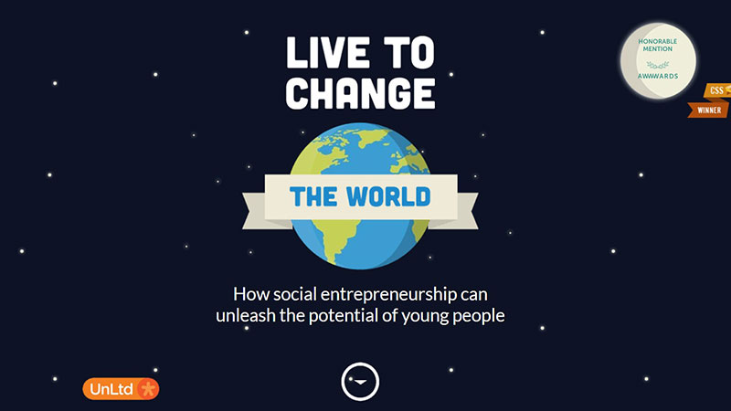
This is a perfect example of single-page website ideas that show how to structure a large quantity of information. It talks about social entrepreneurship and its impact in the last years.
Wind And Words

If you like Game of Thrones, then you are going to love the layout of this single-page website. It collected data from subtitles this site shows different character interactions that you may not have thought of.
iFly KLM Selections – Responsive HTML5 SinglePage Website Template
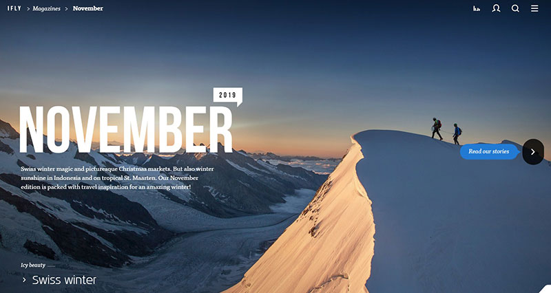
A large part of websites is done vertically. This travel one is an exception and uses a horizontal scroll to show its content. It has exciting background videos that go very well with the entire effects added to it.
Pratham Books Annual Report 2019

This is an excellent example of how single page websites can change the tone of a brand. It showcases the celebration of 15 years at Pratham Books, and they did a great job using colorful illustrations and pure design elements.
Mutant Labs
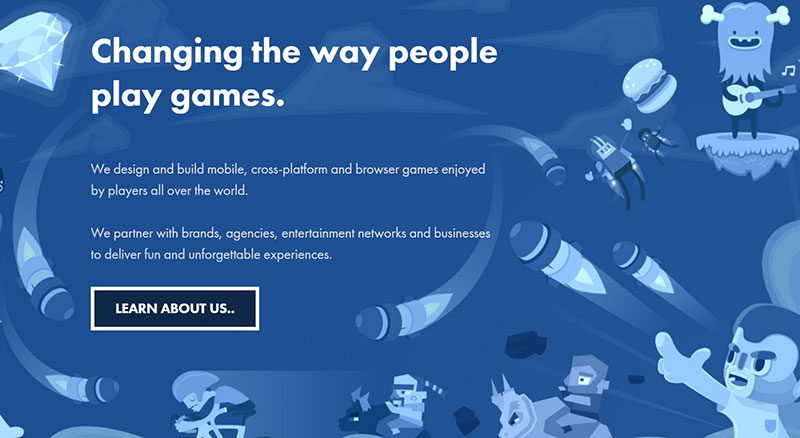
Take a look at how Mutant Labs uses trust elements to underline their trustworthiness. They added logos of all of their clients to bring confidence towards users that are checking them.
Cycle
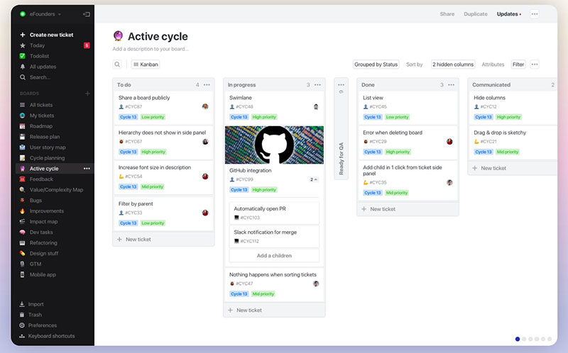
Single page website concepts can also be used for different tools. Cycle is a powerful tool developed for product-centric teams.
Scissors & Clippers – Fullscreen CSS3 Single Page Website Template
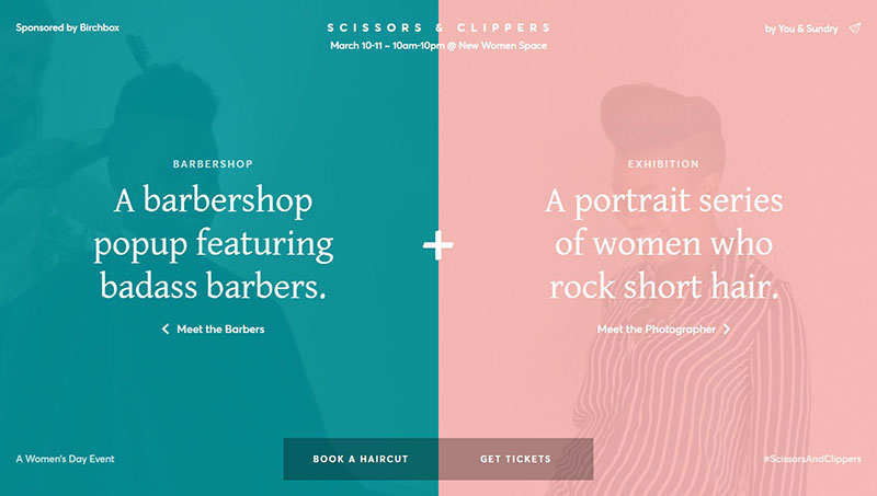
Using different colors for different functioning areas is a great way of helping users interact easily with a website. The Scissors & Clippers website page that uses this strategy. It has two color blocks that divide the page into two distinct, functional areas.
This helps make it quick and simple for users to discover the content that they need.
Balance
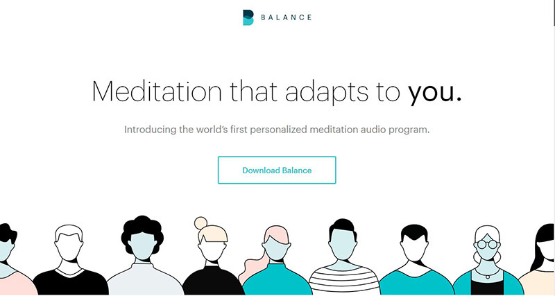
Consider Balance as the first world’s meditation program. The idea behind it is that you develop a habit through which you track your meditation experience. It has many audio files that can be listened to at any time. The more we explored it, the more we liked it and decided to add it to our single-page website list.
Every Last Drop
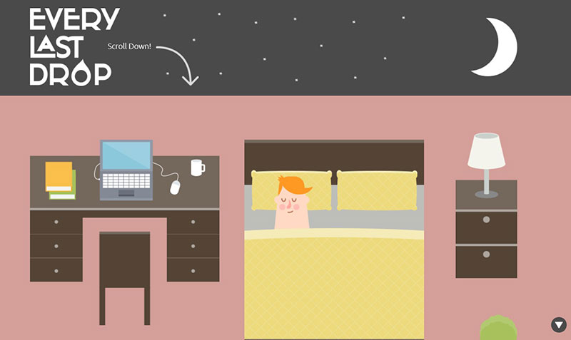
Every Last Drop is a single page website created by folks at Waterwise. This is a UK-based nonprofit that educates people about water consumption and why it is essential to reduce it. It is an excellent example of how information can be structured easily and creatively using a single-page website.
100 Years of National Parks Service
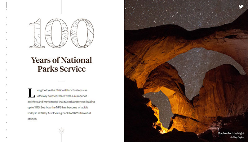
Looking at the technical aspect of this example, we can see it is straightforward. The site stands out due to its beautiful photography and simple layout.
When you scroll down, you see an icon following your progress, similar to a bookmark. Jumping from one section to another is simple and can be done using the corresponding images.
It has a simple effect and it makes navigation feel enjoyable. When you get to the end of the page, you will know everything about the National Parks Service.
Overlay
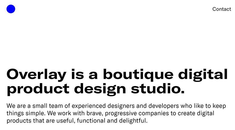
This simple website showcases a product design studio. It shows what they are doing and how the startup wants to bring value to its clients.
Oyster
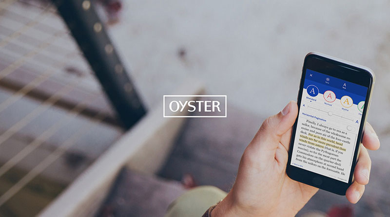
This is a new, single-page website that showcases its product in a professional, straightforward manner.
Glyphy
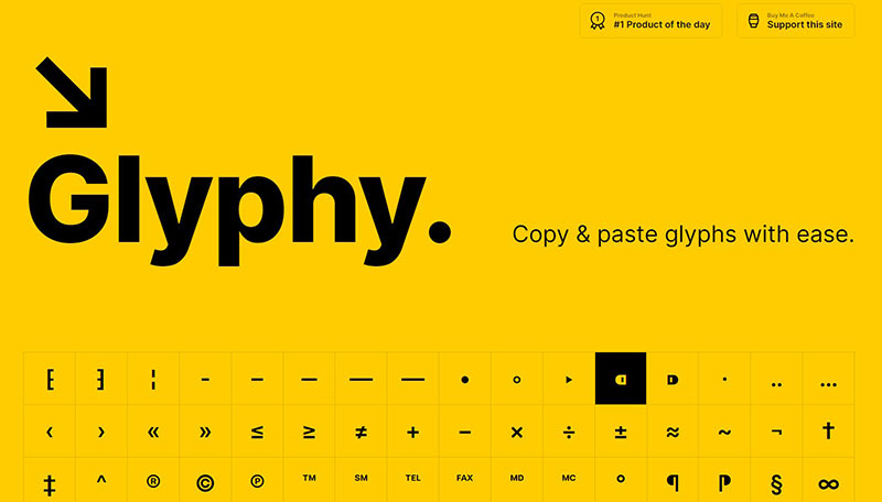
Useful and straightforward, Glyphy offers a single-page website where you can easily copy special characters and symbols to your device without wasting time.
Minimal Wim
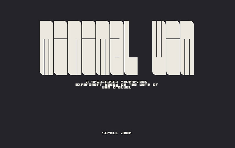
If you are a graphic designer, you are going to love Minimal Wim’s website. It explores the process of creating an entire alphabet.
Ian Enders

This is a tremendous single page website that was created by Ian Enders as an online resume. It is a simple ad creative.
MIND | SETS
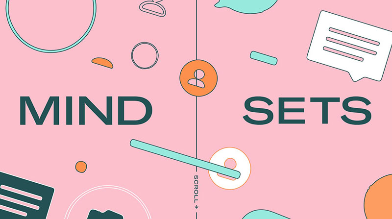
We liked how the content sections of this single page website were created and decided it had to be included here.
Angry Bear
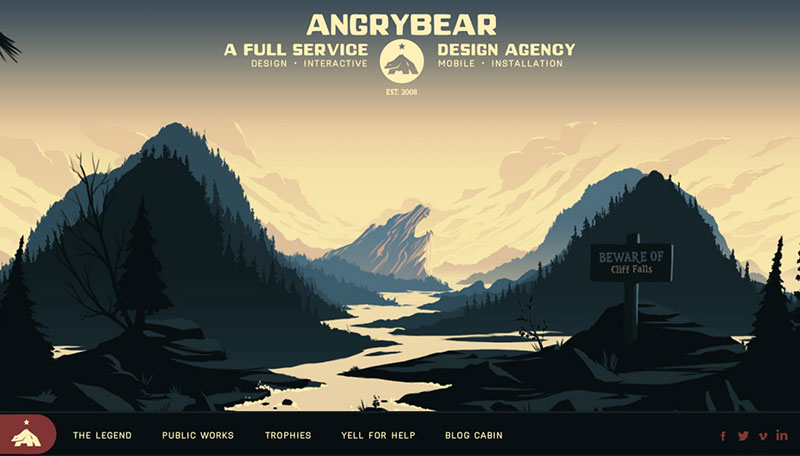
This is the website of a design agency, who used their expertise to put out a great display. It has easy navigation and can be used as a source of inspiration.
Shamim Shafiee UI/UX Designer

This website was created with a minimal aspect in mind. It promotes the traditional Malaysian style and did a great job with it.
If you enjoyed reading this article on single-page website design, you should check out this one about awesome meet the team pages.
We also wrote about a few related subjects like corporate website design, coaching websites, digital agencies, web development companies, creative websites, artists’ websites, black websites, website backgrounds, dental websites, and portfolio websites.
