 Spring Deals Are in Full Bloom
 Web Developers and Agencies
  Beauty and Spa Salons, Barbershops
  Yoga Instructors and Studios
  Doctors and Healthcare
  Event agencies, hosts and organizers
  Gyms and Personal Trainers
  Automotive and Car Repairs
  Photographers and Studios
  Coaching and Consulting
  Event Agencies and Hosts
  Appointment Booking
  Scheduling for Your Business
  Booking for WooCommerce Stores
  See How Others Use Amelia

Explore topics

Read Inspiring Customer Stories
Check out how our user set Amelia for his business
Read the full story
Ever noticed how time feels slower when staring at a loading bar? That’s exactly why loading bar design matters. These visual progress trackers have evolved from simple linear loaders to sophisticated interface loading elements that shape the entire waiting experience.
Progress indicators do more than just fill time. They’re critical microinteractions that maintain user attention and set expectations during wait states. A well-designed loading animation can transform perceived performance, even when actual loading time remains unchanged.
This guide explores:
- Essential principles of visual progress tracking
- Different styles from skeleton screens to circular progress indicators
- Implementation techniques using CSS animation, SVG, and JavaScript libraries
- Best practices for mobile loading elements and responsive loading design
Whether you’re creating a website preloader or task completion indicator, understanding effective loading bar design will help you keep users engaged while your content loads, ultimately improving interface responsiveness and overall UX.
What Should You Know About A Progress Indicator?
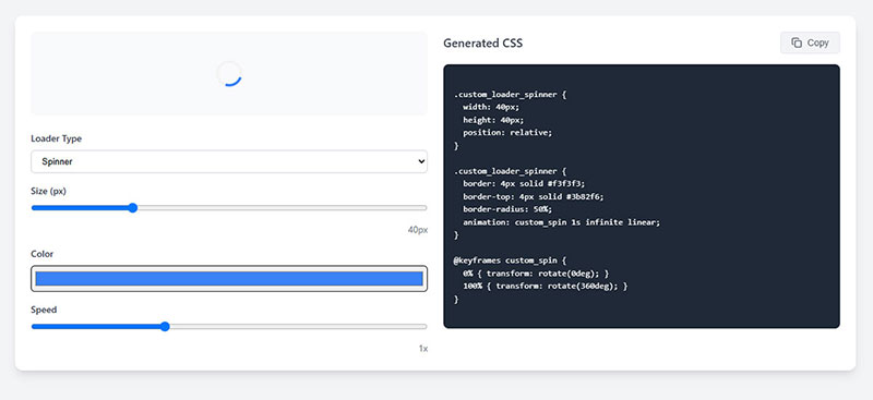
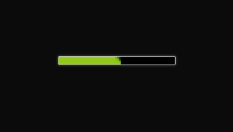
A screenshot from WPDean’s CSS loader generator
A loading bar is highly effective in keeping users patient while data is fetched. Because all users have high expectations when it comes to how fast an interface is, given today’s trends, you will need to meet those expectations by leaving a good impression.
Since you can’t actively communicate with the users while they are waiting, you must use a loading bar as a virtual way to communicate with them and let them know for how long they have to wait. This is a great way to be transparent and the only thing worse than an ugly progress bar is having no progress bar at all.
A good loading bar should make the user feel like something is being accomplished, and how long it will take to finish. To achieve this result, your loading bar should answer the following questions:
- How much time will be required to complete the activity?
- What is the current status at the moment?
More generally, progress bars can also be used to keep track of a user’s activity in an app or on a website. The progress bar will fill as the user engages and finishes certain activities on the interface. Such indicators require immediate feedback to notify users about their status.
Loading bars have the following benefits:
- They reduce the level of uncertainty that users face when using an interface, meaning that the progress bar keeps the user assured that the interface is doing something.
- They offer a purpose for waiting, thus making users more patient. A good loading bar will catch the attention of the user and alter their perception of time in a positive manner, making waiting more bearable.
Types of Loading Bars
Looped

Looped animation loading bars are graphic elements that repeat themselves over and over. They are meant to let the user know that the system is working, but they don’t let the user know how much time is required until the interface is ready to use.
This type of loading bar is recommended for loading screens that don’t last more than 10 seconds, as they are aesthetically pleasing but not appropriate for long loading times because they can induce the feeling of uncertainty, which is exactly what we want to avoid by using progress bars.
Linear
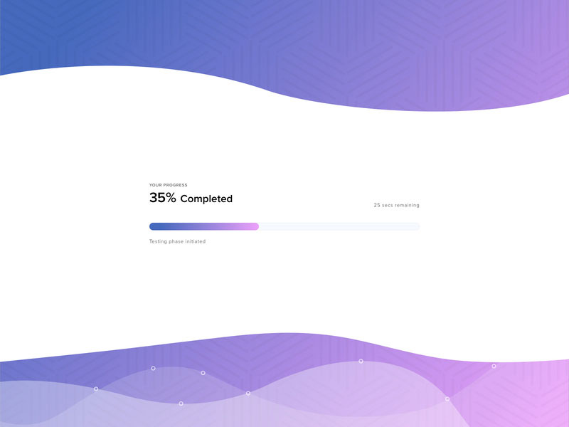
Loading bars with linear animation are much friendlier for interfaces that require showing actual progress. They go from 0 to 100 and they can’t decrease in value, which is why they are called linear bars.
These are probably the most popular type of progress bars which are seen on most platforms, regardless of their type. They can also be used for multi-operation processes by adding markers along the way to notify the user that one process is done and the other is beginning.
Skeleton
Finally, skeleton screens are used for longer waiting times because they include temporary information. Skeleton screens are meant to distract users from the actual waiting process and offer them valuable bits of information to digest while the interface is loading.
These are often seen in OS update loading screens or games. Using a skeleton screen is a great way to shift the attention of the user towards the information rather than how long the waiting time is, as in the case of linear loading bars.
What to Do When Designing A Loading Bar?
Everyone has stumbled up on a progress bar at least once in a lifetime because, as mentioned, they are largely unavoidable in all areas of computing, online or otherwise.
Designers always try to innovate how a loading bar looks to keep the users happy while they wait. It’s a good idea to get creative with progress bars, and hereare some tips on how to do it:
- Let people know what they are waiting for. Informing users about the purpose of the waiting process is mandatory. You can’t simply throw an empty loading bar at them and have them wait minutes and minutes. Fill the space with valuable information such as how much time is left.
- Make the loading bar fit the rest of your design scheme. Don’t create a progress bar that has nothing to do with how your interface works. Use a similar color scheme and the same style used for your branding. You can add your logo or mascot next to the bar as well.
- Always include a true timeframe. For instance, if the loading process usually takes around 1 minute, mention that below the progress bar. Don’t try to lie by saying that it will take one minute, when in fact it takes 5. Be as close to the truth as possible.
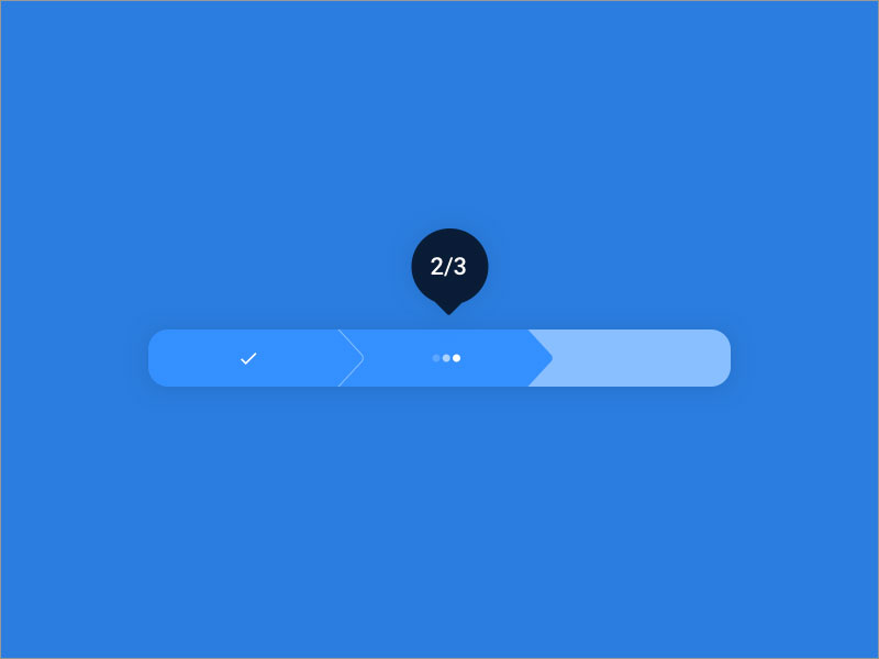
- Instead of showing a percentage between 0 and 100, you should try to use steps. For instance, if the loading process has 3 steps, make the loading bar 1/3, 2/3 and 3/3. It would be easier to wait for it to load this way.
- Use animations to make it dynamic. As mentioned before, you need to distract the user from the fact that they are waiting. Use all sorts of animations to direct the attention of the users towards something else. You can also make the loading bar interactive.
- Users should be able to pause or cancel the loading process. This doesn’t apply for all situations, but if you are designing a progress bar for an update, you should consider these options.
- Make the last part of the loading process the fastest. A progress bar that loads fast near the end of the process gives the effect of a shorter loading time than in the opposite case. It is easier to tolerate, and people enjoy these more.
What Not to Do When Designing A Loading Bar?
Even though you may have plenty of freedom when it comes to designing a loading bar, you need to stay away from this list of common mistakes:
- Don’t use static loading bars. These are indicators that do not move and only let the user know that they should wait. You might have seen the message “Please wait” while using a platform. That is an example of a static loading bar. They don’t offer enough information, they are not engaging, they don’t distract the user, and they are not aesthetic either.
- Don’t give the wrong information. As mentioned before, you need to stay true to your users. Don’t create a progress bar that fills to 90% in a few seconds and takes minutes for the last 10% to load. Make it even and specify the correct time remaining.
- Make sure that the progress bar is constantly moving. A loading bar that stagnates for a long time will give the impression that the platform crashed. This behavior frustrates users, so you might want to give this aspect more attention.
- Avoid transitioning between different types of progress bars. Don’t use a spinner and then move to a linear loading bar. It’s best to maintain the style throughout the whole platform.
FAQ on Loading Bar Design
What makes a good loading bar design?
A good loading bar provides clear visual feedback on process completion. It should be visually consistent with your interface, indicate progress accurately, and maintain user attention through microinteractions. Effective designs reduce perceived wait time while fitting your overall UX strategy. Consider both deterministic (showing exact progress) and indeterministic (activity indicators) options based on your needs.
Should I use linear or circular progress indicators?
The choice depends on context. Linear loading bars work best for defined processes with clear start/end points. They’re familiar and easy to understand. Circular progress indicators save space and work well for ongoing processes or mobile interfaces. Some apps use hybrid approaches. Consider your space constraints and the type of task being tracked.
How do I make loading feel faster?
Focus on perceived performance rather than actual loading time. Use animation timing functions that accelerate toward completion. Add engaging microinteractions, skeleton screens, or progressive loading strategies. Show meaningful information early. Consider gamified loading elements for longer waits. User patience threshold is typically 3-5 seconds before frustration begins.
Are skeleton screens better than traditional loading bars?
Skeleton screens often improve waiting experience design by showing content outlines before the actual data loads. They create less cognitive load during waiting and reduce perceived load time. Traditional loading bars better communicate exact progress. Many interfaces now combine both approaches for optimal visual feedback loops.
What colors work best for loading indicators?
Brand colors typically work well for loading animation, creating design consistency. Blues and greens suggest calmness and patience. Avoid red (suggests errors). Consider color psychology in wait states and ensure sufficient contrast for accessibility. For dark mode loading indicators, adjust brightness appropriately while maintaining color meaning.
How do I implement accessible loading indicators?
Make loading state design accessible by:
- Using ARIA attributes (aria-busy, aria-live)
- Providing text alternatives
- Ensuring color isn’t the only indicator
- Maintaining sufficient contrast
- Supporting keyboard navigation
- Adding screen reader notifications
This improves interface responsiveness for all users regardless of abilities.
What’s the difference between determinate and indeterminate loaders?
Determinate loaders show specific progress percentage (file upload progress, download progress display). They work best when completion time is calculable.
Indeterminate loaders (spinners, animated elements) indicate activity without specific completion metrics. They’re useful when processing time is unknown or variable.
How do I optimize loading animations for mobile?
Mobile loading elements should be lightweight to avoid adding to performance issues. Use CSS animation techniques rather than heavy JavaScript. Consider smaller touch targets and reduced screen space. Test on various devices to verify visual load feedback works across screen sizes. Prioritize responsive loading design principles.
Which technologies are best for implementing loading bars?
Options include:
- HTML5 progress element (simple implementation)
- CSS animation techniques (lightweight, performant)
- SVG progress indicators (scalable, customizable)
- JavaScript loading libraries (React loading components, Vue progress libraries)
- WebGL or Lottie animation loaders (complex, engaging animations)
Choose based on your technical requirements and design complexity.
How do loading bars affect user experience?
Loading indicators significantly impact user patience threshold and engagement during wait periods. Well-designed load time visualization reduces abandonment rates by 10-15%. They set expectations, provide feedback, and maintain user trust. Poor implementation can increase frustration and perceived wait time, affecting overall interface responsiveness perception.
Conclusion
Thoughtful loading bar design transforms waiting from frustration to engagement. Skeleton screens, animated interface elements, and task progress visualization all serve to maintain user attention during critical wait states. Your choice of preloader interface directly impacts perceived performance metrics.
When implementing loading patterns, consider:
- Wait time estimation accuracy
- Visual processing cues that reduce cognitive load
- Cross-platform loading consistency
- Accessibility standards for all users
The difference between abandonment and engagement often comes down to these small but crucial interface states. Whether using minimalist loading design or gamified loading elements, the goal remains consistent: maintain trust while content loads.
As front-end loading patterns continue to evolve, the principles behind effective loading screens remain unchanged. Good loading UX works invisibly, guiding users through necessary pauses without breaking their flow. By understanding both the technical implementation and psychological impact of your progress notification design, you’ll create interfaces that feel responsive even when they’re asking users to wait.
We hope you enjoyed reading this article about loading bar design created by the team at Amelia (the best booking plugin for WordPress).
You should also check out this one on homepage design.
We also wrote about a few related subjects like login page, golden ratio in design, website critique and information architecture.
 Back to Previous
Read Inspiring Customer Stories
Check out how our user set Amelia for his business
Read the full story