It takes time for new consultants to establish themselves. Becoming a successful professional means investing in personal development. It also means reaching an audience of potential future clients. Consultants need to think about how to show their prospective customers why their services are so important for them.
From the standpoint of the consultant, this means the conversion of offered services into money. The most efficient way of achieving this is by setting up a coaching and consultancy website. A website is accessible to anyone and when done in the right way, it will attract many viewers.
The best consulting websites show clients they have found something that they have always been looking for. This article gives some ideas for consultant websites. It provides a list of the best tips for consultants who want to start their own website.
It also contains a list of 17 consulting website examples. The examples show that a consulting website does not have to be a company brochure, but that it can be the centerpiece of the consultant’s marketing.
How to Build an Independent Consultant Website
Below are seven of the best tips for making a consultant website that will bring in a steady flow of potential clients.
- Convey what the value of the service is. This is the first thing that a client looks at when visiting the website. They want to know how consultants present their own value.
- When designing the website, keep the user in mind. Choose a really high-quality platform. The best option is enterprise WordPress hosting. Since this is one of the key points for the result to be a user-friendly experience. Make it simple and clear, ensuring that the user can easily find what he is looking for.
- Make sure that users can find the website. There are many ways of getting the content to the attention of others. Use articles on other sites, use social media and forums. If interesting to the viewers they will look for the consulting firm’s website. But don’t forget, if you use other people’s content, such as case studies from other experts, make sure to credit them using author boxes.
- Use a call-to-action Make it easy for visitors to take the next step and make use of the services.
- Ensure that the expectations are set at the right level. While the site navigation should be simple and straightforward, make clear how the consulting services work
- Build trust and credibility. Giving a trustworthy impression is very important for a consultant. Use case studies, logos, photos, and testimonials from previous clients
- Keep the site up to date and make sure people can find it. Put new content on a regular basis. Make sure that the content is retrievable through a search engine.
- And when it comes to actually building it, you can use a website builder or just some templates.
Astra: Setting a New Standard for Consultant Websites
When it comes to building a sophisticated, high-performing website for consultants, Astra stands out as a forerunner. Here’s why:
Inspirational Design Elements
Astra’s Consultant templates come with built-in background video options that immediately engage your site visitors, setting the tone for the impactful content to follow.
Key Takeaways:
- Utilize Astra’s background video options for an immersive user experience.
- Personalize your site using Astra’s diverse design elements.
Minimalist, Yet Effective
Astra understands that sometimes, less is more. The Consultant templates showcase minimalist designs that are not just sleek but also incredibly functional. With simple navigation options like ‘About’, ‘Contact’, and ‘Services’, your site cuts straight to the chase.
Key Takeaways:
- A minimalist approach can result in an elegant and highly functional website.
- Customize your menu and content sections easily, thanks to Astra’s user-friendly interface.
Navigational Excellence
Astra Consultant templates feature intuitive navigation aids like arrows and beautifully named sections like ‘Expertise’, ‘Methodology’, and ‘Client Testimonials’, allowing visitors to easily find what they’re looking for.
Key Takeaways:
- Thoughtful navigation enhances user experience and encourages engagement.
- Customize section names to reflect your consulting firm’s core values and philosophy.
By combining top-notch design, efficient functionality, and user-friendly navigation, Astra’s Consultant website templates offer a comprehensive solution for consulting professionals who want to make an impactful online presence.
The Best Consultant Websites List
Below follows a list of small consulting firms. They are in no particular order. Yet, there are some clear evaluation criteria:
- The size of the company is no more than 50 employees.
- The website has to be professional, modern, user-friendly, and responsive.
- It must have a variety of resources and contain fresh information.
- It has to be well-written and has to focus on the client, rather than on the company.
- The objective of the website must be to attract new customers.
Find inspiration for a fresh and attractive website on the best consulting website on the internet today.
Syl
The first on the list of consultant websites is Syl. This is a great source of inspiration. The background video was carefully designed to inspire visitors. The animated sections at the bottom bring the site to life. Some of the lessons to take away from this example are:
- How to use background videos.
- Make use of design features.
- Good use of white spaces gives the site a clean look and enhances the user experience.
Millemann
A website with a minimalist design. From the first view of the site, it is clear that it was made by a meticulous mind.
The landing page shows three buttons: About, Contact, and Site Menu. The rest is images and background. These come to life when moving over them with the mouse.
At the bottom right there are two arrows that allow the visitor to navigate to different parts of the site. These sections have beautiful names, like Expertise, Quintessence, and Passion. This is a great example of a website that presents the company’s philosophy.
Ignition Consulting Group
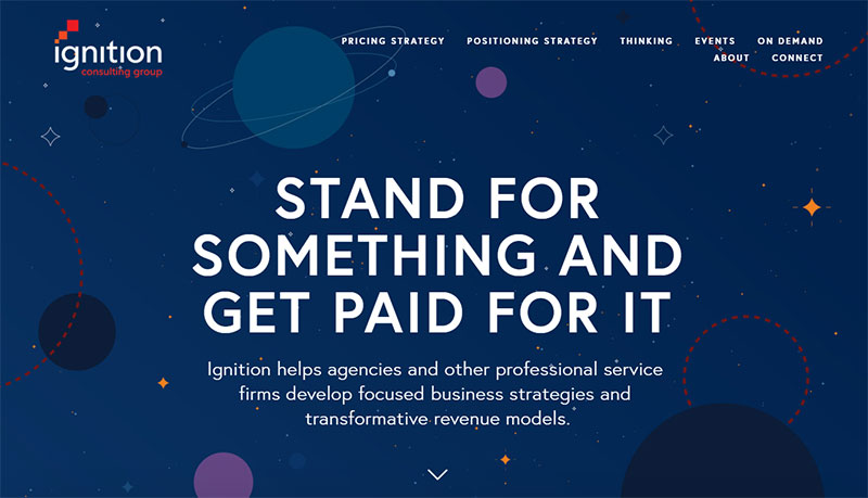
The Ignition Consulting Group provides support to various professional service firms. This is obvious from its website.
Innovation is an important source of income and should not be given away for free. Ignition helps businesses to set up a model for collecting revenues from their intellectual property.
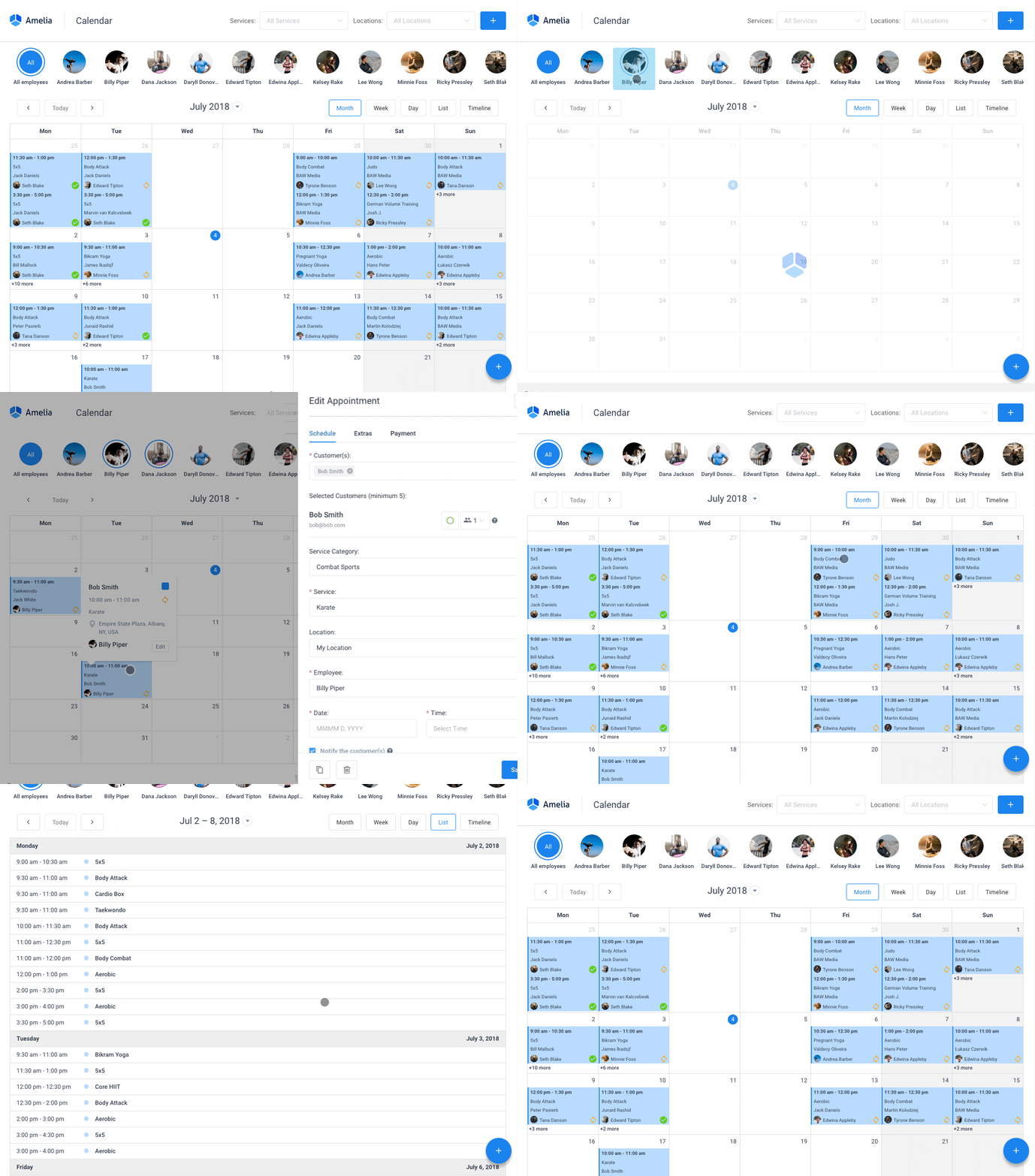
Get more appointments with the right tool for the job
Staying organized has never been easier.
You can now manage your business and grow your brand with a single, powerful WordPress booking plugin that keeps all of your appointments in line, your clients organized and your business booming.
Amelia is perfect for business owners who need to streamline their booking experience both for their staff and their clients.
Amelia handles everything for you, even sending automated email or SMS reminders to your clients. No-shows? Not anymore!
The Amelia WordPress booking plugin adapts to different industries for a blissful online booking experience and employee management.
Want to know more? Check out Amelia’s awesome features to see what you are missing.
Daniel Siegel – Strategy Consultant
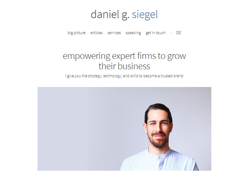
The function of a website goes beyond generating leads. In fact, it is a key in making sales and it does that 24 hours a day and seven days a week. So, even when the consulting firm is closed, it still provides information to decision-makers around the world. Sales are no longer a static thing that is only done eight or nine hours a day. A website makes it a continuous process.
Saicon Consulting
The Kansas State-based consulting company Saicon has a beautiful website, with some technical touches to it. Navigation and browsing are very easy, which helps visitors to find what they want and motivates them to come back.
It makes abundant use of colors. Colors indicate different technology websites. Besides the colors, there are plenty of pictures that grab attention. This is a great example of how to attract viewers.
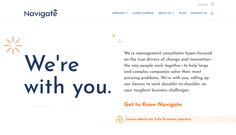
Navigate
This company is from Wayne, Pennsylvania. This consulting website is an example of a clean design. Here are some lessons from looking at this site:
- The attractive use of scrolling animations.
- Design shapes.
- The use of white spaces enhances the clean look and user experience.
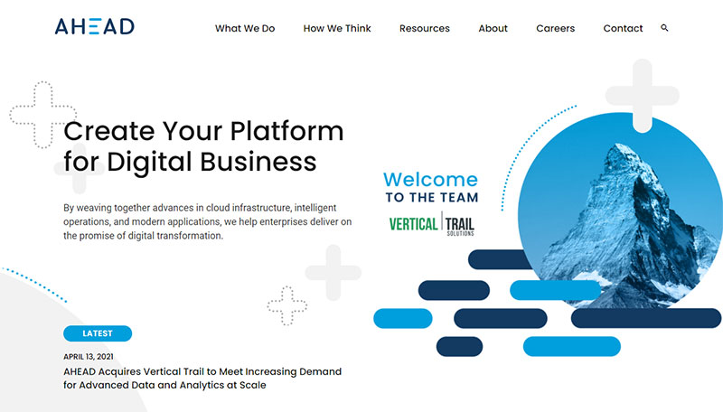
Think Ahead
The website of Think Ahead makes good use of white spaces and clear and clean typography. This company from Chicago, Illinois, promotes itself in a contemporary style. The style is minimalistic but it contains everything for a professional presentation.
Another remarkable thing about it is the content. It takes a prominent place on the website and is regularly changed for new and fresh information.
Before being able to download the whitepaper from the site, it asks visitors to fill in their contact details. This is a smart way of generating leads.
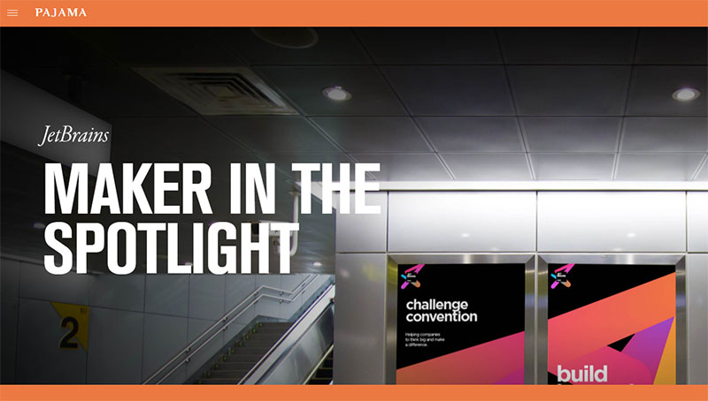
Pajama
The landing page of Pajama’s site comes straight to the point in a beautiful way. The feeling the visitor gets is one of care, peace, and warmth.
Going down the page, one will see a news list, which is presented in the form of modular pictures. Another playful highlight is the footer. It is a picture of a plush toaster with mail envelopes in it. The visitor will understand that that is where the contact details are.
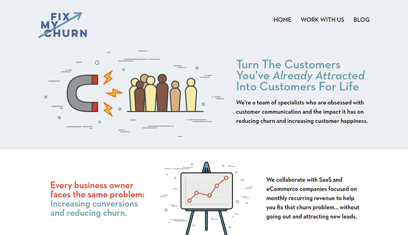
Fix My Churn
The website of Fix My Churn is different. It only has a field where a visitor can fill in his email address. The goal is to only attract people who are really interested.
So, if the visitor likes what he sees, he provides his contact and continues. If not, there is no harm done. Anyone that is willing to give his details already knows everything he needs to know.
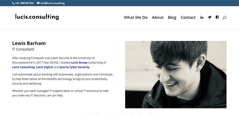
Lucis Consulting
Lucis is a British company and its website inspires people who want to start a small consulting firm. In other words, this is not the place for anyone that is going to build a site for a big company. Here are some highlights:
- Clean design
- The call to action is clearly indicated
- The entire is built up of exciting shapes
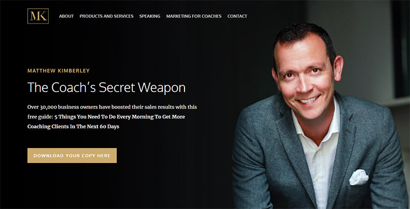
Matthew Kimberley
Matthew Kimberley knows how to promote his agency and get it to the top of his field. The smart use of black in combination with gold letters gives the site a classy look. The emphasis is not on the design, however, but on testimonials from leading industry professionals. The investment is worth the money.
Fresh
Fresh not only wants to be young and fresh but also to build trust. They have accomplished this with a beautiful and stylish web design.
It contains plenty of white that looks great with contrasting colorful blocks. Those elements make the site visually appealing. The structure that is built into the site is apparent when scrolling down. It conveys this company’s services and activities.
Scrolling down the page, the “About Us” window is always visible. The call to action is in the form of a footer that reads “Have a Project?”
Tasha Meys
The next on the list of best consulting website examples is the one of Tasha Mays. She is a social media consultant, as well as an artist, traveler, and photographer. With the design, she shows what she can do to make a brand exciting and colorful.
Here is an important lesson for a good consulting website: A catchy brand name, “Tastefully Tash.” It is a fun name that captures style and playfulness. That also applies to her work.
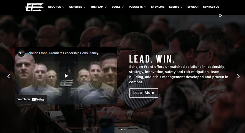
Echelon Front
Echelon Front is a consulting firm with a multipurpose website. They use it to:
- Provide information for interested clients regarding their services.
- Announce their upcoming leadership seminars.
- Support a platform that allows professionals to interact with each other. Here, they can discuss strategies and challenges. This helps them to find solutions together.
- Provide solutions to leaders who are trying to build high-performance teams.
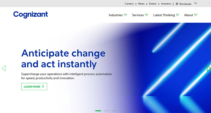
Cognizant
Cognizant designed a consulting website that is fun and exciting. Looking at the pages, with their colors, is an energizing experience. Large fonts make the site easy to read.
Some of the bars are at an angle, which gives the pages a special dynamic. The navigation elements are in such a way that they invite the viewer to explore. A large slider at the top shows pictures that brand the company’s name and philosophy.
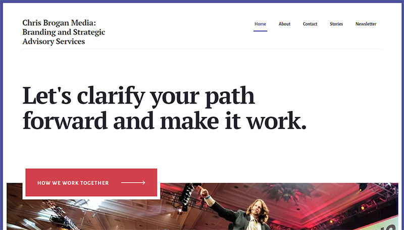
Chris Brogan
Chris Brogan is a business storytelling consultant, bestselling author, and speaker. His web design teaches an important point:
The unique background image offers a huge image of himself riding a laser-shooting shark. This says something about Chris’s creativity, which he is sure to bring to his consultancy work as well. Visitors are convinced of this man’s unique qualities that make him stand out from the rest.
Ending thoughts on the best consultant websites
All of the firms on the list have invested time and energy in developing their consulting website. They have made sure that the website design is professional and that it performs exactly as it should. They are to build credibility and trust. At the same time, they stimulate interaction with current and prospective clients.
The client, too, benefits from these consultant websites. Of course, they provide information about the companies and how they work, and much more. They are amazing resource centers where clients can find information and inspiration.
Do not try to copy any of these sites. Take some elements from them and mix them in when creating a new web design.
Hopefully, these website examples are a source of inspiration to anyone that is working to set up a consulting firm.
If you enjoyed reading this article on consultant websites, you should check out the following ones as well:
- The Best Consulting WordPress Plugins for a Consultant Website
- Business Challenges that Consultants Need to Know How to Fix
- Tips for Becoming a Self-Employed Business Consultant


