In today’s world, content is more important than ever. People are drawn to fresh ideas and information that is useful to them. As this environment is known to be very competitive, consider using the color palette of your website to get a leg up on the competition.
Blue websites are known for generating trust from users, as this is what the color represents. Color is one of the most powerful tools that a designer has, though the tricky part is that it can either make design look great, or break it. This is why choosing the right color should be a priority for any designer.
Why blue websites?
In this article created by our team at Amelia (the best WordPress booking calendar plugin), we’re going to discuss the color blue and how it can be best utilized on your website. We will offer suggestions about what are the best ways to use blue, and give you some visual inspiration using examples.
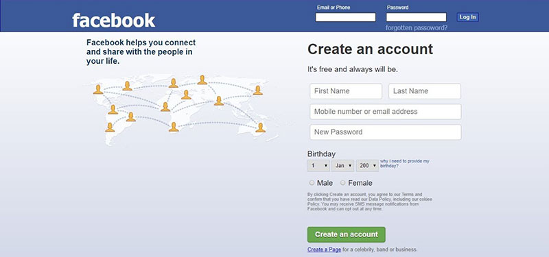
A popular example of the use of blue is Facebook. A fun fact regarding the choice of blue was actually because Mark Zuckerberg is red-green color blind. Even though it was probably an obvious choice, it still demonstrates the power of color. Blue is one of the safest options that designers can go with. This because blue is the favorite color in the majority of the population.
Blue is also associated with trust and reliability and inspires confidence among people that see it. According to scientific studies, it has been shown that it has a calming effect on the brain. It is also inviting and friendly. As it is such a vibrant and versatile color, blue has become one of the more popular choices that web designers go for.
This is the reason why blue websites are done more and more using this color. The main categories that are suitable for it are:
- Business websites
- Financial websites
- Spa and wellness
- Holidays and cruises
- Nonprofit
Cool blue websites examples
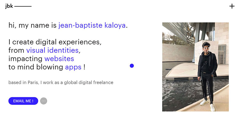
Jean-Baptiste Kaloya Portfolio
Jean-Baptiste Kaloya uses one of the most popular colors in their website design with different shades of blue. We can see the soft gradients on the lighter blues that look great.
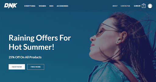
Astra’s Brandstore Template
Astra’s Brandstore template can help your brand look better online. It uses a lot of blue, which many people trust and like. The design works well with WooCommerce, so shopping is easy for users. The template also looks good on phones and tablets. It has different page designs and a fresh look, making it great for online stores that want more sales. For blue websites, Astra’s Brandstore template is a top choice. It looks good and works well. If you’re starting a new online store or updating an old one, this template is a great pick.
Key features include:
- A lightweight, high-converting online store design.
- Smooth WooCommerce integration for effortless product showcasing.
- A striking hero image section to highlight top products or offers.
- Comprehensive customization options, from color palettes to typography.
- A fully responsive design that looks impeccable on all devices.
Astra’s Chartered Accountant Template
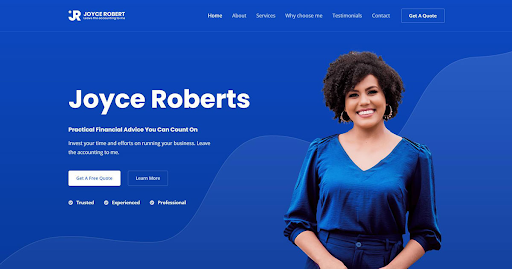
For websites focused on accounting, Astra’s Chartered Accountant template is a top pick. It has a modern design with a bright blue color that stands out. The template gives a feeling of trust and expertise but is not too formal. It has space to talk about products, services, and skills. If you’re starting or updating an accountant website, this template is a great choice. Whether you’re an individual accountant or an accounting firm, this template is designed to cater to your online presence needs.
Key features include:
- Bold Blue Design: A standout blue color that’s eye-catching without being overpowering.
- Balanced Tone: The design communicates expertise without being overly formal.
- Showcase Opportunities: Ample space to highlight products, services, and areas of expertise.
- Ready-to-Use Pages: Comes with pre-made pages to cater to most needs.
- Page Builder Compatibility: Fully compatible with leading page builders for easy customization.
Squilla Fund
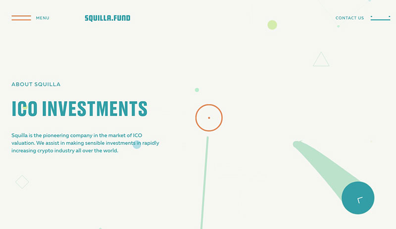
Check out the soft beige tones mixed with a beautiful turquoise on this corporate website talking about the crypto industry. The color palette focuses on reliability and comfort. The name of the blue site colors are:
- Teal Blue
- Moonstone Blue
- Powder Blue
- Magic Mint
- White Smoke
WPDean
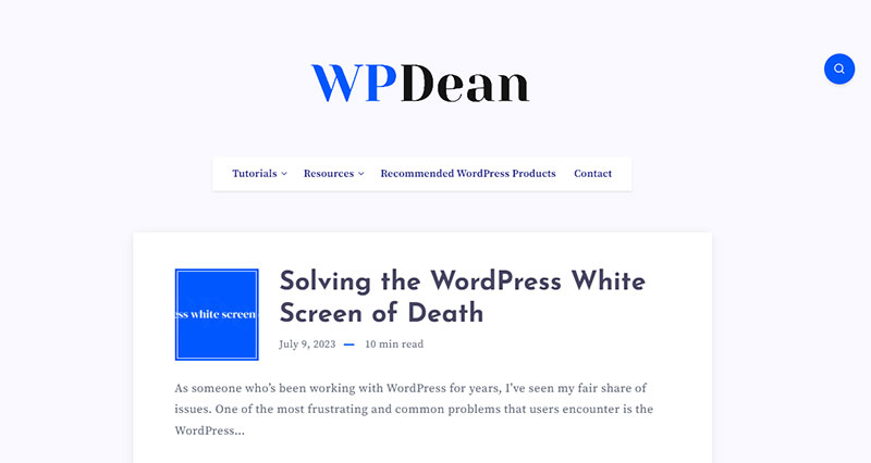
WPDean functions as a thorough guide for WordPress users across all skill levels, providing essential knowledge, advice, techniques, and step-by-step tutorials.
National Climate Assessment
Blue websites like this one look even better when their mission is clearly defined. Here, we are talking about a climate report that shows essential data and needs to be treated with maximum responsibility.
Webflow Interactions 2.0
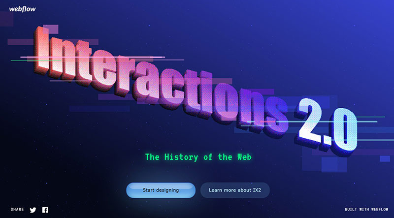
Webflow interactions take advantage of the popular blue palette, and also bring in some gradients to get a simple color scheme. There is also some pink thrown in the design that helps in getting a modern, engaging look.
Canatal
Canatal uses shades of blue to display a beautiful design. This blue website is a great example of how to use a monotone color palette without being boring.
Lake Nona
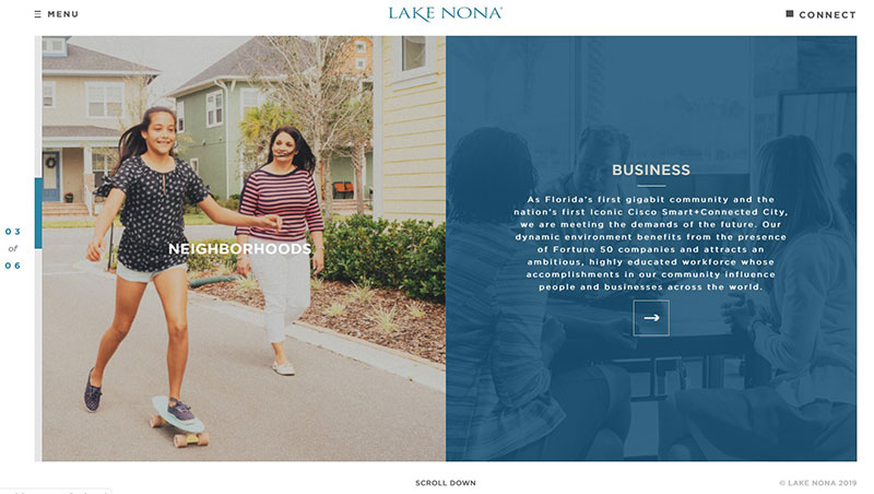
As this website is focusing primarily on a body of water, it is only natural that we see a splash of blue on their website, which goes very well with the more neutral colors shown.
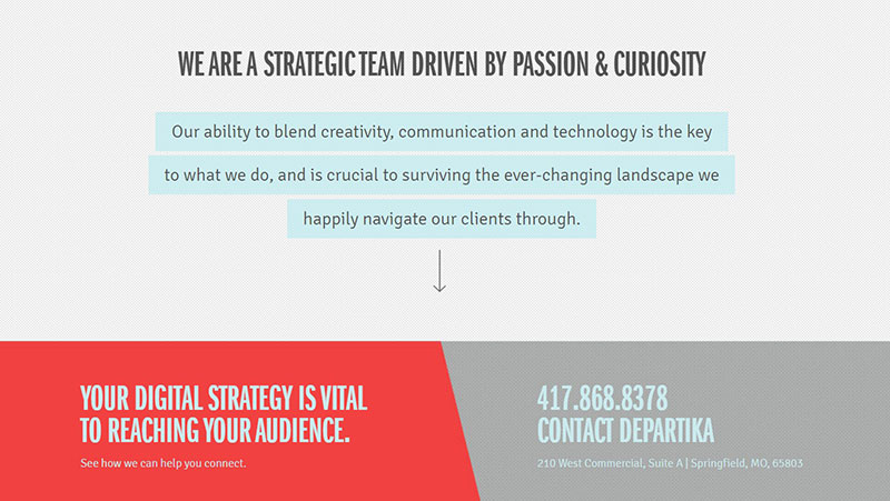
Departika
The color palette used for this website is clean and professional thanks to its soft blues, greys, and whites. It draws attention with its vibrant color mix, and gives us an excellent example of how a blue site should look.
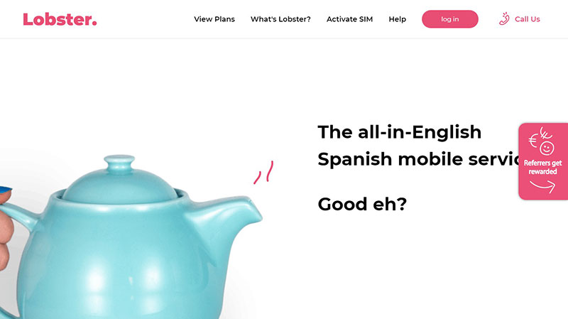
Lobster
If you are a fan of a combination blue and pink mix, then this website is an excellent example of how the two can work well together. Blue websites are sometimes hard to match with a second color, but the designers behind Lobster did a great job.
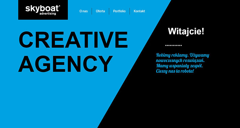
Skyboat
In this example, blue comes in play for a more business-oriented site. As the design could not be done by just using blue, we also see black being added, and it looks great!
Marqeta
Financial websites like to use blues as this color implies credibility and trust. Because Margeta is offering a different kind of service for consumer credit, its use of sky blue is also different from typical branding. It uses dark blue, purple, and cyan for the color scheme.
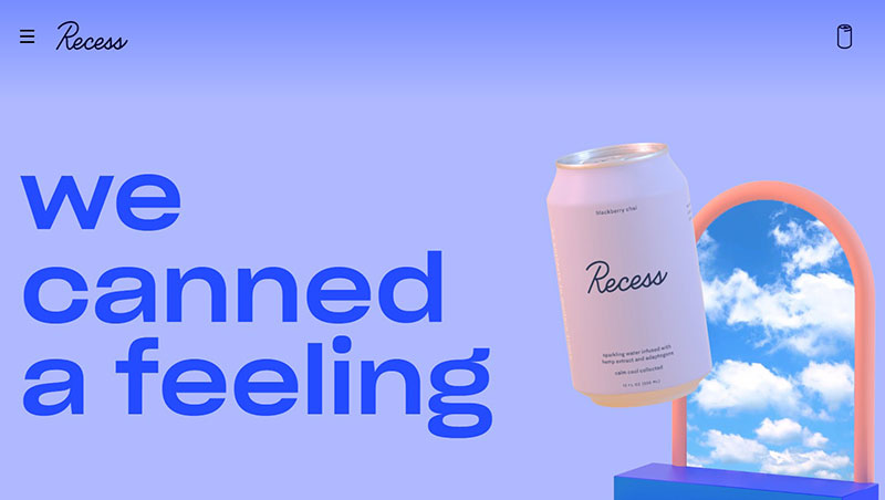
Recess
Combining different shades of color is typically the idea in blue websites. This one brings a calm and dreamy vibe.
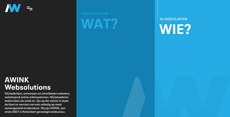
Awink
The monotone color, together with different hues of blue, makes this website a visually appealing one. We also like its broader, darker accents with the dark and light screen areas that play an optical illusion.
This makes you think you see more colors than there are there in reality.
Cher Ami
This beautiful color scheme brings a royal, elegant look by using deep blue and gold shades. The result is like the other blue websites we have shown, but with a modern twist.
It uses it to deliver a powerful visual experience and immediately positions the brand as a top player.
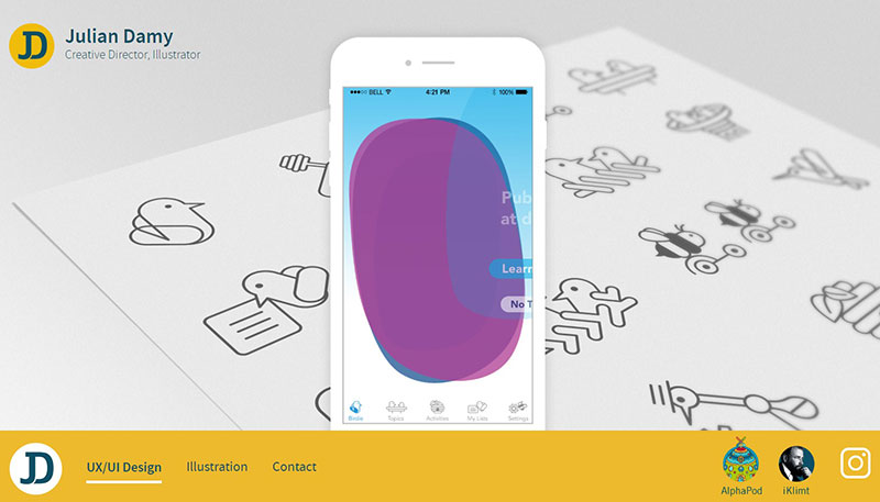
Julian Damy
To achieve a sophisticated look, the creators of this website used deep blue tones together with gold highlights. The result? A great color palette inspired by art history that looks timeless and beautiful.
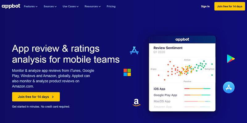
Appbot
The colors used in Appbot match the idea of the brand. We can see powerful combinations of blue together with white.
Andris Gauracs
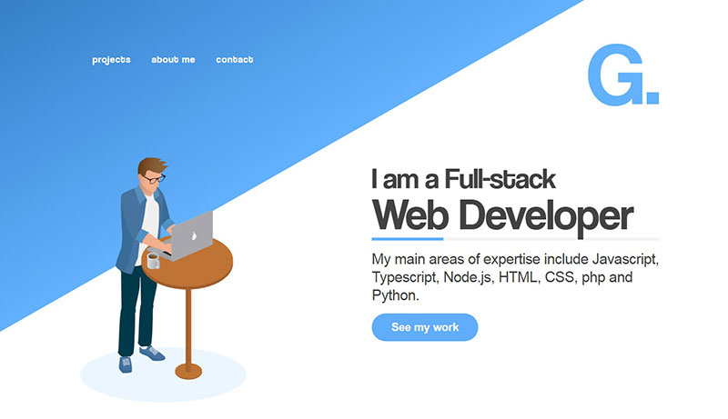
Blue websites are also great to be used as portfolios. This one belongs to a developer, and we can instantly see how the blue demonstrates reliability and trust. The colors that were used for it are:
- Tufts Blue
- French Sky Blue
- Alice Blue
- White Copper
Shibui
When you see this blue website, you will be impressed by its clean look. A great way to obtain the same effect is by using gradients. The site’s palette is made of fresh blue and turquoise colors. They bring a calming and relaxing effect.
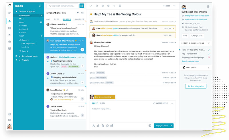
Groove
The palette on this site was done using blue, white, and black. Although in the world of designing, it is a primary color scheme when it is arranged the way it is on the site, the result is a professional look.
Creddy

This is a classic combination using red and blue to create this fresh website design.
Securinvest
Another new and colorful example of how blue sites can look great while adding other elements as well.
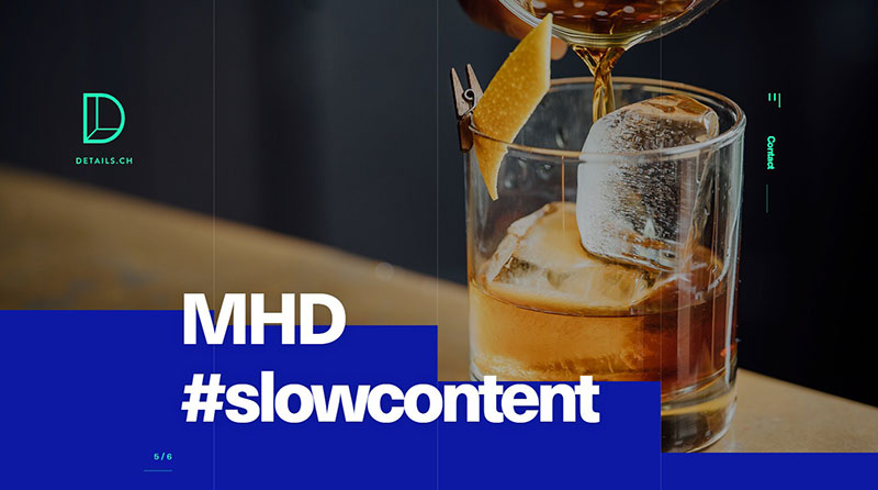
details
This is an excellent site that uses simple, bold colors to bring attention to its design.
Amber Xu
Finishing off our blue websites showcase, we can see the minimalist trend utilized by this website was done by using solid colors against a black background.
FAQs about blue websites
1. What makes a website blue?
A website’s design and branding define its color. Because it is associated with reliability, stability, and serenity, blue is one of the most widely utilized hues in branding and web design. A lot of websites in the technology, banking, and healthcare sectors also use blue because these businesses are frequently linked with the color.
2. Is blue the most popular color for websites?
Together with black, white, and gray, blue is one of the most used colors for websites. Due to its adaptability and calming impact, blue is frequently used as a primary or accent color on websites across all industries. The most common color for a website, however, may change depending on the brand, industry, and target market.
3. How does the color blue affect user experience on a website?
In websites, blue is frequently utilized to evoke feelings of dependability and trust, which can enhance user experience. According to studies, the color blue can also relax visitors, increasing their contentment and involvement. But, if you use too much blue or the wrong shade of blue, the website may come out as distant or unwelcoming.
4. What shades of blue are commonly used in web design?
Navy, royal blue, baby blue, and teal are typical blue hues utilized in web design. These hues can be utilized to convey a variety of attitudes and feelings on a website, from authority and professionalism to playfulness and creativity.
5. Are there any industries or niches where blue is the preferred color for websites?
Due to the color’s associations with trust, dependability, and tranquillity, blue is frequently utilized in sectors like technology, finance, healthcare, and travel. But, depending on the brand and target market, blue can also be utilized successfully in other industries.
6. What are some common color combinations used with blue in web design?
White, gray, black, green, and yellow are common web design color schemes that pair well with blue. On a website, these colors can be utilized to convey a variety of moods and feelings, from vitality and playfulness to simplicity and minimalism.
7. Can blue be used effectively for call-to-action buttons on a website?
A website’s call-to-action buttons can benefit from using the color blue because it conveys reliability and trustworthiness. However, it’s crucial to make sure that the color pops out against the background and that the button is made in a way that draws attention from visitors.
8. What emotions or feelings does the color blue evoke in website visitors?
Blue can make website visitors feel competent, trustworthy, at ease, and trustworthy. Yet, depending on the shade of blue utilized and the context in which it is used, different emotions and feelings may be elicited by blue.
9. Are there any cultural or regional differences in the use of blue on websites?
Blue may be used differently on websites depending on cultural and geographic factors. For instance, while blue is sometimes linked to transcendence and immortality in some Eastern cultures, it is frequently connected with trust and dependability in Western societies.
10. What are some examples of well-designed blue websites?
Facebook, LinkedIn, and Twitter are examples of well-designed blue websites that make use of blue to convey professionalism and trust. Other examples are Booking.com, which utilizes blue and green to convey a sense of vitality and relaxation, and Dropbox, which uses blue and white to convey a sense of simplicity and minimalism.
If you enjoyed reading this article on blue websites, you should check out this one about websites with a yellow color palette.
We also wrote about a few related subjects like website color schemes and pastel color palette examples.
