Website design has changed dramatically over the years, hasn’t it? Do you remember the best website designs from the beginning of the new millennium? Today, only 18 years later, the standards have changed completely.
Not only trends and technologies are completely different nowadays, but the users’ expectations have also grown much higher. For example, many millennials prefer to book appointments online. Amelia took on the challenge to provide them with the perfect way to do so.
In the online era of websites and online businesses, creating beautiful, fully functional designs is quite challenging, especially with all the new technologies and with the constant changes in the industry standards.
2018 will be remembered as the year when it became obvious that all best websites have to be mobile friendly because, for the first time ever, mobile usage has taken over the desktop browsing. With all that in mind, let’s take a look at the best website designs of 2019.
How were websites designed in 2019?
First of all, let’s talk some more about the web page design and some of the newest trends in that field.
Drop shadows and depth
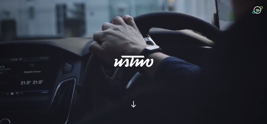
Ustwo
They work with businesses and organizations of all shapes and sizes, from early-stage startups to the world’s leading brands, to create digital products and services that solve the problems of today as well as define the opportunities of the future.
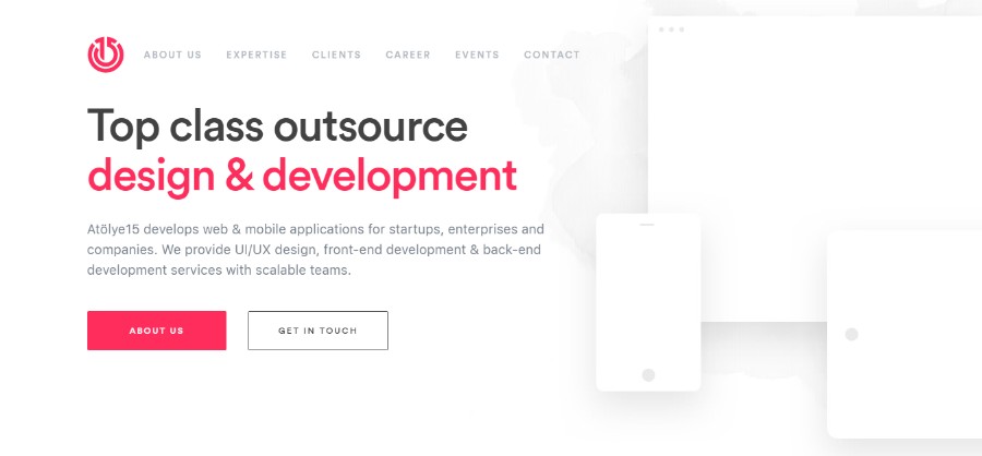
Atölye15
Atölye15 develops web & mobile applications for startups, enterprises, and companies. We provide UI/UX design, front-end development & back-end development services with scalable teams.
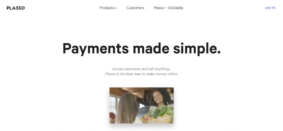
Plasso
Plasso is a powerful all-in-one e-commerce platform. It makes it easy to start and grow your own business.
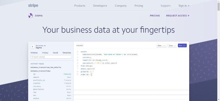
Stripe
Stripe Sigma helps businesses quickly analyze their Stripe data and enables teams to get faster business insights.
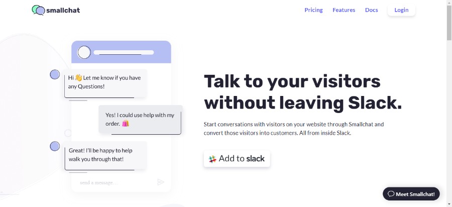
Smallchat
Smallchat runs inside your Slack team, which means no additional software to learn. Be available to chat with visitors on your website and your team members all in one place. Each conversation creates a new thread, allowing your team to manage it all from one place.
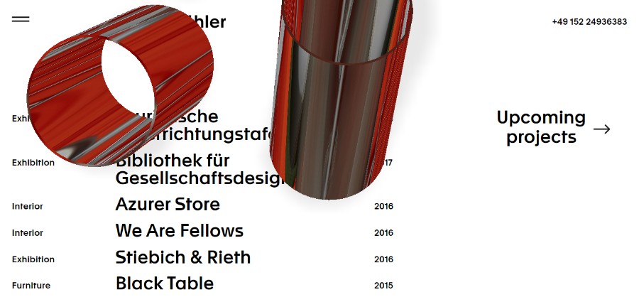
Julian Buehler
Julian Buehler’s portfolio website features an amazing example of the smart use of shadows.
The use of shadow is nearly as old as the website creation itself but we still think it is pretty important to mention it. After all, website designs have changed a lot and with them, we got to see some really cool designs that play nicely with shadows.
Grids and parallax layouts have made it possible for the designers to create depth and the illusion of a world beyond the screen. And while the flat design was very popular in the past years, that is not the case anymore with the best new sites.
Vibrant color schemes
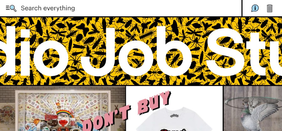
Studio Job
Studio Job was founded in 1998 by Job Smeets in the renaissance spirit, combining traditional and modern techniques to produce once-in-a-lifetime objects.
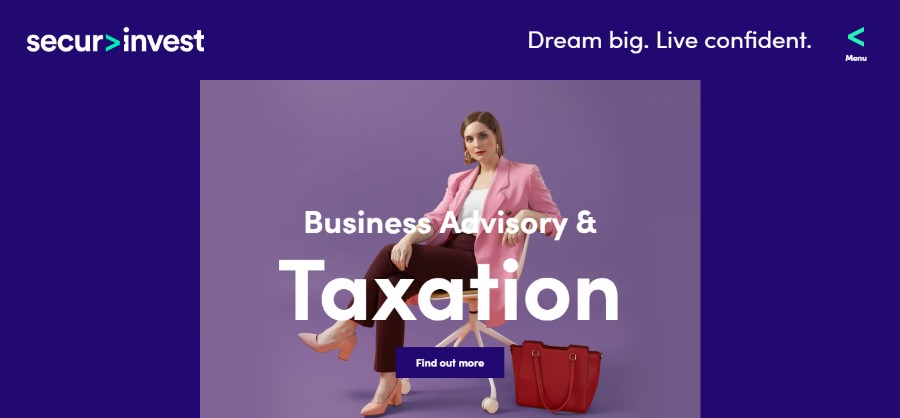
Secureinvest
Securinvest is a full-service financial solutions group comprising three specialist areas – financial advice, business advisory & taxation and mortgage broking.
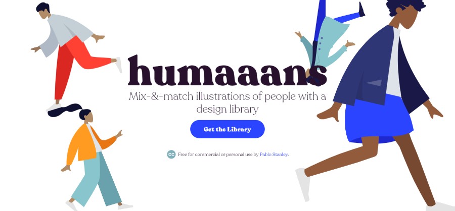
Humaans
Humaaans provides Mix-&-match illustrations of people with a design library.
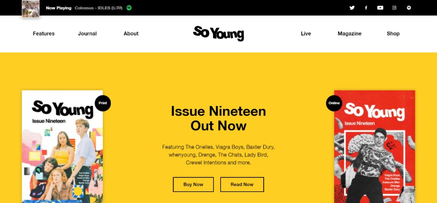
So Young
The pages of this magazine represent a labor of love. So Young is a gift from us to you under the assumption that you keep going to gigs, buying records and looking at the sleeve artwork as you listen.
illo xmas
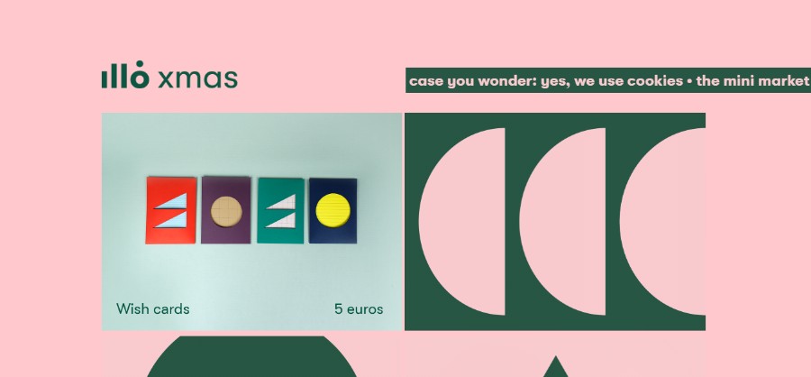
The illo Xmas mini market is a fun studio project created by illo.tv. It’s a temporary online store where they have been free to play with illo’s most iconic colors and shapes, to create our own version of some classic objects of every Xmas: wish cards, decorations, candles and recipes.
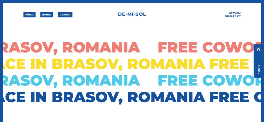
Demisol
Demisol is a free coworking space dedicated to hackers, designers, developers, marketers, troublemakers, and other disrupters.
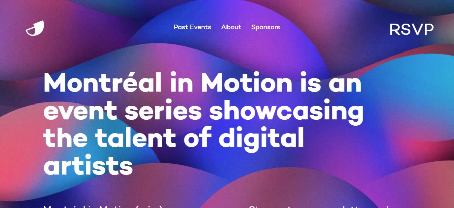
MiM
Montréal in Motion is an event series showcasing the talent of digital artists.
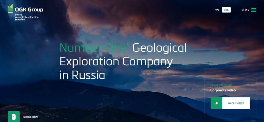
OGK Group
OGK Group of Companies integrates the leaders in geological exploration hither and yond.
Train Body Brain
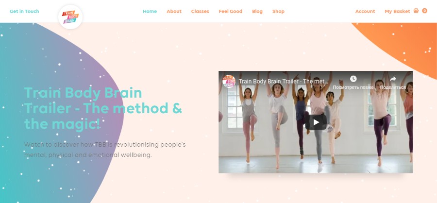
Train Body Brain™ is about building resilience mentally, physically and emotionally. Our classes provide you with fitness and meditation habits to support your wellbeing – both now and for the rest of your life. We put you in charge of your wellbeing.
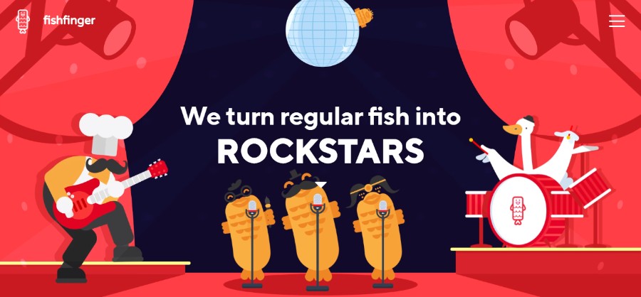
Fishfinger
They’re a team of creatives that love nothing more than creating incredible stories. They specialize in branding, animation, and web; uniquely combining our skills to produce magical digital experiences. They don’t do ‘boring’.
If you check out the top websites of this year, you will notice that 2019 is a year of really vibrant colors. In the past, we’ve seen lots of simple designs with safe colors but that trend has shifted dramatically. All the best new websites use vibrant, saturated colors combined with headers that are no longer just horizontal but reimagined with slashes and hard angles.
Animated elements
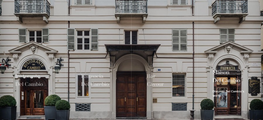
Del Cambio
Del Cambio presents you with the animated portfolio of restaurants.
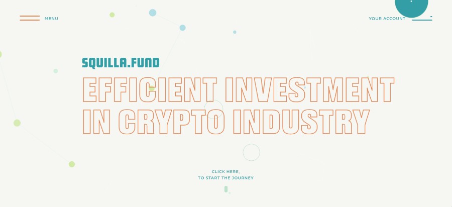
Squilla
Squilla is the pioneering company in the market of ICO valuation. We assist in making sensible investments in rapidly increasing crypto industry all over the world.
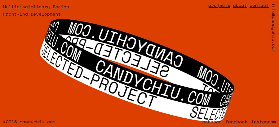
Candy Chui
Chiu Pak Ki, Candy is a Multidisciplinary Designer and Front-End Developer. She graduated from the Hong Kong Design Institute with Distinction. Specializing in interaction design and visual communication, her interests span on memorable immersive user experience journey and delivering design-driven solutions.
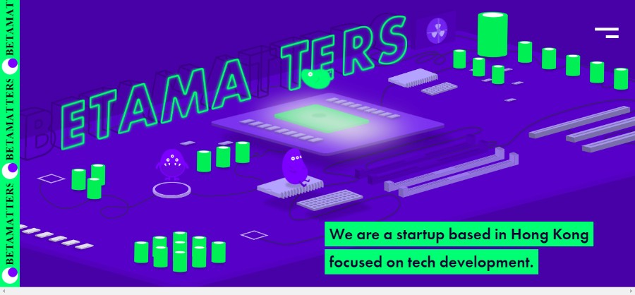
Betamatters
Betammaters is a startup based in Hong Kong focus on tech development.
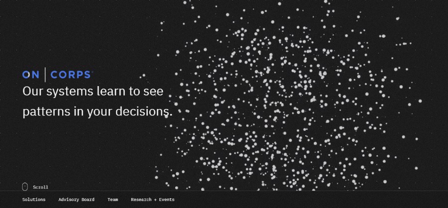
On Corps
Their solutions learn from your best decision makers then deliver intelligent decision guidance to everyone.
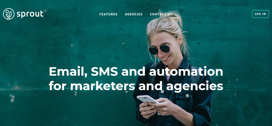
Sprout
Sprout offers email, SMS, and automation for marketers and agencies.
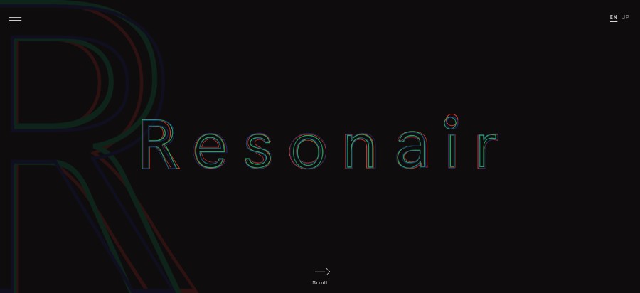
Resonair
Produced by Enhance, Resonair played a key role in the 2016 release of Rez Infinite — a title that won high praise from fans and critics alike, as well as the first-ever Best VR Game title at The Game Awards that same year.
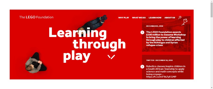
Lego Foundation
In the LEGO Foundation, they share their overall mission with the LEGO Group – to inspire and develop the builders of tomorrow. It demonstrates their shared heritage and is the guiding star for everything they do.
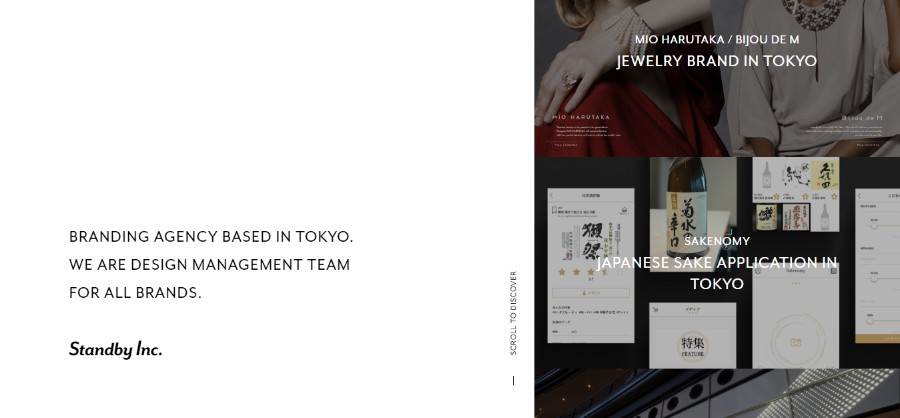
Standby
Standby is a Branding Agency Based in Tokyo. They are a design management team for all brands.
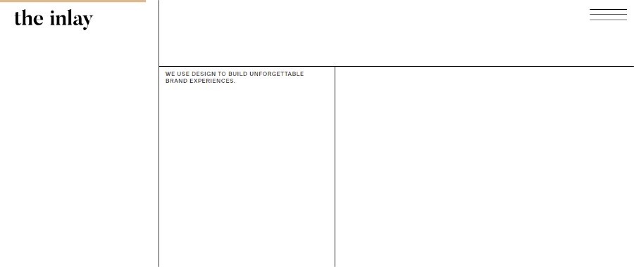
The Inlay
A minimalistic shell that rejects mainstream web trends to showcase everything The Inlay. Combining the Le Corbusier grid with an occasional unexpected interactive twist.
Adding animated elements to your website ideas could result in a really cool design. Try looking for the design inspiration online and you will notice that a lot of best website designs incorporate elements such as particle background to create movement without taking too long to load.
The purpose of the elements like these is to attract the users’ attention and create a memorable first impression the moment the users open the website. The best website design often incorporates motion graphics like these.
Video Backgrounds
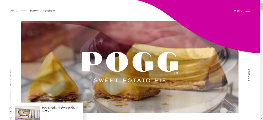
POGG
POGG is crispy, fluffy and creamy all into one irresistible triangle, that no other sweet potato snack can satisfy.
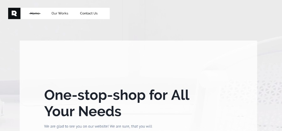
Rondesign
Rondesign Agency portfolio website.
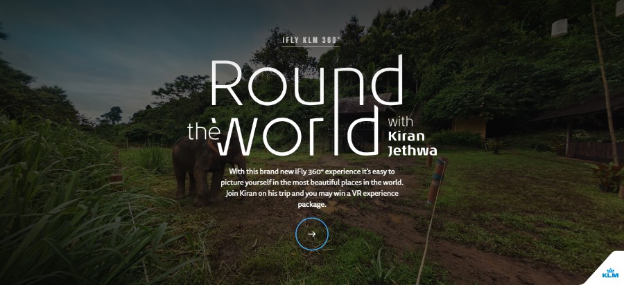
iFly KLM
In this interactive 360° experience it’s easy to picture yourself in the most beautiful places in the world. In the first episode, they take you on a trip to Northern-Thailand.
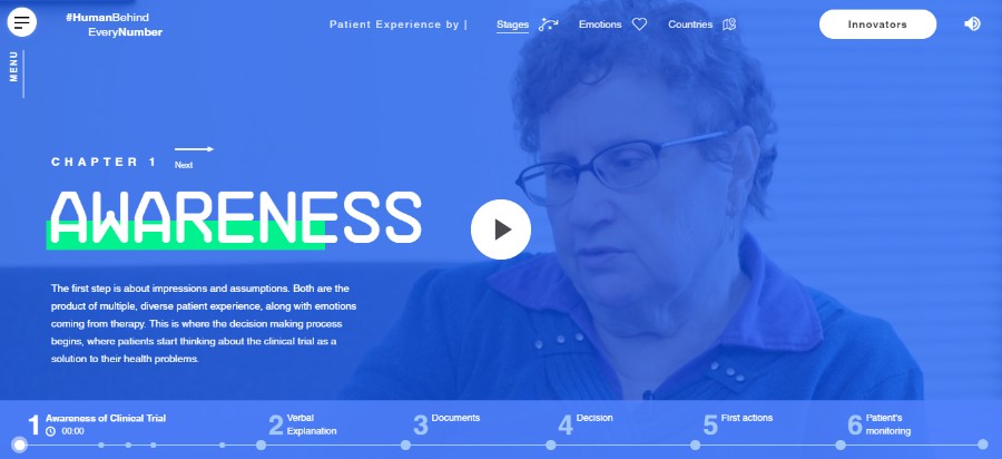
Human Behind Every Number
The website is an interactive report of qualitative research conducted through service design and UX process.
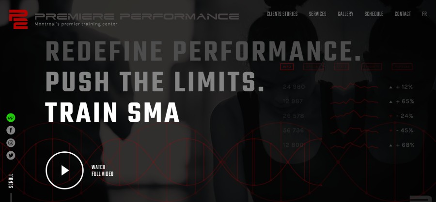
Premiere Performance
Athletes can now discover the behind the scene of Olympian athletes and professionals showcasing P2 personal training center with an interactive website.
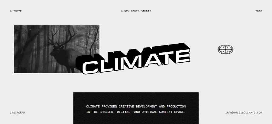
Climate
Climate provides creative development and production in the branded, digital, and original content space.
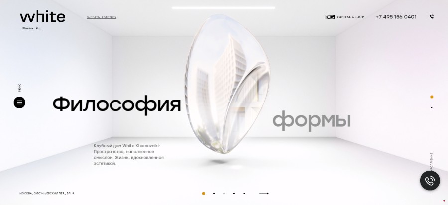
White Khamovniki
A promotional website, CGI-animation for a luxury clubhouse in Moscow for Capital Group company. The idea, CG graphics (3D), animation, and web development were made by team ART3D.
The best websites in 2017 have proved a point – videos are more compelling than text or images ever will be. You could have noticed that top companies often use videos as an important part of their company profile.
In addition to that, social media platforms such as Facebook made it easier to watch videos by auto-playing on mute as you scroll through your feed. Long story short, videos are prioritized over all other kinds of posts.
Mobile friendly
We mentioned earlier the fact that mobile browsing has now officially surpassed desktop. With that in mind, it is only logical that every website designer has to keep mobile-friendly designs in mind at all times.
Organic Shapes
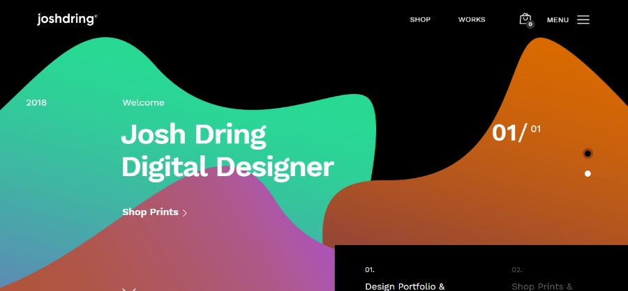
Josh Dring
Digital Design & Art Direction from the United Kingdom.
Back in the day, amazing website designs were simple and clean. To achieve an organized and neat look like that, every website layout was based on sharp corners, squares, and rectangles. And while we still prefer simple and clean designs, we also like to see a larger variety of shapes in 2019. Rounded edges and more organic shapes are one of the most popular new trends in every web design company.
Chatbots/Machine learning
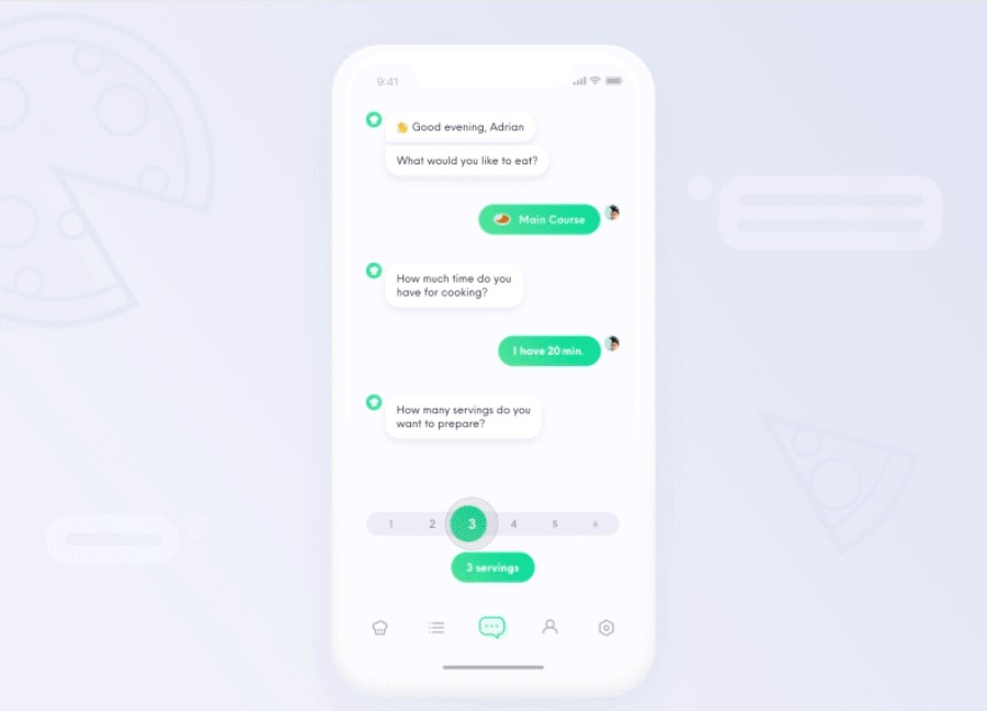
Recipe app – prepare food
This chatbot will not only help you to chose what to eat, but it will also show you how to prepare it. It will show you some tips about how to chop an onion or how to debone meat. Besides that, you can also learn more about each ingredient and its nutritional value.
Chatbots and machine learning are a great way to enhance user interactions with a website. We have seen some truly amazing designs where the chatbots seamlessly interact with the users. This technology is getting better and better every single day and while it is one of the most popular design trends in 2019, we expect it to be the best on the web in the future.
Just try to picture beautiful websites that know exactly what the users want from the companies by analyzing past interactions. Not only will customer services become faster and more efficient, but the customers themselves will also be more satisfied.
Custom illustrations
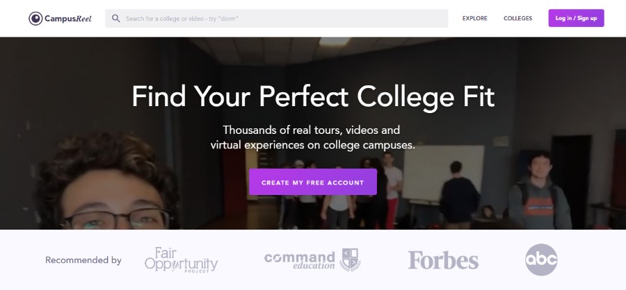
CampusReel
Find Your Perfect College Fit. Thousands of real tours, videos and virtual experiences on college campuses.
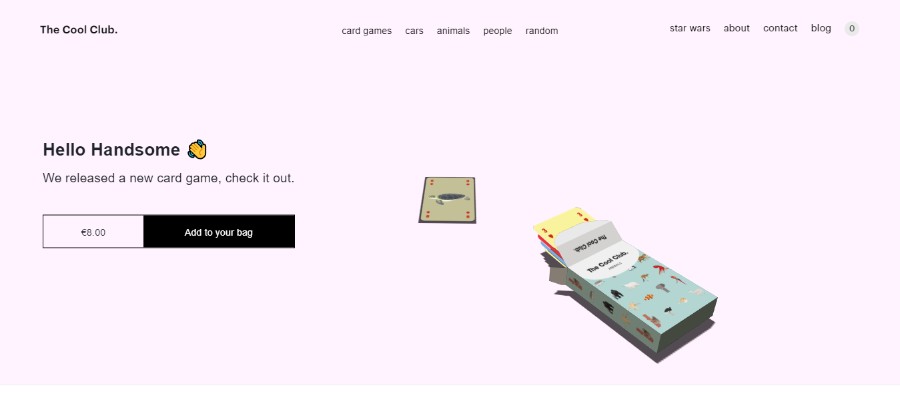
The Cool Club
The Cool Club is a collective of creative minds, making cool things, inspired by some of the most influential people, places and products of our time.
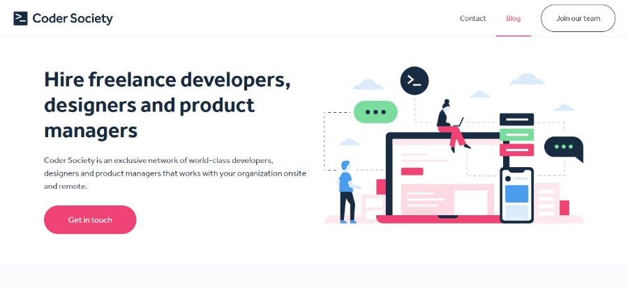
Coder Society
Coder Society is an exclusive network of world-class developers, designers and product managers that works with your organization onsite and remote.
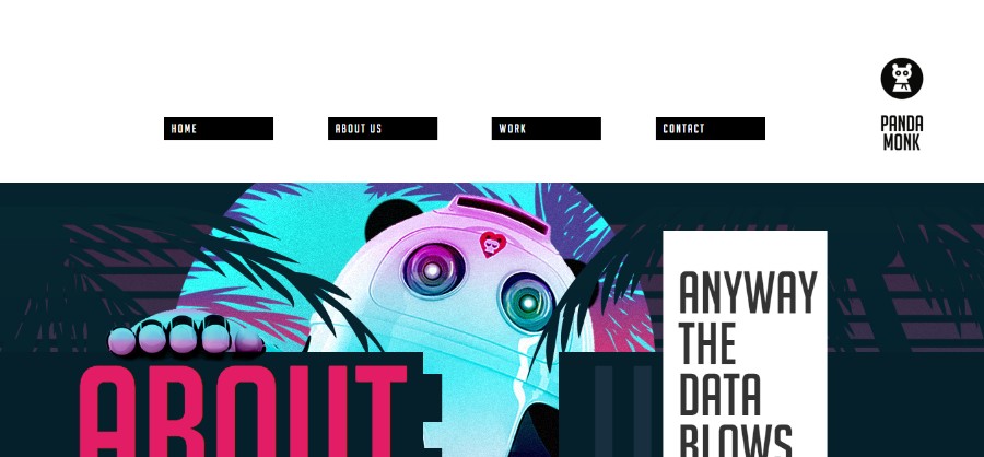
Panda Monk
They cover a well-rounded package for creating and growing online brands and experiences.
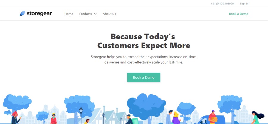
Storegear
Storegear helps you to exceed their expectations, increase on-time deliveries and cost-effectively scale your last-mile.
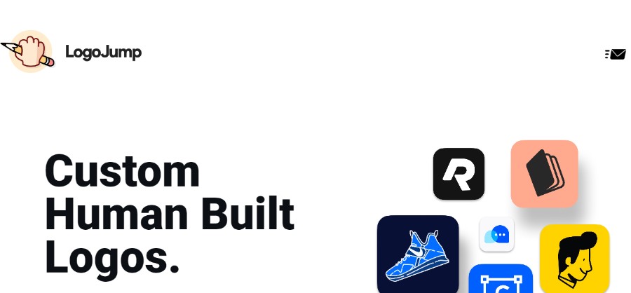
LogoJump
We create powerful, compelling brands for startups, companies, and organizations. Without the algorithms.
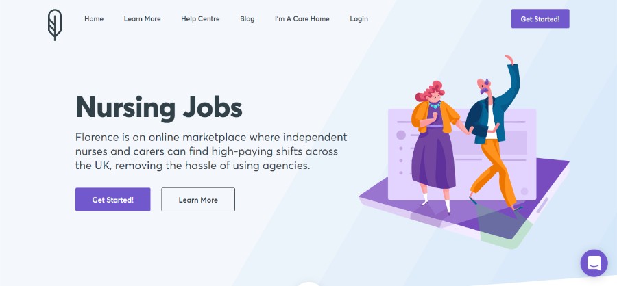
Florence
Florence is an online marketplace where independent nurses and carers can find high-paying shifts across the UK, removing the hassle of using agencies.
Well-made custom illustrations are an amazing way of adding a touch of personality to your website while also occupying the users’ attention. There are countless cool designs to draw and a creative artist can make illustrations that are not only beautiful but also tailored to the brand’s tone.
If you are looking for web design inspiration that incorporates illustrations, pay attention to the serious brands that have made their website more friendly and approachable to customers by incorporating unique and fun elements such as illustrations.
Big, bold typography
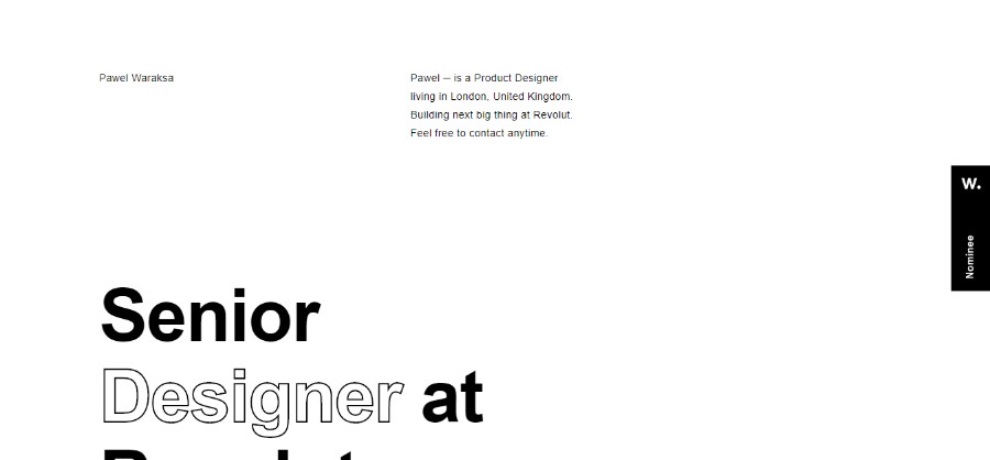
Pawel Waraksa
Pawel ─ is a Product Designer living in London, United Kingdom. Building the next big thing at Revolut.
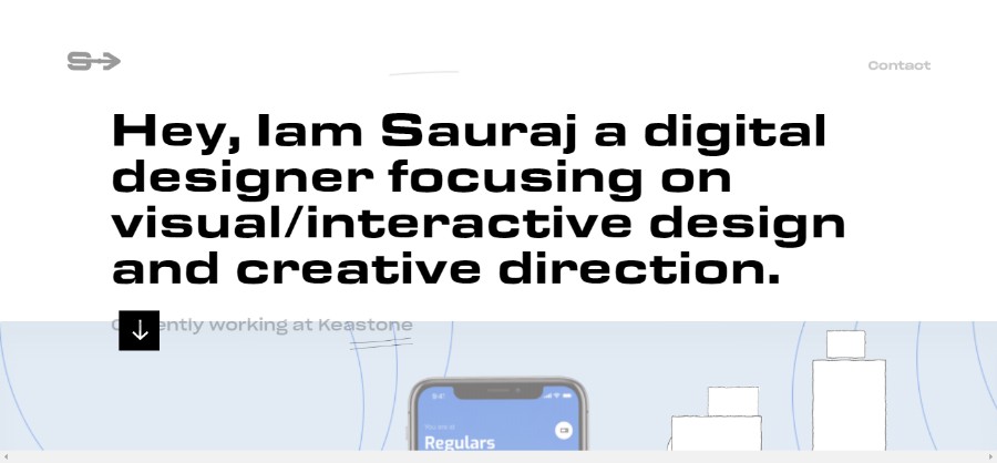
Sauraj
Sauraj is a digital designer focusing on visual/interactive design and creative direction.
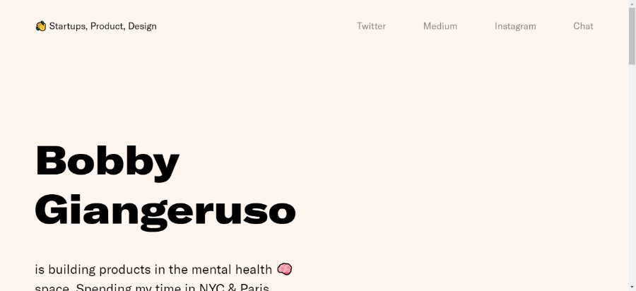
Bobby Giangeruso
Bobby Giangeruso is building products in the mental health space. Spending his time in NYC & Paris.
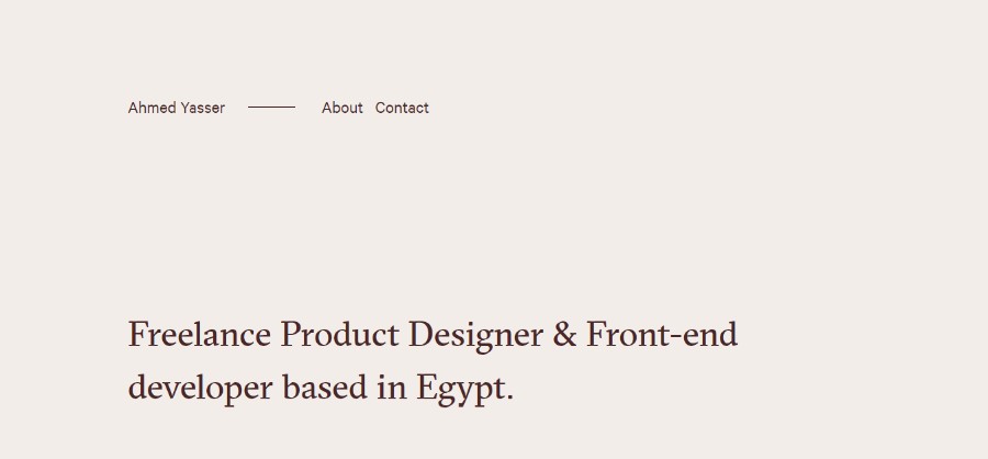
Ahmed Yasser
Ahmed is a Freelance Product Designer & Front-end developer based in Egypt.
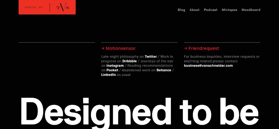
Tobias van Schneider
Tobias van Schneider is a German multi-disciplinary maker of useful, curious and beautiful things (he just doesn’t like the word entrepreneur).
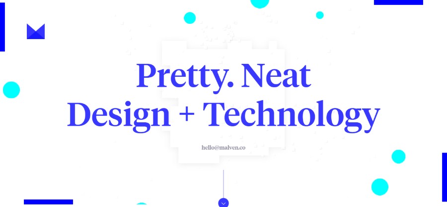
Malven Co.
The best interactive experiences come from research, strategy, passion, and collaboration.
Typography is a very important part of best website designs. It is something that easily gets underestimated – and it should not.
Typography is a powerful visual tool and web designers use specific fonts to evoke emotion, create a personality, and set the tone on the website. Nowadays, with the amazing screen resolutions, many browsers can support custom make typefaces enabled by CSS.
Using big and bold typography as well as contrasting sans serif and serif headings help create dynamic parallels, improve UX, and best of all, keep the visitor reading your website.
Asymmetry and broken grid layouts
Patrick Heng
Patoch is a french creative developer.
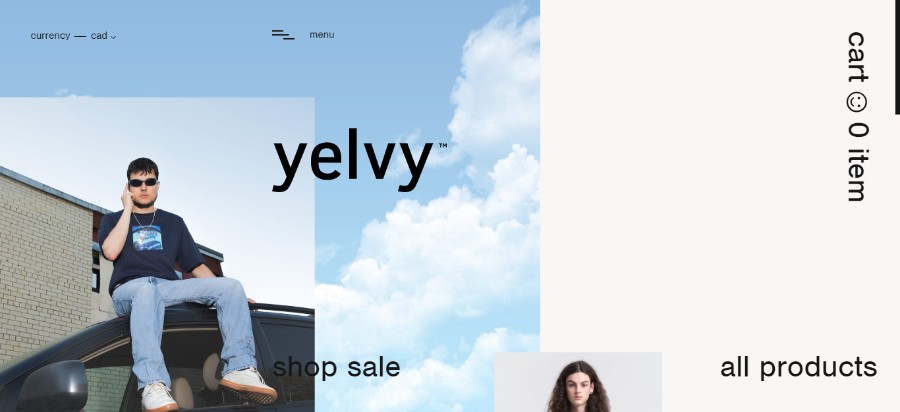
Yelvy
Three young individuals convinced that a lot has yet to be explored in an indispensable and ubiquitous clothing market. The final outcome is what matters, not the initiator.
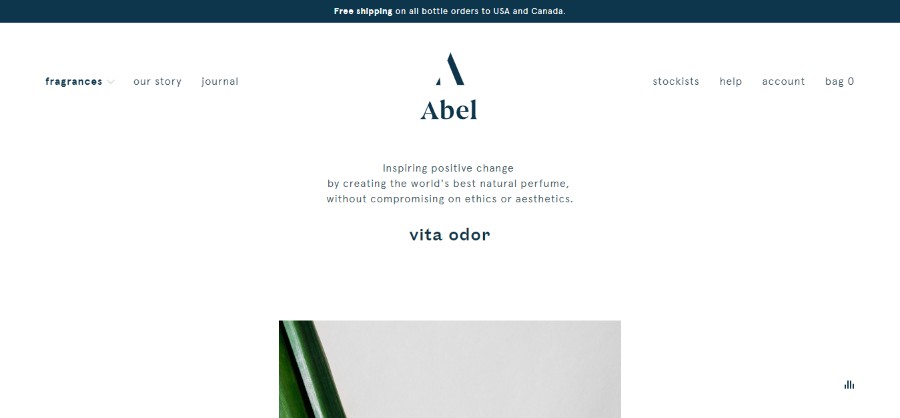
Abel
Following a failed search for a natural perfume that was chic, modern and long lasting. Abel was founded in Amsterdam by New Zealander Frances Shoemack with a simple goal – to create the world’s best natural perfume.
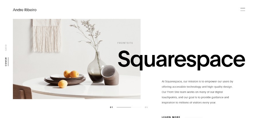
Andre Ribeiro
Brazilian born Designer and Art Director living in Brooklyn, New York.
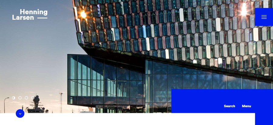
Henning Larsen
Drawing on Scandinavian design tradition, they develop vibrant, sustainable architecture that extends beyond itself and provides lasting value to the users and local context.
If you are looking for graphic design inspiration, forget all you think you know about layouts because the rules have shifted dramatically on that front. Introducing asymmetry and broken grid layouts are one of the newest trends that the website designers had to get used to.
Traditional companies sometimes prefer a simple design, but if you are open to some experimenting, the results can be truly breathtaking – hopefully, in all the right ways.
Replace text with videos
We mentioned already that videos are much more impactful than text or even images. If you have huge blocks of text on your website, there is a huge chance the users will never read all of it. However, if you switch from text to videos, you will communicate all the important information to the users more efficiently.
All that being said, the text is still the number one way of communication online because it is cheap, quick and easy to produce, and sometimes it cannot be replaced with videos or images.
Integrated animations
We mentioned particle backgrounds earlier as one of the easiest animated elements to incorporate into your website design ideas, but there are other small animations that can really enhance the overall cool website design.
For example, it is a great thing to use animations to keep the users’ attention while the website is loading.
Dynamic gradients
Gradients have been a part of website design inspiration for years, but one of the web design trends 2019 has taken things one step further with the gradient filters over photos.
It is a great way to make the image look intriguing and to enhance the overall design. Also, having a gradient background is one of the most popular solutions if you don’t have any other images to work with.
Ending thoughts on the best website designs of 2019
2019 has been an interesting year for every website design company with a bunch of new 2019 design trends surfacing. Best website designs now incorporate elements such as vibrant colors, asymmetrical layout, videos and animations, and more.
A simple website is still the best kind of website but it is important to find a way of adding a touch of personality without making the overall design overwhelming. In this article, you can find your new website inspiration and check out the latest trends for creating the best website.
If you enjoyed reading this article about the best website designs, you should also read these:
- Amazing Portfolio Websites with Great Design (145 Examples)
- Tips for designing the best medical websites
- How to make a great looking spa website
- Using loading animation on websites and apps
