Can you build a house without creating the blueprint? No. And the same goes for web design. Even though it’s tempting to get straight to business, it’s not that simple. For all but the most basic sites, a plan is necessary to ensure a logical design process.
In web design, a website wireframe is a plan that will guide you along the way and keep your workflow organized.
With wireframing, you can experiment with the site layout and overall functionality before putting your ideas into reality, helping you come up with the best user experience among several possibilities.
Now, whether you use pen and paper to create low-fidelity wireframes for your next project, or Adobe XD (or any other app) to create high-fidelity ones, wireframes are still the thing you should start a project with.
This article will explain the wireframing concept and will give you some wireframe examples to inspire you to create your own.
Defining the Concept of Wireframe
So what is wireframing? Think of your website wireframe as a skeleton that holds everything together. This skeleton defines the shape, size, and strength of your website, as well as its looks.
Wireframing represents the process of creating a visual mockup of the website’s structure. You can use it for apps or other software products as well.
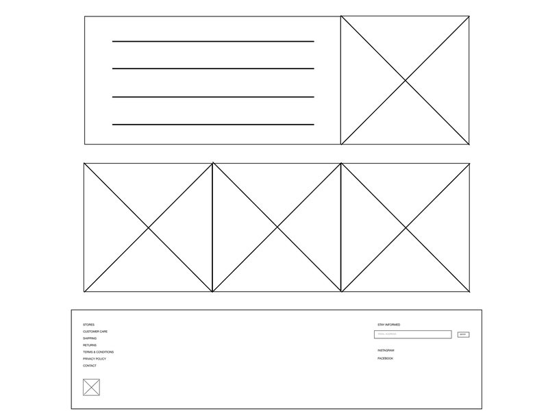
A wireframe contains simple blocks made of geometric shapes that indicate where each element should go once you start putting the website together. It sounds simple, and it is – because that’s the whole point of a mockup.
You can move blocks around very easily, instead of going straight to the interface and having to rebuild the structure of your website. A wireframe works best as a guide to follow before moving on to a high-fidelity prototype that requires more effort to create.
Benefits of Wireframing
A clear benefit of wireframing is that it provides some sort of separation between the design process and the user experience. Instead of focusing only on how the platform looks, you’ll focus on the user’s journey instead.
Likewise, when later working on the appearance, the designer won’t be bothered by aspects related to functionality, since these issues will have been mostly ironed out in the wireframe.
For companies that work with larger design teams, this is a valuable aspect that eases the process and saves a lot of time. Creating a wireframe can be done with a pen and some paper or a big whiteboard until you move it to the virtual environment, so don’t worry about tools being too expensive or inaccessible to some.
Digital wireframes are great for distributed teams where collaborations are required and not all people work under the same roof. Moreover, you can make iterations and revisions easier.
How Can You Create Wireframes?
Oftentimes, UX designers create a quick wireframe that is not as detailed as it should be. A complete wireframe is the only way to avoid all potential mistakes or changes in the later prototype.
Once you check out the wireframe examples included in this article you should have a good idea of how to create your own.
The tools most often used for rapidly creating complete wireframes include Balsamiq, Figma, Weje, and Sketch, but you can use many others for this task. Despite the rough appearance and simplicity of a website wireframe, a more sophisticated tool can make your work much easier.
Before anything else, focus on the fact that wireframes need to be practical. Practicality doesn’t go well with fancy looks, so get used to the idea that it won’t look the tidiest. Wireframes are designed to organize ideas, and they will act as a roadmap that you can follow to reach a specific result.
As you will see in the following wireframe examples, they look like some sort of sketches that gather together all the ideas that need to be put into practice. The most basic form consists of some blocks and arrows on a piece of paper.
Digitally, wireframes are a bit neater, as they contain clickable actions that allow for iterations and further changes. Thus, you can create a wireframe without using any specific tool at first, but digital wireframing tools are recommended.
Below you will find great wireframe designs that should inspire and encourage you to start your own.
Wireframe Examples to Get You Inspired
Fiber Website
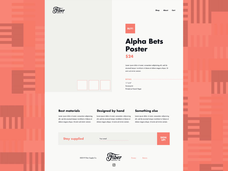
This low-fidelity wireframe design by Zach DeYoung is the perfect example to take inspiration from when designing an online store.
It demonstrates a basic but highly effective layout for a product landing page with a simple navigation menu, well-spaced dummy text blocks for product features, and a prominent mailing list Call-to-Action strip.
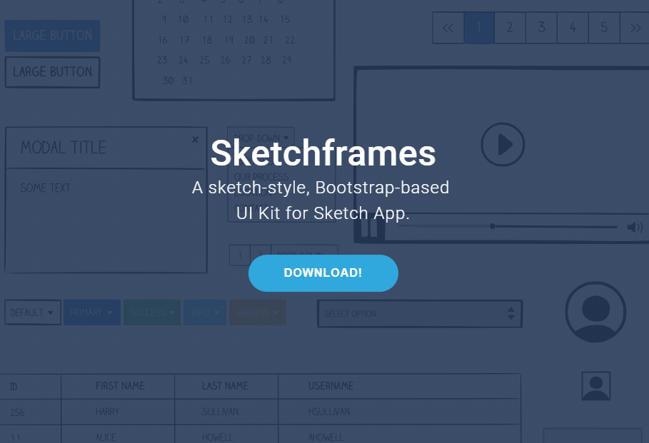
Sketchframes
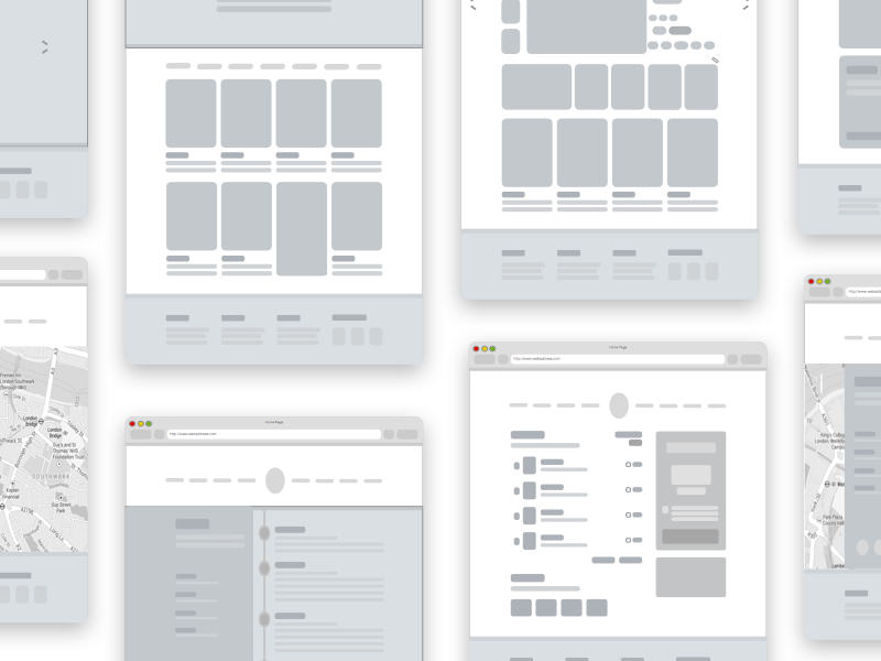
Mottom – Wireframe + Sketch file
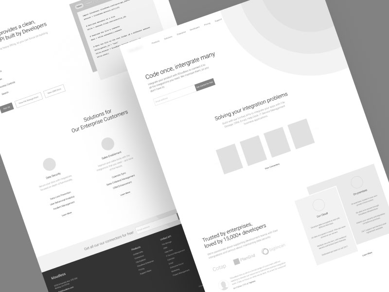
If you want to build a more sophisticated website, check out this wireframe example.
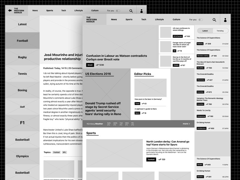
Newspaper Website Wireframe
Here’s a wireframe example of a more refined wireframe that looks organized and a bit fancier than the other ones presented here. It’s ZiyaFenn’s creation and it definitely stands out from the crowd because of its typographic elements and the tessellating block form. This can be used as inspiration for newspapers or news blogs.
Free sketch wireframe
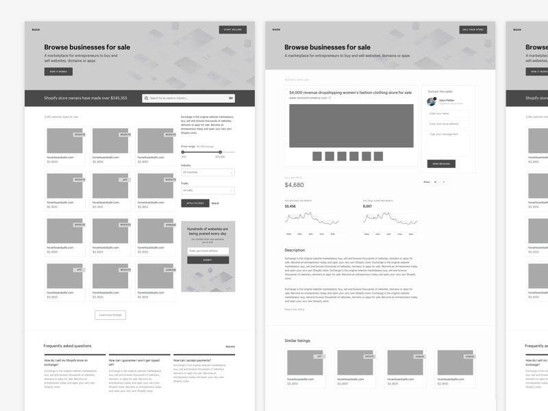
Shopify Exploratory Wireframes
Janna Hagan created this website wireframe for people who are trying to build Shopify sites. It is a high-fidelity wireframe focused on the layout design, but the wireframe is also useful for building visuals. Yet, if you’re interested in building Shopify sites, you’re better off just using a Shopify theme instead of starting from scratch.
Udacity Wireframes
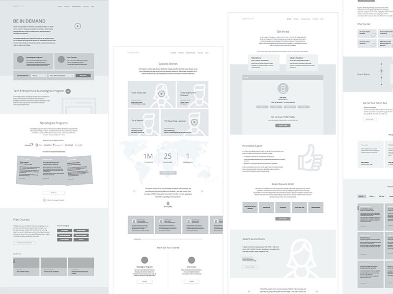
Regardless of what project you want to launch, there’s a lot you can learn by having a look at the wireframes created for Udacity, one of the Web’s most popular online learning sites.
There’s nothing fancy looks-wise at this wireframe example, but you can get a good idea of how much effort was spent in laying out each block of content for an overall pleasing and harmonious effect.
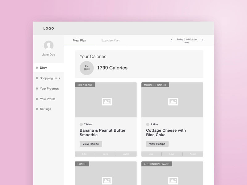
Back to My Body Dashboard Diary Wireframe
This website wireframe by Alyoop is an example of a simple digital wireframe. It’s neat, yet unsophisticated – a grey color palette, a few icons here and there, a few images and that’s it. Back to My Body Dashboard Diary is a good wireframe example for those who are just starting with this wireframing process.
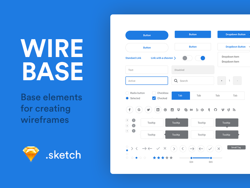
Wirebase wireframe example
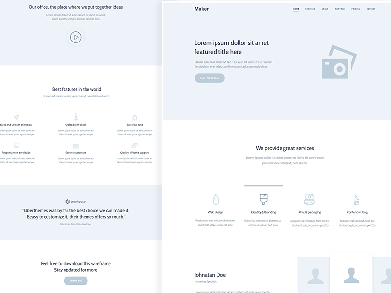
Wireframe Landing Page Free PSD file
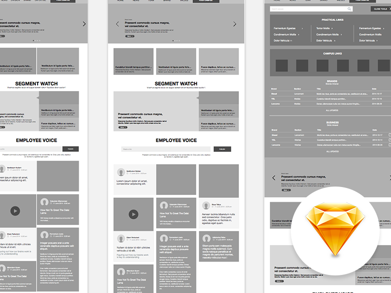
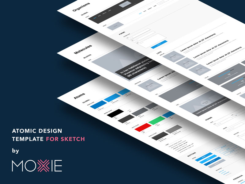
Atomic Design template for Sketch
Ending thoughts on these wireframe examples
Now that you know more about wireframes and you’ve got to discover all these beautiful wireframe examples, here are some principles to keep in mind whenever you build one:
- Build a scalable wireframe – you’ll always want to make changes or add elements to it
- Respect the browser window size/the screen size – the content will be positioned inside this frame
- Don’t build a wireframe based on the viewport – build it from header to footer
- Use realistic content when building your wireframe – it will give you the clearest look
- Stay away from stylistic elements – focus on functionality
And, of course, remember to have fun!
We hope you enjoyed reading this article on wireframe examples created by the team at Amelia (the best booking plugin for WordPress).
You should also check out this one one creating a web designer resume.
We also wrote about a few related subjects like website mockup, coming soon page, sketch plugins, dummy text generator, portfolio website templates, website design questionnaire, web design contract, and free landing page templates.
