The primary way for people to access information, products, and services is through the internet. So, having a website is essential for any company, including gym and fitness businesses. This fitness marketing strategy has the potential of reaching the most people and generating a great number of leads.
A fitness website is a place to introduce people to the fitness parlor, the philosophy, and any special focuses. Besides these, a site can achieve so much more. With the right tools, it helps to manage a schedule, appointments, and payments. It is also powerful in creating a community and engaging clients.
To make a successful fitness website, first consider who the clients are and what their needs are. What do they like and what do they prefer? Then work that into the web design. Consider how they are most likely to consume information. When they visit the website, what will they want to see or do?
This article identifies nine essential elements of any fitness or gym website.
Nine Essential Features of a Good Health and Fitness Website
Location and Contact Information
A very logical element is business information. A gym with one or more locations should list its addresses. But an online fitness platform should likewise provide all relevant business information.
This kind of information is what many visitors will be looking for. Make it easy for them to find exactly that kind of information. This includes, but is not limited to:
- Contact information
- Location
- Opening hours and office hours
- A description of the business
- Answers to frequently asked questions
Staff Info
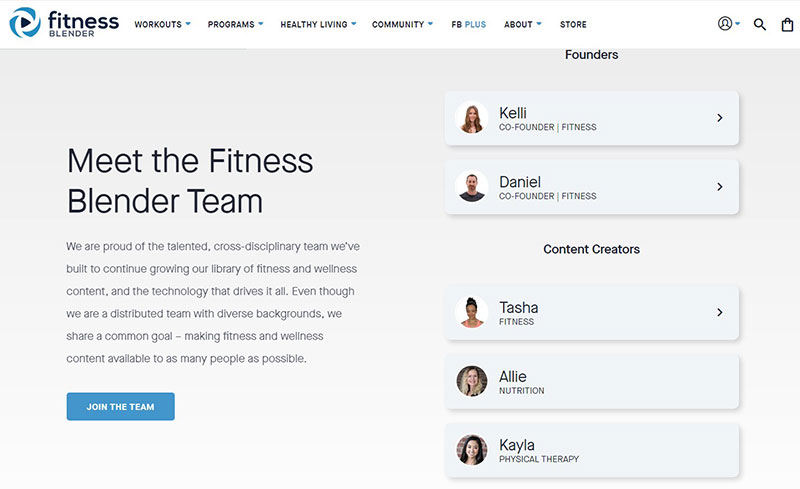
People prefer to work with the people they like and trust and they can be very particular about that. Rather than looking at the gym’s design or philosophy people focus on the people. This is all the more true for small businesses. The gym’s staff is what sets a business apart from the competition.
Adding pictures and short bios to a fitness website adds a personal touch. This is a very successful marketing strategy and attracts new members.
The About page is a great place to add this personal touch. The rest of the site is more limited in length and content. But the “About” section gives ample space and opportunity to be personal and relatable to the viewer.
Responsive Web Design
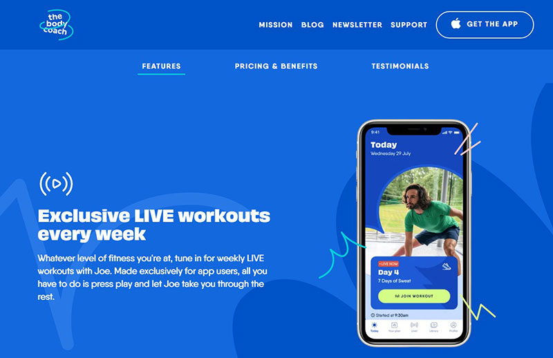
Many visitors will likely use a mobile device, rather than a laptop or desktop computer. For this reason, responsiveness is so important.
Responsiveness means that a website gives a good user experience on different kinds of devices and browsers. No matter whether they use a smartphone, an iPad, or a Windows computer they should be able to read the information in a pleasant way.
In technical terms that means that the website needs to be able to detect the kind of device a visitor is using and adapt to it. Search engines, like Google, give a higher ranking to responsive websites.
Competence
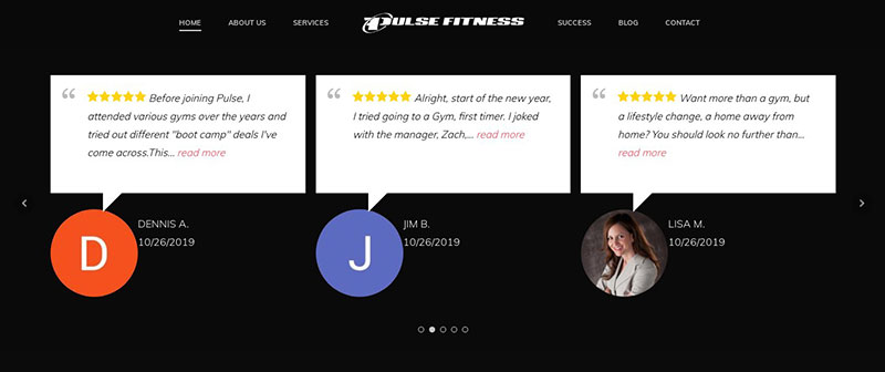
This is probably the most important feature of fitness websites. To move up in the fitness branch, show what abilities and skills the business and workers offer. These claims must be backed up.
It is good to tell people what they will receive but they also want proof of that. Personal trainers that fail to provide that proof will not generate trust in potential clients. Here, it does not matter whether the trainer actually has the qualifications or not.
Here are some ways to confirm competence. They are in order of importance:
- First-hand written testimonials.
- Third-party testimonials from other websites, like Facebook and TrustPilot.
- Image Testimonials.
- Video Testimonials.
Mobile-Friendly and Intuitive User Experience
Responsiveness was already mentioned but a mobile-friendly site is especially important.
People will not come back to a website that does not function well. A good website does not only function well technically, but also provides a positive user experience. This means that users will intuitively understand how it works and where to find the information they want.
Features that most visitors will be looking for are:
- Straightforward navigation
- Social media integration.
- Search bar.
- Simple and fast payments.
High-Quality Images
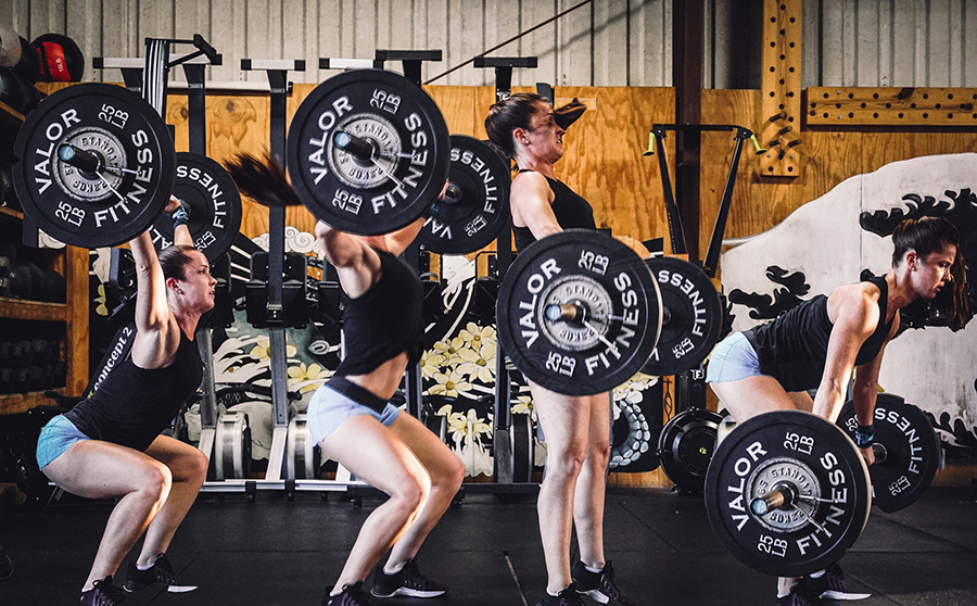
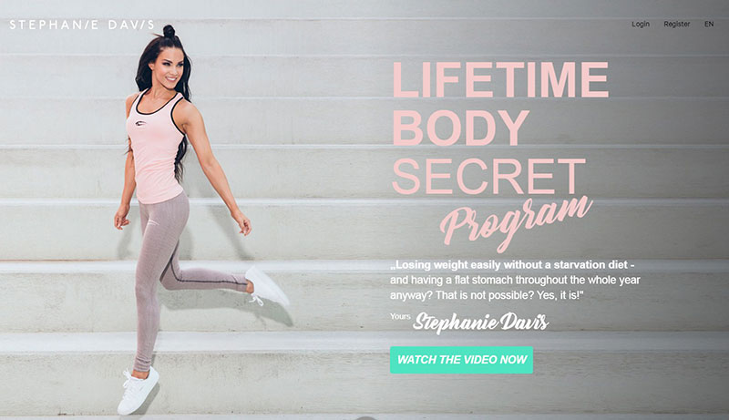
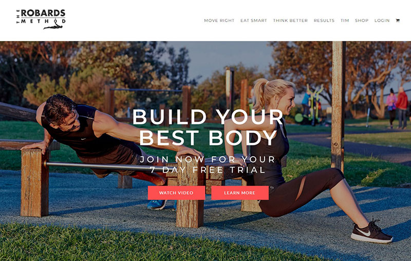
Images are very important. A picture of a toned athlete who is working out motivates a potential client much more than a thousand words. Looking at examples of successful fitness websites shows that all of them use these kinds of images.
The images of athletes feature very prominently on the best fitness websites. They pop and grab the attention. Good quality images are not only attractive but also show the details of the athletes’ bodies.
Using high-quality images can make a big difference in the attractiveness of the website. Poor-quality images are a big turn-off and make the site look cheap.
Gym Blog
A blog that is expanded on a regular basis with new content makes people come back. But more important is the improvements in SEO. In simple terms that means that a website is more visible in search engines. And that in turn leads to more hits.
A gym website that is often updated gives the impression that the site is no longer active. An up-to-date website with fresh information gives the impression that the fitness business is alive and that a lot is going on there.
Think about sharing posts on the latest events, new staff members, health and fitness information, and meals. It can be anything that interests the target audience.
Call to Action
A fitness website is not only a business card. It can be more than that. Most will be very disappointed if all they find on the site is contact information.
Visitors need an invitation to do something. Those invitations on a website are called CTAs, or calls to action. They take the form of a button that the visitor can click. The invitation can be to explore another part of the website or to sign up for something.
Class Schedule
Most gyms and fitness centers have a printed class schedule posted. Others have another printed schedule that members can take with them. That is great for the current members but what about prospective ones?
With an online schedule, they can check the time and see if it suits them. Then they can also sign up online. That is also useful for existing members.
Best Gym and Fitness Website Examples
Here is a list of selected gym and fitness websites. Only the best ones of 2021 are included. All candidates were selected based on several criteria, such as:
- Layout
- Overall impact
- Typography
- Usability
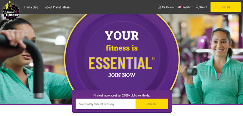
Planet Fitness
Besides promoting the business, this fitness website has a variety of health-related information. For instance, it has a section titled “Bring the gym to you“, which is very handy during the coronavirus pandemic.
It contains information about different fitness levels. It even has sections for beginners and individuals that want to do their first exercise.
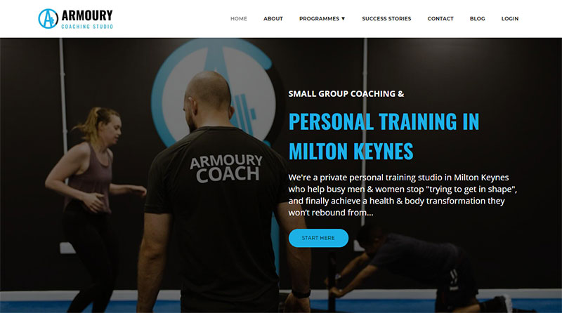
Armoury Coaching Studio
The Armoury Coaching Studio started as the personal training business of Lewis Roberts. He wanted to begin a fit-for-purpose center, which later grew into a large personal trainer studio. His goal was to end up as the first hit on Google.
He started by performing an SEO performance test. After that, he worked hard to optimize all pages, update the web design, and improve the user experience. This resulted in a clear branding for his business.
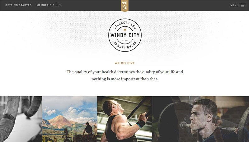
Windy City Crossfit
Windy City CrossFit provides a great example of a simple and elegant fitness website. It has a simple menu and a login section for members.
The attractive logo that is prominently featured projects a professional approach. The brick-type picture carousel gives a great impression and adds creativity.
Windy City CrossFit uses its website also to show what kind of fitness classes they offer. The images are used to inspire future clients.
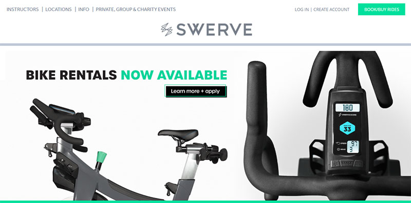
Swerve Fitness
Swerve Fitness places its members in different classes with different levels. After attending a class, Swerve will send an email that shows the performance.
The Swerve gym offers excellent facilities. Apart from the exercise rooms, they have a lounge, lockers, and a smoothie bar.
Their website has clear CTA buttons. It also has third-party testimonials from Bloomberg, Business Insider, and Fox Business. Swerve also offers a blog, a FAQ section, and various social media links.
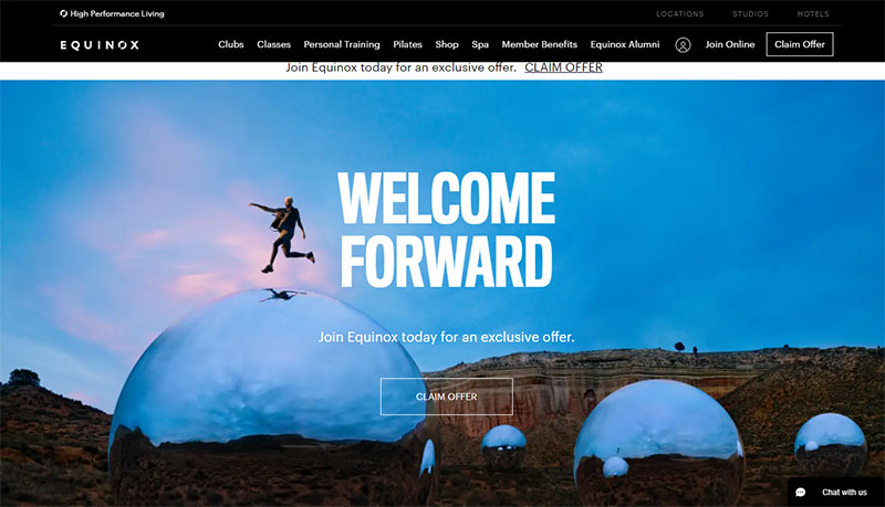
Equinox
The website of Equinox is one of the most exclusive and expensive fitness clubs in the world. Equinox displays its exclusiveness with a very fashionable web design.
The site is very navigable and information for different types of clients is easy to find. The site has information about Equinox’s services and terms. It has a branch locator that makes it easy to find the nearest Equinox club.
Livestrong
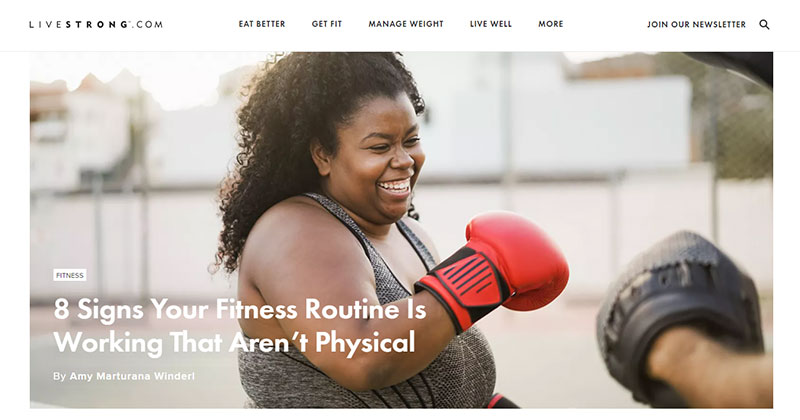
The Livestrong website has a large amount of information on a variety of topics. It has exercises, health care tips, and advice on mental and physical wellbeing.
The website is updated with new information a couple of times per day. It stays up to date with the latest trends in fitness and health.
Roman Fitness Systems
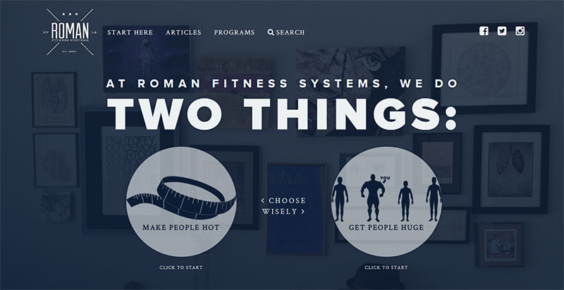
From the first look at the website of Roman Fitness Systems, it is clear that this one is different from all the others. The text on the website has a special sense of humor and has an intriguing effect on the visitor. The founder’s bio is fictional but the footer contains all the relevant business information.
The website makes interesting use of visual website design elements that help the viewer to make a choice. After choosing, the viewer is presented with personalized information.
There is also a direct search function.
Virgin Active
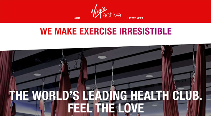
Virgin is an international fitness club. They have branches in Australia, Italy, South Africa, Thailand, and the United Kingdom.
The website is simple enough to make it easy to navigate. It does not overwhelm the visitor with too much information. The designers have chosen the powerful grey and red color scheme, which is in line with the mother company’s colors.
Burn Pilates
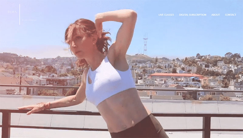
At Burn Pilates, they are very well aware of the huge demand for good gyms. At the same time, they know how much competition is out there and hence the need for a good website.
The designers at Burn Pilates have paid special attention to the layout, typography, and usability. The landing page shows a large workout image. This is accompanied by a video that engages and motivates people. At the bottom is a gallery with Instagram posts.
F45 Training
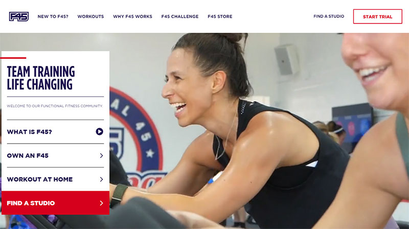
F45 started in 2012 in Australia. Since then, it has increased its client base and has even expanded to other countries, like the United States.
The website grabs the attention of the visitor right from the start. This is in part thanks to the unique templates that the site uses. Every single page shows CTA buttons and social media links. There is a video that familiarizes the visitor with the facilities.
How to Beast
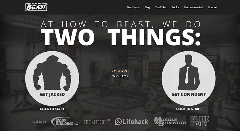
David de las Morenas is a personal trainer with his own website. His services aim at a male audience. This is reflected in his fitness website, which boosts trust in David’s qualifications.
The opening page shows two big buttons that allow the visitor to choose “Get jacked” or “Get confident”. The information is tailored based on that choice.
Additional information consists of a blog, book offers, a selection of YouTube videos, and a quiz that helps to define a training program.
Look Great Naked
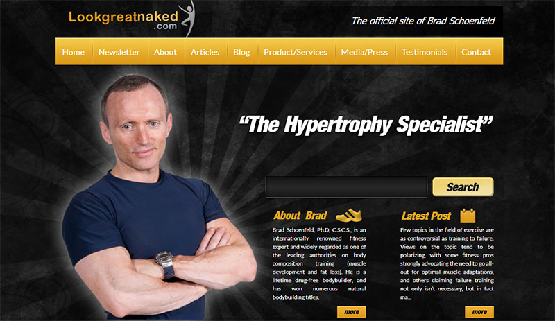
A great example of a catchy brand name. Besides the name, the content is also designed to grab the attention and motivate the viewer.
The owner of this fitness website is personal trainer Brad Schoenfeld, who also has a Ph.D. He runs this blog and offers personal coaching as well. Although the content covers a broad range of topics, it focuses on health and exercise.
Hussle
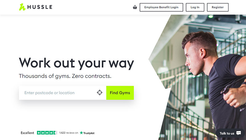
This is not a fitness website in the classical sense of the word. It searches which gyms are the closest to the user. It is up to gym owners to sign up for this website. They can include their business information so that customers can easily find them.
Customers can either log in with their username or sign in with their Google or Facebook accounts.
Hussle also features promos and discounts. This is something that many customers are looking for, which makes this an excellent marketing tool. The offers are clearly shown in the gym’s header.
Cyklus Vancouver
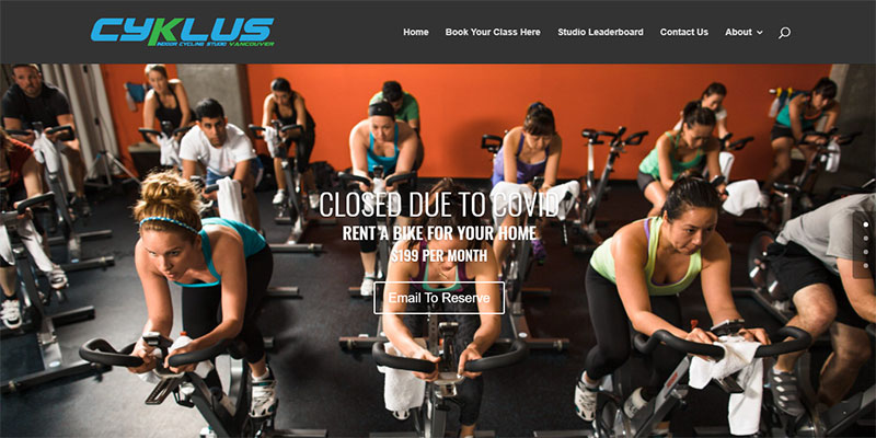
This next example of fitness websites comes straight to the point. The landing page shows a big photo banner that shows the studio’s interior and special offers.
Visitors can make a 360° tour of the studio. Also, the personal trainers are introduced on a different page. All offer the site, visitors find conveniently placed calls to action.
Orange Theory Fitness
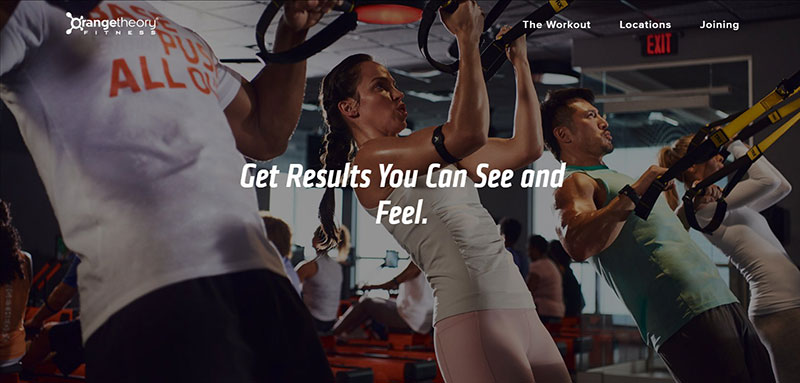
The special feature of this fitness business is that clients can exercise based on their real-time heart rates. Members can monitor their own fitness and work with more motivation towards their fitness goals.
The website is unique too. In line with the business’ name, there is an emphasis on the color orange. That is a smart branding technique. The website features a blog with lots of relevant information and obvious CTAs at the top.
Ending thoughts on building the best fitness websites
In the fitness business, it is important to stand out. Making a website will show how the business is different from all the rest. Therefore, the website must be easy to find and easy to navigate.
Every example on the list of fitness websites presents a professional presentation website. They build the client’s trust in the expertise of the trainers. They cover different types of fitness businesses and gyms. For sure, there is a lot of inspiration for anyone that wants to start a similar company.
When creating your own gym website, make sure to have a convenient scheduler, information about the training programs. Make arrangements for personalized programs. And do not forget the technical side either. About half of the hits come from smartphones. So, make it mobile-friendly and easy to explore.
Get more bookings with the right tool for the job
Staying organized has never been easier.
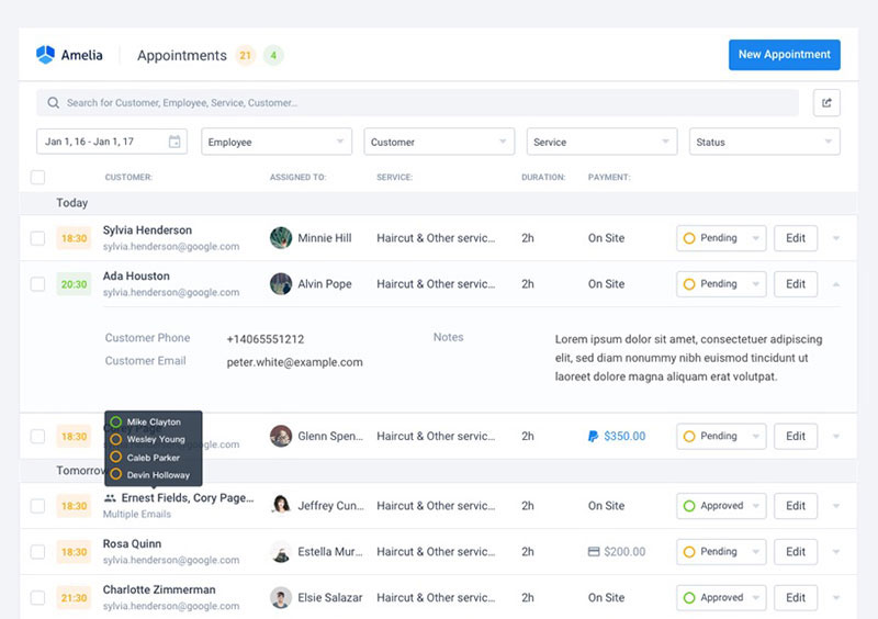
You can now manage your business and grow your brand with a single, powerful WordPress booking plugin that keeps all of your appointments in line, your clients organized and your business booming.
Amelia is the perfect gym booking plugin for business owners who need to streamline their booking experience both for their staff and their clients.
Amelia handles everything for you, even sending automated email or SMS reminders to your clients. No-shows? Not anymore!
The Amelia WordPress booking plugin adapts to different industries for a blissful online booking experience and employee management.
Want to know more? Check out Amelia’s awesome features to see what you are missing.
If you enjoyed reading this article on fitness websites, you should check out this one about barbershop websites.
We also wrote about a few related subjects like dental websites, photography booking apps, yoga websites, salon and spa WordPress themes, photography marketing ideas and hair salon websites.
