
Have you ever wondered why people visit websites regularly? First of all, they do that because of the good content they find there. If they consider that content relevant for their everyday life or for their goals, they will actively use that website.
Choosing good website layouts is the second factor you need to consider. The way the content is delivered through the website layout selected influences how a visitor perceives the website.
We care a lot about how our readers and website visitors feel when they access the website.
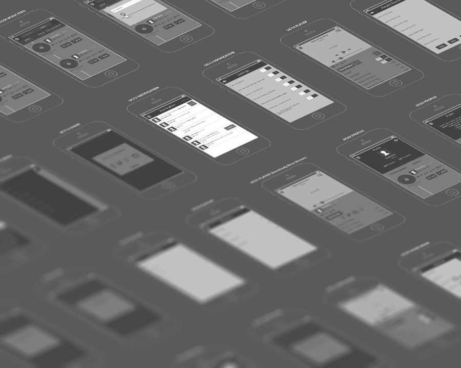
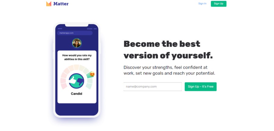
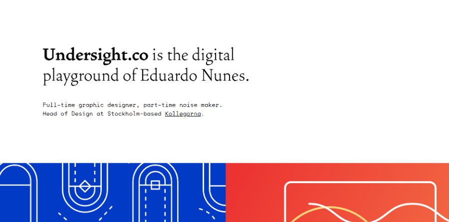
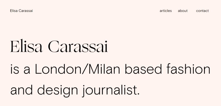
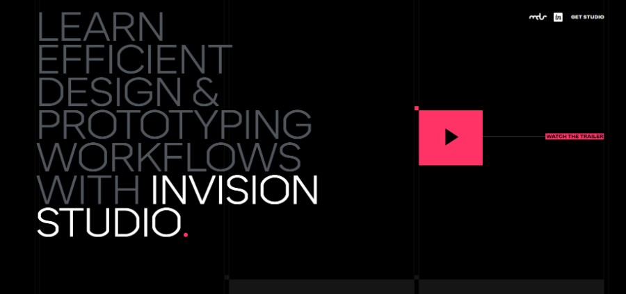
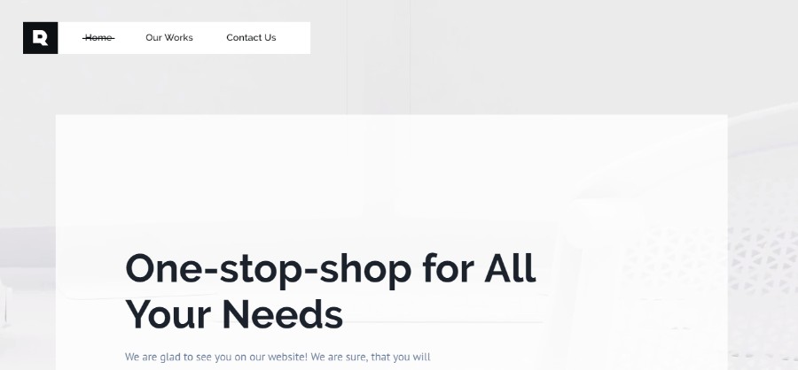
Check out some of the layouts we considered when building our website.
Table of Contents
- The definition of website layouts
- Advantages of using a good website layout
- How does a good website layout look?
- Different types of website layouts you should know about
- Website examples with good layouts
The definition of website layouts
Website layouts are basically patterns that define the whole structure of a website.
The information is structured according to the website’s goals and purposes. When navigating on a website, the visitor follows the exact website layouts that you used in order to visualize the website.
Advantages of using a good website layout
Website layouts include a multitude of benefits that transform websites into effective ones. In eCommerce, if you use the right website layout the conversions will be boosted significantly. Here’s why layouts are so important:
They are easy to use
The first big benefit of building a good website layout is that they are common for users and they know how to work with them. They immediately notice the website layout and they start navigating on the website with ease.
They offer a good UX
In a world where the user experience is so important, it is highly important to find a website layout design that is familiar, that gives users a sense of familiarity.
When users get to see something they already know how to use, they find it more comfortable to find the information they want to know more about. A familiar web design layout is the element that makes the website easier to digest.
They save you money
Website layouts can be reused in time, which means you can save a lot of money and time in the process. Because – as a designer – you don’t have to look for more web page design ideas or to experiment with new website layout templates.
Instead, you just change the visual hierarchy according to the website goals, adjust it to the theme and you are all set.
How does a good website layout look?
Making the layout streamlined
First of all, you need to understand the basic principle behind a web layout design. It has to be streamlined.
Streamlining means getting rid of all the clutter that other websites have, making them very easy to navigate. Using negative space and clean content is the best way to give visitors an idea of how they should navigate on it.
Keeping the goals of the website in mind
If you start analyzing website layout examples, you will see that each site is based on the goals it has. The website layouts selected are the ones that give the users a hint regarding what is important on the site and what isn’t.
Use negative space to balance everything out and include clear call to action buttons. These two elements should rapidly boost your conversions if that is your website’s purpose.
Think about how skimmers operate
You should know that most people who spend time in the online environment are skimmers. Skimmers want to find their information as fast as possible and leave the website in minutes.
In order to offer them what they need and make them come back, you need to create a layout that makes all the content on the website much easier to consume.
The best website that you can design would be one that:
- would help visitors take a look at the navigation bar and the pages you linked there
- is F-shaped
- has plenty of white space so that it’s easier to read the important information
- and has a call to action button created with a distinct color that would draw attention to it
Make it responsive
Users will immediately leave a website that is not responsive. Responsiveness and aesthetics must meet in order to create the best user experience. Website layouts should be scalable so that no matter the device people are using, the website will be displayed properly.
The simpler, the better
The website layout idea you choose must be simple to use. Visitors can’t find any difficulties regarding the navigation on your website. To gain web traffic, make sure that the website is simple and offers the exact instruments needed for smooth navigation.
Different types of website layouts you should know about
One column layout
From all page layout designs, this one is the most common one because of its simplicity. The one-column or single column layout presents all the content in one vertical column. This is the simplest way to present content without using an overwhelming amount of elements.
Even though this website layout is simple to achieve, most websites choose it because of the mobile revolution. People who display websites on mobile devices won’t ever encounter problems with a one-column layout.
Three boxes layout
A common layout is represented by the three boxes layout. As the name says it, the website content should contain a hierarchy where the first box is where you have the most important elements, and the other two boxes represent less important content.
These boxes can either be filled with text, images, or both. You will see this layout often in web design, and it is very easy to obtain.
Split-screen layout
This one is a good layout that makes the website easy to follow. This is the case with the split-screen layout. If the website’s purpose is to present two different pieces of content that are of equal importance and should be presented in the same manner, the split-screen layout allows you to do so.
Both parts of your content will be presented in a simultaneous manner, making it perfect for presenting elements that are equal in terms of importance.
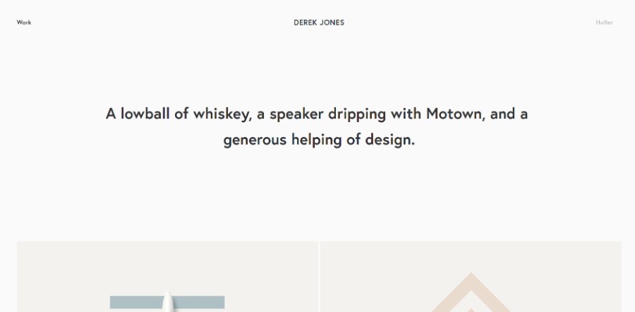
Asymmetrical layout
A layout that is more appropriate for a website that is less strict and more artistic is represented by the asymmetrical layout. It is a technique that is mostly applied where the elements don’t have a very particular order in terms of importance.
Website layouts that use asymmetry should not be imbalanced, in fact. Asymmetry is also a way to balance elements but in an unconventional manner. Using the weight of the elements to create dynamism is the best way to create a responsive, beautiful layout.
Fixed sidebar layout
The easiest and most common way to build a website design is vertical.
Creating a vertical column and placing a fixed element on one side of the website that stays in place while the rest of the page moves vertically is a common way to build the navigation bar style. This layout works because the sidebar is accessible at all times.
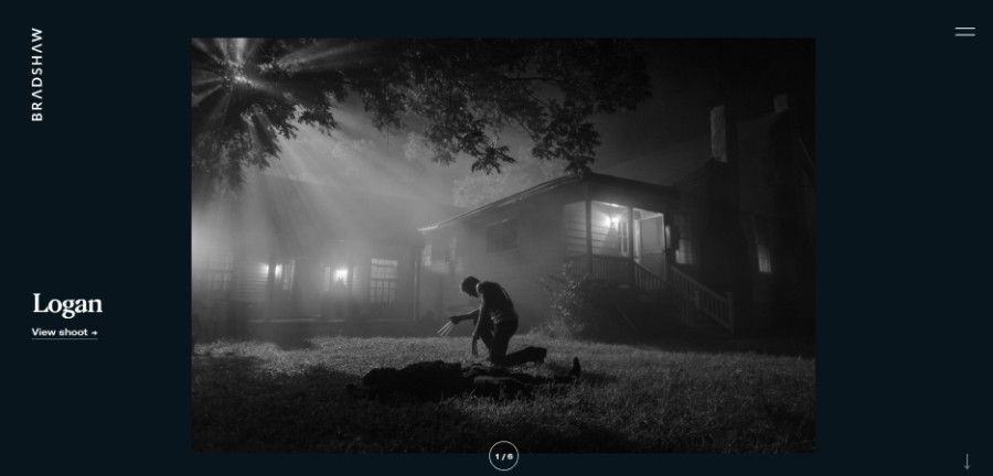
Full-screen image layout
Full-screen layouts are great for photographers or other types of industries that are mostly based on visuals.
Of course, the website layout can be used for different sorts of the website as well, considering that it is very visually appealing and is based on little to no content. Keep in mind to make the content readable by using opaque shapes on top of the image.
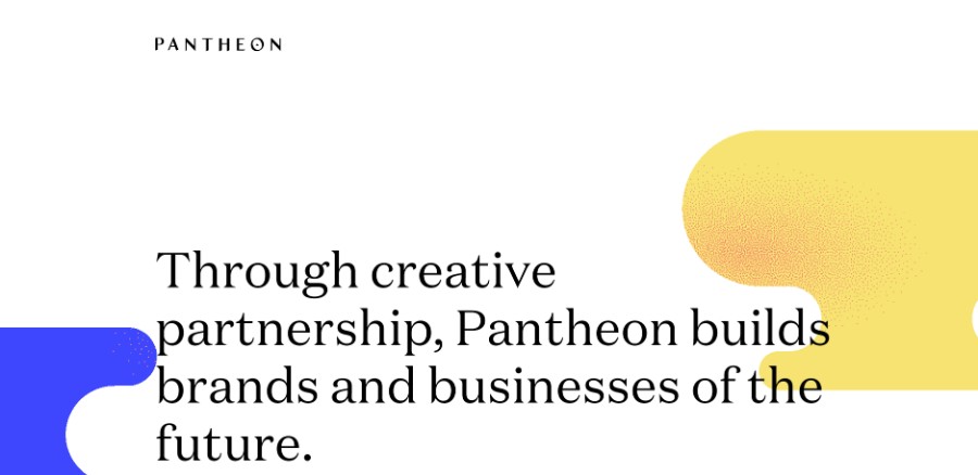
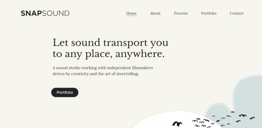
Website examples with good layouts
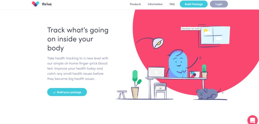
Take health tracking to a new level with our simple at-home finger-prick blood test. Improve your health today and catch any small health issues before they become big health issues.
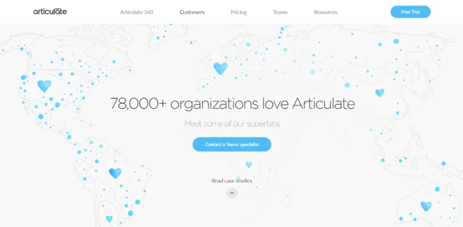
All the apps and resources you need to create courses, continuously updated with new features.
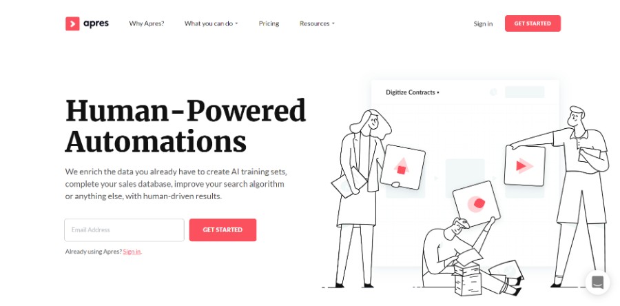
They enrich the data you already have to create AI training sets, complete your sales database, improve your search algorithm, or anything else, with human-driven results.
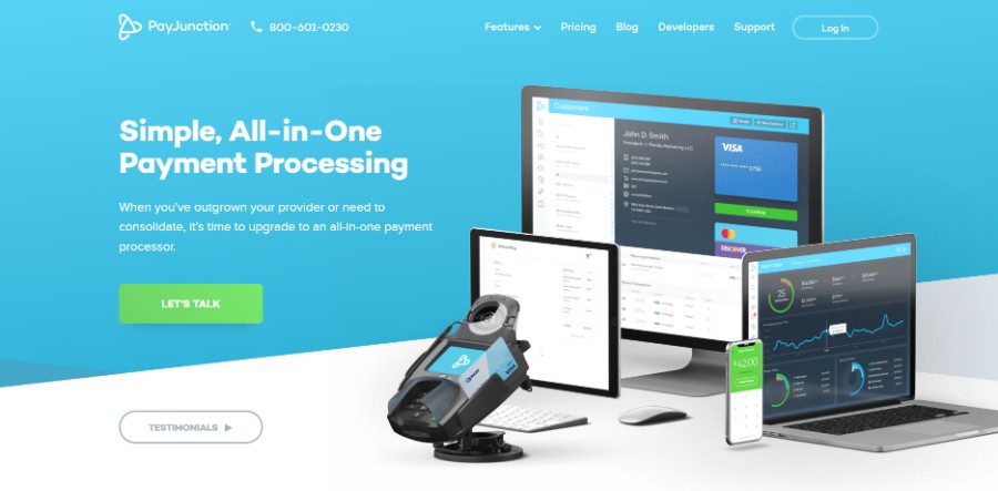
When you’ve outgrown your provider or need to consolidate, it’s time to upgrade to an all-in-one payment processor.
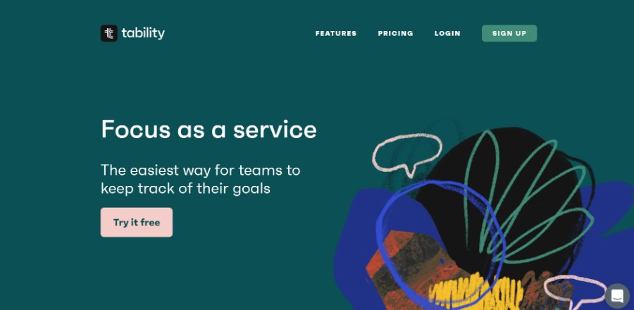
The easiest way for teams to keep track of their goals.
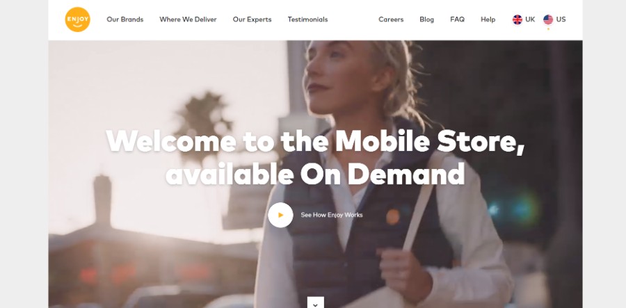
Enjoy brings the best of the store through your door.
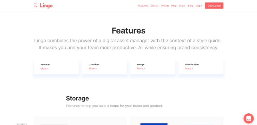
A modern digital asset manager for your brand and product. Create a shared asset library. Empower your team. Ensure consistency. Increase productivity.
Start conversations with visitors on your website through Smallchat and convert those visitors into customers. All from inside Slack.
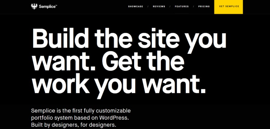
Semplice is the first fully customizable portfolio system based on WordPress. Built by designers, for designers.
Metrics, forecasting, and engagement tools for teams using Stripe, Braintree, and Recurly.
Ending thoughts on awesome website layouts
You should choose the website layouts that meet the goals of your website. If you want to improve the UX and conversions of your website, always choose simple website layouts. Keep the layout intuitive and beautiful to transform your website into a success.
We hope that you enjoyed this article created by our team at Amelia, probably the best appointment scheduling plugin for WordPress.
You should also check out this one on loading animation.
We also wrote about a few related subjects like modern web design, layout design, bad websites, button design, visual design, best 404 page ever, web design trends and dark background. But also an interesting piece with the best WordPress table plugins.
Have you ever wondered how to become a UX designer? Many people think that it is a very complicated process that takes years. In fact, the world of UI design is quite open to new ideas and people. As long as you are passionate about UI design, UX design, A/B testing, or prototyping, then you are perfect for this job.
Because it’s pretty difficult to find reliable sources to learn from, you need a solid starting point. This is why you need to get informed about UI designers or UX designers you can learn from and good resources from where you can get your information from.
At Amelia (the best WordPress bookings plugin), we are determined to make sure you get the necessary information about how to become a UX designer. Aside from this, please keep in mind that the Internet has unlimited resources, and joining a UX community can open a lot of doors for you.
Table of contents
- What is UX design?
- The first step in UX design
- How to become a UX designer?
- Improving your UX design practices
What is UX design?
When asking yourself what exactly User Experience design means, you need to consider several factors. First of all, you should understand that corporate industries are now using UX as a buzzword, a term that takes part in the trend. The User Experience can be defined as the impression a person has when interacting with a product or a service.
This is the simplest definition of the term that you will be able to find. An official definition was launched by the International Organization for Standardization and it is very similar to the previous definition, only a few terms changed. This definition states that User Experience is represented by “a person’s perceptions and responses resulting from the use or the anticipated use of a product, system or service.”
The characteristics that should define UX design are represented by usefulness, usability, desirability, accessibility, credibility, findability and value. The process of designing UX has to respect several goals, depending on what type of interaction is demanded the respective product or service. How to become a UX designer is not that complicated if you know your data well.
The first step in UX design
The first step in becoming a UI/UX developer is to understand two basic principles. One has to do with knowing that the process of becoming a professional UX/UI designer takes time. You will encounter difficulties and you may feel overwhelmed at times if you just started your path, but the patience and perseverance are both worth it. After understanding how to become a UX designer, the rest will come naturally.
The second principle has to do with not aiming for too much. Even though you feel like you start getting around UX/UI design pretty easily, it’s important to acknowledge the fact that you are a beginner, and you will need some time to get your way around this job. Moreover, professional UX designers actually try to stick with the mind of a beginner designer because it’s easier to handle projects this way – always open to learning more.
How to become a UX designer?
UX design courses
Taking courses is the easiest way to assimilate the needed information to start performing as a UX designer.
If you feel like you can’t find the information you are seeking, and nothing seems to be helpful, a course can send you in a good direction without much effort. You will pay for it, but it’s definitely the easy way to learn some things about UX/UI design.
If you think a course is not worth the price, just think of the actual cost of designing an app: a cost that translates to revenue for you as a UX designer involved in creating the app design.
There are plenty of courses online. Here are two articles that are shortlisting some of those courses:
Targeted audience
Learning how to become a UX designer is not that easy. You also have to learn how to work with your audience and select it properly. Once you set the purpose of your design, it’s time to reach the audience you consider relevant.
A User Experience designer has to identify the requirements and preferences of the audience he is working with, long before launching the final version of the design. The targeted audience will offer you the exact starting point you need to create something that people enjoy.
Don’t forget that subjectivity may intervene and what you consider suitable for design, your audience may not. People are interpreting designs in their own ways, and these might not always be the same as yours, which makes the process a little bit more complicated. You need to come up with a UI design that is appealing to the users.
Storytelling skills should be improved
You may wonder what storytelling has to do with design. Well, UX and UI designers must be great communicators. Without good communication skills, the final design won’t reflect the ideas and requirements of the client. Storytelling does exactly that – putting the ideas of the client in something visual, which can transmit an idea.
Using stories to build your design will make it much easier to transmit the idea that the client wants his audience to receive. Storytelling becomes a skill that all UX designers must constantly improve in order to engage the targeted audience and please the customers.
Be open to new ideas
UX designers might be tempted to use the first idea that pops into their heads and seems good enough. In fact, this is a mistake and should be avoided at all costs. When the first idea comes to your mind, take some time to think about its quality and how it can be bettered. Finding many good ideas and choosing the winning one is a process which should take some time. Think that the idea you choose will reflect in the final outcome of your design.
Be a good user yourself
You already know what does a UX designer do, but you might need to put yourself in the position of a user to understand exactly what your work means to regular people who are actually trying to find a product they enjoy using.
Once you have learned how to become a UX designer, all you have to do is start thinking like a user and find out what a person would want to see on a website or mobile app.
Manage testing sessions
Most problems with your UI/UX design will be exposed during testing sessions.
The usability of the design you developed must be tested in different sessions to see how people can interact with it. If everything goes right in these stages, you are ready to launch the design and track the reactions it gets.
Improving your UX design practices
Improve your overall communication skills
As mentioned before, learning how to communicate efficiently is part of being a good UX/UI designer.
Of course, you should know the technical terms used in UX design, but you shouldn’t bother your clients with them, as they don’t know what they mean or how important they are.
Use a language that is very friendly and makes clients understand what you mean. Don’t alienate your customers from the design you create. Instead, explain what you are doing in simpler terms. It is a highly-appreciated skill that not all UX designers have.
Rethink old creations
When you feel like you are out of ideas and you remember you had projects that went well, you can use that core idea but transform it according to the needs of another client. Analyze your previous work and see if the projects could help you in any way after that.
Seek the extraordinary
You understood how to become a UX designer, you tackled your first projects – all that’s left is to find a style of yours that recommend you instead of others. You need to think out of the box and avoid limiting yourself in any way.
Set goals for yourself as a UX designer
Setting goals is a practice that will allow you to advance in your career. Learn how to set challenging (but not overwhelming) goals for yourself and prioritize them above anything else.
The easiest way to achieve the goals you set is following these few principles: make the goals achievable, set deadlines that you respect, set reminders and reward yourself each time you reach one.
Seek the much-needed inspiration
UX/UI designers need to find their inspiration somewhere, and the best way to do it is by reading about the latest trends and trying new things. The design field and all of its subcategories are changing constantly, and it is a benefit you should take advantage of.
Keep your designs simple
You can’t fail by using simplicity, so whenever you feel like you can’t get around a project, stick with what is common and simple, but very responsive. These are the types of designs that never fail.
Ending thoughts on how to become a UX designer
You don’t need any degree to learn how to become a UX designer. You only need the time and motivation to do it, as well as some talent and passion for this industry. Follow the tips you found in this article and get to work.
If you enjoyed reading this article about how to become a UX designer, you should check out this one on affordance in web design.
We also wrote about a few related subjects like persona templates, UAT testing, User Interface design principles, web usability and UX designer portfolio.
Minimalism is appreciated all the time. As the saying goes, less is more. Minimalism is very popular in modern design approaches. Simple website design will always generate the wanted reactions and exploring the principles of minimalism is a condition for building good websites. We noticed this ourselves when we tested several landing pages for Amelia, the best appointment scheduling plugin for WordPress.
Minimalism involves experimenting with color schemes, scrolling, transitions, buttons, and so on. There are several elements that should always be present in minimal design, regardless of the rest of its composition. In this article, you are going to learn what does it take to come up with a simple website design that suits the needs of all visitors.
Table of contents
- The minimalism principles in web design
- The benefits of keeping website design simple
- Tips for building an efficient minimalist website
The minimalism principles in web design
There are several principles that should always be present in simple website design:
- Making the interface user-friendly
- Navigation should be hidden
- The color scheme should be composed of a maximum of three colors
- Negative space is a condition in minimal design
- Using multiple, different fonts is recommended
- No excess details should be included
- The buttons shouldn’t be too numerous
The benefits of keeping website design simple
The number of conversions
After thorough analysis, it has been proven that websites that have a simpler design bring more conversions to the table than websites that are excessively decorated.
For instance, when an eCommerce store adopts a more minimalist look for their website, the increases in sales are visible in a short period of time. Basic websites seem to be overall more efficient than complex ones.
Minimal design doesn’t get outdated
Sleek websites seem to be timeless, even though minimal web design is constantly changing, and new web design trends emerge every month. This is why some websites tend to become outdated very fast. Adopting a trend that recently appeared on the Internet is not the best option if your goal is to design a website that will last a few years from now on.
Simple website design allows you to avoid applying updates to it very often. A minimal website will always keep your visitors from getting distracted, offering them the exact information they need.
People who visit websites looking for products or services won’t be very interested in the way it looks, but in how easy it can be used. These are a few key points in simple website design that you should keep in mind next time you put together a project:
- Minimalism won’t get outdated because it became a style rather than a trend
- Minimalist websites are the most responsive ones
- Minimalist websites have the best loading times because of their simplicity
- A clean website design allows visitors to focus on the products and services you sell
- Navigation is very intuitive on simpler websites, reducing the bounce rate
Tips for building an efficient minimalist website
Simple website design is based on making everything easy to access and to notice. The reason why that happens is that aesthetic websites contain fewer elements, which allow users to focus on what they are really looking for. The level of usability in simple websites must be better, as the interface is intuitive and less crowded.
Aesthetics should – of course – balance with functionality, which is usually difficult to handle in more complex websites. Minimalism contains all these elements and combines them into one great result – clean websites. Here are the principles that make a minimalist website easy to use:
Good navigation
When looking for simple website examples, you will see they have one thing in common – good navigation. In order to offer the users a chance to find whatever he is looking for fast and easy, you need to put together intuitive navigation. You need to use just a few buttons that are visible to the visitors of the website and that are very responsive at the same time.
The menu button should always be present on a website, but the other buttons that send users to other parts of your website should be encapsulated into the menu button. This way, you keep the menu very minimal, but easy to navigate and highly responsive. Make sure to highlight the buttons so that visitors know they can use them to find what they need.
Using negative space (white space)
Negative space is a term used in design which has to do with the space that is left empty in a composition. This is also called white space and it is paramount in minimalist website design. Using white space has many benefits, among which improving the UX and focusing the visitors’ attention on what truly matters on the website.
White space is also used as a balancing tool in simple website design. If the main content blocks you have designed seem to be too crowded, adding white space will solve the issue and will make the website look much better. The minimalist style in website design is perhaps entirely based on the use of negative space and making all elements intuitive to use and very responsive.
Studying typography
Because there are a few elements on simple sites, you need to focus on typography. Capturing attention can be done only by selecting the proper fonts.
Today, simple web design makes great use of typefaces, which can express a specific message or add a nice touch to the entire design. Here are some of the most used fonts this year:
There are many unique WordPress themes that have great typography and you can try them.
Bold fonts
Bold fonts are very appreciated in minimal design and not only. Fonts started to be more and more creative and the only rule to respect when choosing one is to be easy to read. A font that catches attention quickly and it’s also easy to read is more than enough.
Sans Serif fonts
Don’t forget that you can combine multiple typefaces on a minimal website, but they need to match. Sans Serif fonts have a very crisp look that works best with bolder, creative fonts. Choosing two fonts that match can be tricky, which means you should try multiple combinations until you find the one that looks best.
Combing text blocks
Once you put together the content you will include on the website, divide it into blocks and choose the appropriate font for each. By doing so, you give visitors the chance to rapidly scan the content and find the exact information they need.
Using less content
Talking about content, it’s important to keep it to a minimum. As you may already know, minimalism is all about reductionism. Minimizing the number of elements on a website also includes less content, but more quality content. Simplify the structure of your text, use plain language or professional vocabulary and only include information that would be relevant for the user in one way or another.
Hierarchy
In simple website designs, you need to focus on visual harmony. Creating a simple website is all about putting things in order and achieving that visual balance that people often seek when navigating on a site. Aligning elements beautifully, following a grid or a previously-created layout are two details that will turn the website into a well-built one. Bulking all the content in one single place is not an option.
Smart color palettes
Minimal web design is based on using just a few colors. These colors don’t necessarily have to be black and white. In minimal design, using an accent color is a good practice that creates a focal point. Simple website design requires well-thought color palettes that suit the brand of the client. These should be selected according to the preference of the client and the features of the website.
Images
The images you include on the website also have to be minimal. Beautiful visuals represent the only way to get closer to the users and transmitting a message in a more emotional manner. Images are not only decorations but ways to sustain the written content.
Showcase of minimalist websites
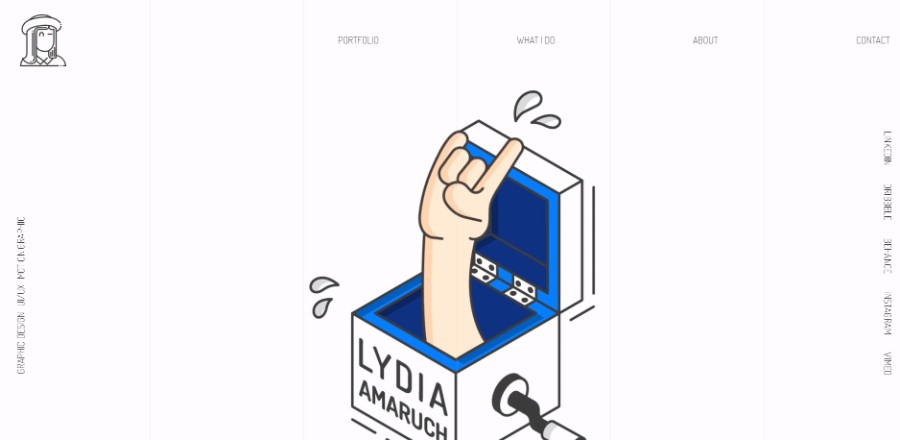
Lydia Amaruch has always been passionate to create, illustrate and photograph everything around her. She is now a graphic designer, UX/UI designer, and motion graphic designer.
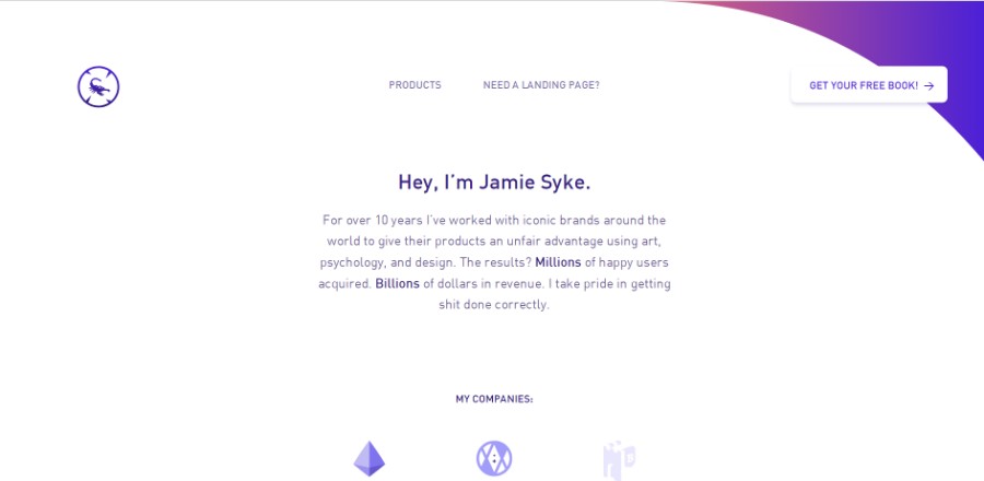
For over 10 years he’s worked with iconic brands around the world to give their products an unfair advantage using art, psychology, and design. The results? Millions of happy users acquired. Billions of dollars in revenue.
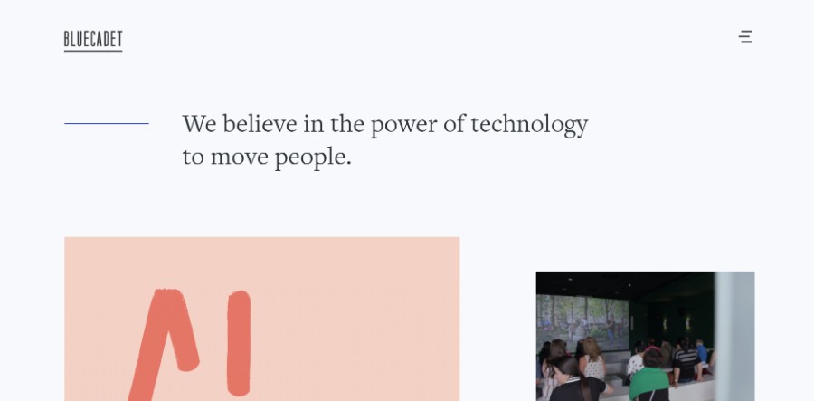
They believe in the power of technology to move people.
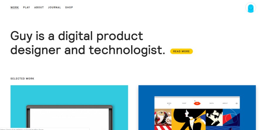
Guy is a digital product designer and technologist.
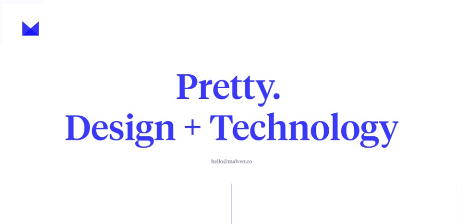
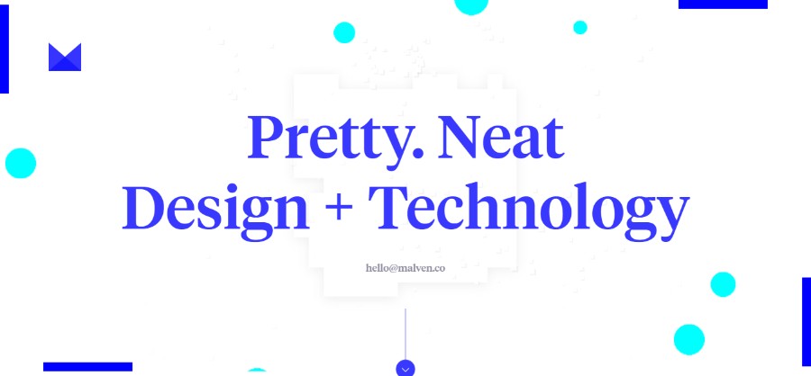
Malven Co. is the web/digital/interactive design and development studio of Chris Malven, based in Des Moines, Iowa.
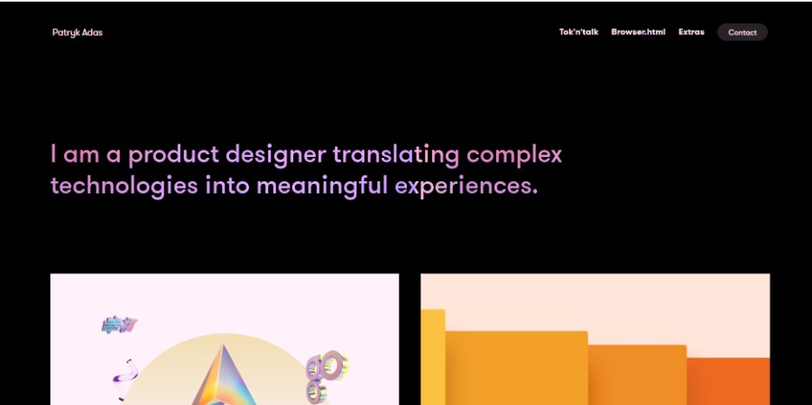
He is a product designer translating complex technologies into meaningful experiences.
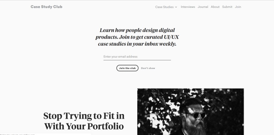
This site started as a side project back in 2015. Collecting only the latest and greatest case studies about digital product design.
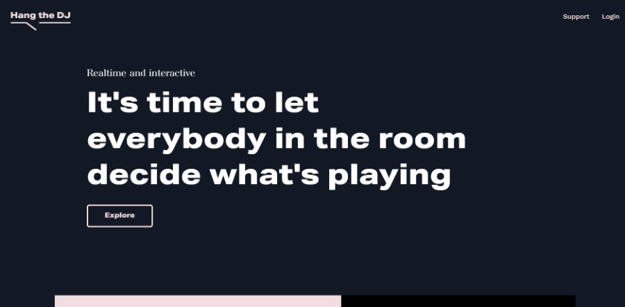
Hang The DJ is the democratic playlist for the upvote era. Set up a playlist, invite your friends to join, and kick off the battle of the tunes.
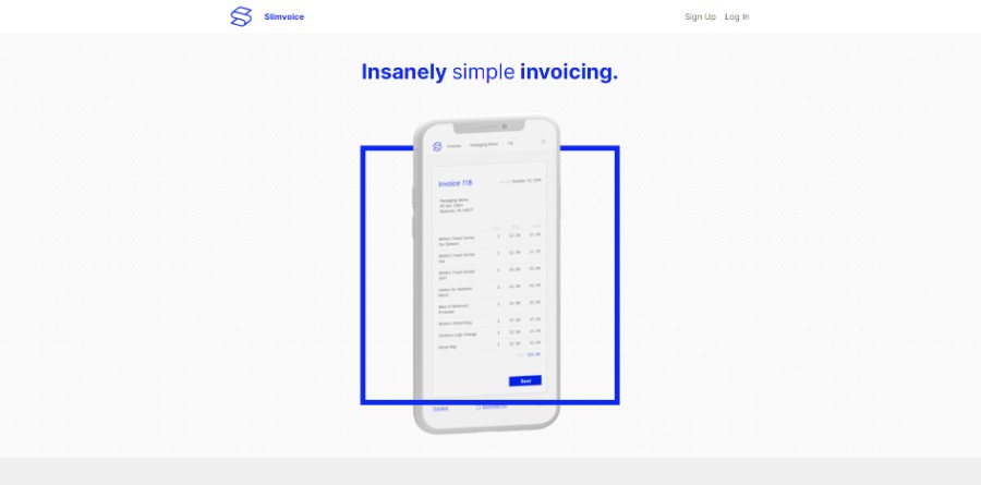
Slimvoice redefines the lightweight app – from the engineering to the design – so that you can spend less time sending and more time receiving.
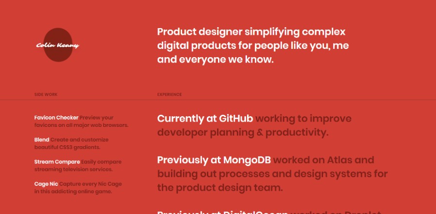
Product designer simplifying complex digital products for people like you, me and everyone we know.
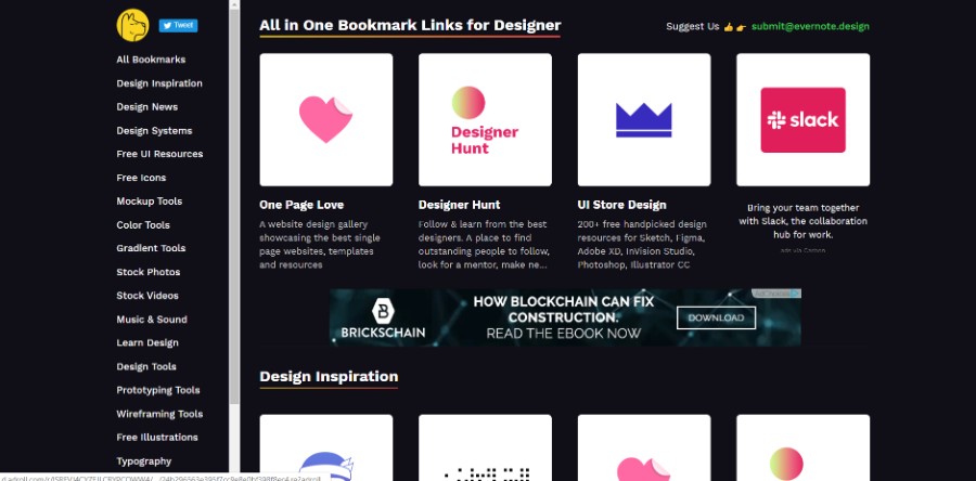
All in One Bookmark Links for Designer.
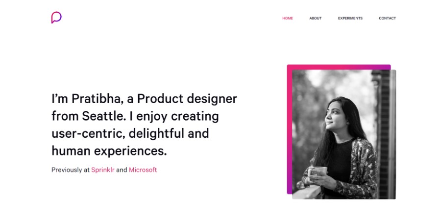
Pratibha is a Product designer from Seattle. She enjoys creating user-centric, delightful and human experiences.
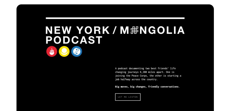
A podcast documenting two best friends’ life-changing journeys 6,380 miles apart. One is joining the Peace Corps, the other is starting a job halfway across the country. Big moves, big changes, friendly conversations.
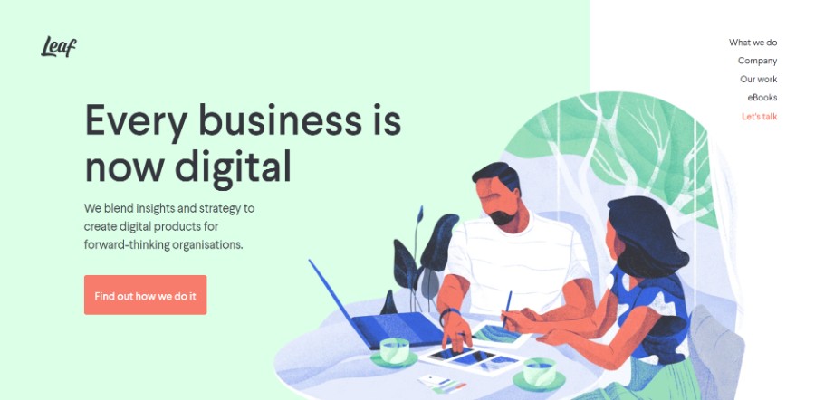
They blend insights and strategy to create digital products for forward-thinking organisations.
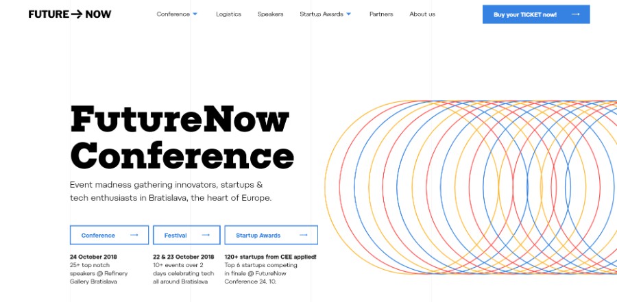
Event madness gathering innovators, startups & tech enthusiasts in Bratislava, the heart of Europe.
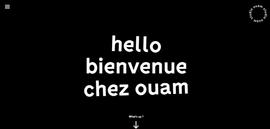
Studio OUAM is a creative agency based in Paris and Bordeaux in France. They specialize in visual identity and brand creation.
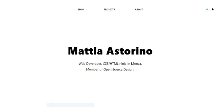
CSS/HTML architect in Monza and member of Open Source Design.

Rezo Zero is a graphic and digital studio that designs and develops unique brand identities and tailor-made digital solutions. Rezo Zero believes in perfection by design and performance by default.
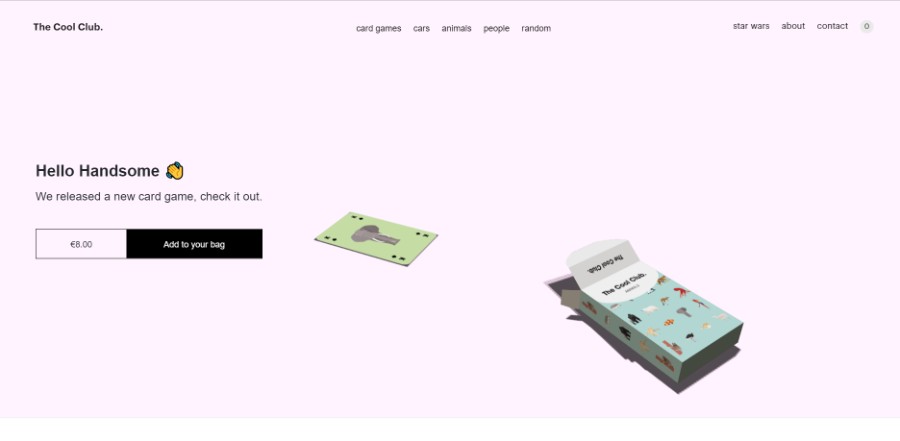
The Cool Club is a collection of the most famous, visionary men and women from around the world. Ante up, it’s time to claim your fame.
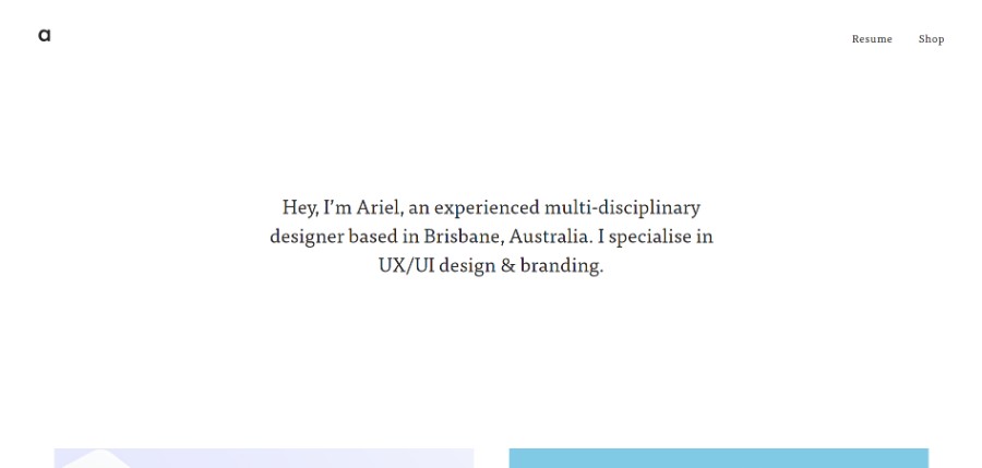
Ariel is an experienced multi-disciplinary designer based in Brisbane, Australia. She specialises in UX/UI design & branding.
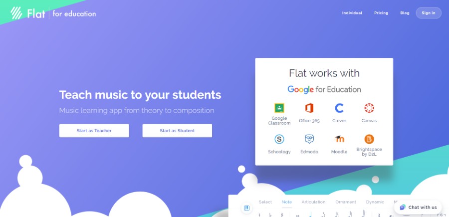
Flat for Education is designed for your music classroom. You can use it on any device to access and create your musical compositions or music education activities.
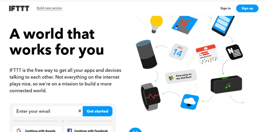
IFTTT is the free way to get all your apps and devices talking to each other. Not everything on the internet plays nice, so we’re on a mission to build a more connected world.
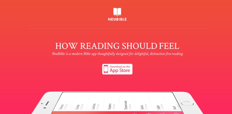
NeuBible is a modern Bible app thoughtfully designed for delightful, distraction-free reading.
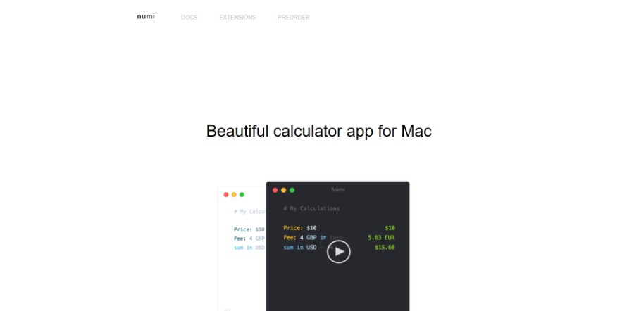
Numi is a beautiful calculator app for Mac.
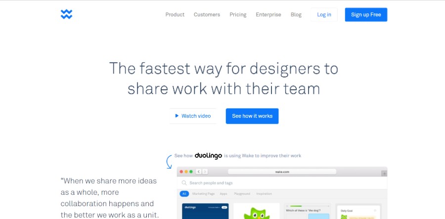
Wake makes it super easy for designers to share work and collect feedback from their team.
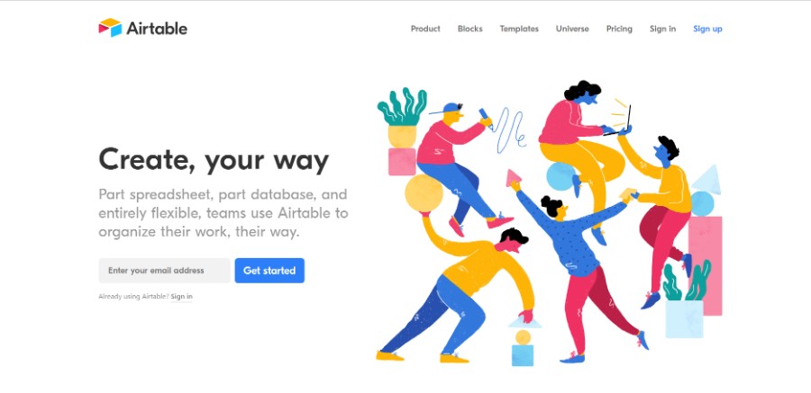
Part spreadsheet, part database, and entirely flexible, teams use Airtable to organize their work, their way.
Finest selection of branding, website & product designs for those who believes in simplicity, beauty and high-quality in design.
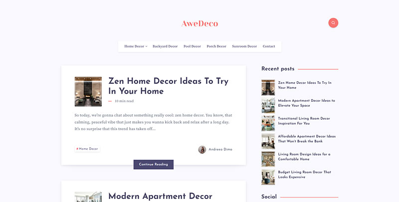
AweDeco is a home decor blog with a minimalist design, brimming with ingenious design inspiration. Readers enjoy a curated selection of chic interior styles, innovative DIY projects, and sustainable living ideas, all communicated through a clean, simple, and user-friendly website interface that champions aesthetic appeal and easy navigation.
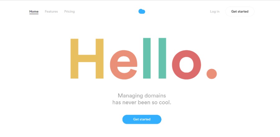
Nuage connects to your registrars’ APIs, allowing you to manage all your domains in the same place. No need to transfer your domains. No worries, we don’t change the infrastructure. Everything remains secure, exactly where it should be.
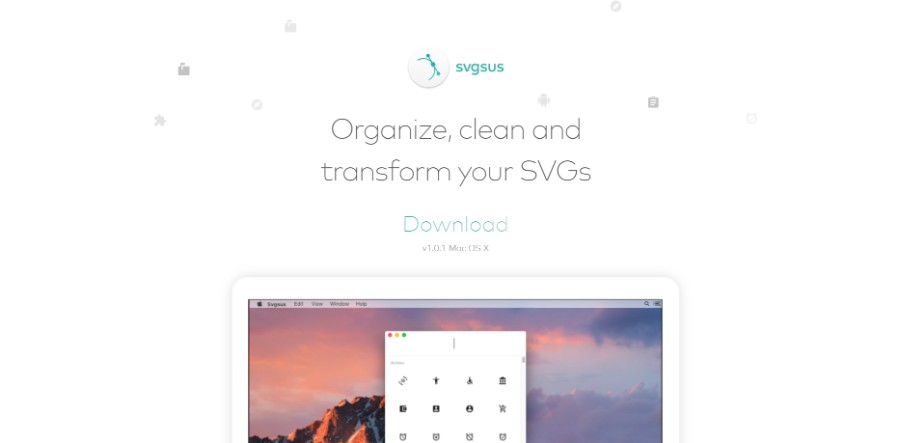
With Svgsus, you find the icons you’re looking for. Search and drag or paste the icons to whatever software you prefer.
Ending thoughts on these simple website design examples
Simple website design is not that simple to create. As you have probably seen in this article, there are many principles to follow to obtain a good result. Most designers prefer a minimalist design because content overload is never beneficial. Thinking about each element of minimal website design and investing more time in usability and responsiveness will help you come up with the best minimal website.
If you enjoyed reading this article on simple website design, you should check out this one on portfolio websites.
We also wrote about a few related subjects like meet the team, single-page website, corporate website design, coaching websites, digital agencies, web development companies, creative websites, artists websites, black websites, and website backgrounds.
Website design has changed dramatically over the years, hasn’t it? Do you remember the best website designs from the beginning of the new millennium? Today, only 18 years later, the standards have changed completely.
Not only trends and technologies are completely different nowadays, but the users’ expectations have also grown much higher. For example, many millennials prefer to book appointments online. Amelia took on the challenge to provide them with the perfect way to do so.
In the online era of websites and online businesses, creating beautiful, fully functional designs is quite challenging, especially with all the new technologies and with the constant changes in the industry standards.
2018 will be remembered as the year when it became obvious that all best websites have to be mobile friendly because, for the first time ever, mobile usage has taken over the desktop browsing. With all that in mind, let’s take a look at the best website designs of 2019.
How were websites designed in 2019?
First of all, let’s talk some more about the web page design and some of the newest trends in that field.
Drop shadows and depth
Ustwo
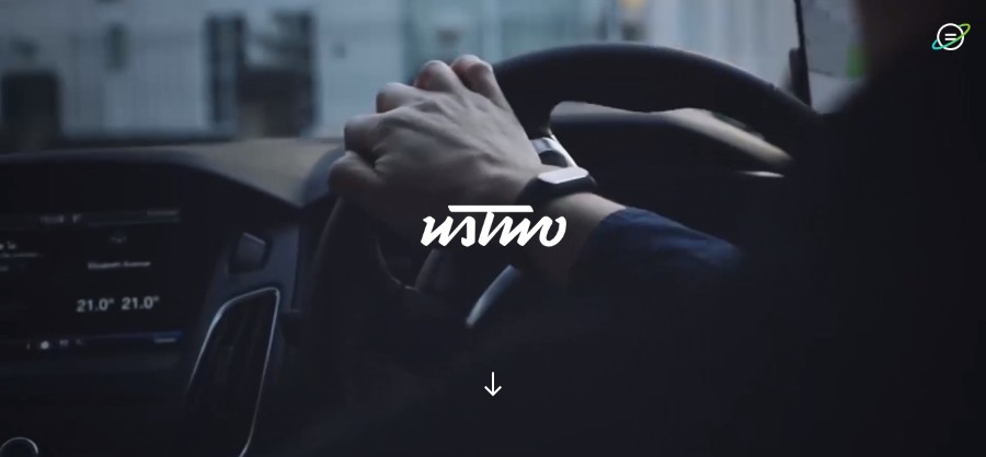
They work with businesses and organizations of all shapes and sizes, from early-stage startups to the world’s leading brands, to create digital products and services that solve the problems of today as well as define the opportunities of the future.
Atölye15
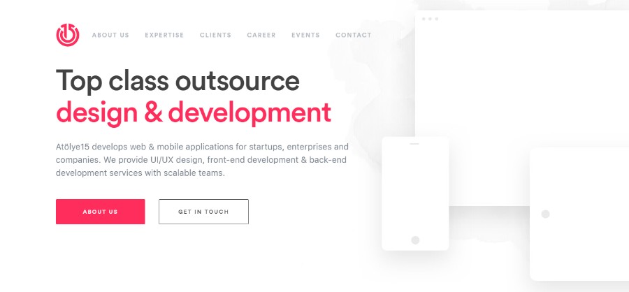
Atölye15 develops web & mobile applications for startups, enterprises, and companies. We provide UI/UX design, front-end development & back-end development services with scalable teams.
Plasso
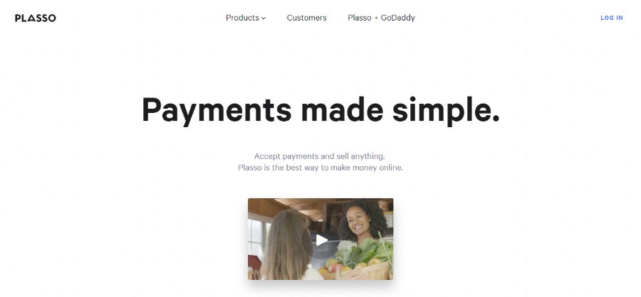
Plasso is a powerful all-in-one e-commerce platform. It makes it easy to start and grow your own business.
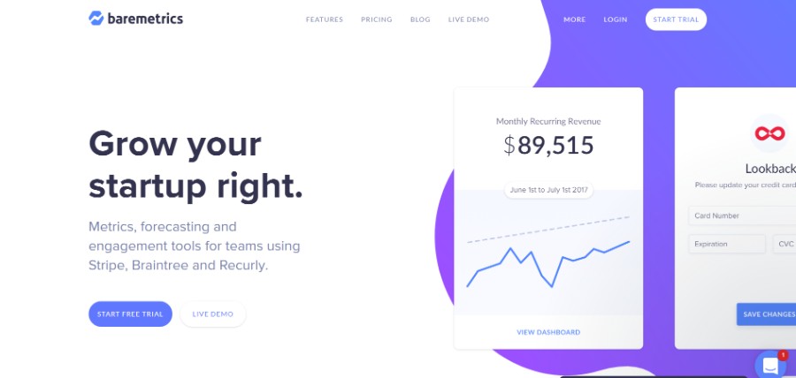
Stripe
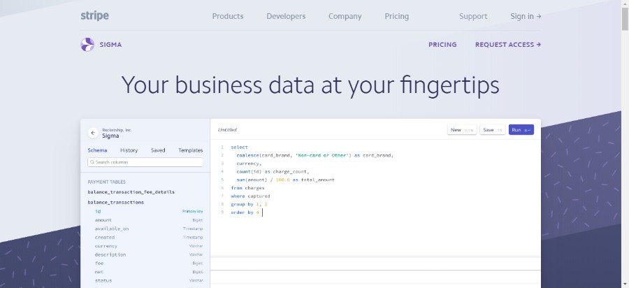
Stripe Sigma helps businesses quickly analyze their Stripe data and enables teams to get faster business insights.
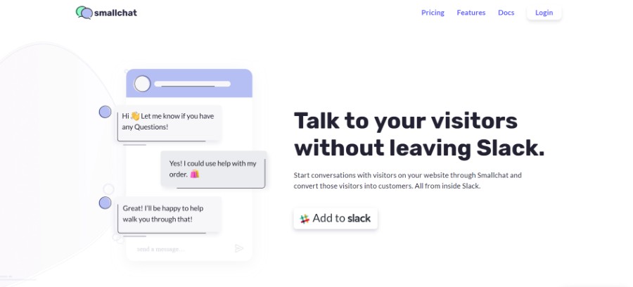
Smallchat
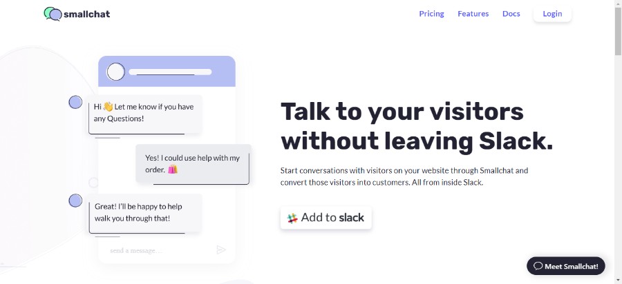
Smallchat runs inside your Slack team, which means no additional software to learn. Be available to chat with visitors on your website and your team members all in one place. Each conversation creates a new thread, allowing your team to manage it all from one place.
Julian Buehler
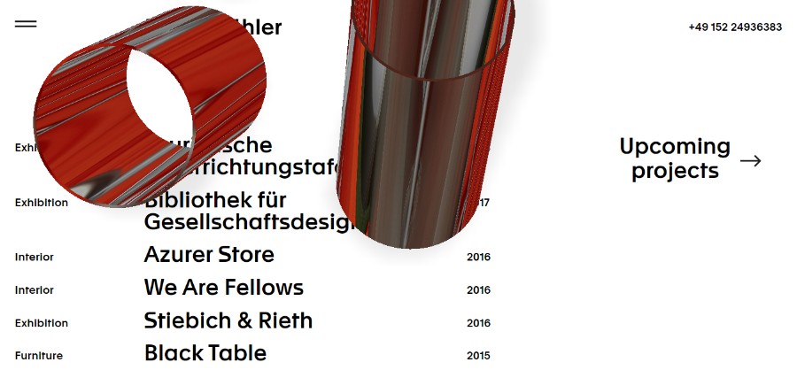
Julian Buehler’s portfolio website features an amazing example of the smart use of shadows.
The use of shadow is nearly as old as the website creation itself but we still think it is pretty important to mention it. After all, website designs have changed a lot and with them, we got to see some really cool designs that play nicely with shadows.
Grids and parallax layouts have made it possible for the designers to create depth and the illusion of a world beyond the screen. And while the flat design was very popular in the past years, that is not the case anymore with the best new sites.
Vibrant color schemes
Studio Job
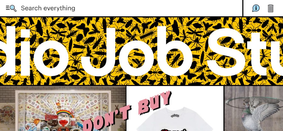
Studio Job was founded in 1998 by Job Smeets in the renaissance spirit, combining traditional and modern techniques to produce once-in-a-lifetime objects.
Secureinvest
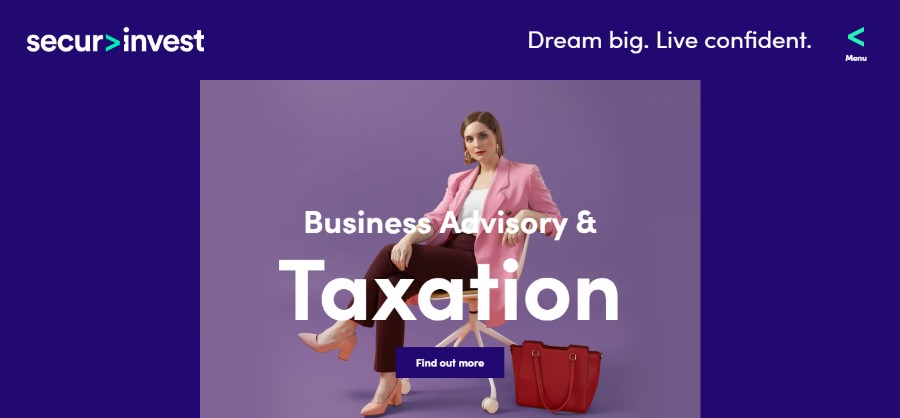
Securinvest is a full-service financial solutions group comprising three specialist areas – financial advice, business advisory & taxation and mortgage broking.
Humaans
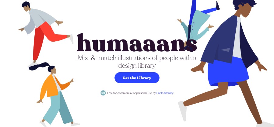
Humaaans provides Mix-&-match illustrations of people with a design library.
So Young
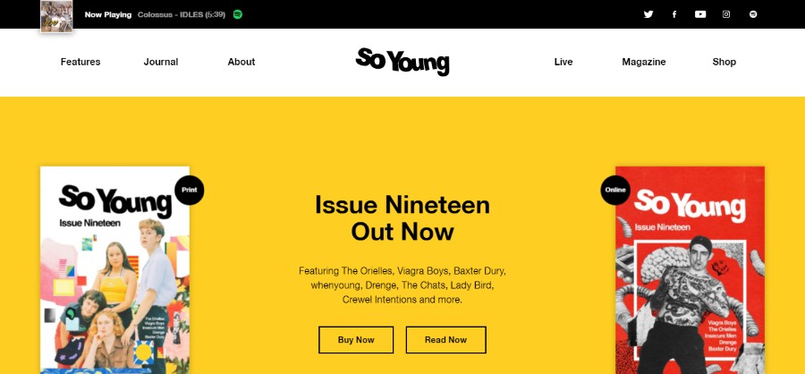
The pages of this magazine represent a labor of love. So Young is a gift from us to you under the assumption that you keep going to gigs, buying records and looking at the sleeve artwork as you listen.
illo xmas
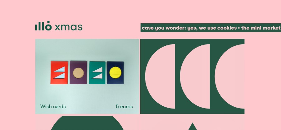
The illo Xmas mini market is a fun studio project created by illo.tv. It’s a temporary online store where they have been free to play with illo’s most iconic colors and shapes, to create our own version of some classic objects of every Xmas: wish cards, decorations, candles and recipes.
Demisol
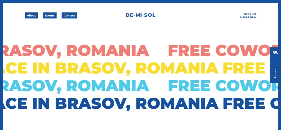
Demisol is a free coworking space dedicated to hackers, designers, developers, marketers, troublemakers, and other disrupters.
MiM
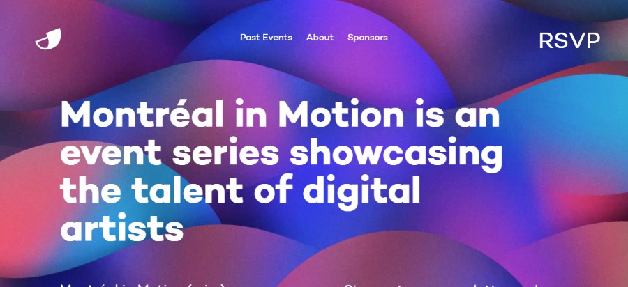
Montréal in Motion is an event series showcasing the talent of digital artists.
OGK Group

OGK Group of Companies integrates the leaders in geological exploration hither and yond.
Train Body Brain
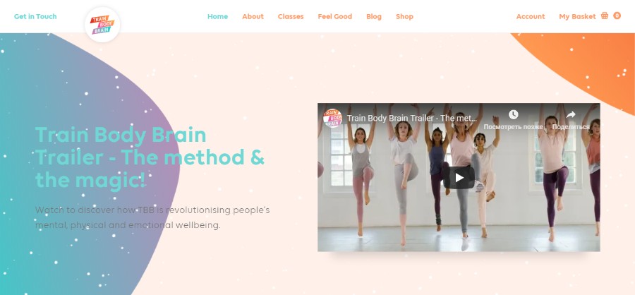
Train Body Brain™ is about building resilience mentally, physically and emotionally. Our classes provide you with fitness and meditation habits to support your wellbeing – both now and for the rest of your life. We put you in charge of your wellbeing.
Fishfinger
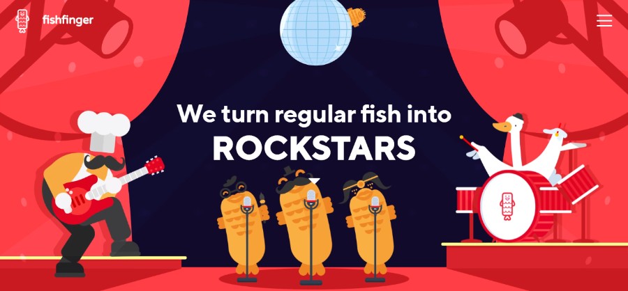
They’re a team of creatives that love nothing more than creating incredible stories. They specialize in branding, animation, and web; uniquely combining our skills to produce magical digital experiences. They don’t do ‘boring’.
If you check out the top websites of this year, you will notice that 2019 is a year of really vibrant colors. In the past, we’ve seen lots of simple designs with safe colors but that trend has shifted dramatically. All the best new websites use vibrant, saturated colors combined with headers that are no longer just horizontal but reimagined with slashes and hard angles.
Animated elements
Del Cambio
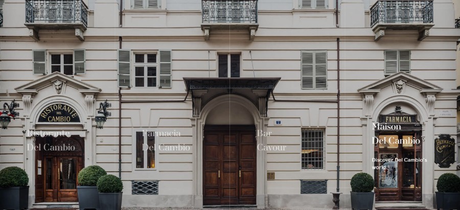
Del Cambio presents you with the animated portfolio of restaurants.
Squilla
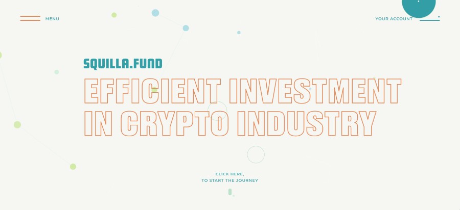
Squilla is the pioneering company in the market of ICO valuation. We assist in making sensible investments in rapidly increasing crypto industry all over the world.
Candy Chui
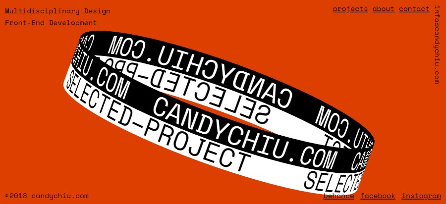
Chiu Pak Ki, Candy is a Multidisciplinary Designer and Front-End Developer. She graduated from the Hong Kong Design Institute with Distinction. Specializing in interaction design and visual communication, her interests span on memorable immersive user experience journey and delivering design-driven solutions.
Betamatters
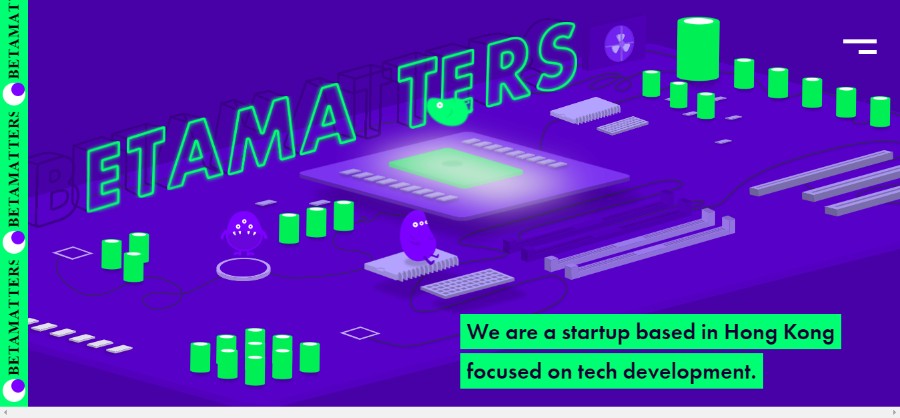
Betammaters is a startup based in Hong Kong focus on tech development.
On Corps
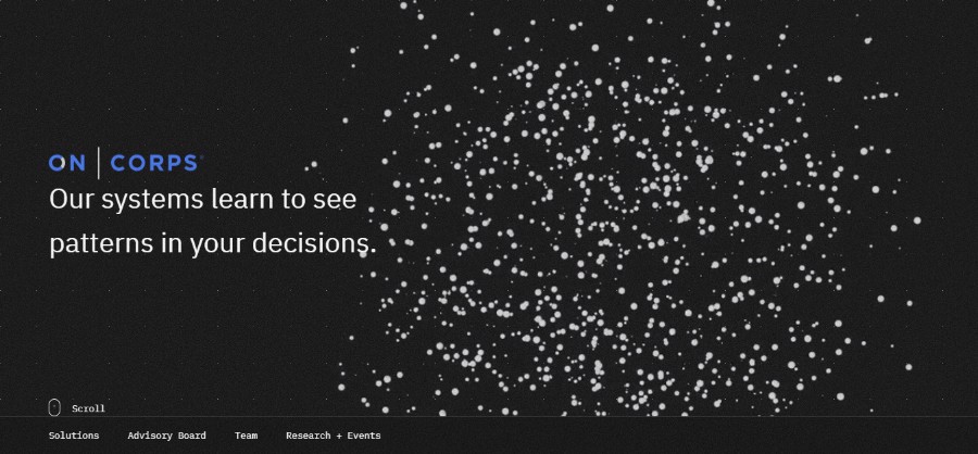
Their solutions learn from your best decision makers then deliver intelligent decision guidance to everyone.
Sprout

Sprout offers email, SMS, and automation for marketers and agencies.
Resonair
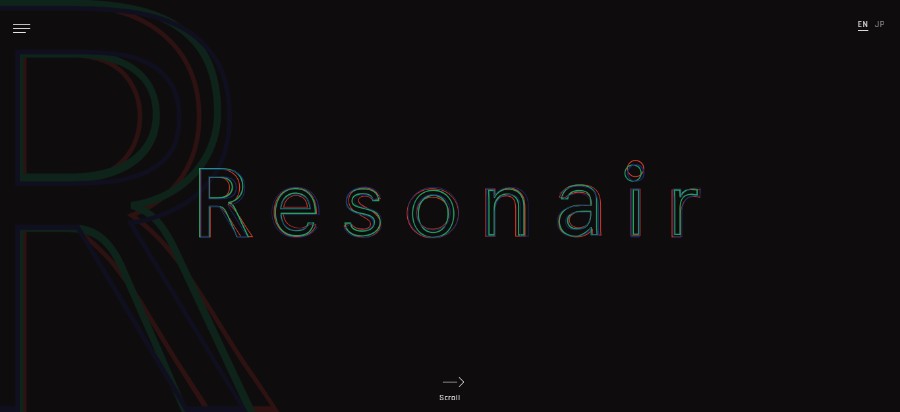
Produced by Enhance, Resonair played a key role in the 2016 release of Rez Infinite — a title that won high praise from fans and critics alike, as well as the first-ever Best VR Game title at The Game Awards that same year.
Lego Foundation
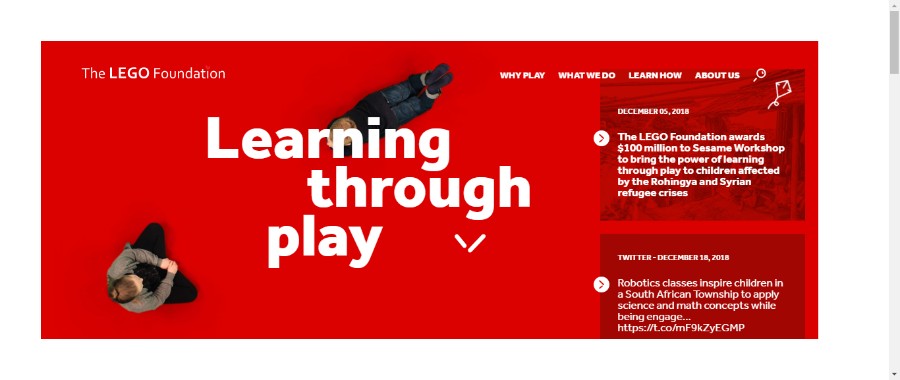
In the LEGO Foundation, they share their overall mission with the LEGO Group – to inspire and develop the builders of tomorrow. It demonstrates their shared heritage and is the guiding star for everything they do.
Standby
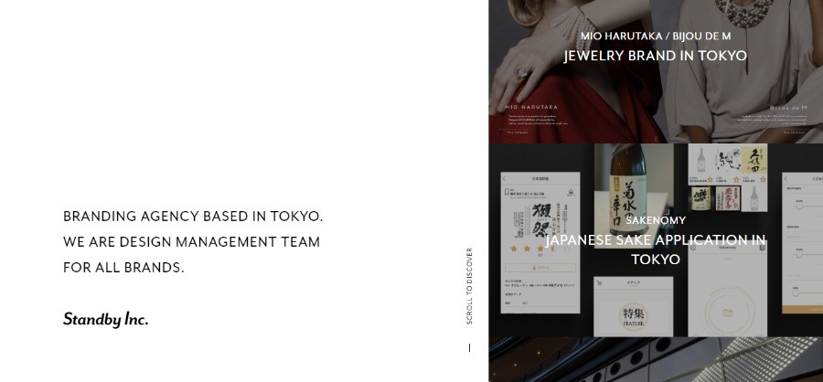
Standby is a Branding Agency Based in Tokyo. They are a design management team for all brands.
The Inlay
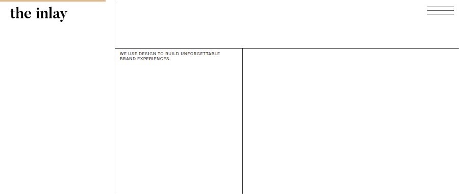
A minimalistic shell that rejects mainstream web trends to showcase everything The Inlay. Combining the Le Corbusier grid with an occasional unexpected interactive twist.
Adding animated elements to your website ideas could result in a really cool design. Try looking for the design inspiration online and you will notice that a lot of best website designs incorporate elements such as particle background to create movement without taking too long to load.
The purpose of the elements like these is to attract the users’ attention and create a memorable first impression the moment the users open the website. The best website design often incorporates motion graphics like these.
Video Backgrounds
POGG
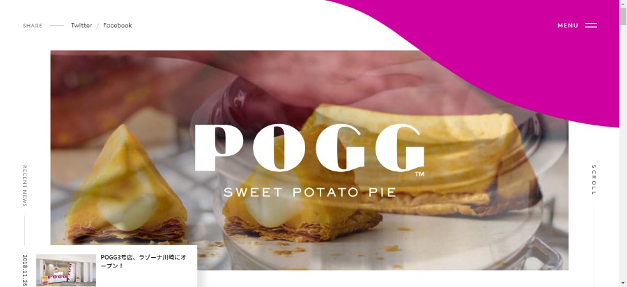
POGG is crispy, fluffy and creamy all into one irresistible triangle, that no other sweet potato snack can satisfy.
Rondesign
Rondesign Agency portfolio website.
iFly KLM
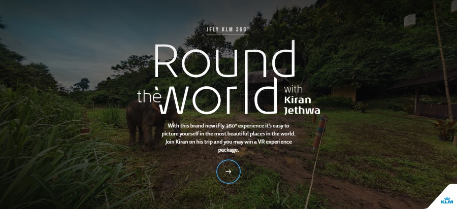
In this interactive 360° experience it’s easy to picture yourself in the most beautiful places in the world. In the first episode, they take you on a trip to Northern-Thailand.
Human Behind Every Number
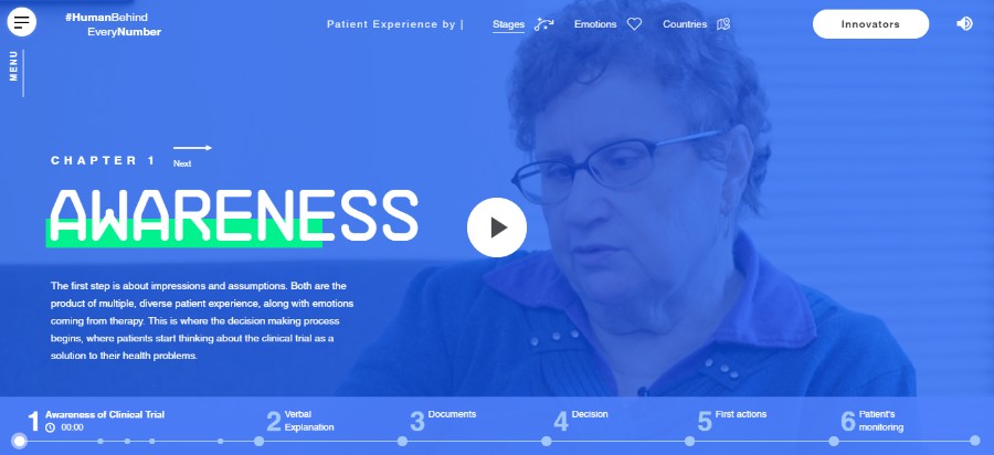
The website is an interactive report of qualitative research conducted through service design and UX process.
Premiere Performance
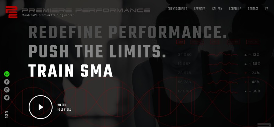
Athletes can now discover the behind the scene of Olympian athletes and professionals showcasing P2 personal training center with an interactive website.
Climate
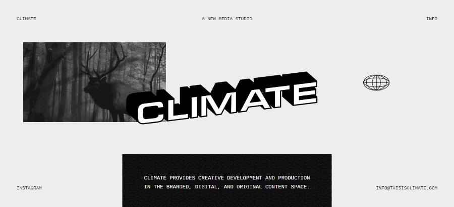
Climate provides creative development and production in the branded, digital, and original content space.
White Khamovniki
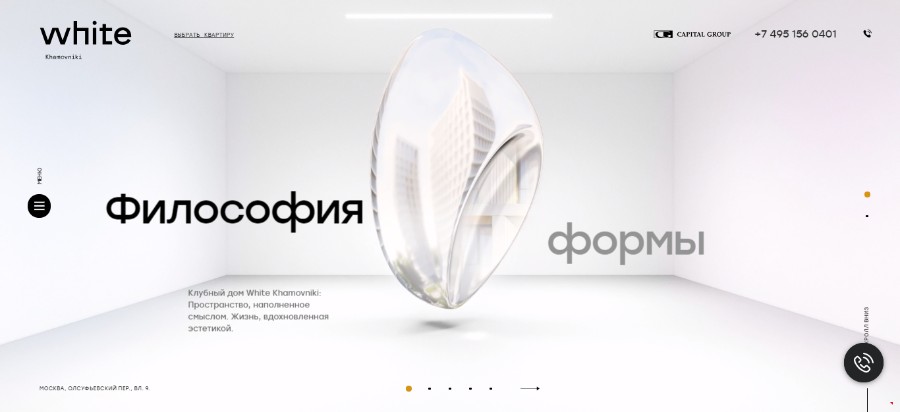
A promotional website, CGI-animation for a luxury clubhouse in Moscow for Capital Group company. The idea, CG graphics (3D), animation, and web development were made by team ART3D.
The best websites in 2017 have proved a point – videos are more compelling than text or images ever will be. You could have noticed that top companies often use videos as an important part of their company profile.
In addition to that, social media platforms such as Facebook made it easier to watch videos by auto-playing on mute as you scroll through your feed. Long story short, videos are prioritized over all other kinds of posts.
Mobile friendly
We mentioned earlier the fact that mobile browsing has now officially surpassed desktop. With that in mind, it is only logical that every website designer has to keep mobile-friendly designs in mind at all times.
Organic Shapes
Josh Dring
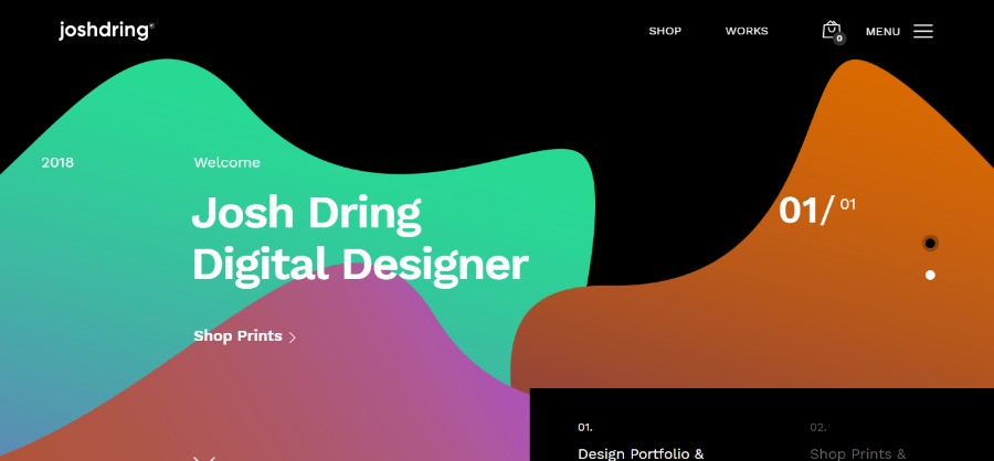
Digital Design & Art Direction from the United Kingdom.
Back in the day, amazing website designs were simple and clean. To achieve an organized and neat look like that, every website layout was based on sharp corners, squares, and rectangles. And while we still prefer simple and clean designs, we also like to see a larger variety of shapes in 2019. Rounded edges and more organic shapes are one of the most popular new trends in every web design company.
Chatbots/Machine learning
Recipe app – prepare food
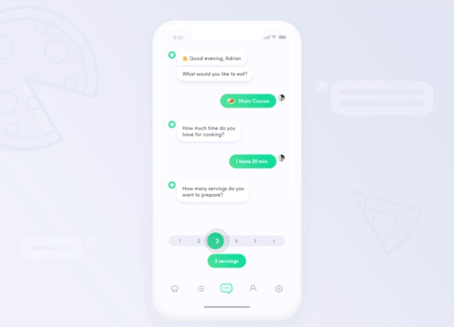
This chatbot will not only help you to chose what to eat, but it will also show you how to prepare it. It will show you some tips about how to chop an onion or how to debone meat. Besides that, you can also learn more about each ingredient and its nutritional value.
Chatbots and machine learning are a great way to enhance user interactions with a website. We have seen some truly amazing designs where the chatbots seamlessly interact with the users. This technology is getting better and better every single day and while it is one of the most popular design trends in 2019, we expect it to be the best on the web in the future.
Just try to picture beautiful websites that know exactly what the users want from the companies by analyzing past interactions. Not only will customer services become faster and more efficient, but the customers themselves will also be more satisfied.
Custom illustrations
CampusReel
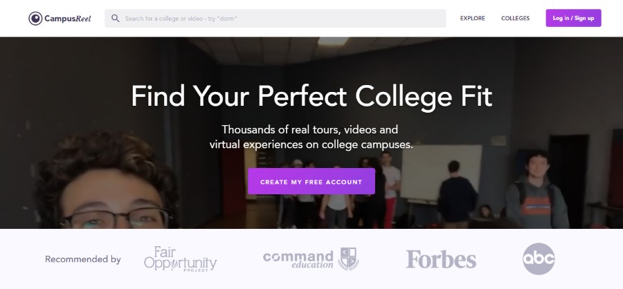
Find Your Perfect College Fit. Thousands of real tours, videos and virtual experiences on college campuses.
The Cool Club
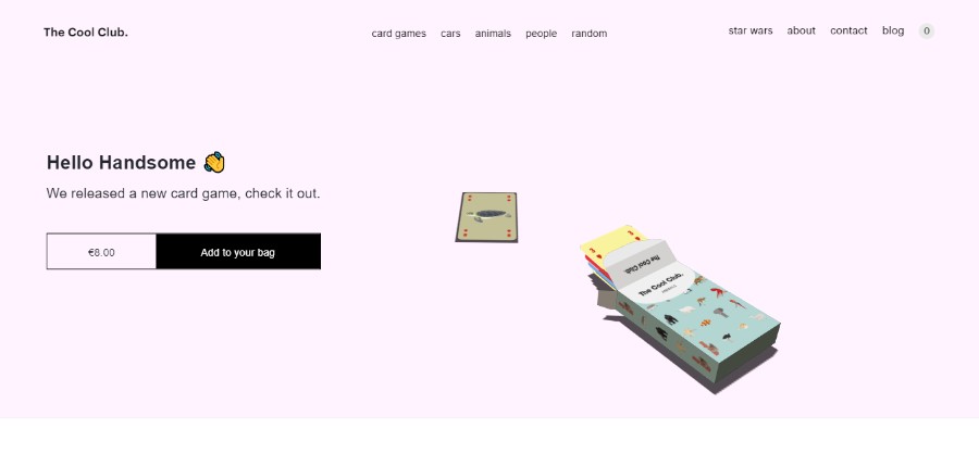
The Cool Club is a collective of creative minds, making cool things, inspired by some of the most influential people, places and products of our time.
Coder Society
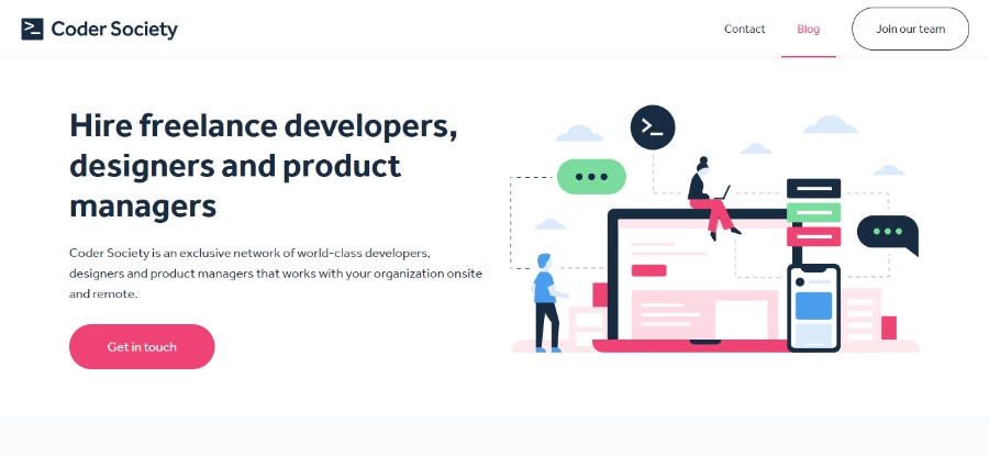
Coder Society is an exclusive network of world-class developers, designers and product managers that works with your organization onsite and remote.
Panda Monk
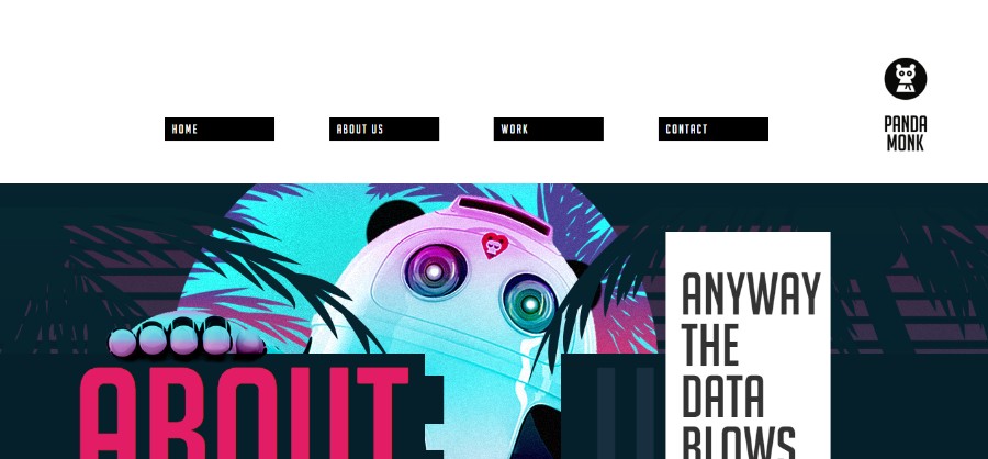
They cover a well-rounded package for creating and growing online brands and experiences.
Storegear
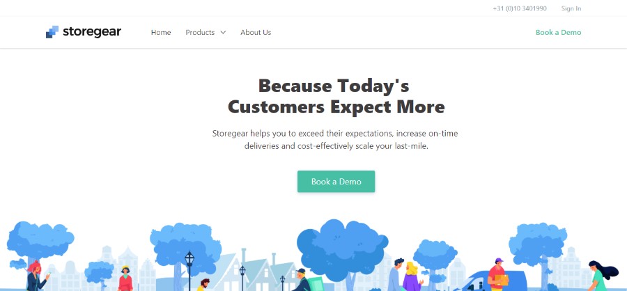
Storegear helps you to exceed their expectations, increase on-time deliveries and cost-effectively scale your last-mile.
LogoJump
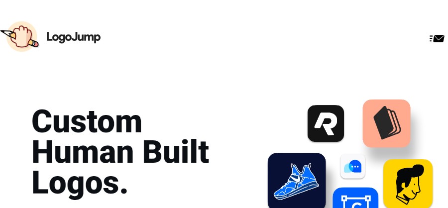
We create powerful, compelling brands for startups, companies, and organizations. Without the algorithms.
Florence
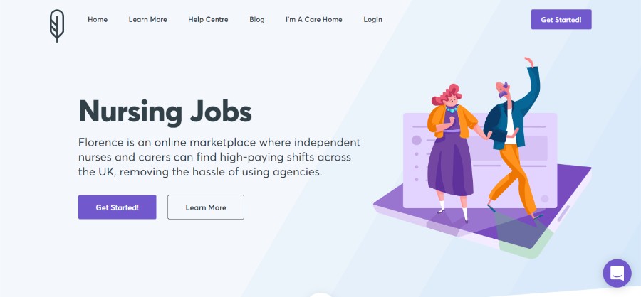
Florence is an online marketplace where independent nurses and carers can find high-paying shifts across the UK, removing the hassle of using agencies.
Well-made custom illustrations are an amazing way of adding a touch of personality to your website while also occupying the users’ attention. There are countless cool designs to draw and a creative artist can make illustrations that are not only beautiful but also tailored to the brand’s tone.
If you are looking for web design inspiration that incorporates illustrations, pay attention to the serious brands that have made their website more friendly and approachable to customers by incorporating unique and fun elements such as illustrations.
Big, bold typography
Pawel Waraksa
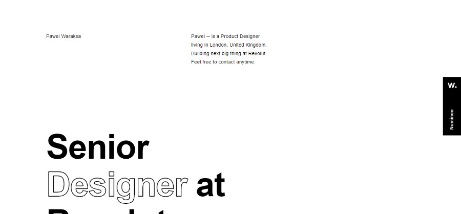
Pawel ─ is a Product Designer living in London, United Kingdom. Building the next big thing at Revolut.
Sauraj
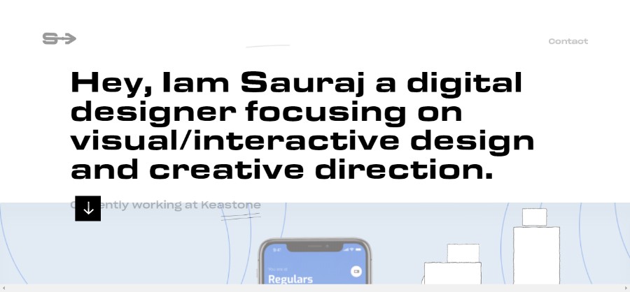
Sauraj is a digital designer focusing on visual/interactive design and creative direction.
Bobby Giangeruso
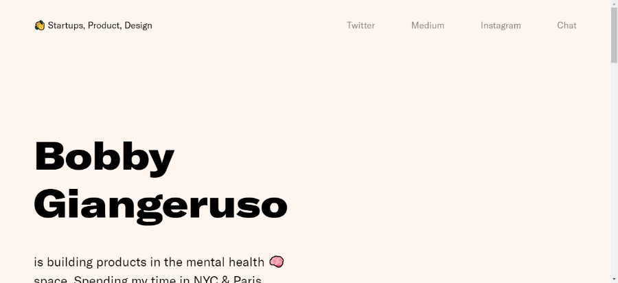
Bobby Giangeruso is building products in the mental health space. Spending his time in NYC & Paris.
Ahmed Yasser
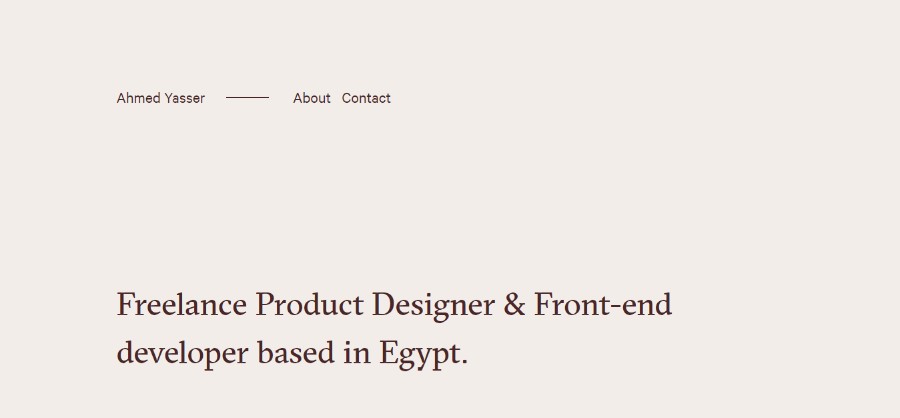
Ahmed is a Freelance Product Designer & Front-end developer based in Egypt.
Tobias van Schneider
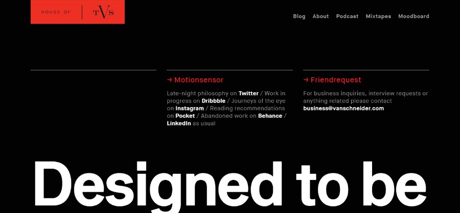
Tobias van Schneider is a German multi-disciplinary maker of useful, curious and beautiful things (he just doesn’t like the word entrepreneur).
Malven Co.
The best interactive experiences come from research, strategy, passion, and collaboration.
Typography is a very important part of best website designs. It is something that easily gets underestimated – and it should not.
Typography is a powerful visual tool and web designers use specific fonts to evoke emotion, create a personality, and set the tone on the website. Nowadays, with the amazing screen resolutions, many browsers can support custom make typefaces enabled by CSS.
Using big and bold typography as well as contrasting sans serif and serif headings help create dynamic parallels, improve UX, and best of all, keep the visitor reading your website.
Asymmetry and broken grid layouts
Patrick Heng
Patoch is a french creative developer.
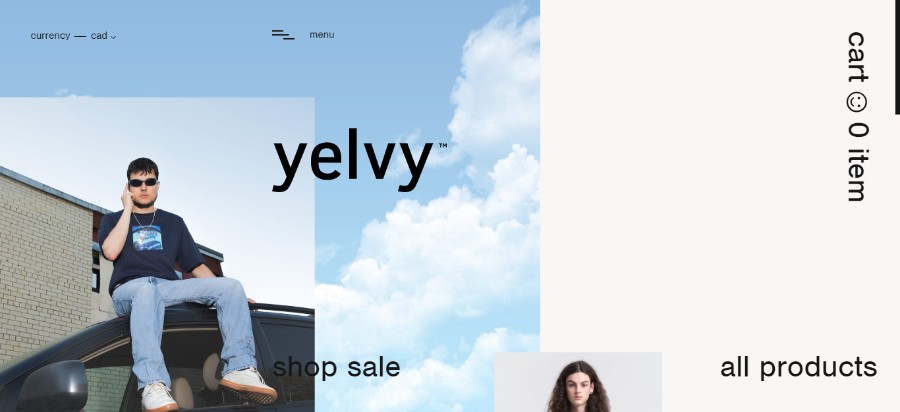
Yelvy
Three young individuals convinced that a lot has yet to be explored in an indispensable and ubiquitous clothing market. The final outcome is what matters, not the initiator.
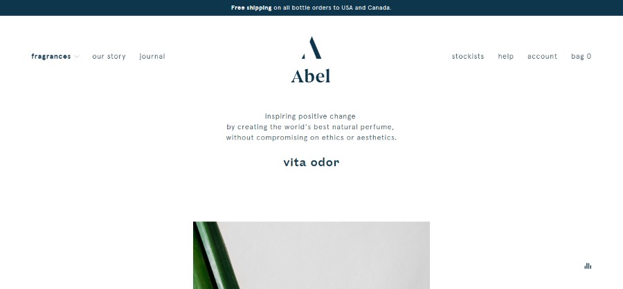
Abel
Following a failed search for a natural perfume that was chic, modern and long lasting. Abel was founded in Amsterdam by New Zealander Frances Shoemack with a simple goal – to create the world’s best natural perfume.
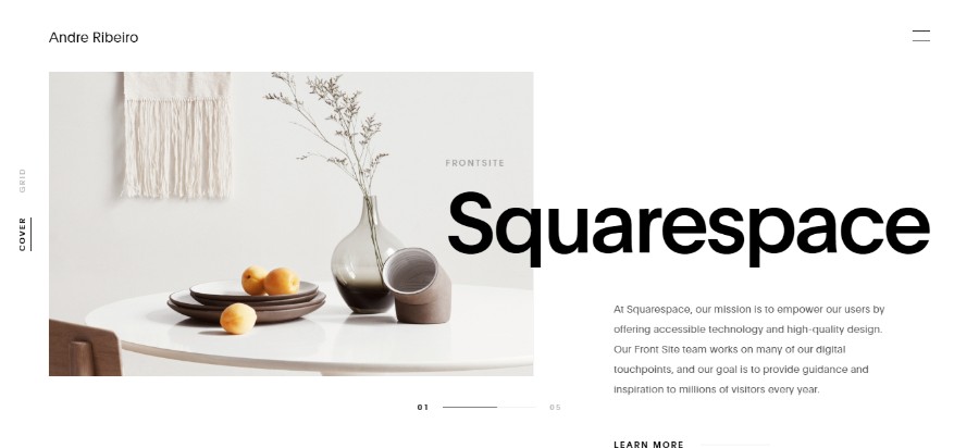
Andre Ribeiro
Brazilian born Designer and Art Director living in Brooklyn, New York.
Henning Larsen
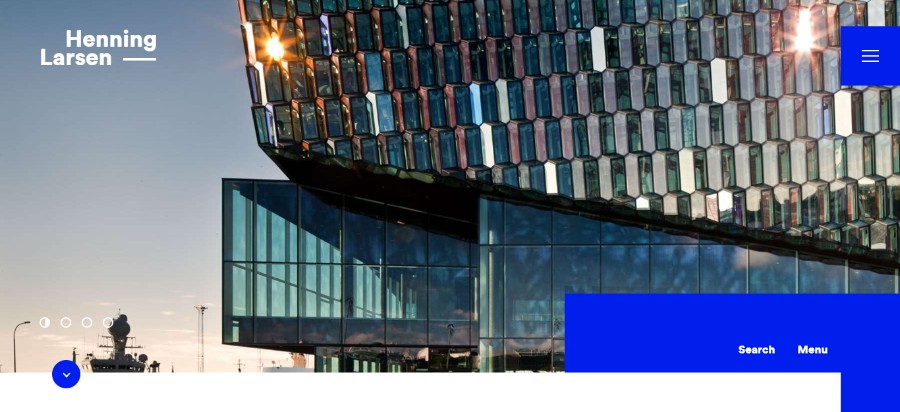
Drawing on Scandinavian design tradition, they develop vibrant, sustainable architecture that extends beyond itself and provides lasting value to the users and local context.
If you are looking for graphic design inspiration, forget all you think you know about layouts because the rules have shifted dramatically on that front. Introducing asymmetry and broken grid layouts are one of the newest trends that the website designers had to get used to.
Traditional companies sometimes prefer a simple design, but if you are open to some experimenting, the results can be truly breathtaking – hopefully, in all the right ways.
Replace text with videos
We mentioned already that videos are much more impactful than text or even images. If you have huge blocks of text on your website, there is a huge chance the users will never read all of it. However, if you switch from text to videos, you will communicate all the important information to the users more efficiently.
All that being said, the text is still the number one way of communication online because it is cheap, quick and easy to produce, and sometimes it cannot be replaced with videos or images.
Integrated animations
We mentioned particle backgrounds earlier as one of the easiest animated elements to incorporate into your website design ideas, but there are other small animations that can really enhance the overall cool website design.
For example, it is a great thing to use animations to keep the users’ attention while the website is loading.
Dynamic gradients
Gradients have been a part of website design inspiration for years, but one of the web design trends 2019 has taken things one step further with the gradient filters over photos.
It is a great way to make the image look intriguing and to enhance the overall design. Also, having a gradient background is one of the most popular solutions if you don’t have any other images to work with.
Ending thoughts on the best website designs of 2019
2019 has been an interesting year for every website design company with a bunch of new 2019 design trends surfacing. Best website designs now incorporate elements such as vibrant colors, asymmetrical layout, videos and animations, and more.
A simple website is still the best kind of website but it is important to find a way of adding a touch of personality without making the overall design overwhelming. In this article, you can find your new website inspiration and check out the latest trends for creating the best website.
If you enjoyed reading this article about the best website designs, you should also read these: