There’s one thing that’s remained a constant among the numerous web design trends, and that’s how fast things change. Design trends constantly change to fit the buying needs of users, which makes web designers anxious, but also provides them with plenty of insight.
Even though you don’t need to strictly follow all of them, comprehending web design trends will make your website more competitive and up to date. Learn below more about web design trends 2019 in this article created by our team at Amelia (probably the best WordPress scheduler plugin).
There have been some years when trends in web design have been all about rampant creativity, with typical stock images and grids being discarded in favor of an asymmetrical layout, vibrant illustrations, and bold color schemes.
In other years, technological breakthroughs have made websites smarter, with subtle interactions and machine learning, with these shifting paradigms driving website design trends (e.g. hamburger menus). 2019 web design trends will see the formation of a symbiosis between technology and aesthetics trends.
We have put together a list of what we expect to be the 2019 design trends, but this doesn’t mean that this is what’s definitely going to happen. That’s because 2019 is the last chance for web designers to leave their impact on this decade.
Micro-interactions & chatbots
There’s one main goal behind micro-interactions, and that’s surprising users and creating events that are human and inviting. A micro-interaction is basically every small action taken on an app or website that garners a specific response. This could even be something as simple as refreshing your Twitter page and hearing a beep, or the red icon that displays how many messages you have on Facebook.
Let’s be honest, we’re constantly connected to people from all around the globe. Being constantly available is a huge deal, especially in 2019. The best way to make sure that you’re always reachable to your visitors is by using chatbots. Increase your website’s interactions by using micro animation to ‘’show’’ them around your website. You need to highlight your most important aspects and save your visitors time.
Minimalism, simplicity but not simplistic
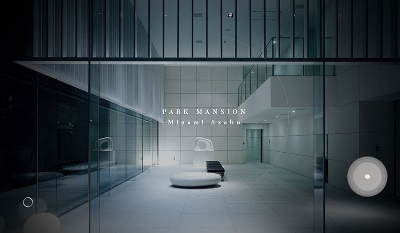
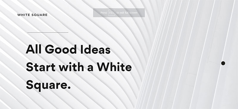
Minimalism has remained one of the most popular web design trends. If your website isn’t overloaded with content and elements, your users won’t have to think too much. Users will find exactly what they are looking for if the website they are visiting is designed in exactly the right way.
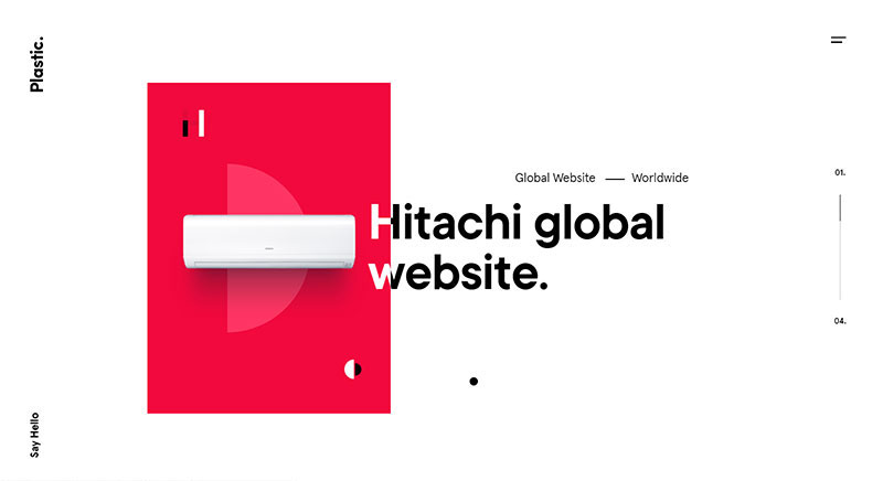
Minimalism will remain one of the most popular 2019 design choices. Websites will have more room to space out their page’s content thanks to fade-in effects and animations, which will, in turn, increase the amount of white space, clear typography, and contrast without having a large amount of distracting elements.
As we go forth, layouts will remain minimal and simplified, with plenty of flat elements and even translucent buttons. Planning before you start designing is key.
Fluid/organic design and elements
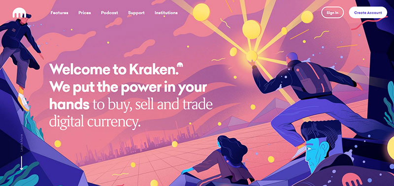
We have gradually started to move away from the flat lines that are part of the flat design and have begun to experiment with more innovative website designs. They consist of more fluid lines and shapes which aren’t your typical square, circle, rectangle, or basically any straight-sided shape.
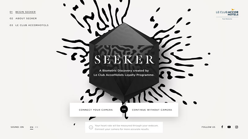
Due to the fact that organic shapes are asymmetrical and imperfect, they can make the elements of your page stand out, which adds depth to web design styles. Although they are nature-based (like how hills and trees curve), free-drawn elements can still capture spontaneous accidents created by people such as the splatter of paint. The objective is to use the illusion of movement to give web designs a human and alive feel.
Nostalgic / throwback / retro design aesthetic
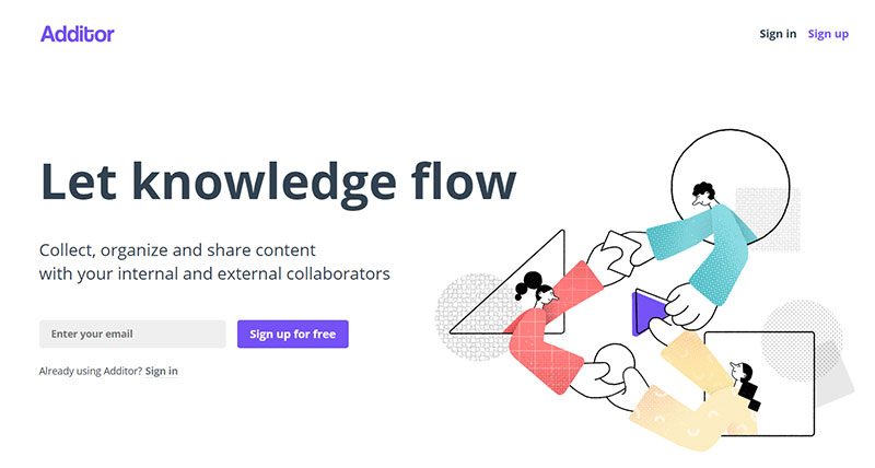
What used to be old can once again become new. As we’ve started going further than flat design, where there seems to be no limit to experimenting, this seems like the ideal moment to usher in the return of old elements of design with a dash of nostalgia.
“Throwback” is a popular term on social media, which has caught the attention of design teams. CSS grids give web designers, organizations, and technology the option to go back in time and deliberately use print-style aesthetics and broken layouts. People adore the welcoming proximity that nostalgic aesthetics generate on the internet, which is in line with fluidity. The best way to express this is through old-school typography and color palettes.
Motion design
The motion-incorporated design has been one of the leading web design trends for a good few years now and it looks as if it’s here to stay. It’s also one of the web trends that will continue to expand in 2019 with an increase in interactive web pages and animated pages.
When adding motion to your web design, it’s easy to go overboard, which will just disorient and confuse your visitors, and might even cause epileptic fits for some of them. If you want to steer clear of needless distractions (and health problems), your use of motion should have a purpose and strobe-like features are unwelcome. Responsible and purposeful use of motion design will highlight key focal points, generate a natural flow, and help users comprehend your general storyline.
Using interactive and animated elements hardly falls into the category of new web design trends – and more importantly, this is a website design trend that’s here to stay. When it contributes towards easier website navigation, it can be a ‘’good’’ thing in web design.
Distraction isn’t the only possible consequence of adding interactions and animations that only add visual flair without contributing to usability. They can sometimes make navigation impossible or even dangerous.
Unique & sophisticated typography
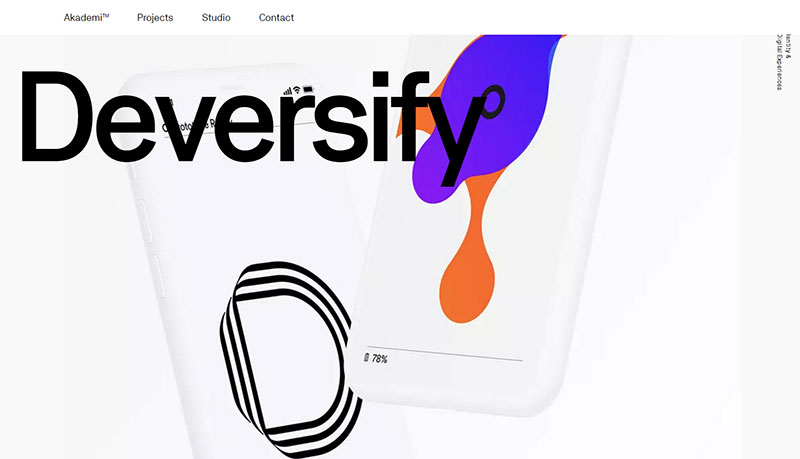
This isn’t bolded text that we’re talking about. Bold typography will instead focus on pushing traditional typography’s boundaries across web pages. The evolution of coding has lead to experimentation. One of the possible design trends of 2019 will consist of designers playing about with white space, animated typography, outlined type, screen-dominating text, and photography-infused typography.
Since not many of us focus on the website’s text, even though it’s as important as web design, choosing just two fonts should usually do it. However, as we go forth, handmade typefaces and variable fonts families are used to make your website look and feel more unique.
While it’s common for designers to experiment with typography, it’s more challenging when that typography is on the web than when it is in print. However, it has become a bit easier to experiment with typography on the web thanks to coding becoming more sophisticated.
Cursor design
Simple arrow cursor designs are now a thing of the past. Things are rapidly changing. Organizations have had their reservations about changing anything about cursors since they’re the most important part of any website’s navigation.
2019 has seen people thinking outside of the box and make bold decisions regarding cursors. Experiment with the design of your organization’s cursor to see if you could make any practical changes that won’t negatively impact your website’s functionality.
More diverse illustration styles
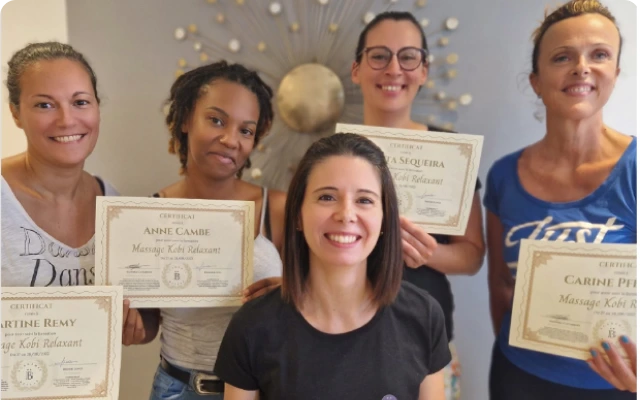
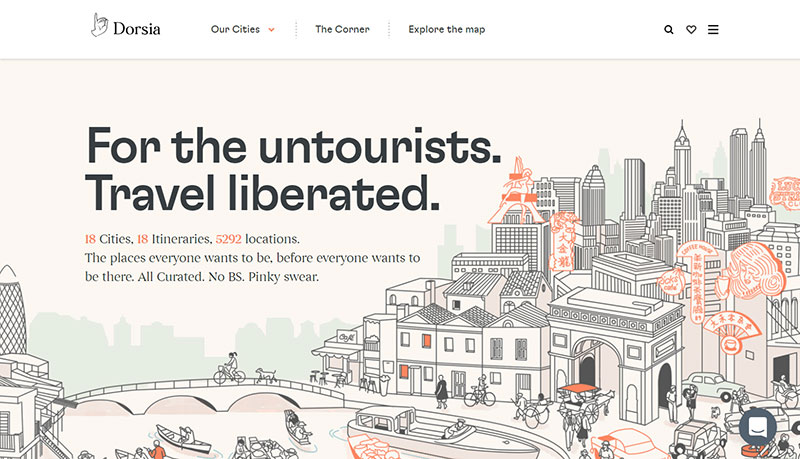
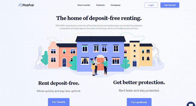
People often forget that the word web is followed by a couple of equally significant W’s: ’World Wide.’ Countless people from across the globe are connected, and they come from a wide variety of gender identities, cultures, ages, and abilities – and they would prefer to see themselves represented online instead of staring at the same stock image models.
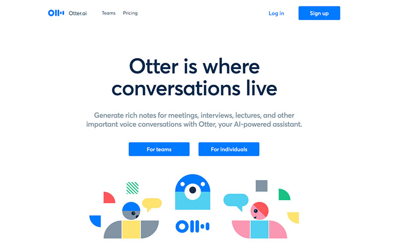
Even the tiniest considerations of the past have really helped to make people from all walks of life feel more included in an organization’s digital space. One of the possible web design trends in 2019 regarding this should see designers go even further in being more inclusive, which includes improving standards of accessibility and using images that are diverse and more socially conscious.
Dynamic full-screen video background
An explainer video isn’t necessary for you to know that online video content is hardly anything new. Not only do videos add diversity to your site, but they’re also popular among those visitors who don’t have enough time to go through a large amount of text.
Adding a dynamic video to your website’s background is probably one of the most efficient ways to catch the attention of users. Go for moving objects.
It’s easier to provide users with more information by using short videos, especially in comparison to still images or text, allowing users to quickly get a grasp on the web page’s or product’s features.
Videos increase the amount of time that users spend on the web page, which helps boost conversion rates and SEO. A good example of this is how Facebook prioritizes video posts. Furthermore, the fact that this is the age of diversified information means that the use of dynamic elements like video backgrounds will slowly increase.
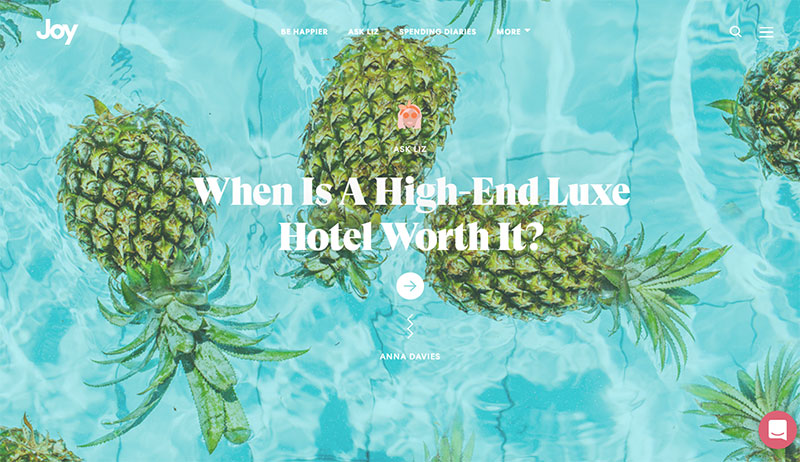
Serifs on screen
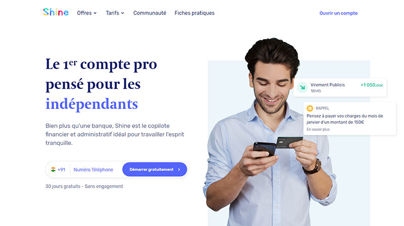
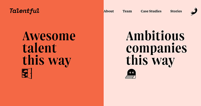
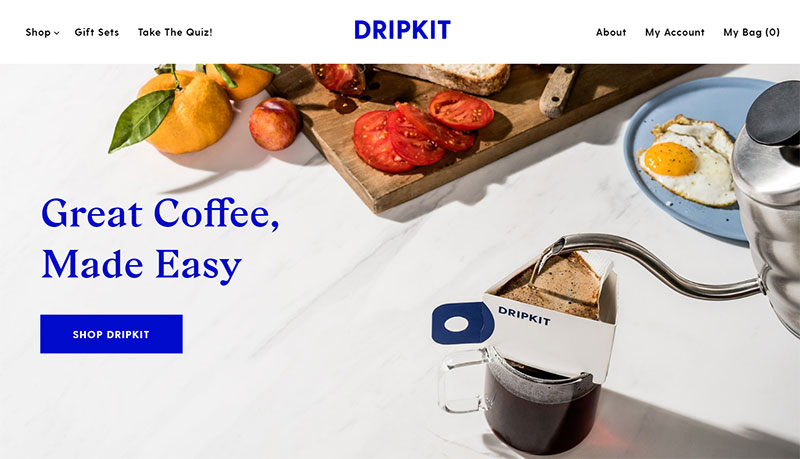
We’re all familiar with the rule that sans serifs are for the screen and serifs are for print. But what are web site design trends for if not to break a few norms?
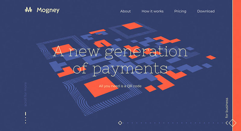
While sans still remains a staple of longer website copy bounds due to its clean readability, the number of organizations using bold serifs in other web design aspects such as callouts and headers is on the rise. This is due to the decorative nature of serifs, which is why they’re the ideal choice for emphasis.
Ending thoughts on these web design trends
This is a post-flat design era, and it appears that we’re seeing a rise in experimental web design. It seems that 2019 is the year when practically no web page element shall be exempt from experimentation.
By turning navigation into the website’s focal point, increasing the amount of white space, looking to past times for inspiration, and experimenting with typography, 2019 is shaping up to be the year of web design trends touching every aspect of design aesthetics.
If you enjoyed reading this article on web design trends, you should check out this one on dark background.
We also wrote about a few related subjects like modern web design, layout design, bad websites, button design, visual design, best 404 page ever, website layouts and loading animation.
