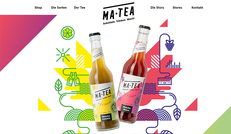
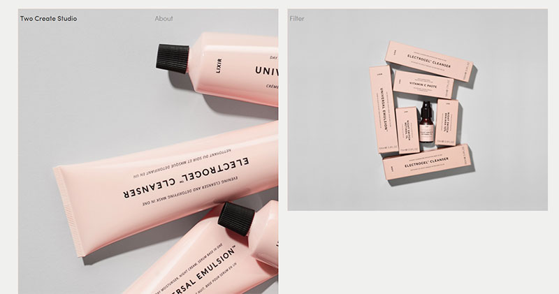
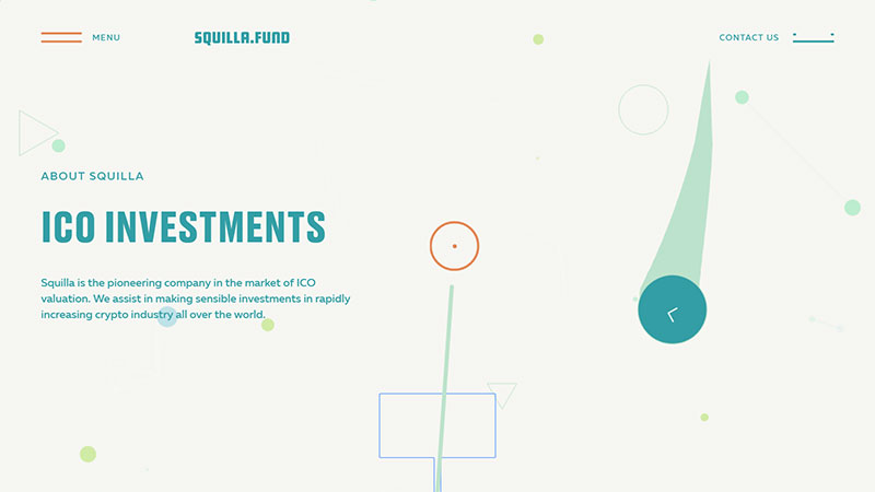
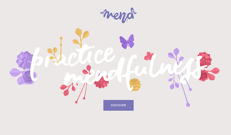
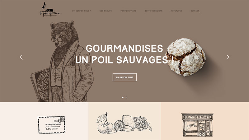
As humans, we are sensitive beings that have emotional responses to all sorts of stimuli. The psychology of color analyzes how different hues can make people feel a certain emotion. Once researchers figured out how the brain works when it comes to colors, they started to be used for various purposes. One of these purposes is intelligently adding colors in web design.
Some colors are well known for their effects: increasing brand recognition, creating a sense of urgency, increasing user engagement, encouraging text comprehension, reducing eye strain, and more. This article investigates what would change if a pastel color palette is selected over other hues.
In order to get a person to do a certain action on a website, web designers have to put theory into practice and follow the principles that make this possible. Colors are part of their everyday life, so there’s no better person to choose the hues that will be used in a project other than a web designer.
They usually study color psychology in-depth, and they notice how it was applied for the biggest companies out there: McDonald’s, KFC, Twitch, FedEx, Taco Bell, Facebook, Skype, Oreo, etc.
These brands have already built an image for themselves, but what happens when you want to start from scratch? What trends are still active in 2019? Well, one of the trends that had major success in past years and is now coming back strong is the pastel color palette.
Pastel hues are popular for their eye-pleasing, elegant effect. They are mostly used in clean designs, where keeping everything simple and uncluttered is a must. Design that features lightness and a lot of negative space should rely on a pastel color palette. The soft, muted hues are the perfect choice in such situations, and keep reading more about this topic in this article created by our team at Amelia (probably the best WordPress reservation plugin).
Defining pastel color palettes
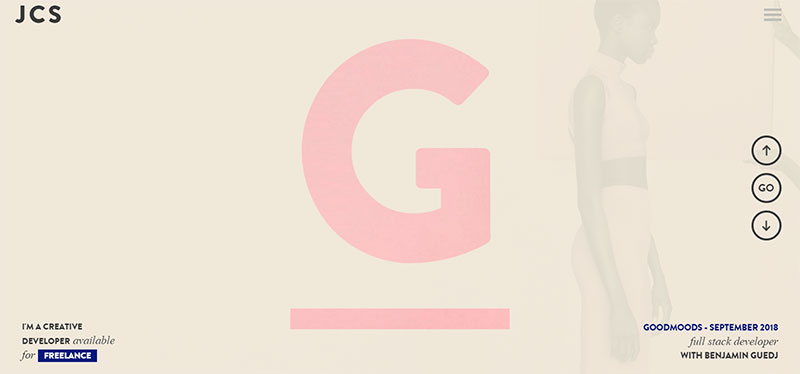
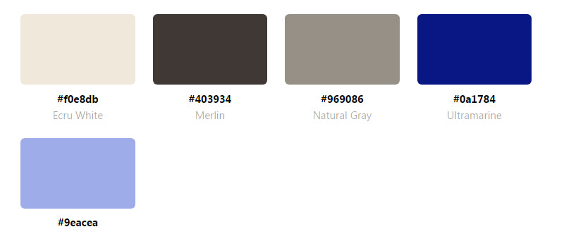
Many people believe that a pastel color palette is much reduced in terms of color numbers compared to other palettes. In fact, pastels include more than just powdered pink, washed blues, and yellows. If you are familiar with the “newborn baby” feel that has become quite mainstream, it’s easy to experiment with other hues and tones in the pastel color palette.
In order to create a pastel color, choose hues with low to medium saturation, a subdued shade, and reduced chromatic content. People call these soft colors. They can also be encountered as neutral, milky, washed out, or desaturated. These colors are easy on the eye and don’t pop out that much. This is a natural color palette that can be combined beautifully to achieve that lovely soft effect whenever it is needed.
Uses of pastel color palettes
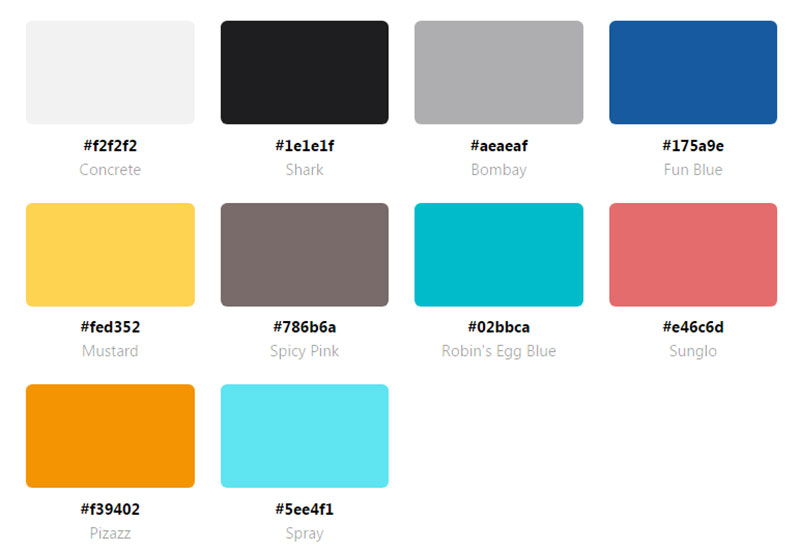
Using colors in web design must be done purposefully. A web designer should know exactly what colors they will use throughout the process to convey a specific message. Each color has its own properties and can invoke specific desired emotions in the viewer. The most common purposes of using certain hues are supporting the brand’s identity, creating a specific web presence, and evoking a feeling.
Pastels can help a web designer alter the impact of a message. For instance, when oversaturated colors are used in a design, the message can be more alert, and more urgent. Conversely, when low-saturated colors are used, the message is a mild, sophisticated one instead.
Backgrounds

A pastel color palette is the best choice for background elements that should stir the interest of the user without making the experience too harsh on the eyes. Pastels are washed-out colors, so the elements can be easily overlooked unless they are placed in the right position. They have an added vibrancy that looks great when placed in appropriate combinations (e.g. white-orange). Pastels work great in top-page sections such as the headers, navigation menu, and CTAs.
Highlighting
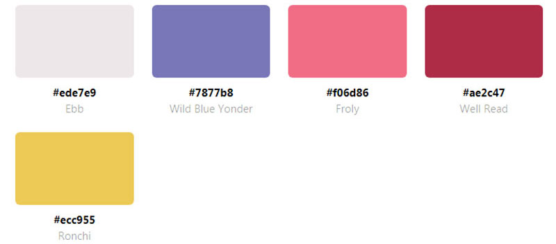
Using the pastel color palette to add a subtle visual effect to the website’s design can be done by highlighting elements on the page with these hues. When an element is meant to stand out from the rest, using pastel colors to highlight it will draw attention very quickly. You can create both high- and low-contrast effects by using pastel color schemes and applying them to textures or other elements.
Contrast
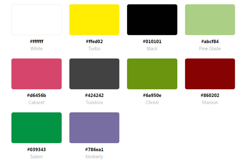
Even though the contrast created with a natural color palette might not be the strongest, you can accentuate elements by combining the proper hues. Contrast is a principle of design that can’t be skipped when building a layout, regardless of what palettes are used. You can create strong contrasts with pastels as long as you use a neutral background.
Neutral
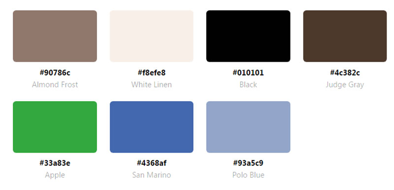
Talking about neutrality, pastel tones are pale. This means that they can be merged in various ways without being rough to the sight. A soft color palette can be integrated into any type of design, for all niches. The obtained effect will be an elegant, neutral, washed-out tone.
Monochrome
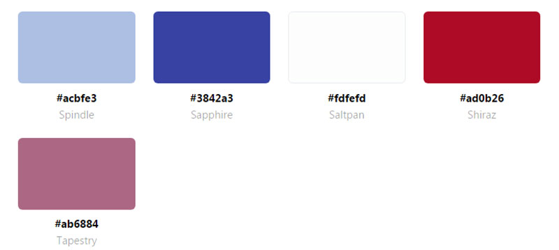
You don’t necessarily have to incorporate multiple hues from a pastel color palette. You can use one single hue and its variations to put together a website design. Choose one single color and play with its shades to accentuate the elements present on the site. Any neutral color should do the job, but you can be bolder and select the popular red chalk or sanguine hue. See what’s trendy today and put it into practice.
Warm/cool effect
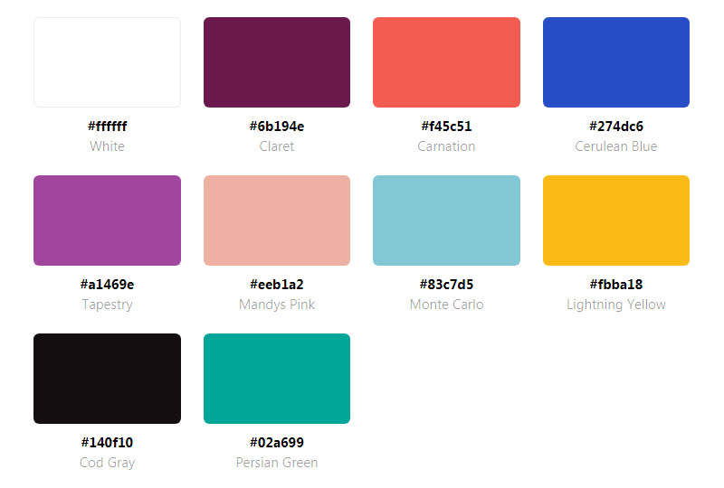
The warm-cool effect involves using two different types of pastel colors. In printing, the black-orange temperature contrast is considered the most effective. A duo-tone palette that combines two opposite colors will give the design that needed balance and harmony. See what colors complement each other the best and use them to achieve that warm-cool effect.
Final thoughts
Considering how many options you have when it comes to choosing a set of colors, it can be tricky to find the winning combination. What’s obvious is that you can’t fail with a pastel color palette. These hues are highly appreciated these days, and they seem to be adopted in all sorts of industries, not web design only.
Fashion designers use pastel hues for their gentle serenity, product designers use them for how pleasing they are to the eye, and so on. They have a distinctive feature that makes them elegant and soothing, unlike the overwhelming chromatic content of other hues.
If you enjoyed reading this article on pastel color palette, you should check out this article about website color schemes.
We also wrote about a few related subjects like blue websites and yellow color palette examples.
