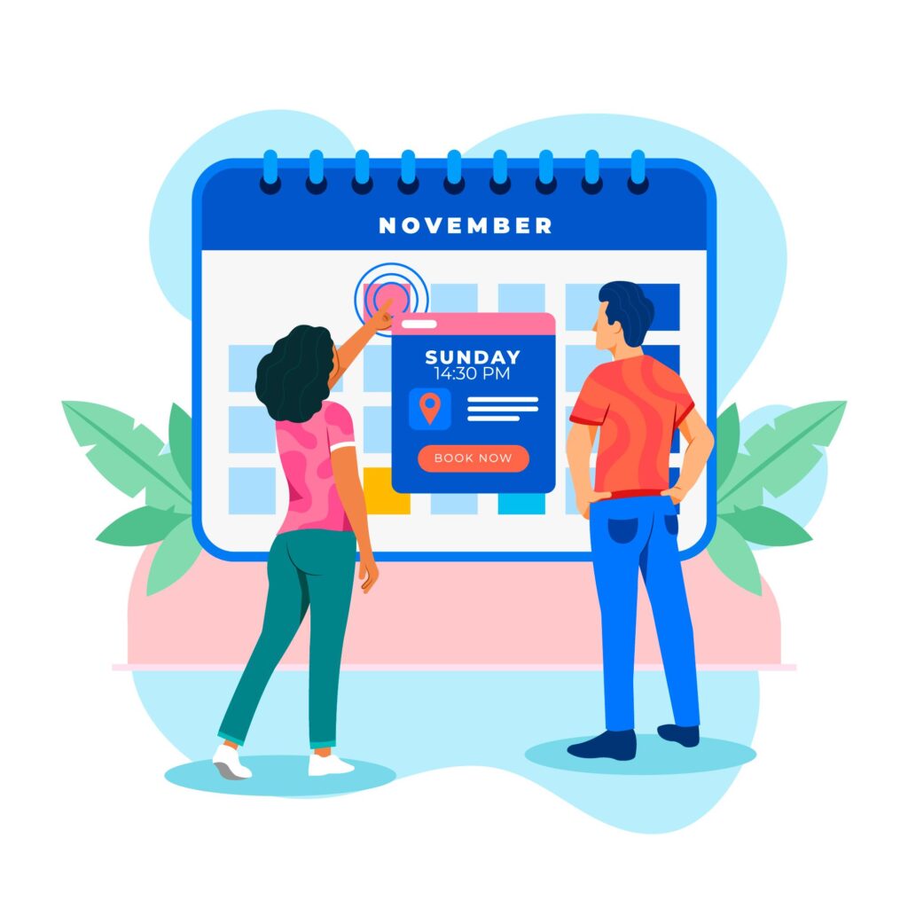
Getting people interested in your event is only part of the job. The real challenge starts when they land on your website and have to figure out what the event is, when it happens, and how to book it.
If that process feels confusing, slow, or incomplete, people leave. Not because they are not interested, but because booking starts to feel like work.
That is why event discovery matters just as much as the booking flow itself. Visitors need to quickly find the right event, understand the key details without digging, and book in a few clear steps.
In this post, we’ll look at how to make that whole process easier with better browsing, clearer event information, and a booking flow that collects the right details without adding friction.
Why Visitors Leave Before Booking an Event
Many event pages lose bookings before the booking process even begins.
Sometimes the issue is visibility. Visitors land on the page, but they cannot quickly find the event that fits their schedule or interests. If browsing feels clunky, they are less likely to keep going.
In other cases, the problem is clarity. A title and date are not always enough to help someone decide. People want to know what the event includes, where it takes place, what to expect, and whether it is worth their time.
Then there’s the booking process itself. Even if someone is interested in the event, a booking flow that asks for too much, feels disorganized, or adds unnecessary steps can still push them away. In the end, the easier you make it to find the right event, understand the details, and book it without friction, the better your chances of turning interest into actual bookings.
Make Events Easier to Find with Better Browsing
As we mentioned already, people are much more likely to book an event when they can find it quickly. But even tho that sounds obvious, a lot of event pages still make visitors work too hard. They need to click around, search for basic information, or scroll through layouts that make browsing feel slower than it should.
A better browsing experience removes that friction early. It helps visitors explore events in the way that feels most natural to them, whether they want to search by date or scan upcoming options at a glance.
Use Event Calendar 2.0 for date-based browsing
Some visitors already know when they want to attend an event. They are not looking for a long list to sort through. They want to open a calendar, check a specific date, and see what is available.
That is where Event Calendar 2.0 makes a real difference. It gives visitors a clear, date-based view of your events, which makes browsing feel more intuitive from the start. Instead of searching through scattered listings, they can move through the calendar and find what works for their schedule faster.
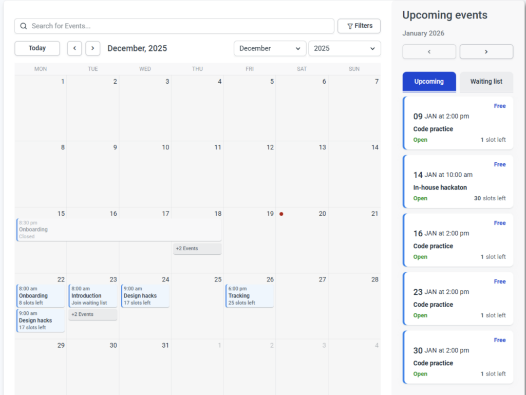
This is especially useful for businesses that run multiple events, recurring sessions, or time-sensitive bookings. When availability is easier to see, the path to booking becomes easier, too.
Use Event List 2.0 for faster scanning
On the other hand, not everyone wants to browse events through a calendar. Some visitors prefer to scan a list of upcoming options and compare them quickly.
Event List 2.0 works well for that kind of browsing. It gives people a simpler way to move through upcoming events, spot what stands out, and open the ones they want to learn more about. For visitors who are still deciding, this kind of layout can feel faster and easier to use.
It also helps reduce the effort needed to get started. Instead of making people click through multiple pages just to understand what is available, a list view gives them a more direct overview of your offerings.
Give visitors more than one way to browse
The bigger point is that people do not all browse the same way. Some think in dates. Others think in options. Some know exactly what they want, while others need to explore before making a decision.
That is why offering more than one way to browse matters. It makes your event pages easier to use for different types of visitors and removes unnecessary friction early in the process.
When people can browse in the way that feels most natural to them, they are more likely to keep going, open event details, and complete their booking.
Make Event Information Easier to Understand
Finding the right event is only the first step. Once someone clicks on it, the next question is simple: Does this actually look like something I want to book?
That answer depends on how clearly the event is presented. If key information is missing, hard to spot, or spread across the page, visitors have to work harder than they should just to understand what they are looking at. And once that happens, hesitation starts to build.
Show the most important event details upfront
It’s simple, people should not have to dig for the basics. If someone opens an event page, they should quickly understand what the event is, when it takes place, where it happens, and what to expect.
That kind of clarity helps people make faster decisions. Instead of clicking around to piece things together, they can focus on whether the event fits their needs.
Strong event details also make the page feel more trustworthy. When the most important information is clear from the start, visitors are less likely to second-guess the booking. So, don’t forget to include all the details:
- date and time
- location or clear online access info
- duration
- price
- event agenda or format
- speaker, host, or organizer
- capacity or availability
- What attendees need to bring or prepare
You can also add things like parking details, check-in instructions, or age limits if they matter for the event. The goal is to answer the questions people are most likely to have before they stop and ask themselves whether booking is even worth it.
Use photo galleries to give people more context
Clear event details matter, but visuals help people understand the experience faster.
A photo gallery gives potential attendees a better sense of what your event actually looks like, whether that means the venue, the setup, the atmosphere, or even past events. Instead of relying only on text, you give them something more concrete to connect with.
This is especially useful when people are booking with little or no previous experience with your brand. If they can already picture the space and the event format, the whole thing feels more familiar and less uncertain.
You can use photo galleries to show things like:
- the venue or event space
- the layout or setup
- the speaker area, stage, or workshop environment
- the overall atmosphere
- highlights from previous events
The key is to keep the gallery relevant. Do not add random images just to fill space. Every photo should help people understand what they are booking and feel more confident about it.
Remove confusion before it turns into drop-off
Even small gaps in information can make an event page harder to use.
If visitors are not sure where the event takes place, how long it lasts, what is included, or what happens after they register, they have to stop and figure it out on their own. That slows the whole experience down and makes the page feel less clear than it should.
A good event page should answer the basic questions right away. People should be able to tell whether the event is online, in person, or hybrid, what the booking includes, whether there are limited spots, and what to expect after registration without having to search for it. Are there any workshops, and how can they participate? Is lunch included, or are there additional charges? While some of these questions may sound irrelevant to you, chances are, your attendees will want answers to them before they even fill out a registration form.
Keep in mind that the more clearly information is presented, the easier it is for visitors to understand the event and decide whether it is right for them.
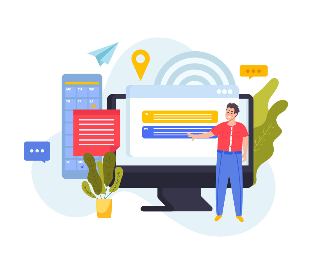
Use Custom Fields to Make Event Booking Smarter
Not every event requires the same information from attendees. A workshop may need an experience level, a networking event may ask for company details, and a private event may need extra notes before the date. On the other hand, not every attendee is the same, so depending on the ticket type or level of involvement in the event, you may need different information.
That is where custom fields are useful. They give you more flexibility to collect information that actually supports the event, instead of relying on the same standard questions every time.
Collect the details you actually need
The point is not to add more questions just because you can. The goal is to collect information that helps you prepare for the event, organize it better, or make the experience smoother for attendees.
That could mean asking for dietary preferences, accessibility needs, guest names, session choices, or company details, depending on the type of event. If a detail helps you plan ahead or support attendees more effectively, it makes sense to include it.
If it does not, it is probably better to leave it out. Asking for too much can make the registration process feel longer and less focused than it needs to be. To make sure attendees don’t feel overwhelmed with the set of questions, make sure they can see key event details upfront. Once they understand what the event includes, what to expect, and why certain information matters, the extra fields feel more relevant and easier to answer.
Keep booking forms short and relevant
Even when extra details are useful, that does not mean you need to ask for everything at once. Keep in mind that the goal is to make the process feel tailored, not overwhelming. So, stay selective and make sure the process is focused on what is truly necessary for that specific event.
Lastly, make sure to check the registrations once they start coming in. Are there any fields people are leaving empty? Are there any extra services they are adding to their ticket? All this information can help you further improve the whole process.
Final Thoughts
Making events easier to find, understand, and book often comes down to small improvements on the page itself. Clear browsing options, complete event details, helpful visuals, and relevant registration fields all make it easier for people to move through the process without confusion.
Ready to make your event pages easier to browse and book? Try Amelia today and build a smoother experience for your attendees.

Explore topics

Read Inspiring Customer Stories
Check out how our user set Amelia for his business