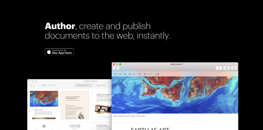
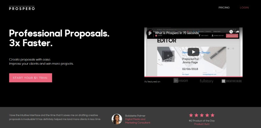
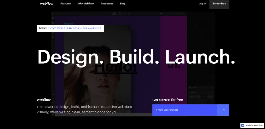
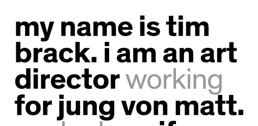
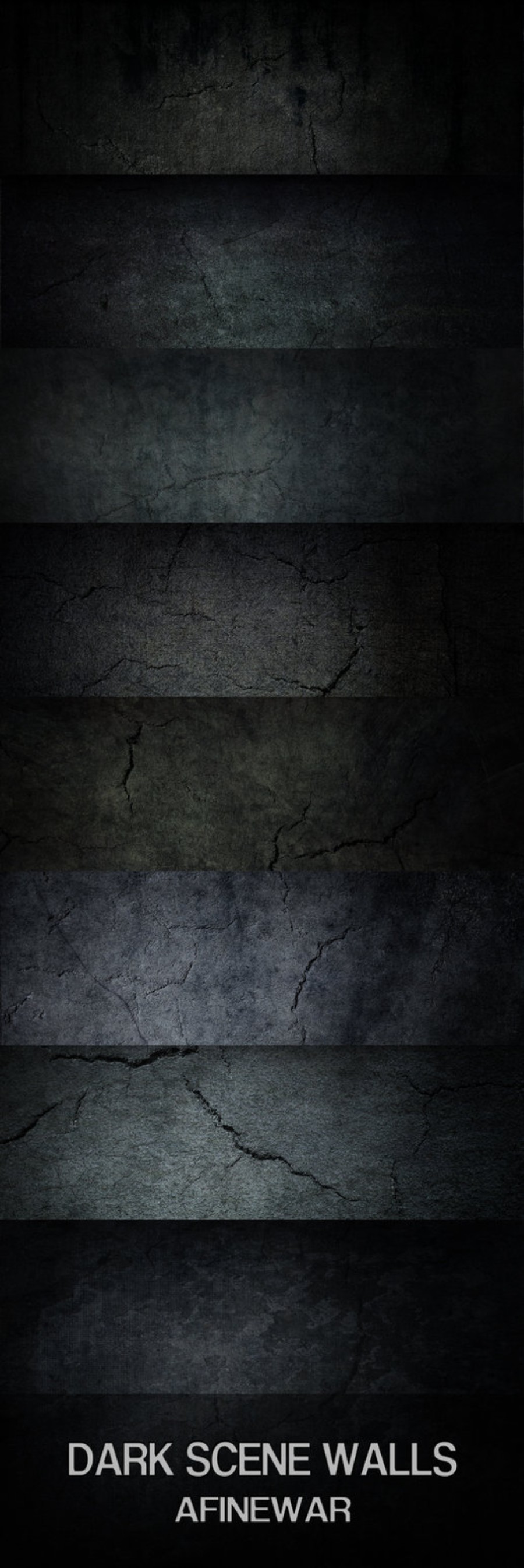
Many people fear using color schemes that include darker colors, but if you know how to choose them they can provide your website with a great look. Using a white background remains the safest bet when building a website, but a dark background is a much better aesthetic choice when the website is meant to transmit something, to generate emotion.
Is either this reason or the designer simply wants to come up with a design that is unconventional and personalized for the brand he is working with. Staying away from using a dark background is a mistake, considering the many design opportunities such a theme gives you. Here are some more details about this topic:
Table of contents
- What you should know about dark backgrounds
- The benefits of using a dark background
- When you should use a dark background
- When you shouldn’t use a dark background
- A few examples of dark background websites
- Dark backgrounds you can use for your website
What you should know about dark backgrounds
Understanding how dark nuances are visualized
A dark background might change the perception of the visitor. The best condition for using one if the content which is present on the website is less text-oriented, meaning that the visual effect of the website is much more important than the written part of it.
As in any other case, the time spent researching the color’s effect is paramount in the design process. Keep in mind that websites that use dark backgrounds are pushing the limits of traditional web design and they need to be very well thought beforehand.
Darker backgrounds can absorb light from the other elements you include on the website. This is why you should make use of negative space to avoid distracting the users from the relevant information.
If you include a lot of written content on a black background image, make sure to make it readable, so that users find it easy to skim through it.
On a dark wallpaper, readability becomes an issue, and you need to put more effort into making all the elements visible and readable. You should learn more about the best paragraph size on such websites, kerning and leading. These details will make the difference between an enjoyable dark website and one that can’t be navigated on.
Dark websites are not all about a black background. You can also use other nuances that have the same effect, such as a dark red background. The options are unlimited, but the rules remain unchanged. You still need to make the content easy to read. Avoid using shades or gradients because they can be difficult to read when the background is darker.
Sans-serif fonts are more recommended than serif ones since they are easier to read. Serif fonts should only be used if readability is not an issue on your website.
Talking about emotional perception
Emotional perception can be altered by the color scheme you select for your website. Color psychology has been studied long enough to determine what effect each color has on the human mind. Dark colors usually transmit a sense of mystery and elegance, even though some other feelings are attributed to them.
Black is the color of formality, power, and elegance, which makes using a black background appropriate for websites that want to transmit that idea. Powerful businesses make good use of color psychology by selecting black or other nuances that match their goals. Dark colors started to dominate the business world. Understanding the effect that colors have and choosing one that is in line with the purpose of the website is a must.
Making everything readable
Designers who choose a dark background often struggle with making the content readable. Visible content that the user can find rapidly is a condition of a successful website. The interface that the user interacts with must contain content elements that are well-emphasized. Text, pictograms, icons, images – they all must be visible enough to make the website easy to navigate on.
Designers that opt for a black background image should test a multitude of typefaces, colors for these typefaces, icons that match the theme of the website and so on. The process can be a thorough one, but the result is surely worth all the trouble.
The benefits of using a dark background
It is good for tired eyes
Reducing eye strain seems to be a mutual goal for websites. Making the website friendly for the eyes of a person can be done by choosing a dark background instead of a brighter one. More than that, a dark background will sustain the hierarchy you want to achieve for the content on the website.
It is aesthetically pleasing
Darker themes for a website are just as dark desktop backgrounds – they are more aesthetically pleasing, and they give users a sense of minimalism. Using a dark background and a similar color scheme will offer the website the needed amount of contrast.
To emphasize one element, using a darker background is the most recommended option. Placing an image or a block of text which is lighter in color on a darker background will make it immediately stand out for the visitors.
Keep in mind that you need to find the right nuances so that the content doesn’t become difficult to read. Unreadable content is what makes users immediately leave the website, which is not the result you desire. You might want to remove your image background to avoid this.
It resembles the night mode option
Using cool dark backgrounds for a website instantly transforms it into a night-mode one. As you may have seen, most devices nowadays feature an option which is called night-mode and turns the lighter colors on the devices to black. Because the device produces less light, energy is saved, as well as saving your eyes from getting sore quickly.
It is appropriate for dark-themed interfaces
If you pay a closer look, user interfaces such as TVs and game consoles have a darker-themed design. The reason behind this is that these devices are mostly used in dimly-lit rooms. This is why the interface of the device must have darker colors, to be suitable for the eyes of the user. More than that, content is easier to promote on a darker user interface.
Other benefits
- It gives the website an elegant look and a sense of mystery
- It encourages using contrasting items
- It offers content the depth needed to stand out
- It is visually appealing
When you should use a dark background
- There are a few situations in which your website’s generic background should be darker:
- The brand’s color scheme is darker, and so has to be the website
- The brand works with a more minimalistic look
- The context of the website encourages using darker colors
- Reducing eye strain on analytics pages that must be used for hours
- Transmitting a message through color psychology
- Creating a dramatic look for the website
- Creating a sense of luxury for the website
- Supporting the visual hierarchy of the content
When you shouldn’t use a dark background
Staying away from a dark background should be done when the website contains a lot of written content and mixed-media that doesn’t match the color scheme. Moreover, B2B applications should opt for other color schemes because a dark background would make the forms difficult to read. If the brand of the website requires brighter colors, a dark theme wouldn’t be suitable.
A few examples of dark background websites
Thomas Rhythm
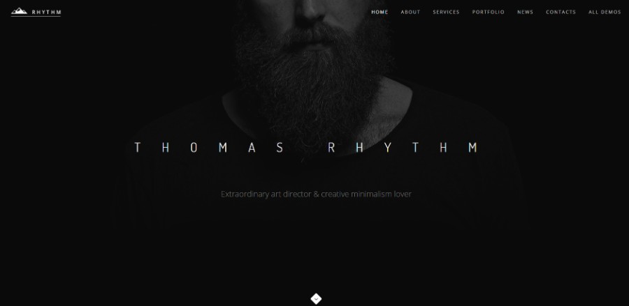
This is an example of a portfolio website that is mostly based on the color black. The dark background is selected to add a fine touch of refinement to the website. The portfolio looks edgy and it is very easy to visualize.
Another good example of a portfolio, Tim Brack uses dark nuances to emphasize his work in a clean manner, without overcrowding the page. He makes great use of negative space and has several layout elements that make the site unique.
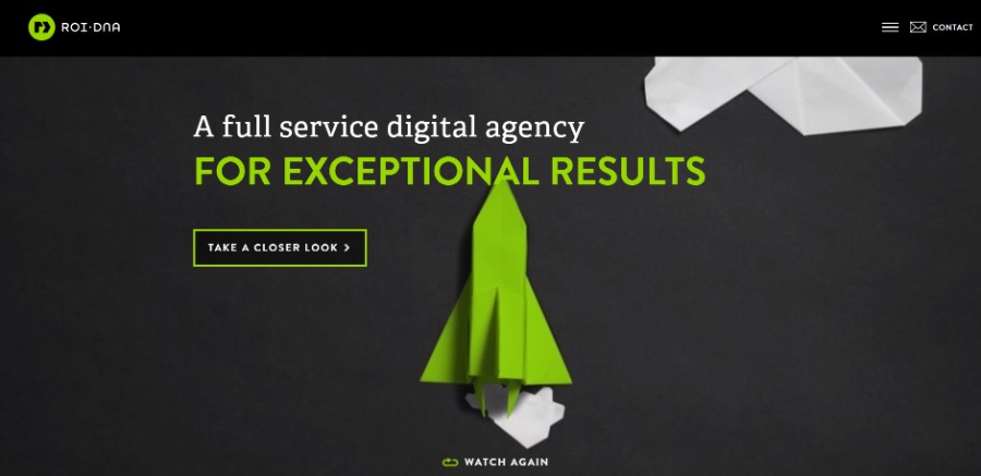
Roidna uses a dark theme, but also includes different types of hues to accentuate certain elements present on the website. It is a good example of websites that direct the viewers towards an image.
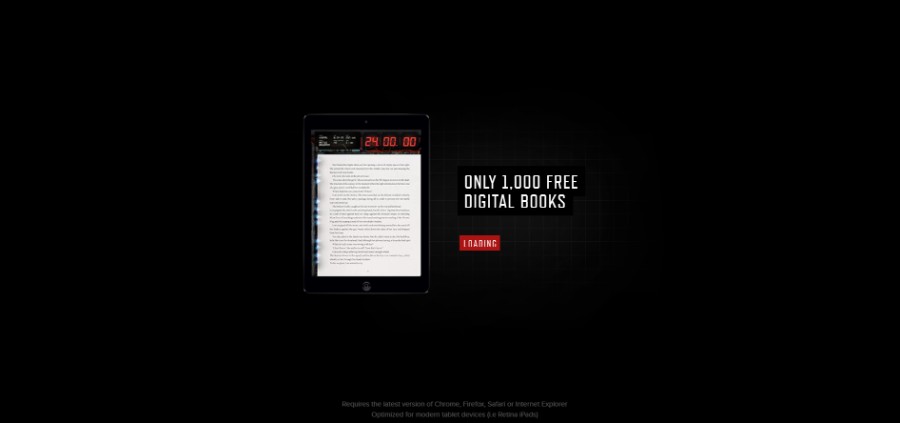
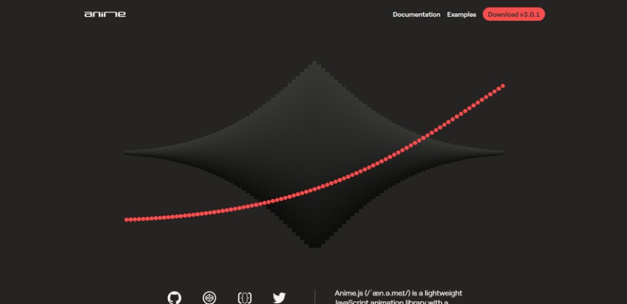
This is a unique project that has a dark theme and multiple animations that make the website look high-tech and mysterious. The content is structured in blocks that are easy to read.
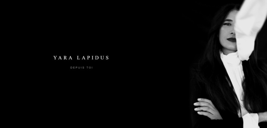
YnY combines multiple elements into a great result. It has a color scheme based on two fundamental colors and it is very aesthetically pleasing, given the website’s elegance. The content on the website can be distinguished fast and the overall look of it is exquisite.
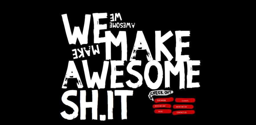
Another website that uses black exclusively to achieve the wanted result. We Make Awesome is a portfolio website that incorporated a dark background and dark color tones. The typeface selected is grunge and the accent nuance is deep red.
Anime.js (/ˈæn.ə.meɪ/) is a lightweight JavaScript animation library with a simple, yet powerful API. It works with CSS properties, SVG, DOM attributes and JavaScript Objects.
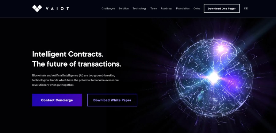
Blockchain and Artificial Intelligence (AI) are two ground-breaking technological trends which have the potential to become even more revolutionary when put together.
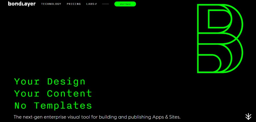
Bondlayer empowers web designers to craft native apps and responsive websites. Without coding or template restrictions.
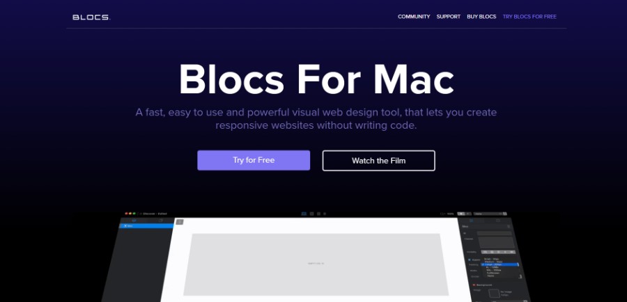
A fast, easy to use and powerful visual web design tool, that lets you create responsive websites without writing code.
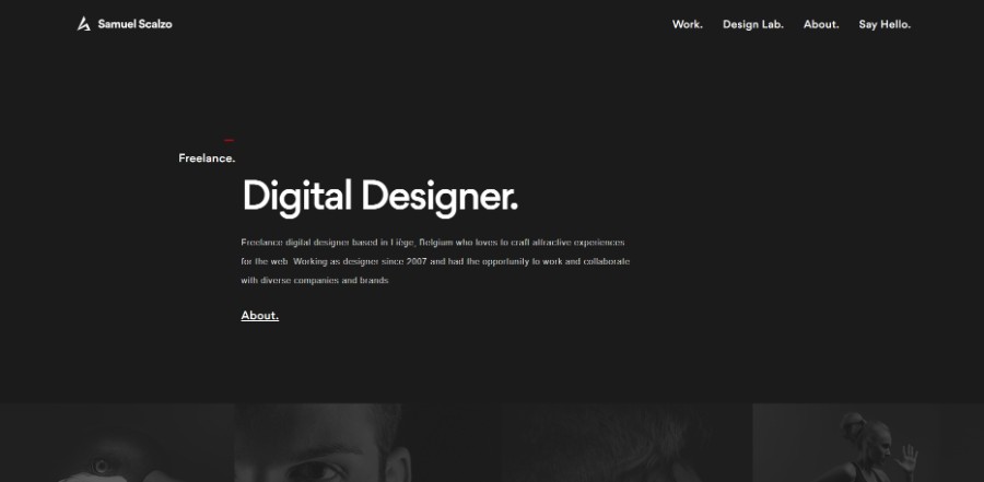
Freelance digital designer based in Liège, Belgium who loves to craft attractive experiences for the web. Working as designer since 2007 and had the opportunity to work and collaborate with diverse companies and brands.
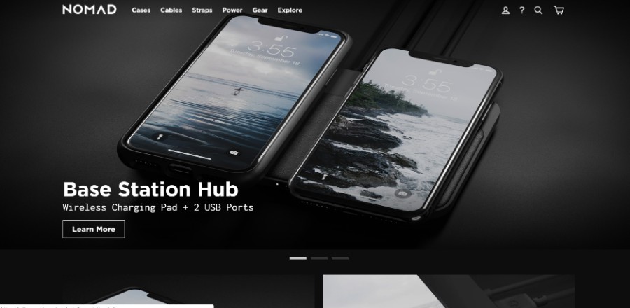
Nomad is much more than a brand name. It’s our philosophy as a company and a team: owning fewer things, being resourceful, and seeking adventure. This is the very core of our product vision: creating minimalist, practical tools that keep us powered on the go. We develop all of our product concepts from the ground up — relying on the lightest, thinnest and strongest materials for our designs.
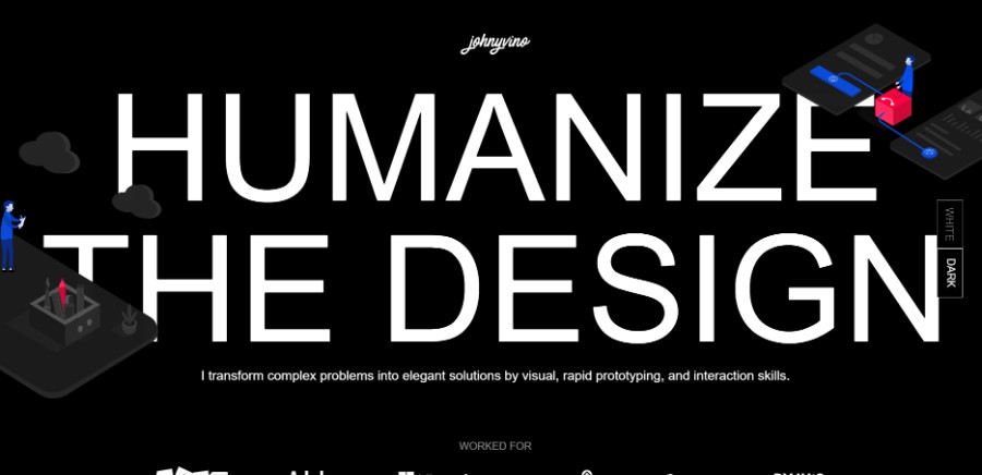
His work often goes beyond conventional interaction patterns and visual styles. He specializes in consumer products by distilling complex data into simple visualization with a sharp eye on subtle details like consistency, color, and typography. I enjoy adding delightful and meaningful microinteractions.
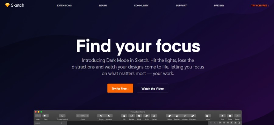
Introducing Dark Mode in Sketch. Hit the lights, lose the distractions and watch your designs come to life, letting you focus on what matters most — your work.
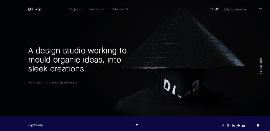
A design studio working to mould organic ideas into sleek creations.
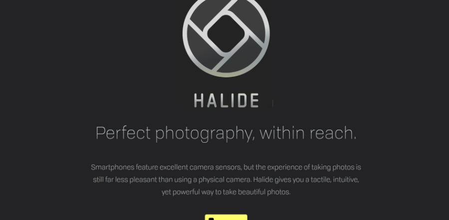
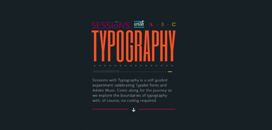
Sessions with Typography is a self-guided experiment celebrating Typekit fonts and Adobe Muse. Come along for the journey as we explore the boundaries of typography with, of course, no coding required.
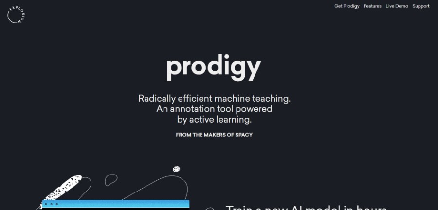
Radically efficient machine teaching. An annotation tool powered by active learning.
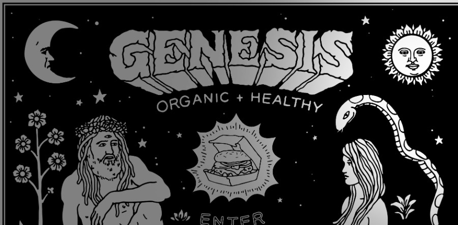
Genesis is a 100% plant based alchemy restaurant concept specialising in fast casual dining and organic comfort food.
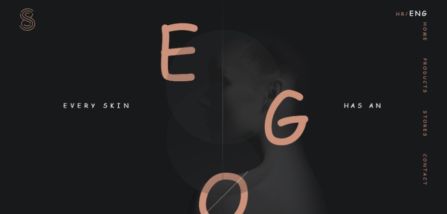
Skinfinity laboratory presents a line of products for skincare which changes everything. The ingredients we introduce, the ratio of active matter which we use, as well as their combination, have not yet been seen in the field of preparative cosmetics. Skinfinity line is unique in every way, most of all in its approach towards skincare.
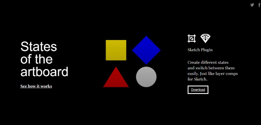
Create different states and switch between them easily. Just like layer comps for Sketch.
Dark backgrounds you can use for your website
Dark grunge interior with spotlight shining on wooden floor
This is a high-resolution dark background image that can be used for all sorts of purposes, including in showcases and logos. There are also some black and white wallpapers that you may use as backgrounds. Be careful about the licensing, though.
As the name says it, this website is a collection of dark textures and dark backgrounds, great for artists or web designers who want to experiment with this type of theme.
3d render of spotlights on a grunge brick wall
For images that have the best quality and scale well with different devices, choose this 3D rendered image with nice lighting effects. It is great for a darker theme, as you can place your products on it and use it as a mockup.
Black dark background with a geometric gray shape
In case you are looking for a dark theme with a twist, this is a simple black background with some geometric shapes on it, great for that elegant feel that business websites want to add to their branding image.
If you want to find a grunge texture for your website’s background image, this website will give you all sorts of walls textures to choose from. You can use the images on this website as simple backgrounds, for logos or as overlay images.
Ending thoughts on using a dark background for your website
If you finally decided to use a dark background for your website, do your research and you have nothing to worry about. Make sure that the dark theme suits your website’s purpose and – once you are completely sure that this type of user interface is for you – start working on the perfect website.
We hope that you enjoyed this article created by our team at Amelia, probably the best WordPress bookings plugin.
You should also check out this one on web design trends.
We also wrote about a few related subjects like modern web design, layout design, bad websites, button design, visual design, best 404 page ever, website layouts and loading animation.
