In the vast landscape of web design, few color choices possess the timeless allure and sophistication as the color black. Symbolizing elegance, mystery, and power, black has the unique ability to captivate and command attention.
In this article, we embark on a journey to explore the web’s most stylish and elegant black design websites—sites that embrace the enigmatic beauty and visual impact of the color black.
Prepare to be immersed in a world of visual splendor, where black serves as both a backdrop and a protagonist. These websites celebrate the beauty of darkness, illustrating how the strategic use of black can transform a digital experience into something truly extraordinary. As we unravel the mysteries and embrace the allure of the color black, we discover a new appreciation for the artistry and sophistication that can be achieved through thoughtful design choices.
Let’s begin!
The Art of Noir: The Best Black Websites in 2023
As we delve into this curated collection of websites, we will witness the masterful use of black as a design element. From sleek minimalist layouts to bold and striking compositions, these websites demonstrate an impeccable understanding of the power of contrast, negative space, and the psychological effects of color. Through their skillful application of black, they create an atmosphere that is both visually arresting and emotionally resonant.
These black-design websites showcase a diverse range of industries and purposes. From fashion and luxury brands to creative portfolios and artistic endeavors, each website represents a unique expression of its respective field. The color black serves as a unifying thread, lending a sense of sophistication and refinement to these online experiences.
Beyond its aesthetic appeal, black design is also a statement of intentionality. It can evoke emotions and a sense of exclusivity, or provide a canvas for other elements to shine. These websites leverage the power of black to enhance their content, guide user attention, and create a distinct brand identity. They exemplify the notion that simplicity and restraint can often speak volumes, creating a lasting impact on visitors.
So, whether you are building your site using a drag-and-drop website builder or hiring a designer, read on to get your inspiration.
Shout
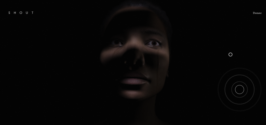
Quite possibly the most effective black website on our list is this one. It combines a dark design, unease music, and an opening video to make its powerful message heard loud and clear. And that message is – stop violence against women.
The design lets you (re)live this woman’s experience. Feel it. Share it. And empathize with it.
Studio Be 4
This creative agency sure knows how to use creativity to tell their story, which is a good indicator that they will know how to help you tell yours.
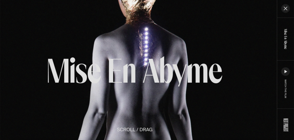
Black here serves as a backdrop and creates a stark contrast with the rest of the design elements, including fonts. Definitely, a bold choice when it comes to creating a visual hierarchy.
Void
Void is one of those not-so-basic black websites that found a way to stand out from the rest. Relying only on its splendid animations, Void takes its visitors on a journey through a compelling visual story.
This story does not use any words – the message is conveyed through images and animated content. The page is entirely black, transmitting a sense of mystery. Other dark colors are used to enhance certain elements. The website also has a narrative background.
Edoardo Smerilli
This captivating black website takes you through some of the best projects of a talented Italian film director.
Black-themed design of this website creates an atmosphere of mystery and power. This dramatic impact is even more emphasized by the seamless navigation that lets you focus on Edoardo’s best works.
The Ordinary
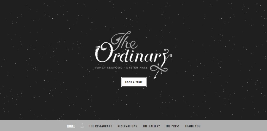
The Ordinary has a black-and-white design, which gives the feeling of a star-filled sky. Such a combination simply can’t go unnoticed – there’s nothing ordinary in The Ordinary.
Also, the website has a nautical theme because seafood is the main attraction at the restaurant.
DopeGood
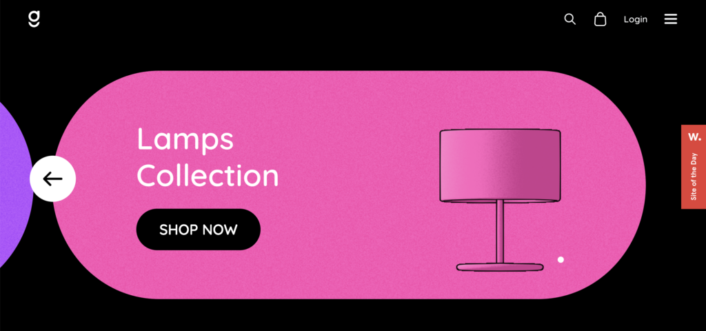
One of those simple, yet effective websites with black backgrounds, DopeGood manages to capture our interest right from the start.
Their load screen looks great against the black background and the CTA button is hard to miss. Kudos to the designer!
Synthese
Synthese is a black background website enriched with geometrically shaped design elements in vivid colors. Such a design approach gives Synthese both depth and playfulness, while clearly showcasing the knowledge and skills of these computer graphics experts.
1MD
The design of this black website is very sleek and elegant. It evokes feelings of power and sophistication while combining colorful elements to enhance visual interest.
The strategic use of black here provides a sense of exclusivity and creates a sense of depth and dimension.
Clover
Clover is another great example of how a website with black background can be visually attractive.
The designer used a combination of black background and bright colored letters and other elements to create a visual hierarchy. Our attention is drawn straight to the focal points, guiding us straight through the content.
GT Super
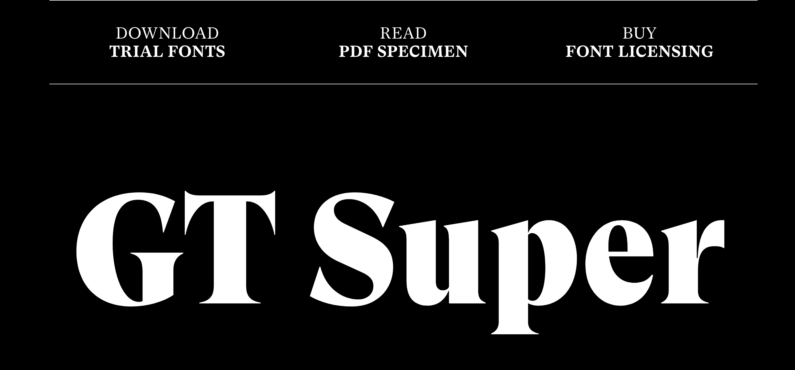
GT Super uses black website design to emphasize the very thing that they are about – typefaces. And it works like a charm!
Every font is clearly visible on this all-black website. Thanks to this color combination and minimalistic design, it takes only a glance for the users to distinguish between different fonts.
Doran
Thanks to its sleek design, Doran found its place on our best black websites list. Vivid colors and eye-catching design elements on this black background create a bold contrast and increase readability.
Moreover, such a restrained color palette conveys elegance, sophistication, and style.
Mav Farm
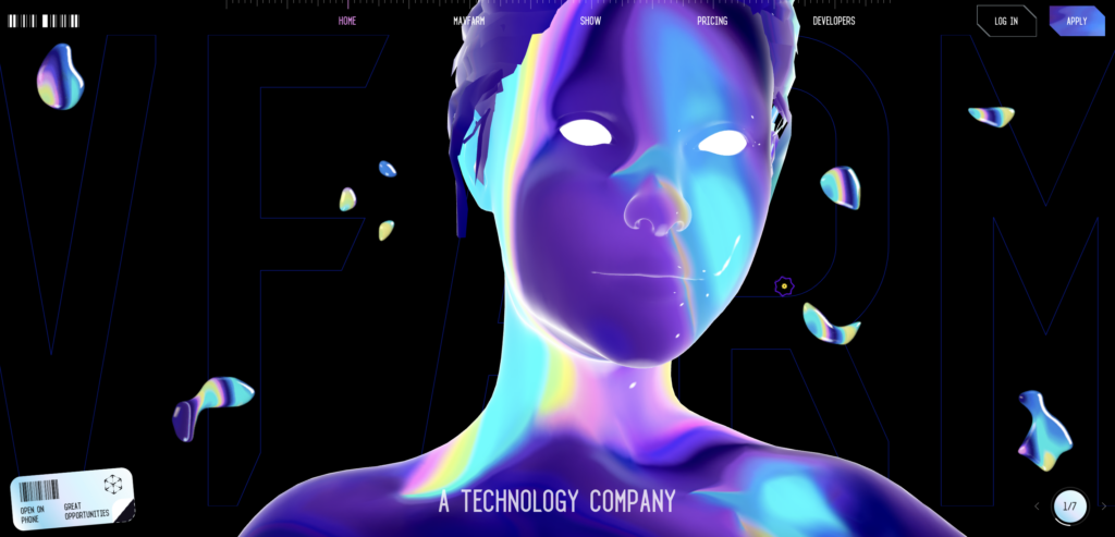
Even though this website is far from minimal design, its unique vibe has placed this black website straight on our list.
One of the most visually striking websites here, Mav Farm uses different elements to leave an impression. What do you think?
Fork Spoon
Fork Spoon boldly combines its black website page with white textual elements. This helps create a high-contrast effect and directs readers’ attention to the most important info.
Also, besides utilizing black-and-white contrast, this website relies heavily on minimalism and simplicity.
Haptic
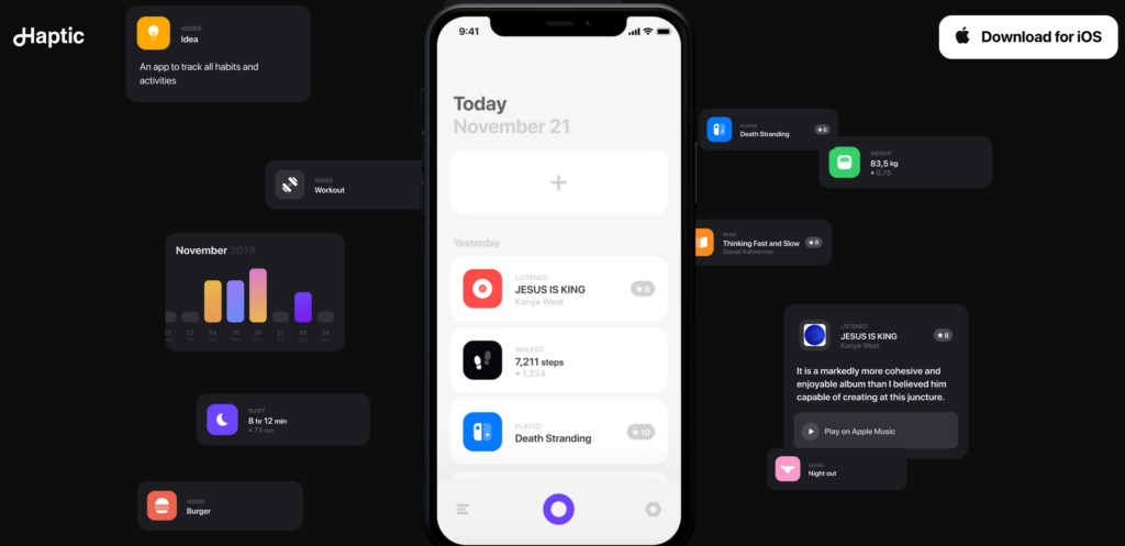
Haptic is a true gem among other black background websites on our list. Why?
Not only did they manage to portray a minimally invasive, yet strikingly effective aesthetic, but they also used some quite cool effects to make their website more engaging. You truly have the feeling you dove right into the product. Great job!
International Women’s Day by Apple
Complemented by black and white photographs, this black website uses design to tell a story.
You can move through the page in different directions and hover over photographs to discover more details about each woman. A brilliant way of creating an interactive, yet elegant website.
Printworks London
Printworks London has one goal – to change the face of the capital’s cultural scene. And it uses its website design to emphasize this.
A combination of the black background, retro 90s-video-games fonts, and images showcasing urban events will definitively pique your interest.
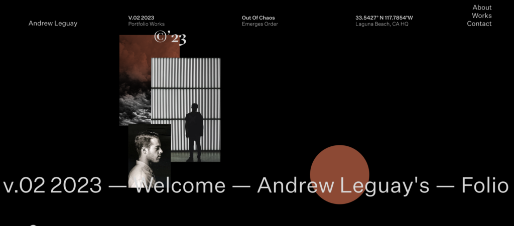
Andrew Leguay
If you’ve been wondering whether to use black for your portfolio website, we say – go for it! This black background website just goes to show how this magnificent color can be used to accentuate your work.
Just remember to pair it with some bright colors, to make your page more dynamic and attention-grabbing.
Yuto Takahashi
Let’s look at another portfolio website that uses black color as a backdrop. Interesting design elements, vivid colors that pop against the dark background, and intuitive navigation guide the visitor and create a sense of depth.
Pretty effective, right?
CONTRATEUR
One of the best black-and-white websites, Contrateur takes its visitors on a country-hopping adventure. The design uses white, large font letters contrasted on a black background to create a more striking effect.
There is also a homepage slider that makes seeing the items easier and more efficient.
Blake Allen
This is another black website that showcases a portfolio. Designed with simplicity in mind, the website is not loaded with animations or other elements. They can easily transform the space into a crowded one, making the website difficult to navigate.
The website features a black background and white typography, which is very easy and pleasurable to read. With its minimal design elements, this black website example leaves a great impression on visitors.
Astra

Astra is a WordPress theme with over 240 templates, some of them in black, like this Black Friday template. All templates are compatible with drag-and-drop page builders and are fully customizable so can be made to suit any purpose.
Layouts are well-designed and feature modern graphics and images, superb typography, and industry-relevant elements on every page. Astra is fast, easy to use, fully responsive, and really can be all things to all people!
When to Use a Black Background?
If you are wondering what types of websites are the most suitable for a black background, here are a few types of websites where a black background can be particularly effective:
- Portfolios: A black background can provide an elegant and immersive canvas to showcase high-quality photographs. It helps enhance the contrast and depth of the images, allowing them to stand out and captivate the viewer’s attention.
- Artistic and creative websites: Websites that focus on art, design, or other creative endeavors can benefit from a black background. It can create a dramatic and visually appealing backdrop for showcasing artwork, illustrations, or other visually striking content.
- Entertainment and nightlife: Websites related to entertainment, music, clubs, or events that aim to create a lively and intense atmosphere can utilize a black background. It can help convey a sense of excitement, mystery, or a vibrant nightlife experience.
- Design studios. Design studios often have a creative and artistic focus, making them well-suited for a black background or incorporating elements of black into their website design.
- Technology and gaming: Websites related to technology, gadgets, or gaming often adopt dark color schemes. A black background can enhance the futuristic or immersive feel of such websites, complementing the visuals and creating a visually engaging experience.
Need a Booking Plugin for Your Stunning Black Website?
Look no more – Amelia is here.
Amelia, one of the best-rated WordPress booking plugins, prioritizes the user experience at every step. Its user-friendly interface allows for effortless setup, configuration, and operation, delivering ease of use.
Experience the convenience of Amelia – a booking solution that is intuitive, hassle-free, and equipped with a wide range of features to streamline your scheduling processes.
Whether you’re seeking to automate appointment or event bookings, track your calendar with ease, efficiently manage your staff and their schedules, or provide your customers with an impeccable booking experience around the clock – Amelia is the solution you’ve been looking for.
Unlock the full potential of your business with Amelia and enjoy a comprehensive suite of tools designed to simplify your operations.
Interested?
Give Amelia a try and join more than 55.0000 users worldwide.
Tips on How to Use a Black Background for Your Website
When using a black background for your website, it’s important to consider certain factors to ensure a visually appealing and functional design. Here are some tips to help you effectively use a black background:
Contrast and readability
Ensure that there is sufficient contrast between the black background and the text or other elements on the page. This means you should use light or vibrant colors for text and other important elements to ensure readability. Make sure to test the color combinations to ensure that the content remains clear and easy to read.
Strategic use of white space
Incorporate ample white space or negative space around the content to create a sense of balance and prevent the design from feeling overcrowded. Basically, the contrast between the black background and white space can make the content stand out and enhance the overall aesthetic.
Attention to typography
The first thing to remember is to select fonts that are legible and visually appealing against a black background. Moreover, choose font styles that offer good readability, even in different sizes. Finally, consider using bold or thicker fonts to make the text more prominent and easier to read.
Utilize color accents
Introduce vibrant or contrasting colors as accents to draw attention to specific elements on the page. This can help create visual interest and guide users’ focus within the design. Next, experiment with different color schemes to find combinations that complement the black background.
Consider accessibility
Keep in mind that a black background may pose accessibility challenges for some users with visual impairments or color vision deficiencies. Ensure that your website meets accessibility standards by providing alternative text for images, using high contrast between foreground and background elements, and utilizing accessibility features and tools.
Test across devices
Black backgrounds can appear differently on various devices and screen sizes. Make sure to test your website design on different devices, including desktops, laptops, tablets, and mobile devices, to ensure consistent and optimized visual presentation.
Use high-quality visuals
Black backgrounds can provide an excellent canvas for showcasing high-quality visuals, such as images, videos, or illustrations. But you first need to ensure that the visuals you use are of high resolution and optimized for web display to maintain their quality and impact.
Consistency in design elements
Maintain consistency in design elements, such as color schemes, typography, and overall visual style. Consistency helps create a cohesive and polished look for your website, enhancing the user experience.
Consider loading times
Heavy use of black backgrounds, especially with large images or videos, may impact the loading times of your website. Optimize your media files, use appropriate file formats, and consider content delivery networks (find a hosting solution that includes a reliable CDN) to ensure a smooth and fast-loading experience for your visitors.
So, Which of These Black Websites Is Your Favorite?
Utilizing a black background for your website design can create a visually captivating and sophisticated experience. When done right, it can enhance the overall aesthetics, draw attention to key elements, and convey a sense of elegance and creativity.
However, it’s crucial to balance the visual impact with considerations of readability, accessibility, and user experience.
By carefully choosing contrasting colors, incorporating white space, and paying attention to typography, you can ensure that your content remains legible and engaging. Additionally, employing color accents strategically and maintaining consistency in design elements contribute to a polished and cohesive look.
Remember to test your design across different devices and optimize your visuals for fast loading times. Also, keep in mind the importance of accessibility standards to ensure that your website is usable by all visitors.
If you enjoyed this article, you should also check these:
