Have you ever wondered why people visit websites regularly? First of all, they do that because of the good content they find there. If they consider that content relevant for their everyday life or for their goals, they will actively use that website.
Choosing good website layouts is the second factor you need to consider. The way the content is delivered through the website layout selected influences how a visitor perceives the website.
We care a lot about how our readers and website visitors feel when they access the website.
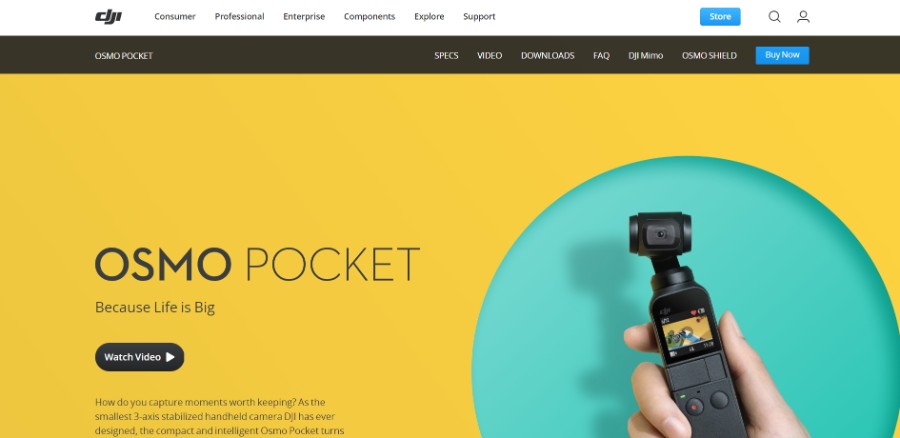
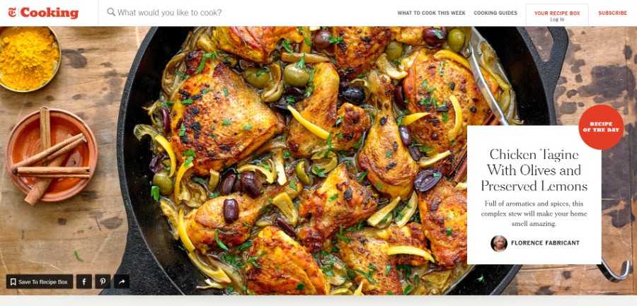
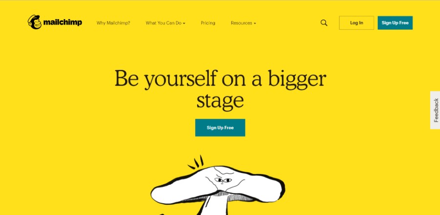
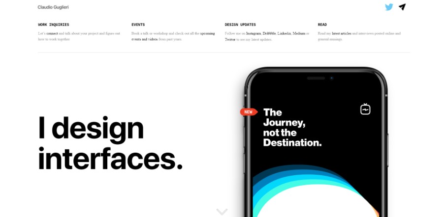
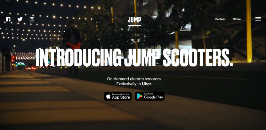
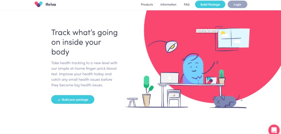
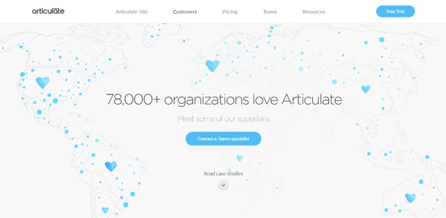
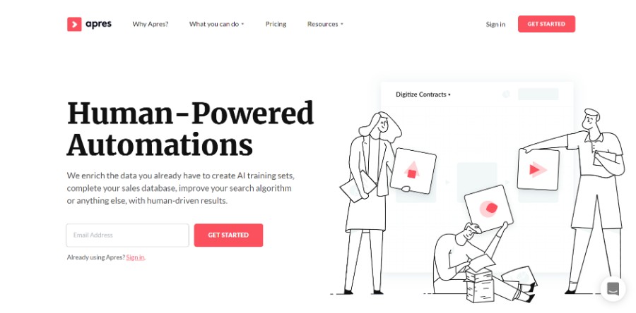
Check out some of the layouts we considered when building our website.
Table of Contents
- The definition of website layouts
- Advantages of using a good website layout
- How does a good website layout look?
- Different types of website layouts you should know about
- Website examples with good layouts
The definition of website layouts
Website layouts are basically patterns that define the whole structure of a website.
The information is structured according to the website’s goals and purposes. When navigating on a website, the visitor follows the exact website layouts that you used in order to visualize the website.
Advantages of using a good website layout
Website layouts include a multitude of benefits that transform websites into effective ones. In eCommerce, if you use the right website layout the conversions will be boosted significantly. Here’s why layouts are so important:
They are easy to use
The first big benefit of building a good website layout is that they are common for users and they know how to work with them. They immediately notice the website layout and they start navigating on the website with ease.
They offer a good UX
In a world where the user experience is so important, it is highly important to find a website layout design that is familiar, that gives users a sense of familiarity.
When users get to see something they already know how to use, they find it more comfortable to find the information they want to know more about. A familiar web design layout is the element that makes the website easier to digest.
They save you money
Website layouts can be reused in time, which means you can save a lot of money and time in the process. Because – as a designer – you don’t have to look for more web page design ideas or to experiment with new website layout templates.
Instead, you just change the visual hierarchy according to the website goals, adjust it to the theme and you are all set.
How does a good website layout look?
Making the layout streamlined
First of all, you need to understand the basic principle behind a web layout design. It has to be streamlined.
Streamlining means getting rid of all the clutter that other websites have, making them very easy to navigate. Using negative space and clean content is the best way to give visitors an idea of how they should navigate on it.
Keeping the goals of the website in mind
If you start analyzing website layout examples, you will see that each site is based on the goals it has. The website layouts selected are the ones that give the users a hint regarding what is important on the site and what isn’t.
Use negative space to balance everything out and include clear call to action buttons. These two elements should rapidly boost your conversions if that is your website’s purpose.
Think about how skimmers operate
You should know that most people who spend time in the online environment are skimmers. Skimmers want to find their information as fast as possible and leave the website in minutes.
In order to offer them what they need and make them come back, you need to create a layout that makes all the content on the website much easier to consume.
The best website that you can design would be one that:
- would help visitors take a look at the navigation bar and the pages you linked there
- is F-shaped
- has plenty of white space so that it’s easier to read the important information
- and has a call to action button created with a distinct color that would draw attention to it
Make it responsive
Users will immediately leave a website that is not responsive. Responsiveness and aesthetics must meet in order to create the best user experience. Website layouts should be scalable so that no matter the device people are using, the website will be displayed properly.
The simpler, the better
The website layout idea you choose must be simple to use. Visitors can’t find any difficulties regarding the navigation on your website. To gain web traffic, make sure that the website is simple and offers the exact instruments needed for smooth navigation.
Different types of website layouts you should know about
One column layout
From all page layout designs, this one is the most common one because of its simplicity. The one-column or single column layout presents all the content in one vertical column. This is the simplest way to present content without using an overwhelming amount of elements.
Even though this website layout is simple to achieve, most websites choose it because of the mobile revolution. People who display websites on mobile devices won’t ever encounter problems with a one-column layout.
Three boxes layout
A common layout is represented by the three boxes layout. As the name says it, the website content should contain a hierarchy where the first box is where you have the most important elements, and the other two boxes represent less important content.
These boxes can either be filled with text, images, or both. You will see this layout often in web design, and it is very easy to obtain.
Split-screen layout
This one is a good layout that makes the website easy to follow. This is the case with the split-screen layout. If the website’s purpose is to present two different pieces of content that are of equal importance and should be presented in the same manner, the split-screen layout allows you to do so.
Both parts of your content will be presented in a simultaneous manner, making it perfect for presenting elements that are equal in terms of importance.
Asymmetrical layout
A layout that is more appropriate for a website that is less strict and more artistic is represented by the asymmetrical layout. It is a technique that is mostly applied where the elements don’t have a very particular order in terms of importance.
Website layouts that use asymmetry should not be imbalanced, in fact. Asymmetry is also a way to balance elements but in an unconventional manner. Using the weight of the elements to create dynamism is the best way to create a responsive, beautiful layout.
Fixed sidebar layout
The easiest and most common way to build a website design is vertical.
Creating a vertical column and placing a fixed element on one side of the website that stays in place while the rest of the page moves vertically is a common way to build the navigation bar style. This layout works because the sidebar is accessible at all times.
Full-screen image layout
Full-screen layouts are great for photographers or other types of industries that are mostly based on visuals.
Of course, the website layout can be used for different sorts of the website as well, considering that it is very visually appealing and is based on little to no content. Keep in mind to make the content readable by using opaque shapes on top of the image.
Website examples with good layouts
Take health tracking to a new level with our simple at-home finger-prick blood test. Improve your health today and catch any small health issues before they become big health issues.
All the apps and resources you need to create courses, continuously updated with new features.
They enrich the data you already have to create AI training sets, complete your sales database, improve your search algorithm, or anything else, with human-driven results.
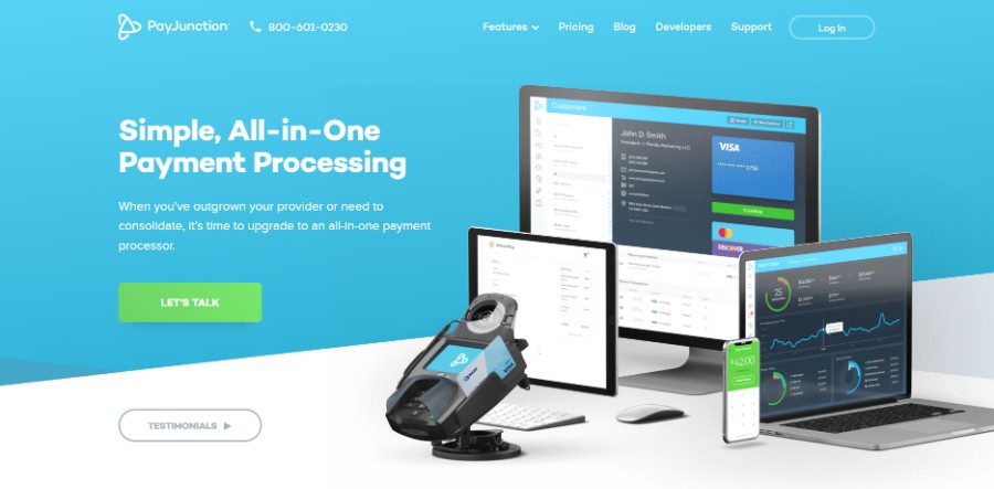
When you’ve outgrown your provider or need to consolidate, it’s time to upgrade to an all-in-one payment processor.
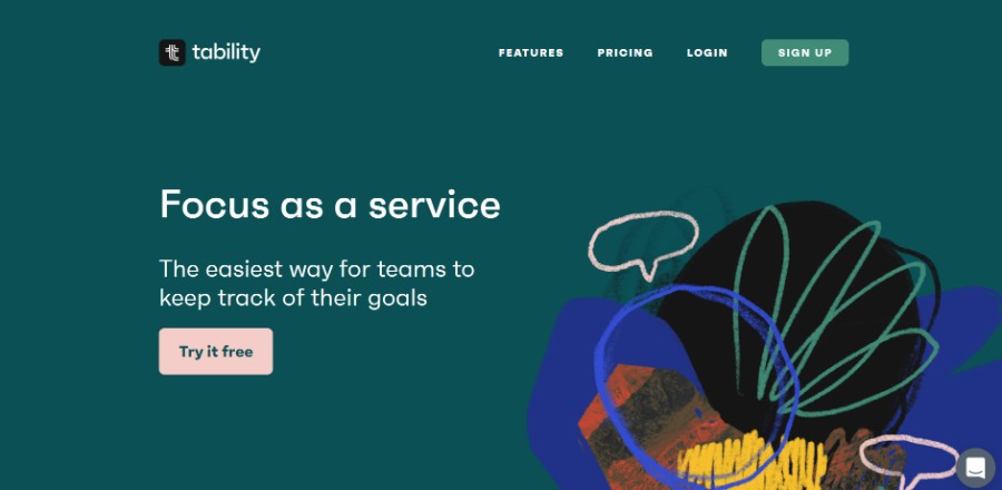
The easiest way for teams to keep track of their goals.
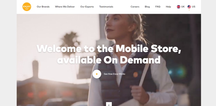
Enjoy brings the best of the store through your door.
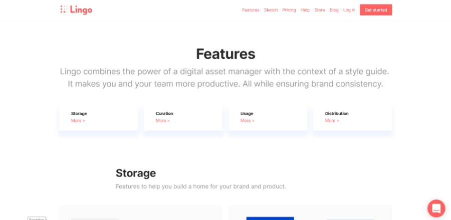
A modern digital asset manager for your brand and product. Create a shared asset library. Empower your team. Ensure consistency. Increase productivity.
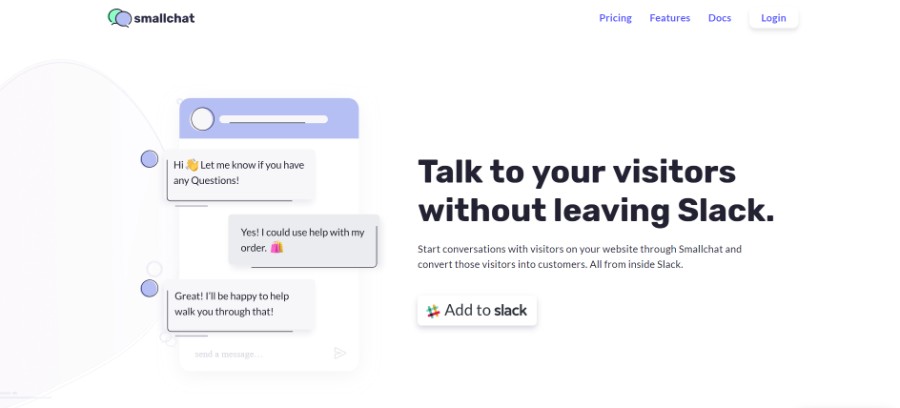
Start conversations with visitors on your website through Smallchat and convert those visitors into customers. All from inside Slack.
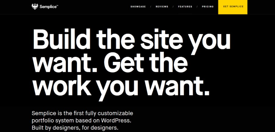
Semplice is the first fully customizable portfolio system based on WordPress. Built by designers, for designers.
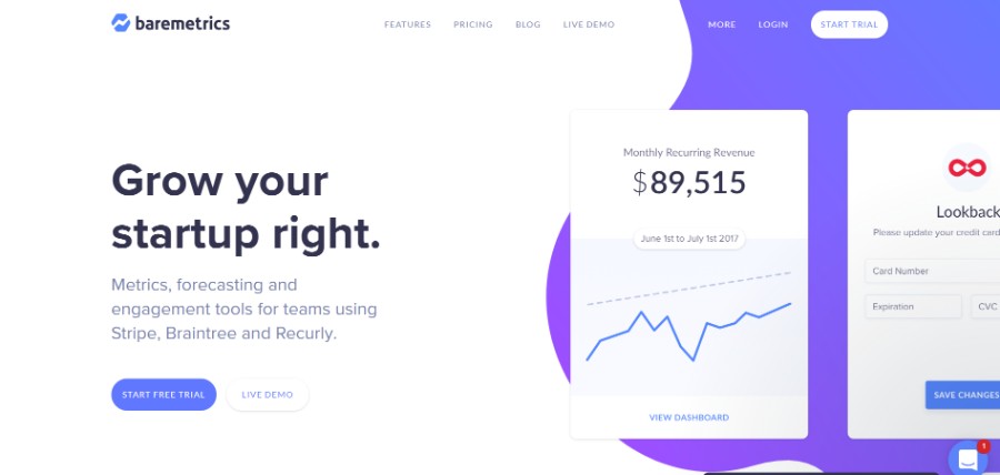
Metrics, forecasting, and engagement tools for teams using Stripe, Braintree, and Recurly.
Ending thoughts on awesome website layouts
You should choose the website layouts that meet the goals of your website. If you want to improve the UX and conversions of your website, always choose simple website layouts. Keep the layout intuitive and beautiful to transform your website into a success.
We hope that you enjoyed this article created by our team at Amelia, probably the best appointment scheduling plugin for WordPress.
You should also check out this one on loading animation.
We also wrote about a few related subjects like modern web design, layout design, bad websites, button design, visual design, best 404 page ever, web design trends and dark background. But also an interesting piece with the best WordPress table plugins.
