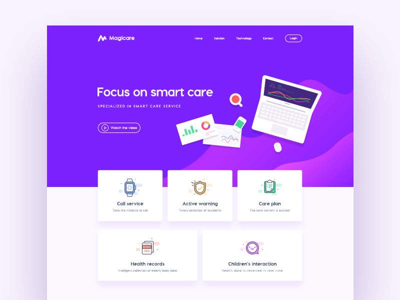
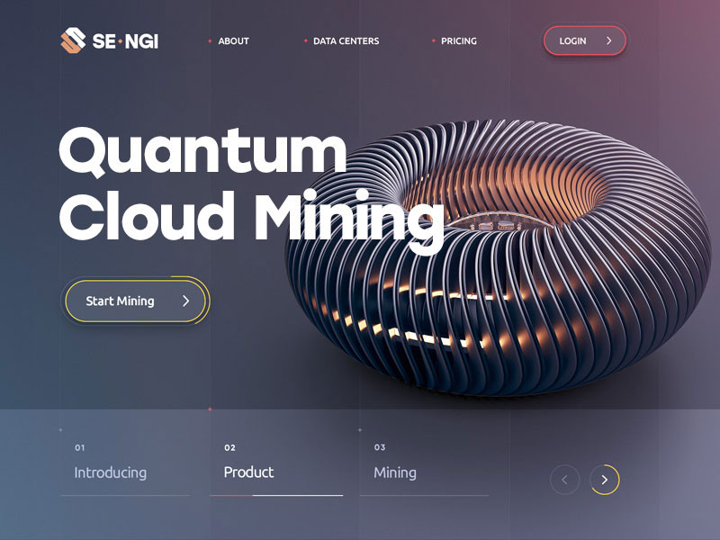
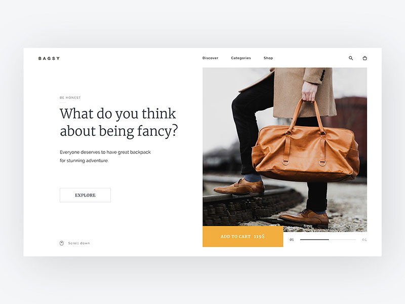
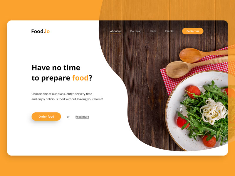
Website design is constantly evolving to suit the needs of an ever more sophisticated and demanding audience. What we knew about website design a year ago is already outdated. The new web design trends that emerge in web design are more advanced, more streamlined, and more user-friendly than ever before.
Over the past 10 years or more, having a website has become an absolute priority for businesses and individuals alike, yet one cannot stop at putting up a few pages of content and hoping for the best.
The problem is that websites are no longer simple pages to build a digital presence – they are also powerful tools that can increase the amount of money you make every month. To get the most out of your site, you need to pay close attention to website design.
After all, websites have come a long way since the 1990s, and modern web design involves somewhat more than throwing together a nice layout.
In this article created by our team at Amelia (our WordPress booking plugin for web developers), you will learn about ten of the most important elements you should keep in mind when putting together a modern website. Here’s what you need to know:
Design – Importance and Level of Impact
The best web design practices lead to the best feedback from users. The question is: why? Isn’t content more important than the way a website looks? Isn’t responsiveness more important than what fonts you use?
Of course, these aspects contribute to the overall image of a website, but they are nothing without following the basic rules of web design.
Whether you’re building a custom solution or working on WordPress web design, in order to make a site enjoyable, you need to make sure that it is aesthetically pleasing and it doesn’t tire the eyes of the viewer.
Before anything else, you need to establish a good first impression which is a sum of elements such as good loading times, responsiveness, and design.
The best-designed websites incorporate these design elements thoughtfully and in a balanced manner so that the final result is satisfactory for the user. Mainly design should be uniquely tied with branding strategy, because digital branding must follow certain standards and the first one is to keep your look the same including your website and other platforms.
Web design is a continuous process and you’ll always need to make new improvements amid changing trends and the evolving expectations of your visitors.
Essential Modern Web Design Elements to Keep an Eye On
Moving on to modern website design, there are several important elements that differentiate nice, clean modern websites from other, older styles. Below you will find a list of these elements, as well as an explanation to help you achieve the best result.
Minimalism
People often mistake modernism for minimalism. These are not the same, but they influence each other greatly. The principle of minimalism is “less is more”, while modernism focuses on airy design, as clear-cut and clean-lined as possible.
In modern website design, the idea of simplicity should be borne in mind. Following a minimalist principle will help your visitors instantly assimilate the information you provide them with. Besides, the minimal design has many benefits for your website.
Color Palettes in Modern Website Design
In modern website design, color palettes are quite unassuming – they are simple, yet impactful enough. You will have to be consistent with the color palette once you chose one because it will become part of your brand design.
Get your web design inspiration from other big websites that have made their brand popular through the use of a simple, consistent color palette. See FedEx, McDonald’s, or Amazon. You can also get inspiration by checking out some of the modern web design examples and the color palettes that trusted New York web design companies are using.
Navigation
Another element you should pay great attention to as web designers is the site’s navigation system. The more complex it is, the easier it is to confuse visitors. It’s best to keep it simple and responsive so that users can rapidly access any section of the website they are interested in.
Modern web design encourages using a clear navigation system with extra assistance to help users find the information they are looking for (e.g. using a search bar with suggestions or faceted search).
Typography in website design
People often forget that typography can impact a website’s design tremendously. The typefaces you choose can influence the overall feel of the website. You need to think twice when combining fonts, especially if you want to build a modern website.
Typefaces come in all sorts of shapes and sizes. It’s best to use larger font sizes so that users will encounter no problem in reading the content on all sorts of devices.
It would be a good idea to get your web design inspiration from companies that use their own particular like ArtKai, unique font instead of ready-made ones you can find in online markets.
A branded typeface can create a sense of individualism for the respective website, which is the exact result you should strive for. See Beyonce’s symbolic “Knockout”font as a reference.
White Space
The use of white space in web design is underestimated, as it can change the entire aspect of a site when used properly. When a website is filled with too much information or too many design elements, it will overwhelm users and they will probably skim through the content, not absorbing any of it.
When adding a few areas that allow the users to breathe and take a break from all that content, you help them recharge their batteries for the next paragraph. The website aesthetic becomes more pleasing.
White space is used as a much-needed visual break. It minimizes distractions and sets a clearer eye-path that people will follow when browsing your website. In modern web design, the use of white space is almost mandatory, as it accentuates relevant information for those in a hurry.
White space is the easiest way to direct attention towards a certain subject. It will also make the page look cleaner and airy, like a well-lit room.
CTAs
Remember what we said about a clear navigation system? Call-To-Action buttons will help you achieve that, while also increasing the chance to turn your visitors into actual clients.
CTAs are pivotal elements in guiding the users through your website. When building a CTA button, you need to take into account where you place it, how you design it, and what text you use for it.
Depending on your website’s specifics, you can use a CTA button on each page, but not more.
Iconography and Photography
A website is nothing without visual content. Of course, quality copy is needed to ensure the minimum amount of information that a user should get from the website they are visiting, but accompanying imagery makes it that much better.
In modern web design, you will have to make sure that the images or icons you choose are suitable for the theme you’ve selected, the color palette you are using, and the subject of your site.
You shouldn’t use too many photos, as they can slow down your website and make it look too cluttered. This year’s web design trends encourage using unique, high-quality photos that give the users a glimpse into what your site’s all about.
The more personal the content, the better the user experience.
Hero Images
Another popular trend governing modern web design is using a full-screen image as a base for your website’s homepage. Hero images are max-size banner images placed above the fold to grab the attention of the users and pique their interest.
Of course, you’ll have to make sure that the hero image doesn’t make it difficult for the user to read the text that’s above it. If it intersects with your navigation menu, the text must have a contrastive color and a bigger size to ensure clear visibility.
As we’ve seen above, modern web design demands proper management of digital assets. You’ll be working with many files, often in a range of different file types (graphics, photos, videos, etc), all of which need to be readily accessible for all involved teams.
As a result, it might make sense, especially as your company or client portfolio grows, to invest in a digital asset management solution. This technology makes it easy for design and marketing teams to quickly access the files needed to keep the project moving forward.
Responsiveness
Responsiveness refers to a website’s ability to look good and function well on any size device. If the user tries to access a section on your website but they can’t because it wasn’t designed for their device’s screen size, they will leave — as simple as that.
Today’s users access the Web with a number of different devices at any given moment but each layout looks great, and mobile users will form a large segment of the audience for any modern website.
Background Videos
Alongside the use of a full-screen image as the background for your main page, another trend has also become popular in modern website design — video backgrounds. These are more difficult to implement, given that you need to keep the website responsive, but they are worth all the trouble.
They can be used to tell your story in a quick, engaging, and aesthetic manner, and from the moment the user enters your site, their attention will be grabbed by the background video.
The video should include the key points of your work. This way, visitors will know right from the start what your website is about and they can direct their attention to whatever they are interested in without skimming through your copy.
Ending thoughts on modern web design
You’ve now read a few things about the most common practices in modern web design. There are, of course, many other aspects that could help you design a modern website, but following these basic principles is an excellent starting point.
To get the most out of your site, lay the foundation using these elements, and don’t forget to add a personal touch to your site to get closer to your visitors.
If you enjoyed reading this article on modern web design, you should check out this one on layout design.
We also wrote about a few related subjects like bad websites, button design, visual design, best 404 page ever, web design trends, dark background, website layouts and loading animation.


