
Explore topics
Event Calendar vs Event List: Which Booking View Converts Better?
Amelia 9.3 Update Brings More Control to Scheduling and Events
Group Bookings vs. Individual Appointments: Which Model Fits Your Business?
Amelia vs Start Booking: Which Booking Solution Is Better for WordPress Businesses?
Amelia Q1 2026 Update: Improvements, Integrations, and What’s Coming Next

Read Inspiring Customer Stories
Check out how our user set Amelia for his business
Read the full storyWhen businesses compare booking views, they often focus on which one looks better on the page. But visual preference alone is not what drives conversions. What matters more is whether the booking view matches the way visitors naturally browse for events.
Some people start with a date in mind and want to see what is happening on a specific day. Others are less focused on the calendar itself and simply want to browse upcoming events, compare options, and choose the one that interests them most.
That is where the difference between Event Calendar 2.0 and Event List 2.0 becomes important.
In Amelia, both views support event booking, but they help users reach that booking decision in different ways. One is better suited to date-first browsing, while the other is often more effective for discovery and comparison.
Let’s see which one converts better!
What Is Event Calendar 2.0 in Amelia?
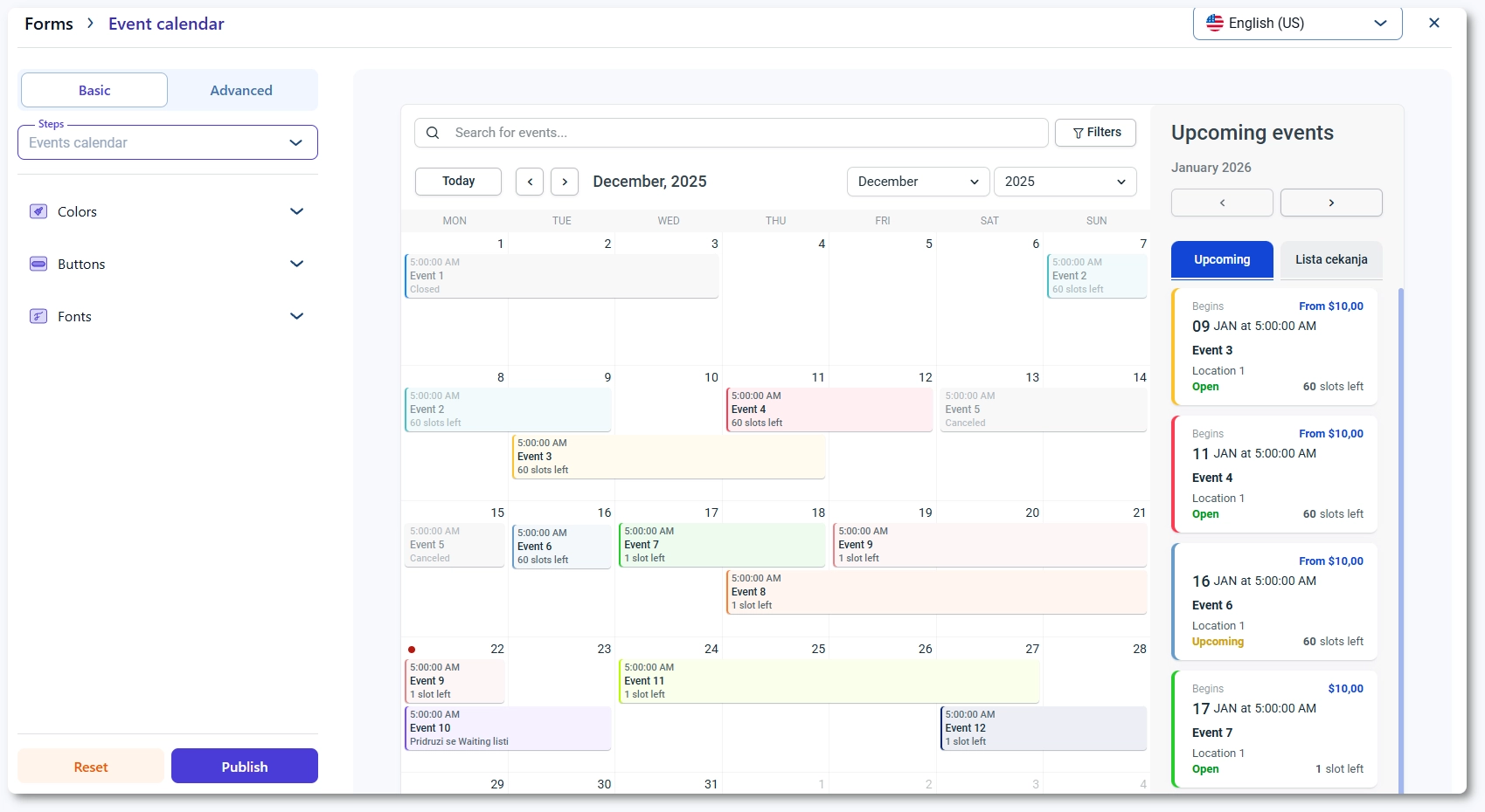
Event Calendar 2.0 is Amelia’s calendar-based event booking view.
Instead of showing events in a simple vertical list, it displays them inside an interactive monthly calendar, making it easier for visitors to browse events through dates and schedule patterns rather than through a standard feed of upcoming options.
This view is built for customers who want to scan the month, check what is happening on specific days, and open event details directly from the calendar. Rather than forcing users to search through a long list, it gives them a more visual way to explore availability and understand how events are spread across the schedule.
If several events fall on the same date, Amelia does not try to display everything in full inside the calendar cell. Instead, it shows the first event and groups the remaining ones under a “+X events” label, which helps keep the interface more manageable while still signaling that more options are available on that day.
Amelia has also continued refining this view over time. Its changelog and annual product updates reference improvements tied to Event Calendar 2.0, including unique status-based CSS classes that give users more control over styling and customization.
Key strengths of Event Calendar 2.0
- Works especially well for visitors who think in dates first and want to start from a specific day, week, or part of the month.
- Helps users orient themselves quickly and move toward a booking decision faster when timing is their main priority.
- Gives a clear visual overview of when activity happens across the month.
- Makes it easier to spot schedule patterns instead of viewing each event in isolation.
- Helps users compare busy days, quieter periods, and the overall rhythm of upcoming events at a glance.
- Supports one of the main strengths of calendar-style interfaces in general: fast time-based browsing.
Where it can create friction
That same structure can also create some limitations.
A monthly calendar is useful for scanning dates, but it often hides important event details until the user clicks into a specific item. This means the view is strong for schedule discovery, but not always as strong for immediate content comparison.
Dense schedules can also make the interface feel visually crowded. When many events compete for limited space inside calendar cells, the layout can become harder to scan, especially on smaller screens or busier months.
On the other hand, sparse schedules can make the calendar feel underused, which may reduce its perceived value if only a few dates contain activity.
General UX guidance points out that calendar views can become noisy when too much information is packed into them, while classic event-calendar guidance has also noted that calendar-only views may reveal too little detail on their own.
What Is Event List 2.0 in Amelia?
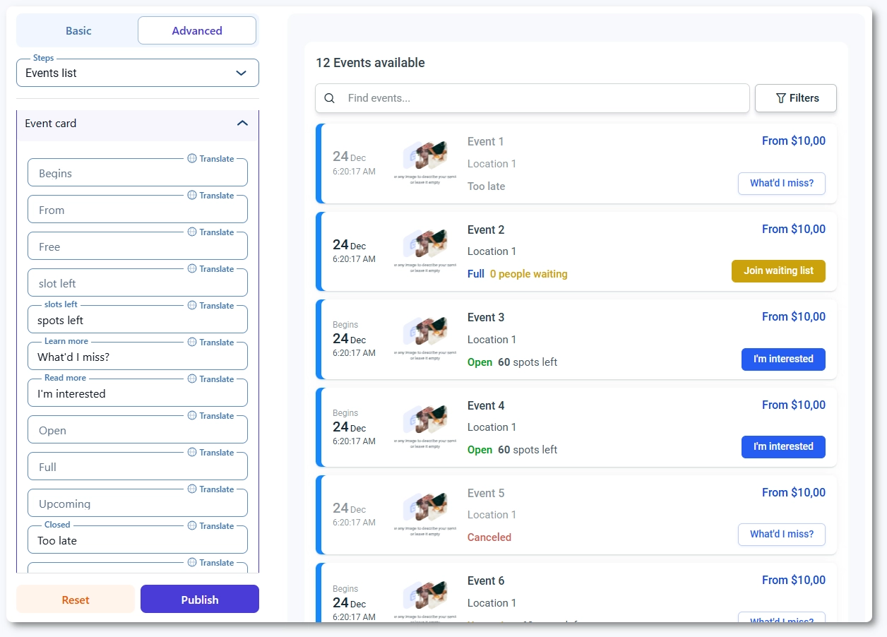
Event List 2.0 is Amelia’s list-based event booking view.
Instead of displaying events inside a monthly calendar, it presents them in a vertical list layout that helps visitors browse upcoming events more directly and compare options more easily.
This view gives customers a more complete overview of upcoming events while keeping ticket reservations smooth and accessible. It is built for businesses that want visitors to explore events through content and details first, rather than through a date grid.
Customers can browse upcoming events and narrow the selection using filters such as tags, locations, and start date. This makes Event List 2.0 particularly useful when visitors want to compare options based on event type, place, or timing before deciding what to book.
Each event in the list appears as its own card, and clicking it opens the event details popup, where users can continue into the booking flow and ticket selection. In that sense, Event List 2.0 changes the browsing experience more than the booking flow itself.
Amelia’s shortcode options now allow users to display future events, past events, or custom date ranges, and later updates added support for preselecting locations in shortcodes as well.
Key strengths of Event List 2.0
- Works especially well for users who want to browse and compare multiple events before making a decision.
- Shows more event information up front than a calendar grid usually can.
- Makes discovery easier when users rely on event titles, summaries, filters, and ticket context rather than specific dates.
- Gives visitors a more content-led way to explore upcoming events.
- Helps users review options across a time period without opening individual dates first.
- Fits businesses that want event discovery to feel more like browsing a catalog than scanning a schedule.
Where it can create friction
Event List 2.0 is usually less efficient for users who already know the exact date they want. In those cases, a calendar view can feel faster because it lets them navigate directly through the schedule rather than scroll through entries.
It can also require more scrolling when a business has a large number of events. That is not always a problem, but it can make the experience feel heavier if users need to move through many cards before finding the right match.
Another limitation is that list layouts make broader schedule patterns less visible than a calendar grid. Users may see the details of individual events more clearly, but they get less of the immediate month-level overview that a calendar naturally provides.
Event Calendar vs Event List: What Actually Changes for Conversions?
When comparing Event Calendar 2.0 and Event List 2.0, it is easy to assume the conversion difference comes from the booking process itself. In Amelia, that is not really the main factor. The bigger difference usually happens earlier, during the browsing and selection stage.
That is because both views lead users into a very similar booking path once they choose an event.
In Amelia’s event calendar, clicking an event opens a details popup, and Amelia’s event list works the same way, allowing users to open the event details popup and continue from there. Ticket reservations happen from that same event-selection flow.
So in practical terms, the real conversion question is usually not, “Which one has the better checkout?” It is closer to, “Which one helps visitors find the right event faster and with less friction?”
Calendar view may convert better when…
- Visitors are date-driven and already have a rough day, week, or part of the month in mind.
- Users need a quick way to scan dates and move toward booking faster.
- Events are closely tied to specific days, so the schedule itself helps people decide.
- A visual monthly overview makes it easier to understand what is happening and when.
- Customers benefit from comparing activity across the month at a glance.
- The event schedule is active enough for the calendar to feel useful and informative, not too empty.
List view may convert better when…
- Visitors are exploring options instead of searching by date.
- Users want to browse upcoming events before deciding what to book.
- It is important to compare event titles, summaries, and other details more easily.
- Filters such as tags, locations, or dates help users narrow down their choices.
- You want each event to stand out more clearly as its own option.
- You have fewer events per month and do not need a full calendar view.
- You want a simpler path to comparing events without scanning a monthly grid.
- Discovery depends more on content and comparison than on date-based browsing.
So which one converts better? Usually, Event Calendar 2.0 has the edge when visitors choose by date, while Event List 2.0 has the edge when visitors choose by event. In Amelia, the booking flow is largely shared. The real difference is which view gets users to that booking decision more efficiently.
Use Cases: When to Choose Event Calendar 2.0
Event Calendar 2.0 is usually the better fit when visitors naturally browse by date first rather than by event name or description. Amelia’s calendar view is built around a monthly date grid, which makes it more useful when time is the main way people navigate.
Choose Event Calendar 2.0 when you run:
- Workshops, classes, or recurring community events
- People often start by checking a specific day
- The question is usually “What’s happening on this date?”
- Seasonal event programs
- The schedule itself helps sell the events
- Visitors want to see how events are spread across the month
- Venues or organizers with many events per month
- A visual schedule overview makes browsing easier
- Users can compare busy and quieter dates more quickly
- Businesses with returning visitors
- Repeat visitors often come back to check what is happening on certain days
- A calendar supports that habit better than a long list
Event Calendar 2.0 works best when:
- Time is the main navigation system
- Visitors already have a day or date range in mind
- A monthly schedule view adds useful context
- Comparing dates at a glance matters more than showing detailed event information up front
Use Cases: When to Choose Event List 2.0
Event List 2.0 is usually the better fit when visitors need to explore, compare, and understand events before deciding. Amelia’s list view is built around upcoming-event overview, filters, and event-card browsing, which makes it more useful when discovery depends on content, not just dates.
Choose Event List 2.0 when you run:
- Webinars, trainings, tours, or niche events
- Users often need more context before committing
- Titles, summaries, and event details play a bigger role in the decision
- Businesses promoting featured upcoming events
- You want important events to stand out clearly
- A list makes each event feel more like a featured option
- Sites with lighter event frequency
- A full calendar may feel too empty
- A list can present a smaller number of events more clearly
- Marketing pages where filters matter
- Users may want to browse by tag, location, or date
- Filtering matters more than scanning a month grid
Event List 2.0 works best when:
- Event discovery is content-led, not date-led
- Users want to compare options more directly
- Event titles, summaries, and filters help drive decisions
- You want each event to stand out as its own item rather than as part of a calendar layout
A simple way to frame the difference is this: Event Calendar 2.0 is better when users browse by time, while Event List 2.0 is better when users browse by event.
A Smarter Approach: Match the View to the Page Goal
Instead of asking which view is better in general, it usually makes more sense to ask which view fits the purpose of a specific page better.
In many cases, the strongest choice is not picking one format for the whole site, but matching the view to how visitors are expected to browse on that page.
Use Event Calendar 2.0 on pages focused on schedule browsing
- Best for pages where visitors want to scan dates first
- Useful when the schedule itself is part of the value
- Strong fit for recurring events, busy monthly programs, and date-driven browsing
- Helps users see what is happening across the month at a glance
Use Event List 2.0 on pages focused on promotion and discovery
- Best for pages where visitors need to browse and compare event options
- Useful when event titles, summaries, or filters play a bigger role in the decision
- Strong fit for featured events, niche events, and marketing-focused pages
- Helps each event stand out more clearly as its own option
Use shortcode filtering to tailor the view to different page goals
Amelia gives users more flexibility here than a simple one-size-fits-all display.
Its shortcode options support showing all events, a single event, recurring instances, tags, date ranges, and other filtered groups, which makes it easier to shape the browsing experience around the goal of each page.
That means a business does not always have to choose one universal winner between Event Calendar 2.0 and Event List 2.0.
A smarter approach is to use the view that best supports the job of the page, whether that job is helping people browse a schedule or helping them discover and compare upcoming events.
Final Thoughts
Neither Event Calendar 2.0 nor Event List 2.0 is automatically the better choice in every situation. The stronger option depends on how your customers prefer to browse and how they naturally move toward a booking decision.
Some users want to start with the schedule. Others want to start with the event itself. That is why the better-converting view is usually the one that matches the visitor’s browsing behavior, not the one that simply looks more appealing.
In Amelia, both views support booking effectively, but they solve different discovery problems. Event Calendar 2.0 is better suited to date-first browsing, while Event List 2.0 is better for browsing, comparing, and evaluating upcoming options in more detail.
Choosing the right one comes down to aligning the interface with visitor intent. The easier you make that first step, the easier it becomes for users to move toward booking.
Event Calendar 2.0 helps people book by browsing dates, while Event List 2.0 helps them book by browsing options. The better converter is the one that makes that first decision easier.
Read Inspiring Customer Stories
Check out how our user set Amelia for his business
Read the full story