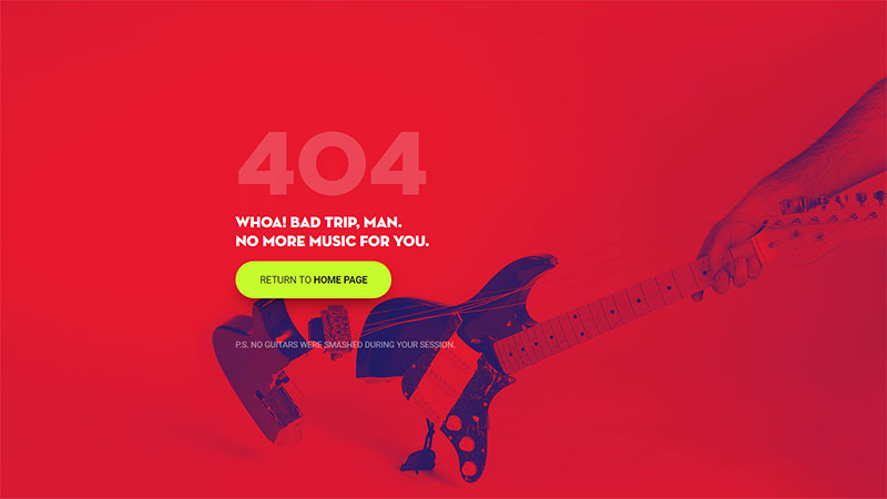
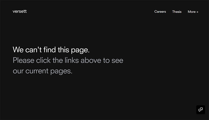
Error pages are almost always annoying to users, but that doesn’t mean you can’t turn them into a pleasant experience using a bit of creativity. Encountering a 404 page is not uncommon in the online environment, so don’t expect your users to freak out too badly when they come across one. With a little effort, you can come up with the best 404 pages ever and entertain your visitors while the website is down.
You may wonder whether this is actually possible and it’s not just some joke that you don’t have time for at the moment. Well, it’s not. Any business owner can personalize the 404 Page Not Found result so that visitors take a moment to read the message that you want to convey and return to the website later when it is up and running.
A memorable 404 error page will also help you retain your website’s professional look even during downtime. Moreover, you will get to enjoy the copious fun that comes with designing the best 404 page ever.
This article created by our team at Amelia (probably the best WordPress scheduler plugin) contains a few tips and tricks that you can apply right away to keep your website errors on a positive note.
What’s a 404 error page?
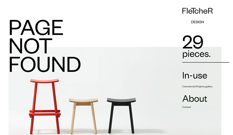
The 404 error page occurs when a website, in whole or in part, cannot be accessed. The reasons are varied – the page may have been removed, the user’s internet connection might be faulty, the URL might have been typed poorly, and so on. The usual messages that appear on this page are:
- 404 Page Not Found
- 404 Not Found
- HTTP 404
- ERROR 404
- The page cannot be found
- The requested URL seems to be broken
In addition to alerting that there’s a problem, the best 404 error pages give the user information about additional steps that they can take in order to reach the website properly. Because they may now be lost or got misdirected, finding their way around the error, and getting back to a working part of your site, is essential for the user.
The reason behind creating customized 404 pages
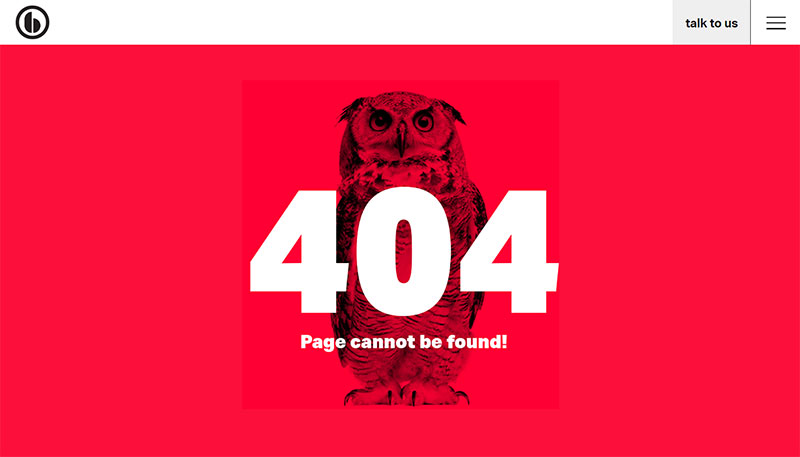
So, you may wonder why you need a customized 404 error page since even the basic ones provide some level of troubleshooting advice. Frankly, it’s all about the user experience and how your website is perceived. By putting time and effort into making the 404 error page attractive, there is a good chance of having the visitor return to your page or website later, in the hope that it is back on track.
Visitors very quickly learn patterns about websites when they browse the Internet, and so they know the common 404 error pages that they see each and every day won’t be worth reading. It’s at that point that they may leave, never to be seen again. Once you’ve decided to create a customized 404 page, know that you’ll have to dedicate some of your time and technical knowledge to make it work correctly. The steps involved include editing the .htaccess file and running commands.
Another few reasons why you may want to create the best 404 error page are:
- Building a strong brand image– your brand’s image will be visibly strengthened once you keep the elements that you use on the very same line; if your users expect to see certain types of content or visuals from your site, use the same style when you’re designing the 404 error page.
- Increasing your SEO – use internal links on the page to send your visitors to somewhere else on your site, and reduce bounce rate by disappointed users.
- Keeping visitors happy instead of frustrated–a 404 error is not what visitors access a website for, but you can make the experience less frustrating by customizing the generic 404 error page.
- Giving your brand a voice– in many cases, brands are just a mishmash of specific visuals and mottos; through messages like this error page, you can differentiate your brand with a friendly voice that makes visitors come back for more.
- Increasing conversion rates – by accepting the fact that there is something wrong with your site and apologizing for it, there is a good chance to make the user return and transform into a loyal one, thus increasing your website’s retention and conversion rates.
Tips and tricks for a great 404 page
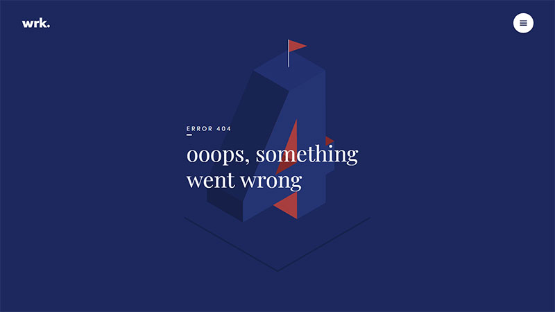
The main purpose of a 404 error page is to let people know that there is something wrong with the website at the moment in a clear way. Being vague won’t have a good outcome, so make sure to convey a message that specifically states what is the cause behind the error and when the site is expected to get back on track. Of course, you need to do this in a catchy manner that stirs the interest of any person who sees the custom 404 page. Here are some tips that should help you:
Carefully explain the issues
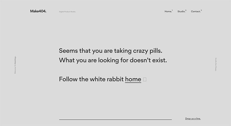
The first thought that may pop into users’ heads is that your website is permanently down. Reassure them by stating the nature of the problem. A 404 error can be solved in a matter of hours if you know what caused it in the first place. Explain the issue and the potential solutions that it may have (e.g. mistyped URL). Also, be sure to offer alternative links for them to follow.
Always speak friendly
To obtain the best 404 error page ever, use a friendly tone of voice. Adding some personality and humor to the 404 message will keep visitors entertained instead of compounding the frustration of not finding what they wanted.
Make use of visual elements
If you’re not good with words, but you still want to customize your 404 error page message, put visuals to work. Make use of color contrasts, geometric shapes, and shadows to create a visually-pleasing effect that highlights how professional the website looks even when it is stuck in a 404 error. Stick with positive color psychology, as it can reduce the negative feelings that a person may have because they can’t reach their goal.
Don’t be afraid to use images

Using a background image instead of the plain-white background that all websites have can be a good idea too. Putting together the best 404 error page ever is definitely not an easy process and it requires creativity and effort. See what image fits the context and use it for an extra touch of professionalism. Adding Call-To-Action buttons is a good idea as well if they fit the context and the page’s layout.
Illustration and animation are catchy
If you can afford to pay for personalized animations or illustrations, this is probably the best way to add visuals to a 404 error page. In case you haven’t noticed, many of the most interesting 404 pages include cute animations that turn anger into entertainment.
Link the user to another page on your site

When one of your site’s pages is struck down in a 404 error, you can direct the visitors to another page of your website that is still working. This way, they might still find something relevant to their initial search, and you can take advantage of their visit. Instead of losing a visitor for good, do something to redirect them to another part of your website. Who said that 404 pages can’t be useful too?
Make the search bar accessible
When one page in a multi-page website doesn’t work, give visitors the opportunity to look for something else. Create the best 404 error page ever by adding a search bar that visitors can rapidly use to look for other pages within your website.
Be funny
Don’t be afraid to use humor when you’re describing the 404 error. It is not the most dramatic situation that can happen to a website, so it’s best to keep the tone positive. Furthermore, humor enhances your emotional connection with users. A good laugh will erase the little hate generated by the existence of an inconvenient error.
Give direction
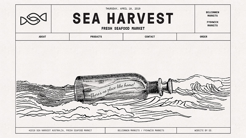
Users can’t be left with no choices after they are greeted by a 404 error page. Give them some direction by adding links to the most important pages of your website that are still up, or your social media accounts instead.
If you enjoyed reading this article on best 404 page ever, you should check out this one on visual design.
We also wrote about a few related subjects like modern web design, layout design, bad websites, button design, web design trends, dark background, website layouts and loading animation.
