Selecting the best free fonts is a crucial, yet often overlooked, activity in design when you’re working with a tight budget.
Amateurs tend to invest too little attention when choosing fonts for their projects, whether it is about a website, a presentation, or traditional media items.
It’s a shame, really, because choosing fonts can be a lot of fun and there is no shortage of amazing fonts out there, ideal for all kinds of projects.
However, scrolling through pages and pages of the best free fonts for designers won’t get you anywhere if you can’t recognize each typeface’s particularities and how they can be used in combination for that perfect result.
Whether you’re a hobbyist or a seasoned professional, this article created by our team at Amelia (the WordPress booking plugin) should help you choose the best font for your next project by giving you a few tips and listing 35 of the most popular free fonts available.
Continue reading to find out more.
How Can You Choose an Appropriate Typeface?
Let’s start with a few tips that will help you choose a better typeface for your project. Ultimately, the purpose of your design project is the number one criterion to follow when searching for fonts.
The typeface or font family you use has to be aligned with the style that you adopted for the project itself, as well as with its purpose. Ask yourself what you want to convey to your audience: Formality? Playfulness? Futurism? Nostalgia?
Fonts can make a huge difference in the nuance of the message and the overall atmosphere created, which should always align with the purpose of the piece. The font you choose should evoke the exact emotion that you want to obtain from your target audience.
The safest way to obtain that emotion is to narrow down a list of the best free fonts to those that suit the context you are working in.
Most of the time you’ll be using clean, simple fonts, but you can also opt for a typeface to use for special occasions that is very easy to recognize and has unique branding properties as well.
Although you’re encouraged to get creative, there is one rule that cannot be broken when choosing a font: it has to be legible. The main purpose of a font is to ease the reading process for the user, while also giving the project a certain feel.
Unreadable fonts — as fabulous as they may look — can be safely eliminated from your shortlist, so you can already reduce your search to those with good communication properties and solid legibility.
Try to choose your fonts the way you choose your shoes — they need to be both good-looking and practical. Stylish, yet comfy.
To support a high readability level, you also need to pay great attention to size. Select your fonts based on how well the respective typeface looks at a certain size. Some fonts come in a standard size that cannot be changed because that’s the only size in which they look good.
The best fonts can be altered according to your needs in terms of both size and letter spacing. To choose the most readable fonts, select one and edit your copy with it, but use 10px. If it’s difficult to read, it’s not a proper font.
A List of the Best Free Fonts to Choose From
Assuming that you know what to follow when choosing your font, it’s time to learn more about font families and their basic differences. Some people simply can’t distinguish sans serif fonts from serif ones, let alone other families that have very particular features.
The information below should help you make the distinction faster and easier while providing a few excellent examples of free fonts in each typeface category.
Serif
To distinguish serif fonts, think of the typefaces you see in newspapers, books, or magazines — any piece of work that involves a lot of copy. Serif fonts are ideal for design projects that include larger blocks of text.
Why? This font family is characterized by the very delicate decorative features they contain. They are easy to read and familiar to a wide audience and are thus often used for print design projects.
The characters in serif fonts are easy to recognize once you process the difference. Here are some serif fonts to analyze:
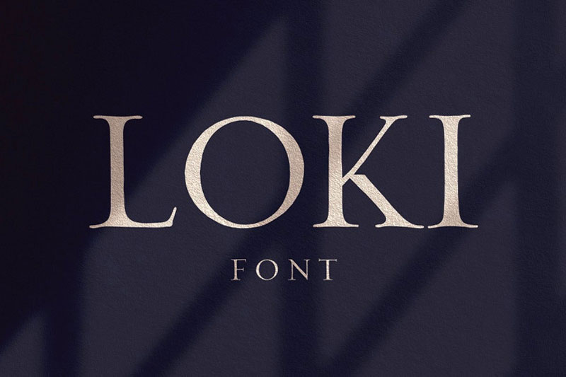
Loki
Loki is actually a hybrid font. It was created as a hand-written script font, but it is a serif font at heart. It contains differing line weights in many of the characters and elegant serif touches.
The typeface’s name is inspired by the Norse god Loki who was known for his misleading characteristics. Loki is more suitable for titles rather than content as it is only available in all caps.
Note: the demo version of this serif typeface is free for personal use only.
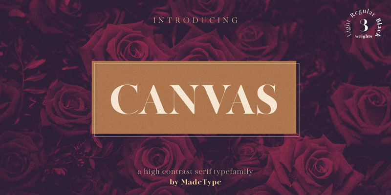
Canvas
One of the best free fonts out there, Canvas is a versatile typeface that is perfect for those who desire a professional yet simple result. Each letter has thickness details that make it pleasurable to read, combining both the fanciness of formal fonts and the boldness of more creative ones.
Note: the demo version of this serif typeface is free for personal use only.
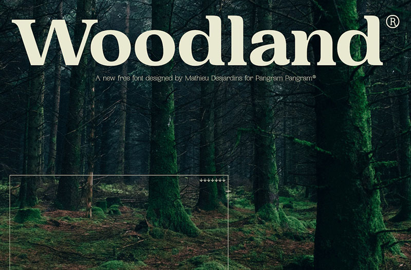
Woodland
Mathieu Desjardins went the full nine yards when he came up with six different weights for this font.
For serif fonts, it’s important to give the user variants in terms of line thickness, so that they can use the font for both copy content and titles.
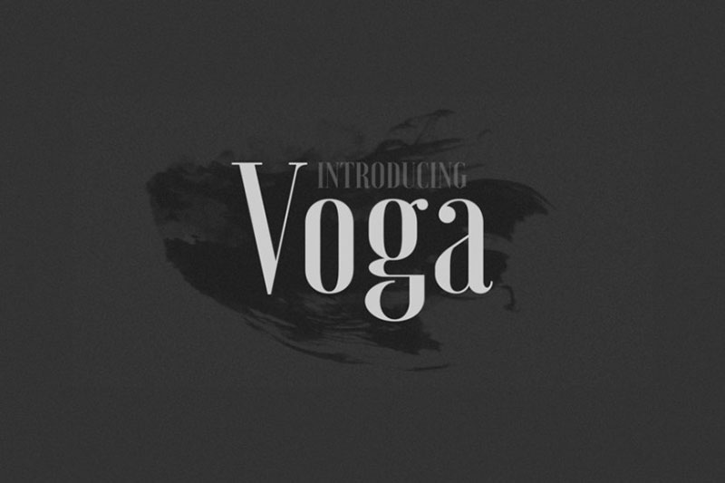
Voga
This list of the best free fonts wouldn’t be complete without Voga. When he designed this serif typeface, Charles Daoud tried to mix both straight lines and curves, to great effect.
Line thickness differs from one letter to another and Voga is carefully designed to look great in editorial layouts for headings and titles. It’s a good serif typeface for invitations too.
Note: the demo version is free for personal use only.
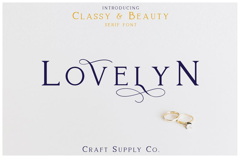
Lovelyn
The last font in this category, Lovelyn is a Craft Supply creation that is perfect for those who want a decorative typeface that would ornate any printed design one could think of. Lovelyn was designed as a romantic, elegant font purposed for filling wedding invitations.
Note: the demo version is free for personal use only.
Timothy
Timothy is a playful hand-drawn typeface with block capitals, just like the ones you see in fairytale books.
Timothy carries the name of its inspiration, Timothy Goodman, and was created by Ksenya Zoltsman who made the font free to use for both personal and commercial use.
Sans Serif
Moving on to sans serif fonts, let’s explain their characteristics. “Sans” means “without” in French, so the name becomes pretty self-explanatory — it means “without serifs”. If serif fonts are decorated and suitable for longer bits of text, sans serif fonts are the exact opposite.
They don’t have any decorative elements included, they are cleaner and simpler in appearance, and they can be used in a more neutral manner.
Below you will find the best free fonts in the sans serif family.
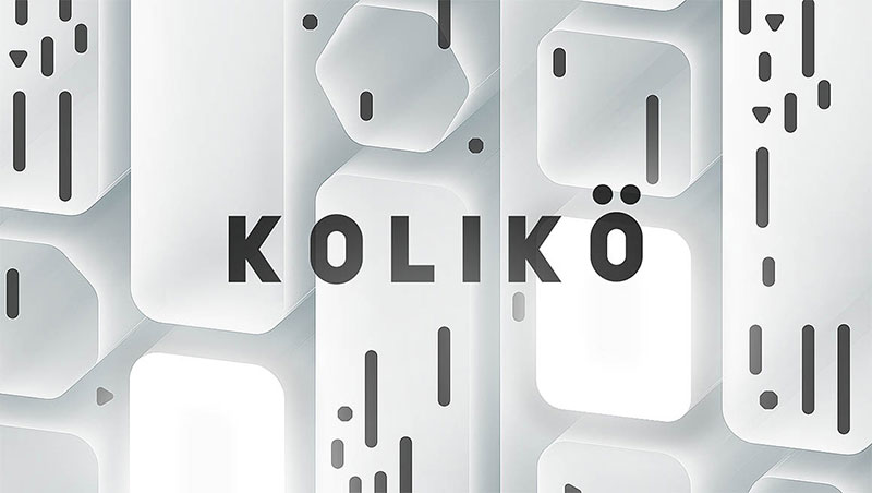
Kolikö
The first in this sans serif section is Koliko.
This is a bolder font, suitable for those who want to emphasize the creative part of their design project.
As a sans serif font, it’s easy to read, but it has thicker lines compared to a regular sans serif typeface. It would be appropriate for geeky websites, especially tech- or science-related.
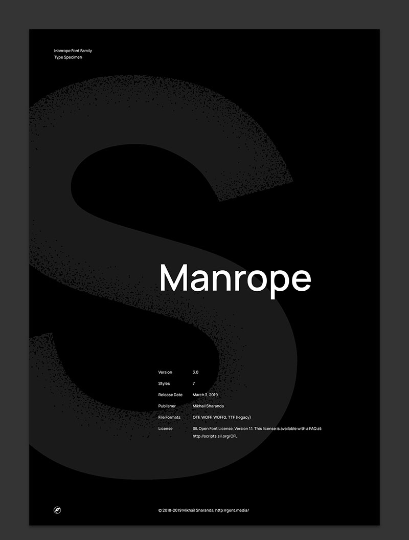
Manrope
Michael Sharanda came up with the open-source typeface Manrope with the sole purpose of helping modern users.
You can use this typeface for basically anything and given the fact that it is open-source, you can even create your own font based on it.
Manrope is a free font that is good for all purposes, considering that it is delivered in seven different styles.
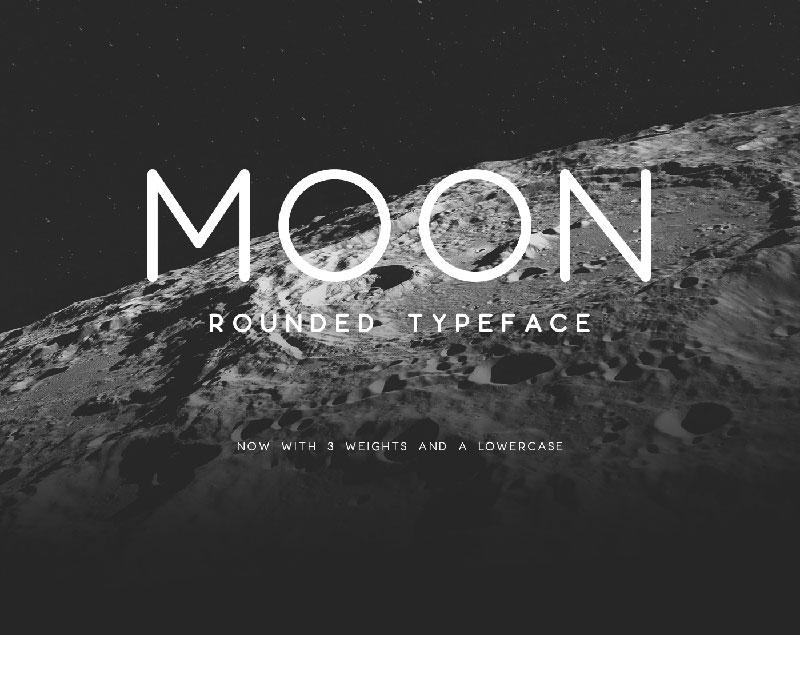
Moon
Fancy rounded fonts? Then you’ll definitely like Moon. This sans serif font has rounded, minimal letters, suitable for all types of design projects.
Note: the demo version is free for personal use only.
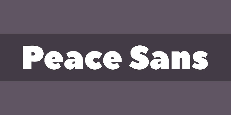
Peace Sans
This is a sans serif font that will look great on social media designs or print designs.
It is a free font that can be used for personal and commercial purposes. In terms of looks, this free font is clean and evokes the idea of peace, just as its name describes.
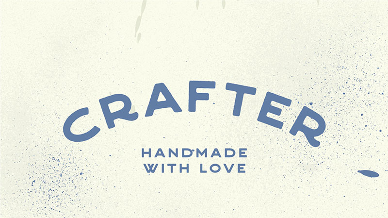
Crafter
Crafter is a hand-made font that originates back in 1871. Since then, it has been improved and is now a popular typeface for various design projects, especially for posters, logos, or headings.
Alex Jojanic created this free font after gathering his inspiration from hand-painted metal signs.
Monospaced
The next family of fonts, monospaced typefaces are those that resemble typewriter machine styles.
They have just one width for all characters in a font, thus being highly legible. Programmers prefer monospaced fonts for their readability and equal alignment across lines.
Here are some examples:
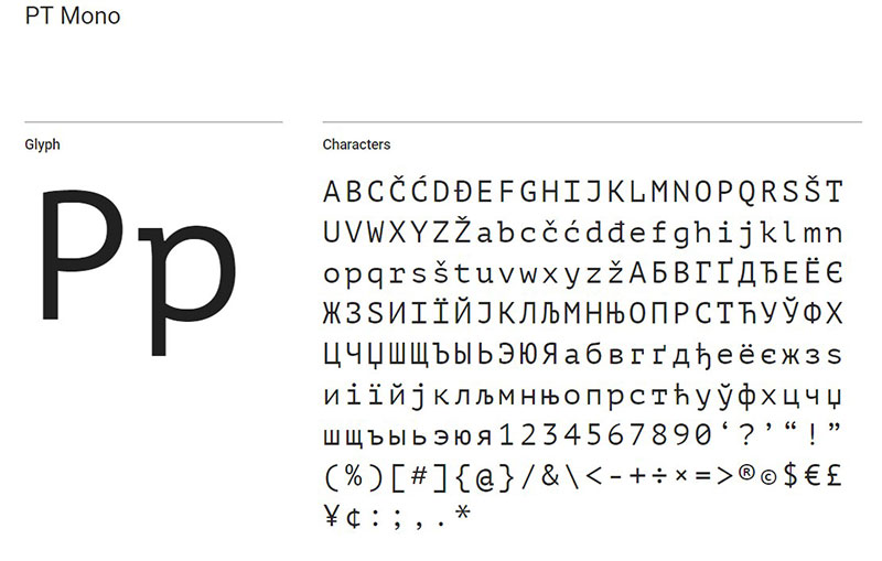
PT Mono
This is probably one of the best free fonts in the monospaced family. It will help you recognize monospaced fonts in an instant. PT Mono is a very sharp font that fits most design projects.
It was developed for use in contexts such as forms, worksheets, and tables, and is also very popular amongst programmers.
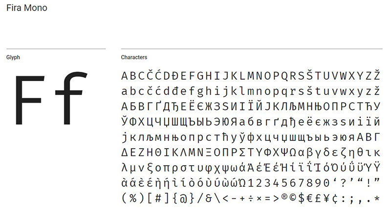
Fira Mono
The Fira Mono free font will work great in all formats. It has been designed for coding purposes, but it can also be used to style headings.
It looks the best when resized to 12 or 16 px. Make sure to use it in a bold format for extra visibility. It also looks great if you use uppercase-only.
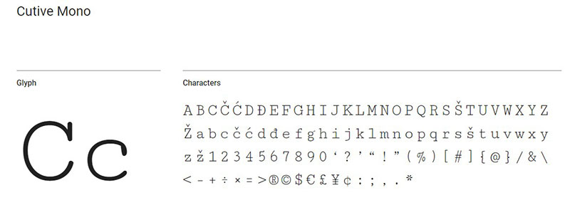
Cutive Mono
Looking for a traditional monospace font? Cutive Mono is the typeface that will end your search.
It’s a free font that’s great for code snippets because of its thin lines and even spacing, and it can be used to great effect in any project aimed at software developers.
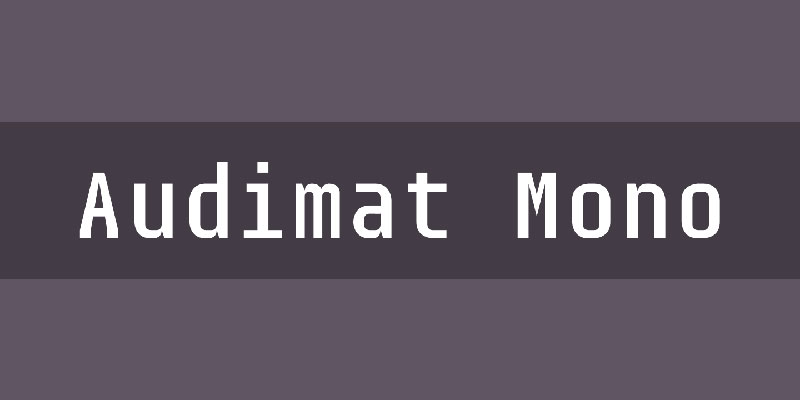
Audimat Mono
If you enjoy any fonts by SMeltery, you’ll automatically love Audimat Mono too. It was created by Jack Usine and you can choose between nine different variations of this free font, to suit all the needs you may have.
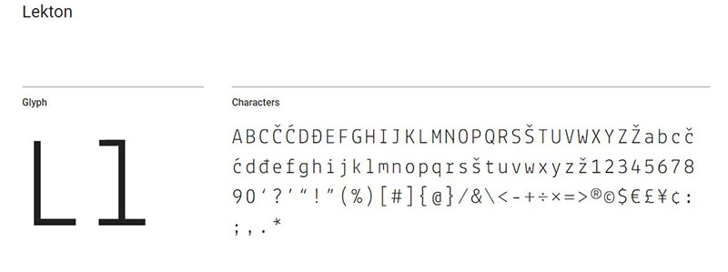
Lekton
This free font was designed by the Institute for Industrial Arts in Italy. It has its origins in the looks of the typefaces used on Olivetti typewriters, a company that was influential in typeface design.
Handwriting
Moving on to the next category, this style is very popular nowadays. Even though it’s more difficult to include in combinations and it can be tricky to use in all industries, a handwriting font can give a project that special allure that everyone is trying to achieve.
Here is a shortlist of the best free fonts in a handwritten style:
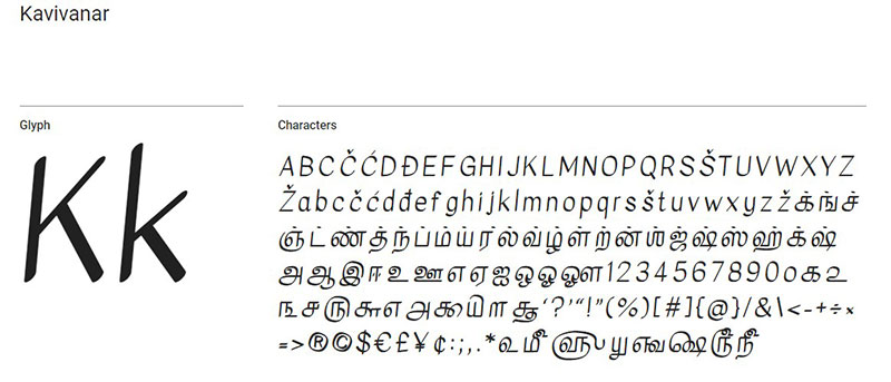
Kavivanar
Handwritten fonts sometimes struggle to be bold. Well, Kavivanar is definitely bold enough to get anyone’s attention. If you are familiar with Tamil handwriting, you will recognize this font in an instant.
It includes Tamil alphabet letterforms as well as Latin letterforms and it was created by the type designer Tharique Azeez who is now based in Sri Lanka.
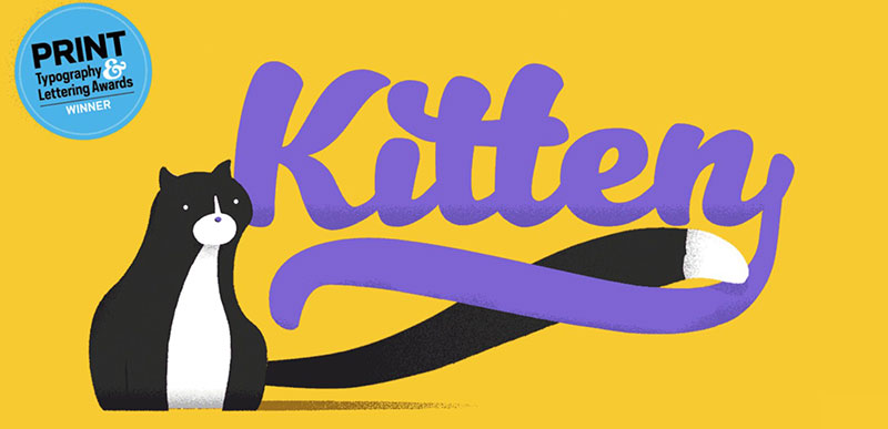
Kitten
As the name suggests, this script font is nothing but adorable. Kitten is designed to be used for logos or print design, but you shouldn’t limit yourself to those areas. It’s a great font that comes in different weights, but they are only free to use for personal purposes.
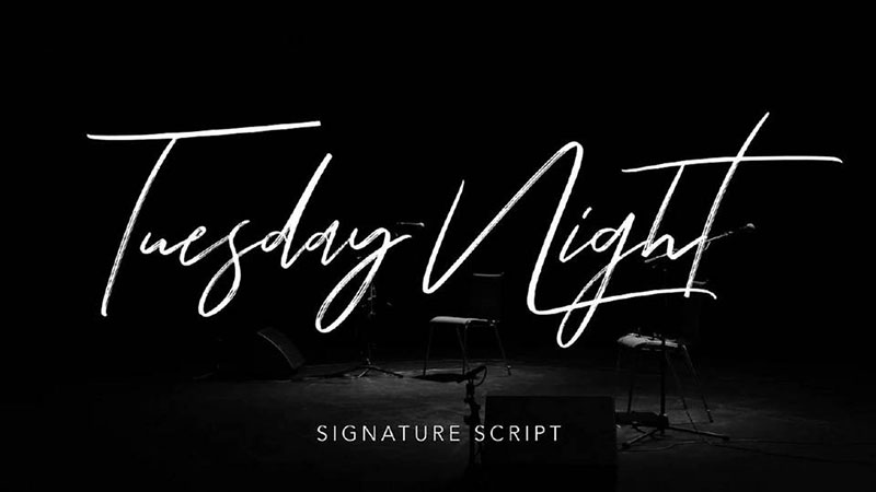
Tuesday Night
Font Forestry knows how to create good fonts, and Tuesday Night is just one example. The typeface is perfect for wedding invitations due to the attention-grabbing capital letters and exquisite form.
Note: the demo version is free for personal use only.
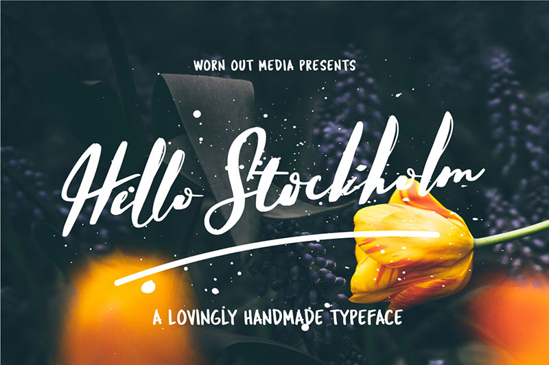
Hello Stockholm
Last, but not least, Hello Stockholm is one of the best free fonts when it comes to handwriting. It is inspired by Scandinavian minimalism and it combines its simplicity with classic brushstrokes. This font goes well with all sans serif fonts.
Retro
Let’s talk a bit about vintage or retro fonts. They are at the center of attention these days because of their versatility and impressive effects on the audience. By using a retro font, you can instantly add age and texture to a design.
We’ve selected some great free fonts from the retro style below:
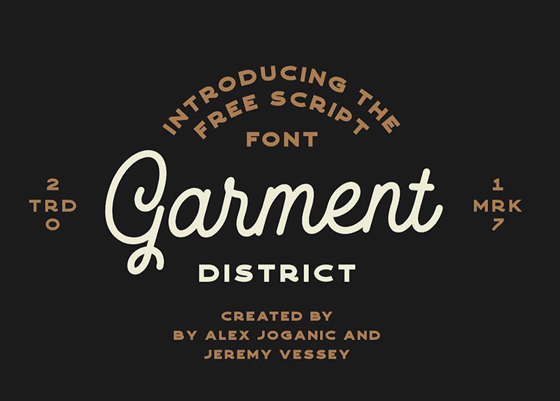
GarmentDistrict
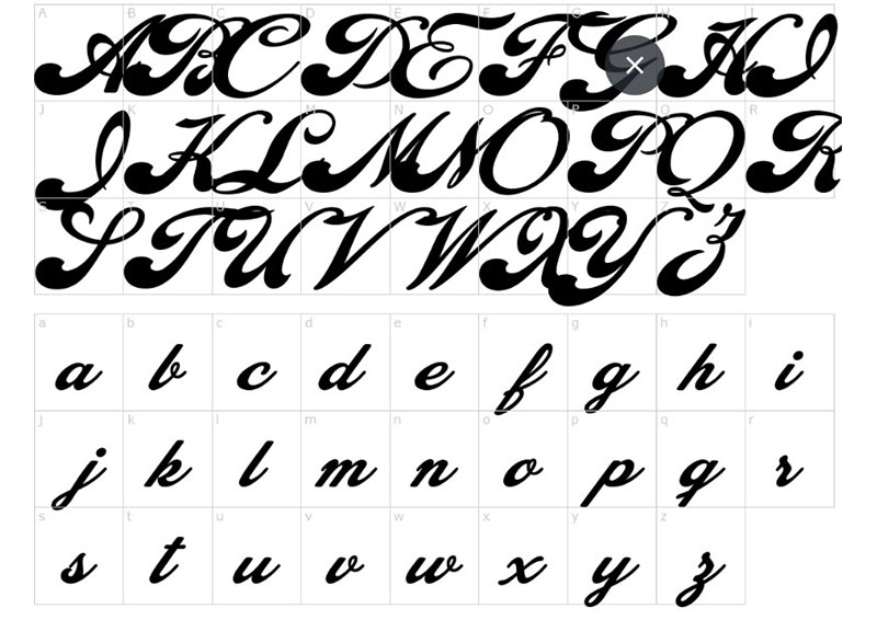
This is actually a Monoline Script font that has a vintage look to it. It’s the perfect typeface if you want a fancy design. It can be used for branding, signs, and ads, but you can get creative with it and use it with copy as well.
What’s unique about it is that you get to choose between different uppercase letter options.
Bobbers
Bobbers is a 70’s inspired font that will only work well with specific projects. It is so bold and daring that you couldn’t be using it in a minimal design. Choose this font for your project’s header if you want to turn all the eyes towards your design and tell a confident story.
Note: the demo version is free for personal use only.
Canterbury
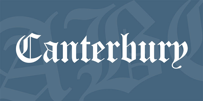
How could we skip an OldEnglish font? Canterbury is a vintage font that resembles the typefaces used to write titles on the oldest newspapers out there. For that newsy look and a glimpse into the past, give Canterbury a chance.
Cheque
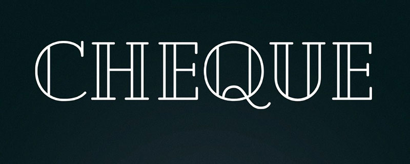
Cheque is a geometric-based typeface that has a classic look to it, which makes it vintage. It was actually a student’s project of Mirela Belova but it is now a display font that many people use for all sorts of purposes.
Brush
Tired of normality? Brush fonts will save the day. Each letter of a brush font will surprise you through its uniqueness. These fonts are a combination of vintage-retro fonts and modern fonts.
Brush-style typography is definitely not for all purposes, but it’s worth a revival in popularity for sure.
Oh Now!
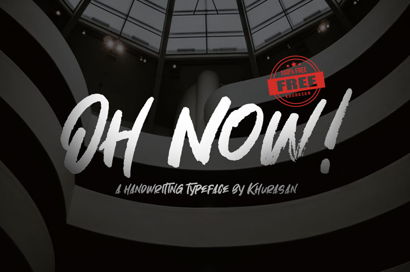
Syaf Rizal is known for his vast collection of amazing fonts. Adding one more to the list Oh Now! is a brush font that can’t be ignored. It is a textured, edgy typeface that can be used in all sorts of combinations for a unique effect.
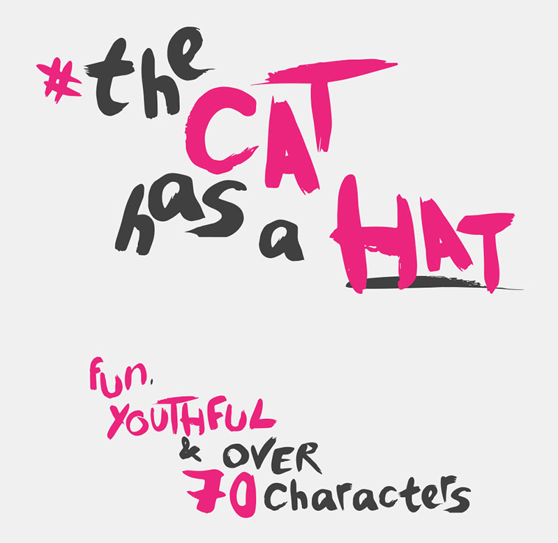
The Cat Has a Hat
Are you a fan of Dr. Seuss? You probably guessed that The Cat Has a Hat, Luke Thornhill’s font is inspired by the book of a similar name. Luke created no less than 1,500 characters and packed them all into one set that you can use as you please.
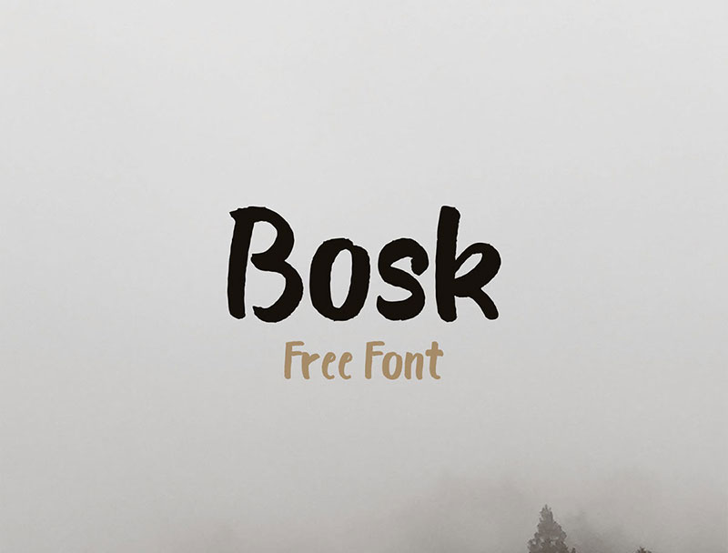
Bosk
Boris Garic used his talent to create this font using a brush pen only. How amazing is that? The creator worked hard on Bosk, which is now one of the most appreciated handmade brush fonts out there.
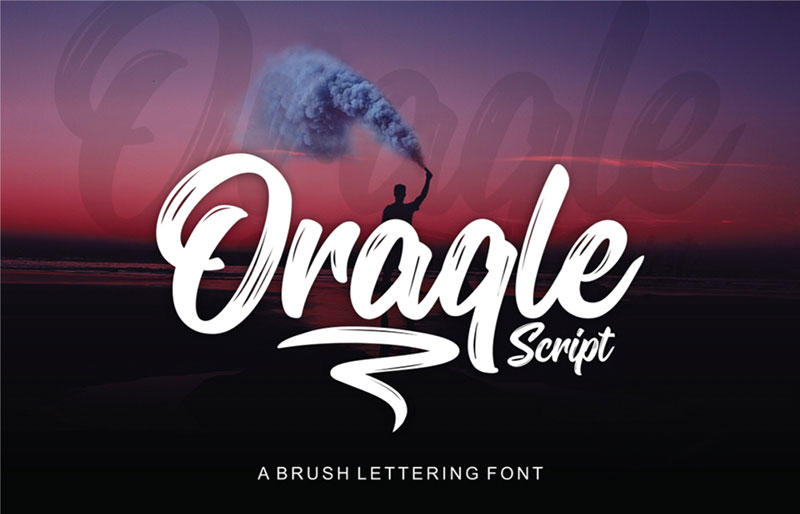
Oraqle Script
Need bold strokes? Oragle Script has it. This is another level of brush lettering —one that will stick to your retina once you see it. This font is preferred for logos, clothing, printing, and invitations.
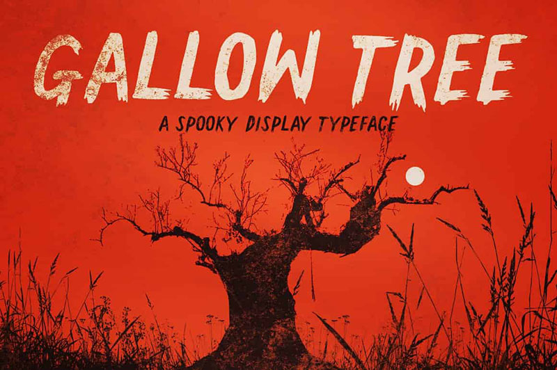
GallowTree
It was about time to include a horror font in this list. Gallow Tree is a spooky, yet very pleasing brush font created with a Faber Castell brush pen. Simon Stratford poured his heart and soul into creating this beautiful font that we get to use.
Note: the demo version is free for personal use only.
Number
Designers who use a lot of numbers know how difficult it is to find a font that supports all types of characters. The aesthetic of numbers is a bit more complicated than combining two fonts from different families, so it deserves special treatment.
Here are some number-friendly fonts to get you out of this uncomfortable situation:
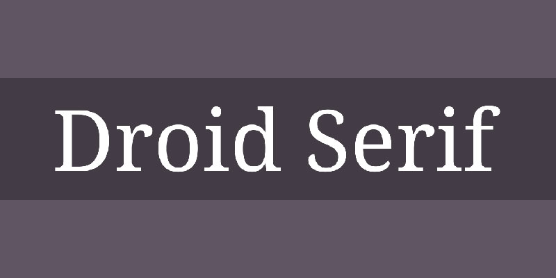
DroidSerif
This is a serif font built on contemporary design principles. Droid Serif is great if you are writing a lot of numbers because it is universal and legible. You won’t encounter any readability problems with this free font and that’s what makes it one of the best free fonts of this type.
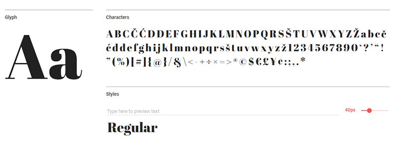
AbrilFatface
Serifs with original numbers are not uncommon, but AbrilFatface seems to be the most creative one. You’ve probably seen this free font while surfing the web, which is a testament to its versatility.
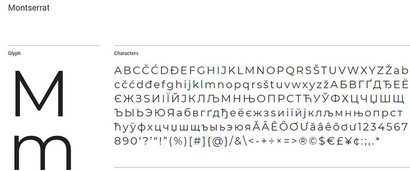
Montserrat
Montserrat is a free font that is often used for titles, but it is just as good for numbers. Because of its letter spacing and thin lines, it is easy to read and aesthetically pleasing.
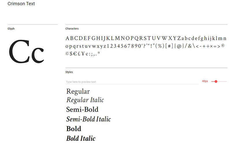
Crimson Text
Garamond-style serif fonts are among the top choices of designers, so there’s no wonder why Crimson Text is included here. This free font is widely used yet still appreciated because of its lining and tabular figures.
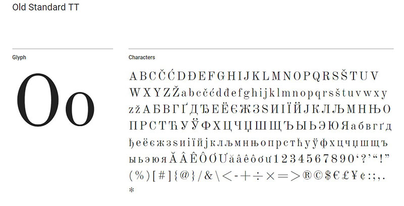
Old Standard TT
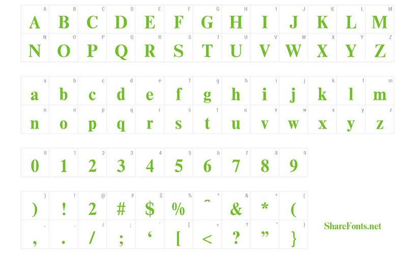
Besides the gorgeous, old-school number style, this free font also supports popular characters like the dollar sign and much else besides. It’s a font you don’t want to skip if it fits your project’s style.
Ending thoughts on these free fonts for designers
Before proceeding to use any of the free fonts above, make sure that you check the licenses again, in case anything changed. The license is normally listed on the website where you can download the free font, so don’t forget to give it a quick read to ensure that it’s okay to use.
As for design, this huge list of free fonts should at least give you some inspiration for your next design project. Analyze them, see which one is suitable for your needs and proceed to combine them with other typefaces that fit. It’s a long process but it’s worth all the trouble.
If you enjoyed reading this article on the best free fonts out there, you should check out these with Cursive Fonts and Font Combinations you can try. There are also these cool fonts you could check out.
