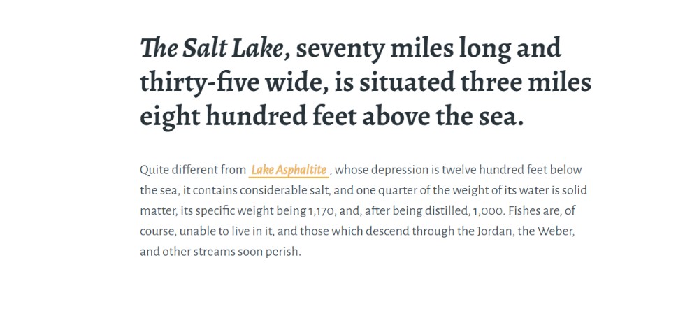
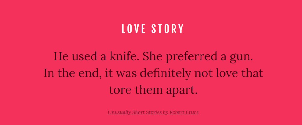
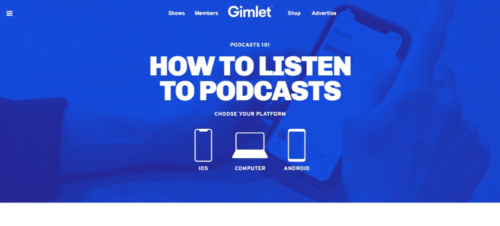
Typography is one of the key parts of every website design. Choosing the right font combinations is a big decision that should not be taken lightly. With so many nice fonts out there, how do you choose the right ones?
Today, we are going to talk some more about choosing fonts and making beautifully looking font combinations. You are not alone in the big world of design and drawing inspiration from other designer’s work is a great idea.
That being said, let’s take a look at the fonts that go together, and let’s help you pick the perfect font pairing for your website. In the meantime, check out the fonts that we chose for Amelia, our WordPress booking plugin, and maybe you will find your inspiration there!
Font Combinations: Basic Tips
Tip 1: Use font superfamilies
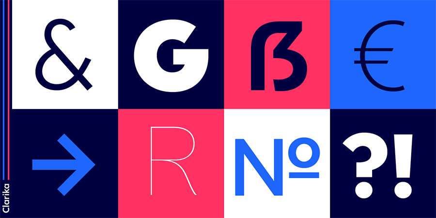
One of the easiest ways to find complementary fonts is by using fonts from the same superfamily. A font superfamily is a group of the fonts that fall into multiple classifications.
Most popular font superfamilies can be divided into 2 big categories; the font families grouped together for the same purpose; and the font families with the same letterforms.
For example, a popular superfamily based on the same letterform is Lucida (comprising Lucida Sans, Lucida Serif, Lucida Typewriter Sans, Lucida Typewriter Serif, and Lucida Math) while a notable superfamily based on the same purpose is Liberation (comprising Liberation Sans, Liberation Serif, and Liberation Mono)
Tip 2: Pair contrasting typefaces
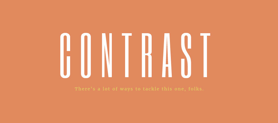
Making a good font match isn’t always about finding similar fonts. On the contrary, you can use entirely different yet still complementary typefaces. Usually, the contrasting font matching involves serif and sans serif.
The best font combinations often don’t come in the form of overly similar fonts. For example, paring a serif with another serif is not the best idea.
One thing to keep in mind is establishing a clear hierarchy. This could be as simple as varying the size and weight of the same typeface. However, in cases like these, careful font matching is extremely important. If you have a display face packed with unique personality, you’ll need something more neutral to do the hard work.
Tip 3: Pair type sub-categories
Speaking of serif and sans serif, we are talking about two quite broad categories and each of them can be split into a number of sub-categories. For instance, Old Style serifs such as Bembo, Caslon, and Garamond will combine well with Humanist sans serifs, such as Gill Sans and Lucida Grande.
On the other hand, Transitional serifs have a stronger contrast between thick and thin strokes. For example, Bookman, Mrs. Eaves, Perpetua, and Times agree with Geometric sans serifs such as Avant Garde, Avenir, Century Gothic, Eurostile, Futura, and Univers.
How to use these combinations
Step 1: Embed the fonts into your website by adding the embed code as the first element in the < head > of your HTML document.
Step 2: Declare the fonts that will be used for body and headings in your styles.css file.
The Combinations
Now let’s talk about some popular font pairs that have proven themselves effective.
Mercury and Whitney
Whitney: clear for signage, compact for print.
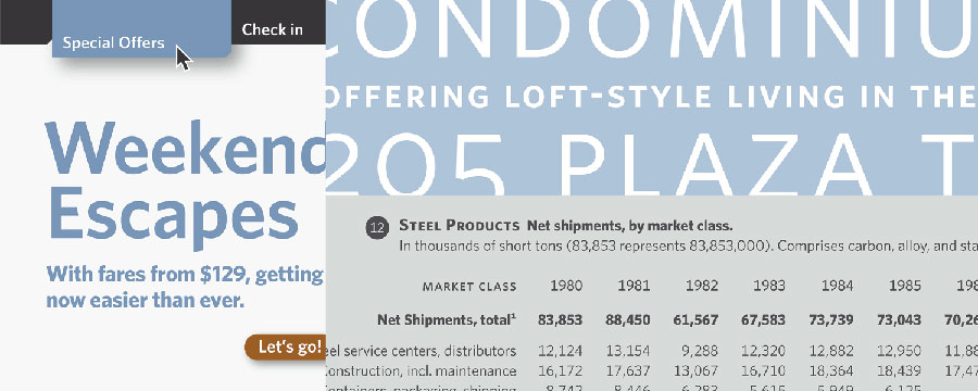
Whitney is a popular font family that was originally created for the Whitney Museum in New York. It contends the demands of editorial typography as well as those of the public signage.
Mercury: high style meets high performance
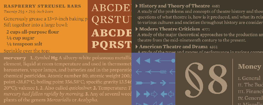
Mercury Text is a font family of high performance and great style. It took 9 years to develop this type family, but the hard work put into it definitely paid off.
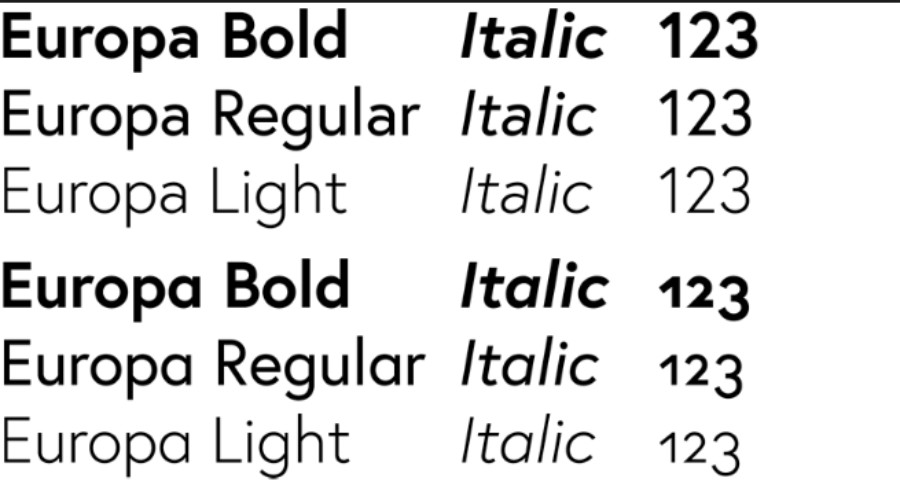
Adobe Garamond and Europa
Garamond-style typefaces are popular and often used, particularly for printing body text and book.
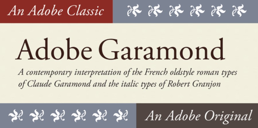
Europa is an independent font design that matches perfectly with Adobe Garamond.
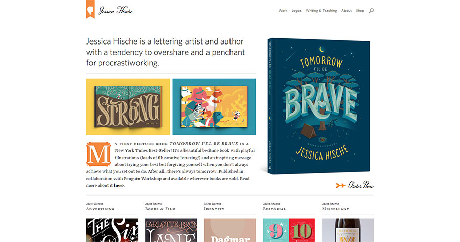
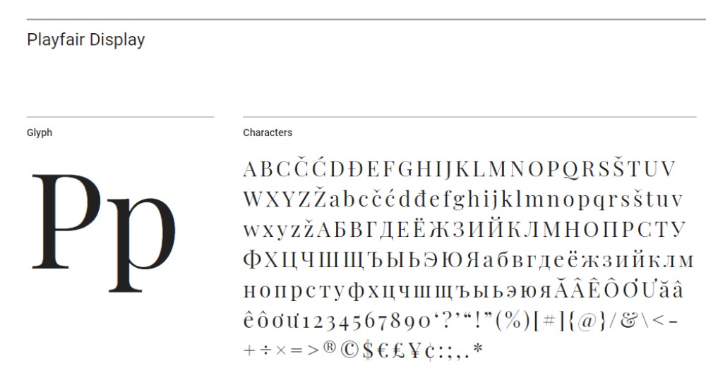
Montserrat and Playfair Display
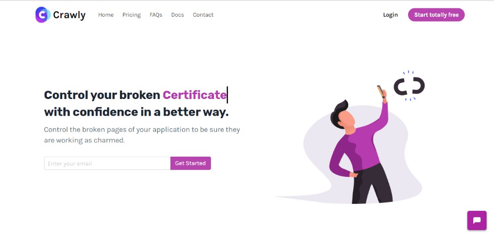
If you are looking for nice Google font pairings that are both bold and friendly, you should consider combining Montserrat and Work Sans.
Montserrat is one of the most popular fonts in its collection and it is perfect for modern websites as well as for some classic designs. It can easily be adapted to many different personalities.
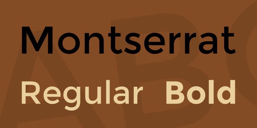
Combining it with Playfair Display creates one of the most powerful Google font combinations.
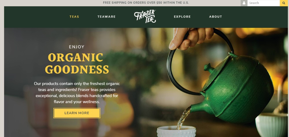
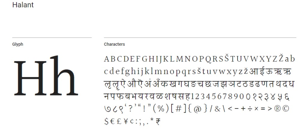
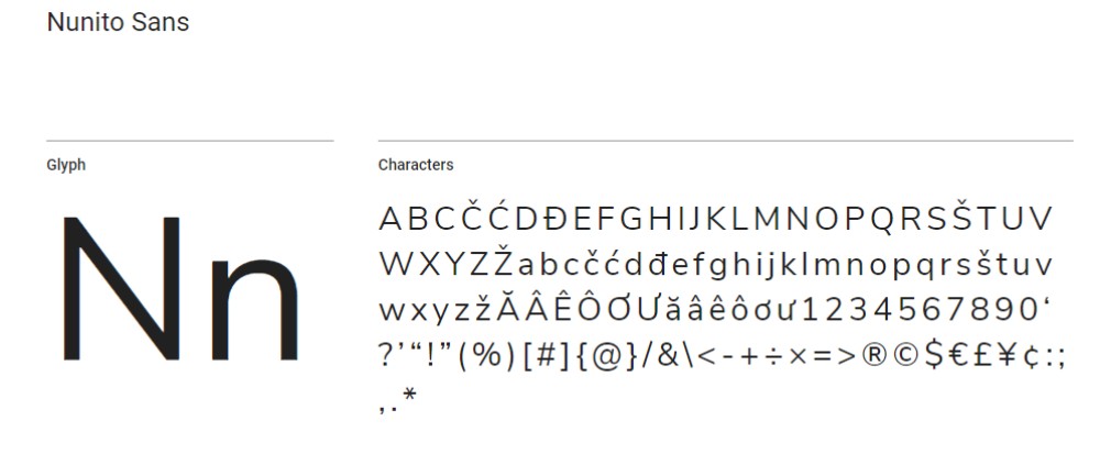
Halant and Nunito Sans
If you are looking for an elegant serif typeface for attractive headlines, Halant should be the fort of your choice.
Combine it with Nunito Sans as a body font and you will get an elegant and minimal style that can work great for almost every website.
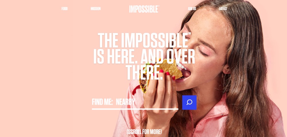
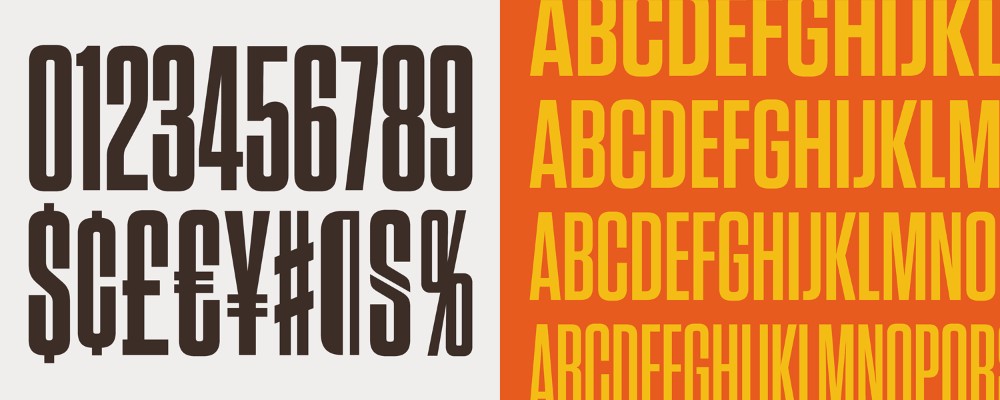
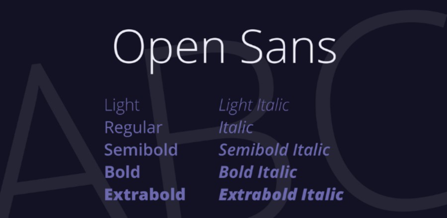
Tungsten and Open Sans
If you own a cheerful and youthful brand, you want your font pair to be bright, shiny, and friendly-looking as well.
Combining Tungsten for the headings with Open Sans for the body is an amazing combo for cases like this.
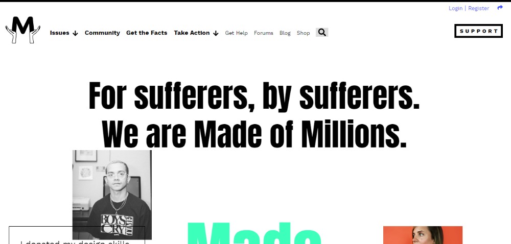
Anton and Work Sans
Combining Anton and Work Sans is one of the best font pairings for those who want to achieve kind of an elegant and high-end style.
Anton
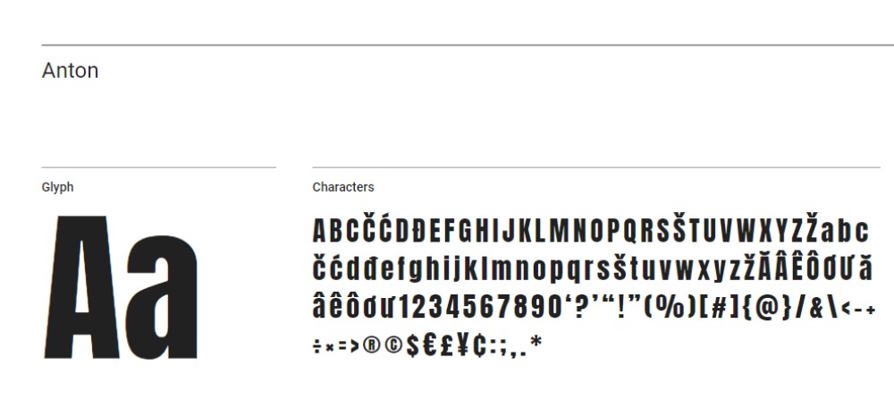
In this combination, Anton should be used for the headings while Work Sans gives the modern look to the body. Together, they beautifully combine modernity and tradition.
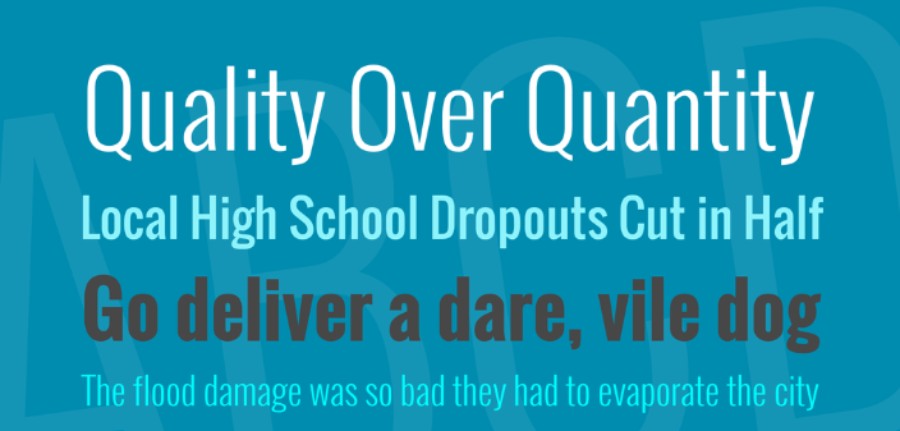
Oswald and Cardo
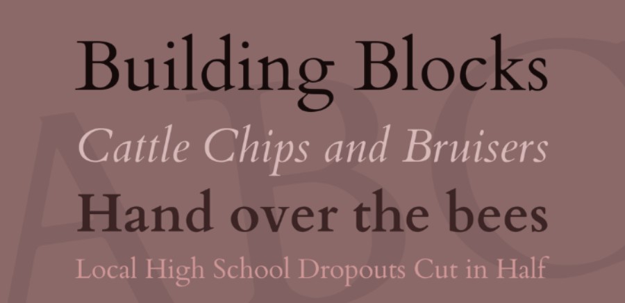
If you want to create a strong impact with a powerful high contrast combination, combining Oswald and Cardo is the way to go. A condensed sans-serif in all caps for the headings and a classically styled serif for the body.
Oswald
Cardo
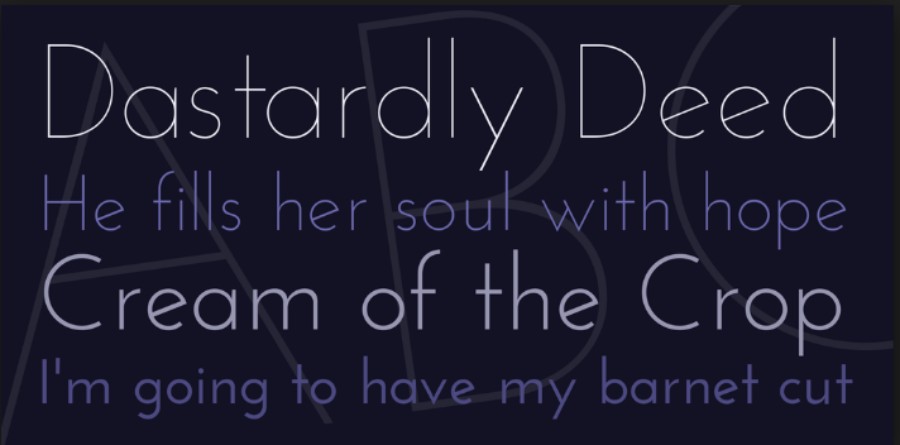
Yeseva One and Josefin Sans
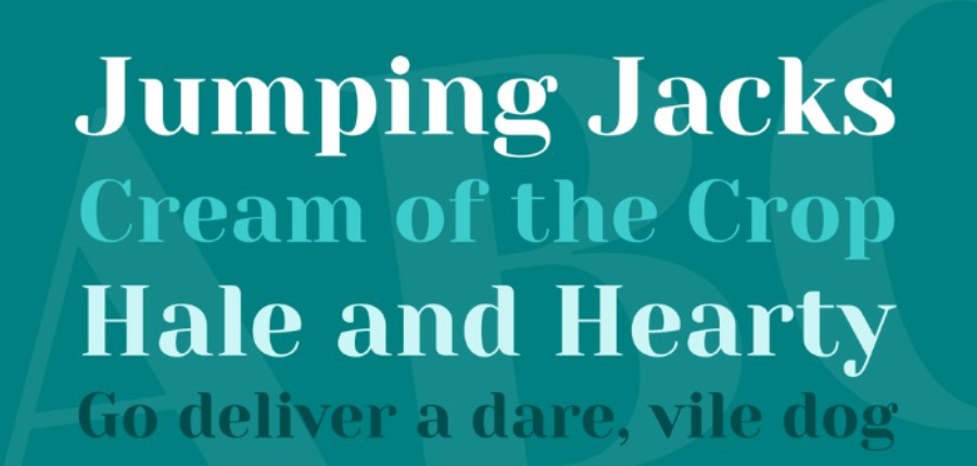
If you want your website to have a retro, luxurious, or manuscript look, combining Yeseva One and Josefin Sans will be one of your favorite font combinations.
Use Yeseva One for headings to give the website kind of a classic vibe and then add the Josefin Sans body that beautifully fits the theme.
Yeseva One
Josefin Sans
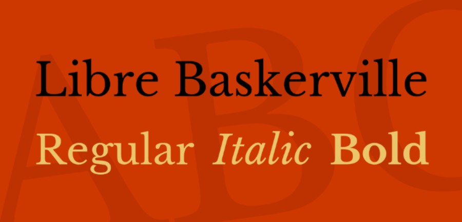
Nixie One and Libre Baskerville
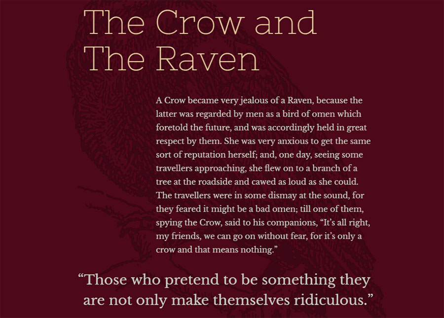
Nixie one is a perfect typeface for headlines but it needs to be softened up by combining it with another font for the text body. But which font to choose?
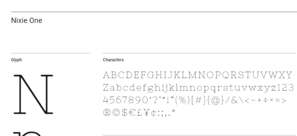
Well, Libre Baskerville, of course. The two make a beautiful font combination that is both contrasting and easy on the eyes.
Rubik and Karla
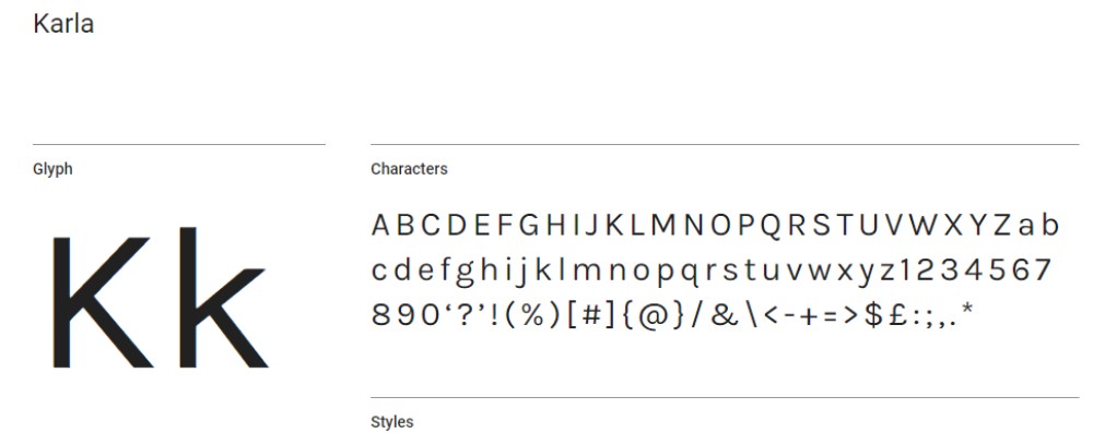
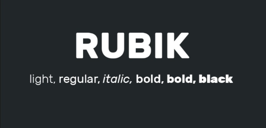
Google font Karla is a simple and clean font that pairs beautifully with Rubik.
Karla + Rubik give the website a super clean look that is very readable and perfect for tech blogs and similar websites.
Karla
Rubik
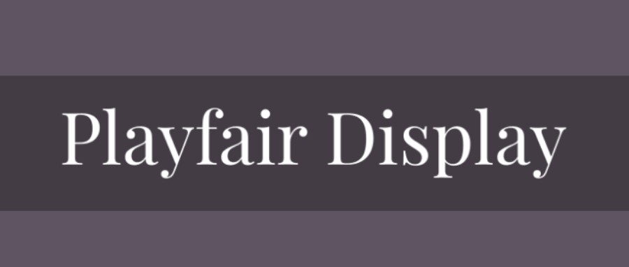
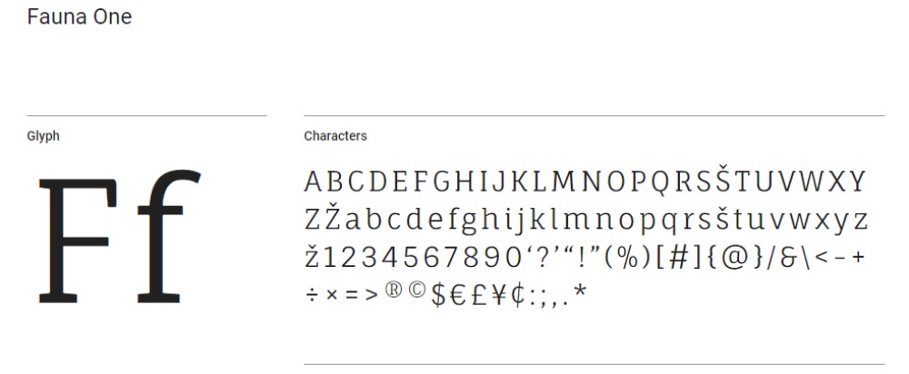
Playfair Display and Fauna One
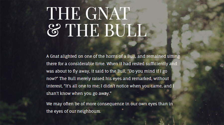
Playfair Display and Fauna One pair beautifully and are usually used for feminine blogs or for news blog websites. They complement each other in all the right ways.
Oswald and Quattrocento
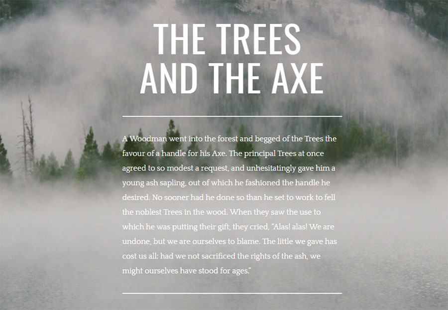
Oswald is a great choice for those who want the headlines on the website to be outstanding irrespective of the weight of the font. It attracts the user’s attention instantly.
Combined with Quattrocento this is one of the best font combinations you could use for a modern and beautiful website design.
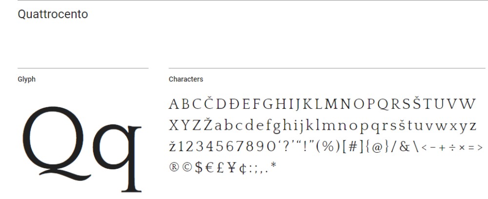
This font combo is commonly used by real estate agencies, attorneys, elite boutiques, and similar websites. It is also great for product description content as well as in highlighting the superior quality of the products.
Open Sans Condensed and Lora
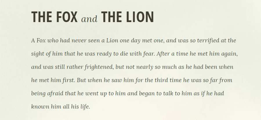
The condensed version of Open Sans Google font is one of the a versatile font. When combined with Lora, the results are simply magical for website design.
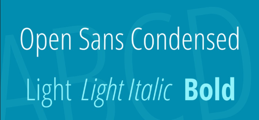
Both fonts are clean and easy to read and when paired together, the combination is simple yet classy and beautiful. This is hands down one of the most popular free Google fonts combo.
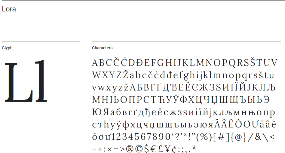
No matter the type of website you are building, there isn’t much that can go wrong with this versatile combination. It works great for any blog site, the landing page of a website, business web page, web app, and so on.
Raleway and Roboto Slab
If you are looking for a classic and versatile combination of Google free fonts, look no more. Raleway and Roboto Slab is one of the most amazing font combinations you can use for web pages.
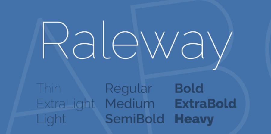
The two fonts are quite different but they complement each other beautifully. They create a strong and sort of magical impression and catch the user’s attention immediately.
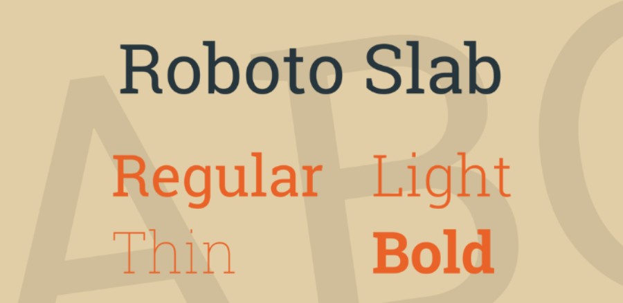
This is one of the best Google font combinations for elite e-commerce sites for products such as upscale jewelry, designer clothing, and similar. Both fonts can be used interchangeably as headlines and body texts. Try out different options with this combo and see which works best for your website design and your brand.
Roboto and Roboto Condensed
If you like Roboto, you should check out one of the web designers’ favorite font combinations; Roboto + Roboto Condensed.
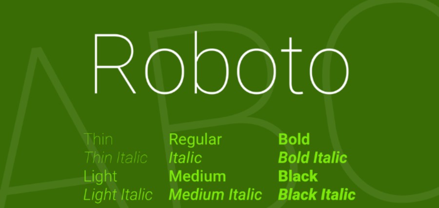
It is simple, clean, elegant, and easy to read. The combination is so versatile it can work great with all kinds of websites.
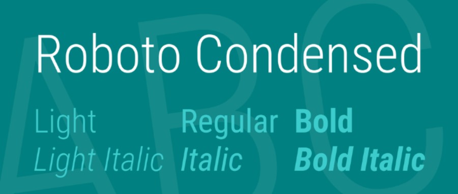
It works great for any tech start-up company, a contemporary small-scale business venture, and similar. It will pair lovely with any brand identity with a massive value in the future.
Playfair Display and Source Sans Pro
Playfair Display is believed to have its inspiration from the 18th-century letterforms and it maintained a dose of its old charm, but with a modern touch to it.

But instead of combining two similar fonts, Playfair Display pairs well with futuristic and modern fonts such as Source Sans Pro. This is one of the good font pairings that are creative but still practical and easy to read.
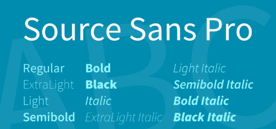
This Playfair Display font pairing gives a personal touch to taglines and product descriptions and it is apt for web pages that deal with products and graphic design services. The combination of the old charm and the modern design immediately catches the user’s attention in all the right ways.
Quicksand (Medium + Light)
Sometimes, all it takes is combining two different versions of the same font to create a powerful type combination. One of those great font combinations is composed of Medium Quicksand for headings and Light Quicksand for the body text.


Quicksand is a geometric display sans-serif with rounded terminals, which makes it a user-friendly and easy to read. If you combine it with bright and shiny colors, you will get a modern and edgy look.
Abril Fatface and Roboto
If you are looking for a fashionable and chic website typography combo, consider using Abril Fatface + Roboto.
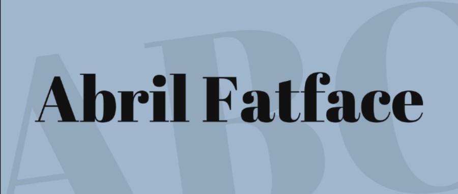
As said by Abril Fatface’s authors: “The thin serifs and clean curves lend the typeface a refined touch that gives any headline an elegant appearance”.
Roboto balances out the entire design and gives it that friendly and stylish overall look that you want in a well designed modern website.
Enriqueta and Droid Serif
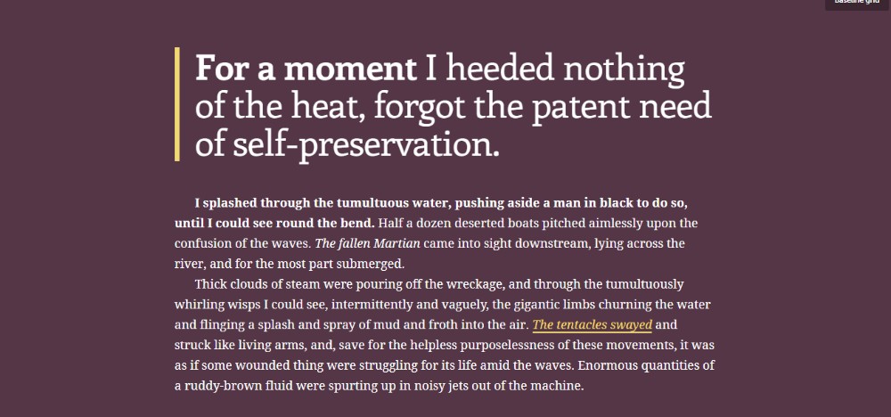
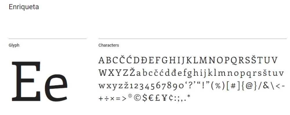
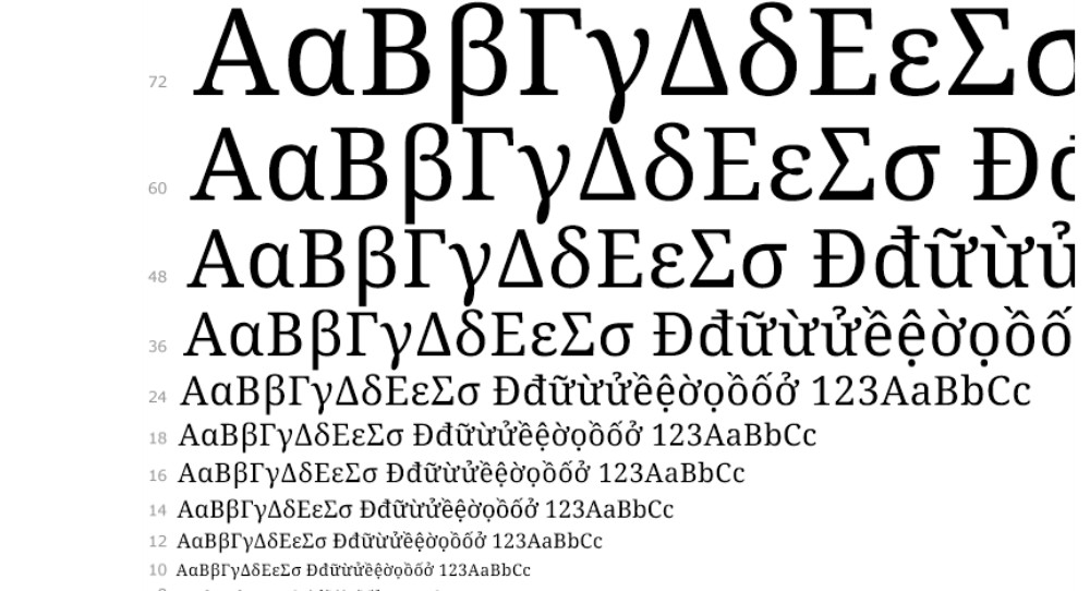
When combining Enriqueta and Droid Serif, Enriqueta should be used for headlines while the Droid Sans will beautifully balance the overall look when used for the text body.
The two fonts are quite different and they create a beautiful contrast that is powerful yet elegant.
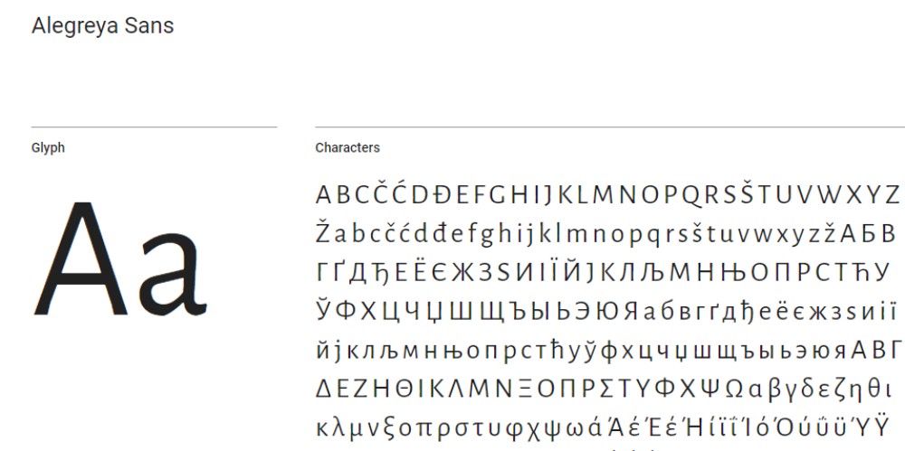
Alegreya and Alegreya Sans
The combination of Alegreya and Alegreya Sans looks stunning.
Alegreya
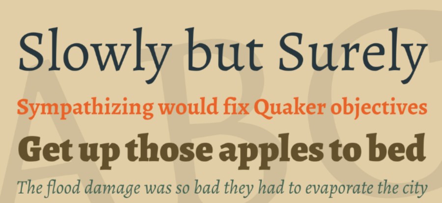
The Alegreya and Alegreya Sans combo gives a practical approach for the web page contents. And while it is easy to read and understand, the combination is also fun and unique.
Alegreya Sans
Fjalla One and Noto Sans
Fjalla One isn’t what we would normally call a super versatile typeface. However, when used for headlines and paired with a contrasting font that complements is well, it can deliver amazing results.
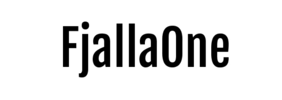
One of the best fonts to combine with Fjalla One is Noto Sans. Noto Sans is quite a universal font that doesn’t demand any formatting for the errors displayed. It can be found in the Google library.
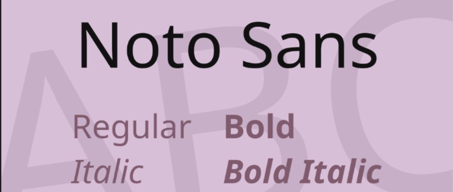
When paired, these two fonts are great for landing pages of websites and even for blogs. It is also good for long texts that need to be broken down into subheadings.
The universal character of Nato Sans makes it the right choice for reaching quickly to the international audience.
PT Sans and PT Sans Narrow
If you are a fan of the traditional fonts that deliver the old charm with the modern twist, PT Sans is definitely one of the fonts you should take a close look at. When paired with PT Sans Narrow, it becomes one of the best font combos we have seen so far.
PT Sans
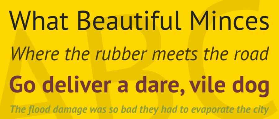
In fact, this was one of the top Google font combinations 2017 and it is still one of the favorite typeface trends of the web designers across the globe. It draws an immediate attention yet it is easy to read and very user-friendly.
PT Sans Narrow

In either way, the combo works great as body text or a headline and you can simply decide how to choose between the two based on your personal preference or your brand requirements.
It is a versatile combination that can easily become a part of any website and it can be used in the majority of modern digital communication contents.
Josefin Sans and Amatic SC
Josefin Sans and Amatic SC is a wonderful combination when implemented right. With that in mind, it shall be implemented carefully because of the unpredictable nature of both fonts.
Josefin Sans

Amatic SC
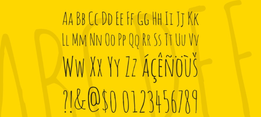
Yes, the combination will grab the users’ attention immediately but it is not for everyone. If you decide to give it a try, you should never use Amatic SC as the page’s main body text typeface because it will drive the users crazy.
However, if you are an entertainer, a musician, an artist, or a creative individual of any sort, this combo might be just the thing you have been looking for. It also works great for niche blogs because of the dominant tone of the fonts.
Merriweather and Montserrat
The Montserrat Google font has been very popular among web designers for quite some time. However, if you aren’t sure about the Monserrat font pairing, consider combining it with Merriweather and you are in for a real treat.

Merriweather
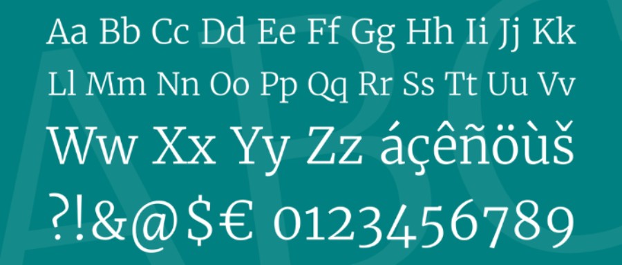
The combo is easy to read and quite stylish and you can use both fonts interchangeably as headlines or texts for the paragraph. In both cases, the results will be great so you can style the page with these typefaces according to your own preference or the requirements of your brand.
The combination of Montserrat and Merriweather fonts does well for online news or any publishing agency, it’s great for the business websites, and it reflects the right chord between the classic traditional and modern designs.
Fjala One and Lora
You don’t need a professional font pairing tool to realize that Fjala One matches beautifully with Lora.
Lora
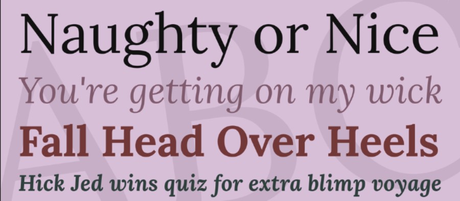
Like all good font combinations, this combo is easy to read and it has a touch of elegance and style to it that you definitely want to add to a website.
Combine it with a pink or a rose gold palette and you will get a perfect combination for a feminine styled website for a brand run by a strong businesswoman, for example.
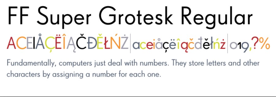
Super Grotesk and Minion Pro
The Minion Pro and the Super Grotesk are a great combination if you use the Minion Pro for the headlines and the sans-serif Super Grotesk for the body text.
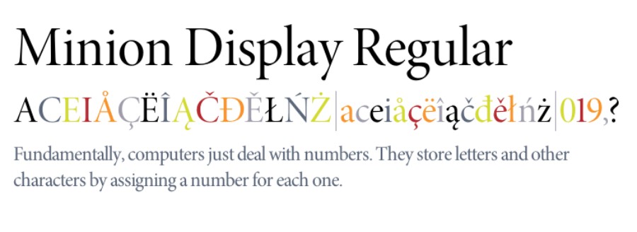
When paired like that, these fonts can help you create an elegant and stylish web page.
Libre Franklin and Libre Baskerville
If you are looking for a sort of a traditional feel to your website, you should consider pairing Libre Franklin and Libre Baskerville fonts.
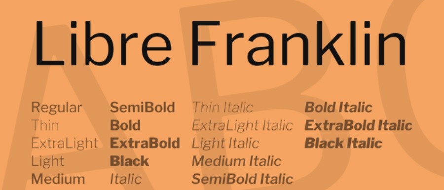

They both have been optimized for the screen usage, they are readable and simple, and they still have the touch of the old charm if that is your thing.
Freight Sans and Freight Text
We mentioned earlier in our font pairing guide that if you aren’t sure how to match fonts, you should try and work within the font superfamilies. One of the best examples of how well those fonts work together is the combination of Freight Sans and Freight text.
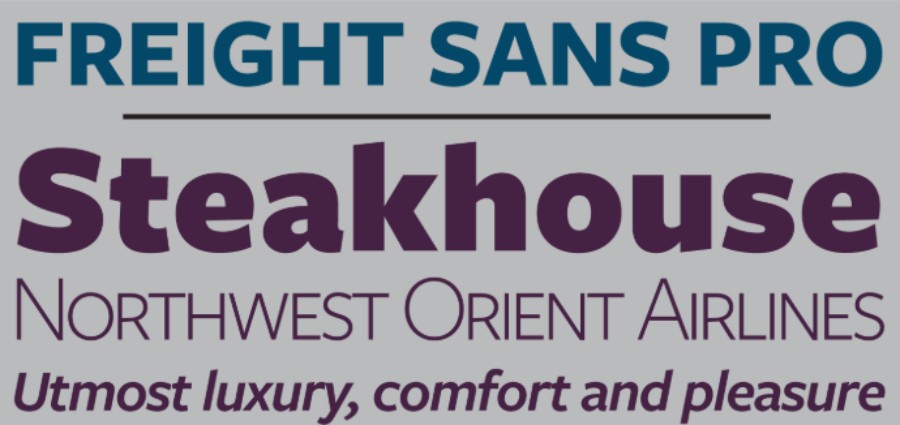
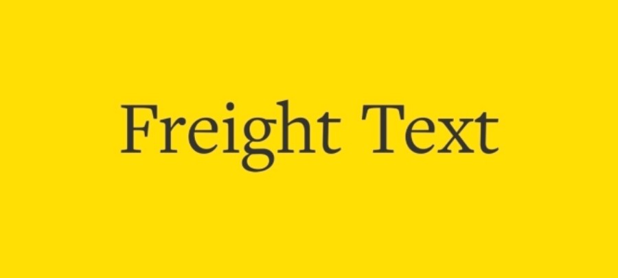
Freight is available in a large range of weights and styles, including Sans, Text, Display and Micro versions – giving you a versatile typographic toolkit to work with.
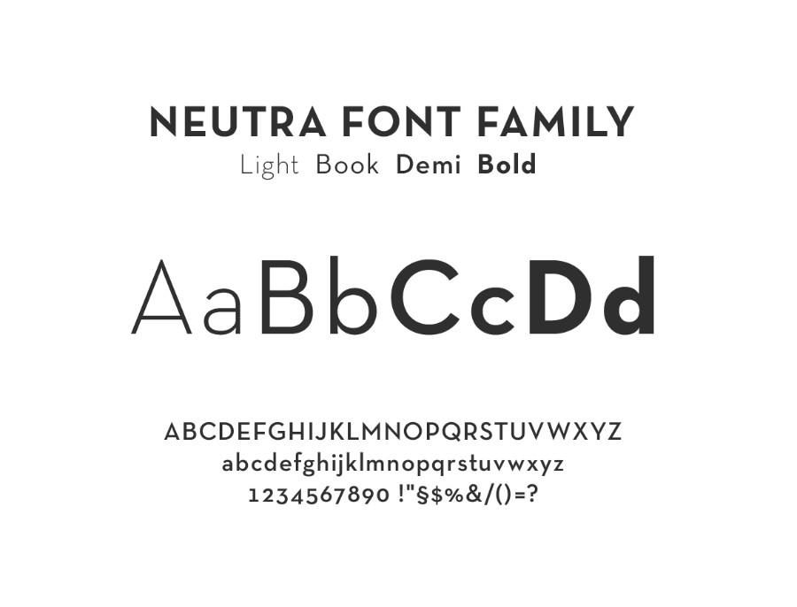
Kaufmann and NeutraDemi
If you are tired of all the classic ways to match a font, try to take a look at some of the more unexpected font duos. One of them is the Kaufmann and NeutraDemi combination.
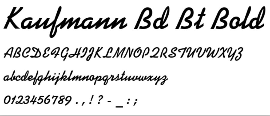
It isn’t an obvious match but once you see how beautifully these two fonts complement each other, you will not be able to take your eyes off of them.
Brandon Grotesque and Minion Pro
You have already seen the Minion Pro font on our list before and the reason for that is the amazing versatility of this reliable font. However, when you pair it with Brandon Grotesque, the results are truly amazing.
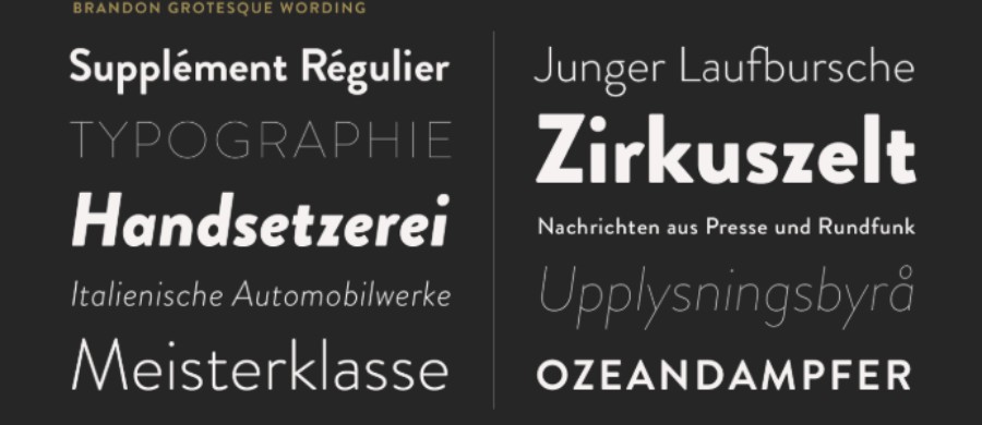
This is a great serif and sans-serif font pairing, with both typefaces remaining crisp and easy to scan in any page layout.
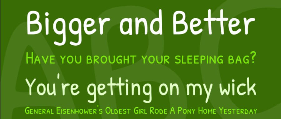
Josefin Slab and Patrick Hand
Josefin Slab is a result of the designer Santiago Orozco’s idea who wanted to create a typeface similar to Label and Memphis, but with a modern twist. As a result of that, he created a distinctive and unique font that is perfect for headlines.
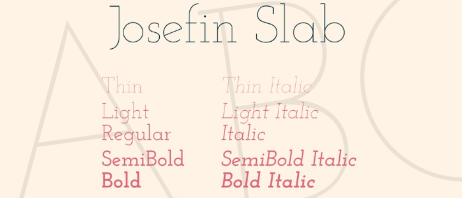
When combined with Patrick Hand used for the body text, it creates an impactful typeface combination full of personality and easily recognizable by its friendly vibe.
Helvetica Neue and Garamond
This is a famously harmonious duo, combining ubiquitous Neo-Grotesque sans serif Helvetica Neue for headlines with the classic Old Style serif Garamond for text.
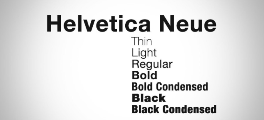
Mix up different weights and sizes between the two neutral families to establish a hierarchy within your designs.
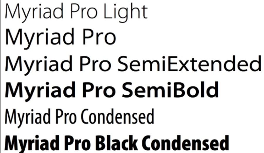
Caslon and Myriad
Caslon and Myriad combo is a classic font pairing that combines the old charm with the modern and chic style.
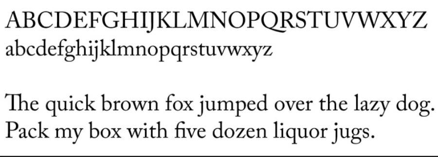
Myriad is famously used in Apple’s corporate communication, as well as in the Rolls Royce logo.
Fontin and Fontin Sans
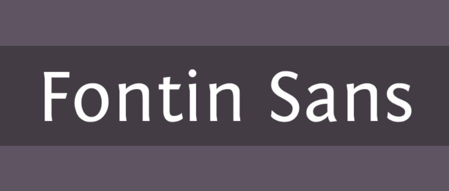
Fontin and Fontin Sans is another font combination that works great with web design. Fontin was designed specifically for use at small sizes, and features loose spacing and a tall x-height.
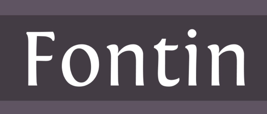
Combine it with Fontin Sans and you have a beautiful and easy to read typeface pairing that can be incorporated into almost any website.
Minion and Poppl-Laudatio
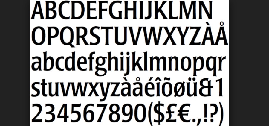
Both Minion and Poppl-Laudatio are packed with character and personality yet then bond amazingly and create a beautifully balanced typeface combo.
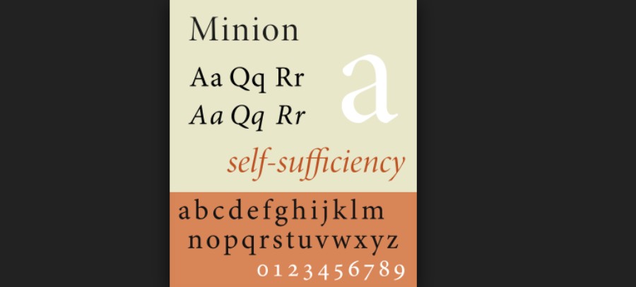
It combines the old charm of the Minion inspired by the late Renaissance-era type with the quirky edge of the Poppl-Laudatio.
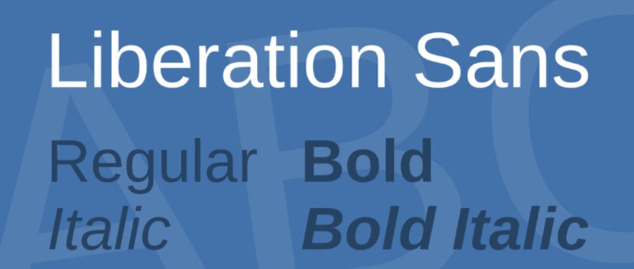
Liberation Serif and Liberation Sans
Superfamily Liberation was intended as an open-source substitute for many commonly used Windows fonts, such as Arial, Times New Roman, and Courier New.
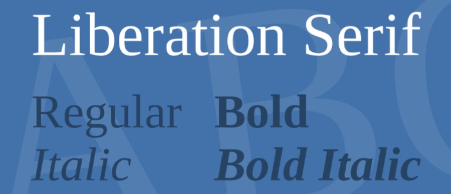
Not only can you pair Liberation Serif and Liberation Sans to create a beautiful typeface combo, but you can also play around with the other variations of this superfamily, for example, Sans Narrow and Mono.
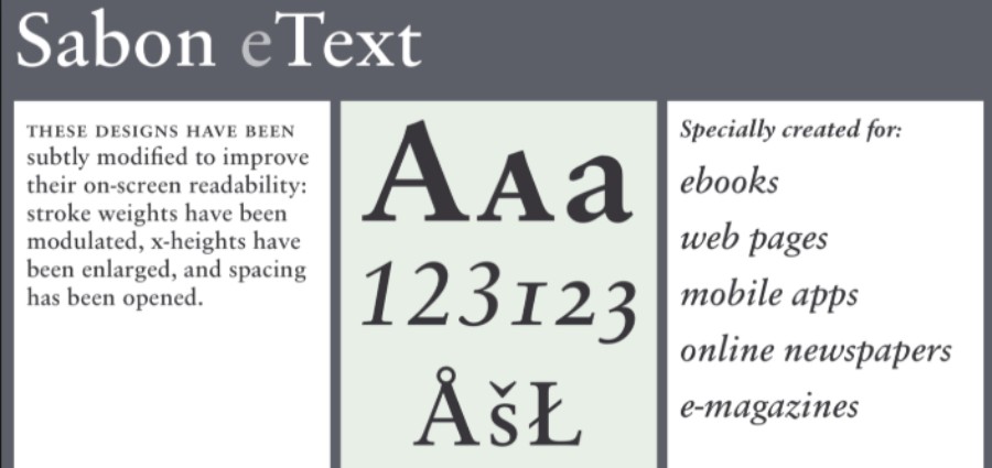
Trade Gothic Bold and Sabon
Trade Gothic Bold and Sabon are fonts that go well together but if you really want to get the most out of this combo, you should use the Trade Gothic Bold for headlines and the Sabon font for the body text.
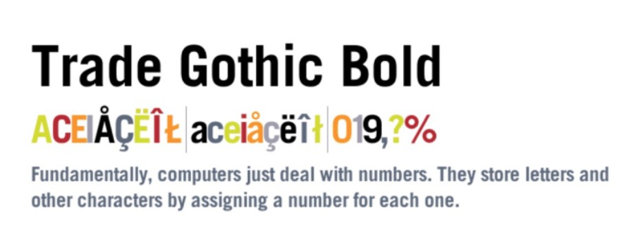
Both fonts are very readable and elegant and when combined, the results are simply outstanding.
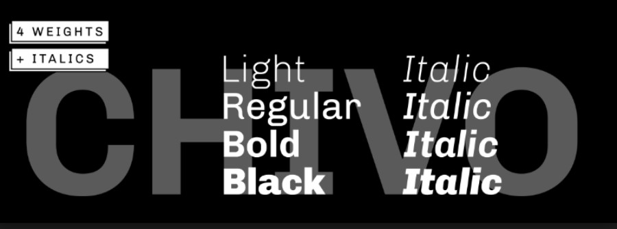
Chivo and Overpass
If what you are looking to create is a trendy website, you should use a font combination such as the combo of Chivo and Overpass.
Open Sans and PT Sans
If you are looking for a font combo that works with any design, you should choose a versatile typeface combination such as this Open Sans font pairing.
Open Sans is usually a good option for body text, but when making it bold or extra bold it looks great as a headline font. PT Sans is a minimal font that is a great choice for the body text and it matches Open Sans beautifully.
FAQs about font combinations
1. What are some good font combinations for a professional website?
It’s crucial to use fonts that are simple to read and exude professionalism when choosing font combinations for a professional website. Using two complementing sans-serif fonts or combining a sans-serif and a serif font are two common font combinations for business websites. For example, the font pairings Georgia and Helvetica, Lato and Open Sans, and Montserrat and Roboto are effective choices for business websites.
2. How many fonts should I use on my website for a cohesive look?
A website might appear busy and unprofessional by using too many fonts. Generally speaking, a website should only employ three fonts: one for the primary body text, one for headings, and one for additional emphasis. You may produce a unified and aesthetically pleasing design that is simple to read and navigate by minimizing the number of typefaces.
3. Can I use two different serif fonts together?
It is feasible to combine two separate serif fonts, although finding a pleasing combination can be difficult. Make sure the size, weight, or style of any two serif fonts you use contrast noticeably from one another. Readers will find it simpler to distinguish between headers and body content if, for instance, a serif font is combined with a larger, more elaborate serif font.
4. How do I choose font pairings that complement each other?
Look for fonts that have complementary traits when choosing font combinations. This can be achieved through identical x-heights, weight contrast, or matching stroke widths. Use fonts that are comparable in tone or mood as well, such as a lively script font combined with a strong sans-serif font for a fun and contemporary appearance.
5. Can I use two fonts from the same font family together?
A successful method for producing a united and coherent design is to combine two fonts from the same font family. Use fonts from the same family that has several weights or styles to avoid a boring appearance. For instance, contrasting a bold, condensed font with a lighter, more open font can establish contrast and hierarchy.
6. Should I stick to one type of font or mix and match different types?
While it is possible to utilize just one typeface in a design project, mixing and matching various font styles can add visual interest and aid in communicating an information hierarchy. Yet, it’s crucial to pick fonts that go well together and don’t clash or compete for the viewer’s attention. Use fonts with different weights or styles, such as a robust sans-serif and a delicate script.
7. What are some font combinations that work well for print materials like brochures and flyers?
It’s critical to use readable and simple-to-read font combinations when creating print items like brochures and flyers. Sans-serif fonts are ideal for headers and subheadings, whereas serif fonts are frequently a solid choice for body text. For print items, some well-liked font pairings are Times New Roman and Arial, Garamond and Futura, and Bodoni and Helvetica. And if you need a quick starting point, you can even generate templates with AI to streamline the design process.
8. How do I make sure my font combinations are accessible for users with visual impairments?
It’s crucial to think about accessibility for users with visual impairments when choosing font combinations. Choose legible typefaces with good contrast, like sans-serif styles with a high x-height. A font size that is comfortable to read for people with vision impairments should also be used.
9. Can I mix script and sans-serif fonts together?
Using script and sans-serif typefaces in a design project can produce an intriguing and eye-catching contrast. Use script typefaces sparingly and exclusively for headings or specific emphasis to prevent a cluttered appearance. For a well-balanced design, combine a script font with a straightforward sans-serif font. An attractive and contemporary appearance can be achieved, for instance, by combining a delicate script font with a strong sans-serif font.
10. What are some common mistakes to avoid when combining fonts on a design project?
Using typefaces that clash or fight for attention, employing too many fonts, and using difficult-to-read fonts are some frequent pitfalls to avoid when combining fonts. While choosing font combinations, it’s crucial to keep the project’s context and goal in mind. To ensure that font combinations are readable and easy to read, test them out on various devices and displays.
Ending thoughts on this font combinations article
The font selection is an important part of the website designing process and finding the right matching fonts is not as easy as it seems.
Today, we took a closer look at some of the fonts that go well together and create great font combinations for the web.
Think about the vibe you want your website to have and choose your favorite typeface combo accordingly.
If you enjoyed reading this article on Font Combinations, you should check out these about Cursive Fonts and Best Free Fonts. But also an interesting piece with table plugins.


