Web design is not static — trends come and go, and what’s hot in 2019 might be old hat in 2020. If you want to keep your audience engaged, you’ll have to adapt constantly or your website risks falling out of vogue.
That said, it’s important to understand that bad websites don’t necessarily involve bad design. Your website quality can also be influenced by how responsive it is, what type of content you include, how fast it loads, and many other aspects.
This article will take you a deeper look at the various factors that can turn an otherwise good and unique website into an absolute monstrosity.
Is Web Design That Important After All?
Before moving on to analyzing the aspects that make up the worst websites, you should understand the basic purpose of web design. It is supposed to:
- Help users form a good first impression of your site
- Build a brand image
- Increase customer conversion
- Attract more traffic and improve discoverability (SEO)
- Stir the interest of users and maintain their attention
- Give a good visitor or customer experience
Mistakes you should avoid if you don’t want to design bad websites
Now let’s move to the mistakes that transform good websites in the worst websites:
Bad Content

The kind that makes you say “Nope!”
Users may get over bad visuals, but they will never forgive bad content. All websites include content of some sort, whether it be sales copy, informative articles, or a directory listing. You need to make sure that the content you include on your own website is accurate and of high quality.
Text with grammar mistakes, images with copyright issues, bad formatting — all these will make your website’s quality drop tremendously. Moreover, users won’t trust your website, as it doesn’t inspire any sort of authority.
Good content is just as important as good structure and design, so give your user base something to enjoy reading or researching while navigating your site.
Slow Load Times
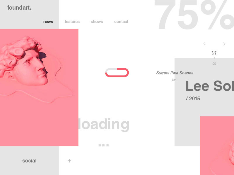
Bad websites load slowly. A few seconds can make the difference between a reasonable website and one that will be avoided at all times. People are impatient in the online environment — it’s not a secret.
This is why the time factor is critical when designing websites. Users won’t bother to wait to see your website unless it loads fast. If it takes forever to load, they will move on to the next option they have, and the Internet is full of options.
Since many users prefer accessing websites via smaller devices like mobile phones or tablets, load times can’t be ignored. Anything under 10 seconds is alright, but even that’s stretching it.
Poor Navigation System

A classic example of a website good navigation
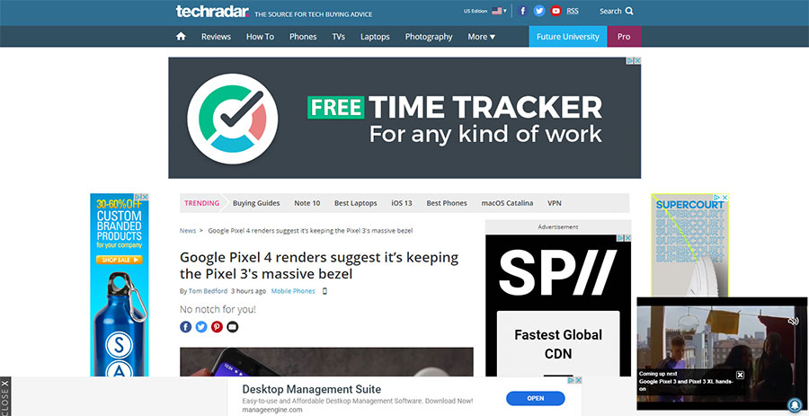
The worst websites are a pain to navigate. The system is cluttered, confusing, and very difficult to figure out. You should avoid allowing pop-ups on your site, which can confuse users and render them incapable of keeping track of their actions on the site.
It’s best to keep the navigation system clean and simple. People should be able to access different parts of the website without having to backtrack at any point. Analyze other websites and see which navigation system seems the easiest to use.
No Contact Details Included
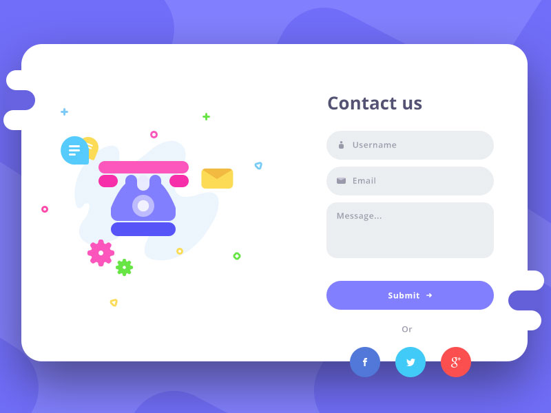
Regardless of your website’s specifics, you need to include some contact details. Whether you are a freelancer, an artist, or a company, people might want to contact you for various reasons.
Make this action accessible by visibly including your contact details on the website. You can either include it in the footer of your website (which is visible regardless of the page the users are viewing) or you can create a separate page for contact details only.
Bad websites make it a true quest to find any sort of contact information.
Improper Font Sizes
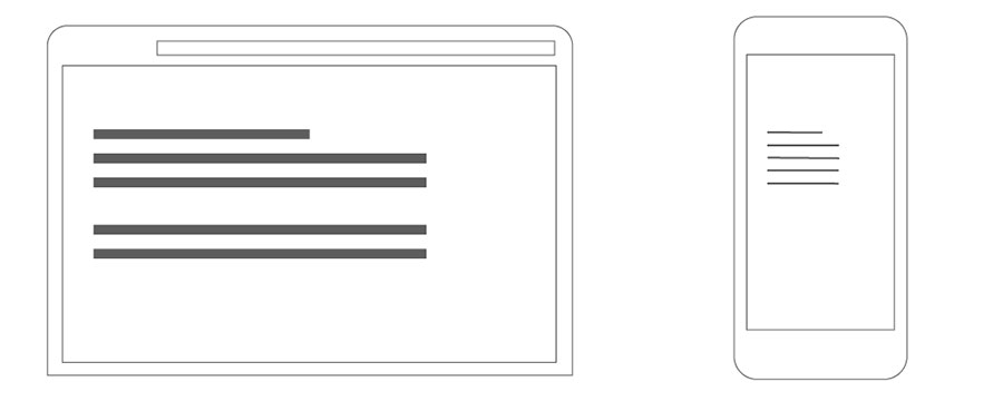
First of all, make your website scalable, so that users can see it properly regardless of the device they are using.
Second of all, pay attention to what font size you are using. The typeface choice is personal, but the font size should be chosen according to a basic design rule: keep the body copy size around 16px, secondary text around 14px, and headers over 18px.
No CTAs or Bad CTAs

What to click, what to click
All websites should include Call-To-Action buttons. They increase the rate of conversion and they make the difference between a mediocre website and a bad website. If you have no CTAs at all included, then do some research on how to build good CTAs from scratch.
If you have CTAs, but they are too basic or they involve guesswork, you need to change the text. Keep it very clear: “Share now”, “Click here”, “Buy now”. Don’t use too many CTAs either —this can turn users the other way around in a second.
Inconsistency

Make sure that your website is consistent. Consistency refers to using the same color scheme for all pages, maintaining a certain layout, using the same font combo, pairing visual content, and so on.
This is indeed an aspect that takes a lot of time, but that’s what differentiates poorly designed websites from excellent ones.
Low-Quality Images

Fake people looking fake
Images are extremely important for a myriad of reasons. They are more appreciated than text, improve your SEO score, make your website look more professional, and more. But there’s one thing that can turn your website into an ugly monster: low-quality images.
Either use HQ images from your own archive or buy them on the Internet. Royalty-free images are mass-used, so they won’t add any unicity to your site. Choose images that resonate with your visitors’ interests or your company’s specifics.
Long Chunks of Text

You are getting away with it only if you are a news site. Source: NY Times
Another aspect you’ll notice on bad websites is too much text, arranged in huge chunks that are very difficult to read through. If that’s the case for your website, reduce the amount of text you include, leaving only the essential bits.
Now, format those bits so that they are easy to scan. People won’t have the time to read all the information on every website they visit. Make it easy for them to gather the exact info they need by highlighting the most important parts.
Cluttered Pages

Don’t include too many things on one single page. Simplicity is key when it comes to web design. A bad website will contain cluttered pages that include too much information, most of it irrelevant.
The purpose of a website is to follow the rules of good design — an airy layout with enough content to satisfy the curiosity or need of the user. You shouldn’t continue adding elements until there is no white space left on your page.
A Lot of Ads

No one can take away your right to place ads on your site, but bad websites are basically full of ads. When the adds take just as much space as the content itself, it is obvious that there is a problem that needs to be fixed.
One or two ads are enough for monetization purposes, and remember to avoid pop-up ads at all costs. Unless you want your visitors to be frustrated with your site, keep it clean.
Duplicated Content

Using the same content or titles on all of your pages won’t have any positive results. The worst websites out there simply copy and paste the content from one page to all the others.
Hire a copywriter to create unique content for all of your pages or create it on your own. Even though it takes longer, and, as they say, “there’s nothing new under the sun”, a professional website won’t go very far without original content.
If you want to check your site for duplicate content, you can use the duplicate content checker by Sitechecker.
Ending thoughts on these bad websites
Now that you know how bad websites look and what mistakes you should avoid, get down to business. You will need to think through each move you make in terms of website design — from the content to the looks and where you put the contact details.
Simply give it the attention it deserves and your website will turn out great.
We hope you enjoyed reading this article on bad websites created by the team at Amelia (the best booking plugin for WordPress).
You should also check out this one about button design.
We also wrote about a few related subjects like modern web design, layout design, visual design, best 404 page ever, web design trends, dark background, website layouts and loading animation.


