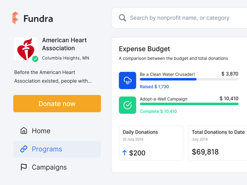
Affordances refer to the properties that an object has. These properties tell users how many actions they can do using the respective object. To put it simply, imagine a button. Buttons are created to be turned or pushed. The properties of this button transform it into an object that can be either turned or pushed. These properties represent the button’s affordance.
Even though this term can seem a bit technical, it is useful when talking about web design. In website design, terms are often used interchangeably, which leads to confusion.
The correct use of terms can represent the key to obtaining a better user experience. Web designers must use consistent terms to describe their work so that they can communicate with each other properly.
This is the purpose of affordances. They help web designers think of products with affordances to figure out what the outcome should look like.
Nonetheless, understanding the affordances psychology is more and more difficult because the way people use and control objects has changed over the years. Solid knowledge of what an affordance is will help any web designer, as it is an essential and highly useful concept in web design.
What are digital affordances?
The purpose of web design is to improve the user experience. Affordances and metaphors can be used specifically for achieving this goal. At first, digital affordances may seem irrelevant for the process. Some people might even consider them counterintuitive. Digital interfaces can deeply influence the user experience, as the model of interaction changes entirely.
The digital world is full of different types of affordance. For instance, when a person clicks a submit button, they do it because of how the button looks. It has characteristic elements that tell users that it is an interactive element. Simple text, with no effects on it, wouldn’t encourage people to click it in any way.
This is where digital affordances intervene. Making the hyperlink look like an actual button that resembles the item in the real world would help visitors find and use the element.
The whole purpose is to make the digital element look like one encountered in the real world so that visitors can easily associate the characteristics. Learn below more about this topic in this article created by our team at Amelia (probably the best WordPress reservation plugin).
User Interface elements and interactivity
Web designers are the ones responsible for shaping the user interfaces that people get to use. They use elements that are supposed to make visitors interact with them.
This means that all the elements they include on a user interface must-have features that make them look interactive. The way users perceive and use a website is solely the result of how a web designer put together the UI elements. The whole design is focused on encouraging interaction.
The theory of affordances in web design
Once you understand what an affordance is and how it can be used, you will get better at interface design. Using affordances in web design will lead to better usability and more interaction from the users, depending on the purpose of the website. An affordance can influence the conversion or registration rates, for example.
The user behavior on a site can change entirely once affordance theories are applied in web design. Because of the visible impact it has, an affordance should be the main concern of a web designer before starting a process, even though it can seem tricky at first.
Examples of affordances in web design
After web designers learn how to define affordance, it’s time to study aspects related to each type of affordance. They all have the same purpose: setting clear expectations and respecting them until the project is done.
Labels
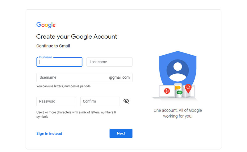
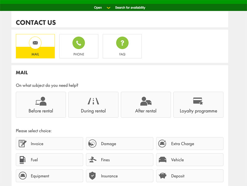
Labels represent the most common type of affordance. Labels are specific for websites that target a less tech-savvy audience. For websites that have complex interfaces that are difficult to navigate, using labels can rapidly make it easier to use. A label indicates the function of an element, thus letting the user know what it does.
For instance, when a user completes a form, they expect to have details about what they should write in each field. Because all forms are customized for each website, there is no pattern that they could follow in this sense. The second option would be a validation process where visitors would rely on their mistakes to figure out what they should type into the fields. Clearly, that wouldn’t be good interface design.
To organize the functions of a website, the label affordance is used. It is the clearest, most precise method of giving people details about how the form fields work and what they should do in order to interact with the site.
Patterns
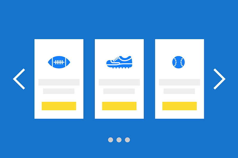
People who spend time on different websites will notice patterns between them. These patterns refer to certain actions that are repetitive and they are the same, or at least similar, on every site that people access. For instance, when visualizing pictures in carousel mode, users will know how to use the left and right arrows to browse through the images.
The pattern affordance can be elegantly used on any type of interface to signal actions to the visitors. People are exposed to a myriad of pattern affordances every single day, by browsing various types of websites. This way, they become quicker at recognizing and using them when they stumble upon similar ones.
Metaphorical affordances
The easiest way to add an affordance in web design is to have a real-world reference. This object that is existent in real life represents metaphors for the affordance. Take icons for examples. Most icons are inspired by real-life objects, thus communicating affordance.
Email icons use envelopes as a metaphor. The homepage of a website is often signaled by using a house icon, which transmits the idea of “going home”. Printer icons refer to using the functionality of a printer and so on.
Interestingly, the icon for the save function is a Floppy Disk which is obsolete technology, but designers still use it because it acts as both a metaphorical affordance and a pattern affordance, in that people are accustomed to the association.
When web designers think of ways to convey a message through visual elements, they should use metaphorical affordances. The physical world offers designers the exact inspiration they need to create visual aids that are intuitive to use. It’s important to keep in mind that not all web designers use metaphorical affordances, but they represent the best starting point if you’re out of ideas.
Explicit affordances
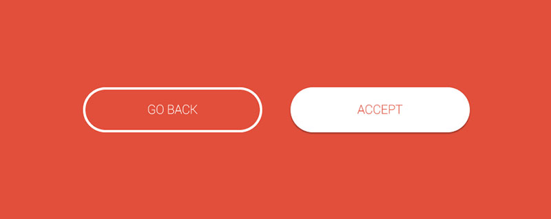
These are similar to metaphorical affordances at some level. An explicit affordance relies not only on the physical aspect of a real-life object but also on language. When a person visits a website and a button has “Click Me” written on it, there are two types of affordances combined: the physical appearance of a regular button and the persuasive short phrase.
Explicit affordances are the ones that help web designers guide users through the interface. Whenever a user has to fill a form, they require more information about what information they should insert in that field.
Spelling out direction through an explicit affordance is a foolproof way to design the user interface, but it can also be troubling if it is used excessively. Make sure to give users enough room to make decisions on their own and use their intuition.
Animated affordances
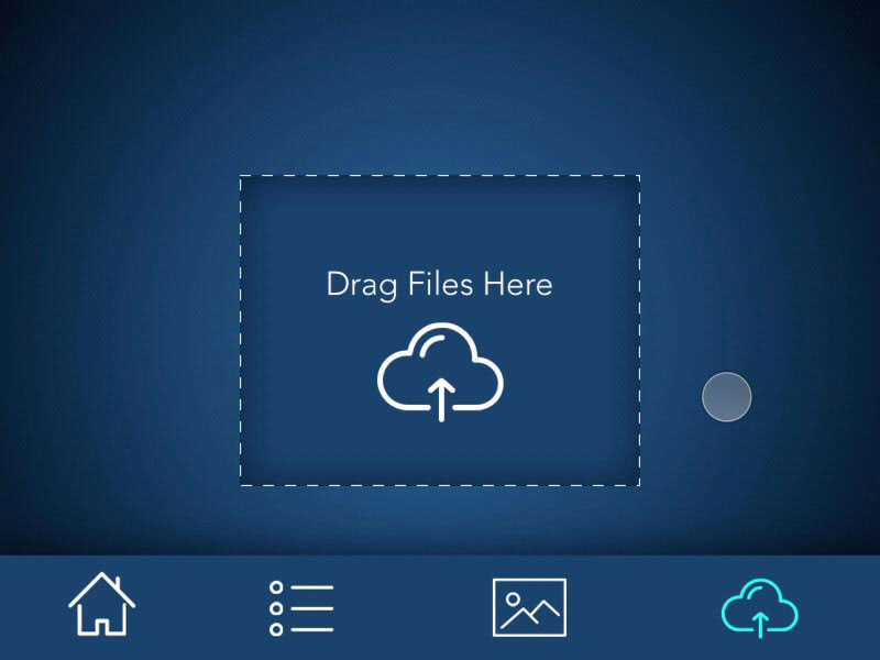
Animated affordances refer to those actions that users are required to do in order to interact with elements on the site. They are also inspired by physical objects and activities. Dragging and dropping is a common interface animation that most users enjoy.
Similar actions such as pulling or swiping are also used by web designers to make the user interface more interactive. The trick is that animated affordances combine the digital world with the physical one because it gives users the feeling that they’re interacting with real, palpable things.
Hidden affordances
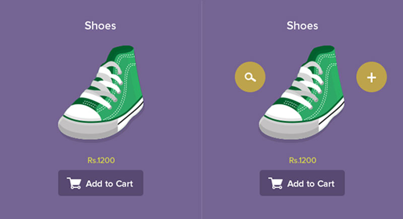
A hidden affordance will only appear when certain conditions are present. For instance, making a word clickable only on hover. The affordance is not present until the user discovers it and interacts with it.
Web designers should use hidden affordances for websites that already have a cluttered interface and would like to visually simplify it. The only drawback of a hidden affordance is that the user has to find it on their own, without having any clues that point them to it.
False affordances

False affordances are random mistakes that web designers make and don’t notice. Their effect is not pleasing to the user. Users expect something to happen when they notice an element that has certain characteristics (e.g. a button).
In some cases, because of minor web design mistakes, the element doesn’t do what it is expected to do. Simply put, a button won’t do anything when clicked. These are small details that are sometimes missed during the design process.
An affordance doesn’t exist in the real world, but it has a tremendous impact on the digital world. People spend a lot of their time online, so it’s important to understand the importance of affordances and how they are used in web design to help users interact with and navigate a website.
If you enjoyed reading this article about affordance in web design, you should check out this one on how to become a UX designer.
We also wrote about a few related subjects like persona templates, UAT testing, User Interface design principles, web usability and UX designer portfolio.
