All businesses and organizations own a website today. The question is no longer whether you possess a website or not. It is about what competitive advantage your website has and what makes it stand out from the 1.6 billion other websites out there. Technology advancements appear quickly and companies are forced to keep up with them no matter what it takes. Otherwise, they risk being ignored.
To stand out from the smorgasbord of websites that reside on the Internet, you need to focus on web usability. A good experience with a website will make a visitor keep coming back, and this can only happen by meeting people’s expectations, following several laws of UX, and respecting a set of web usability principles. This matter is discussed in detail below by the team at Amelia (our WordPress booking plugin), so, continue reading to find out what web usability is, why it matters, and how can you improve it for your own site.
Why Is Web Usability So Important?
Users feel important when the website they visit is focused on their needs and meets their expectations. To achieve that, all business owners must analyze what their target audience wants and adapt the web usability level to their requirements and desires. Prospective clients need to value the user experience in order to interact with the website and generate profit for you.
Web usability is the one element that makes the difference between an effective website and one that is disregarded without a second thought. All visitors need to have a pleasurable experience on a website to continue to interact with it, and good web design is the key to achieving this. Every little detail present on a website, including buttons or forms, can affect how a visitor feels when they access a site. Without gathering significant insight into your potential visitors’ minds, you won’t be able to reach a website usability level that will generate positive results in the long run.
Don’t Skip Testing
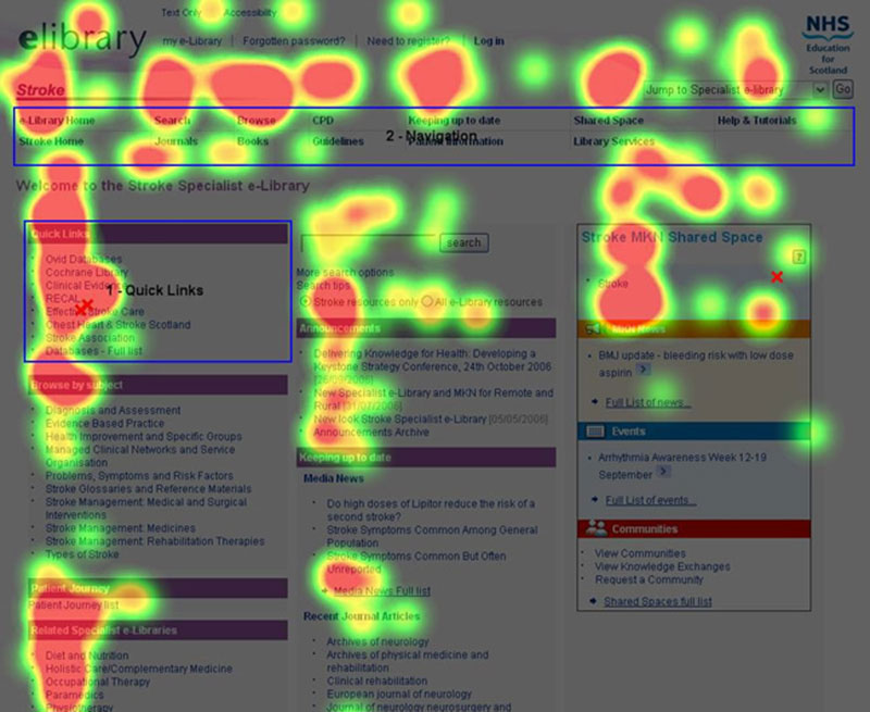
Web usability is all about testing your site often and noticing what can be improved. Dealing with web design only once is not possible when you own a website that you want to propel to the top.
Some new trends in web design appear almost every month, and you won’t be able to keep up with all of them, but you’ll have to keep the user experience engaging and interactive. That won’t happen unless you test the website regularly and find mistakes that can be fixed or aspects that can be upgraded.
Skipping this step will only throw you in a loop of not knowing what to improve and may result in you making changes that hurt usability, not enhance it. Staying informed about the latest trends in web design can also help you stay ahead of the curve and ensure your website remains relevant and competitive.
Web Usability Principles to Follow
These are some web usability principles to get you started with improving your site. Choose the one that suits your case the best:
7 +/- 2
George A. Miller concluded a while ago – people are not able to retain all the information they see. Short-term memory can only retain around five out of nine things that a person sees at one time.
This is a biological limitation of the brain that was proved by science. Keeping this in mind, when dealing with web usability, you need to divide information into five to nine chunks at a time. This simple principle can help you create a good, clean website layout without much effort. It is used in many industries other than design, so you can safely rely on it.
The 2-second rule
Another simple principle that should determine how you design your website is that users are not willing to spend more than 2 seconds waiting for a website to load.
If your website takes forever to load, don’t wonder why you don’t have enough visitors or why the bounce rate (people who exit a website without interacting with it in any way) goes through the roof. Web usability has to do with how quickly the site loads as well, so do your best to improve this aspect.
Accessibility
One of the most basic principles of good design is to be inclusive of as many users as possible, taking into account that not all people are alike. Some of your users may have disabilities or conditions like colorblindness, and care must be taken when choosing color schemes and font weights in light of this fact. Even for able persons, a website that features faint, hard-to-read fonts can be an instant turn-off.
Clarity
The core of web usability is creating clear sites. By cluttering a website and filling it with all sorts of elements that are irrelevant for a user, you only make things worse. Instead of making your site’s visitors confused by adding distractions on the site, try to keep everything clear and guide users towards engaging in specific activities on it. Clarity is the only way to design a website properly and to give people the needed guidelines when navigating it. Stick to this principle no matter what other rules you choose to respect.
Learnability
People are pleased when they interact with a website that is traditionally built. Since all users learn from their past experiences, they generate certain expectations in their heads. Try to keep your website as intuitive as possible. Web usability is improved when the website doesn’t require any instructions or when it’s easy to figure out. Learnability refers to making a design intuitive by using elements that people are already familiar with.
Credibility
No one will remain on a website that doesn’t inspire trust. Not all websites look trustworthy and that has to do with web usability as well. If a user encounters a lot of errors and warnings while navigating on your site, it is very unlikely that they will trust your site. To establish credibility, make sure that your website has been built professionally, that the content is well-written and mistake-free, and that no errors or broken links lay around the site unnoticed.
Purpose
Every single page that is part of your website should have a purpose from the very beginning. Because all web designers are limited in space, you need to clarify what the purpose of the site is in the first place. This gives users some direction and you can establish a target audience much easier. All elements included on your site should contribute to perfect web usability, guided by clear goals.
CTAs
As mentioned, giving your visitors some direction is an absolute must in web usability design. Use CTAs (Call-To-Action) for that. CTAs are buttons that contain action verbs that invite a website’s visitors to do something. For instance, eCommerce websites include CTAs such as “Buy Now” or “Contact Us”. Do the same on your own website but try to moderate the use of them. Too many CTAs can make your site look spammy, while little to no CTAs will lead to poor usability.
Conversions
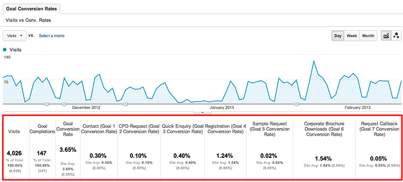
Make a priority out of conversions. All websites should make visitors turn into customers in the shortest time possible. If you don’t know where else to start with your website, focus on increasing the number of conversions that your website generates at the end of the month. It could be a simple change of color on some element or other that does the trick.
In Conclusion
When you put a website together, you need to pay attention to the tiniest details, all of which contribute to an enhanced level of web usability. The better a user feels on a website, the higher the chances of turning them into a regular visitor. By following the nine principles listed above, you can’t fail. Just figure out what the best combo for your own situation is and put it into practice. You will notice a huge difference, even if you implement only some of these principles.
If you enjoyed reading this article on web usability, you should check out this one on User Interface design principles.
We also wrote about a few related subjects like persona templates, UAT testing, affordance, how to become a UX designer and UX designer portfolio. But also an interesting piece with WordPress tables plugin examples.


