 A Birthday Worth Celebrating
Adding buttons to your website is an absolute must. Not only do they help users interact with your site, but they also encourage them to spend more time on it. In some cases,buttons don’t seem to have much of a role, but finding a good place for them can actually boost sales and make the user experience more enjoyable.
Keep reading more about this topic in this article created by the team at Amelia (the best booking plugin for WordPress).
The Basics of Designing a Button
As with most design work, there is a set of rules which needs to be respected regardless of what type of button you want to create. All personalized buttons must follow these basic rules, and the button you create should be styled according to its purpose on the page.
Above all, buttons have to direct the user’s attention towards them. As such, buttons are often accompanied by a Call-To-Action statement – encouraging the user to click it. But the CTA alone cannot be relied upon to entice the user, and traditional design rules won’t make your buttons stand out from the rest, so you will have to get creative.
This is a short guide that will help you understand buttons and list six different rules that will ensure your buttons’ success.
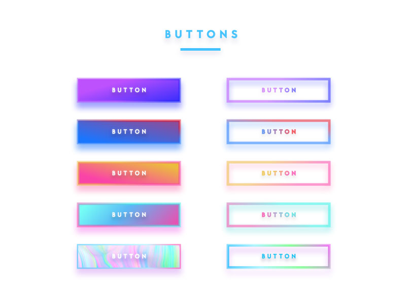
Types of Buttons
Buttons come in various types because they can be used for different purposes. They can be placed anywhere on the website interface and, to obtain the best effect, you need to choose the most appropriate type of button for your site. To make your own buttons, choose one of the following types:
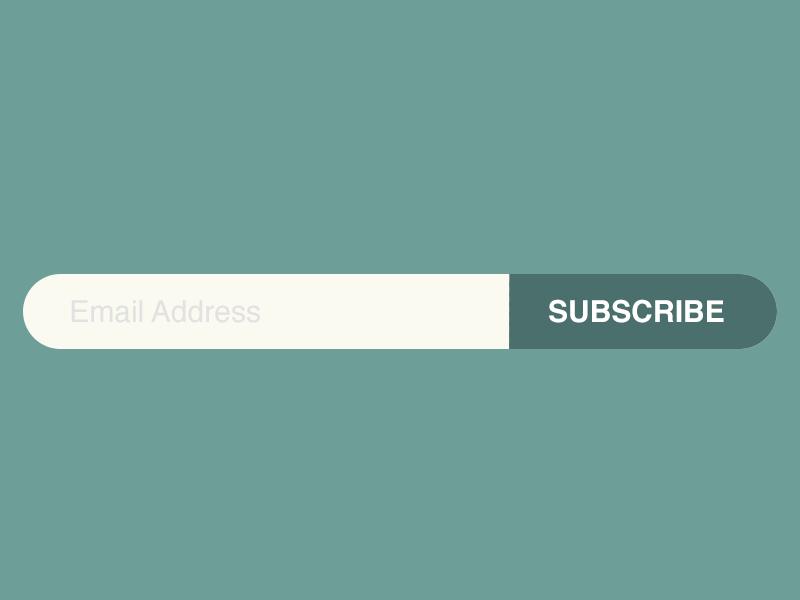
Text
This is probably the most common type of button. They look like simple blocks of text that are accentuated. In button design, the text button is not very effective because they are not emphasized enough, yet they can be used when that is exactly the effect that one desires to obtain.
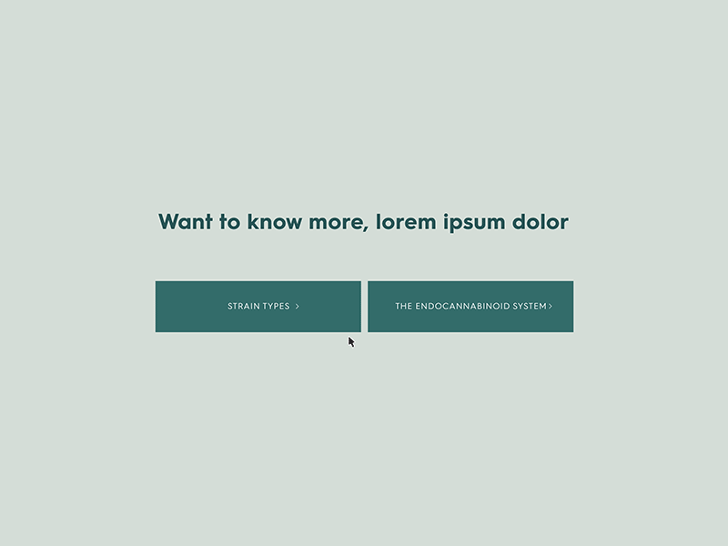
Ghost
Ghost buttons are also called outlined buttons and they are a bit more difficult to design. They are normally used for actions that are less important, compared to text buttons that are designed for primary actions. The button design process for the ghost type is just a bit more complex than in the case of the text button type.
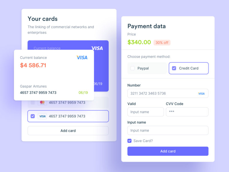
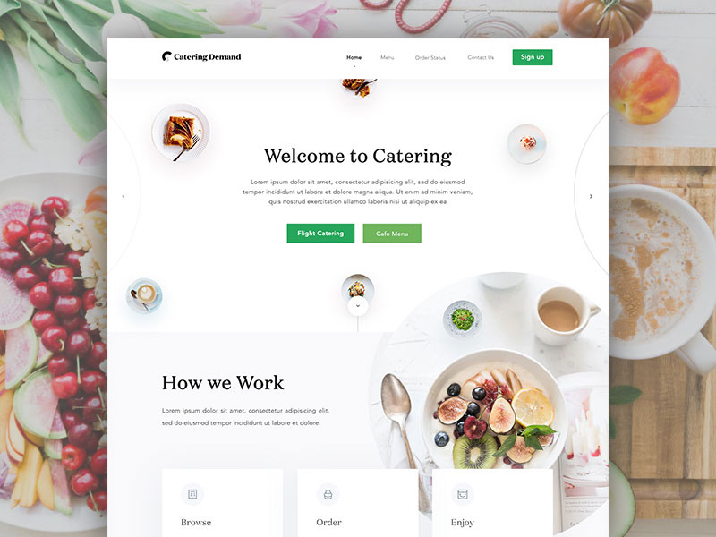
Raised
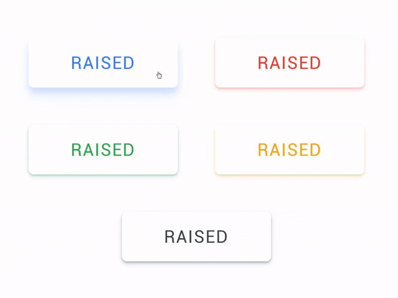
Raised buttons are also known as contained buttons and you can recognize them by the rectangular shape which has a 3D effect. The 3D effect is obtained by using a drop-shadow below it. This makes it look more like a real-life button, so it is more intuitive to press on it.
Toggle
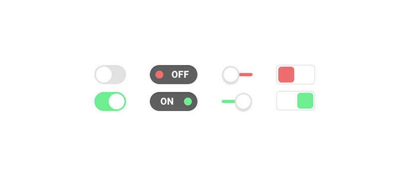
The toggle button type is used by those who want to group multiple actions in one single button or to showcase a range of settings.
In the former case, the user clicks the button and chooses only one single option at a time. Whenever one option is selected, no second option can be added. If clicking another option, the first one will be automatically deselected.
In the latter case, the toggle button allows one to activate or deactivate different settings.
Floating
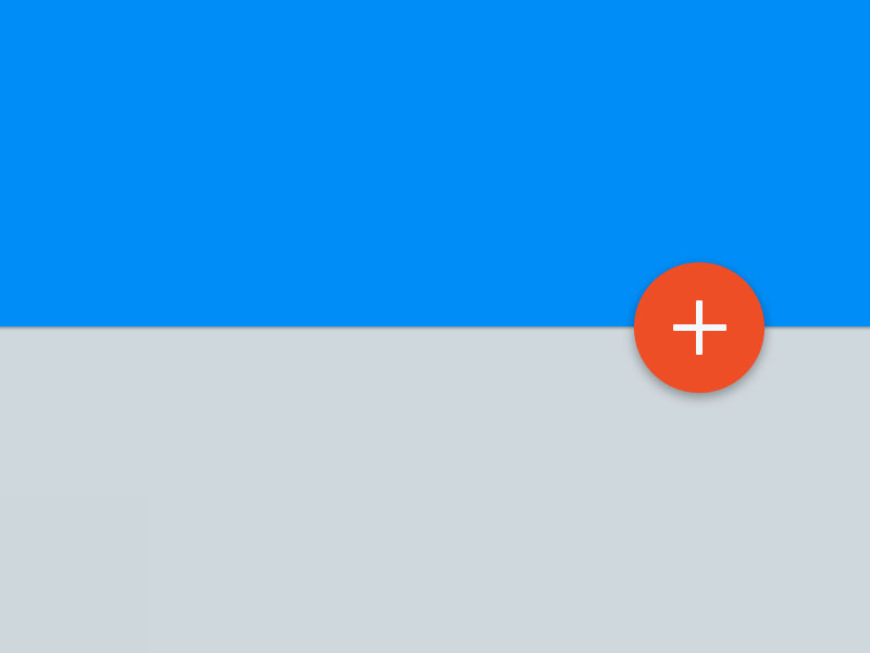
Floating action buttons are often known as FAB. They are used for common actions on the interface. Usually, they are placed very visibly, above the content. In most situations, they have a circular shape, but it is not mandatory.
In button design, choosing the proper type is essential because it will determine how easilythe interface can be used on a mobile phone, on a PC, on a tablet, and so on. For example, using a text button is not as finger-friendly as using a raised button for mobile users, yet it would be fine on a PC. The arguments for each button type are numerous, so take your time to make an appropriate choice.
Color and Contrast
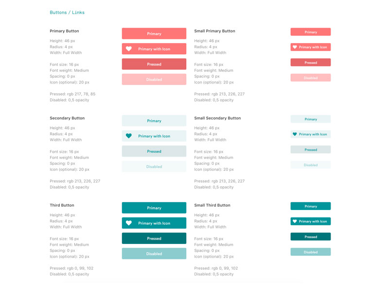
Color psychology plays a huge role in button design. Each color has the power to influence a person in one way or another. You will need to differentiate your website buttons based on their purpose. You should keep in mind both color psychology and aesthetic principles.
We recommend styling them as follows:
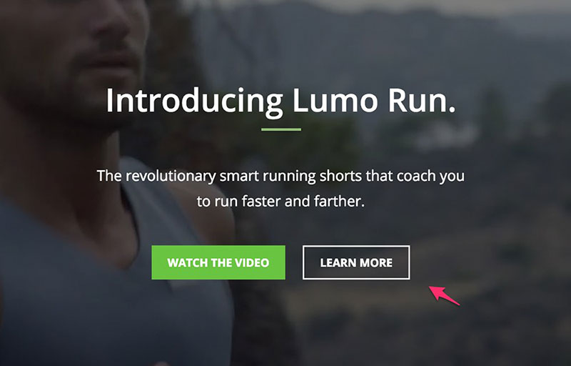
- Primary actions – solid color, high-contrast
- Secondary actions – transparent color, solid outline
- Tertiary actions – underlined text
Every color has a power of its own. See the logos of the biggest brands out there and you will understand their role. Red is usually associated with passion, hunger, or energy. Yellow or other dimmed colors are perfect for buttons that lead to informative pages. Green or blue are good for buttons that indicate a positive action (e.g. donate).
The Six Golden Rules
1. Keep it traditional
Don’t go too crazy with shapes. Buttons should still look like buttons. Otherwise, your website’s visitors might get confused and avoid the oddly-shaped element you’ve placed there. Try to keep it traditional when it comes to shaping.
In button design, you need to consider basic principles. For instance, if your website contains elements that are square, go for the same pattern with your buttons. If your website is more on the round side, round the edges of your button rectangle or use circle buttons.
Regardless of the shape you choose, make sure that it is noticeable and attracts the eyes of the user. Once you choose a shape, maintain it throughout the whole interface because otherwise, you won’t obtain an aesthetic effect.
Moreover, the user will be familiarized with the shape of the button and will scan for more as they use the interface.
2. Make them visible
There is no point in creating a button if you don’t make it pop from the rest of the elements. A button that doesn’t stand out in any way will be completely ignored by users. Try to place it in a visible location, in a position where visitors can easily notice it.
Put yourself in a visitor’s shoes: what area of the website do you observe first when you enter it? That is the place where you want your button to be. Conventional placement is one of the most important aspects of button design, so don’t overlook it.
Use white space and contrasting colors to accentuate the presence of the button as well.
3. Label them
You can’t create a button without labeling it. Otherwise, people won’t know what to do with it, even though you might have it explained throughout your copy content. Adding a clear label to the button you’ve designed will let users know what to expect when they click it.
The minimum font size you should use for buttons is 16px. Anything less than that is not visible enough. Consider that when you design the shape of the button too. Plus, leave enough free room around the label to make the button look good.
4. Size them
As mentioned above, you can’t include labels that have less than 16px. That should give you an idea of how big the buttons should be on a page. You can use size to establish priority. In button design, the biggest one holds the greatest importance and it is the easiest to click.
Smaller buttons are attributed to less important actions. Use MIT Touch Lab as a tool that can help you with this process. The size they recommend is 10mm x 10mm, but you can play with it according to the available space on your interface.
5. Don’t use too many
You shouldn’t include a lot of buttons on a site, even though it might be tempting. Many mobile apps and website interfaces include a dozen buttons on one single page. This won’t make users click them. Instead, they might make users leave in an instant because the interface is way too crowded.
One button per page is the goal you should strive for. Maybe two, if absolutely necessary.
6. Add feedback
When the button is clicked, do something that lets the user know that the action has been noted. Otherwise, they might over-click the button and the app or website can crash. The interaction experience should be just as good as the looks of the button. You can make the button change colors or make a sound when clicked.
Ending thoughts on these button design
Hopefully, the tips you found in this article will be helpful. Button design is not as easy as people think. It’s a good idea to invest your time into reading about CTAs and their effect on users.
You’d be amazed how much of a difference such a small element can make in the long run. Keep these two words in mind when putting your buttons together: recognition & clarity. These are the qualities that all interface buttons should have.
If you enjoyed reading this article on button design, you should check out this one about bad websites.
We also wrote about a few related subjects like modern web design, layout design, visual design, best 404 page ever, web design trends, dark background, website layouts and loading animation.

Explore topics
Introducing Amelia and IvyForms: A New Way to Collect Details Before Booking
Per-Person Pricing vs Flat Rate Pricing: Which One Fits Your Service?
WordCamp Europe 2026 Recap: Kraków, Community & Conversations
Celebrating 8 Years of Amelia: A Story Built With Love
Flexible Pricing for Appointments: How to Price Services by Person, Date, Time, and Demand

Read Inspiring Customer Stories
Check out how our user set Amelia for his business