
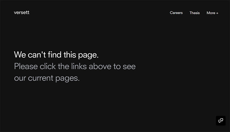
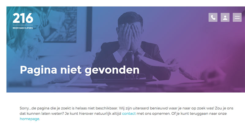
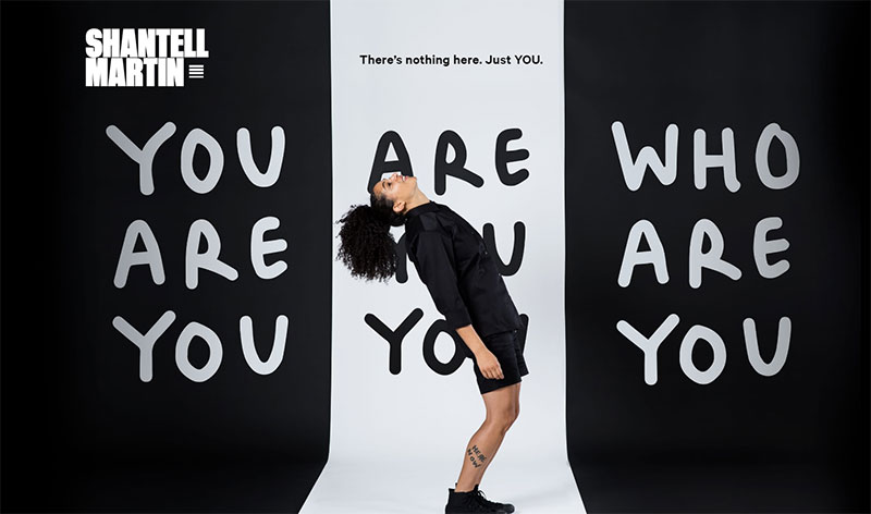
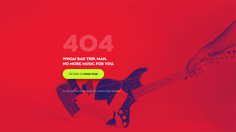
Error pages are almost always annoying to users, but that doesn’t mean you can’t turn them into a pleasant experience using a bit of creativity. Encountering a 404 page is not uncommon in the online environment, so don’t expect your users to freak out too badly when they come across one. With a little effort, you can come up with the best 404 pages ever and entertain your visitors while the website is down.
You may wonder whether this is actually possible and it’s not just some joke that you don’t have time for at the moment. Well, it’s not. Any business owner can personalize the 404 Page Not Found result so that visitors take a moment to read the message that you want to convey and return to the website later when it is up and running.
A memorable 404 error page will also help you retain your website’s professional look even during downtime. Moreover, you will get to enjoy the copious fun that comes with designing the best 404 page ever.
This article created by our team at Amelia (probably the best WordPress scheduler plugin) contains a few tips and tricks that you can apply right away to keep your website errors on a positive note.
What’s a 404 error page?
The 404 error page occurs when a website, in whole or in part, cannot be accessed. The reasons are varied – the page may have been removed, the user’s internet connection might be faulty, the URL might have been typed poorly, and so on. The usual messages that appear on this page are:
- 404 Page Not Found
- 404 Not Found
- HTTP 404
- ERROR 404
- The page cannot be found
- The requested URL seems to be broken
In addition to alerting that there’s a problem, the best 404 error pages give the user information about additional steps that they can take in order to reach the website properly. Because they may now be lost or got misdirected, finding their way around the error, and getting back to a working part of your site, is essential for the user.
The reason behind creating customized 404 pages
So, you may wonder why you need a customized 404 error page since even the basic ones provide some level of troubleshooting advice. Frankly, it’s all about the user experience and how your website is perceived. By putting time and effort into making the 404 error page attractive, there is a good chance of having the visitor return to your page or website later, in the hope that it is back on track.
Visitors very quickly learn patterns about websites when they browse the Internet, and so they know the common 404 error pages that they see each and every day won’t be worth reading. It’s at that point that they may leave, never to be seen again. Once you’ve decided to create a customized 404 page, know that you’ll have to dedicate some of your time and technical knowledge to make it work correctly. The steps involved include editing the .htaccess file and running commands.
Another few reasons why you may want to create the best 404 error page are:
- Building a strong brand image– your brand’s image will be visibly strengthened once you keep the elements that you use on the very same line; if your users expect to see certain types of content or visuals from your site, use the same style when you’re designing the 404 error page.
- Increasing your SEO – use internal links on the page to send your visitors to somewhere else on your site, and reduce bounce rate by disappointed users.
- Keeping visitors happy instead of frustrated–a 404 error is not what visitors access a website for, but you can make the experience less frustrating by customizing the generic 404 error page.
- Giving your brand a voice– in many cases, brands are just a mishmash of specific visuals and mottos; through messages like this error page, you can differentiate your brand with a friendly voice that makes visitors come back for more.
- Increasing conversion rates – by accepting the fact that there is something wrong with your site and apologizing for it, there is a good chance to make the user return and transform into a loyal one, thus increasing your website’s retention and conversion rates.
Tips and tricks for a great 404 page
The main purpose of a 404 error page is to let people know that there is something wrong with the website at the moment in a clear way. Being vague won’t have a good outcome, so make sure to convey a message that specifically states what is the cause behind the error and when the site is expected to get back on track. Of course, you need to do this in a catchy manner that stirs the interest of any person who sees the custom 404 page. Here are some tips that should help you:
Carefully explain the issues
The first thought that may pop into users’ heads is that your website is permanently down. Reassure them by stating the nature of the problem. A 404 error can be solved in a matter of hours if you know what caused it in the first place. Explain the issue and the potential solutions that it may have (e.g. mistyped URL). Also, be sure to offer alternative links for them to follow.
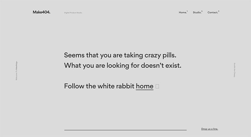
Always speak friendly
To obtain the best 404 error page ever, use a friendly tone of voice. Adding some personality and humor to the 404 message will keep visitors entertained instead of compounding the frustration of not finding what they wanted.
Make use of visual elements
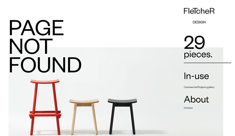
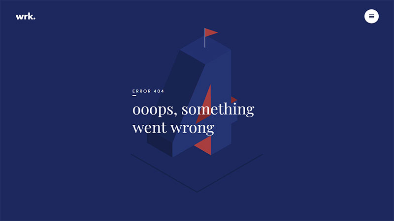
If you’re not good with words, but you still want to customize your 404 error page message, put visuals to work. Make use of color contrasts, geometric shapes, and shadows to create a visually-pleasing effect that highlights how professional the website looks even when it is stuck in a 404 error. Stick with positive color psychology, as it can reduce the negative feelings that a person may have because they can’t reach their goal.
Don’t be afraid to use images
Using a background image instead of the plain-white background that all websites have can be a good idea too. Putting together the best 404 error page ever is definitely not an easy process and it requires creativity and effort. See what image fits the context and use it for an extra touch of professionalism. Adding Call-To-Action buttons is a good idea as well if they fit the context and the page’s layout.
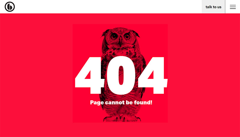
Illustration and animation are catchy
If you can afford to pay for personalized animations or illustrations, this is probably the best way to add visuals to a 404 error page. In case you haven’t noticed, many of the most interesting 404 pages include cute animations that turn anger into entertainment.
Link the user to another page on your site
When one of your site’s pages is struck down in a 404 error, you can direct the visitors to another page of your website that is still working. This way, they might still find something relevant to their initial search, and you can take advantage of their visit. Instead of losing a visitor for good, do something to redirect them to another part of your website. Who said that 404 pages can’t be useful too?
Make the search bar accessible
When one page in a multi-page website doesn’t work, give visitors the opportunity to look for something else. Create the best 404 error page ever by adding a search bar that visitors can rapidly use to look for other pages within your website.
Be funny
Don’t be afraid to use humor when you’re describing the 404 error. It is not the most dramatic situation that can happen to a website, so it’s best to keep the tone positive. Furthermore, humor enhances your emotional connection with users. A good laugh will erase the little hate generated by the existence of an inconvenient error.
Give direction
Users can’t be left with no choices after they are greeted by a 404 error page. Give them some direction by adding links to the most important pages of your website that are still up, or your social media accounts instead.
If you enjoyed reading this article on best 404 page ever, you should check out this one on visual design.
We also wrote about a few related subjects like modern web design, layout design, bad websites, button design, web design trends, dark background, website layouts and loading animation.
Visual design has to do with how a website looks and how well its design matches its function. Although visual perception is largely subjective, a natural and pleasing aesthetic can only be achieved if elements are strategically placed according to certain principles and rules.
Without sketching, the UI design process would be unclear and complicated. Problems may appear and the final result won’t mirror the expectations of a designer. And sketching is not important in web design only – it is a part of the developing process in many other fields. Starting a project by outlining your ideas on a piece of paper is the best decision because it lets you picture the articulated design before actually starting to work on it. Moreover, a sketch can be presented to the client, who can offer you the necessary feedback to make eventual improvements.
Whether you have secret future plans for your website or you are simply redesigning it, leaving the website blank won’t be a pleasant experience for your visitors. Instead, you should spend some time crafting a catchy Coming Soon page to let your visitors know about your temporary absence.
People are oftentimes confused when it comes to using the terms web designer and web developer. Even though both jobs involve working in the same type of business, they are visibly different, and they require totally opposite skill sets.
There are people who deal with web design and development at the same time, but that doesn’t mean that the two jobs are the same. They are not identical jobs. Instead, they are complementary. When people use the terms web designer versus web developer interchangeably, they are stirring a hornet’s nest, because it’s just plain wrong.
Affordances refer to the properties that an object has. These properties tell users how many actions they can do using the respective object. To put it simply, imagine a button. Buttons are created to be turned or pushed. The properties of this button transform it into an object that can be either turned or pushed. These properties represent the button’s affordance.
Even though this term can seem a bit technical, it is useful when talking about web design. In website design, terms are often used interchangeably, which leads to confusion.
As you might already know, Amelia 1.5 is now live! But what does that mean for you, we will explain here.
We strive to make Amelia more and more helpful for all the business owners and end-users with every single feature that we add and a bug that we fix. We want to answer the needs that Amelia’s users might have. We keep monitoring Amelia’s features wishlist carefully, and recently another set of the most wanted features was released.
#1 Feature: Sorting of Services on the Service page
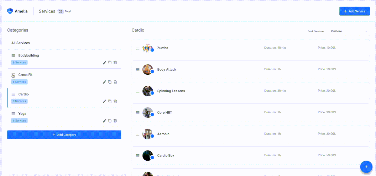
Now it is possible to sort services on the Service page and reorder them the way you need them to appear on the front end, the way you want your users to see them. It doesn’t strictly have to be in alphabetical order anymore; now you can put the service you want to promote first for example! What is even more impressive, you can do it by just dragging and dropping it in the right position – easy like Sunday morning!
In the Sort Service dropdown you have four main options: “Name Ascending”, “Name Descending”, “Price Ascending”, and “Price Descending”; but you also have “Custom” as an option, it will be automatically chosen if you manually move any service on the list with drag and drop function.
#2 Feature: Email address doesn’t have to be mandatory!
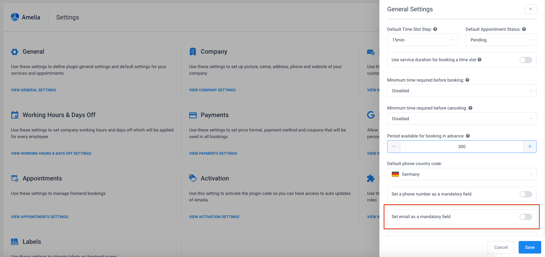
A lot of businesses that use Amelia to take care of the booking process didn’t want to collect the email addresses of their customers, and it is something that we just made possible. Now your booking form can become even more straightforward and quick to fill: disable “email is mandatory” option on the General Settings page, and your customers will be able to finish the booking process without entering any email address. Voilà!
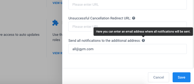
#3 Feature: Send all notifications to the additional email address
Many business owners would like to be in the loop, and know which appointments are being booked at their website “on the go”. This new option allows you to define one additional email address that will receive all notifications that you have enabled on the Notification page. If you, as an owner, prefer to receive all the email notifications about the appointments, enter your email address in the Notifications settings page, and you will receive copies of all the email notifications sent to your employees and customers.
#4 Feature: Restrict customers from booking group appointments if their group is smaller than the required minimum
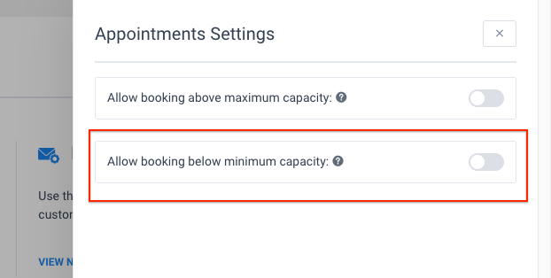
Do you have some services that require a certain minimum amount of attendees to be performed? It is not comfortable if you need to call someone and let them know that the appointment they booked won’t happen. That kind of thing happened to all of us at least once.
For example, you are organizing a group therapy and unless there is a minimum of 4 people attending it won’t make sense. Now, you can configure Amelia to automatically prevent customers from scheduling appointments for certain services if the number of people in their group doesn’t meet the minimum capacity requirement – this is just one more thing Amelia will handle for you and help you avoid an unpleasant situation, isn’t that excellent? If, on the other hand, you do allow booking appointments even if the minimum capacity is not reached – it is possible as well.
#5 Feature: Choose whether your customer will see other customers in the Google Calendar Events
Customers will not see other attendees by default in Google calendar events, but if you want them to be seen from other’s customers’ calendars, you can quickly turn this option on, so customers know who the guys they will be attending the appointment with are.
#6 Feature: RTL (right-to-left) writing
To support all of you speaking and writing Arabic, Hebrew, Persian, Urdu, and other languages that use RTL (right-to-left) writing, RTL feature is added!
Additional small features that will make your bookings nice and easy:
- Admin, manager, and employee (if you allowed them in the Roles Settings) can now approve appointment below minimum capacity,
- Added %extra_name% and %extra_quantity% placeholders in the notifications,
- Added more options in Minimum time required before booking and canceling options
- Added 1 and 2 minutes time slots in Time Slot Step option, more options – more fun!
- Added option in Appointment Settings to choose whether you will allow booking above maximum capacity for appointments with Pending status,
- Allowed editing of the appointments in the past,
Additionally, you will have an even better and modern Dashboard, all your important metrics will be just in front of your eyes. Amelia Dashboard is redesigned to look nice, but more importantly to be more useful to you and your employees. With new charts and tables, you can better follow your appointments, employees, and services.
In the end, we would like to mention some bug fixes that won’t annoy you anymore:
- Fixed issue with sending notifications when customer schedules through the Search booking form.
- Fixed issue with time zone option and appointment time placeholders in the notifications.
- Fixed issue with the total price when the appointment with extras is added from the back-end.
- Fixed issue with status translation on the Customer’s back-end.
Conclusion
To track how Amelia is becoming smarter and smarter by time, or to find the feature you need, don’t forget to check: Changelog. With new functionalities added, Amelia is becoming one of the best assistants you can ever higher, and that your customers love.
We live in an era where everything is evolving at a very fast pace and some things can seem bizarre. Ever since the invention of information technology, humanity’s lifestyle has reached a pace which no previous generation could have imagined to be possible. Each new generation deals with a faster life where they struggle to keep up with all the constant changes which can make or break them within days. The internet’s invention has accelerated things even more, connecting people who live on opposite sides of the globe with unimaginable simplicity.
There’s one thing that’s remained a constant among the numerous web design trends, and that’s how fast things change. Design trends constantly change to fit the buying needs of users, which makes web designers anxious, but also provides them with plenty of insight.