
Creating a well-designed law firm website is vital. It reflects the professionalism that a firm provides. (more…)
Let’s say you are owning and running an excellent online business backed by an efficient supply chain and a well-trafficked website.
What could you possibly do to improve your business even more? There could be at least one thing that you could improve and generate more revenue.
What About Cart Abandonment?
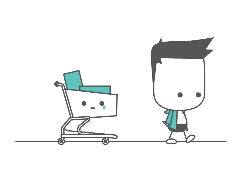
The way today’s marketers regard an abandoned cart is about to change. Instead of giving up and identifying cart abandonment to a lost client, marketers need to see an abandoned cart as the best occasion to establish, build, and nurture improved customer rapport.
An approach from a positive angle will get you a higher ROI, and every entrepreneur on the planet will target a higher return on their investments. Everyone sells something, be it professional skills, products, or services and no matter what you sell, profit remains your target.
Marketers associate an abandoned cart to lower conversion rates and a lost chance of generating more revenue. There is no doubt that cart abandonment is a problem for online businesses and a serious one that you need to pay heed to and do everything to fix it sooner rather than later.
Retailers experience an average abandonment rate of 68%. It is a high cart abandonment rate that often scares drives entrepreneurs into thinking they can find a one-off fix and reduce cart abandonment. An entire industry of online marketing bloggers thrives by writing on quick fixes.
However, the reality is entirely different because there is no such thing as a one-off fix for high website cart abandonment rates. The first step in finding a solution is acknowledging that the real issue is not cart abandonment, but why your users decide to leave their cart behind.
As an entrepreneur, you need to shift focus and find the tools that will help you establish and grow a base of loyal customers that will return to your website and contribute to your sales repeatedly. This is what you need to fix, and this is how you will reduce the abandonment rate.
Now, how do you build such a customer base? Before we get into details of strategies that you could use to achieve that outcome, you need to place yourself in your users’ shoes and view things from their perspective. You’ve been a customer yourself many times, right?
How many times in the past haven’t you abandoned your cart on different e-commerce websites? It’s likely that you decided to move on to a different website or close your laptop all together right before you typed in your bank details and it probably happened more than once.
Common Reasons for Cart Abandonment

Data analytics can provide much insight, but it does have its limitations. People choose to drop off their cart and never make the final purchase for different reasons, including:
- A checkout process full of twists and turns that involves too much effort on their part
- Tax or shipping fees that dramatically increase the price, which they take as rudeness
- An exceedingly tricky/detailed registration procedure that takes too long
- Slow page loading time that can make them feel like they are wasting their time
- A security concern that may deter users from entering their credit card details
- Slow moving website. There are lots of ways to speed up a WordPress site.The easiest thing you can do is to enable caching. Here’s a WordPress browser caching guide from CollectiveRay that can help you with that.
You have to change your approach to clients and see them as a new chance of establishing, building, and nourishing long-term relationships. No longer regard a user as a successful or a failed conversion. Thinking in sale and loss terms won’t help diminish cart abandonment rate.
However, if you choose to look the website cart option/function as a means to support customer fidelity, you are on your way to fostering an effortless, consistent conversion rate.
What Options Do You Have after You Understand the Problem?

Once you figure that your shopping cart is a tool to building a solid base of loyal clients, it is time to move on and discover what options/solutions you have at your disposal to achieve your new objective: have customers come back to your website all over again. Here are some options:
Allow Guest Checkout

Users, and therefore potential customers, don’t like feeling pressure when they are on retailer’s website. The guest checkout function offers them just what they want: a great browsing experience, no strings attached. It works for 80% of the major US-based e-commerce websites!
A guest checkout entails a low-commitment level, and users enjoy low-commitment. What they hate is feeling overwhelmed with credential requests and pushy paywalls. If you push your user to give away their details the minute they land on your website, you will drive them away.
First, give them a chance to get used to your website/brand, let them save the items that interest them, and then embolden them to sign up. At this point, they’ve become accustomed to your site and signing up to your website no longer feels coercive, frustrating, or aggressive.
A guest checkout tells your future customers that you are well aware of their freedom to check out other options and that you fully respect that freedom. Let them browse freely and push for conversion after they’ve come to comprehend that you can provide them with the most value.
Make sure you have a happy client the first time around, and you will have a happy client coming back the second time, the third time, and many times around. Also, optimize your website to ensure it looks good on any device and no matter how users access your site.
Use Thumbnails

Acquiring products or services online is convenient, and convenience is an important criterium for many people today considering that we live in a fast-paced era. Well, that convenience has a downside: it lacks the see/touch component of a physical store. What can you do about it?
The solution is simple: HD images. High-quality HD images of what users are paying for will be making the online purchasing experience more palpable because HD images let them see the details. Every website that sells products or services can benefit from using high-definition images.
Travel websites can post appealing and clear images of the destinations they are marketing. These images allow users to envision their trip’s details. A site that organizes events can highlight the venue/venues where the event will occur or the potential performers at the event.
Promote Honesty

What you see is what you get. No surprises. This is the approach that customers like. They don’t appreciate shock charges as they are about to enter bank details and make the buy. That’s the point where cart abandonment occurs. Choose to be honest with your customers all the way.
Make sure your users/potential customers are fully aware from the very beginning of any and all additional charges. You can easily use a banner-disclaimer to let them know that certain booking fees apply. You can also provide detailed fee description in your inventory.
Add Trust Logos

Third party trust logos reassure potential customers that they can shop safely with the respective retailer. 61% of potential customers have proceeded to cart abandonment or left e-commerce websites that lacked security logos, according to Actual Insights.
Trust logos or security logos allow users to feel safe as they enter their credit card details. Online fraud is an issue, and if you put yourself in the mind of your customer, you immediately understand why a trust seal matters.
Incorporate Customer Testimonials

Real-life customer testimonials convey a clear message to your users: real-life people just like me have been here and have bought these products and used these services. Testimonials build brand confidence in your potential customers, and they feel safe to make purchases.
There are several ways you can make testimonials available to your users: comments, text, or photo journals, or even videos. A comment section is more challenging to manage, and you must arm yourself with the skills required to moderate submissions on a regular basis.
You can determine former customers to share the experience by launching a contest where they can get a prize if their shared photos or videos are selected as the most inspiring or creative. Customers will do their best to share engaging content in their testimonials.
This method of harnessing testimonials will increase your customer engagement, and it will foster a feeling of safety and comfort in your new users
Allow Shopping Cart Editing
Cart abandonment also occurs when users cannot edit their shopping cart. People make mistakes. To err is human, they say, so give your users the opportunity to edit their cart instead of going through the entire process all over again. It frustrates them and drives them away.
Provide Quick and Easy-to-Access Support

Users need help, and they need to find it quickly. If they cannot find a solution to their problem quickly, card abandonment occurs. The competition is acerb online, and your competitors are waiting for opportunities just like this to steal a conversion right from under your nose.
Support should not be ten steps away but one step away. Make it easy for the users to see it and use it. A live chat function may be an efficient solution. Also, a simple email/link to your support team could do the trick. Don’t forget to specify hours of operations in a visible manner!
Offer Special Promotions and Discounts
People are crazy about deals. They will choose a website that offers discounts and promotions over one that doesn’t without a second thought.
Discounts, bonuses, special offers, they are all triggers that determine users to stay on a specific website, and you want it to be your website to give them an excuse in the shape of an attractive deal!
Implement Free Cancellation Policy

Clear free cancellation policy can contribute significantly to reducing cart abandonment. People hate feeling trapped, pushed, or coerced in any manner so offer them the possibility to change their mind later on and cancel their booking on your travel website.
A booking decision involves a significant amount of money, and people usually want to take their time before they make a purchase. Let them have that time by making your free cancellation policy visible on your website, which takes the pressure out of the equation for users.
Provide Free Shipping

There is nothing that frustrates customers and encourages cart abandonment more than additional fees. 40% of potential customers abandon their shopping carts because the retailer doesn’t offer free shipping, according to a study from Forrester Research.
That goes to prove once again that shipping fees are an important barrier to conversion. That realization has led to more than half of e-commerce website to ensure free shipping, according to a TechCrunch report.
Today, users expect free shipping to be included because the retail market is highly competitive and mature with players such as Amazon. Missing shipping fees encourages users to increase their purchase value by 30%. That should be enough to encourage you to offer free shipping.
Free shipping, no matter which forms it takes, is imperative if you are looking to reduce cart abandonment on your website. It is essential that users feel they are winning something and when they don’t get to pay for shipping, it is precisely how they feel: winners.
Sometimes, smaller retailers are unable to offer free shipping 24/7/365. You can use a different approach in this case and offer free shipping at specific promotional intervals. According to UPS, retailers experience a sales increase of 10-20% during free-shipping promotional periods.
Free shipping for large purchases represents one way to reward the potential customer. Establish a threshold as a reference and provide free shipping for all purchases exceeding that threshold. Users will feel encouraged to buy, and you will have ensured a correct margin as well.
Sometimes, free shipping is not an option for a retailer. It is time to get creative and offer something else that will add value to your user’s transaction and discourage cart abandonment: an incentive, such as a future discount, loyalty program, or free samples.
Summary
As you can see, there are several ways to reduce cart abandonment, and your task is not that complicated. Adding a set of uncomplicated features or correcting some of the existing functions could make a big difference on your bottom line by cutting down booking abandonment. Even better, after you optimize your site to reduce cart abandonment, you can prevent any remaining abandonment using an exit-intent popup!
Making extra profits is not that difficult as long you start now and don’t delay the matter longer. Use these simple tips to reduce cart abandonment on your booking website now, before your competition takes advantage and secures clients that you were supposed to retain.
Get more bookings with the right tool for the job
Staying organized has never been easier.
You can now manage your business and grow your brand with a single, powerful WordPress appointment booking plugin that keeps all of your appointments in line, your clients organized and your business booming.
Amelia is perfect for business owners who need to streamline their booking experience both for their staff and their clients.
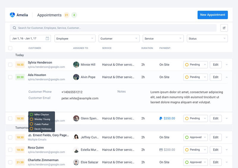
Amelia handles everything for you, even sending automated email or SMS reminders to your clients. No-shows? Not anymore!
The Amelia WordPress booking plugin adapts to different industries for a blissful online booking experience and employee management.
Want to know more? Check out Amelia’s awesome features to see what you are missing.